
As an undergrad I lived 1/4 mile from the Mass Ave/Mem Drive intersection, and you could sometimes hear when a truck didn't make it. We'd go running out to investigate.
08.03.2025 17:13 — 👍 2 🔁 0 💬 0 📌 0As an undergrad I lived 1/4 mile from the Mass Ave/Mem Drive intersection, and you could sometimes hear when a truck didn't make it. We'd go running out to investigate.
08.03.2025 17:13 — 👍 2 🔁 0 💬 0 📌 0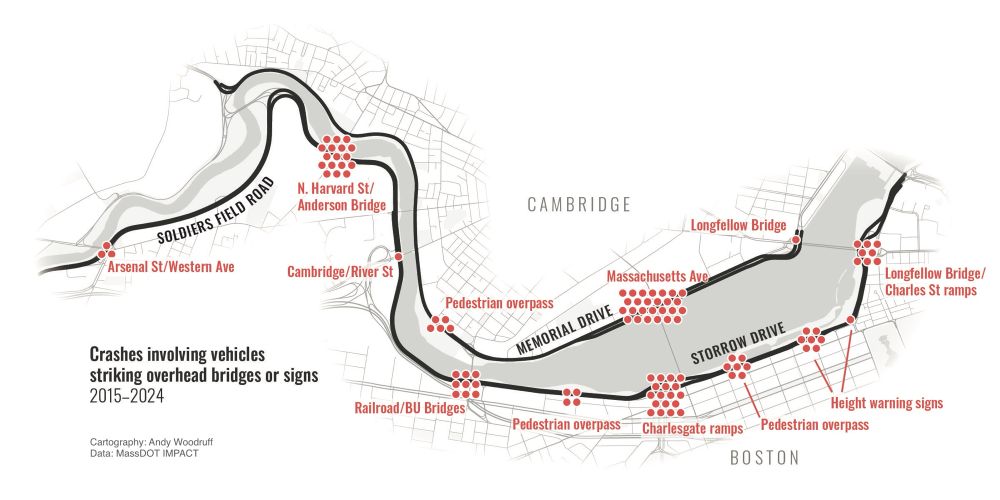
Map showing locations of vehicles striking overhead bridge structures on Storrow Drive/Soldiers Field Road and Memorial Drive in Boston and Cambridge, Massachusetts.
I finally have the chance to make a bunch of Boston maps again, and no collection would be complete without a map of Storrowing. (Truck vs low overpass)
The “winner” of the last decade is not on Storrow, but rather adjacent to the smartest humans on the planet over at Mem Drive/Mass Ave.
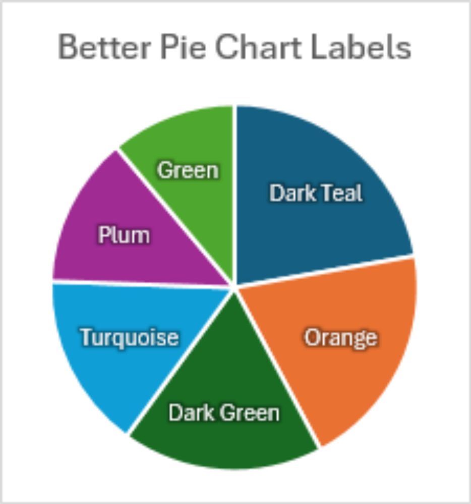
Better Pie Chart Data Labels
peltiertech.com/better-pie-c...

Better Pie Chart Data Labels
Better Pie Chart Data Labels
I've just posted a tutorial showing how to improve pie chart data labels. First, format text with a glow effect to improve contrast. Second, use VBA to position labels between Center and Inside End. Also, you'll read how to fix VBA timing issues.
If You Don’t Need/Want Copilot...
www.youtube.com/watch?v=eYVP...
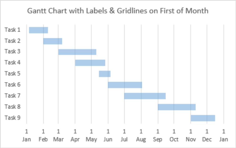
Gantt Chart with Nice Date Axis
peltiertech.com/gantt-chart-...
But I'm the king of workarounds, especially when it comes to Excel charts. I've figured out a way, and I've updated the tutorial.
23.01.2025 20:02 — 👍 0 🔁 0 💬 1 📌 0I've updated the technique to add milestones in the chart. Normally this would use a single-point XY scatter chart series, but the trick I used to get the nice date axis (spoiler: a secondary axis line chart series) prevented the use and added XY series.
23.01.2025 20:02 — 👍 0 🔁 0 💬 1 📌 0Go ahead, count the pixels in the chart image: 1 Feb is closer to 1 Mar (28 days) than it is to 1 Jan (31 days).
23.01.2025 20:02 — 👍 0 🔁 0 💬 1 📌 0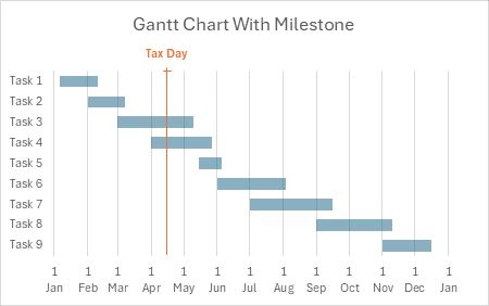
Excel Gantt Chart with Nice Date Axis and Milestone
A few years ago I wrote a tutorial showing how to make a Gantt chart with a "nice" horizontal date axis. This axis has proportionally spaced dates, e.g., the first of each month, which is not possible with a standard stacked bar chart construction.
23.01.2025 20:01 — 👍 1 🔁 0 💬 1 📌 0😊
22.01.2025 00:05 — 👍 0 🔁 0 💬 0 📌 0Below the ants are some Excel4Macros.
20.01.2025 22:20 — 👍 1 🔁 0 💬 0 📌 0
Nice Bar Chart Data Labels
This quick tutorial shows how to create data labels for your bar chart which are attractive, informative, and legible.
#excelcharts #peltiertech
peltiertech.com/nice-bar-cha...