
Imagine going through ALL this trouble just to finally get your laptop back and continue playing Stardew Valley from your last save back in 2019...
02.12.2024 22:54 — 👍 1 🔁 0 💬 0 📌 0
@michalmalewicz.bsky.social
I build + share my methods (just not here). Designed 500+ products, many for Fortune 500. ✦ Building the internet since 1998 ✦ 361K designers ✦ $1M+ sales
Imagine going through ALL this trouble just to finally get your laptop back and continue playing Stardew Valley from your last save back in 2019...
02.12.2024 22:54 — 👍 1 🔁 0 💬 0 📌 0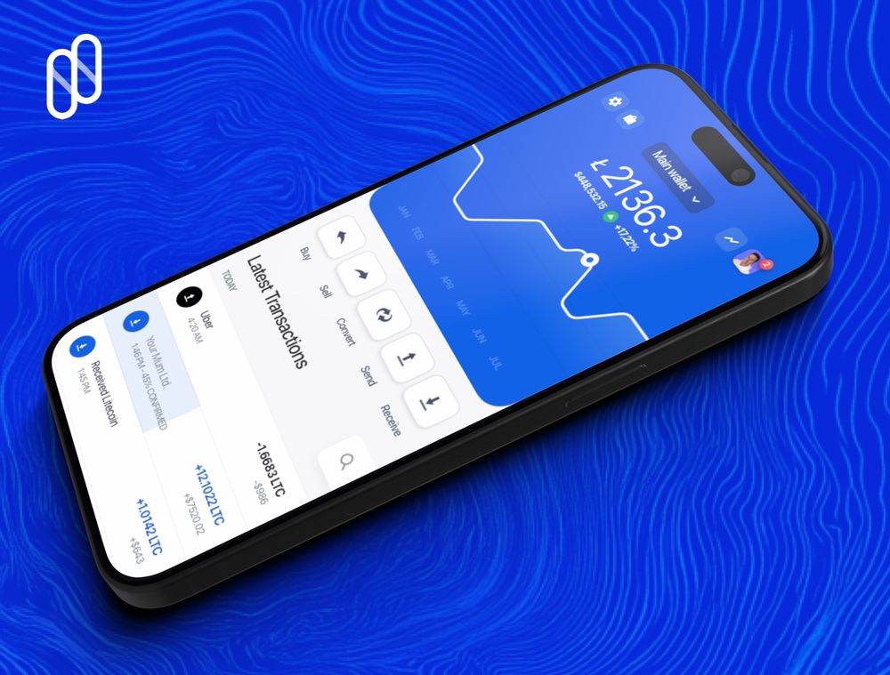
I did a thing. $LTC
01.12.2024 13:02 — 👍 1 🔁 0 💬 0 📌 0We just launched the new feed view and posting your projects directly.
Best way to showcase your work and get new clients!

Just a quick reminder to ...
BUY! BUY MY PRODUCTS.
Send me money! 😂
hype4academy.gumroad.com

This is a cute little platform, but nah. I'm only here to telling you to BUY MY STUFF :-)
hype4academy.gumroad.com
I am a super-serious person.
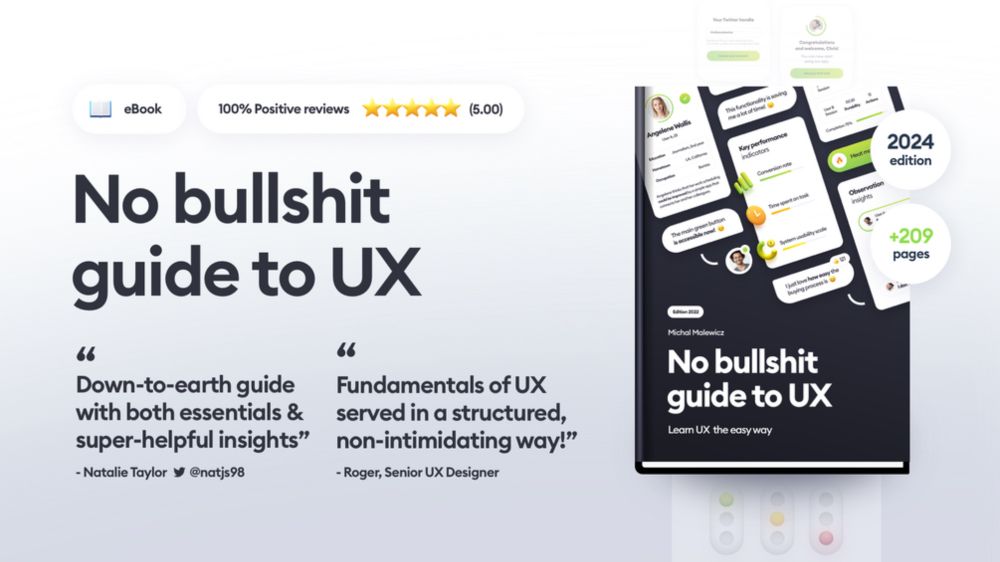
Wrote a book and it has a swear word in the title.
That's professionalism.
hype4academy.gumroad.com/l/guidetoux/
LP Challenge Memoir on @michalmalewicz.bsky.social #square.one
14.11.2024 01:34 — 👍 2 🔁 1 💬 1 📌 0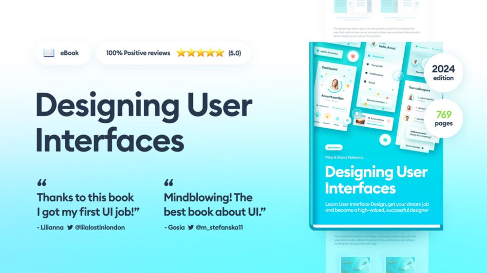
⚠️I wrote a book and over 10,000 people used it to master design.
This year we lowered the price - for good.
Do not miss this 👇
gum.co/uibook

If you want to join 50,000 people learning from my books and courses go to:
square.one
And start with a free account!
This is simply the best approach.
But there's also the other 20% of usecases that I will cover later.
If you want to see that post, make sure to follow me
@michalmalewicz
and of course like / comment and bookmark this one for easy reference.
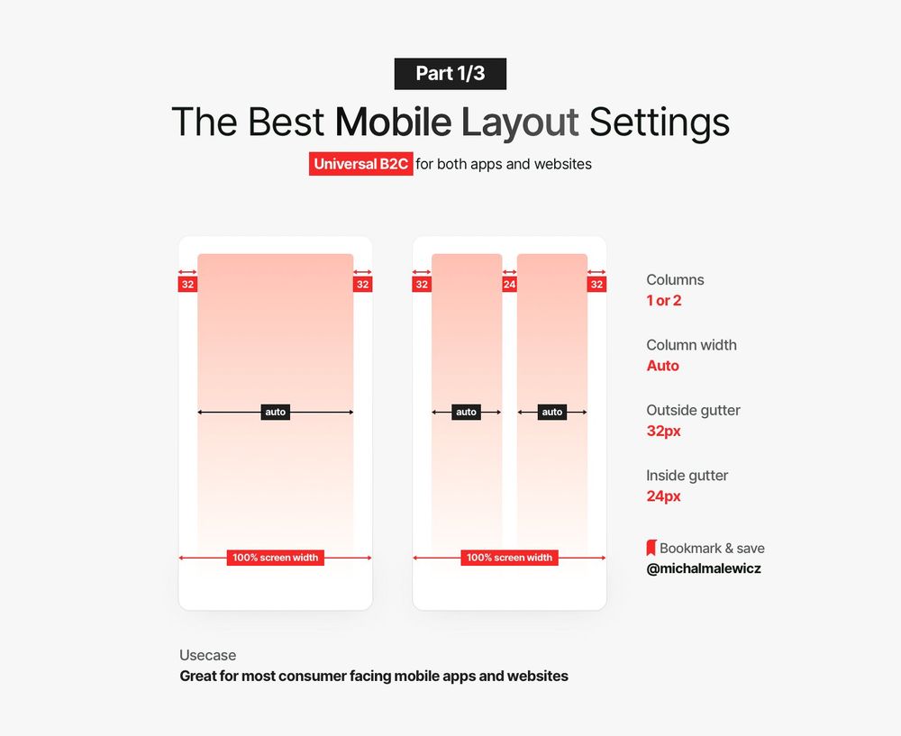
Having larger (32p) margins on the sides, assuming your content is big enough and readable, naturally allows LESS text to be visible per line.
That means it's easier to focus on what's there and read it.
For most B2C products that are supposed to be friendly...
use that same spacing (24p in this case) for vertical spaces between similar groups.
You can space out completely separate sections by 32 and 48, but that's a story for a whole other post.
Why this works and when?
If you ever used my Hierarchy Strips method (it's in most of my courses) then you'd know we cannot do another 32px between them.
That will mess up the hierarchy and grouping.
To make it flow naturally, decrease the internal gutter by your grid value (-8p) and...
Most mobile interfaces are single column on purpose.
It helps with readability and avoids cognitive overload with the attention only going down.
But sometimes you do need two columns. What then?
🔖 Bookmark this!
This is the layout setting for Mobile that we use in about 80% of the projects.
It uses a flexible column width and a rather large 32p margins on the sides.
Now let's explain why it works in a short thread 🧵👇