
👀
19.12.2025 21:35 — 👍 0 🔁 0 💬 1 📌 0👀
19.12.2025 21:35 — 👍 0 🔁 0 💬 1 📌 0If you land up in the Wellington newsroom there'd more chances to collaborate. Flick me a message you are interested and want to chat about data journalism. I was lucky enough to make the jump from data science to data journalism back in 2017 and I've never regretted it.
05.11.2025 20:41 — 👍 2 🔁 0 💬 0 📌 0
BusinessDesk has a fantastic (and rare) for a data journalist in New Zealand. The Herald and BusinessDesk are separate publications, but whoever is in this role will work with me on projects like Budget day visualisations 1/2
careers.nzme.co.nz/jobs/6697721...
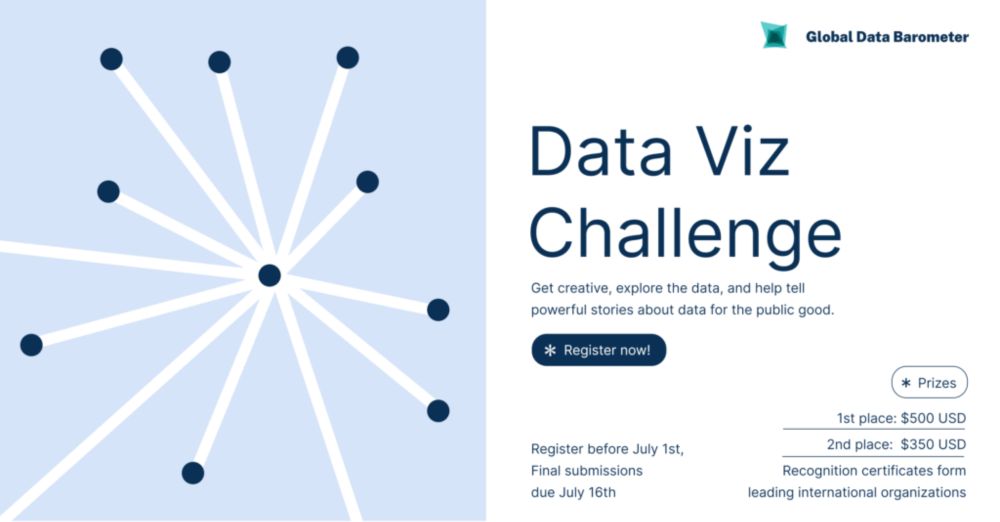
The Global Data Barometer - Data Visualization Challenge 2025 is open!
We’re inviting you to use the second edition dataset to create powerful stories about data for the public good.
Register by July 1
Submission deadline: July 16
Explore the guidelines: globaldatabarometer.org/2025/06/glob...
I'm updating a small app I last looked at in 2019. I wrote it using @svelte.dev v2.15.0 - things have really changed a lot in the svelte ecosystem since then!
09.04.2025 04:05 — 👍 4 🔁 0 💬 0 📌 0I'm not actually certain about this but I believe sometimes the sensors get innudated and report crazy numbers. When I was making river level visualisations for the Auckland floods in 2023 I had to exclude a bunch of rivers where the reported depth was a little higher than Mount Cook.
04.04.2025 06:15 — 👍 13 🔁 0 💬 1 📌 0But if, for example, you think the bit of the Selwyn electorate that has been added to Wigram is more left leaning that the rest of Selwyn you can use the sliders to see how that plays out.
27.03.2025 21:41 — 👍 3 🔁 0 💬 0 📌 0
With the blunt assumption that voting preference is uniform across electorates there a four electorates that might have had different outcomes if the new boundaries had been used in the 2023 election.
www.nzherald.co.nz/nz/interacti...
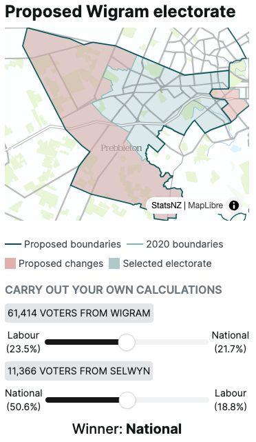
New Zealand's new (proposed) electorate boundaries were released this week. MMP means that electorate boundaries don't really impact the outcome of elections, but it's still interesting to how the changes might impact individual MPs.
27.03.2025 21:41 — 👍 0 🔁 0 💬 1 📌 0Don’t read this on the bus you might miss your stop…
11.03.2025 21:44 — 👍 7 🔁 0 💬 0 📌 0Was in 2011 - well before waste water testing was introduced. But the price per gram and point (dose) was higher was similar in 2009 and 2017/18 (without inflation adjustment) and the price has dropped since then.
01.03.2025 23:05 — 👍 3 🔁 0 💬 0 📌 0On current evidence that would be sneaking into correlation with causation territory 🥲
01.03.2025 20:43 — 👍 1 🔁 0 💬 1 📌 0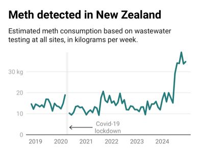
This is not a good graph. More on NZ Herald.
www.nzherald.co.nz/nz/meth-use-...
(Paywalled)
Well forgotten is quick subjective - but I think plenty of people who weren’t alive in the 70s don’t know the story. The podcast hosts also found new details from documents that weren’t available at the time.
18.02.2025 19:47 — 👍 2 🔁 0 💬 1 📌 0
I had fun seeing how far an article can go creating a page for the ‘Mr Asia: A forgotten history podcast’.
@svelte.dev makes it really easy to export an artist’s vision from Illustrator or similar and adapt it into code.
Also have a listen it’s a great podcast!
www.nzherald.co.nz/nz/mr-asia-p...

🚨 New blog post! 🚨
If you want to learn about:
🎨 Monochrome colour palettes
📊 Designing better black & white visualisations
🛠️ Rethinking single-colour chart design
Read this ➡️ nrennie.rbind.io/blog/monochr...
#RStats #DataViz #ggplot2 #RLadies
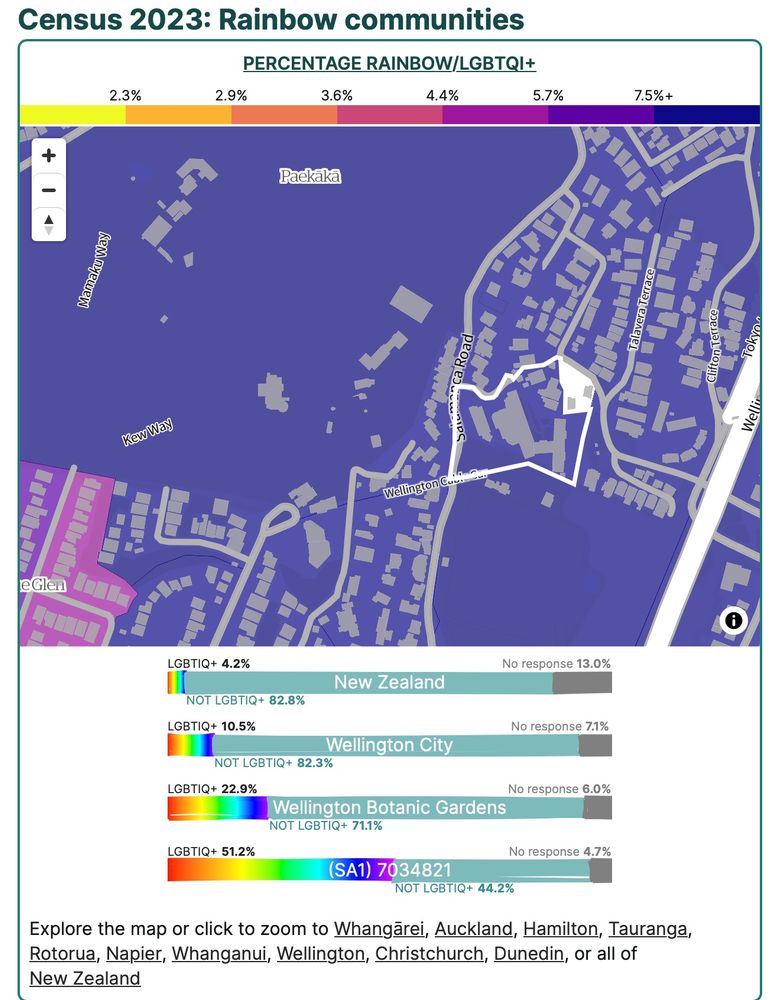
A screenshot of an interactive map showing a much higher proportion of rainbow identifying individuals in Wellington. The National average is 4.2%, Wellington is 10.5%, the suburb called Wellington Botanic Gardens is 22.9% and the neighbourhood around Weir House is 51.2%.
Here's a fun (paywalled) map looking at the distribution of rainbow communities around New Zealand using the latest census data.
www.nzherald.co.nz/nz/census-da...
I’ve heard a few horror stories over the years - lots of spreadsheets and deadlines are often an unfortunate combination!
04.12.2024 04:52 — 👍 1 🔁 0 💬 1 📌 0It's tempting - not this year - but definitely something to think about for next year.
03.12.2024 22:08 — 👍 1 🔁 0 💬 0 📌 0
Nice! I hope they're enjoying it - I had a great time there - in 1994!
This is for 2023 - the leavers data generally gets released in July or August.
Thanks :) the p-value was very small - essentially 0.
03.12.2024 20:51 — 👍 1 🔁 0 💬 1 📌 0You can filter to the see the attainment rates for different demographic groups - were you thinking something beyond that?
02.12.2024 21:12 — 👍 1 🔁 0 💬 1 📌 0Thanks - and thanks for creating the list - it's very helpful.
02.12.2024 21:08 — 👍 2 🔁 0 💬 0 📌 0Thanks! - @kiwifarah.bsky.social is another New Zealand data journalist on here.
02.12.2024 20:44 — 👍 1 🔁 0 💬 1 📌 0
A new day, new datajournalists on my nerdy list. go.bsky.app/KKnngCM
Welcome to @joshnicholas.com @meikeeijsberg.bsky.social @vizowl.bsky.social @maxzierer.bsky.social @grasjcj.bsky.social
And there is always room for more nerds. So feel free to suggest someone in the comments, even yourself. ;)
I haven't discovered many other people using svelte here. I've been using it for Herald interactives for a few years and I'm definitely keen to be involved in any local svelte events if you know of/come across any :)
02.12.2024 18:10 — 👍 2 🔁 0 💬 1 📌 0Thanks!. I probably needed more nuance than characters allowed - I find it incredible specifically from a data point of view - i.e that adding up this list of variables www.educationcounts.govt.nz/__data/asset... for every student and then averaging over the student population is so predictive.
02.12.2024 05:26 — 👍 0 🔁 0 💬 1 📌 0
This was the first interactive I've rebuilt using @svelte.dev v5. State management between components was definitely cleaner and easier.
I tried out the new @tailwindcss.com v4 beta - the new prefix system combined with css variables is great when embedding in a site that also uses tailwind. /end

The screenshot shows my old school - Logan Park High School - and you can see all the NZ schools in our (paywalled) article www.nzherald.co.nz/nz/politics/...
Some technical details to follow 2/-
