

Very late to this but here we go! A collection of our visual and graphics storytelling from 2025. Enjoy 💞
21.01.2026 01:25 — 👍 33 🔁 18 💬 0 📌 4
Very late to this but here we go! A collection of our visual and graphics storytelling from 2025. Enjoy 💞
21.01.2026 01:25 — 👍 33 🔁 18 💬 0 📌 4
By comparing Gaza’s damaged structures with Manhattan’s building inventory (using New York Department of Buildings data), @reuters.com provided readers with a powerful sense of scale and context. @sudevk.bsky.social
12.01.2026 14:32 — 👍 2 🔁 1 💬 0 📌 0
A thread of some design/code highlights for me from our 'How Bangalore Uses the Metro' 📊 project.
1. The header sign is fully HTML/CSS. 'Go Down Take Up For Toilet' is real signage at one of our biggest stations (pic below) :P

A wizard ponders five blue crystal orbs labeled WIP
Them: So what have y'all been up to?
Me: Haha, you know. The usual.
The Usual:


Today, @vonter.bsky.social and I launched cbfc.watch, an archive of over 100k censorship records for ~18k movies released in India since 2017. For the first time, you can search for any movie and see how they were modified before release.
The site is fun to explore, but here's some #dataviz in it!

We did something recently along the lines by visualising the death toll in the ongoing Israel - Palestine conflict.
www.reuters.com/graphics/ISR...

The true size of Africa reut.rs/3UXBoKc
03.09.2025 10:30 — 👍 85 🔁 32 💬 1 📌 5
Stranded at sea: A decade after EU’s migrant crisis, hundreds still dying in Mediterranean.
My last project in @reuters.com with @joanfaus.bsky.social and @sudevk.bsky.social
www.reuters.com/graphics/MIG...


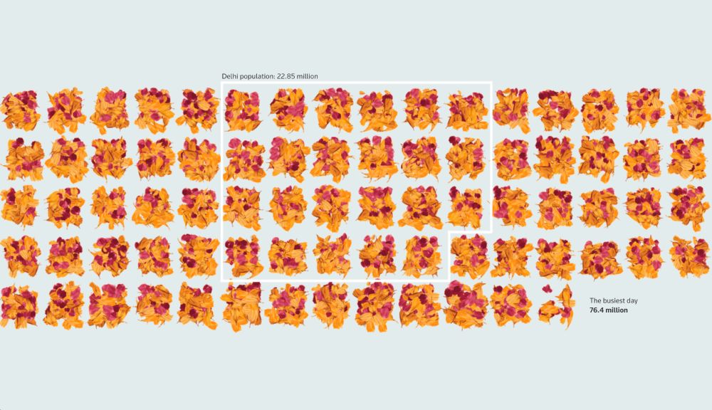
My latest with @deabankova.bsky.social , @rebeccapazos.bsky.social and Mayank Munjal explores the unprecedented scale of the massive Maha Kumbh festival in India, which drew a staggering 663 million visits to the ghats for ritual bathing over a 45-day period.
www.reuters.com/graphics/IND...

Buildings Wrapped in Solid Gasoline
In a strong example of using data & graphics to explain a highly technical topic, @graphics.reuters.com showed how flammable panels fueled a fire that killed 10 people in a high-rise residential building in Valencia, Spain.
https://twp.ai/4ink8O
New project! Made a tool lets you explore, subset and summarize over 10M rows of data from the Time Use Survey of India in your browser. How people in different states, professions and groups spend their time? And then export your findings for #dataviz too!
diagramchasing.fun/2025/time-us...

How South Korea's largest and deadliest wildfire spread www.reuters.com/graphics/SOU... by @sudevk.bsky.social Han Huang and @adolfux.bsky.social
09.04.2025 09:44 — 👍 4 🔁 1 💬 0 📌 0Glad to see some of the projects I worked on at @graphics.reuters.com made it to the #IIBAwards 2024 Longlist!
12.03.2025 12:48 — 👍 1 🔁 0 💬 0 📌 0
Thrilled to finally share one of the most challenging projects I've ever worked on!
With Simon Scarr, @rebeccapazos.bsky.social & Nidal al-Mughrabi, @graphics.reuters.com visualised the tragic loss of life in the war between Israelis and Palestinians in Gaza.
#dataviz #threejs #svelte
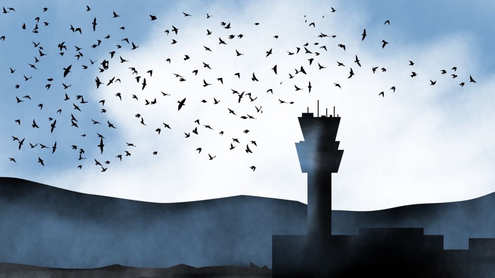
Birds 🦅 collide with aircraft 🛩️ about 150 times a day. But serious incidents such as the Jeju Air crash in South Korea last month are rare yet often fatal, except for a few lucky near-misses.
A look at how bird strikes are a challenge for aviation.
www.reuters.com/graphics/SOU...

Sankey diagram showing research collaboration flows between non-Western countries (left) and their top collaborator countries (right). Thicker lines indicate more collaborations, with the United States and United Kingdom being major collaborators for most countries.

Line graph showing AI research collaborations from 2014-2024, with a popup detail, which has a small bar chart, for South Korea showing it had 799 collaborations in 2017.
I made charts for this story by @khadijaalam.bsky.social published on @restofworld.org! A news graphic after a long time for me. #dataviz
restofworld.org/2025/us-chin...
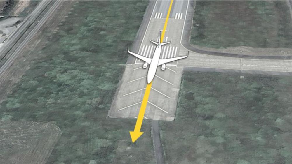
Maps and diagrams break down the final moments of the Jeju Air flight that crash-landed 🛬 in South Korea 🇰🇷, ending up as the country’s deadliest air crash.
reuters.com/graphics/SOU...
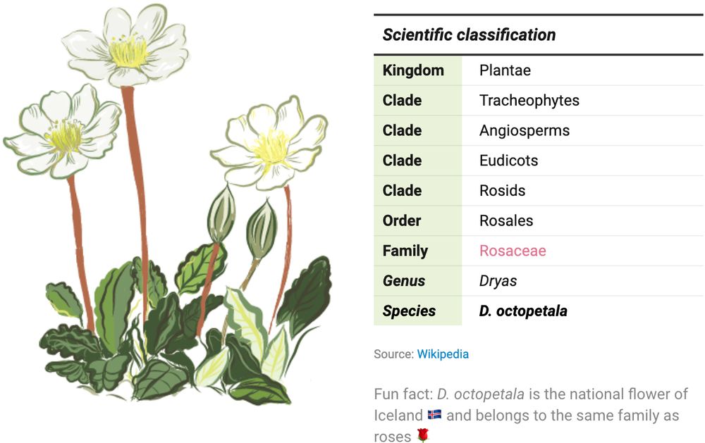
Table of the scientific classification of the flower Dryas octopetala annotated with a handmade illustration. Created by Eleni from the Datawrapper team.

Screenshot of I “Made a Graph of Wikipedia... This Is What I Found”. Shown is a network graph of all Wikipedia articles and the links between them, resulting in a colourful representation of the world's collective knowledge. Among the most interesting findings are so-called communities, groups of articles that are more closely linked to each other than the rest of the site, represented by the individual colours. Published on YouTube by adumb.
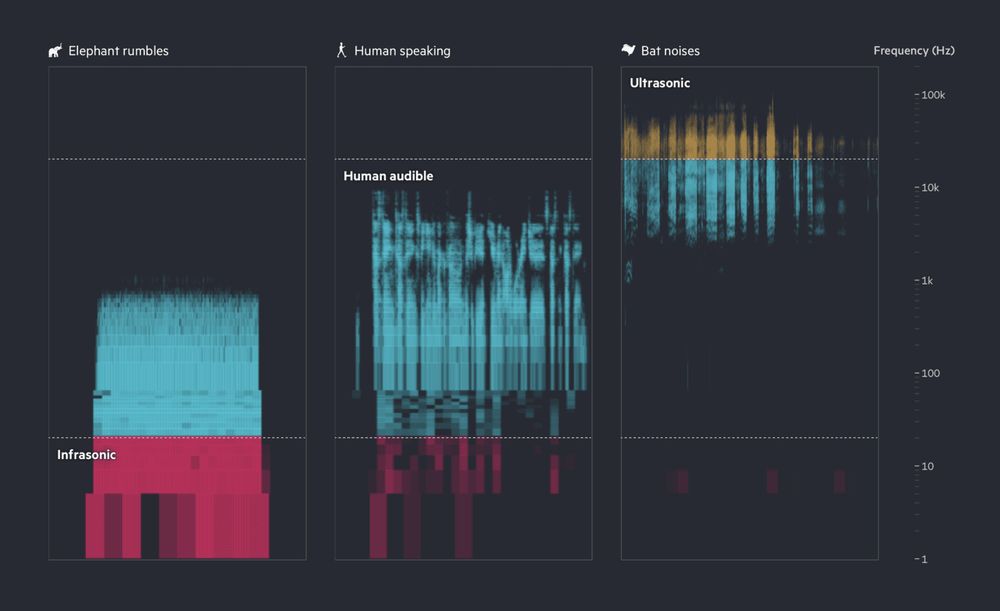
This image shows a spectrogram of three sound types: elephant rumbles (mostly infrasonic, red), human speaking (audible range, blue), and bat noises (ultrasonic, yellow and blue), with frequency increasing from bottom to top on a logarithmic scale. Published by Financial Times.
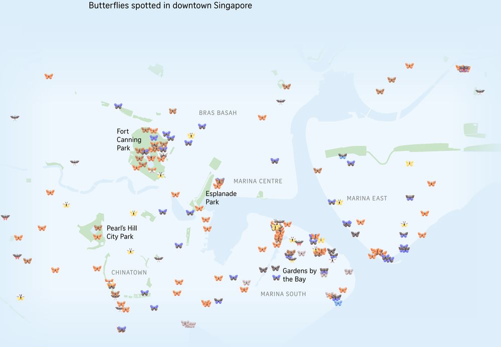
Map of downtown Singapore with little 3D butterflies added where butterflies have been spotted in the area. Different colored butterflies represent different species. Published in The Straits Times.
End of the year! ✨🎄🎇 So here we've got a special Data Vis Dispatch for you: it comes from the whole Datawrapper team. We're sharing our favorite visualizations of 2024. Take a look here 🎁 https://blog.datawrapper.de/data-vis-dispatch-december-17-2024/ and tell us: what were your favorites?
17.12.2024 16:33 — 👍 71 🔁 26 💬 2 📌 6One of the most challenging projects I've worked on since joining Reuters. Despite warnings from the world’s hunger watchdog of an impending catastrophe in Sudan, famine struck anyway. www.reuters.com/graphics/FAM...
05.12.2024 12:11 — 👍 54 🔁 21 💬 2 📌 5
Follow us!
go.bsky.app/CnSL5PB


