YouTube video by Arctic Circle
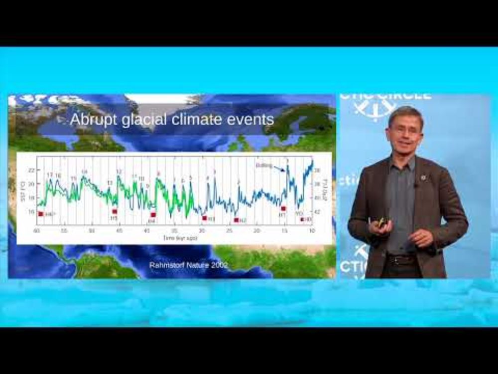
Is the AMOC Shutting Down? - Atlantic Meridional Overturning Circulation
The risk of an #AMOC shutdown - explained in 15 minutes at the Arctic Circle in Reykjavik on Saturday.
I had the honor of presenting a letter by 44 experts warning of that underestimated risk to the Icelandic 🇮🇸 climate minister Guðlaugur Þór Þórðarson.
youtu.be/k0FUZKQhU6U?...
25.10.2024 08:01 — 👍 282 🔁 144 💬 6 📌 9

read our report which uses satellite imagery to map environmental catastrophe in gaza
with @denisedslu.bsky.social
🎁: www.bloomberg.com/graphics/202...
29.07.2025 15:40 — 👍 29 🔁 11 💬 0 📌 3
How clear and simple data visualizations bring the climate crisis home
Climate change is a slow-moving disaster. We need graphics that capture both its pace and its impact.
Data visualizations are some of the most powerful tools in a climate science communicator’s playbook. However, designing visuals that are clear to the public and policy makers is not a straightforward task, writes @rachitdubey.bsky.social .
So, what works?
25.07.2025 14:55 — 👍 31 🔁 19 💬 2 📌 5
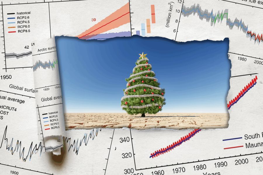
People tell me nobody wants to look at climate curves anymore, yet here we are!!! Please enjoy our interactive journey through 485 million years of climate history and dive into the fascinating and important work of paleoclimate scientists.
🎁 www.zeit.de/wissen/umwel...
20.06.2025 09:32 — 👍 112 🔁 38 💬 9 📌 1
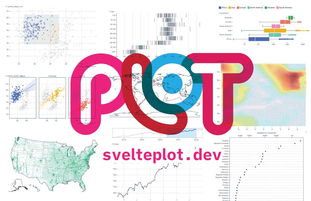
SveltePlot logo with the website address https://svelteplot.dev and a few example plots in the background
Last week I had the pleasure of finally releasing the #SveltePlot alpha version during my talk at the #SvelteSummit in Barcelona. It's a new visualization framework for @svelte.dev that I've been working on for the past 18 months, so it's about time for a 🧵
13.05.2025 11:21 — 👍 169 🔁 37 💬 8 📌 8
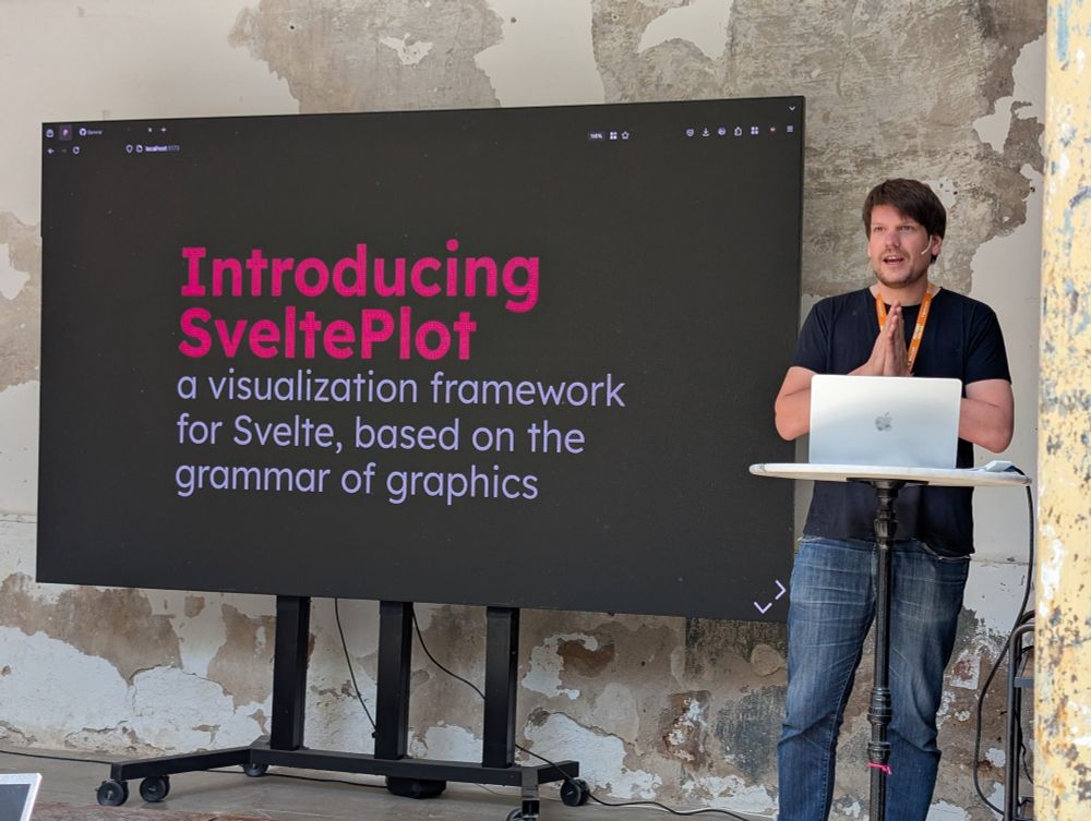
Gregor on stage at Svelte Summit
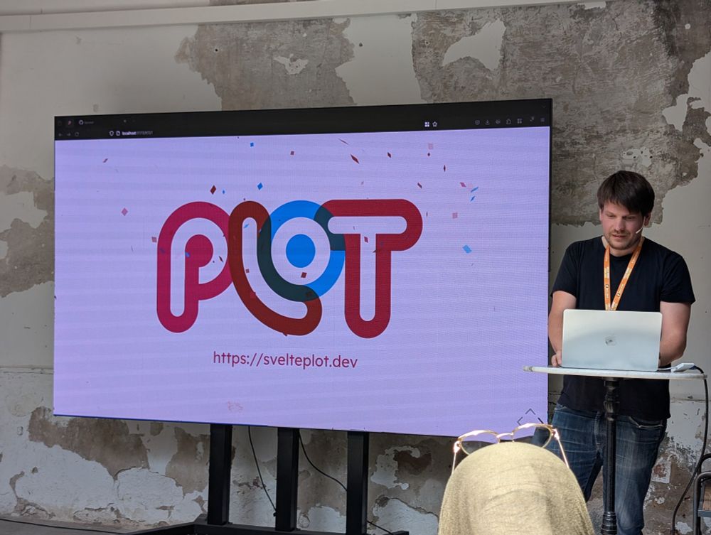
The launch of SveltePlot
stoked for svelteplot.dev, launched on stage just now at #sveltesummit by @driven-by-data.net
08.05.2025 13:52 — 👍 89 🔁 13 💬 2 📌 1
I‘m really excited about that! I’m sure you gonna create something good, Gregor.
I’m currently very happy with Layercake, but that might be a different use case.
01.05.2025 10:52 — 👍 2 🔁 0 💬 0 📌 0
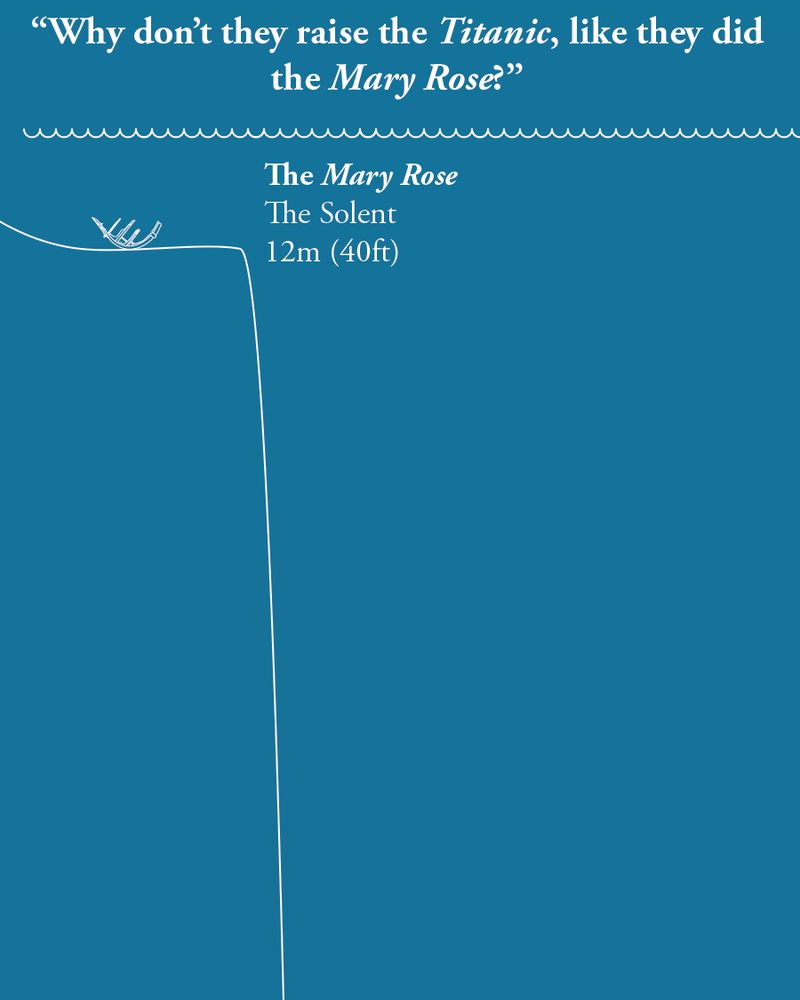
A light blue diagram depicting the sea, with the water's surface at the top, and just below it is an outline of the Mary Rose, with the depth (12m, 40ft or 6.7 fathoms). There is a line showing the seabed, which takes a rapid dive into the vertical...
On the anniversary of the sinking of the Titanic, we thought we'd answer a question that's often asked,
"If they raised the Mary Rose, why not raise the Titanic?"
Allow our scaled diagram to explain...
15.04.2025 08:21 — 👍 13200 🔁 5368 💬 217 📌 1316
That’s very good to know! Thanks for pointing that out.
11.04.2025 06:43 — 👍 0 🔁 0 💬 0 📌 0
Introducing Tunnel and Fortress
A brief introduction to the new Tunnel and Fortress training series, hosted by Nīkau, and instructed by Julian Oliver. Please see here for more information: https://learn.nikau.io
I'm very pleased to share Tunnel & Fortress, a new live coached training series bringing the art of system administration to those with no prior experience in the field. Participants will deploy, garden & harden servers to keep their communities safe.
video.nikau.io/w/sXj2kQ8vQo...
#exitbigtech
02.04.2025 18:59 — 👍 33 🔁 12 💬 2 📌 1
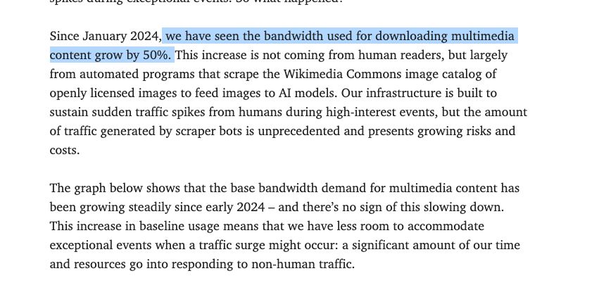
The Wikimedia Foundation, which owns Wikipedia, says its bandwidth costs have gone up 50% since Jan 2024 — a rise they attribute to AI crawlers.
AI companies are killing the open web by stealing visitors from the sources of information and making them pay for the privilege
02.04.2025 09:12 — 👍 5646 🔁 2640 💬 67 📌 178
I’m thrilled to bring together two institutions that shaped my work: BarabásiLab & metaLAB (at) Harvard.
On June 11–12, 2025, we’re hosting Data | Art—a conference on how data entangles with artistic, scientific & curatorial practices.
We have a stellar lineup of speakers! More soon: data-art.info
10.03.2025 15:18 — 👍 32 🔁 8 💬 6 📌 0

poster for the event
Join us online on Thu 20 March 18:00–19:00 CET:
*Visualising climate science*
by Angela Morelli
Visualisation is a powerful tool for navigating the complexity of climate change. However, visualising climate science can confuse, misinform or polarise.
Register at: www.eventbrite.at/e/iiid-conve...
01.03.2025 08:45 — 👍 12 🔁 4 💬 0 📌 0
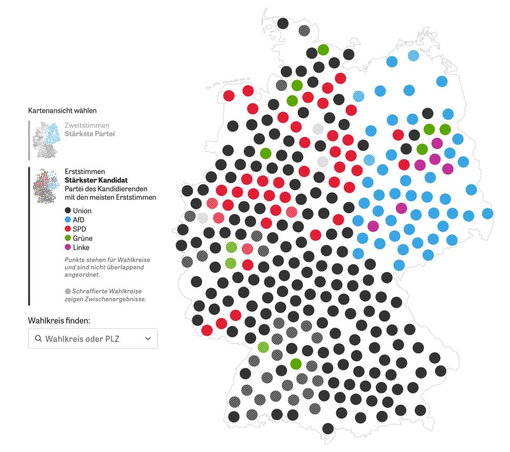
Cartogram of 299 German election districts
For the German election we wanted to use a cartogram of German election districts but didn't find anything good, so we created our own. Here's a little nerd thread how the final algorithm worked 🤓 🧵 #gis #cartogram #election #datavis #cartography
27.02.2025 16:48 — 👍 561 🔁 180 💬 20 📌 25
Also a great example of using helper visualisations in the process of creating a visualisation.
27.02.2025 17:10 — 👍 4 🔁 0 💬 0 📌 0
Fixing the outer districts is such a good idea!
Thanks so much for sharing. Very clever approach.
27.02.2025 17:08 — 👍 12 🔁 0 💬 2 📌 0
Ah, and inauguration crowd photos.
21.02.2025 15:36 — 👍 1 🔁 0 💬 0 📌 0
The „1 million Covid death“ feature by the NYT.
„Voter shift maps“ used for example by NYT.
Visualisation with emojis became a category.
I’ll find the links in my collection later at home.
21.02.2025 15:35 — 👍 3 🔁 0 💬 1 📌 0
If you are thinking about general types, I would also suggest the usage of satellite imagery with before/after (Gaza, Ukraine, wildfires) or as static images (Uyhur labour camps).
Then the visualisation used by Apple activity on the Apple Watch became quite iconic.
21.02.2025 15:35 — 👍 2 🔁 0 💬 3 📌 0
Hockey Stick graph became pretty relevant.
The ocean water temperature year charts were also very present.
21.02.2025 11:40 — 👍 1 🔁 0 💬 1 📌 0
Unpic 1.0 – Unpic
Introducing the first version of Unpic: image components for every framework
I am very excited to announce Unpic 1.0 🎉
As easy as an <img> tag but generates all the right attributes and styles for a responsive image. No downloading and no build-time resize
• Components for ten frontend frameworks
• Support for 26 image providers, now with type-safe transforms for every one
20.01.2025 10:10 — 👍 170 🔁 27 💬 9 📌 1
+1 for RSS feed.
23.01.2025 14:55 — 👍 1 🔁 0 💬 0 📌 0
this is so good. this is so so so good. i'm running around my office screaming the lev manovich quote about how software is ideology
15.01.2025 15:35 — 👍 4737 🔁 1251 💬 48 📌 17
I recommend adding flower pollen and rosehip powder to the mix.
14.01.2025 19:27 — 👍 1 🔁 0 💬 0 📌 0
Lovely example of how weird real-world data is. I put all 55 million points in Overture maps into a Nomic Atlas map. Lots of points spuriously appearing in the ocean. But the 1° square around 'null island' (0° lat, 0° long) is suspiciously clear -- someone has cleared out bad data just there.
06.01.2025 02:36 — 👍 259 🔁 55 💬 9 📌 6
@moritzstefaner.bsky.social, reminds me of your solargraphy and I thought you might like the visualisation.
05.01.2025 15:50 — 👍 1 🔁 0 💬 1 📌 0
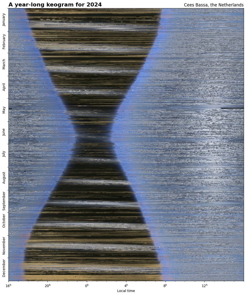
This image shows the hourglass shape of the nights shortening and
lengthening from winter to summer and from summer to winter, passing
clouds, the Moon passing through the night sky every month (diagonal
bands) and the Sun climbing higher in the sky during summer.
For the 4th year in a row, my all-sky camera has been taking an image of the sky above the Netherlands every 15 seconds. Combining these images reveal the length of the night changing throughout the year, the passage of clouds and the motion of the Moon and the Sun through the sky. #astrophotography
04.01.2025 13:27 — 👍 863 🔁 226 💬 21 📌 44

Why I'm quitting the Washington Post
Democracy can't function without a free press
Anne Telnaes, Pulitzer-winning editorial cartoonist for the Washington Post, has resigned.
The paper censored a cartoon that criticized billionaires.
Democracy dies in broad daylight, too.
anntelnaes.substack.com/p/why-im-qui...
04.01.2025 01:03 — 👍 797 🔁 308 💬 18 📌 18
Graphics editor at Scientific American. Medical illustrator-turned-datavizzer, New Yorker, parent. She/her. These views are mine, get your own. https://amandamontanez.com/
nyc-based programmer and designer. alum @recursecenter.bsky.social. public transit enjoyer. thoughts on local-first software, javascript frameworks, web components, css and other web minutiae.
🌐 https://jakelazaroff.com
A ship in harbor is safe, but that is not what ships are built for.
creator → @sli.dev • @unocss.dev • @vueuse.org • @vitest.dev • elk.zone
core team → @nuxt.com • @vite.dev • vuejs.org
maintainer → @shiki.style • eslint.style
he/him → antfu.me
Open source developer building tools to help journalists, archivists, librarians and others analyze, explore and publish their data. https://datasette.io […]
[bridged from https://fedi.simonwillison.net/@simon on the fediverse by https://fed.brid.gy/ ]
🇪🇪🏳️⚧️ | Archivist | 9 CVEs in Chrome | CSS noob | MapartCraft | Horse | rebane2001#3716 | Lyra 🦊
she/her
https://lyra.horse/
@rebane2001@infosec.exchange
28. bis 31. August 2025 im nordbrandenburgischen Kuhlmühle - AUSGEBUCHT!
https://kollapscamp.de/
Journalist, currently at The New York Times. I cover privacy, technology, A.I., and the strange times we live in. Named after the Led Zeppelin song. Author of YOUR FACE BELONGS TO US. (Yes, in my head it will always be All Your Face Are Belong To Us)
NGO Tech Lead
🧡 Svelte Ambassador
Astro | DataViz | HomeLab | Vet 🫡
🔗 https://fubits.dev
The retreat where curious programmers recharge and grow.
Work at the edge of your abilities, develop your volitional muscles, and learn generously.
earth observation, remote sensing, visual journalism
a graphics framework for sveltejs https://layercake.graphics
Curator, advocate of collectivity; Research Fellow with expertise in Spatial Commoning. Wellington, Aotearoa/New Zealand
https://criticalsignals.nz
Founder of https://fathom.info, co-founder of https://processing.org, lecturer at https://mit.edu
Satellite images past and present (mostly related to the space industry) 🛰️
Building an archive of interactive declassified spy satellite images 🕵️
https://spacefromspace.com/declassified-satellite-images
Making the web more stylish ✨🎨 DevRel Lead for CSS & Web UI @ Google Chrome. Cohost of the CSS Podcast & host of Designing in the Browser. 🌎 una.im
A global production house specialised in cinematic stories of tech innovation.
www.techdocumentaries.com