Flowchart presented under the title “A Model of Workplace Wellbeing”.
On the left, six groups of drivers of workplace wellbeing are listed: Development and security; Relationships; Independence and flexibility; Variety and fulfilment; Earnings and benefits; and Risk, health, and safety.
The six groups of drivers combine to feed the four measures of workplace wellbeing at the centre of the flowchart: Job satisfaction; Meaning and purpose; Positive emotions; and Negative emotions.
Workplace wellbeing is shown to feed three pathways to performance: productivity; recruitment; and retention, which in turn feed firm performance.
The source of the chart is Figure 1.4 of the book Why Workplace Wellbeing Matters by Jan-Emmanuel De Neve and George Ward, of which a full citation is provided.
🔑 This model of workplace #wellbeing underpins Work Wellbeing Playbook 2.0, published this week by the World Wellbeing Movement.
Playbook 2.0 features recommendations to support leaders create effective research-informed work wellbeing strategies.👇
worldwellbeingmovement.org/playbook-2025/
14.11.2025 09:15 — 👍 0 🔁 0 💬 0 📌 0

Line graph presented under the title “Global Trends of Benevolence, 2005-2024”. Subtitle reads: “The most recent global data show benevolent acts continue to be, on average, around 10% more frequent than before the Covid-19 pandemic.”
Lines for instances of helping strangers, donations, and volunteering are presented over time for the period 2005 to 2024, plus a line for any prosocial action. All four lines rise in 2020 at the onset of the COVID-19 pandemic and, while trending to return to previous levels, remain above the levels observed in 2017-2019.
The source of the graph is the Gallup World Poll, presented in Figure 2.2 from World Happiness Report 2025, published in the chapter “Caring and sharing: Global analysis of happiness and kindness”, of which a full citation is provided.
🤗 Happy #WorldKindnessDay!
Data published in this year’s World Happiness Report shows that we’re still riding a post-Covid “benevolence bump” – despite evidence of a return towards pre-pandemic levels.
Read more in Ch2 of #WHR2025👇
doi.org/10.18724/whr...
13.11.2025 09:45 — 👍 1 🔁 0 💬 0 📌 0

Jan-Emmanuel De Neve delivering a keynote to Mind Summit 2025, held at the Vibra São Paulo, Brazil.

Large audience engaging with Jan-Emmanuel De Neve’s keynote at Mind Summit 2025, held at the Vibra São Paulo, Brazil.

Jan-Emmanuel De Neve in conversation with Adriana Drulla on stage at Mind Summit 2025, in front of the cover of the book Why Workplace Wellbeing Matters.
#Wellbeing science is drawing ever larger crowds!
Our Director, Prof Jan-Emmanuel De Neve recently delivered a keynote to Mind Summit 2025 in São Paulo, sharing how organisations that put people first are creating a lasting competitive advantage.
06.11.2025 09:47 — 👍 1 🔁 0 💬 0 📌 0

Four bar graphs presented under the title “Employment Status and Wellbeing around the World”.
Charts are presented for four dimensions of work wellbeing: life satisfaction; meaningfulness; positive emotions; and negative emotions.
Coloured bars represent the average level in each measure, by employment status. Those employed full-time score highest for life satisfaction, while those who are self-employed score highest for meaningfulness. Levels of positive emotions are comparatively flatter regardless of employment status, but lowest for those unemployed. Unemployed people also score highest for negative emotions.
The source of the chart is Figure 3.1 of the book Why Workplace Wellbeing Matters by Jan-Emmanuel De Neve and George Ward, of which a full citation is provided.
💼 Across all measures of #wellbeing, people in work tend to be happier than those out of work. Those who are unemployed fare worst of all, with large gaps in life satisfaction, meaning and emotions.
28.10.2025 11:02 — 👍 0 🔁 0 💬 0 📌 0

Image of a smiling child presented alongside the title “Wellbeing Interventions in Schools”.
Subtitle reads: “Five bitesize reports highlighting interventions on select themes related to wellbeing in schools,” alongside coloured labels for: Physical Activity; Whole School Approach; Teacher Wellbeing; Online Interventions; and Peer Relations: Bullying.
The graphic includes the URL wellbeing.hmc.ox.ac.uk/schools as well as the logos of the Wellbeing Research Centre at the University of Oxford, and the International Baccalaureate.
📝 We’ve worked with the International Baccalaureate to highlight some of the most promising pathways to improving #wellbeing in schools.
A new series of bitesize research reports cover five important wellbeing themes for students, teachers and schools.👇
wellbeing.hmc.ox.ac.uk/schools/
24.10.2025 11:38 — 👍 0 🔁 0 💬 0 📌 0

View of the Siew-Sngiem Clock Tower at Harris Manchester College, Oxford, alongside the text ‘Annual Report 2025’ and the logo of the Wellbeing Research Centre at the University of Oxford.
1️⃣ year in #wellbeing science ... check out our latest Annual Report!👇
wellbeing.hmc.ox.ac.uk/annual-repor...
13.10.2025 08:30 — 👍 1 🔁 0 💬 0 📌 0
LAST CHANCE: Registrations for the Reapra Dialogues close TODAY! Secure your place.👇
10.10.2025 09:05 — 👍 1 🔁 0 💬 0 📌 0

View of the sculpture “The World Turned Upside Down” outside LSE’s Saw Swee Hock Student Centre.
🗣️ @cep-lse.bsky.social have a jam-packed schedule of #wellbeing seminars this term, including findings from two major RCTs in Germany and the United States.
Find out more👇
cep.lse.ac.uk/_new/events/...
07.10.2025 09:45 — 👍 1 🔁 0 💬 0 📌 0

Seven plots presented under the title “Work-Life Balance Has a Substantial Impact on Wellbeing”. Subtitle reads: “Impact of each work-life balance factor on job and life satisfaction”.
Points with error bars present seven different measures of work-life balance: Allowed to decide how daily work is organised; Allowed to influence policy decisions; Allowed to choose/change pace of work; Worry about work problems when not working; Can decide when to start/finish work; Job prevents you from giving time to partner/family; and Too tired after work to enjoy things like do at home.
Measures suggestive of greater autonomy are associated with greater job and life satisfaction, and measures suggestive of poor work-life balance the inverse. Freedom to decide when to start or finish work is associated with a small decrease in both.
The source of the chart is Figure 7.5 of the book Why Workplace Wellbeing Matters by Jan-Emmanuel De Neve and George Ward, of which a full citation is provided.
🎭 Striking the right balance between work and life outside of work is critical to our #wellbeing. Job flexibility, in particular, has a strong positive impact on our satisfaction with life.
#WorkLifeWeek
06.10.2025 09:01 — 👍 0 🔁 0 💬 0 📌 0

Graphic with the title “Pathways to Performance”. A call to action encourages users to swipe to explore.

Graphic presented under the title “Productivity”. In a field experiment of more than 1,800 call centre workers, a one-point increase in happiness (on a five-point scale) was associated, on average, with a 12% increase in productivity. This is the average across all tasks: the boost to productivity was as high as 20% among workers completing tasks requiring greater social skills.
The source of the finding is the article ‘Does employee happiness have an impact on productivity?’, published in the journal Management Science, of which a full citation is provided.

Graphic presented under the title “Retention”. Happier companies have lower employee turnover. Companies with an average job satisfaction of four (out of five) instead of three typically report about a quarter less employee turnover from year to year. Employees who rate their companies two stars or less (as compared to leaving five stars) are twice as likely to begin an application to a new job on Glassdoor that week.
The source of the finding is the paper ‘Workplace Happiness and Job Search Behavior: Evidence From A Field Experiment’, of which a full citation is provided.

Graphic presented under the title “Recruitment”. A study of more than 23 million job seekers in the US using the platform Indeed, found that organisations with higher wellbeing scores gained around 2% more applications than average - companies with the lowest scores received 3% fewer than average.
The source of the finding is the paper ‘Workplace Happiness and Job Search Behavior: Evidence From A Field Experiment’, of which a full citation is provided.
Improved workplace #wellbeing can unlock organisational potential via multiple pathways to performance, including:
⬆️ Productivity
⬆️ Retention
⬆️ Recruitment
02.10.2025 10:35 — 👍 0 🔁 0 💬 0 📌 0

Reapra Dialogues 2025 | October 23-24
Home /
💚 Join Prof Paul Behrens (Reapra Senior Research Fellow), Dr Wanying Zhou (Research Fellow), and Annegeke Jansen (Reapra Research Associate) among a full programme of #wellbeing experts at Reapra Dialogues 2025, from October 23 to 24.
Find out more👇
26.09.2025 07:45 — 👍 1 🔁 0 💬 0 📌 1

Alberto Prati receives the ISQOLS Young Scholar Award from Francesco Sarracino.
👏 Congrats to Dr Alberto Prati, Ajinomoto Research Fellow, who picked up the ISQOLS Young Scholar Award for his contributions to #wellbeing science.
Alberto was recognised alongside former KSI Research Fellow, Dr Lucía Macchia, and Centre Affiliate, Dr Mark Fabian.
24.09.2025 08:45 — 👍 1 🔁 0 💬 0 📌 0

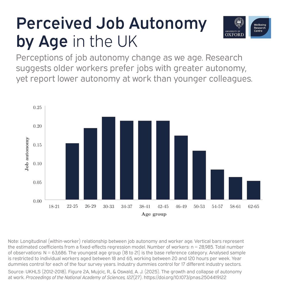
Bar chart presented under the title “Perceived Job Autonomy by Age in the UK”. Subtitle reads: “Perceptions of job autonomy change as we age. Research suggests older workers prefer jobs with greater autonomy, yet report lower autonomy at work than younger colleagues.”
Vertical bars show that perceptions of job autonomy appear to rise among young professionals, peaking among those aged 30-33. Levels are maintained through most of middle age, and then drop steeply from 46-49 through to 62-65.
Notes state that the chart is based upon a total of 63,686 observations from 28,985 UK workers, with the bars representing estimated coefficients from a fixed-effects regression model.
The source of the chart is the UKHLS for the years 2012 to 2018, presented in Figure 2A of the journal article “The growth and collapse of autonomy at work” published in PNAS, of which a full citation is provided.
🧑💻 Job autonomy peaks early in a person’s career and then collapses. A typical worker’s subjective perception of job autonomy increases until the surprisingly early age of 40, and then falls over the next 20 to 30 years of their working life.
SOURCE 👉 doi.org/10.1073/pnas...
19.09.2025 08:58 — 👍 1 🔁 0 💬 0 📌 0

Image of Michael Plant of the Wellbeing Research Centre at the University of Oxford, alongside the quote: “None of us is certain about ethics. What should we do when we don’t know what’s right? Our new paper develops a ‘moral marketplace’ theory to guide decisions under moral uncertainty.”
🤔 Even with the best of intentions, how can we possibly choose the ‘right’ solution when individuals’ #wellbeing is at stake?
We don’t necessarily have to choose one over another, after all...👇
doi.org/10.3998/ergo...
11.09.2025 08:45 — 👍 2 🔁 0 💬 0 📌 0

First page of the article “Moral Uncertainty, Proportionality and Bargaining”, published in the journal Ergo. A DOI link is provided at the bottom for users wishing to read more.
NEW: Imagine you’re a policymaker that wants to put #wellbeing first, but you know there are different, seemingly competing accounts of wellbeing.
How do you possibly choose?
Read more from Michael Plant and colleagues in the journal Ergo👇
doi.org/10.3998/ergo...
05.09.2025 11:29 — 👍 2 🔁 0 💬 0 📌 0

Image of William Fleming of the Wellbeing Research Centre at the University of Oxford, alongside the quote: “We can’t just assume the right answer is digital. We need any change to include the individuals who rely on these services as well as those who work to provide them.”
🚑 The UK is not alone in facing growing demands for assessment, diagnosis, and treatment of mental health conditions.
But does the NHS’ digital transformation go far enough to secure the #wellbeing of service users and providers?
Read more👇
doi.org/10.2196/66040
29.08.2025 08:45 — 👍 2 🔁 0 💬 0 📌 0

A medical professional using a tablet computer.
NEW: Adopting a human-centred approach pioneered in computer science and engineering can support the expansion of mental health provision in the UK, according to new research published in the journal JMIR Human Factors.
Read more👇
wellbeing.hmc.ox.ac.uk/news/human-c...
26.08.2025 13:00 — 👍 1 🔁 0 💬 0 📌 0

Our 2026 Author Team, World Happiness Report 2026: Social Media and Wellbeing
NEW: We’ve assembled a global team of leading researchers to examine the association between social media and #wellbeing for World Happiness Report 2026.👇
21.08.2025 09:31 — 👍 4 🔁 3 💬 1 📌 0

Image of William Fleming of the Wellbeing Research Centre at the University of Oxford, alongside the quote: “Too often in policy and research, we underappreciate the extent to which work enables and constrains our ability to live a healthy life.”
⏳ The average person will spend around 90,000 hours of their life at work. If we are to live happy and healthy lives, we must consider the human cost (and value) of how our jobs are designed.
Read more in the journal Social Theory & Health👇
doi.org/10.1057/s412...
05.08.2025 09:15 — 👍 1 🔁 0 💬 0 📌 0

Bar chart presented under the title “Sharing Meals and Life Evaluation, 2022-2023”. Subtitle reads: “Even people who shared just one meal with one or more others in the past week have notably higher life evaluations (5.2 out of 10) than those who ate all of their meals alone (4.9).”
Vertical bars show that, on average, the number of meals shared per week is positively associated with life evaluation.
The source of the chart is the Gallup World Poll, published in the chapter “Sharing meals with others: How sharing meals supports happiness and social connections” from World Happiness Report 2025, of which a full citation is provided.
🍕 People who share more meals with other people report, on average, higher life evaluations.
The peak effect occurs for those who shared 13 meals in the previous week, reporting average life evaluations of 6.1 (out of 10).
Read more in Ch3 of #WHR2025👇
doi.org/10.18724/whr...
31.07.2025 13:15 — 👍 0 🔁 0 💬 0 📌 0

Composite image of three different views of the World Happiness Report Data Dashboard, alongside the URL data.worldhappiness.report.
🔢 The World Happiness Report Dashboard, new for 2025, allows you to explore and compare multiple measures and factors of global #wellbeing.
Check out the Happiness Dashboard for yourself, powered by Gallup Analytics👇
data.worldhappiness.report
24.07.2025 11:15 — 👍 0 🔁 0 💬 0 📌 0

Image of Jan-Emmanuel De Neve of the Wellbeing Research Centre at the University of Oxford, alongside the quote: “The social element, feeling like you belong, is a driver of workplace wellbeing that really stands out as separating the great companies from the not-so-great companies.”
👥 Belonging is when people feel accepted, secure and supported as their authentic selves: a key driver of workplace #wellbeing.
Read more from Jan-Emmanuel De Neve’s conversation for McKinsey’s Author Talks👇
www.mckinsey.com/featured-ins...
22.07.2025 09:32 — 👍 0 🔁 0 💬 0 📌 0
Seven plots presented under the title “Work-Life Balance Has a Substantial Impact on Wellbeing”. Subtitle reads: “Impact of each work-life balance factor on job and life satisfaction”.
Points with error bars present seven different measures of work-life balance: Allowed to decide how daily work is organised; Allowed to influence policy decisions; Allowed to choose/change pace of work; Worry about work problems when not working; Can decide when to start/finish work; Job prevents you from giving time to partner/family; and Too tired after work to enjoy things like do at home.
Measures suggestive of greater autonomy are associated with greater job and life satisfaction, and measures suggestive of poor work-life balance the inverse. Freedom to decide when to start or finish work is associated with a small decrease in both.
The source of the chart is Figure 7.5 of the book Why Workplace Wellbeing Matters by Jan-Emmanuel De Neve and George Ward, of which a full citation is provided.
🌝/🌚 The dark side of flexibility? While flexibility can increase worker #wellbeing, it can also in some cases undermine it.
One major issue is the extent to which it can lead to a blurring of the lines between work and personal lives.👇
16.07.2025 09:45 — 👍 0 🔁 0 💬 0 📌 0
Bar chart presented under the title “Perceived Job Autonomy by Age in the UK”. Subtitle reads: “Perceptions of job autonomy change as we age. Research suggests older workers prefer jobs with greater autonomy, yet report lower autonomy at work than younger colleagues.”
Vertical bars show that perceptions of job autonomy appear to rise among young professionals, peaking among those aged 30-33. Levels are maintained through most of middle age, and then drop steeply from 46-49 through to 62-65.
Notes state that the chart is based upon a total of 63,686 observations from 28,985 UK workers, with the bars representing estimated coefficients from a fixed-effects regression model.
The source of the chart is the UKHLS for the years 2012 to 2018, presented in Figure 2A of the journal article “The growth and collapse of autonomy at work” published in PNAS, of which a full citation is provided.
🧑💻 Job autonomy peaks early in a person’s career and then collapses. A typical worker’s subjective perception of job autonomy increases until the surprisingly early age of 40, and then falls over the next 20 to 30 years of their working life.
SOURCE 👉 doi.org/10.1073/pnas...
10.07.2025 09:01 — 👍 0 🔁 0 💬 0 📌 0

Three bar graphs presented under the title “Meaningful Work is Usually Enjoyable Work”. Subtitle reads: “Percentage of respondents who say they enjoy work by various measures of meaning at work”.
Bars present percentage share of responses for measures of: how much workers consider their work as improving the lives of other people; how often they feel enthusiastic; and how much they feel the things they do are meaningful. Each graph shows a higher share of responses for ‘Yes’, ‘Often’, or ‘Always’.
The source of the chart is Figure 7.7 of the book Why Workplace Wellbeing Matters by Jan-Emmanuel De Neve and George Ward, of which a full citation is provided.
Purpose 🤝 Wellbeing
Having a job that improves the lives of others is much more enjoyable. Moreover, research shows that having a job we feel passionate or enthusiastic about is significantly associated with being more likely to find work fun and interesting.
01.07.2025 09:15 — 👍 0 🔁 0 💬 0 📌 0

Map presented under the title “Change of Life Satisfaction in the UK, 2012-2023”. Subtitle reads: “Some areas of the UK have seen substantial increases in average life satisfaction over the past decade - but others have lagged behind.”
Local authority areas in England, Scotland and Wales are coloured in various shades of red and green, with green shades to represent areas with an increase in average life satisfaction between 2012 and 2023, and red shades to indicate a decrease. Darker shades represent a larger change. Grey regions denote places for which there is no data or insufficient sample size.
The source of the graph is the Annual Population Survey, presented in the 2025 UK Wellbeing Report published by the World Wellbeing Movement, of which a full citation is provided.
⬆️ Pendle, +0.93
⬆️ Brentwood, +0.76
⬆️ Colchester, +0.74
⬇️ Nuneaton and Bedworth, -0.95
⬇️ Rushmoor, -0.96
⬇️ Cambridge, -1.00
Some areas of the UK have seen substantial increases in #wellbeing over the past decade – but others have lagged behind.👇
worldwellbeingmovement.org/uk-wellbeing...
26.06.2025 07:45 — 👍 0 🔁 0 💬 0 📌 0

Author Talks: Are your employees happy at work?
Jan-Emmanuel De Neve of the University of Oxford discusses his book, “Workplace Wellbeing: The Science Behind Employee Happiness and Organizational Performance.”
🗣️ “There is a big discrepancy between walking the walk and talking the talk.”
84% of managers agree improved #wellbeing can provide a competitive advantage, yet only one-third treat workplace wellbeing as a strategic priority.
Read more via McKinsey👇
20.06.2025 10:45 — 👍 1 🔁 0 💬 0 📌 0

Scatter plot presented under the title “Satisfaction and Automation”. Subtitle reads: “Satisfaction on a 1-5 scale by current level of automation”.
Data points are plotted by job satisfaction on the y-axis, against a scale of job automation on the x-axis. A trendline shows a negative correlation between the two measures.
The source of the chart is Figure 12.1 of the book Why Workplace Wellbeing Matters by Jan-Emmanuel De Neve and George Ward, of which a full citation is provided.

Scatter plot presented under the title “Purpose and Automation”. Subtitle reads: “Purpose on a 1-5 scale by current level of automation”.
Data points are plotted by sense of purpose on the y-axis, against a scale of job automation on the x-axis. A trendline shows a negative correlation between the two measures.
The source of the chart is Figure 12.1 of the book Why Workplace Wellbeing Matters by Jan-Emmanuel De Neve and George Ward, of which a full citation is provided.

Scatter plot presented under the title “Happiness and Automation”. Subtitle reads: “Happiness on a 1-5 scale by current level of automation”.
Data points are plotted by happiness at work on the y-axis, against a scale of job automation on the x-axis. A trendline shows a negative correlation between the two measures.
The source of the chart is Figure 12.1 of the book Why Workplace Wellbeing Matters by Jan-Emmanuel De Neve and George Ward, of which a full citation is provided.

Scatter plot presented under the title “Stress and Automation”. Subtitle reads: “Stress on a 1-5 scale by current level of automation”.
Data points are plotted by stress at work on the y-axis, against a scale of job automation on the x-axis. A trendline shows a positive correlation between the two measures.
The source of the chart is Figure 12.1 of the book Why Workplace Wellbeing Matters by Jan-Emmanuel De Neve and George Ward, of which a full citation is provided.
🤖 The most-automated roles also score lowest across all four measures of workplace #wellbeing.
For those still in so-called ‘high-exposure’ jobs, the impact of AI and robotics remains uncertain – will these technologies replace or reshape their work?
19.06.2025 09:45 — 👍 0 🔁 0 💬 0 📌 0

Line graph presented under the title “Happiness Poverty in the UK, 2012-2023”. Subtitle reads: “Prior to 2020, the proportion of UK adults living below the Happiness Poverty Line was falling year on year. Despite an initial recovery in 2022, that trend has since reversed.”
The share of the population who rate their satisfaction with life at 5 or below on a 0-10 scale is presented for the home nations of England, Scotland, Wales, and Northern Ireland. In 2023, the share is highest in Wales at 14.7%, and lowest in Northern Ireland at 12.3%. The trend is shown to have fallen between 2012 and 2020, before peaking in 2020, recovering in 2021, and now again rising.
The source of the graph is the Annual Population Survey, presented in the 2025 UK Wellbeing Report published by the World Wellbeing Movement, of which a full citation is provided.
🏴 14.7%
🏴 13.2%
🏴 12.9%
𝖭𝖨𝖱 12.3%
The 2025 UK Wellbeing Report estimates that nearly 7 million people – around 13% of the adult population – are living below the Happiness Poverty Line in the UK.
Read more via the World Wellbeing Movement👇
worldwellbeingmovement.org/uk-wellbeing...
18.06.2025 09:07 — 👍 0 🔁 0 💬 0 📌 0