
Nothing better to improve the functioning of your team than a six hour meeting.
Your team will definitely still enjoy working with each other after six hours of arguing about features.
Nothing better to improve the functioning of your team than a six hour meeting.
Your team will definitely still enjoy working with each other after six hours of arguing about features.
PI planning?
More like Poo planning amirite? 💩
Ok but this would make a fascinating dating app matching method
22.03.2025 18:00 — 👍 3 🔁 1 💬 0 📌 0
Screenshot of the app WhatWeWatchin's fascinating interpretation of a login screen. The text input boxes extend off the right of the screen, and the ghost text within them are different colors for each box. Below these are three buttons that belong on a 1999 GeoCities web page. The "log in" and "log in with google" buttons are a bold blue and black horizontal gradient, and our off-center in the opposite direction of the text input boxes. Between them is a forgot password link that does not seem to be centered on any other element in the entire design, but is rather doing its own thing. Below all of this is a perfectly centered "create account" button with a vertical blue to pink to black gradient. All of these elements are crowded into a container that only takes up the bottom 2/3 of the screen for absolutely zero aesthetically justified reason.
This is what happens when devs do UX design
22.03.2025 17:50 — 👍 14 🔁 1 💬 3 📌 1
The curse of working in UX is that all apps now fall into one of these categories:
- designed by a UX team
- designed by a UX designer
- UXers may have worked on this but they were overruled by leadership obsessed with meeting short-term goals at the cost of long-term user trust
- designed by a dev

Push notification from Moto Widget. Head: Silver Spring. Body: Not as cool with increasing amounts of sunshine
Tensions are rising between the town of Silver Spring and the sun
14.03.2025 20:18 — 👍 12 🔁 2 💬 0 📌 0💀
15.02.2025 15:44 — 👍 0 🔁 0 💬 0 📌 0Hahaha amazing. I snort laughed when I read it.
13.02.2025 04:35 — 👍 1 🔁 0 💬 0 📌 0
Tumblr post from yokowan "why does my butt plug have dailies" and a screenshot from the lovense (remote controlled sex toy) app with daily tasks to earn rewards and a prize wheel. The daily tasks include login (+5), connect toy (+15), and control toy (+30)
Sorry, I can't hang out. I have to complete my butt plug dailies.
12.02.2025 22:17 — 👍 856 🔁 292 💬 16 📌 21![TThis form was created inside of [Name]. Does this form look suspicious? Report Google Forms](https://cdn.bsky.app/img/feed_thumbnail/plain/did:plc:oprdovssaezdnlddx5k3pf3h/bafkreicwbwhjurba5zcagakv5mk7svldst7cihheiig5ytb47u2hwom2qu@jpeg)
TThis form was created inside of [Name]. Does this form look suspicious? Report Google Forms
I grew this survey inside my womb
19.01.2025 17:04 — 👍 21 🔁 3 💬 0 📌 0
@visualmalvi_ tweets a screenshot of an online death certificate request. The page prompts "The person listed on the death certificate is" and gives two options "myself" and "someone else"
It's nice to account for edge cases, like beatlejuice using your flow.
16.01.2025 19:15 — 👍 94 🔁 16 💬 4 📌 0
My job as a UX writer/customer service chatbot convo designer is to sit in meetings and go "this is a nightmare and will make people really mad" when companies try to do stuff like this.
Meeting a short term goal of reducing cancellations is deceptive if you're nuking user trust in the process.
Thank you for explaining it as I would have never figured that out myself since my brain was tragically lost by TSA in 2004 and I've been unable to get a replacement
20.12.2024 00:41 — 👍 3 🔁 0 💬 1 📌 0
A screenshot from a wine tracker app. The button choices are "edit this bottle" and "un-drink"
I did not realize that was an option
19.12.2024 23:11 — 👍 50 🔁 3 💬 6 📌 2
IIRC this *is* from one of those bad ui contests, I couldn't find the exact one but there's another very similar
www.reddit.com/r/Programmer...
Bad UI contests are such an underrated format for comedy
This is glorious
I want to believe that it was done satirically and not part of an actual design, but... I mean, I've seen worse.
07.12.2024 22:05 — 👍 4 🔁 0 💬 2 📌 0
Tweet from @fabionkallaku featuring a screenshot of a form. The form field says please enter your phone number. Instead of a text input box, there is a slider that the user has slid to 74,626,282,613. Fabions caption: I hope he was fired
So cursed it is almost art
07.12.2024 22:01 — 👍 25 🔁 4 💬 1 📌 0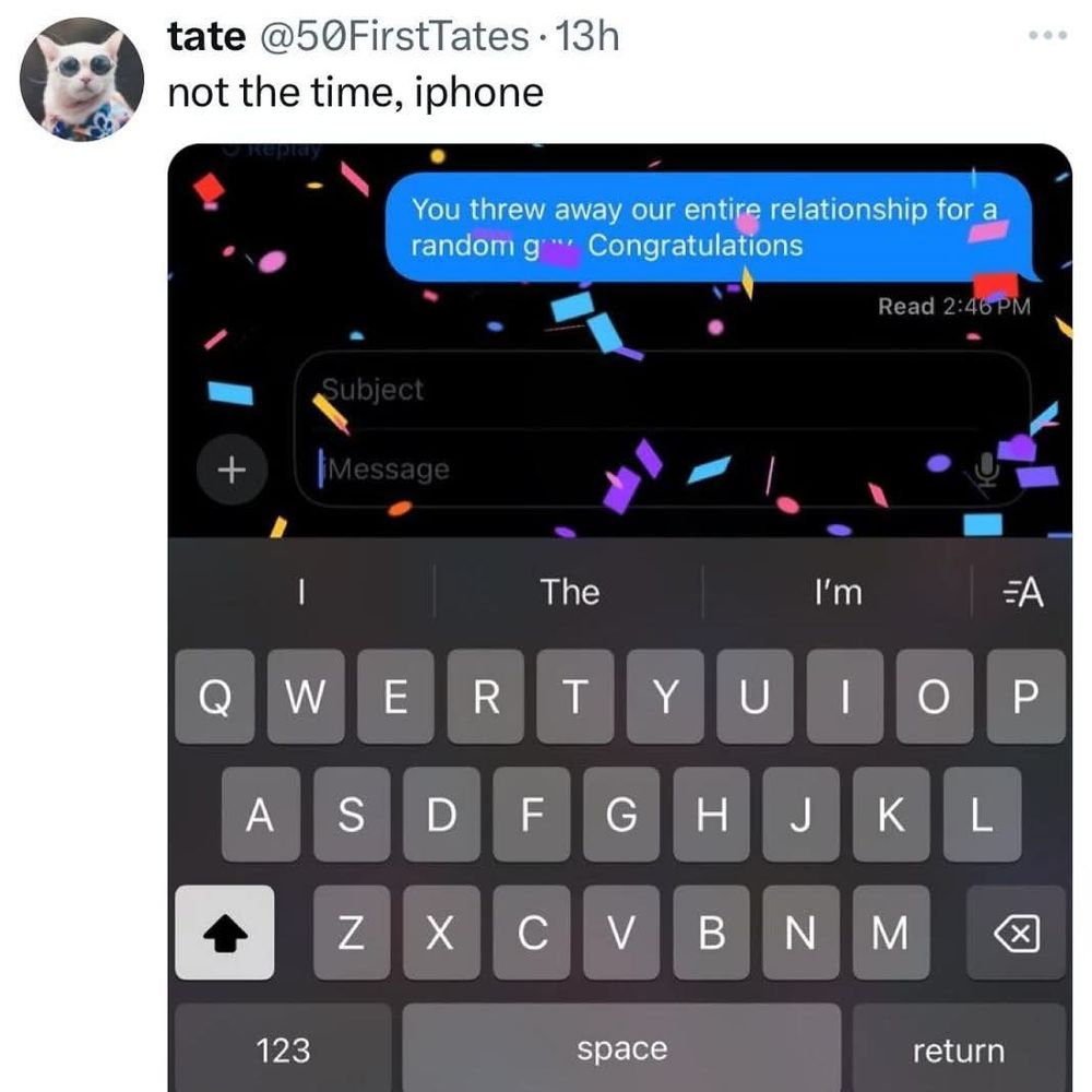
a tweet from @50firsttates that contains a screenshot of iMessage. The text reads "you threw The way our entire relationship for a random guy. Congratulations" and there is celebratory confetti all over the screen. Tate's caption: not the time, iphone
Congratulations 🎉🎉🎉
07.12.2024 21:59 — 👍 384 🔁 38 💬 1 📌 0
screenshot of a riverside.fm chat riverbot: type 'agent' anytime to get connected right away me: agent riverbot: I'm sorry, I didn't understand that.
oh riverside you motherfucker
05.12.2024 19:53 — 👍 42 🔁 1 💬 4 📌 0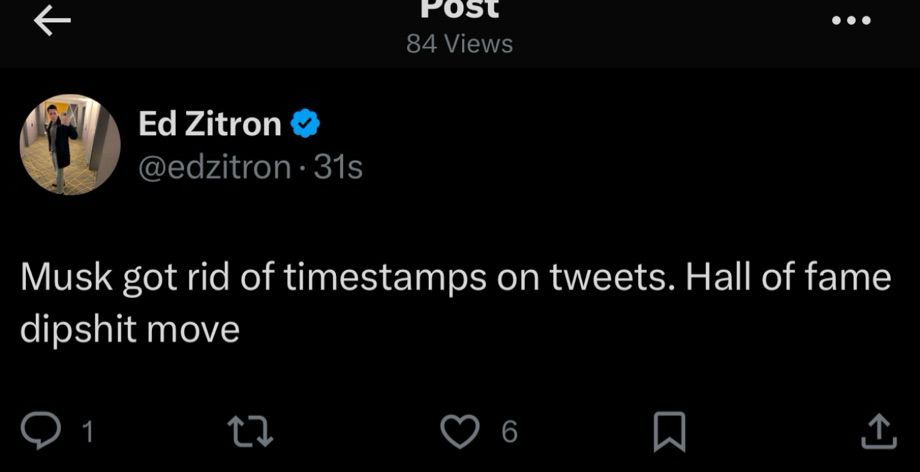
Twitter posts no longer have timestamps. That's exactly what you want on a network built on being a realtime information source. Possibly the worst to ever do it in social media
04.12.2024 21:14 — 👍 18020 🔁 2275 💬 458 📌 552
A pop up box that reads "Need Help!!!" with three exclamation marks. The options are "no" and "ok"
Absolutely unhinged way to ask me if I want a tutorial
04.12.2024 19:00 — 👍 43 🔁 1 💬 4 📌 1