
a long dog
15.01.2026 18:18 — 👍 1 🔁 0 💬 0 📌 0a long dog
15.01.2026 18:18 — 👍 1 🔁 0 💬 0 📌 0working on a serif. resisting posting images of it until I make more decisions about the forms. but rest assured....I am working on a serif and I think it looks Good.
13.01.2026 21:03 — 👍 1 🔁 0 💬 0 📌 0

HNY from BFF! may this year bring you many fonts
05.01.2026 15:10 — 👍 2 🔁 0 💬 0 📌 0
MD Nichrome, a geometric sans-serif with a strong retro flavour, syncopated proportions. It’s inspired by 70s sci-fi paperback covers, and available in 16 styles (8 weights, from a very thin to a very bold, with matching obliques).

MD Polychrome, a typeface based on magnetic ink bank numbers (and the various retro-high-tech fonts they inspired in the 60s and 70s). Available in four styles, loosely corresponding to different print sizes rather than weights.

MD IO, a monospaced typeface intended for super-legible text. It’s somewhat futuristic in appearance (but not distractingly so) with strongly textured italics. Available in 16 styles, with weights from very light to very bold.

MD Lórien, a slightly ornate serif influenced by Caslon and the 18th century European typefaces which Caslon’s fonts were derived from. It’s available in five weights, with matching italics, swash caps, ligatures, etc. etc.
For any game developers* caught by the Monotype/Fontworks price hikes:
- you can use our fonts for video games
- there are no usage caps or renewal fees
- unrestricted trial fonts for in-engine testing
- smaller dev teams pay less.
mass-driver.com
*Extended Latin support, but not Japanese, sorry!
font sale through the end of the year! code valid til 11:59PM (EST) on NYE
17.12.2025 19:33 — 👍 0 🔁 0 💬 0 📌 0

Gayot New!
01.12.2025 17:33 — 👍 0 🔁 0 💬 0 📌 0


more progress on Rithum 🥁 very psyched about this one
18.11.2025 16:19 — 👍 4 🔁 0 💬 0 📌 0

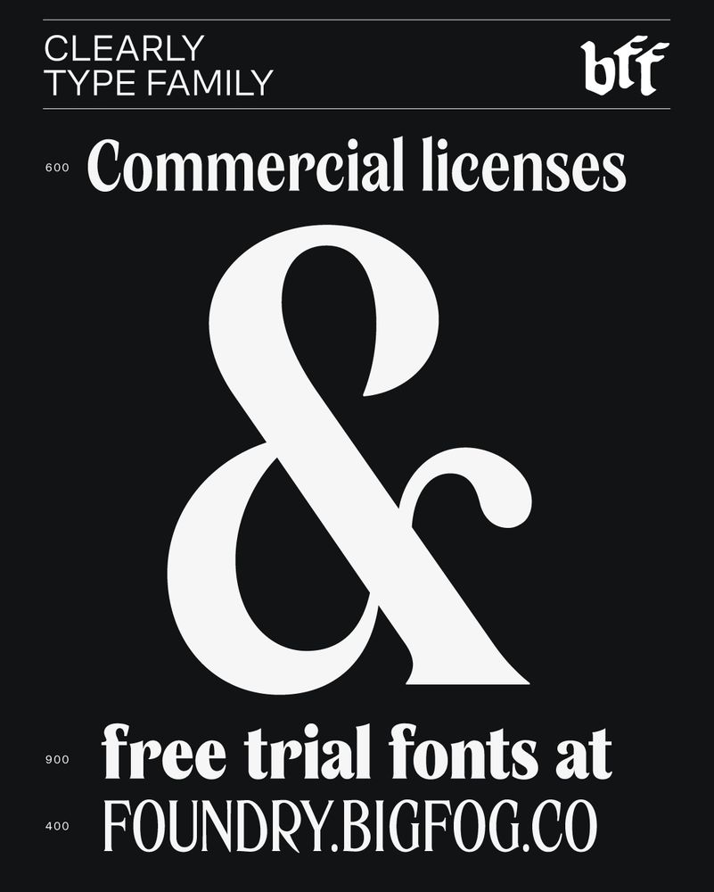
🔠 Clearly
31.10.2025 13:35 — 👍 1 🔁 0 💬 0 📌 0

stars in Gayot New (its pronounced like you're surprised to see someone named Guy: "Guy! Oh...")
29.10.2025 13:10 — 👍 1 🔁 0 💬 0 📌 0
Brand designers love the control, originality and ownership of making their own fonts. But how is custom type reshaping the culture and economy of type design itself? I wrote about why so many design studios are creating fonts and what it means for the rest of us! www.itsnicethat.com/articles/eli...
23.10.2025 22:49 — 👍 16 🔁 3 💬 0 📌 0
watched my favorite film (live action Scooby Doo movie) and cannot stop thinking about this banger of a line from Fred.
typeset in Rube(-y dooby doo)

the genre is Disco Martini
14.10.2025 18:23 — 👍 0 🔁 0 💬 0 📌 0
test driving my WIP typeface Rithum on a groovy show flyer for some friends
14.10.2025 18:22 — 👍 0 🔁 0 💬 1 📌 0


Gayot New Extremes: license the extreme weights (Thin & Black) and get both for the price of one. A deal some typographers are calling "out of this world" 👽
foundry.bigfog.co/typefaces/gayot-new
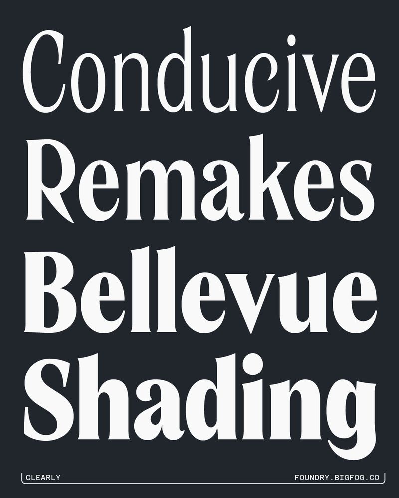
Clearly 🌫️ a flared display face in seven weights
02.10.2025 14:05 — 👍 1 🔁 0 💬 0 📌 0this is a great joke and i hope it finds its niche audience
27.09.2025 17:39 — 👍 2 🔁 0 💬 0 📌 0
"who created the seminal ambient work 'the disintegration loops'?"
[voros twins] BASINKI?!

Designers, typophiles, and deal lovers: get an *extreme*-ly good deal on some fonts. License Gayot New's extreme weights—Thin and Black—for the price of a single weight. BOGO, if you will. 🔠👽
25.09.2025 21:04 — 👍 1 🔁 0 💬 0 📌 0
wonky /a
23.09.2025 14:02 — 👍 0 🔁 0 💬 0 📌 0
the BFF sampler platter, bon appétit
22.09.2025 19:19 — 👍 0 🔁 0 💬 0 📌 0


Discotack 🪩🤠 Country Western meets Art Nouveau in this reverse contrast slab. Available from BFF + Blaze Type now!
12.09.2025 13:28 — 👍 0 🔁 0 💬 0 📌 0


RUBE 🌸 my chunky funky unicase typeface
09.09.2025 13:16 — 👍 2 🔁 1 💬 1 📌 0


👽 Gayot New 👽 a retro sci-fi typeface in 8 weights
27.08.2025 16:37 — 👍 3 🔁 0 💬 0 📌 0just tried adding swashes to a letter with the pen tool like all those graphic design influencers do and i'm happy to report it looked like shit just like it does in their videos
21.08.2025 20:21 — 👍 2 🔁 0 💬 0 📌 0

Two WIP typefaces in varying states of good-ness. The first is a serif with no interesting story (drew an "a" i liked...kept drawing) and the second is my take on Dellacroce Beta (Carl P. Dellacroce, c. 1970) with some alternates and added uppercase.
12.08.2025 22:03 — 👍 2 🔁 0 💬 0 📌 0
Heading to Portland for @typecon.bsky.social tomorrow! Who's gonna be there?
05.08.2025 20:00 — 👍 2 🔁 1 💬 0 📌 0
come find me at #typecon to get one of these stickers 😎
23.07.2025 23:11 — 👍 3 🔁 0 💬 0 📌 0
Stoked to be speaking at #TypeCon2025 about using Blender to make 3D animations and graphics to promote your typefaces! If you'll be in Portland for TypeCon gimme a shout
18.07.2025 17:03 — 👍 0 🔁 0 💬 0 📌 0I think the glass effect looks sick (in Figma, Blender, or otherwise) but having it as a native feature will inevitably lead to it feeling overused extremely quickly (already starting to feel it imo)
17.07.2025 18:46 — 👍 3 🔁 0 💬 0 📌 0
cookin up something a wee bit more usable
15.07.2025 20:19 — 👍 1 🔁 0 💬 0 📌 0