
Oh nice, thanks for letting me know!
03.11.2025 20:27 — 👍 3 🔁 0 💬 0 📌 0Oh nice, thanks for letting me know!
03.11.2025 20:27 — 👍 3 🔁 0 💬 0 📌 0
So many!
1. @yan-holtz.bsky.social: www.yan-holtz.com
2. @puntofisso.bsky.social: puntofisso.net/newsletter/
3. @visualisingdata.com: visualisingdata.com/newsletter/
4. @infowetrust.com: www.chartography.net
5. @ebertini.bsky.social: filwd.substack.com
6. @parabole.bsky.social: www.theplot.media
Thank you, Dominik!
19.06.2025 11:50 — 👍 0 🔁 0 💬 0 📌 0Thanks, Ben – means a lot coming from you! I definitely had you in mind when I wrote about "all the other people giving back to the community". Thanks for all the work you do!
18.06.2025 17:07 — 👍 2 🔁 0 💬 0 📌 0Ha, I can picture that very well. So nice of you! Thanks, Neil; it's much appreciated!
18.06.2025 17:05 — 👍 1 🔁 0 💬 0 📌 0Thanks for the kind words, Frank – but more importantly, thanks for all the work *you* do for the community! As *the* accessibility advocate in the scene, with all the great articles, talks, and workshops you share, I wouldn’t have been surprised if you’d ended up with that award. Very soon, I hope!
18.06.2025 17:04 — 👍 1 🔁 0 💬 1 📌 0
Picture of me and the text "Impactful Community Leader, Lisa Charlotte Muth, Datawrapper" below and the text "Information is Beautiful Awards 2024 Winner" in a badge.
Wow! It's a great honor to receive this Information is Beautiful Award.
Thanks to @datawrapper.de for letting me inspire people. And thanks to everyone else who's contributing to the lovely #dataviz community!
Find all #IIBAwards winners here: www.informationisbeautifulawards.com/news/680-ann...

A poster showing icons for 40 different visualization types, categorized by goal – e.g. "showing shares" or "showing flows" or "showing developments over time".
📊 There are *so* many chart types out there. Which one should you use for what kind of data and goal?
I tried to answer the question in a new blog post (and poster!): www.datawrapper.de/blog/chart-t...

I just added lots of new content to my website! lisacharlottemuth.com
→ #dataviz projects & articles I've worked on at @datawrapper.de in the past years
→ a new "Events" page with information about the Data Vis Meetup, the Data Vis Book Club, and the Unwrapped conference
→ an updated About me page


Thanks for doing and sharing your research – fascinating! I really like the split continents map; haven't see this before.
Other mobile-friendly map approaches I know are
→ splitting a map in the middle (www.nytimes.com/interactive/...)
→ rotating the map (www.washingtonpost.com/graphics/pol...)

I talk about more (data-vis-focused) tools and methods for finding a good categorical color palette here:
www.datawrapper.de/blog/create-...
🌈 Jan's tool looks amazing to find a #dataviz palette!
A similar tool is the Python Color Palette Finder by @yan-holtz.bsky.social: python-graph-gallery.com/color-palett...
What I like about Jan's tool is that I can browse palettes *by chart type* – so smart. (This, and the German name.)
Yay, another small multiple chart type in Datawrapper! It's been lots of fun to play around with it so far:
18.02.2025 14:47 — 👍 10 🔁 0 💬 0 📌 0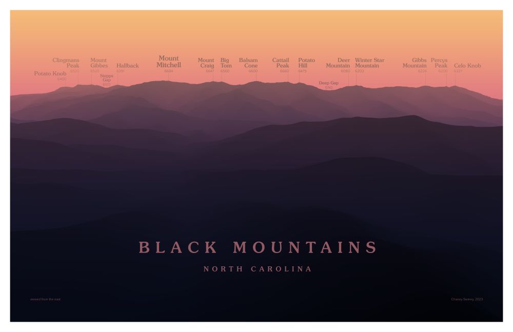
Image of the Black Mountains in North Carolina, cast in a gradient reminiscent of sunset hues: orange at the top to dark purple at the bottom. Summits are labeled with their names and elevations.
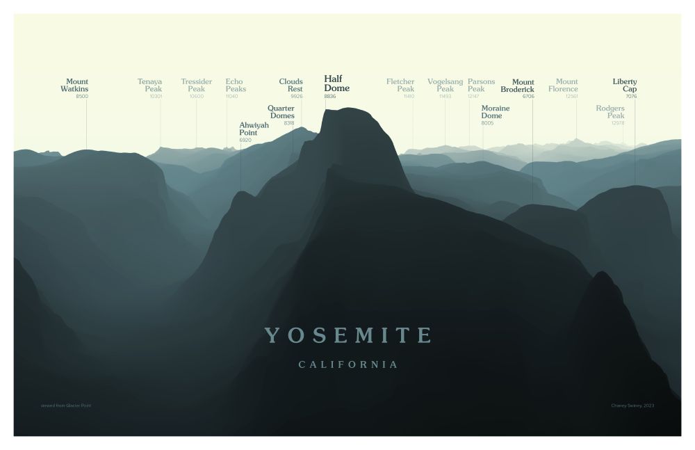
Image of Half Dome and its surroundings in Yosemite National Park, cast in a gradient of yellowish blue. Summits are labeled with their names and elevations.
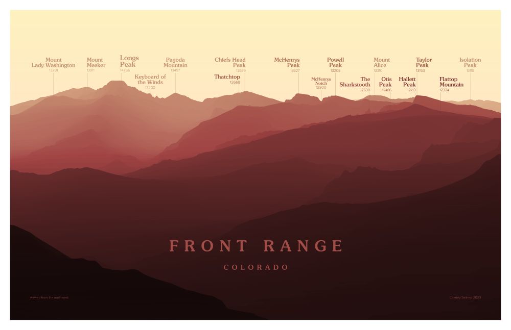
Image of the Front Range in Rocky Mountain National Park, cast in a gradient of yellow to red. Summits are labeled with their names and elevations.
A favorite recent project: Peakscapes. I love the layered looks you get in the #mountains, and I always want to be able to name everything in view. These designs provide a cleaner, more idealized view of the landscape than a photo can.
Are they #maps? Or geographic art? I'm not sure.
Thanks for attending and commenting, Sonja, and thanks to all the other panelists! Definitely a fun and interesting conversation.
04.12.2024 13:43 — 👍 2 🔁 0 💬 0 📌 0I only ordered it (roughly) by start date of the first seasons, but that bit about Sherlock could be true! I remember loving that show from the first season and being confused by the long waiting times. I wasn't used to it at all (yet!).
28.11.2024 19:34 — 👍 1 🔁 0 💬 0 📌 0Thank you, Morgan! Super happy to hear that the grid did for you what I wanted it to do.
28.11.2024 15:20 — 👍 2 🔁 0 💬 1 📌 0Oh yeah, definitely. I read somewhere that because viewers don't remember the plot or even the big cliffhanger in the season finale after waiting for years, they can be less motivated to watch the next season. I can see that!
28.11.2024 15:18 — 👍 1 🔁 0 💬 1 📌 0Thanks, Pierre!
28.11.2024 15:14 — 👍 0 🔁 0 💬 0 📌 0It was fun putting this together! Have a look and let me know what you think:
28.11.2024 15:00 — 👍 46 🔁 5 💬 7 📌 0Danke dir! Die Bezeichnungen sind auf jeden Fall sehr unglücklich, weil Hautfarbe so wenig mit race zu tun hat! Aber solange sich niemand dadurch diskriminiert fühlt und wir keine besseren haben, kann und sollte man sie in der Kommunikation im amerikanischen Raum schon verwenden.
28.11.2024 14:59 — 👍 1 🔁 0 💬 0 📌 0
→ NZZ 🇨🇭: www.nzz.ch/internationa...
→ La Repubblica 🇮🇹: www.repubblica.it/esteri/2024/...
→ The Economist: www.economist.com/interactive/...
→ CBC 🇨🇦: newsinteractives.cbc.ca/elections/us...
News sites in other countries:
===============
→ Le Monde 🇫🇷: www.lemonde.fr/les-decodeur...
→ ZEIT ONLINE 🇩🇪: www.zeit.de/politik/ausl...
→ Aftenposten 🇳🇴: www.aftenposten.no/verden/i/63z...
→ Financial Times: ig.ft.com/us-elections...
→ Reuters: www.reuters.com/graphics/USA...
→ Al Jazeera: www.aljazeera.com/us-election-...
→ The Times 🇬🇧: www.thetimes.com/world/us-wor...
→ The Telegraph 🇬🇧: www.telegraph.co.uk/us-election/...
→ NBC News: www.nbcnews.com/politics/202...
→ Fox News TV: www.foxnews.com/elections
→ CNN: edition.cnn.com/election/202...
→ ABC News: abcnews.go.com/Elections/20...
Other English-speaking news sites
===============
→ The Guardian 🇬🇧: www.theguardian.com/us-news/ng-i...
→ The Wall Street Journal: www.wsj.com/election/202...
→ Bloomberg: www.bloomberg.com/graphics/202...
→ USAToday: eu.usatoday.com/elections/re...
→ POLITICO: www.politico.com/2024-electio...
→ Axios: www.axios.com/visuals/elec...
→ PBS: www.pbs.org/newshour/ele...
→ NPR: apps.npr.org/2024-electio...


Curious how different news sites visualize U.S. election results? Here are 25+ links — let me know in the comments which ones I missed!
U.S. news sites
===============
→ The New York Times: www.nytimes.com/interactive/...
→ The Washington Post: www.washingtonpost.com/elections/re...
Thanks for the kind words, Sebastian!
11.10.2024 07:08 — 👍 1 🔁 0 💬 0 📌 0


🎉 New blog post! Choosing colors for a #dataviz on race, ethnicity or continents can be tricky. I collected lots of examples and wrote down 6 guidelines to help ensure all your readers feel respected by your color choices: blog.datawrapper.de/colors-for-r...
10.10.2024 10:30 — 👍 73 🔁 28 💬 2 📌 0
I'm really looking forward to Rose's findings here!
Might be interesting for others who like #dataviz 📊, too: