I forgot about my novelette 'Breaking Water', which was nominated for the Shirley Jackson Awards in 2016, and follows a journalist and a cook who becomes a 'dead charmer' as they grapple with the spiritual fallout of an epidemic of the undead in Kolkata:
03.10.2025 16:58 — 👍 72 🔁 32 💬 7 📌 0
VIDEO GAME OF THE YEAR, my book, is one of the best video game history books around
linktr.ee/jordanwminor
17.10.2024 22:15 — 👍 161 🔁 27 💬 4 📌 21
It is so, so important to learn to understand the difference between A Gross Thing That Freaks Me Out, versus A Thing Which Causes Actual Harm In The World
because as long as you can't navigate the difference, your disgust is a lever that can be used to manipulate you
22.07.2025 01:43 — 👍 8393 🔁 4014 💬 2 📌 29
hi folks 👋🏽 i'm Sara (they/she), an angry brown dyke writing political analysis of media, mostly games. my latest video, which i'd love you to watch, is "Navigating Palestine in Assassin's Creed" 🇵🇸
check my articles here: muckrack.com/sara-khan-9
& video essays here: youtube.com/@gameassist?...
18.10.2024 21:21 — 👍 31 🔁 11 💬 0 📌 0

Logo Design Iteration (1).
a bunch of shapes that are being merged and divided to create 67 black and white logos

Logo Design Iteration (2).
67 black and white logos with two options marked with a highlight box

Logo Design Iteration (3).
turning two iterations of the logos into banners, flags, and standards. option one is a sort of eye-like shape. option two is a figure eight with bullet shapes as the negative space of the eight.
colors are black, white, and blue

Logo Design Iteration (4).
turning two iterations of the logos into banners, flags, and standards. option one is a sort of eye-like shape. option two is a figure eight with bullet shapes as the negative space of the eight.
colors are black, white, and red
visdev 2 part 2/2
taking these building blocks, i started iterating on a bunch of designs (my original goal was 100 logos but i ended up with 67). then i asked for feedback and critique on subsets of the logos in order to narrow down my design to two options. finally, i started playing with color
13.08.2025 01:49 — 👍 0 🔁 0 💬 0 📌 0
visdev 2 part 1/2
i wanted to focus on simple geometric designs that were inspired by the both Bauhaus design and the fascist Italian Futurist movement's ideals of speed, machinery, violence, youth, and industry. i needed to create simple building blocks that felt more fluid and dynamic than squares
13.08.2025 01:49 — 👍 1 🔁 0 💬 1 📌 0
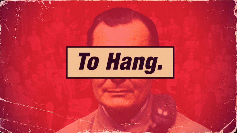
thumbnail of youtube video. Hermann Goring with "to hang" written over his eyes," red background
Fantasies of Nuremberg
On justice, punishment, and the Earth crying out for vengeance. youtu.be/n9Ay5tzHIBU
25.07.2025 15:27 — 👍 1626 🔁 450 💬 38 📌 62
and i’m genuinely at a loss for what to do. when does it become our duty to fight back. and what does fighting back look like?
12.08.2025 06:23 — 👍 3 🔁 0 💬 0 📌 0
been seeing some absolutely heinous shit on the news about what the current administration is doing and i keep thinking “why don’t any of the people in these systems seem to question their orders? why do they gleefully wield violence when they are supposed to be held accountable by the people?”
12.08.2025 06:23 — 👍 3 🔁 0 💬 1 📌 0
can the right to revolt be granted to the people? or is it something that cannot ever be given by the state?
12.08.2025 06:18 — 👍 1 🔁 0 💬 1 📌 0

death first to fascists and dictators.

'...when a long train of abuses and
usurpations, pursuing invariably the same Object evinces a design to reduce them under absolute Despotism, it is their right, it is their ***duty***, to throw off such Government."

it is out ~~right~~ duty to revolt.
thinking about the right to revolt and what happens when the State refuses to protect the rights of the People and instead prioritizes the wishes of Oligarchs and Tyrants.
12.08.2025 06:15 — 👍 3 🔁 0 💬 1 📌 0

turning two iterations of the logos into banners, flags, and standards. option one is a sort of eye-like shape. option two is a figure eight with bullet shapes as the negative space of the eight.
colors are black, white, and blue

turning two iterations of the logos into banners, flags, and standards. option one is a sort of eye-like shape. option two is a figure eight with bullet shapes as the negative space of the eight.
colors are black, white, and red
taking some options and turning them into the flags of the fictional corporate/fascist military government
12.08.2025 06:08 — 👍 1 🔁 0 💬 0 📌 0
Personally I think reading old books ('classics' or not) is good, actually, as is reading new books, and you can and should read both, and not make a virtue out of not reading one or the other. Art is contiguous with history, and readers/writers should have an awareness of what came before.
11.08.2025 11:03 — 👍 666 🔁 185 💬 11 📌 19
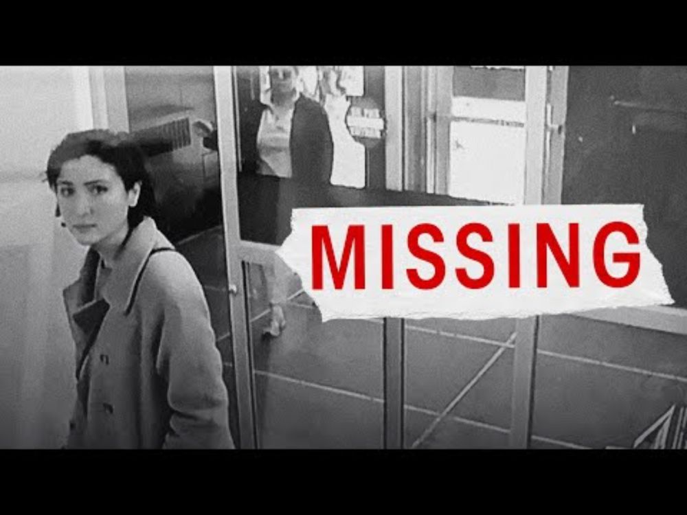
YouTube video by Lily Alexandre
Notes on Vanishing
My new video, Notes on Vanishing, is out now.
I keep returning to an unthinkable question: is it time for trans people to make ourselves disappear?
Enjoy 🌃
youtu.be/cqhiup5qSY8
01.05.2025 02:43 — 👍 700 🔁 187 💬 29 📌 56
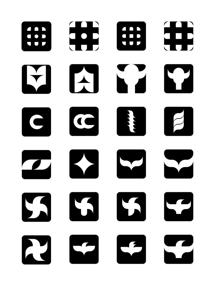
twenty four more minimalist black and white logos. a fair amount have an eagle-inspired design in reference to roman/european/orthodox/byzantine/fascist iconography
round three
10.08.2025 22:07 — 👍 2 🔁 0 💬 1 📌 0
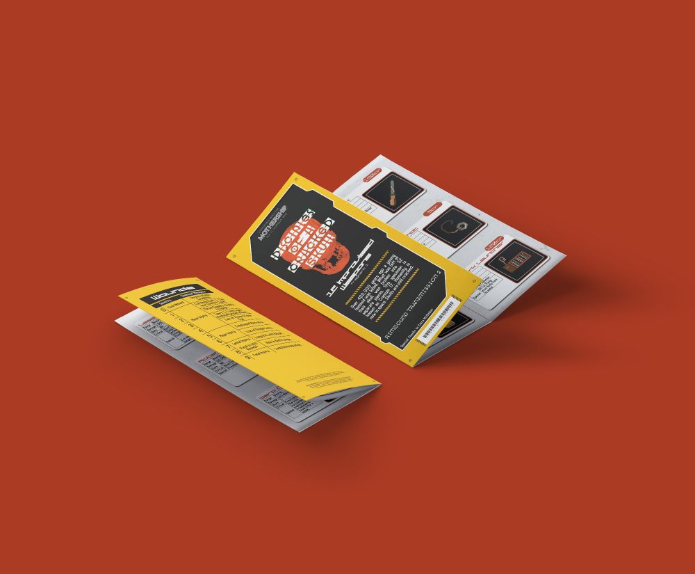
A mockup of a trifold pamphlet with a bold yellow black and red cover with an industrial look about it.
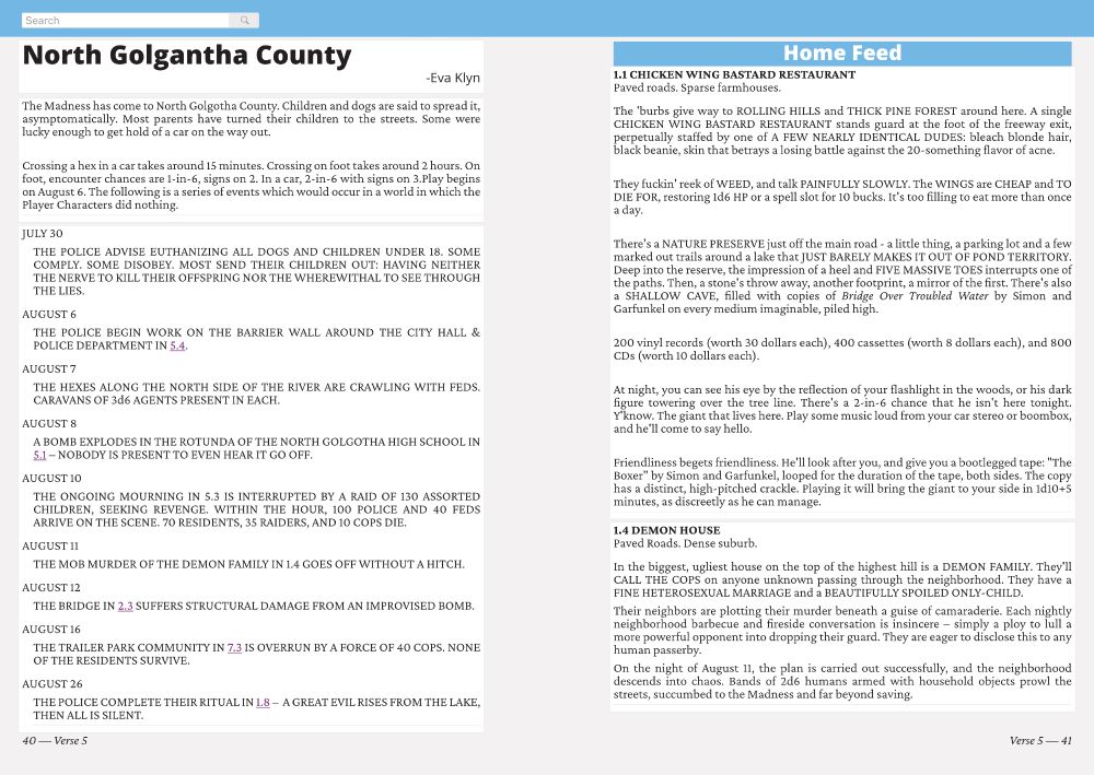
A spread displaying a piece timeline of events as well as descriptions of locations formatted to look like posts on a social media site.
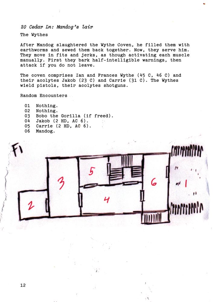
A incredibly dingy looking map and key, it looks as if it was scapbooked together with typewriter texts and torn paper
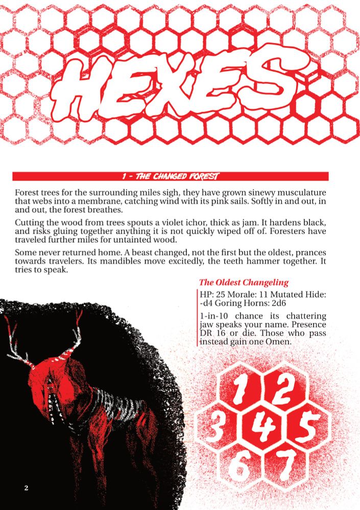
A bombastic page showing bright red distorted hexagons and text describing locations
Hey btw you can hire me to do layout on magazines and rpgs. Here is just a small collection of my works. More examples in the thread to come.
10.08.2025 18:18 — 👍 53 🔁 29 💬 1 📌 4
mood
#yuri #yurivn
10.08.2025 05:35 — 👍 2089 🔁 693 💬 10 📌 11
the design language should be pulling inspiration from futurist/bauhaus visuals as well as the political ideologies associated with those design trends (namely, italian fascism in the early 20th century)
3/3
09.08.2025 22:35 — 👍 4 🔁 0 💬 0 📌 0
the context of these icons/logos is that they are supposed to be the main symbol of the corporate-fascist military bureaucracy the player is working for in a corporate horror piece of interactive fiction.
2/3
09.08.2025 22:35 — 👍 0 🔁 0 💬 1 📌 0

Sun Microsystems logo from the 1990s
the design on the bottom left is inspired in part by the Sun Microsystems logo from the 1990s (pictured here) and in part by online neo-nazi hate symbols referencing nazi war flags (not pictured here)
1/3
09.08.2025 22:35 — 👍 0 🔁 0 💬 1 📌 0

tweet more black and white minimalist logos.
round two
some design notes to follow
09.08.2025 22:20 — 👍 3 🔁 0 💬 2 📌 0

19 logo/icon iterations in black and white. simple and semi-complex shapes made out of minimalist building blocks. some are abstract shapes. some look like flowers. some look like eyes. some look like eagle/double eagle standards.
logo/icon explorations
09.08.2025 11:46 — 👍 14 🔁 0 💬 1 📌 0

a screenshot of 1428’s instagram page showing a screenshot of PT and announcing my chapter.
yay here is something very cool i can finally announce!!
i’m part of a book project that explores liminal spaces in popular culture, especially horror. the book is a collection of essays.
i’m talking about video games!
it’s currently only being teased on instagram www.instagram.com/p/DM75ojjtlf...
04.08.2025 15:48 — 👍 121 🔁 25 💬 9 📌 2

Hades style Harrow, maybe I'll do some more of these.
#tlt #harrowhark #harrow #thelockedtomb #fanart
25.06.2025 07:47 — 👍 140 🔁 75 💬 3 📌 2
![[a diagram with two labeled shapes. each label says "[Description of diagram component]"]
Figure 1. Proper labeling of diagram components](https://cdn.bsky.app/img/feed_thumbnail/plain/did:plc:jeuyuocty24bvuqc5i2mqnqc/bafkreidtjeaomapwahwbrz6yhi7hzcj5dhhtiyw7qyly5oo6iyxuujrey4@jpeg)
[a diagram with two labeled shapes. each label says "[Description of diagram component]"]
Figure 1. Proper labeling of diagram components

Style Guide (5).
Print & Web Documents.
Print documents should be formatted for standard US Letter paper (8.5 x 11”) with margins of 1” all around. Web versions of print documents should be formatted as pageless documents (one scrolling page). Hyperlinks are strongly encouraged. All hyperlinks should be bolded and colored as Internal Links & References. Hyperlinks should never be underlined.
All print documents should fit into one of two categories: Memos and Manuals. Memos are any documents delivered via the Bureau Mail Service and should be single-page or numbered single-sided pages. Manuals will be bound in a Standard Bureau-Issue Binder (Three Ring) with buff, tabbed, manila divider pages if there are sections.
Every print document should have the Bureau Letterhead or Bureau Logo visible on each page.
visdev part 5/5
06.08.2025 14:26 — 👍 1 🔁 0 💬 0 📌 0

Style Guide (1).
Headings End With Periods.
Body text is written in complete sentences with Referenced Sections bolded and colored in dark blue (#1155cc). The body text is always justified. Any technical instructions that are rendered inline are set in the monospace typeface and are highlighted with light blue like so.
Any technical instructions in fenced code block (the markdown syntax is to be enclosed in lines with three backticks) will be printed as blocks of text:
This set of instructions will have a 0.4-inch hanging indent and does not need any highlight. It will be rendered in the monospace typeface.
This text will not be justified.
![Style Guide (2).
Avoid widows and orphans. That is, keep paragraphs together in the same page and column. Only split a paragraph if it has four or more lines on each separated section.
[sidebar
Sidebar Styles.
If there is sidebar text, ensure that it is bounded in a box with a background slightly darker than the page. The sidebar should be about ½ the size of the column it is attached to. The sidebar text should be smaller than the body text of the page.
]
If a page contains less than a full column of text but is the final page in a section, it is okay to split the column into its constituent paragraphs. Try to keep the text in the left column longer than that in the right.
[sidebar
Sidebar Location.
Sidebars should be on the outside of a page.
]](https://cdn.bsky.app/img/feed_thumbnail/plain/did:plc:jeuyuocty24bvuqc5i2mqnqc/bafkreidytaoxcdejeqx6nxhz5dwojbvsantaqdcjo3lfpve4nj5hcnlly4@jpeg)
Style Guide (2).
Avoid widows and orphans. That is, keep paragraphs together in the same page and column. Only split a paragraph if it has four or more lines on each separated section.
[sidebar
Sidebar Styles.
If there is sidebar text, ensure that it is bounded in a box with a background slightly darker than the page. The sidebar should be about ½ the size of the column it is attached to. The sidebar text should be smaller than the body text of the page.
]
If a page contains less than a full column of text but is the final page in a section, it is okay to split the column into its constituent paragraphs. Try to keep the text in the left column longer than that in the right.
[sidebar
Sidebar Location.
Sidebars should be on the outside of a page.
]

Style Guide (3).
Internal Links & References.
#1155cc
Document Backgrounds—Default.
#fafaff
Document Backgrounds—Alternate.
#efefef
Document Backgrounds—Sidebars.
#cfe2f3
Document Text.
#121517
Formatting.
Text inside non-sidebar boxes will be padded 0.2 inches on all sides. Text inside sidebar boxes will be padded 0.1 inches on all sides. Any redacted text will have each redacted character replaced with an underscore in the monospace typeface, before the whole redacted text is highlighted in the Document Text color. Here is an example of _____________.
All non-monospace text will be justified with 1.15 spacing and will have a space added after the end of each paragraph. All monospace text blocks will have a 0.4-inch hanging indent and will not be justified. Additionally, all monospace text blocks will not have a space added after the end of a paragraph.
![Style Guide (4).
Labels & Diagrams.
Labels will have rounded corners and should appear to be capsule-shaped. If labels are attached to portions of an image or diagram, they should have a connecting line that is dashed (—·—) and has a filled in circle connector at the relevant portion of the image or diagram (see Figure 1).
Captions will have no left padding. Their text will be italicized and will not have a period.
[a diagram with two labeled shapes. each label says "[Description of diagram component]"]
Figure 1. Proper labeling of diagram components](https://cdn.bsky.app/img/feed_thumbnail/plain/did:plc:jeuyuocty24bvuqc5i2mqnqc/bafkreiakogarerkcrlrkydntpfaj4pk4lbuluzzvuegznrijnfo6kwwxay@jpeg)
Style Guide (4).
Labels & Diagrams.
Labels will have rounded corners and should appear to be capsule-shaped. If labels are attached to portions of an image or diagram, they should have a connecting line that is dashed (—·—) and has a filled in circle connector at the relevant portion of the image or diagram (see Figure 1).
Captions will have no left padding. Their text will be italicized and will not have a period.
[a diagram with two labeled shapes. each label says "[Description of diagram component]"]
Figure 1. Proper labeling of diagram components
visdev part 4/5
06.08.2025 14:26 — 👍 2 🔁 0 💬 1 📌 0
![Style Guide—Typography (1).
Option A.
This option uses the IBM Plex Sans font family with technical instructions in the IBM Plex Mono typeface with a light blue highlight.
Heading [IBM Plex Sans Bold]
Body text will look like this [IBM Plex Sans Normal]. Any code segments [IBM Plex Mono Normal] will look like this[1]
_____
[1] Any footnotes will look like this. [IBM Plex Sans Condensed Normal]
Option B.
This option uses the Noto Sans font family with technical instructions in the Noto Sans Mono typeface with a light blue highlight.
Heading [Noto Sans Black]
Body text will look like this [Noto Sans Normal]. Any code segments [Noto Sans Mono Normal] will look like this[1]
_____
[1] Any footnotes will look like this. [Noto Sans Light]](https://cdn.bsky.app/img/feed_thumbnail/plain/did:plc:jeuyuocty24bvuqc5i2mqnqc/bafkreigyzlarrpe4pxyz2djncgqmhim6egqrxhdkehrs4n6vsyveenomuu@jpeg)
Style Guide—Typography (1).
Option A.
This option uses the IBM Plex Sans font family with technical instructions in the IBM Plex Mono typeface with a light blue highlight.
Heading [IBM Plex Sans Bold]
Body text will look like this [IBM Plex Sans Normal]. Any code segments [IBM Plex Mono Normal] will look like this[1]
_____
[1] Any footnotes will look like this. [IBM Plex Sans Condensed Normal]
Option B.
This option uses the Noto Sans font family with technical instructions in the Noto Sans Mono typeface with a light blue highlight.
Heading [Noto Sans Black]
Body text will look like this [Noto Sans Normal]. Any code segments [Noto Sans Mono Normal] will look like this[1]
_____
[1] Any footnotes will look like this. [Noto Sans Light]
Style Guide—Typography (3).
Icon Weight & Stroke.
Per the Material Design Icon Style Guide:
The recommended stroke weight for icons is 2dp or the regular weight (400), which includes curves, angles, and both interior and exterior strokes. Material Symbols can provide a range of weights between thin (100) and bold (700).
Complex Icons.
Per the Material Design Icon Style Guide:
If an icon requires complex details, subtle adjustments can be made to improve its legibility. These adjustments are referred to as optical corrections. Any optical correction should use the geometric forms on which all other icons are based, without skewing or distorting those shapes.
![Style Guide—Typography (2).
Icons.
All icons will either be (a) sourced from the Google Font Material Symbols[1] or (b) designed as an extension of this set of symbols.
In order to match the style guide of the Google Font Material Symbols, please refer to the Icon Style Guide or the official Material Design Icon Style Guide[2].
Icon Corners.
Per the Material Design Icon Style Guide:
Corner radii are 2dp by default. For the outlined style symbols, interior corners are square, not rounded. For shapes 2dp wide or less, stroke corners shouldn’t be rounded.
For the rounded style symbols, both exterior and interior corner radii are rounded and for the sharp style symbols, both exterior and interior corners radii reduce from 2dp to 0dp.
⎯⎯⎯⎯⎯⎯⎯⎯⎯⎯⎯⎯⎯⎯⎯⎯⎯⎯⎯⎯⎯
[1] Available at: https://fonts.google.com/icons.
[2] Available at: https://m3.material.io/styles/icons/designing-icons.](https://cdn.bsky.app/img/feed_thumbnail/plain/did:plc:jeuyuocty24bvuqc5i2mqnqc/bafkreidjpjvryh6ckd5zhcu7g3dhvmjtwxcuubuc3s3hryu4heyt5a6wom@jpeg)
Style Guide—Typography (2).
Icons.
All icons will either be (a) sourced from the Google Font Material Symbols[1] or (b) designed as an extension of this set of symbols.
In order to match the style guide of the Google Font Material Symbols, please refer to the Icon Style Guide or the official Material Design Icon Style Guide[2].
Icon Corners.
Per the Material Design Icon Style Guide:
Corner radii are 2dp by default. For the outlined style symbols, interior corners are square, not rounded. For shapes 2dp wide or less, stroke corners shouldn’t be rounded.
For the rounded style symbols, both exterior and interior corner radii are rounded and for the sharp style symbols, both exterior and interior corners radii reduce from 2dp to 0dp.
⎯⎯⎯⎯⎯⎯⎯⎯⎯⎯⎯⎯⎯⎯⎯⎯⎯⎯⎯⎯⎯
[1] Available at: https://fonts.google.com/icons.
[2] Available at: https://m3.material.io/styles/icons/designing-icons.

Style Guide—Typography (3).
Icon Weight & Stroke.
Per the Material Design Icon Style Guide:
The recommended stroke weight for icons is 2dp or the regular weight (400), which includes curves, angles, and both interior and exterior strokes. Material Symbols can provide a range of weights between thin (100) and bold (700).
Complex Icons.
Per the Material Design Icon Style Guide:
If an icon requires complex details, subtle adjustments can be made to improve its legibility. These adjustments are referred to as optical corrections. Any optical correction should use the geometric forms on which all other icons are based, without skewing or distorting those shapes.
visdev part 3/5
06.08.2025 14:26 — 👍 3 🔁 0 💬 1 📌 0

Mood Board—Visual Direction (3).
Control
Henry Dreyfuss
Marcello Nizzoli
Olivetti
Ettore Sottsass
Filippo Tommaso Marinetti
SCP Foundation
Brutalism
Functionalism
Streamline Moderne
Art Deco
Futurist & Futurism
Bauhaus
International Style

Style Guides.
visdev part 2/5
i have added Bauhaus and International Style as referenced design/architecture styles
06.08.2025 14:26 — 👍 3 🔁 0 💬 1 📌 0

Visual Direction.
Corporate Horror Game.

Mood Boards.
![Mood Board--Visual Direction (1).
[image of a folder from the Federal Bureau of Control from the 2019 video game Control]
[promotional art for the 2019 video game Control featuring the title of the game and the main character]
[image of the Oldest House from the 2019 video game Control]
[Divisumma 14 Printing Calculator designed by Marcello Nizzoli]
[Divisumma 24 Printing Calculator designed by Marcello Nizzoli]
[Rotary Telephone (model 302) designed by Henry Dreyfuss]
[the SCP Foundation logo]](https://cdn.bsky.app/img/feed_thumbnail/plain/did:plc:jeuyuocty24bvuqc5i2mqnqc/bafkreibjuqfmcx3nleyd4zkpsbaggzulgr7pvnjlrmrr7gioygkqst2j2u@jpeg)
Mood Board--Visual Direction (1).
[image of a folder from the Federal Bureau of Control from the 2019 video game Control]
[promotional art for the 2019 video game Control featuring the title of the game and the main character]
[image of the Oldest House from the 2019 video game Control]
[Divisumma 14 Printing Calculator designed by Marcello Nizzoli]
[Divisumma 24 Printing Calculator designed by Marcello Nizzoli]
[Rotary Telephone (model 302) designed by Henry Dreyfuss]
[the SCP Foundation logo]
![Mood Board--Visual DIrection (2).
[Enorme Telephone designed by Ettore Sottsass]
[Preliminary Project for Microenvironment, Element for Landscape Home designed by Ettore Sottsass]
[Preliminary Project for Microenvironment designed by Ettore Sottsass]
[The Mercury train designed by Henry Dreyfuss]
[Summa 19 Calculator designed by Ettore Sottsass]
[unidentified train in the Streamline Moderne style]
[the Chrysler Building]
[rendering of the interior of a coach car on the Mercury train designed by Henry Dreyfuss]
[unidentified Greyhound station in the Streamline Moderne architectural style]](https://cdn.bsky.app/img/feed_thumbnail/plain/did:plc:jeuyuocty24bvuqc5i2mqnqc/bafkreigxdmi5oubyk4kelwq5mp64rnnx3wvmyrxepzj2cmmsj3kuuy3geu@jpeg)
Mood Board--Visual DIrection (2).
[Enorme Telephone designed by Ettore Sottsass]
[Preliminary Project for Microenvironment, Element for Landscape Home designed by Ettore Sottsass]
[Preliminary Project for Microenvironment designed by Ettore Sottsass]
[The Mercury train designed by Henry Dreyfuss]
[Summa 19 Calculator designed by Ettore Sottsass]
[unidentified train in the Streamline Moderne style]
[the Chrysler Building]
[rendering of the interior of a coach car on the Mercury train designed by Henry Dreyfuss]
[unidentified Greyhound station in the Streamline Moderne architectural style]
visdev part 1/5
06.08.2025 14:26 — 👍 1 🔁 0 💬 1 📌 1
Democratic Nominee for Mayor of NYC. Assemblymember. Running to make this city affordable. Democratic Socialist. Early Voting: 10/25 - 11/2. Election Day: 11/4. zohranfornyc.com
24 | They/He | Looking for Work | Mississippian turned Ontarian | Solo Game Dev (for now) | M.A. in Game Studies (Research Project in Narrative Design) | Socialist Southerner
https://seaside-cowboy.github.io
STUDIO INVESTIGRAVE의 쯔꾸르 공포/스토리 게임 개발자 :: 제작게임 교언영색, 한랭, 엘리베이터 힛치, 데드 플레이트, 메리드 인 레드, 로트 인 파라다이스 | ENG account @racheldrawsthis.bsky.social
Rach 👻 he/she :: indie game developer & digital artist & character designer :: making games at @studioinvestigrave.bsky.social | 🇰🇷 account @racheldrawsthiskr.bsky.social
https://linktr.ee/racheldrawsthis
Economist, YouTuber, gamer, author, academic (in that order)
A teeny-tiny game studio specializing in ridiculous games with off-the-wall concepts and sexy, stupid hooks.
💖 BARD HARDER! 🚀 Kiss/OFF 🐟 Road Trip to the End of the World (OUT NOW!)
https://linktr.ee/sharkandpelican
The 76th most followed account on bluesky. I will NOT be updating this ranking when it’s no longer true
toronto designer + game dev + Appalachian folk musician from central pennsylvania. ui+ux. they/them/any.
I write stuff. I knit stuff. I cook stuff. Ask me about my weird little books. https://www.clpolk.com/
i do stuff @dcellgames.com
An independent games media outlet focused on uplifting diverse voices.
angry brown dyke, commie bitch 😇
• writer: https://muckrack.com/sara-khan-9
• co-founder, streamer, content creator: @gameassistyt.bsky.social
• organiser: @nogamesforgenocide.com
🧡🤍💜 • 28, they/she
🇵🇸 حرروا فلسطين
i make videos and write things
evelynn - she/her - phd - https://www.youtube.com/c/iamerror
other socials, reading challenge, book club, blog, mutual aid, bookshop.org recs & more can be found ➡️ linktr.ee/bookishmillennial
twitter bad or whatever
https://naokoaf.com/
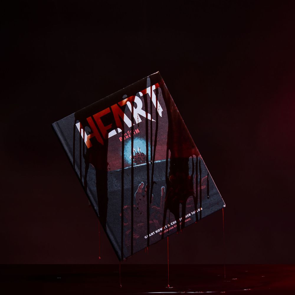
We make excellent TTRPGs: Eat the Reich, DIE, Heart, Spire, Hollows, Voidheart Symphony, Honey Heist, etc. Made of lovely humans; home of UFO Press.
alarmingly official homestuck account
A show about the Dragon Age games, and what we think makes them special!
Currently preparing to play Dragon Age: Origins
New episodes every other Thursday!
https://sites.libsyn.com/550367
https://ko-fi.com/codexentries