Of A Feather. Data Art For Bird Nerds.
10,151 bird species visualized in a single composition, positioned radially by wing length. This hyper-detailed artwork combines morphological data from AVONET with colors extracted from Wikipedia des...
Wikipedia describes birds in lots of different ways:
"bright scarlet head, throat, and upperparts"
"wings that are grey-black grading into green or blue"
"upperparts are a dull olive-green"
I gathered 10,151 of these descriptions and used them to make this visualization
www.jerthorp.me/ofafeather
23.11.2025 14:05 —
👍 15
🔁 2
💬 1
📌 0
Love the design turned into Tableau sparkles!
24.11.2025 02:48 —
👍 2
🔁 0
💬 1
📌 0
Thanks Brittany! It’s not a complicated chart to make but thought I’d share share the use case with other BI developers ☺️
29.09.2025 22:40 —
👍 1
🔁 0
💬 0
📌 0

Screenshot of Kevin Wee's Tableau Public viz, entitled Dual-Pane Cycle Plot(ish): Comparing Two Metrics at Monthly and Yearly levels. The viz contains two charts, both showing the same two metrics: (1) A typical dual-axis chart with a line overlapping a bar in the same coordinate, and (2) A dual-pane segmented line chart. In the latter design, the two metrics are placed in juxtaposition, segmented by year and supplemented with yearly average lines.
The revised design enables readers to analyze #data unobstructedly, as the metric lines are placed in juxtaposition. The line segmentation and yrly average lines facilitate the detection of seasonality at both mthly & yrly levels.
Thanks, @brrosenau.bsky.social, for inspiring the viz format.
(2/n)
29.09.2025 04:09 —
👍 2
🔁 1
💬 1
📌 0
Hi #DataFam, I recently introduced a cycle plot-inspired design as an alternative to the typical dual-axis chart type in a #dataviz project. bit.ly/46E8Afa
The #Tableau viz addresses the limitations of dual-axis charts in terms of suggestive correlation and crowded views.
(1/n)
29.09.2025 04:09 —
👍 0
🔁 0
💬 1
📌 0

Latest TUG is youtu.be/7f7ggIU1W-k
Menu, Hover, Select… and Action! Bringing Dashboards to Life by @datatastemaker.bsky.social
Boost your Data Infographics with Five Graphic Design Concepts by @kevinwee.bsky.social
LOTS of awesome content @ youtube.com/@TeamDataFam #DataFam
25.09.2025 07:49 —
👍 1
🔁 1
💬 0
📌 0
If my chemistry degree serves me right, they are the probability of electrons occuring revolving a nucleus based on their energy level and spin status 😁
03.08.2025 18:44 —
👍 3
🔁 0
💬 1
📌 0
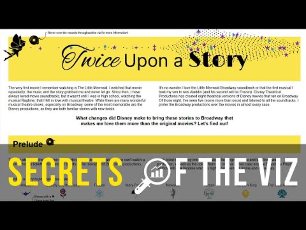
YouTube video by Louis Yu
Epi 66 : Twice Upon a Story
Frozen's "Let It Go" was the outlier success but did you ever wondered about the rest of the #disney franchise? Join us #datafam with @nicoleklassen.bsky.social as she share her insights from her #IronViz piece, including a very unique Ternary Plot 📊 too!
youtu.be/Boug-5Uy6tg
27.05.2025 15:49 —
👍 1
🔁 1
💬 1
📌 0
The dashboard design, as a concept, can be applied to other survey #dataviz and analyses as well. I wonder if #Tableau would be open to collaborating to create an automatically generated dashboard interface for all #TC26 presenters. It'd be epic! 🙋
28.05.2025 01:02 —
👍 0
🔁 0
💬 0
📌 0
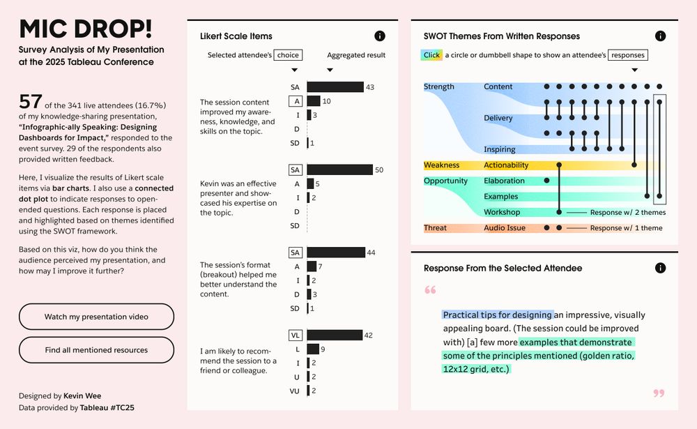
A demonstration of my Survey Response Analysis Dashboard.
In the middle of the dashboard lies four horizontal bar charts indicating the survey respondents' levels of agreement on the following statements:
The session content improved my awareness, knowledge, and skills on the topic.
Kevin was an effective presenter and showcased his expertise on the topic.
The session's formart (breakout) helped me better understand the content.
I am likely to recommend the session to a friend or colleague.
At the top-right of the dashboard lies a connected dot plot, with each circle or dumbbell shape representing written feedback from an attendee. The row position of a circle or a dumbbell terminal represents a SWOT theme identified in the feedback. Row 1 and 2 are for the theme Strength | Content. Row 3 and 4 are for the theme Strength | Delivery. Row 5 is for the theme Strength | Inspiring. Row 6 is for the theme Weakness | Actionability. Row 7 is for the theme Opportunity | Elaboration. Row 8 is for the theme Opportunity | Examples. Row 9 is for the theme Opportunity | Workshop. Row 10 is for the theme Threat | Audio Issue.
At the bottom-right of the dashboard lies a selected attendee's response to the following questions: 1. What did you enjoy the most about this session? 2. What, if anything, would you improve about your experience at this session?
Texts under specific SWOT themes are highlighted with the theme color according to the connected dot plot above.
1 Connected dot plot:
For the written responses and identified themes
2 Full text from the selected attendee:
Phrases are highlighted based on the identified themes
3 Interactivity between charts:
You may click any shape in dot plot to find all responses from the selected attendee
28.05.2025 01:02 —
👍 0
🔁 0
💬 1
📌 0
🚨 NEW VIZ: Hey #DataFam, I just dropped a fresh #Survey Response Analysis #Dashboard, visualizing Likert scale responses & open feedback. rb.gy/cu59qu
Tools used:
@tableaupublic.bsky.social and @figma.com
#dataviz #data
The #TableauPublic dashboard contains several innovative features 🧵👇
28.05.2025 01:02 —
👍 4
🔁 0
💬 1
📌 0
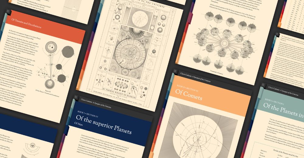
Screenshots of websites pages arranged in a collage
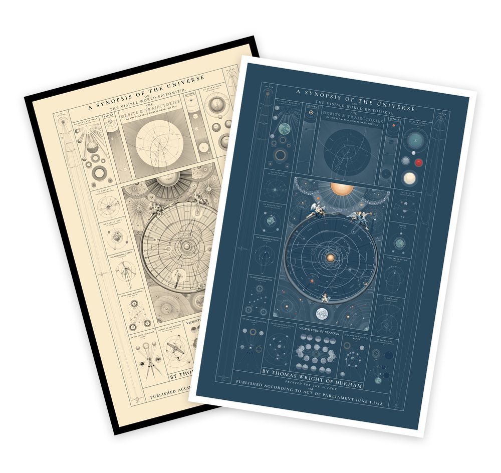
Antique and color posters

Closeup of antique poster
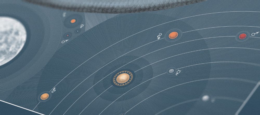
Closeup of color poster
New: I recreated Tomas Wright’s 1742 astronomical treatise, Clavis Cælestis, and its accompanying sheets titled A Synopsis of the Universe. New posters are available in antique style and modern colors.
Explore: www.c82.net/clavis-caele...
How it was made: www.c82.net/blog/?id=99
24.05.2025 19:01 —
👍 84
🔁 22
💬 7
📌 8
Latest TUG is youtu.be/90SJoCYr-_w
"Infographic-ally Speaking: Designing Dashboards for Impact" by @kevinwee.bsky.social
Learn design principles & best practices to create impactful infographic dashboards for your portfolio.
LOTS of awesome content @ youtube.com/@TeamDataFam #DataFam
20.05.2025 05:59 —
👍 1
🔁 1
💬 0
📌 0
I feel like it's the equivalent of seeing "ads" in a blog
25.04.2025 02:58 —
👍 1
🔁 0
💬 1
📌 0
I didn’t like it too! Now both top and right are buttons, so distracting
25.04.2025 02:54 —
👍 1
🔁 0
💬 1
📌 0
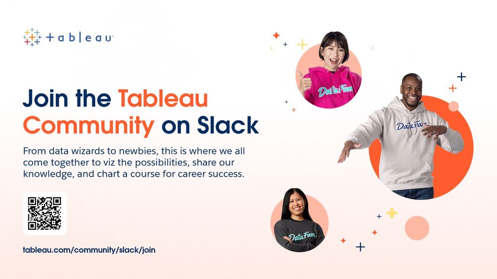
cta slide to join the tableau community on slack, with pictures of three people from around the world and a qr code to scan and join
one of my favorite (maybe underrated?) announcements from Tableau Conference - the new community slack space. i think it will be one of the best spots to collaborate, find user groups, share work, and also tableau help! Learn more at tableau.com/community/slack
19.04.2025 17:03 —
👍 7
🔁 2
💬 0
📌 0
Just filled in all my data! I appreciate the distance data this year. <3
19.04.2025 16:25 —
👍 2
🔁 0
💬 1
📌 0
YouTube video by Data Visualization Society
IIB Awards Shortlist Announcement
The #IIB Award Shortlist announcement is happening now!
#dataviz #datavisualization #infographics
@datavizsociety.bsky.social
www.youtube.com/watch?v=39ZC...
19.04.2025 16:04 —
👍 2
🔁 2
💬 0
📌 0
Right!!!!!?!
15.04.2025 17:45 —
👍 1
🔁 0
💬 0
📌 0
I was so excited I flew! 😂
14.04.2025 22:23 —
👍 1
🔁 0
💬 0
📌 0

🚨 Hey #DataFam, come check out my presentation at the #Tableau Conference tomorrow on my practice in designing impactful #infographic #dashboards: rb.gy/lcc3uu
Date: 15 April 2025
Time: 4 PM (PDT)
Location: Content Pavillion, Stage 5
Excited to see you in San Diego! #TC25
14.04.2025 19:49 —
👍 5
🔁 0
💬 0
📌 0
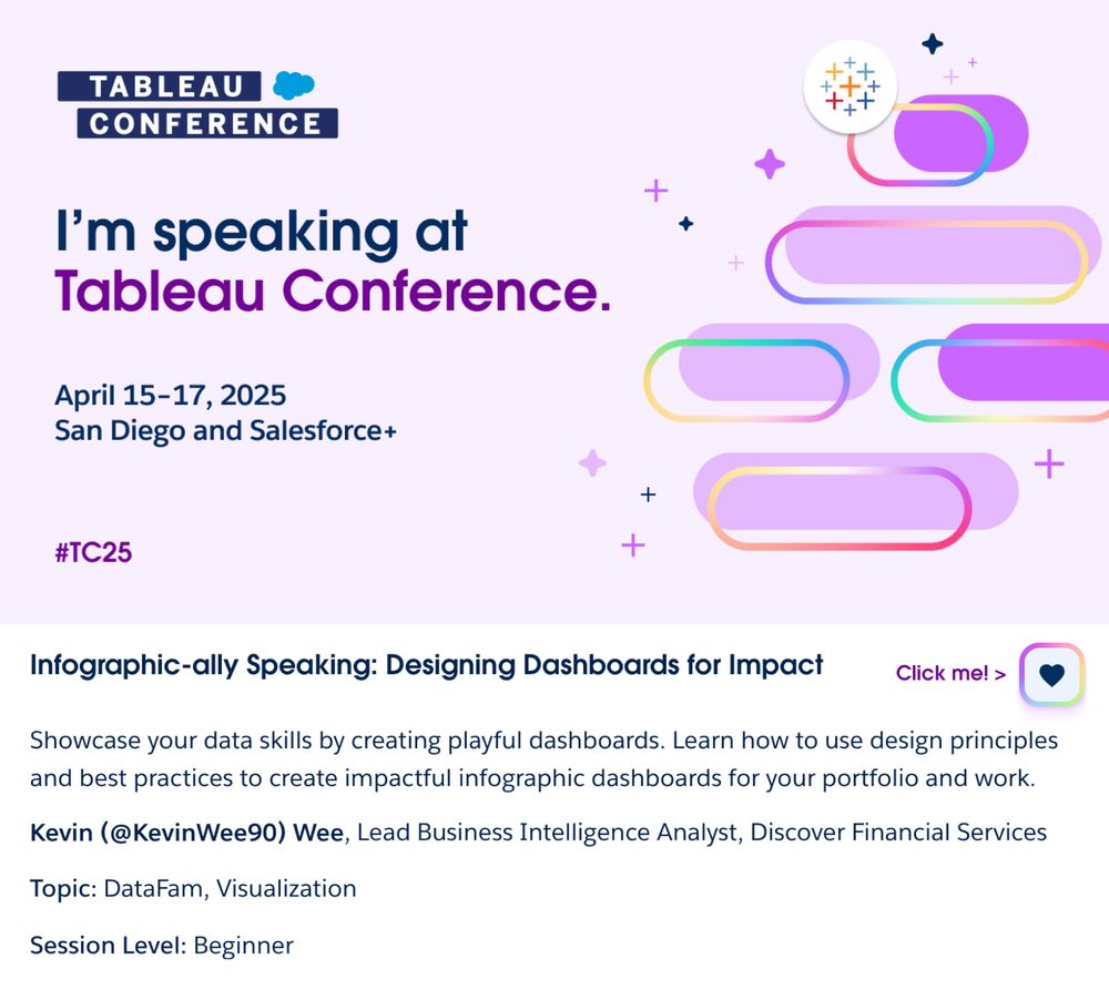
"I am speaking at Tableau Conference" card for the 2025 conference in San Diego. Kevin Wee's presentation is entitled "Infographic-ally Speaking: Designing Dashboards for Impact."
🚨NEWS: Hi #Datafam, I’ll return to the #Tableau Conference and share my infographic #dashboard #design practices! rb.gy/lcc3uu
Plz like ❤️ my session at the Registration Portal now (link above) so we know how many are interested! Details are coming soon!
#tc25 #dataviz @tableaupublic.bsky.social
11.03.2025 13:24 —
👍 6
🔁 1
💬 0
📌 0
See you this evening!
14.04.2025 18:43 —
👍 0
🔁 0
💬 0
📌 0
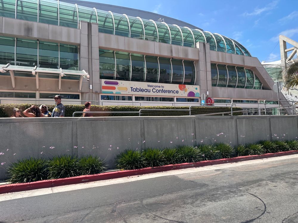
Arrived!!! 🤩 #TC25 #Datafam
13.04.2025 19:31 —
👍 5
🔁 0
💬 0
📌 0
Landed!
13.04.2025 18:44 —
👍 1
🔁 0
💬 0
📌 0
Got my new adidas shoes and breaking into it today! Cannot wait to walk with yall! ❤️
10.04.2025 14:48 —
👍 1
🔁 0
💬 0
📌 0
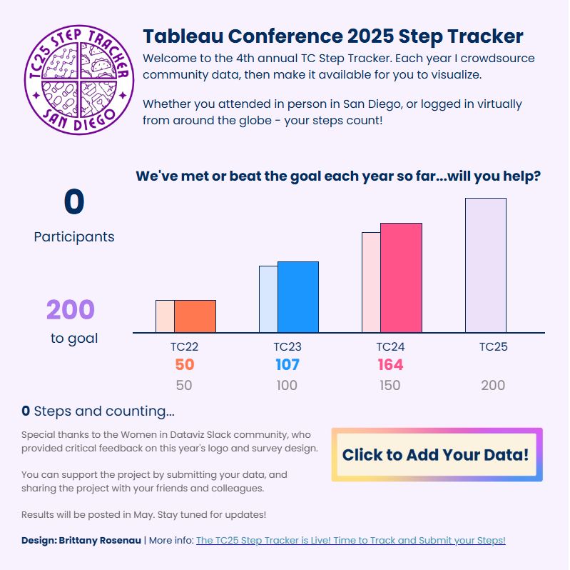
brightly colored comparison bars showing actual participants vs goal participants for tc22, 23, and 24. tc25 has a goal bar sized to 200, with no participants yet.
I hope you're packing some good shoes - the TC25 Step Tracker is live! Post conference, log your steps--let's turn this into the biggest community sourced dataset yet this year. Open to all, in person and virtual!
📖: brittanyrosenau.medium.com/the-tc25-ste...
📊: public.tableau.com/app/profile/...
10.04.2025 13:49 —
👍 6
🔁 2
💬 2
📌 1
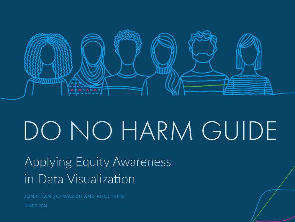
🌍 As DEI programs face setbacks, it’s crucial to rethink inclusive design. The Do No Harm Guide by @urbaninstitute.bsky.social goes beyond aesthetics, challenging us to communicate data with empathy and equity. A must-read for those working with data. 📊
🔗 www.urban.org/sites/defaul...
#dataviz
11.03.2025 18:41 —
👍 57
🔁 31
💬 1
📌 1
"I am speaking at Tableau Conference" card for the 2025 conference in San Diego. Kevin Wee's presentation is entitled "Infographic-ally Speaking: Designing Dashboards for Impact."
🚨NEWS: Hi #Datafam, I’ll return to the #Tableau Conference and share my infographic #dashboard #design practices! rb.gy/lcc3uu
Plz like ❤️ my session at the Registration Portal now (link above) so we know how many are interested! Details are coming soon!
#tc25 #dataviz @tableaupublic.bsky.social
11.03.2025 13:24 —
👍 6
🔁 1
💬 0
📌 0