You’re right but it’s a totally unnecessary discrepancy, no reason why the white stripe can’t be deeper and the #NSE logotype shifted upwards :)
30.01.2026 17:45 — 👍 3 🔁 0 💬 0 📌 0
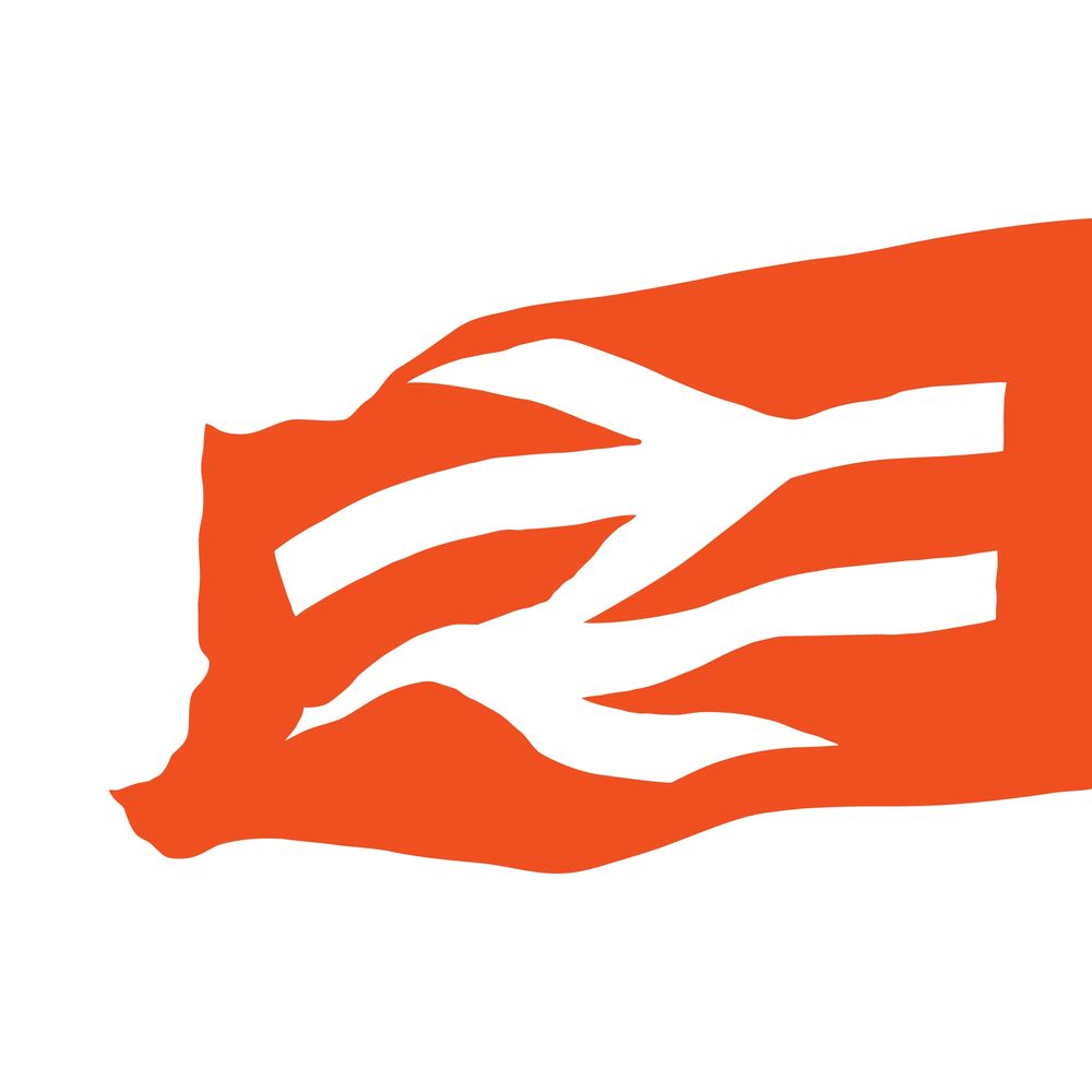
Will never understand why the stripes are a different depth on locomotives #NetworkSouthEast #NSE
30.01.2026 15:07 — 👍 11 🔁 0 💬 3 📌 0
I can forgive that, partly because silver (‘Argent’) and white are equivalents in heraldic terms) 😬
29.01.2026 19:52 — 👍 10 🔁 0 💬 0 📌 0
Spectacular; a simple, single, white double arrow is so effective; only muppets would want this to be red on that backdrop
29.01.2026 18:01 — 👍 12 🔁 1 💬 1 📌 0

Colour photo of the concourse at Manchester Piccadilly station taken in 1986 and fromt he Manchester Libraries collections. People millinga round inc. a couple with a baby buggy pushed by a man in a blue coat on the left. In the foreground three women, two with carrier bags. There's a poster for the Manchester Pullman on the right and on the Train Information board in the background a 'Speedy Gonzales" travel poster. Above is strung a slightly sagging banner for the 'Peak Wayfarer' day runabout ticket for buses and trains with the logo/symbols for Great Manchester Transport, the BR 'double arrow' and the National Bus Company 'N' symbol.
Three transport logotype/symbols in a row at Manchester Piccadilly station in 1986 on a saggy banner. #logo #manchester #transport @doublearrow64.bsky.social @richardprice.bsky.social #transport #manchester
29.01.2026 10:12 — 👍 13 🔁 1 💬 0 📌 0

There was an article about him in the modernist (#44, September 2022) with some photos too IIRC
www.unitedcattleproducts.co.uk
28.01.2026 21:01 — 👍 2 🔁 0 💬 1 📌 0
it was a Norman Wilson creation and that is the domain of @richardprice.bsky.social
28.01.2026 20:49 — 👍 1 🔁 0 💬 1 📌 0
Innit
28.01.2026 20:48 — 👍 2 🔁 0 💬 0 📌 0
I keep reading it as ‘co-wheels’ 😬
28.01.2026 19:54 — 👍 1 🔁 0 💬 2 📌 0
Mmmm, tripe :)
@richardprice.bsky.social
28.01.2026 19:45 — 👍 1 🔁 0 💬 1 📌 0

And of course because I like to have a bit of fun....
26.01.2026 21:13 — 👍 3 🔁 1 💬 0 📌 0
Happy 50th birthday Birmingham International!
26.01.2026 13:27 — 👍 17 🔁 2 💬 0 📌 0
I know the GLA, who issued this, don't use TfL's Johnston - but boy, this shows why TfL do. Talk about looking 'wrong'. #typography #design @doublearrow64.bsky.social
24.01.2026 14:05 — 👍 12 🔁 2 💬 3 📌 0

I gather Gerry Barney wanted the symbol to be massive on the sides of locomotives from day one but was overruled; not clear who was responsible for it but it was first seen on a locomotive in 1978 on 56036.
And there was this which was earlier still…
(Photograph: Alan Harrison)
24.01.2026 12:17 — 👍 3 🔁 0 💬 0 📌 0
Hard to argue with…
#LargeLogo #RevisedBlue
24.01.2026 11:06 — 👍 9 🔁 0 💬 1 📌 0
Who is propagating this nonsense? Apart from always having been distinctly nondescript, those Network Rail major station icons are now obsolete and bear absolutely no relation to the new wayfinding design idiom
22.01.2026 12:05 — 👍 11 🔁 0 💬 2 📌 0
Some sort of love/hate button?
22.01.2026 11:59 — 👍 1 🔁 0 💬 0 📌 0

A screenshot from a 1979 video of Eastern Scottish buses in the Airdrei/Coatbridge area. a line of contemporary cars wait at traffic signals whilst in the distance a green double deck Eastern Scottish bus moves away. Behind it, to the left, a BR parcels van in large logo livery. (RBache on Facebook)
No missing the BR van @doublearrow64.bsky.social - from a video on FB about Eastern Scottish buses & in the very year, 1979, I was conductor Ashworth of New St garage who worked duties on this type of bus through this type of town!
(Richard Bache/Facebook)
21.01.2026 18:15 — 👍 8 🔁 1 💬 1 📌 0

The same arrangement was used on Mark 2 Pullmans in Executive InterCity livery, this example not having any typographic descenders (cf the ‘g‘ in the example above which gets pretty close to the lower edge of the red stripe
flic.kr/p/aFyiok
19.01.2026 19:59 — 👍 7 🔁 0 💬 0 📌 0


Intercity Pullman carriage names were aligned very oddly; the Flame Red stripe was 180mm deep, the x-height was 80mm, the gap below was 35mm and the gap above 65mm and I have absolutely no idea why, text was usually centred on x-height
flic.kr/p/2jjGiEj (Michael J Collins)
19.01.2026 19:59 — 👍 7 🔁 0 💬 1 📌 0
I think there was probably a small but reliable pool of suppliers (e.g. Doric Signs) who were carefully supervised to ensure high standards
There is a desire to improve things but there is very little buy-in; the railway is too fragmented now to achieve anything of worth when it comes to wayfinding
19.01.2026 19:14 — 👍 2 🔁 0 💬 0 📌 0
Admittedly this is only temporary but “We’ll do our own thing, thanks” is the scourge of wayfinding across the British rail network…
19.01.2026 11:54 — 👍 8 🔁 0 💬 4 📌 0
No, hadn’t seen them and they’re not very nice for various reasons, not least the use of symbols/roundels with the original thin arrow which was addressed in the most recent Wayfinding guidance; I also don’t like ampersands much
19.01.2026 11:50 — 👍 3 🔁 0 💬 1 📌 0

Morning all. A bitterly cold morning as I recall, as 37408 ‘Loch Rannoch’ traversed the Oban line with the Grangemouth to Connell Ferry oil train. Another service that was lost to road transport shortly after. Hope you all have a great day.
#Class37 #Tractor #LargeLogo
18.01.2026 06:28 — 👍 73 🔁 8 💬 1 📌 0
Amaryllis, amaryllis
Amaryllis
Amaryllis, amaryllis
Amaryllis
Amaryllis, amaryllis
Rock me amaryllis
18.01.2026 13:00 — 👍 5 🔁 0 💬 1 📌 0

So these numbers are definitely Rail Alphabet, albeit incorrect positive weight and very tightly spaced
flic.kr/p/2qKY3Ak
18.01.2026 00:39 — 👍 2 🔁 0 💬 0 📌 0

Yes, probably the ones repainted at Crewe with knock-off Rail Alphabet, Crewe Works-style, but certainly not Helvetica
18.01.2026 00:31 — 👍 2 🔁 0 💬 1 📌 0
Yes, very unusual, they were usually Rail Alphabet
17.01.2026 19:01 — 👍 2 🔁 0 💬 1 📌 0

Prototype InterCity version on 73123 had Helvetica numbers…
17.01.2026 17:26 — 👍 2 🔁 0 💬 1 📌 0