Android Developers Blog's Avatar

Android Developers Blog

@android-developers.googleblog.com.web.brid.gy

News and insights on the Android platform, developer tools, and events. [bridged from https://android-developers.googleblog.com/ on the web: https://fed.brid.gy/web/android-developers.googleblog.com ]

237 Followers  |  0 Following  |  401 Posts  |  Joined: 20.08.2024  |  3.8135

Latest posts by android-developers.googleblog.com.web.brid.gy on Bluesky

Preview
#WeArePlay: Meet the people coding a more sustainable world _Posted by Robbie McLachlan, Developer Marketing_ How do you tackle the planet's biggest sustainability and environmental challenges? For 10 new founders we’re spotlighting in #WeArePlay, it starts with coding. Their apps and games are helping to build a healthier planet by developing career paths for aspiring environmentalists, preserving indigenous knowledge, and turning nature education into an adventure for all. Here are a few of our favourites: #### Ariane, Flávia, Andréia, and Mayla's game BoRa turns a simple park visit into an immersive, gamified adventure. _Ariane, Flávia, Andréia, and Mayla, co-founders of Fubá Educação Ambiental_ _São Carlos, Brazil_ Passionate about nature, co-founders Mayla, Flávia, Andréia, and Ariane met while researching environmental education. They wanted to foster more meaningful connections between people and Brazil's national parks. Their app, BoRa - Iguaçu National Park, transforms a visit into an immersive experience using interactive storytelling, gamified trails, and accessibility features like sign language, helping everyone connect more deeply with the natural world. #### Louis and Justin's app, CyberTracker, turns the ancient knowledge of indigenous trackers into vital scientific data for modern conservation. _Louis, co-founder of CyberTracker Conservation_ _Cape Town, South Africa_ Louis knew that animal tracking was a science, but the expert knowledge of many indigenous trackers couldn't be recorded because they were unable to read or write. He partnered with Justin to create CyberTracker to solve this. Their app uses a simple icon-based interface, enabling non-literate trackers to record vital biodiversity data. This innovation preserves invaluable knowledge and supports conservation efforts worldwide. #### Bharati and Saurabh’s app, Earth5R, turns a passion for the planet into real-world experience and careers in the green economy. _Bharati and Saurabh, co-founders of Earth5R Environmental Services_ _Mumbai, India_ After a life-changing cycling trip around the world, Saurabh was inspired by sustainable practices he saw in different communities. He and his wife, Bharati, brought those lessons home to Mumbai and launched Earth5R. Their app provides environmental education and career development, connecting people to internships and hands-on projects. By providing the skills and experience needed for the green economy, they're building the next generation of environmental leaders. Discover more #WeArePlay stories from founders across the globe.
07.08.2025 16:00 — 👍 0    🔁 0    💬 0    📌 0
Preview
What is HDR? _Posted by John Reck – Software Engineer_ 
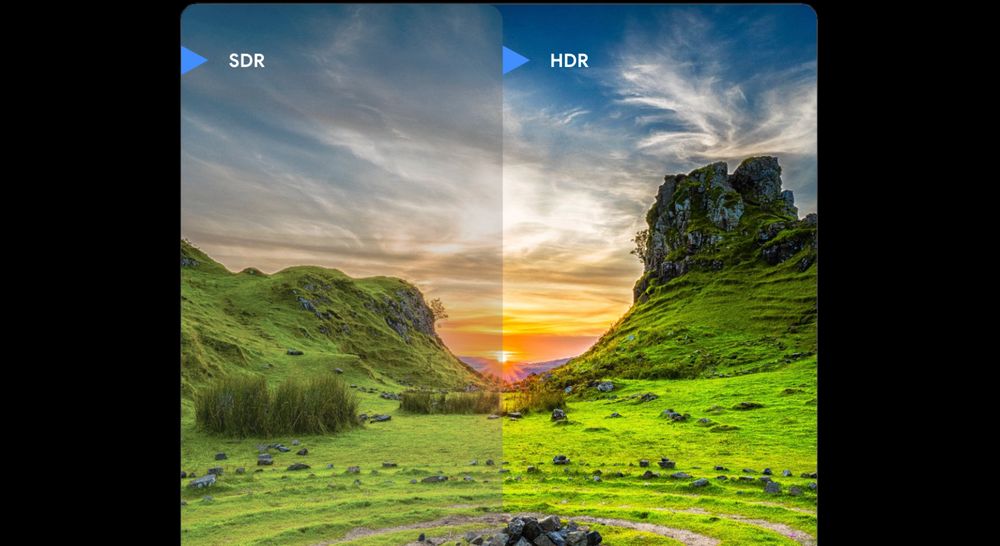
For Android developers, delivering exceptional visual experiences is a continuous goal. High Dynamic Range (HDR) unlocks new possibilities, offering the potential for more vibrant and immersive content. Technologies like UltraHDR on Android are particularly compelling, providing the benefits of HDR displays while maintaining crucial backwards compatibility with SDR displays. On Android you can use HDR for both video and images. Over the years, the term HDR has been used to signify a number of related, but ultimately distinct visual fidelity features. Users encounter it in the context of camera features (exposure fusion), or as a marketing term in TV or monitor (“HDR capable”). This conflates distinct features like wider color gamuts, increased bit depth or enhanced contrast with HDR itself. From an Android Graphics perspective, HDR primarily signifies **higher peak brightness capability that extends beyond the conventional Standard Dynamic Range**. Other perceived benefits often derive from standards such as HDR10 or Dolby Vision which also include the usage of wider color spaces, higher bit depths, and specific transfer functions. In this article, we’ll establish the foundational color principles, then address common myths, clarify HDR’s role in the rendering pipeline, and examine how Android’s display technologies and APIs enable HDR experience. ## The components of color Understanding HDR begins with defining the three primary components that form the displayed volume of color: bit depth, transfer function, and color gamut. These describe the precision, scaling, and range of the color volume, respectively. While a color model defines the format for encoding pixel values (e.g., RGB, YUV, HSL, CMYK, XYZ), RGB is typically assumed in a graphics context. The combination of a color model, a color gamut, and a transfer function constitutes color space. Examples include sRGB, Display P3, Adobe RGB, BT.2020, or BT.2020 HLG. Numerous combinations of color gamut and transfer function are possible, leading to a variety of color spaces. _Components of color_ #### **Bit Depth** Bit depth defines the precision of color representation. A higher bit depth allows for finer gradation between color values. In modern graphics, bit depth typically refers to bits per channel (e.g., an 8-bit image uses 8 bits for each red, green, blue, and optionally alpha channel). Crucially, bit depth does not determine the overall range of colors (minimum and maximum values) an image can represent; this is set by the color gamut and, in HDR, the transfer function. Instead, increasing bit depth provides more discrete steps within that defined range, resulting in smoother transitions and reduced visual artifacts such as banding in gradients. **5-bit** **8-bit** Although 8-bit is one of the most common formats in widespread usage, it’s not the only option. RAW images can be captured at 10, 12, 14, or 16 bits. PNG supports 16 bits. Games frequently use 16-bit floating point (FP16) instead of integer space for intermediate render buffers. Modern GPU APIs like Vulkan even support 64-bit RGBA formats in both integer and floating point varieties, providing up to 256-bits per pixel. #### **Transfer Function** A transfer function defines the mathematical relationship between a pixel’s stored numerical value and its final displayed luminance or color. In other words, the transfer function describes how to interpret the increments in values between the minimum and maximum. This function is essential because the human visual system's response to light intensity is non-linear. We are more sensitive to changes in luminance at low light levels than at high light levels. Therefore, a linear mapping from stored values to display luminance would not result in an efficient usage of the available bits. There would be more than necessary precision in the brighter region and too little in the darker region with respect to what is perceptual. The transfer function compensates for this non-linearity by adjusting the luminance values to match the human visual response. While some transfer functions are linear, most employ complex curves or piecewise functions to optimize image quality for specific displays or viewing conditions. sRGB, Gamma 2.2, HLG, and PQ are common examples, each prioritizing bit allocation differently across the luminance range. #### **Color Gamut** Color gamut refers to the entire range of colors that a particular color space or device can accurately reproduce. It is typically a subset of the visible color spectrum, which encompasses all the colors that the human eye can perceive. Each color space (e.g., sRGB, Display P3, BT2020) defines its own unique gamut, establishing the boundaries for color representation. A wider gamut signifies that the color space can display a greater variety of colors, leading to richer and more vibrant images. However, simply having a larger gamut doesn't always guarantee better color accuracy or a more vibrant result. The device or medium used to display the colors must also be capable of reproducing the full range of the gamut. When a display encounters colors outside its reproducible gamut, the typical handling method is clipping. This is to ensure that in-gamut colors are properly preserved for accuracy, as otherwise attempts to scale the color gamut may produce unpleasant results, particularly in regions in which human vision is particularly sensitive like skin tones. ## HDR myths and realities With an understanding of what forms the basic working color principles, it’s now time to evaluate some of the common claims of HDR and how they apply in a general graphics context. ### Claim: HDR offers more vibrant colors This claim comes from HDR video typically using the BT2020 color space, which is indeed a wide color volume. However, there are several problems with this claim as a blanket statement. The first is that images and graphics have been able to use wider color gamuts, such as Display P3 or Adobe RGB, for quite a long time now. This is not a unique advancement that was coupled to HDR. In JPEGs for example this is defined by the ICC profile, which dates back to the early 1990s, although wide-spread adoption of ICC profile handling is somewhat more recent. Similarly on the graphics rendering side the usage of wider color spaces is fully decoupled from whether or not HDR is being used. The second is that not all HDR videos even use such a wider gamut at all. Although HDR10 specifies the usage of BT2020, other HDR formats have since been created that do not use such a wide gamut. The biggest issue, though, is one of capturing and displaying. Just because the format allows for the color gamut of BT2020 does not mean that the entire gamut is actually usable in practice. For example current Dolby Vision mastering guidelines only require a 99% coverage of the P3 gamut. This means that even for high-end professional content, it’s not expected that the authoring of content beyond that of Display P3 is possible. Similarly, the vast majority of consumer displays today are only capable of displaying either sRGB or Display P3 color gamuts. Given that the typical recommendation of out-of-gamut colors is to clip them, this means that even though HDR10 allows for up to BT2020 gamut, the widest gamut in practice is still going to be P3. Thus this claim should really be considered something offered by HDR video profiles when compared to SDR video profiles specifically, although SDR videos could use wider gamuts if desired without using an HDR profile. ### Claim: HDR offers more contrast / better black detail One of the benefits of HDR sometimes claimed is dark blacks (e.g. Dolby Vision Demo #3 - Core Universe - 4K HDR or “Dark scenes come alive with darker darks” ) or more detail in the dark regions. This is even reflected in BT.2390: “HDR also allows for lower black levels than traditional SDR, which was typically in the range between 0.1 and 1.0 cd/m2 for cathode ray tubes (CRTs) and is now in the range of 0.1 cd/m2 for most standard SDR liquid crystal displays (LCDs).” However, in reality no display attempts to show anything but SDR black as the blackest black the display is physically capable of. Thus there is no difference between HDR or SDR in terms of how dark it can reach - both bottom out at the same dark level on the same display. As for contrast ratio, as that is the ratio between the brightest white and the darkest black, it is overwhelmingly influenced by how dark a display can get. With the prevalence of OLED displays, particularly in the mobile space, both SDR and HDR have the same contrast ratio as a result, as they both have essentially perfect black levels giving them infinite contrast ratios. The PQ transfer function does allocate more bits to the dark region, so in theory it can convey better black detail. However, this is a unique aspect of PQ rather than a feature of HDR. HLG is increasingly the more common HDR format as it is preferred by mobile cameras as well as several high end cameras. And while PQ may contain this detail, that doesn’t mean the HDR display can necessarily display it anyway, as discussed in Display Realities. ### Claim: HDR offers higher bit depth This claim comes from HDR10 and some, but not all, Dolby Vision profiles using 10 or 12-bits for the video stream. Similar to more vibrant colors, this is really just an aspect of particular video profiles rather than something HDR itself inherently provides or is coupled to HDR. The usage of 10-bits or more is otherwise not uncommon in imaging, particularly in the higher end photography world, with RAW and TIFF image formats capable of having 10, 12, 14, or 16-bits. Similarly, PNG supports 16-bits, although that is rarely used. ### Claim: HDR offers higher peak brightness This then, is all that HDR really is. But what does “higher peak brightness” really mean? After all, SDR displays have been pushing ever increasing brightness levels before HDR was significant, particularly for sunlight viewing. And even without that, what is the difference between “HDR” and just “SDR with the brightness slider cranked up”? The answer is that we define “HDR” as having a brightness range bigger than SDR, and we think of SDR as being the range driven by autobrightness to be comfortably readable in the current ambient conditions. Thus we define HDR in terms of things like “HDR headroom” or “HDR/SDR ratio” to indicate it’s a floating region relative to SDR. This makes brightness policies easier to reason about. However, it does complicate the interaction with traditional HDR such as that used in video, specifically HLG and PQ content. #### **PQ/HLG transfer functions** PQ and HLG represent the two most common approaches to HDR in terms of video content. They represent two transfer functions that represent different concepts of what is “HDR.” PQ, published as SMPTE ST 2084:2014, is defined in terms of absolute nits in the display. The expectation is that it encodes from 0 to 10,000 nits, and expects to be mastered for a particular reference viewing environment. HLG takes a different approach, instead opting to take a typical gamma curve for part of the range before switching to logarithmic for the brighter portion. This has a claimed nominal peak brightness of 1000 nits in the reference environment, although it is not defined in absolute luminance terms like PQ is. Industry-wide specifications have recently formalized the brightness range of both PQ- and HLG-encoded content in relation to SDR. ITU-R BT. 2408-8 defines the reference white level for graphics to be 203 nits. ISO/TS 22028-5 and ISO/PRF 21496-1 have followed suit; 21496-1 in particular defines HDR headroom in terms of nominal peak luminance, relative to a diffuse white luminance at 203 nits. The realities of modern displays, discussed below, as well as typical viewing environments mean that traditional HDR video are nearly never displayed as intended. A display’s HDR headroom may evaporate under bright viewing conditions, demanding an on-demand tonemapping into SDR. Traditional HDR video encodes a fixed headroom, while modern displays employ a dynamic headroom, resulting in vast differences in video quality even on the same display. ### Display Realities So far most of the discussion around HDR has been from the perspective of the content. However, users consume content on a display, which has its own capabilities and more importantly limits. A high-end mobile display is likely to have characteristics such as gamma 2.2, P3 gamut, and a peak brightness of around 2000 nits. If we then consider something like HDR10 there are mismatches in bit usage prioritization: * PQ’s increased bit allocation at the lower ranges ends up being wasted * The usage of BT2020 ends up spending bits on parts of a gamut that will never be displayed * Encoding up to 10,000 nits of brightness is similarly headroom that’s not utilized These mismatches are not inherently a problem, however, but it means that as 10-bit displays become more common the existing 10-bit HDR video profiles are unable to actually take advantage of the full display’s capabilities. Thus HDR video profiles are in a position of simultaneously being forward looking while also already being unable to maximize a current 10-bit display’s capabilities. This is where technology such as Ultra HDR or gainmaps in general provide a compelling alternative. Despite sometimes using an 8-bit base image, because the gain layer that transforms it to HDR is specialized to the content and its particular range needs it is more efficient with its bit usage, leading to results that still look stunning. And as that base image is upgraded to 10-bit with newer image formats such as AVIF, the effective bit usage is even better than those of typical HDR video codecs. Thus these approaches do not represent evolutionary or stepping stones to “true HDR”, but rather are also an improvement on HDR in addition to having better backwards compatibility. Similarly Android’s UI toolkit’s usage of the extendedRangeBrightness API actually still primarily happens in 8-bit space. Because the rendering is tailored to the specific display and current conditions it is still possible to have a good HDR experience despite the usage of RGBA_8888. ## Unlocking HDR on Android: Next steps High Dynamic Range (HDR) offers advancement in visual fidelity for Android developers, moving beyond the traditional constraints of Standard Dynamic Range (SDR) by enabling higher peak brightness. By understanding the core components of color – bit depth, transfer function, and color gamut – and debunking common myths, developers can leverage technologies like Ultra HDR to deliver truly immersive experiences that are both visually stunning and backward compatible. In our next article, we'll delve into the nuances of HDR and user intent, exploring how to optimize your content for diverse display capabilities and viewing environments.
06.08.2025 16:00 — 👍 1    🔁 1    💬 0    📌 0
Preview
Android Studio Narwhal Feature Drop is stable - start using Agent Mode _Posted by Paris Hsu – Product Manager, Android Studio_ The next wave of innovation is here with Android Studio Narwhal Feature Drop. We're thrilled to announce that Gemini in Android Studio's Agent Mode is now available in the stable release, ready to tackle your most complex coding challenges. This release also brings powerful new tools for XR development, continued quality improvements, and key updates to enhance your productivity and help you build high-quality apps. Dive in to learn more about all the updates and new features designed to supercharge your workflow. _Gemini in Android Studio: Agent Mode_ ## Develop with Gemini ### Try out Agent Mode Go beyond chat and assign tasks to Gemini. Gemini in Android Studio's Agent Mode is a powerful AI feature designed to handle complex, multi-stage development tasks. To use Agent Mode, click **Gemini** in the sidebar and then select the **Agent** tab. You can describe a high-level goal, like adding a new feature, generating comprehensive unit tests, or fixing a nuanced bug. The agent analyzes your request, breaks it down into smaller steps, and formulates an execution plan that uses IDE tools, such as reading and writing files and performing Gradle tasks, and can span multiple files in your project. It then iteratively suggests code changes, and you're always in control—you can review, accept, or reject the proposed changes and ask the agent to iterate based on your feedback. Let the agent handle the heavy lifting while you focus on the bigger picture. After releasing Agent Mode to Canary, we had positive feedback from the developers who tried it. We were so excited about the feature’s potential, we moved it to the stable channel faster than ever before, so that you can get your hands on it. Try it out and let us know what you build. _Gemini in Android Studio: Agent Mode_ Currently, the default model offered in the free tier in Android Studio has a shorter context length, which can limit the depth of response from some agent questions and tasks. In order to get the best performance from Agent Mode, you can bring your own key for the public Gemini API. Once you add your Gemini API key with a paid GCP project, you’ll then be able to use the latest Gemini 2.5 Pro with a full 1M context window from Android Studio. Remember to pick the “Gemini 2.5 Pro” from the model picker in the chat and agent input boxes. _Gemini in Android Studio: model selector_ ### Rules in prompt library Tailor the response from Gemini to fit your project's specific needs with Rules in the prompt library. You can define preferred coding styles, tech stacks, languages, or output formats to help Gemini understand your project standards for more accurate and personalized code assistance. You can set these preferences once, and they’ll be automatically applied to all subsequent prompts sent to Gemini. For example, you can create a rule such as, "_Always provide concise responses in Kotlin using Jetpack Compose._ " You can also set rules at the IDE level for personal use across projects, or at the project level, which can be shared with teammates by adding the .idea folder to your version control system. _Rules in prompt library_ ### Transform UI with Gemini [Studio Labs] You can now transform UI code within the Compose Preview environment using natural language, directly in the preview. This experimental feature, available through Studio Labs, speeds up UI development by letting you iterate with simple text commands. To use it, right-click in the Compose Preview and select Transform UI With Gemini. Then enter your natural language requests, such as "_Center align these buttons_ ," to guide Gemini in adjusting your layout or styling, or select specific UI elements in the preview for better context. Gemini will then edit your Compose UI code in place, which you can review and approve. ## Immersive development ### XR Android Emulator and template Kickstart your extended reality development! Android Studio now includes: * **XR Android Emulator:** The XR Android Emulator now launches embedded within the IDE by default. You can deploy your Jetpack app, navigate the 3D space, and use the Embedded Layout Inspector directly inside Android Studio. * **XR template:** Get a head start on your next project with a new template specifically designed for Jetpack XR. This provides a solid foundation with boilerplate code to begin your immersive experience development journey right away. _XR Android Emulator_ _XR Android template in new project template_ ### Embedded Layout Inspector for XR The embedded Layout Inspector now supports XR applications, which lets you inspect and optimize your UI layouts within the XR environment. Get detailed insights into your app's component structure and identify potential layout issues to create more polished and performant experiences. _Embedded Layout Inspector for XR_ ### Android Partner Device Labs available with Android Device Streaming Android Partner Device Labs are device labs operated by Google OEM partners, such as Samsung, Xiaomi, OPPO, OnePlus, vivo, and others, and expand the selection of devices available in Android Device Streaming. To learn more, see Connect to Android Partner Device Labs. _Android Device Streaming supports Android Partner Device Labs_ ## Optimize and refine ### Jetpack Compose preview quality improvements We've made several enhancements to Compose previews to make UI iteration faster and more intuitive: * **Improved code navigation:** You can now click on a preview's name to instantly jump to its @Preview definition, or click an individual component within the preview to navigate directly to the function where it's defined. Hover states and improved keyboard arrow navigation make moving through multiple previews a breeze. * **Preview picker:** The new Compose preview picker is now available. You can click any @Preview annotation in your Compose code to access the picker and easily manage your previews. _Compose preview: Improved code navigation_ _Compose preview picker_ ### K2 mode by default Android Studio now uses the K2 Kotlin compiler by default. This next-generation compiler brings significant performance improvements to the IDE and your builds. By enabling K2, we are paving the way for future Kotlin programming language features and an even faster, more robust development experience in Kotlin. _K2 mode setting_ ### 16 KB page size support To help you prepare for the future of Android hardware, this release adds improved support for transitioning to 16 KB page sizes. Android Studio now offers proactive warnings when building apps that are incompatible with 16 KB devices. You can use the APK Analyzer to identify which specific libraries in your project are incompatible. Lint checks also highlight the native libraries which are not 16 KB aligned. To test your app in this new environment, a dedicated 16 KB emulator target is also available in the AVD Manager. _16 KB page size support: APK Analyzer indication_ _16 KB page size support: Lint checks_ ### Services compatibility policy Android Studio offers service integrations that help you and your team make faster progress as you develop, release, and maintain Android apps. Services are constantly evolving and may become incompatible with older versions of Android Studio. Therefore, we are introducing a policy where features that depend on a Google Cloud service are supported for approximately a year in each version of Android Studio. The IDE will notify you when the current version is within 30 days of becoming incompatible so you can update it. _Example notification for services compatibility policy_ ## Summary To recap, Android Studio Narwhal Feature Drop includes the following enhancements and features: **Develop with Gemini** * **_Gemini in Android Studio_ : agent mode:** use Gemini for tackling complex, multi-step coding tasks. * **_Rules in Prompt Library_ :** Customize Gemini's output for your project's standards. * **_Transform preview with Gemini [Studio Labs]_ :** Use natural language to iterate on Compose UI. **Immersive development** * **_Embedded XR Android Emulator_ :** Test and debug XR apps directly within the IDE. * **_XR template_ :** A new project template to kickstart XR development. * **_Embedded Layout Inspector for XR_ :** Debug and optimize your UI in an XR environment. * **_Android Partner Device Labs available with Android Device Streaming_ :** access more Google OEM partner devices. **Optimize and refine** * **_Compose preview improvements_ :** Better navigation and a new picker for a smoother workflow. * **_K2 mode by default_ :** Faster performance with the next-gen Kotlin compiler. * **_16KB page size support_ :** Lint warnings, analysis, and an emulator to prepare for new devices. * **_Services compatibility policy_ :** Stay up-to-date for access to integrated Google services. ## Get started Ready to accelerate your development? Download Android Studio Narwhal Feature Drop and start exploring these powerful new features today! As always, your feedback is crucial to us. Check known issues, report bugs, suggest improvements, and be part of our vibrant community on LinkedIn Medium, YouTube, or X. Let's build the future of Android apps together!
31.07.2025 17:30 — 👍 0    🔁 0    💬 0    📌 0
Preview
#WeArePlay: 10 million downloads and counting, meet app and game founders from across the U.S. _Posted by Robbie McLachlan, Developer Marketing_ They saw a problem and built the answer. Meet 20 #WeArePlay founders from across the U.S. who started their entrepreneurial journey with a question like: what if reading was no longer a barrier for anyone? What if an app could connect neighbors to fight local hunger? What if fitness or self-care could feel as engaging as playing a game? These new stories showcase how innovation often starts with finding the answer to a personal problem. Here are just a few of our favorites: ### Cliff’s app Speechify makes the written word accessible to all _Cliff, founder of Speechify_ _Miami, Florida_ Growing up with dyslexia, Cliff always wished he could enjoy books but found reading them challenging. After moving to the U.S., the then college student turned that personal challenge into a solution for millions. His app, Speechify, empowers people by turning any text—from PDFs to web pages—into audio. By making the written word accessible to all, Cliff’s innovation gives students, professionals, and auditory learners a new kind of independence. ### Jenny’s game Run Legends turns everyday fitness into a social adventure _Jenny, founder of Talofa Games_ _San Francisco, California_ As a teen, Jenny funded her computer science studies by teaching herself to code and publishing over 100 games. A passionate cross-country runner, she wanted to combine her love for gaming and fitness to make exercise feel more like an adventure. The result is Run Legends, a multiplayer RPG where players battle monsters by moving in real life. Jenny’s on a mission to blend all types of exercise with playful storytelling, turning everyday fitness into a fun, social, and heroic quest. ### Nino and Stephanie’s app Finch makes self-care a rewarding daily habit _Nino and Stephanie, co-founders of Finch_ _Santa Clara, California_ As engineers, Nino and Stephanie knew the power of technology but found the world of self-care apps overwhelming. Inspired by their own mental health journeys and a gamified app Stephanie built in college, they created Finch. The app introduces a fresh take on the virtual pet: by completing small, positive actions for yourself, like journaling or practicing breathing exercises, you care for your digital companion. With over 10 million downloads, Finch has helped people around the world build healthier habits. With seasonal events every month and growing personalization, the app continues to evolve to make self-care more fun and rewarding. ### John’s app The HungreeApp connects communities to fight hunger _John, founder of The HungreeApp_ _Denver, Colorado_ John began coding as a nine-year-old in Nigeria, sometimes with just a pen and paper. After moving to the U.S., he was struck by how much food from events was wasted while people nearby went hungry. That spark led him to create The HungreeApp, a platform that connects communities with free, surplus food from businesses and restaurants. John’s ingenuity turns waste into opportunity, creating a more connected and resourceful nation, one meal at a time. ### Anthony’s game studio Tech Tree Games turns a passion for idle games into cosmic adventures for aspiring tycoons _Anthony, founder of Tech Tree Games_ _Austin, Texas_ While working as a chemical engineer, Anthony dreamed of creating an idle game like the ones he loved to play, leading him to teach himself how to code from scratch. This passion project turned into his studio Tech Tree Games and the hit title Idle Planet Miner, where players grow a space mining empire filled with mystical planets and alluring gems. After releasing a 2.0 update with enhanced visuals for the game, Anthony is back in prototyping mode with new titles in the pipeline. Discover more #WeArePlay stories from the US and stories from across the globe.
24.07.2025 16:00 — 👍 0    🔁 0    💬 0    📌 0
Preview
#WeArePlay: With over 3 billion downloads, meet the people behind Amanotes _Posted by Robbie McLachlan – Developer Marketing_ In our latest #WeArePlay film, which celebrates the people behind apps and games on Google Play, we meet Bill and Silver - the duo behind Amanotes. Their game company has reached over 3 billion downloads with their mission ‘everyone can music’. Their titles, including the global hit Magic Tiles 3, turn playing musical instruments into a fun, easy, and interactive experience, with no musical background needed. Discover how Amanotes blends creativity and technology to bring joy and connection to billions of players around the world. #### What inspired you to create Amanotes? **Bill:** It all began with a question I’d pursued for over 20 years - how can technology make music even more beautiful? I grew up in a musical family, surrounded by instruments, but I also loved building things with tech. Amanotes became the space where I could bring those two passions together. **Silver:** Honestly, I wasn’t planning to start a company. I had just finished studying entrepreneurship and was looking to join a startup, not launch one. I dropped a message in an online group saying I wanted to find a team to work with, and Bill reached out. We met for coffee, talked for about an hour, and by the end, we just said, why not give it a shot? That one meeting turned into ten years of building Amanotes. #### Do you remember the first time you realized your game was more than just a game and that it could change someone’s life? **Silver:** There’s one moment I’ll never forget. A woman in the U.S. left a review saying she used to be a pianist, but after an accident, she lost use of some of her fingers and couldn’t play anymore. Then she found Magic Tiles. She said the game gave her that feeling of playing again—even without full movement. That’s when it hit me. We weren’t just building a game. We were helping people reconnect with something they thought they’d lost. #### How has Google Play helped your journey? **Silver:** Google Play has been a huge part of our story. It was actually the first platform we ever published on. The audience was global from day one, which gave us the reach we needed to grow fast. We made great use of tools such as Firebase for A/B testing. We also relied on the Play Console for analytics and set custom pricing by country. Without Google Play, Amanotes wouldn’t be where it is today. #### What’s next for Amanotes? **Silver:** Music will always be the soul of what we do, but now we’re building games with more depth. We want to go beyond just tapping to songs. We're adding stories, challenges, and richer gameplay on top of the music. We’ve got a whole lineup of new games in the works. Each one is a chance to push the boundaries of what music games can be. Discover other inspiring app and game founders featured in #WeArePlay.
17.07.2025 16:00 — 👍 0    🔁 0    💬 0    📌 0
Preview
New tools to help drive success for one-time products _Posted by Laura Nechita – Product Manager, Google Play and Rejane França – Group Product Manager, Google Play_ Starting today, Google Play is revamping the way developers can manage one time products, providing greater flexibility and new ways to sell. Play has continually enhanced the ways developers can reach buyers by helping you to diversify the way you can sell products. Starting in 2022, we created more flexibility for subscriptions and a new Console interface. And now, we are bringing the same flexibility to one-time products, aligning the taxonomy for our one-time products. Previously known as in-app products, one-time product purchases are a vital way for developers to monetize on Google Play. As this business model continues to evolve, we've heard from many of you that you need more flexibility and less complexity in how you offer these digital products. To address these needs, we're launching new capabilities and a new way of thinking about your products that can help you grow your business. At its core, we've separated **what the product is from how you sell it**. For each one-time product, you can now configure multiple **purchase options** and **offers**. This allows you to **sell the same product in multiple ways, reducing operational costs by removing the need to create and manage an ever-increasing number of catalog items**. You might have already noticed some changes as we introduce this new model, which provides a more structured way to define and manage your one-time product offerings. ## Introducing the new model We're introducing a new three-level hierarchy for defining and managing one-time products. This new structure builds upon concepts already familiar from our subscription model and aligns the taxonomy for all of your in-app product offerings on Play. * **One-time product:** This object defines **what** the user is buying. Think of it as the core item in your catalog, such as a "Diamond sword", “Coins” or “No ads”. * **Purchase option:** This defines **how** the entitlement is granted to the user, its price, and where the product will be available. A single one-time product can have multiple purchase options representing different ways to acquire it, such as buying it or renting it for a set period of time. Purchase options now have two distinct types: **buy** and **rent**. * **Offer:** Offers further modify a purchase option and can be used to model **discounts** or **pre-orders**. A single purchase option can have multiple offers associated with it. This allows for a more organized and efficient way to manage your catalog. For instance, you can have one "Diamond sword" product and offer it with a "Buy" purchase option in the US for $10 and a "Rent" purchase option in the UK for £5. This new taxonomy will also allow Play to better understand what the catalogue means, helping developers to further amplify their impact in Play surfaces. ### More flexibility to reach more users The new model unlocks significant flexibility to help you reach a wider audience and cater to different user preferences. * **Sell in multiple ways:** Once you've migrated to PBL 8, you can set up different ways of selling the same product. This reduces the complexity of managing numerous individual products for slightly different scenarios. * **Introducing rentals:** We're introducing the ability to configure items that are sold as rentals. Users have access to the item for a set duration of time. You can define the **rental period** , which is the amount of time a user has the entitlement after completing the purchase, and an optional **expiration period** , which is the time after starting consumption before the entitlement is revoked. * **Pre-order capabilities:** You can now set up one-time products to be bought before their release through **pre-order offers**. You can configure the start date, end date, and the release date for these offers, and even include a discount. Users who pre-order agree to pay on the release date unless they cancel beforehand. * **No default price:** we will remove the concept of default price for a product. Now you can set and manage the prices in bulk or individually for each region. * **Regional pricing and availability:** Price changes can now be applied to purchase options and offers, allowing you to set different prices in different regions. Furthermore, you can also configure the regional availability for both purchase options and offers. This functionality is available for paid apps in addition to one-time products. * **Offers for promotions:** Leverage offers to create various promotions, such as discounts on your base purchase price or special conditions for early access through pre-orders. To use these new features you first need to upgrade to PBL 8.0. Then, you'll need to utilize the new monetization.onetimeproducts service of the Play Developer API or use the Play Developer Console. You'll also need to integrate with the queryProductDetailsAsync API to take advantage of these new capabilities. And while querySkuDetailsAsync and inappproducts service are not supported with the new model, they will continue to be supported as long as PBL 7 is supported. ### Important considerations * With this change, we will offer a backwards compatible way to port your existing SKUs into this new model. The migration will happen differently depending on how you decide to interact with your catalogue the first time you change the metadata for one or more products. * New products created through Play Console UI are normalized. And products created or managed with the existing inappproducts service won't support these new features. To access them, you'll need to convert existing ones in the Play Developer Console UI. Once converted, a product can only be managed through the new Play Developer API or Play Developer Console. Products created through the new monetization.onetimeproducts service or through the Play Developer Console are already converted. * Buy purchase options marked as ‘Backwards compatible’ will be returned as response for calls through querySkuDetailsAsync API. At launch, all existing products have a backwards compatible purchase option. * At the time of this post, the pre-orders capability is available through the Early Access Program (EAP) only. If you are interested, please sign-up. * One-time products will be reflected in the earnings reports at launch (Base plan ID and Offer ID columns will be populated for newly configured one-time products). To minimise the potential for breaking changes, we will be updating these column names in the earnings reports later this year. We encourage you to explore the new Play Developer API and the updated Play Console interface to see how this enhanced flexibility can help you better manage your catalog and grow your business. We're excited to see how you leverage these new tools to connect with your users in innovative ways.
15.07.2025 16:00 — 👍 0    🔁 0    💬 0    📌 0
Preview
Transition to using 16 KB page sizes for Android apps and games using Android Studio _Posted by Mayank Jain – Product Manager and Jomo Fisher – Software Engineer_ ## **Get ready to upgrade your app's performance as Android embraces 16 KB memory page sizes** ## Android’s transition to 16 KB Page size Traditionally, Android has operated with the 4 KB memory page size. However many ARM CPUs (the most common processors for Android phones) support the larger 16 KB page size, offering improved performance gains. With Android 15, the Android operating system is page-size-agnostic, allowing devices to run efficiently with either 4 KB or 16 KB page size. Starting **November 1st, 2025** , all new apps and app updates that use native C/C++ code targeting Android 15+ devices submitted to Google Play must support 16 KB page sizes. This is a crucial step towards ensuring your app delivers the best possible performance on the latest Android hardware. Apps without native C/C++ code or dependencies, that just use the Kotlin and Java programming languages, are already compatible, but if you're using native code, now is the time to act. This transition to larger 16 KB page sizes translates directly into a better user experience. Devices configured with 16 KB page size can see an overall performance boost of 5-10%. This means **faster app launch times** (up to 30% for some apps, 3.16% on average), **improved battery usage** (4.56% reduction in power draw), **quicker camera starts** (4.48-6.60% faster), and even **speedier system boot-ups** (around 0.8 seconds faster). While there is a marginal increase in memory use, a faster reclaim path is worth it. ## The native code challenge – and how Android Studio equips you If your app uses native C/C++ code from the Android NDK or relies on SDKs that do, you'll need to recompile and potentially adjust your code for 16 KB compatibility. The good news? Once your application is updated for the 16 KB page size, the **same application binary can run seamlessly on both 4 KB and 16 KB devices**. This table describes who needs to transition and recompile their apps We’ve created several Android Studio tools and guides that can help you prepare for migrating to using 16 KB page size. ## Detect compatibility issues **APK Analyzer:** Easily identify if your app contains native libraries by checking for .so files in the lib folder. The APK Analyzer can also visually indicate your app's 16 KB compatibility. You can then determine and update libraries as needed for 16 KB compliance. **Alignment Checks:** Android Studio also provides warnings if your prebuilt libraries or APKs are not 16 KB compliant. You should then use the APK Analyzer tool to review which libraries need to be updated or if any code changes are required. If you want to detect the 16 KB page size compatibility checks in your CI (continuous integration) pipeline, you can leverage scripts and command line tools. **Lint in Android Studio** now also highlights the native libraries which are not 16 KB aligned. ## Build with 16 KB alignment **Tools Updates:** Rebuild your native code with 16 KB alignment. Android Gradle Plugin (AGP) version 8.5.1 or higher automatically enables 16 KB alignment by default (during packaging) for uncompressed shared libraries. Similarly, Android NDK r28 and higher compile 16 KB-aligned by default. If you depend on other native SDK’s, they also need to be 16 KB aligned. You might need to reach out to the SDK developer to request a 16 KB compliant SDK. ## Fix code for page-size agnosticism **Eliminate Hardcoded Assumptions:** Identify and remove any hardcoded dependencies on PAGE_SIZE or assumptions that the page size is 4 KB (e.g., 4096). Instead, use getpagesize() or sysconf(_SC_PAGESIZE) to query the actual page size at runtime. ## Test in a 16 KB environment **Android Emulator Support:** Android Studio offers a 16 KB emulator target (for both arm64 and x86_64) directly in the Android Studio SDK Manager, allowing you to test your applications before uploading to Google Play. **On-Device Testing:** For compatible devices like Pixel 8 and 8 Pro onwards (starting with Android 15 QPR1), a new developer option allows you to switch between 4 KB and 16 KB page sizes for real-device testing. You can verify the page size using adb shell getconf PAGE_SIZE. ## Don't wait – prepare your apps today Leverage Android Studio’s powerful tools to detect issues, build compatible binaries, fix your code, and thoroughly test your app for the new 16 KB memory page sizes. By doing so, you'll ensure an improved end user experience and contribute to a more performant Android ecosystem. As always, your feedback is important to us – check known issues, report bugs, suggest improvements, and be part of our vibrant community on LinkedIn, Medium, YouTube, or X.
10.07.2025 21:00 — 👍 0    🔁 0    💬 0    📌 0
Preview
Evolving Android’s early-access programs: Introducing the Canary channel _Posted by Dan Galpin – Android Developer Relations_ To better support you and provide earlier, more consistent access to in-development features, we are announcing a significant evolution in our pre-release program. Moving forward, the Android platform will have a **Canary release channel** , which will replace the previous developer preview program. This Canary release channel will function alongside the existing beta program. This change is designed to provide a more streamlined and continuous opportunity for you to try out new platform capabilities and provide feedback throughout the entire year, not just in the early months of a new release cycle. ## Limitations of the previous developer preview model The Developer Preview program has been a critical part of our release cycle, but its structure had inherent limitations: * Developer Previews were not tied to a release channel, and had to be manually flashed to devices every time the cycle would restart. * Because previews were tied to the next designated Android release, they were only available during the earliest part of the cycle. Once a platform version reached the Beta stage, the preview track would end, creating a gap where features that were promising but not yet ready for Beta had no official channel for feedback. ## A continuous flow of features with the Canary channel The new Android platform Canary channel addresses these challenges directly. By flashing your supported Pixel device to the Canary release channel, you can now receive a continuous, rolling stream of the latest platform builds via **over-the-air (OTA) updates**. * You can try out and provide input on new features and planned behavior changes in their earliest stages. These changes may not always make it into a stable Android release. * The Canary release channel will run in parallel with the beta program. The beta program remains the way for you to try a more polished set of likely soon-to-be-released features. * You can use the Canary builds with your CI to see if any of our in-development features cause unexpected problems with your app, maximizing the time we have to address your concerns. ## Who should use the Canary channel? The Canary channel is intended for developers that want to explore and test with the earliest pre-release Android APIs and potential behavior changes. Builds from the Canary channel will have passed our automated tests as well as experienced a short test cycle with internal users. You should expect bugs and breaking changes. These bleeding-edge builds will not be the best choice for someone to use as their primary or only device. The existing beta channel will remain the primary way for you to make sure that your apps are both compatible with and take advantage of upcoming platform features. ## Getting started and providing feedback You can use the Android Flash Tool to get the most recent Canary build onto your supported Pixel device. Once flashed, you should expect OTA updates for the latest Canary builds as they become available. To exit the channel, flash a Beta or Public build to your device. This will require a data partition wipe. Canary releases will be available on the Android Emulator through the Device Manager in Android Studio (currently, just in the Android Studio Canary channel), and Canary SDKs will be available for you to develop against through the SDK Manager. Since most behavior changes require targeting a release, you can target Canary releases the way you can target any other platform SDK version, or use the Compatibility Framework with supported features to enable behavior changes in your apps. Feedback is a critical component of this new program, so please file feature feedback and bug reports on your Canary experience through the Google Issue Tracker. By transitioning to a true Canary channel, we aim to create a more transparent, collaborative, and efficient development process, giving you the seamless access you need to prepare for the future of Android.
10.07.2025 18:14 — 👍 0    🔁 0    💬 0    📌 0
Preview
Start building for the next generation of Samsung Galaxy devices _Posted by J. Eason – Director, Product Management_ The next generation of foldable and wearable devices from Samsung has arrived. Yesterday at Galaxy Unpacked, Samsung introduced the new Galaxy Z Fold7, Galaxy Z Flip7, and Galaxy Watch8 series. For Android developers, these devices represent an exciting new opportunity to create engaging and adaptive experiences that reach even more users on their favorite screens. With new advancements in adaptive development and the launch of Wear OS 6, it has never been a better time to build for the expanding Android device ecosystem. Learn more about what these new devices mean for you and how you can get started. ## Unfold your app’s adaptive potential on Samsung’s newest Galaxy devices The launch of the Galaxy Z Fold7 and Z Flip7 on Android 16 means users are about to experience your app in more dynamic and versatile ways than before. This creates an opportunity to captivate them with experiences that adaptively respond to every fold and flip. And preparing your app for these features is easier than you think. Building adaptive apps isn’t just about rewriting your code, but about making strategic enhancements that ensure a seamless experience across screens. Google and Samsung have collaborated to bring a more seamless and powerful desktop windowing experience to large screen devices and phones with connected displays in Android 16 across the Android ecosystem. These advancements will enhance Samsung DeX, starting with the new Galaxy Z Fold7 and Z Flip7, and also extend to the wider Android ecosystem. To help you meet this moment, we’ve built a foundation of development tools to simplify creating compelling adaptive experiences. Create adaptive layouts that reflow automatically with the Compose Adaptive Layouts library and guide users seamlessly across panes with Jetpack Navigation 3. Make smarter top-level layout decisions using the newly expanded Window Size Classes. Then, iterate and validate your design in Android Studio, from visualizing your UI with Compose Previews to generating robust tests with natural language using Journeys with Gemini. ## Build for a more personal and expressive era with Wear OS 6 The next chapter for wearables begins with the new Samsung Galaxy Watch8 series becoming the first device to feature Wear OS 6, the most power-efficient version of our wearable platform yet. This update is focused on giving you the tools to create more personal experiences without compromising on battery life. With version 4 of the Watch Face Format, you can unlock new creative possibilities like letting users customize their watch faces by selecting their own photos or adding fluid transitions to the display. And, to give you more flexibility in distribution, the Watch Face Push API allows you to create and manage your own watch face marketplace. Beyond the watch face, you can provide a streamlined experience to users by embracing an improved always-on display and adding passkey support to your app with the Credential Manager API, which is now available on Wear OS. Check out the latest changes to get started and test your app for compatibility using the Wear OS 6 emulator. ## Get started building across screens, from foldables to wearables With these new devices from Samsung, there are more reasons than ever to build experiences that excite users on their favorite Android screens. From building fully adaptive apps for foldables to creating more personal experiences on Wear OS, the tools are in your hands to create for the future of Android. Explore all the resources you’ll need to build adaptive experiences at developer.android.com/adaptive-apps. And, start building for Wear OS today by checking out developer.android.com/wear and visiting the Wear OS gallery for inspiration.
10.07.2025 16:00 — 👍 0    🔁 0    💬 0    📌 0
Preview
Level up your game: Google Play's Indie Games Fund in Latin America returns for its 4th year _Posted by Daniel Trócoli – Google Play Partnerships_ We're thrilled to announce the return of **Google Play's Indie Games Fund (IGF) in Latin America** for its fourth consecutive year! This year, we're once again committing **$2 million** to empower another **10 indie game studios** across the region. With this latest round of funding, our total investment in Latin American indie games will reach an impressive **$8 million USD**. Since its inception, the IGF has been a cornerstone of our commitment to fostering growth for developers of all sizes on Google Play. We've seen firsthand the transformative impact this support has had, enabling studios to expand their teams, refine their creations, and reach new audiences globally. ## What's in store for the Indie Games Fund in 2025? Just like in previous years, selected small game studios based in Latin America will receive a share of the $2 million fund, along with support from the Google Play team. As Vish Game Studio, a previously selected studio, shared: **"The IGF was a pivotal moment for our studio, boosting us to the next level and helping us form lasting connections."** We believe in fostering these kinds of pivotal moments for all our selected studios. The program is open to indie game developers who have already launched a game, whether it's on Google Play, another mobile platform, PC, or console. Each selected recipient will receive between **$150,000 and $200,000** to help them elevate their game and realize their full potential. **Check out all eligibility criteria andapply now!** Applications will close at **12:00 PM BRT on July 31, 2025**. To give your application the best chance, remember that **priority will be given to applications received by 12:00 PM BRT on July 15, 2025**.
01.07.2025 14:00 — 👍 0    🔁 0    💬 0    📌 0
Preview
Top announcements to know from Google Play at I/O ‘25 _Posted by Raghavendra Hareesh Pottamsetty – Google Play Developer and Monetization Lead_ At Google Play, we're dedicated to helping people discover experiences they'll love, while empowering developers like you to bring your ideas to life and build successful businesses. This year, Google I/O was packed with exciting announcements designed to do just that. For a comprehensive overview of everything we shared, be sure to check out our blog post recapping What's new in Google Play. Today, we'll dive specifically into the latest updates designed to help you streamline your subscriptions offerings and maximize your revenue on Play. Get a quick overview of these updates in our video below, or read on for more details. ## #1: Subscriptions with add-ons: Streamlining subscriptions for you and your users We're excited to announce multi-product checkout for subscriptions, a new feature designed to streamline your purchase flow and offer a more unified experience for both you and your users. This enhancement allows you to **sell subscription add-ons right alongside your base subscriptions** , all while maintaining a **single, aligned payment schedule**. The result? A simplified user experience with just one price and one transaction, giving you more control over how your subscribers upgrade, downgrade, or manage their add-ons. Learn more about how to create add-ons. _You can now sell base subscriptions and add-ons together in a single, streamlined transaction_ ## #2: Showcasing benefits in more places across Play: Increasing visibility and value We're also making it easier for you to **retain more of your subscribers** by showcasing subscription benefits in more key areas across Play. This includes the **Subscriptions Center, within reminder emails, and even during the purchase and cancellation processes**. This increased visibility has already proved effective, **reducing voluntary churn by 2%**. To take advantage of this powerful new capability, be sure to enter your subscription benefits details in Play Console. _To help reduce voluntary churn, we’re showcasing your subscriptions benefits across Play_ ## #3: New grace period and account hold duration: Decreasing involuntary churn Another way we’re helping you maximize your revenue is by extending grace periods and account hold durations to tackle unintended subscription losses, which often occur when payment methods unexpectedly decline. Now, you can customize both the grace period (when users retain access while renewal is attempted) and the account hold period (when access is suspended). You can set a grace period of up to 30 days and an account hold period of up to 60 days. However, the total combined recovery period (grace period + account hold) cannot exceed 60 days. This means instead of an immediate cancellation, your users have a longer window to update their payment information. Developers who've already extended their decline recovery period—from 30 to 60 days—have seen impressive results, with an **average 10% reduction in involuntary churn for renewals**. Ready to see these results for yourself? Adjust your grace period and account hold durations in Play Console today. _Developers who extend their decline recovery period see an average 10% reduction in involuntary churn_ But that’s not all. We’re constantly investing in ways to help you optimize conversion throughout the entire buyer lifecycle. This includes boosting purchase-readiness by prompting users to **set up payment methods and verification** right from device setup, and we've integrated these prompts into highly visible areas like the Play and Google account menus. Beyond that, we're continuously **enabling payments in more markets** and **expanding payment options**. Our AI models are even working to **optimize in-app transactions** by suggesting the right payment method at the right time, and we're bringing buyers back with **effective cart abandonment reminders**. That’s it for our top announcements from Google I/O 2025, but there’s so many more updates to discover from this year’s event. Check out What's new in Google Play to learn more, and to dive deeper into the session details, view the Google Play I/O playlist for all the announcements.
30.06.2025 16:00 — 👍 0    🔁 0    💬 0    📌 0
Preview
Get ready for the next generation of gameplay powered by Play Games Services _Posted by Chris Wilk – Group Product Manager, Games on Google Play_ To captivate players and grow your game, you need tools that enhance discovery and retention. Play Games Services (PGS) is your key to unlocking a suite of services that connect you with over 2 billion monthly active players. PGS empowers you to drive engagement through features like **achievements** and increase retention with **promotions tailored to each gameplay progress**. These tools are designed to help you deliver relevant and compelling content that keeps players coming back. We are continuously evolving gaming on Play, and this year, we're introducing more PGS-powered experiences to give you deeper player insights and greater visibility in the Play Store. To access these latest advancements and ensure continued functionality, you must migrate from PGS v1 to PGS v2 by May 2026. Let’s take a closer look at what’s new: ## Drive discovery and engagement by rewarding gameplay progress We’re fundamentally transforming how achievements work in the Play Store, making them a key driver for a great gaming experience. Now deeply embedded across the store, achievements are easily discoverable via search filters and game detail pages, and further drive engagement when offered with Play Points. At a minimum, you should have at least 15 achievements spread across the lifetime of the game, in the format of incremental achievements to show progress. Games that enable players to earn at least 5 achievements in the first 2 hours of gameplay are most successful in driving deeper engagement*. The most engaging titles offer 40 or more achievements with diverse types of goals including leveling up characters, game progression, hidden surprises, or even failed attempts. To help you get the most out of achievements, we’ve made it easier to create achievements with **bulk configuration in Play Console**. For eligible titles*, Play activates quests to reward players for completing achievements - for example with Play Points. Supercell activated quests for Hay Day, leading to an average 177% uplift in installs*. You can tailor your quests to achieve specific campaign objectives, whether it's attracting high-value players or driving spend through repeated engagement, all while making it easy to jump back into your game. _Hay Day boosted new installs with achievement-based quests_ ## Increase retention with tailored promotions Promotional content is a vital tool for you to highlight new events, major content updates, and exciting offers within your game. It turns Play into a direct marketing channel to re-engage with your players. We've enhanced audience targeting capabilities so you can tailor your content to reach and convert the most relevant players. By integrating PGS, you can use the **Play Grouping API** to create custom segments based on gameplay context*. Using this feature, Kabam launched promotional content to custom audiences for Marvel Contest of Champions, resulting in a 4x increase in lapsed user engagement*. _Marvel Contest of Champions increased retention with targeted promotional content_ ## Start implementing PGS features today PGS is designed to make the sign-in experience more seamless for players, automatically syncing their progress and identity across Android devices. With a single tap, they can pick up where they left off or start a new game from any screen. Whether you use your own sign-in solution, services from third parties, or a combination of both, we've made it easier to integrate Play Games Services with the Recall API. To ensure a consistent sign-in experience for all players, we’re phasing out PGS v1. > All games currently using PGS v1 must migrate to PGS v2 by **May 2026**. After this date, you will no longer be able to publish or update games that use the v1 SDK. Below you'll find the timeline to plan your migration: ### Migration guide --- * **Migration Overview** * **Migrate to Play Games Services v2 (Java or Kotlin)** * **Migrate to Play Games Services v2 (Unity)** **May 2025** | As announced at I/O, new apps using PGS v1 can no longer be published. While existing apps can release updates with v1 and the APIs are still functional, you’ll need to migrate by May 2026, and APIs will be fully shut down in 2028. **May 2026** | APIs are still functional for users, but are no longer included in the SDK. New app versions compiled with the most recent SDK would fail in the build process if your code still uses the removed APIs. If your app still relies on any of these APIs, you should migrate to PGS v2 as soon as possible. **Q3 2028** | APIs are no longer functional and will fail when a request is sent by an app. ## Looking ahead, more opportunities powered by PGS Coming soon, players will be able to generate unique, AI-powered avatars within their profiles – creating fun, diverse representations of their gaming selves. With PGS integration, developers can allow players to carry over their avatar within the game. This enables players to showcase their gaming identity across the entire gameplay experience, creating an even stronger motivation to re-engage with your game. _Gen AI avatar profiles create more player-centric experiences_ PGS is the foundational tool for maximizing your business growth on Play, enabling you to tailor your content for each player and access the latest gameplay innovations on the platform. Stay tuned for more PGS features coming this year to provide an even richer player experience. _* To be eligible, the title must participate in Play Points, integrate Play Games Services v2, and have achievements configured in Play Console._ _* Data source from partner. Average incremental installs over a 14-day period._ _* Data source from partner._ _* The Play Grouping API provides strong measures to protect privacy for end users, including user-visible notification when the API is first used, and opt-out options through My Activity._
30.06.2025 15:45 — 👍 0    🔁 0    💬 0    📌 0
Preview
How Mecha BREAK is driving PC-only growth on Google Play Games _Posted by Kosuke Suzuki – Director, Games on Google Play_ On July 1, Amazing Seasun Games is set to unveil its highly anticipated action shooting game - _Mecha BREAK_ , with a multiplatform launch across PC and Console. A key to their PC growth strategy is Google Play Games on PC, enabling the team to build excitement with a pre-registration campaign, maximize revenue with PC earnback, and ensure a secure, top-tier experience on PC. ## Building momentum with pre-registration With a legacy of creating high-quality games since 1995, Amazing Seasun Games has already seen Mecha BREAK attract over 3.5 million players during the last beta test. To build on this momentum, the studio is bringing their game to Google Play Games on PC to open pre-registration and connect with its massive player audience. > _"We were excited to launch on Google Play Games on PC. We want to make sure all players can enjoy the Mecha BREAK experience worldwide."_ > > **- Kris Kwok, Executive Producer of Mecha BREAK and CEO of Amazing Seasun Games** _Mecha BREAK pre-registration on Google Play Games on PC homepage_ ## Accelerating growth with the Native PC program _Mecha BREAK_ 's launch strategy includes leveraging the native PC earnback, a program that gives native PC developers the opportunity to unlock up to 15% in additional earnback. Beyond earnback, the program offers comprehensive support for PC game development, distribution, and growth. Developers can manage PC builds in Play Console, simplifying the process of packaging PC versions, configuring releases, and managing store listings. Now, you can also view PC-specific sales reports, providing a more precise analysis of your game's financial performance. ## Delivering a secure and high quality PC experience Mecha BREAK is designed to deliver an intense and high-fidelity experience on PC. Built on a cutting-edge, proprietary 3D engine, the game offers players three unique modes of fast-paced combat on land and in the air. * **Diverse combat styles:** Engage in six-on-six hero battles, three-on-three matches, or the unique PvPvE extraction mode "Mashmak". * **Free customization options:** Create personalized characters with a vast array of colors, patterns and gameplay styles, from close-quarters brawlers to long-range tactical units. _Mecha BREAK offers a high-fidelity experience on PC_ The decision to integrate with Google Play Games on PC was driven by the platform's robust security infrastructure, including tools such as Play Integrity API, supporting large-scale global games like _Mecha BREAK_. > _"Mecha BREAK’s multiplayer setting made Google Play Games a strong choice, as we expect exceptional operational stability and performance. The platform also offers advanced malware protection and anti-cheat capabilities."_ > > **- Kris Kwok, Executive Producer of Mecha BREAK and CEO of Amazing Seasun Games** ## Bring your game to Google Play Games on PC This year, the native PC program is open to all PC games, including PC-only titles. If you're ready to expand your game's reach and accelerate its growth, learn more about the eligibility requirements and how to join the program today.
25.06.2025 17:00 — 👍 0    🔁 0    💬 0    📌 0
Preview
Top 3 updates for Android developer productivity at Google I/O ‘25 _Posted by Meghan Mehta – Android Developer Relations Engineer_ ## #1 Agentic AI is available for Gemini in Android Studio Gemini in Android Studio is the AI-powered coding companion that makes you more productive at every stage of the dev lifecycle. At Google I/O 2025 we previewed new agentic AI experiences: Journeys for Android Studio and Version Upgrade Agent. These innovations make it easier for you to build and test code. We also announced Agent Mode, which was designed to handle complex, multi-stage development tasks that go beyond typical AI assistant capabilities, invoking multiple tools to accomplish tasks on your behalf. We’re excited to see how you leverage these agentic AI experiences which are now available in the latest preview version of Android Studio on the canary release channel. You can also use Gemini to automatically generate Jetpack Compose previews, as well as transform UI code using natural language, saving you time and effort. Give Gemini more context by attaching images and project files to your prompts, so you can get more relevant responses. And if you’re looking for enterprise-grade privacy and security features backed by Google Cloud, Gemini in Android Studio for businesses is now available. Developers and admins can unlock these features and benefits by subscribing to Gemini Code Assist Standard or Enterprise editions. ## #2 Build better apps faster with the latest stable release of Jetpack Compose Compose is our recommended UI toolkit for Android development, used by over 60% of the top 1K apps on Google Play. We released a new version of our Jetpack Navigation library: Navigation 3, which has been rebuilt from the ground up to give you more flexibility and control over your implementation. We unveiled the new Material 3 Expressive update which provides tools to enhance your product's appeal by harnessing emotional UX, making it more engaging, intuitive, and desirable for your users. The latest stable Bill of Materials (BOM) release for Compose adds new features such as autofill support, auto-sizing text, visibility tracking, animate bounds modifier, accessibility checks in tests, and more! This release also includes significant rewrites and improvements to multiple sub-systems including semantics, focus and text optimizations. These optimizations are available to you with no code changes other than upgrading your Compose dependency. If you’re looking to try out new Compose functionality, the alpha BOM offers new features that we're working on including pausable composition, updates to LazyLayout prefetch, context menus, and others. Finally, we've added Compose support to CameraX and Media3, making it easier to integrate camera capture and video playback into your UI with Compose idiomatic components. ## #3 The new Kotlin Multiplatform (KMP) shared module template helps you share business logic KMP enables teams to deliver quality Android and iOS apps with less development time. The KMP ecosystem continues to grow: last year alone, over 900 new KMP libraries were published. At Google I/O we released a new Android Studio KMP shared module template to help you craft and manage business logic, updated Jetpack libraries and new codelabs (Getting started with Kotlin Multiplatform and Migrating your Room database to KMP) to help you get started with KMP. We also shared additional announcements at KotlinConf. Learn more about what we announced at Google I/O 2025 to help you build better apps, faster.
23.06.2025 17:01 — 👍 0    🔁 0    💬 0    📌 0
Preview
Agentic AI takes Gemini in Android Studio to the next level _Posted bySandhya Mohan – Product Manager, and Jose Alcérreca – Developer Relations Engineer _ Software development is undergoing a significant evolution, moving beyond reactive assistants to **intelligent agents**. These agents don't just offer suggestions; they can **create execution plans** , utilize external tools, and make complex, multi-file changes. This results in a more capable AI that can **iteratively solve challenging problems** , fundamentally changing how developers work. At Google I/O 2025, we offered a glimpse into our work on agentic AI in Android Studio, the integrated development environment (IDE) focused on Android development. We showcased that by combining agentic AI with the built-in portfolio of tools inside of Android Studio, the IDE is able to assist you in developing Android apps in ways that were never possible before. We are now incredibly excited to announce the next frontier in Android development with **the availability of 'Agent Mode' for Gemini in Android Studio**. These features are available in the latest Android Studio Narwhal Feature Drop Canary release, and will be rolled out to business tier subscribers in the coming days. As with all new Android Studio features, we invite developers to provide feedback to direct our development efforts and ensure we are creating the tools you need to build better apps, faster. ## Agent Mode Gemini in Android Studio's Agent Mode is a new experimental capability designed to handle complex development tasks that go beyond what you can experience by just chatting with Gemini. With Agent Mode, you can describe a complex goal in natural language — from generating unit tests to complex refactors — and the agent formulates an execution plan that can span multiple files in your project and executes under your direction. Agent Mode uses a range of IDE tools for reading and modifying code, building the project, searching the codebase and more to help Gemini complete complex tasks from start to finish with minimal oversight from you. To use Agent Mode, click Gemini in the sidebar, then select the Agent tab, and describe a task you'd like the agent to perform. Some examples of tasks you can try in Agent Mode include: * Build my project and fix any errors * Extract any hardcoded strings used across my project and migrate to strings.xml * Add support for dark mode to my application * Given an attached screenshot, implement a new screen in my application using Material 3 The agent then suggests edits and iteratively fixes bugs to complete tasks. You can review, accept, or reject the proposed changes along the way, and ask the agent to iterate on your feedback. _Gemini breaks tasks down into a plan with simple steps. It also shows the list of IDE tools it needs to complete each step._ While powerful, you are firmly in control, with the ability to review, refine and guide the agent’s output at every step. When the agent proposes code changes, you can choose to accept or reject them. _The Agent waits for the developer to approve or reject a change._ Additionally, you can enable “Auto-approve” if you are feeling lucky 😎 — especially useful when you want to iterate on ideas as rapidly as possible. You can delegate routine, time-consuming work to the agent, freeing up your time for more creative, high-value work. Try out Agent Mode in the latest preview version of Android Studio – we look forward to seeing what you build! We are investing in building more agentic experiences for Gemini in Android Studio to make your development even more intuitive, so you can expect to see more agentic functionality over the next several releases. _Gemini is capable of understanding the context of your app_ ## Supercharge Agent Mode with your Gemini API key The default Gemini model has a generous no-cost daily quota with a limited context window. However, you can now add your own Gemini API key to expand Agent Mode's context window to a massive **1 million tokens** with Gemini 2.5 Pro. A larger context window lets you send more instructions, code and attachments to Gemini, leading to even higher quality responses. This is especially useful when working with agents, as the larger context provides Gemini 2.5 Pro with the ability to reason about complex or long-running tasks. _Add your API key in the Gemini settings_ To enable this feature, get a Gemini API key by navigating to Google AI Studio. Sign in and get a key by clicking on the “Get API key” button. Then, back in Android Studio, navigate to the settings by going to **File** (**Android Studio** on macOS) **> Settings > Tools > Gemini** to enter your Gemini API key. Relaunch Gemini in Android Studio and get even better responses from Agent Mode. Be sure to safeguard your Gemini API key, as additional charges apply for Gemini API usage associated with a personal API key. You can monitor your Gemini API key usage by navigating to AI Studio and selecting **Get API key > Usage & Billing**. Note that business tier subscribers already get access to Gemini 2.5 Pro and the expanded context window automatically with their Gemini Code Assist license, so these developers will not see an API key option. ## Model Context Protocol (MCP) Gemini in Android Studio's Agent Mode can now interact with external tools via the Model Context Protocol (MCP). This feature provides a standardized way for Agent Mode to use tools and extend knowledge and capabilities with the external environment. There are many tools you can connect to the MCP Host in Android Studio. For example you could integrate with the Github MCP Server to create pull requests directly from Android Studio. Here are some additional use cases to consider. In this initial release of MCP support in the IDE you will configure your MCP servers through a mcp.json file placed in the configuration directory of Studio, using the following format: { "mcpServers": { "memory": { "command": "npx", "args": [ "-y", "@modelcontextprotocol/server-memory" ] }, "sequential-thinking": { "command": "npx", "args": [ "-y", "@modelcontextprotocol/server-sequential-thinking" ] }, "github": { "command": "docker", "args": [ "run", "-i", "--rm", "-e", "GITHUB_PERSONAL_ACCESS_TOKEN", "ghcr.io/github/github-mcp-server" ], "env": { "GITHUB_PERSONAL_ACCESS_TOKEN": "<YOUR_TOKEN>" } } } } _Example configuration with two MCP servers_ For this initial release, we support interacting with external tools via the _stdio_ transport as defined in the MCP specification. We plan to support the full suite of MCP features in upcoming Android Studio releases, including the Streamable HTTP transport, external context resources, and prompt templates. For more information on how to use MCP in Studio, including the mcp.json configuration file format, please refer to the Android Studio MCP Host documentation. By delegating routine tasks to Gemini through Agent Mode, you’ll be able to focus on more innovative and enjoyable aspects of app development. Download the latest preview version of Android Studio on the canary release channel today to try it out, and let us know how much faster app development is for you! As always, your feedback is important to us – check known issues, report bugs, suggest improvements, and be part of our vibrant community on LinkedIn, Medium, YouTube, or X. Let's build the future of Android apps together!
23.06.2025 17:00 — 👍 0    🔁 0    💬 0    📌 0
Preview
Top 3 things to know for AI on Android at Google I/O ‘25 _Posted by Kateryna Semenova – Sr. Developer Relations Engineer_ AI is reshaping how users interact with their favorite apps, opening new avenues for developers to create intelligent experiences. At Google I/O, we showcased how Android is making it easier than ever for you to build smart, personalized and creative apps. And we’re committed to providing you with the tools needed to innovate across the full development stack in this evolving landscape. This year, we focused on making AI accessible across the spectrum, from on-device processing to cloud-powered capabilities. Here are the top 3 announcements you need to know for building with AI on Android from Google I/O ‘25: ## #1 Leverage the efficiency of Gemini Nano for on-device AI experiences For on-device AI, we announced a new set of ML Kit GenAI APIs powered by Gemini Nano, our most efficient and compact model designed and optimized for running directly on mobile devices. These APIs provide high-level, easy integration for common tasks including text summarization, proofreading, rewriting content in different styles, and generating image description. Building on-device offers significant benefits such as local data processing and offline availability at no additional cost for inference. To start integrating these solutions explore the ML Kit GenAI documentation, the sample on GitHub and watch the "Gemini Nano on Android: Building with on-device GenAI" talk. ## #2 Seamlessly integrate on-device ML/AI with your own custom models The Google AI Edge platform enables building and deploying a wide range of pretrained and custom models on edge devices and supports various frameworks like TensorFlow, PyTorch, Keras, and Jax, allowing for more customization in apps. The platform now also offers improved support of on-device hardware accelerators and a new AI Edge Portal service for broad coverage of on-device benchmarking and evals. If you are looking for GenAI language models on devices where Gemini Nano is not available, you can use other open models via the MediaPipe LLM Inference API. Serving your own custom models on-device can pose challenges related to handling large model downloads and updates, impacting the user experience. To improve this, we’ve launched Play for On-Device AI in beta. This service is designed to help developers manage custom model downloads efficiently, ensuring the right model size and speed are delivered to each Android device precisely when needed. For more information watch “Small language models with Google AI Edge” talk. ## #3 Power your Android apps with Gemini Flash, Pro and Imagen using Firebase AI Logic For more advanced generative AI use cases, such as complex reasoning tasks, analyzing large amounts of data, processing audio or video, or generating images, you can use larger models from the Gemini Flash and Gemini Pro families, and Imagen running in the cloud. These models are well suited for scenarios requiring advanced capabilities or multimodal inputs and outputs. And since the AI inference runs in the cloud any Android device with an internet connection is supported. They are easy to integrate into your Android app by using Firebase AI Logic, which provides a simplified, secure way to access these capabilities without managing your own backend. Its SDK also includes support for conversational AI experiences using the Gemini Live API or generating custom contextual visual assets with Imagen. To learn more, check out our sample on GitHub and watch "Enhance your Android app with Gemini Pro and Flash, and Imagen" session. These powerful AI capabilities can also be brought to life in immersive Android XR experiences. You can find corresponding documentation, samples and the technical session: "The future is now, with Compose and AI on Android XR". _**Figure 1:** Firebase AI Logic integration architecture_ ## Get inspired and start building with AI on Android today We released a new open source app, Androidify, to help developers build AI-driven Android experiences using Gemini APIs, ML Kit, Jetpack Compose, CameraX, Navigation 3, and adaptive design. Users can create personalized Android bot with Gemini and Imagen via the Firebase AI Logic SDK. Additionally, it incorporates ML Kit pose detection to detect a person in the camera viewfinder. The full code sample is available on GitHub for exploration and inspiration. Discover additional AI examples in our Android AI Sample Catalog. _The original image and _Androidifi-ed_ image_ Choosing the right Gemini model depends on understanding your specific needs and the model's capabilities, including modality, complexity, context window, offline capability, cost, and device reach. To explore these considerations further and see all our announcements in action, check out the AI on Android at I/O ‘25 playlist on YouTube and check out our documentation. We are excited to see what you will build with the power of Gemini!
16.06.2025 17:01 — 👍 0    🔁 0    💬 0    📌 0
Preview
Top 3 things to know for AI on Android at Google I/O ‘25 _Posted by Kateryna Semenova – Sr. Developer Relations Engineer_ AI is reshaping how users interact with their favorite apps, opening new avenues for developers to create intelligent experiences. At Google I/O, we showcased how Android is making it easier than ever for you to build smart, personalized and creative apps. And we’re committed to providing you with the tools needed to innovate across the full development stack in this evolving landscape. This year, we focused on making AI accessible across the spectrum, from on-device processing to cloud-powered capabilities. Here are the top 3 announcements you need to know for building with AI on Android from Google I/O ‘25: ## #1 Leverage the efficiency of Gemini Nano for on-device AI experiences For on-device AI, we announced a new set of ML Kit GenAI APIs powered by Gemini Nano, our most efficient and compact model designed and optimized for running directly on mobile devices. These APIs provide high-level, easy integration for common tasks including text summarization, proofreading, rewriting content in different styles, and generating image description. Building on-device offers significant benefits such as local data processing and offline availability at no additional cost for inference. To start integrating these solutions explore the ML Kit GenAI documentation, the sample on GitHub and watch the "Gemini Nano on Android: Building with on-device GenAI" talk. ## #2 Seamlessly integrate on-device ML/AI with your own custom models The Google AI Edge platform enables building and deploying a wide range of pretrained and custom models on edge devices and supports various frameworks like TensorFlow, PyTorch, Keras, and Jax, allowing for more customization in apps. The platform now also offers improved support of on-device hardware accelerators and a new AI Edge Portal service for broad coverage of on-device benchmarking and evals. If you are looking for GenAI language models on devices where Gemini Nano is not available, you can use other open models via the MediaPipe LLM Inference API. Serving your own custom models on-device can pose challenges related to handling large model downloads and updates, impacting the user experience. To improve this, we’ve launched Play for On-Device AI in beta. This service is designed to help developers manage custom model downloads efficiently, ensuring the right model size and speed are delivered to each Android device precisely when needed. For more information watch “Small language models with Google AI Edge” talk. ## #3 Power your Android apps with Gemini Flash, Pro and Imagen using Firebase AI Logic For more advanced generative AI use cases, such as complex reasoning tasks, analyzing large amounts of data, processing audio or video, or generating images, you can use larger models from the Gemini Flash and Gemini Pro families, and Imagen running in the cloud. These models are well suited for scenarios requiring advanced capabilities or multimodal inputs and outputs. And since the AI inference runs in the cloud any Android device with an internet connection is supported. They are easy to integrate into your Android app by using Firebase AI Logic, which provides a simplified, secure way to access these capabilities without managing your own backend. Its SDK also includes support for conversational AI experiences using the Gemini Live API or generating custom contextual visual assets with Imagen. To learn more, check out our sample on GitHub and watch "Enhance your Android app with Gemini Pro and Flash, and Imagen" session. These powerful AI capabilities can also be brought to life in immersive Android XR experiences. You can find corresponding documentation, samples and the technical session: "The future is now, with Compose and AI on Android XR". _**Figure 1:** Firebase AI Logic integration architecture_ ## Get inspired and start building with AI on Android today We released a new open source app, Androidify, to help developers build AI-driven Android experiences using Gemini APIs, ML Kit, Jetpack Compose, CameraX, Navigation 3, and adaptive design. Users can create personalized Android bot with Gemini and Imagen via the Firebase AI Logic SDK. Additionally, it incorporates ML Kit pose detection to detect a person in the camera viewfinder. The full code sample is available on GitHub for exploration and inspiration. Discover additional AI examples in our Android AI Sample Catalog. _The original image and _Androidifi-ed_ image_ Choosing the right Gemini model depends on understanding your specific needs and the model's capabilities, including modality, complexity, context window, offline capability, cost, and device reach. To explore these considerations further and see all our announcements in action, check out the AI on Android at I/O ‘25 playlist on YouTube and check out our documentation. We are excited to see what you will build with the power of Gemini!
16.06.2025 16:00 — 👍 0    🔁 0    💬 0    📌 0
Preview
Upcoming changes to Wear OS watch faces _Posted by François Deschênes Product Manager - Wear OS_ Today, we are announcing important changes to Wear OS watch face development that will affect how developers publish and update watch faces on Google Play. As part of our ongoing effort to enhance Wear OS app quality, we are moving towards supporting only the Watch Face Format and removing support for AndroidX / Wearable Support Library (WSL) watch faces. We introduced Watch Face Format at Google I/O in 2023 to make it easier to create watch faces that are customizable and power-efficient. The Watch Face Format is a declarative XML format, so there is no executable code involved in creating a watch face, and there is no code embedded in the watch face APK. ## What's changing? Developers will need to migrate published watch faces to the Watch Face Format by January 14, 2026. Developers using Watch Face Studio to build watch faces will need to resubmit their watch faces to the Play Store using Watch Face Studio version 1.8.7 or above - see below for more details. ## When are these changes coming? #### Starting **January 27, 2025** (already in effect): * No new AndroidX or Wearable Support Library (WSL) watch faces (legacy watch faces) can be published on the Play Store. Developers can still publish updates to existing watch faces. #### Starting **January 14, 2026** : * **Availability:** Users will not be able to install legacy watch faces on any Wear OS devices from the Play Store. Legacy watch faces already installed on a Wear OS device will continue to work. * **Updates:** Developers will not be able to publish updates for legacy watch faces to the Play Store. * **Monetization:** The following won’t be possible for legacy watch faces: one-off watch face purchases, in-app purchases, and subscriptions. Existing purchases and subscriptions will continue to work, but they will not renew, including auto-renewals. ## What should developers do next? To prepare for these changes and to continue publishing watch faces to the Play Store, developers using AndroidX or WSL to build watch faces must migrate their watch faces to the Watch Face Format and resubmit to the Play Store by **January 14, 2026**. Developers using Watch Face Studio to build watch faces will need to resubmit their watch faces to the Play Store using Watch Face Studio version 1.8.7 or above: * Be sure to republish for all Play tracks, including all testing tracks as well as production. * Remove any bundles from these tracks that were created using Watch Face Studio versions prior to 1.8.7. ## Benefits of the Watch Face Format Watch Face Format was developed to support developers in creating watch faces. This format provides numerous advantages to both developers and end users: * **Simplified development:** Streamlined workflows and visual design tools make building watch faces easier. * **Enhanced performance:** Optimized for battery efficiency and smooth interactions. * **Increased security:** Robust security features protect user data and privacy. * **Forward-compatible:** Access to the latest features and capabilities of Wear OS. ## Resources to help with migration To get started migrating your watch faces to the Watch Face Format, check out the following developer guidance: * Watch Face Format getting started guide * Watch Face Format reference * Quick-start samples * Validation tools We encourage developers to begin the migration process as soon as possible to ensure a seamless transition and continued availability of your watch faces on Google Play. We understand that this change requires effort. If you have further questions, please refer to the Wear OS community announcement. Please report any issues using the issue tracker.
12.06.2025 16:00 — 👍 0    🔁 0    💬 0    📌 0
Preview
Smoother app reviews with Play Policy Insights beta in Android Studio _Posted by Naheed Vora – Senior Product Manager, Android App Safety_ # **Making it easier for you to build safer apps from the start** We understand you want clear Play policy guidance early in your development, so you can focus on building amazing experiences and prevent unexpected delays from disrupting launch plans. That’s why we’re making it easier to have smoother app publishing experiences, from the moment you start coding. With Play Policy Insights beta in Android Studio, you’ll get richer, in-context guidance on policies that may impact your app through lint warnings. You’ll see policy summaries, dos and don'ts to avoid common pitfalls, and direct links to details. We hope you caught an early demo at I/O. And now, you can check out Play Policy Insights beta in the Android Studio Narwhal Feature Drop Canary release. _Play Policy Insights beta in Android Studio shows rich, in-context guidance_ ### How to use Play Policy Insights beta in Android Studio Lint warnings will pop up as you code, like when you add a permission. For example, if you add an Android API that uses Photos and requires READ_MEDIA_IMAGES permission, then the Photos & Video Insights lint warning will appear under the respective API call line item in Android Studio. You can also get these insights by going to **Code > Inspect for Play Policy Insights** and selecting the project scope to analyze. The scope can be set to the whole project, the current module or file, or a custom scope. _Get Play Policy Insights beta for the whole project, the current module or file, or a custom scope and see the results along with details for each insights in the Problems tool window._ In addition to seeing these insights in Android Studio, you can also generate them as part of your Continuous Integration process by adding the following dependency to your project. **Kotlin** lintChecks("com.google.play.policy.insights:insights-lint:<version>") **Groovy** lintChecks 'com.google.play.policy.insights:insights-lint:<version>' ## Share your feedback on Play Policy Insights beta We’re actively working on this feature and want your feedback to refine it before releasing it in the Stable channel of Android Studio later this year. Try it out, report issues, and stop by the Google Play Developer Help Community to share your questions and thoughts directly with our team. **Join us on June 16** when we answer your questions. We’d love to hear about: * How will this change your current Android app development and Google Play Store submission workflow? * Which was more helpful in addressing issues: lint warnings in the IDE or lint warnings from CI build? * What was most helpful in the policy guidance, and what could be improved? Developers have told us they like: * Catching potential Google Play policy issues early, right in their code, so they can build more efficiently. * Seeing potential Google Play policy issues and guidance all in one-place, reducing the need to dig through policy announcements and issue emails. * Easily discussing potential issues with their team, now that everyone has shared information. * Continuously checking for potential policy issues as they add new features, gaining confidence in a smoother launch. For more, see our Google Play Help Center article or Android Studio preview release notes. We hope features like this will help give you a better policy experience and more streamlined development.
11.06.2025 16:00 — 👍 0    🔁 0    💬 0    📌 0
Preview
Developer preview: Enhanced Android desktop experiences with connected displays _Posted by Francesco Romano – Developer Relations Engineer on Android, and Fahd Imtiaz – Product Manager, Android Developer_ > _Today, Android is launching a few updates across the platform! This includes the start of Android 16's rollout, with details for bothdevelopers and users, a Developer Preview for enhanced Android desktop experiences with connected displays, and updates for Android users across Google apps and more, plus the June Pixel Drop. We're also recapping all the Google I/O updates for Android developers focused on building excellent, adaptive Android apps._ Android has continued to evolve to enable users to be more productive on large screens. Today, we’re excited to share that connected displays support on compatible Android devices is now in developer preview with the Android 16 QPR1 Beta 2 release. As shown at Google I/O 2025, connected displays enable users to attach an external display to their Android device and transform a small screen device into a powerful tool with a large screen. This evolution gives users the ability to move apps beyond a single screen to unlock Android’s full productivity potential on external displays. The connected display update builds on our desktop windowing experience, a capability we previewed last year. Desktop windowing is set to launch later this year for users on compatible tablets running Android 16. Desktop windowing enables users to run multiple apps simultaneously and resize windows for optimal multitasking. This new windowing capability works seamlessly with split screen and other multitasking features users already love on Android and doesn't require switching to a special mode. Google and Samsung have collaborated to bring a more seamless and powerful desktop windowing experience to large screen devices and phones with connected displays in Android 16 across the Android ecosystem. These advancements will enhance Samsung DeX, and also extend to other Android devices. For developers, connected displays and desktop windowing present new opportunities for building more engaging and more productive app experiences that seamlessly adapt across form factors. You can try out these features today on your connected display with the Android 16 QPR1 Beta 2 on select Pixel devices. ## What’s new in connected displays support? When a supported Android phone or foldable is connected to an external display through a DisplayPort connection, a new desktop session starts on the connected display. The phone and the external display operate independently, and apps are specific to the display on which they’re running. The experience on the connected display is similar to the experience on a desktop, including a task bar that shows running apps and lets users pin apps for quick access. Users are able to run multiple apps side by side simultaneously in freely resizable windows on the connected display. _Phone connected to an external display, with a desktop session on the display while the phone maintains its own state._ When a desktop windowing enabled device (like a tablet) is connected to an external display, the desktop session is extended across both displays, unlocking an even more expansive workspace. The two displays then function as one continuous system, allowing app windows, content, and the cursor to move freely between the displays. _Tablet connected to an external display, extending the desktop session across both displays._ A cornerstone of this effort is the evolution of desktop windowing, which is stable in Android 16 and is packed with improvements and new capabilities. ## Desktop windowing stable release We've made substantial improvements in the stability and performance of desktop windowing in Android 16. This means users will encounter a smoother, more reliable experience when managing app windows on connected displays. Beyond general stability improvements, we're introducing several new features: * **Flexible window tiling:** Multitasking gets a boost with more intuitive window tiling options. Users can more easily arrange multiple app windows side by side or in various configurations, making it simpler to work across different applications simultaneously on a large screen. * **Multiple desktops:** Users can set up multiple desktop sessions to match their distinct productivity requirements and switch between the desktops using keyboard shortcuts, trackpad gestures, and Overview. * **Enhanced app compatibility treatments:** New compatibility treatments ensure that even legacy apps behave more predictably and look better on external displays by default. This reduces the burden on developers while providing a better out-of-the-box experience for users. * **Multi-instance management:** Users can manage multiple instances of supporting applications (for example, Chrome or, Keep) through the app header button or taskbar context menu. This allows for quick switching between different instances of the same app. * **Desktop persistence:** Android can now better maintain window sizes, positions, and states across different desktops. This means users can set up their preferred workspace and have it restored across sessions, offering a more consistent and efficient workflow. ## Best practices for optimal app experiences on connected displays With the introduction of connected display support in Android, it's important to ensure your apps take full advantage of the new display capabilities. To help you build apps that shine in this enhanced environment, here are some key development practices to follow: #### Build apps optimized for desktop * **Design for any window size:** With phones now connecting to external displays, your mobile app can run in a window of almost any size and aspect ratio. This means the app window can be as big as the screen of the connected display but also flex to fit a smaller window. In desktop windowing, the minimum window size is 386 x 352 dp, which is smaller than most phones. This fundamentally changes how you need to think about UI. With orientation and resizability changes in Android 16, it becomes even more critical for you to update your apps to support resizability and portrait and landscape orientations for an optimal experience with desktop windowing and connected displays. Make sure your app supports any window size by following the best practices on adaptive development. * **Implement features for top productivity:** You now have all the tools necessary to build mobile apps that match desktop, so start adding features to boost users productivity! Allow users to open multiple instances of the same app, which is invaluable for tasks like comparing documents, managing different conversations, or viewing multiple files simultaneously. Support data sharing with drag and drop, and maintain user flow across configuration changes by implementing a robust state management system. #### Handle dynamic display changes * **Don't assume a constantDisplay object:** The Display object associated with your app's context can change when an app window is moved to an external display or if the display configuration changes. Your app should gracefully handle configuration change events and query display metrics dynamically rather than caching them. * **Account fordensity configuration changes:** External displays can have vastly different pixel densities than the primary device screen. Ensure your layouts and resources adapt correctly to these changes to maintain UI clarity and usability. Use density-independent pixels (dp) for layouts, provide density-specific resources, and ensure your UI scales appropriately. #### Go beyond just the screen * **Correctly support external peripherals:** When users connect to an external monitor, they often create a more desktop-like environment. This frequently involves using external keyboards, mice, trackpads, webcams, microphones, and speakers. If your app uses camera or microphone input, the app should be able to detect and utilize peripherals connected through the external display or a docking station. * **Handle keyboard actions:** Desktop users rely heavily on keyboard shortcuts for efficiency. Implement standard shortcuts (for example, Ctrl+C, Ctrl+V, Ctrl+Z) and consider app-specific shortcuts that make sense in a windowed environment. Make sure your app supports keyboard navigation. * **Support mouse interactions:** Beyond simple clicks, ensure your app responds correctly to mouse hover events (for example, for tooltips or visual feedback), right-clicks (for contextual menus), and precise scrolling. Consider implementing custom pointers to indicate different actions. ### Getting started Explore the connected displays and enhanced desktop windowing features in the latest Android Beta. Get Android 16 QPR1 Beta 2 on a supported Pixel device (Pixel 8 and Pixel 9 series) to start testing your app today. Then enable **desktop experience features** in the developer settings. Support for connected displays in the **Android Emulator** is coming soon, so stay tuned for updates! Dive into the updated documentation on multi-display support and window management to learn more about implementing these best practices. ### Feedback Your feedback is crucial as we continue to refine these experiences. Please share your thoughts and report any issues through our official feedback channels. We're committed to making Android a versatile platform that adapts to the many ways users want to interact with their apps and devices. The improvements to connected display support are another step in that direction, and we can't wait to see the amazing experiences you'll build!
10.06.2025 18:02 — 👍 0    🔁 0    💬 0    📌 0
Preview
Top 3 updates for building excellent, adaptive apps at Google I/O ‘25 _Posted by Mozart Louis – Developer Relations Engineer_ > _Today, Android is launching a few updates across the platform! This includes the start of Android 16's rollout, with details for bothdevelopers and users, a Developer Preview for enhanced Android desktop experiences with connected displays, and updates for Android users across Google apps and more, plus the June Pixel Drop. We're also recapping all the Google I/O updates for Android developers focused on building excellent, adaptive Android apps._ Google I/O 2025 brought exciting advancements to Android, equipping you with essential knowledge and powerful tools you need to build outstanding, user-friendly applications that stand out. If you missed any of the key #GoogleIO25 updates and just saw the release of Android 16 or you're ready to dive into building excellent adaptive apps, our playlist is for you. Learn how to craft engaging experiences with Live Updates in Android 16, capture video effortlessly with CameraX, process it efficiently using Media3's editing tools, and engage users across diverse platforms like XR, Android for Cars, Android TV, and Desktop. Check out the Google I/O playlist for all the session details. Here are three key announcements directly influencing how you can craft deeply engaging experiences and truly connect with your users: ## #1: Build adaptively to unlock 500 million devices In today's diverse device ecosystem, users expect their favorite applications to function seamlessly across various form factors, including phones, tablets, Chromebooks, automobiles, and emerging XR glasses and headsets. Our recommended approach for developing applications that excel on each of these surfaces is to create a single, adaptive application. This strategy avoids the need to rebuild the application for every screen size, shape, or input method, ensuring a consistent and high-quality user experience across all devices. The talk emphasizes that you don't need to rebuild apps for each form factor. Instead, small, iterative changes can unlock an app's potential. Here are some resources we encourage you to use in your apps: #### New feature support in Jetpack Compose Adaptive Libraries * We’re continuing to make it as easy as possible to build adaptively with Jetpack Compose Adaptive Libraries. with new features in 1.1 like pane expansion and predictive back. By utilizing canonical layout patterns such as List Detail or Supporting Pane layouts and integrating your app code, your application will automatically adjust and reflow when resized. #### Navigation 3 * The alpha release of the Navigation 3 library now supports displaying multiple panes. This eliminates the need to alter your navigation destination setup for separate list and detail views. Instead, you can adjust the setup to concurrently render multiple destinations when sufficient screen space is available. #### Updates to Window Manager Library * AndroidX.window 1.5 introduces two new window size classes for expanded widths, facilitating better layout adaptation for large tablets and desktops. A width of 1600dp or more is now categorized as "extra large," while widths between 1200dp and 1600dp are classified as "large." These subdivisions offer more granularity for developers to optimize their applications for a wider range of window sizes. #### Support all orientations and be resizable * In Android 16 important changes are coming, affecting orientation, aspect ratio, and resizability. Apps targeting SDK 36 will need to support all orientations and be resizable. #### Extend to Android XR * We are making it easier for you to build for XR with the Android XR SDK in developer preview 2, which features new Material XR components, a fully integrated Emulator withinAndroid Studio and spatial videos support for your Play Store listings. #### Upgrade your Wear OS apps to Material 3 Design * Wear OS 6 features Material 3 Expressive, a new UI design with personalized visuals and motion for user creativity, coming to Wear, Android, and Google apps later this year. You can upgrade your app and Tiles to Material 3 Expressive by utilizing new Jetpack libraries: Wear Compose Material 3, which provides components for apps and Wear ProtoLayout Material 3 which provides components and layouts for tiles. You should build a single, adaptive mobile app that brings the best experiences to all Android surfaces. By building adaptive apps, you meet users where they are today and in the future, enhancing user engagement and app discoverability. This approach represents a strategic business decision that optimizes an app’s long-term success. ## #2: Enhance your app’s performance optimization Get ready to take your app's performance to the next level! Google I/O 2025, brought an inside look at cutting-edge tools and techniques to boost user satisfaction, enhance technical performance metrics, and drive those all-important key performance indicators. Imagine an end-to-end workflow that streamlines performance optimization. #### Redesigned UiAutomator API * To make benchmarking reliable and reproducible, there's the brand new **UiAutomator API**. Write robust test code and run it on your local devices or in Firebase Test Lab, ensuring consistent results every time. #### Macrobenchmarks * Once your tests are in place, it's time to measure and understand. Macrobenchmarks give you the hard data, while App Startup Insights provide actionable recommendations for improvement. Plus, you can get a quick snapshot of your app's health with the App Performance Score via DAC. These tools combined give you a comprehensive view of your app's performance and where to focus your efforts. #### R8, More than code shrinking and obfuscation * You might know R8 as a code shrinking tool, but it's capable of so much more! The talk dives into R8's capabilities using the "Androidify" sample app. You'll see how to apply R8, troubleshoot any issues (like crashes!), and configure it for optimal performance. It'll also be shown how library developers can include "consumer Keep rules" so that their important code is not touched when used in an application. ## #3: Build Richer Image and Video Experiences In today's digital landscape, users increasingly expect seamless content creation capabilities within their apps. To meet this demand, developers require robust tools for building excellent camera and media experiences. #### Media3Effects in CameraX Preview * At Google I/O, developers delve into practical strategies for capturing high-quality video using CameraX, while simultaneously leveraging the Media3Effects on the preview. #### Google Low-Light Boost * Google Low Light Boost in Google Play services enables real-time dynamic camera brightness adjustment in low light, even without device support for Low Light Boost AE Mode. #### New Camera & Media Samples! * For Google I/O 2025, The Camera & Media team created new samples and demos for building excellent media and camera experiences on Android. It emphasizes future-proofing apps using Jetpack libraries like Media3 Transformer for advanced video editing and Compose for adaptive UIs, including XR. Get more information about incrementally adding premium features with CameraX, utilizing Media3 for AI-powered functionalities such as video summarization and HDR thumbnails, and employing specialized APIs like Oboe for efficient audio playback. We have also updated CameraX samples to fully use Compose instead of the View based system. Learn more about how CameraX & Media3 can accelerate your development of camera and media related features. ## Learn how to build adaptive apps Want to learn more about building excellent, adaptive apps? Watch this playlist to learn more about all the session details.
10.06.2025 18:01 — 👍 0    🔁 0    💬 0    📌 0
Preview
A product manager's guide to adapting Android apps across devices _Posted by Fahd Imtiaz, Product Manager, Android Developer Experience_ > _Today, Android is launching a few updates across the platform! This includes the start of Android 16's rollout, with details for bothdevelopers and users, a Developer Preview for enhanced Android desktop experiences with connected displays, and updates for Android users across Google apps and more, plus the June Pixel Drop. We're also recapping all the Google I/O updates for Android developers focused on building excellent, adaptive Android apps._ With new form factors emerging continually, the Android ecosystem is more dynamic than ever. From phones and foldables to tablets, Chromebooks, TVs, cars, Wear and XR, Android users expect their apps to run seamlessly across an increasingly diverse range of form factors. Yet, many Android apps fall short of these expectations as they are built with UI constraints such as being locked to a single orientation or restricted in resizability. With this in mind, Android 16 introduced API changes for apps targeting SDK level 36 to ignore orientation and resizability restrictions starting with large screen devices, shifting toward a unified model where adaptive apps are the norm. This is the moment to move ahead. Adaptive apps aren’t just the future of Android, they’re the expectation for your app to stand out across Android form factors. ## Why you should prioritize adaptive now _Source: internal Google data_ Prioritizing optimizations to make your app _adaptive_ isn't just about keeping up with the orientation and resizability API changes in Android 16 for apps targeting SDK 36. Adaptive apps unlock tangible benefits across user experience, development efficiency, and market reach. * **Mobile apps can now reach users on over 500 million active large screen devices:** Mobile apps run on foldables, tablets, Chromebooks, and even compatible cars, with minimal changes. Android 16 will introduce significant advancements in desktop windowing for a true desktop-like experience on large screens, including connected displays. And Android XR opens a new dimension, allowing your existing apps to be available in immersive environments. The user expectation is clear: a consistent, high-quality experience that intelligently adapts to any screen – be it a foldable, a tablet with a keyboard, or a movable, resizable window on a Chromebook. * **“The new baseline” with orientation and resizability API changes in Android 16:** We believe mobile apps are undergoing a shift to have UI adapt responsively to any screen size, just like websites. Android 16 will ignore app-defined restrictions like fixed orientation (portrait-only) and non-resizable windows, beginning with large screens (smallest width of the device is >= 600dp) including tablets and inner displays on foldables. For most apps, it’s key to helping them stretch to any screen size. In some cases if your app isn't adaptive, it could deliver a broken user experience on these screens. This moves adaptive design from a nice-to-have to a foundational requirement. * **Increase user reach and app discoverability in Play:** Adaptive apps are better positioned to be ranked higher in Play, and featured in editorial articles across form factors, reaching a wider audience across Play search and homepages. Additionally, Google Play Store surfaces ratings and reviews across all form factors. If your app is not optimized, a potential user's first impression might be tainted by a 1-star review complaining about a stretched UI on a device they don't even own yet. Users are also more likely to engage with apps that provide a great experience across their devices. * **Increased engagement on large screens:** Users on large screen devices often have different interaction patterns. On large screens, users may engage for longer sessions, perform more complex tasks, and consume more content. > **Concepts saw a 70% increase in user engagement** on large screens after optimizing. > > Usage for 6 major media streaming apps in the US was up to **3x more for tablet and phone users** , as compared to phone only users. * **More accessible app experiences:** According to the World Bank, 15% of the world’s population has some type of disability. People with disabilities depend on apps and services that support accessibility to communicate, learn, and work. Matching the user’s preferred orientation improves the accessibility of applications, helping to create an inclusive experience for all. ## Today, most apps are building for smartphones only _“...looking at the number of users, the ROI does not justify the investment”._ That's a frequent pushback from product managers and decision-makers, and if you're just looking at top-line analytics comparing the number of tablet sessions to smartphone sessions, it might seem like a closed case. While top-line analytics might show lower session numbers on tablets compared to smartphones, concluding that large screens aren't worth the effort based solely on current volume can be a trap, causing you to miss out on valuable engagement and future opportunities. Let's take a deeper look into why: 1. **The user experience ‘chicken and egg’ loop:** Is it possible that the low usage is a symptom rather than the root cause? Users are quick to abandon apps that feel clunky or broken. If your app on large screens is a stretched-out phone interface, the app likely provides a negative user experience. The lack of users might reflect the lack of a good experience, not always necessarily lack of potential users. 2. **Beyond user volume, look at user engagement:** Don't just count users, analyze their worth. Users interact with apps on large screens differently. The large screen often leads to longer sessions and more immersive experiences. As mentioned above, usage data shows that engagement time increases significantly for users who interact with apps on both their phone and tablet, as compared to phone only users. 3. **Market evolution:** The Android device ecosystem is continuing to evolve. With the rise of foldables, upcoming connected displays support in Android 16, and form factors like XR and Android Auto, adaptive design is now more critical than ever. Building for a specific screen size creates technical debt, and may slow your development velocity and compromise the product quality in the long run. ## Okay, I am convinced. Where do I start? For organizations ready to move forward, Android offers many resources and developer tools to optimize apps to be adaptive. See below for how to get started: 1.**Check how your app looks on large screens today:** Begin by looking at your app’s current state on tablets, foldables (in different postures), Chromebooks, and environments like desktop windowing. Confirm if your app is available on these devices or if you are unintentionally leaving out these users by requiring unnecessary features within your app. 2. **Address common UI issues:** Assess what feels awkward in your app UI today. We have a lot of guidance available on how you can easily translate your mobile app to other screens. a. Check the Large screens design gallery for inspiration and understanding how your app UI can evolve across devices using proven solutions to common UI challenges. b. Start with quick wins. For example, prevent buttons from stretching to the full screen width, or switch to a vertical navigation bar on large screens to improve ergonomics. c. Identify patterns where canonical layouts (e.g. list-detail) could solve any UI awkwardness you identified. Could a list-detail view improve your app's navigation? Would a supporting pane on the side make better use of the extra space than a bottom sheet? 3. **Optimize your app incrementally, screen by screen:** It may be helpful to prioritize how you approach optimization because not everything needs to be perfectly adaptive on day one. Incrementally improve your app based on what matters most – it's not all or nothing. a. Start with the foundations. Check out the large screen app quality guidelines which tier and prioritize the fixes that are most critical to users. Remove orientation restrictions to support portrait and landscape, and ensure support for resizability (for when users are in split screen), and prevent major stretching of buttons, text fields, and images. These foundational fixes are critical, especially with API changes in Android 16 that will make these aspects even more important. b. Implement adaptive layout optimizations with a focus on core user journeys or screens first. i. Identify screens where optimizations (for example a two-pane layout) offer the biggest UX win ii. And then proceed to screens or parts of the app that are not as often used on large screens c. Support input methods beyond touch, including keyboard, mouse, trackpad, and stylus input. With new form factors and connected displays support, this sets users up to interact with your UI seamlessly. d. Add differentiating hero user experiences like support for tabletop mode or dual-screen mode on foldables. This can happen on a per-use-case basis - for example, tabletop mode is great for watching videos, and dual screen mode is great for video calls. While there's an upfront investment in adopting adaptive principles (using tools like Jetpack Compose and window size classes), the long-term payoff may be significant. By designing and building features once, and letting them adapt across screen sizes, the benefits outweigh the cost of creating multiple bespoke layouts. Check out the adaptive apps developer guidance for more. ## Unlock your app's potential with adaptive app design The message for my fellow product managers, decision-makers, and businesses is clear: **adaptive design will uplevel your app** for high-quality Android experiences in 2025 and beyond. An adaptive, responsive UI is the scalable way to support the many devices in Android without developing on a per-form factor basis. If you ignore the diverse device ecosystem of foldables, tablets, Chromebooks, and emerging form factors like XR and cars, your business is accepting hidden costs from negative user reviews, lower discovery in Play, increased technical debt, and missed opportunities for increased user engagement and user acquisition. Maximize your apps' impact and unlock new user experiences. Learn more about building adaptive apps today.
10.06.2025 18:01 — 👍 0    🔁 0    💬 0    📌 0
Preview
Android 16 is here _Posted by Matthew McCullough – VP of Product Management, Android Developer_ > _Today, Android is launching a few updates across the platform! This includes the start of Android 16's rollout with details for bothdevelopers and users, a Developer Preview for enhanced Android desktop experiences with connected displays, updates for Android users across Google apps and more, plus the June Pixel Drop. We're also recapping all the Google I/O updates for Android developers focused on building excellent, adaptive Android apps._ Today we're releasing Android 16 and making it available on most supported Pixel devices. Look for new devices running Android 16 in the coming months. This also marks the availability of the source code at the Android Open Source Project (AOSP). You can examine the source code for a deeper understanding of how Android works, and our focus on compatibility means that you can leverage your app development skills in Android Studio with Jetpack Compose to create applications that thrive across the entire ecosystem. ## Major and minor SDK releases With Android 16, we've added the concept of a minor SDK release to allow us to iterate our APIs more quickly, reflecting the rapid pace of the innovation Android is bringing to apps and devices. We plan to have another release in Q4 of 2025 which also will include new developer APIs. Today's major release will be the only release in 2025 to include planned app-impacting behavior changes. In addition to new developer APIs, the Q4 minor release will pick up feature updates, optimizations, and bug fixes. We'll continue to have quarterly Android releases. The Q3 update in-between the API releases is providing much of the new visual polish associated with Material Expressive, and you can get the Q3 beta today on your supported Pixel device. ## Camera and media APIs to empower creators Android 16 enhances support for professional camera users, allowing for night mode scene detection, hybrid auto exposure, and precise color temperature adjustments. It's easier than ever to capture motion photos with new Intent actions, and we're continuing to improve UltraHDR images, with support for HEIC encoding and new parameters from the ISO 21496-1 draft standard. Support for the Advanced Professional Video (APV) codec improves Android's place in professional recording and post-production workflows, with perceptually lossless video quality that survives multiple decodings/re-encodings without severe visual quality degradation. Also, Android's photo picker can now be embedded in your view hierarchy, and users will appreciate the ability to search cloud media. ## More consistent, beautiful apps Android 16 introduces changes to improve the consistency and visual appearance of apps, laying the foundation for the upcoming Material 3 Expressive changes. Apps targeting Android 16 can no longer opt-out of going edge-to-edge, and ignores the elegantTextHeight attribute to ensure proper spacing in Arabic, Lao, Myanmar, Tamil, Gujarati, Kannada, Malayalam, Odia, Telugu or Thai. ### Adaptive Android apps With Android apps now running on a variety of devices and more windowing modes on large screens, developers should build Android apps that adapt to any screen and window size, regardless of device orientation. For apps targeting Android 16 (API level 36), Android 16 includes changes to how the system manages orientation, resizability, and aspect ratio restrictions. On displays with smallest width >= 600dp, the restrictions no longer apply and apps will fill the entire display window. You should check your apps to ensure your existing UIs scale seamlessly, working well across portrait and landscape aspect ratios. We're providing frameworks, tools, and libraries to help. You can test these overrides without targeting using the app compatibility framework by enabling the UNIVERSAL_RESIZABLE_BY_DEFAULT flag. Read more about changes to orientation and resizability APIs in Android 16. ### Predictive back by default and more Apps targeting Android 16 will have system animations for back-to-home, cross-task, and cross-activity by default. In addition, Android 16 extends predictive back navigation to three-button navigation, meaning that users long-pressing the back button will see a glimpse of the previous screen before navigating back. To make it easier to get the back-to-home animation, Android 16 adds support for the onBackInvokedCallback with the new PRIORITY_SYSTEM_NAVIGATION_OBSERVER. Android 16 additionally adds the finishAndRemoveTaskCallback and moveTaskToBackCallback for custom back stack behavior with predictive back. ### Consistent progress notifications Android 16 introduces Notification.ProgressStyle, which lets you create progress-centric notifications that can denote states and milestones in a user journey using points and segments. Key use cases include rideshare, delivery, and navigation. It's the basis for Live Updates, which will be fully realized in an upcoming Android 16 update. ### Custom AGSL graphical effects Android 16 adds RuntimeColorFilter and RuntimeXfermode, allowing you to author complex effects like Threshold, Sepia, and Hue Saturation in AGSL and apply them to draw calls. ## Help to create better performing, more efficient apps and games From APIs to help you understand app performance, to platform changes designed to increase efficiency, Android 16 is focused on making sure your apps perform well. Android 16 introduces system-triggered profiling to ProfilingManager, ensures at most one missed execution of scheduleAtFixedRate is immediately executed when the app returns to a valid lifecycle for better efficiency, introduces hasArrSupport and getSuggestedFrameRate(int) to make it easier for your apps to take advantage of adaptive display refresh rates, and introduces the getCpuHeadroom and getGpuHeadroom APIs along with CpuHeadroomParams and GpuHeadroomParams in SystemHealthManager to provide games and resource-intensive apps estimates of available GPU and CPU resources on supported devices. ### JobScheduler updates JobScheduler.getPendingJobReasons in Android 16 returns multiple reasons why a job is pending, due to both explicit constraints you set and implicit constraints set by the system. The new JobScheduler.getPendingJobReasonsHistory returns the list of the most recent pending job reason changes, allowing you to better tune the way your app works in the background. Android 16 is making adjustments for regular and expedited job runtime quota based on which apps standby bucket the app is in, whether the job starts execution while the app is in a top state, and whether the job is executing while the app is running a Foreground Service. To detect (and then reduce) abandoned jobs, apps should use the new STOP_REASON_TIMEOUT_ABANDONED job stop reason that the system assigns for abandoned jobs, instead of STOP_REASON_TIMEOUT. ### 16KB page sizes Android 15 introduced support for 16KB page sizes to improve the performance of app launches, system boot-ups, and camera starts, while reducing battery usage. Android 16 adds a 16 KB page size compatibility mode, which, combined with new Google Play technical requirements, brings Android closer to having devices shipping with this important change. You can validate if your app needs updating using the 16KB page size checks & APK Analyzer in the latest version of Android Studio. ### ART internal changes Android 16 includes the latest updates to the Android Runtime (ART) that improve the Android Runtime's (ART's) performance and provide support for additional language features. These improvements are also available to over a billion devices running Android 12 (API level 31) and higher through Google Play System updates. Apps and libraries that rely on internal non-SDK ART structures may not continue to work correctly with these changes. ## Privacy and security Android 16 continues our mission to improve security and ensure user privacy. It includes Improved security against Intent redirection attacks, makes MediaStore.getVersion unique to each app, adds an API that allows apps to share Android Keystore keys, incorporates the latest version of the Privacy Sandbox on Android, introduces a new behavior during the companion device pairing flow to protect the user's location privacy, and allows a user to easily select from and limit access to app-owned shared media in the photo picker. ### Local network permission testing Android 16 allows your app to test the upcoming local network permission feature, which will require your app to be granted NEARBY_WIFI_DEVICES permission. This change will be enforced in a future Android major release. ## An Android built for everyone Android 16 adds features such as Auracast broadcast audio with compatible LE Audio hearing aids, Accessibility changes such as extending TtsSpan with TYPE_DURATION, a new list-based API within AccessibilityNodeInfo, improved support for expandable elements using setExpandedState, RANGE_TYPE_INDETERMINATE for indeterminate ProgressBar widgets, AccessibilityNodeInfo getChecked and setChecked(int) methods that support a "partially checked" state, setSupplementalDescription so you can provide text for a ViewGroup without overriding information from its children, and setFieldRequired so apps can tell an accessibility service that input to a form field is required. ### Outline text for maximum text contrast Android 16 introduces outline text, replacing high contrast text, which draws a larger contrasting area around text to greatly improve legibility, along with new AccessibilityManager APIs to allow your apps to check or register a listener to see if this mode is enabled. _Text with enhanced contrast before and after Android 16's new outline text accessibility feature_ ## Get your apps, libraries, tools, and game engines ready! If you develop an SDK, library, tool, or game engine, it's even more important to prepare any necessary updates now to prevent your downstream app and game developers from being blocked by compatibility issues and allow them to target the latest SDK features. Please let your developers know if updates to your SDK are needed to fully support Android 16. Testing involves installing your production app or a test app making use of your library or engine using Google Play or other means onto a device or emulator running Android 16. Work through all your app's flows and look for functional or UI issues. Review the behavior changes to focus your testing. Each release of Android contains platform changes that improve privacy, security, and overall user experience, and these changes can affect your apps. Here are several changes to focus on that apply, **even if you aren't yet targeting Android 16:** * **JobScheduler:** JobScheduler quotas are enforced more strictly in Android 16; enforcement will occur if a job executes while the app is on top, when a foreground service is running, or in the active standby bucket. setImportantWhileForeground is now a no-op. The new stop reason STOP_REASON_TIMEOUT_ABANDONED occurs when we detect that the app can no longer stop the job. * **Broadcasts:** Ordered broadcasts using priorities only work within the same process. Use another IPC if you need cross-process ordering. * **ART:** If you use reflection, JNI, or any other means to access Android internals, your app might break. This is never a best practice. Test thoroughly. * **Intents:** Android 16 has stronger security against Intent redirection attacks. Test your Intent handling, and only opt-out of the protections if absolutely necessary. * **16KB Page Size:** If your app isn't 16KB-page-size ready, you can use the new compatibility mode flag, but we recommend migrating to 16KB for best performance. * **Accessibility:** announceForAccessibility is deprecated; use the recommended alternatives. Make sure to test with the new outline text feature. * **Bluetooth:** Android 16 improves Bluetooth bond loss handling that impacts the way re-pairing occurs. Other changes that will be impactful once your app targets Android 16: * **User Experience:** Changes include the removal of edge-to-edge opt-out, required migration or opt-out for predictive back, and the disabling of elegant font APIs. * **Core Functionality:** Optimizations have been made to fixed-rate work scheduling. * **Large Screen Devices:** Orientation, resizability, and aspect ratio restrictions will be ignored. Ensure your layouts support all orientations across a variety of aspect ratios to adapt to different surfaces. * **Health and Fitness:** Changes have been implemented for health and fitness permissions. Get your app ready for the future: * **Local network protection:** Consider testing your app with the upcoming Local Network Protection feature. It will give users more control over which apps can access devices on their local network in a future Android major release. Remember to thoroughly exercise libraries and SDKs that your app is using during your compatibility testing. You may need to update to current SDK versions or reach out to the developer for help if you encounter any issues. Once you’ve published the Android 16-compatible version of your app, you can start the process to update your app's targetSdkVersion. Review the behavior changes that apply when your app targets Android 16 and use the compatibility framework to help quickly detect issues. ## Get started with Android 16 Your Pixel device should get Android 16 shortly if you haven't already been on the Android Beta. If you don’t have a Pixel device, you can use the 64-bit system images with the Android Emulator in Android Studio. If you are currently on Android 16 Beta 4.1 and have not yet taken an Android 16 QPR1 beta, you can opt out of the program and you will then be offered the release version of Android 16 over the air. For the best development experience with Android 16, we recommend that you use the latest Canary build of Android Studio Narwhal. Once you’re set up, here are some of the things you should do: * Test your current app for compatibility, learn whether your app is affected by changes in Android 16, and install your app onto a device or Android Emulator running Android 16 and extensively test it. Thank you again to everyone who participated in our Android developer preview and beta program. We're looking forward to seeing how your apps take advantage of the updates in Android 16, and have plans to bring you updates in a fast-paced release cadence going forward. For complete information on Android 16 please visit the Android 16 developer site.
10.06.2025 18:00 — 👍 0    🔁 0    💬 0    📌 0
Preview
Announcing Kotlin Multiplatform Shared Module Template _Posted by Ben Trengrove - Developer Relations Engineer, Matt Dyor - Product Manager_ To empower Android developers, we’re excited to announce Android Studio’s new Kotlin Multiplatform (KMP) Shared Module Template. This template was specifically designed to allow developers to use a single codebase and apply business logic across platforms. More specifically, developers will be able to add shared modules to existing Android apps and share the business logic across their Android and iOS applications. This makes it easier for Android developers to craft, maintain, and most importantly, own the business logic. The **KMP Shared Module Template** is available within Android Studio when you create a new module within a project. _Shared Module Templates are found under the New Module tab_ ## A single code base for business logic Most developers have grown accustomed to maintaining different code bases, platform to platform. In the past, whenever there’s an update to the business logic, it must be carefully updated in each codebase. But with the KMP Shared Module Template: * Developers can write once and publish the business logic to wherever they need it. * Engineering teams can do more faster. * User experiences are more consistent across the entire audience, regardless of platform or form factor. * Releases are better coordinated and launched with fewer errors. Customers and developer teams who adopt KMP Shared Module Templates should expect to achieve greater ROI from mobile teams who can turn their attention towards delighting their users more and worrying about inconsistent code less. ## KMP enthusiasm The Android developer community remains very excited about KMP, especially after Google I/O 2024 where Google announced official support for shared logic across Android and iOS. We have seen continued momentum and enthusiasm from the community. For example, there are now over 1,500 KMP libraries listed on JetBrains' klibs.io. Our customers are excited because KMP has made Android developers more productive. Consistently, Android developers have said that they want solutions that allow them to share code more easily and they want tools which boost productivity. This is why we recommend KMP; KMP simultaneously delivers a great experience for Android users while boosting ROI for the app makers. The KMP Shared Module Template is the latest step towards a developer ecosystem where user experience is consistent and applications are updated seamlessly. ## Large scale KMP adoptions This KMP Shared Module Template is new, but KMP more broadly is a maturing technology with several large-scale migrations underway. In fact, KMP has matured enough to support mission critical applications at Google. Google Docs, for example, is now running KMP in production on iOS with runtime performance on par or better than before. Beyond Google, Stone’s 130 mobile developers are sharing over 50% of their code, allowing existing mobile teams to ship features approximately 40% faster to both Android and iOS. ## KMP was designed for Android development As always, we've designed the Shared Module Template with the needs of Android developer teams in mind. Making the KMP Shared Module Template part of the native Android Studio experience allows developers to efficiently add a shared module to an existing Android application and immediately start building shared business logic that leverages several KMP-ready Jetpack libraries including Room, SQLite, and DataStore to name just a few. ## Come check it out at KotlinConf Releasing Android Studio’s KMP Shared Module Template marks a significant step toward empowering Android development teams to innovate faster, to efficiently manage business logic, and to build high-quality applications with greater confidence. It means that Android developers can be responsible for the code that drives the business logic for every app across Android and iOS. We’re excited to bring Shared Module Template to **KotlinConf in Copenhagen, May 21 - 23**. ## Get started with KMP Shared Module Template To get started, you'll need the latest edition of Android Studio. In your Android project, the Shared Module Template is available within Android Studio when you create a new module. Click on “File” then “New” then “New Module” and finally “Kotlin Multiplatform Shared Module” and you are ready to add a KMP Shared Module to your Android app. We appreciate any feedback on things you like or features you would like to see. If you find a bug, please report the issue. Remember to also follow us on X, LinkedIn, Blog, or YouTube for more Android development updates!
20.05.2025 22:00 — 👍 0    🔁 0    💬 0    📌 0
Preview
16 things to know for Android developers at Google I/O 2025 _Posted byMatthew McCullough – VP of Product Management, Android Developer_ Today at Google I/O, we announced the many ways we’re helping you build excellent, adaptive experiences, and helping you stay more productive through updates to our tooling that put AI at your fingertips and throughout your development lifecycle. Here’s a recap of 16 of our favorite announcements for Android developers; you can also see what was announced last week in The Android Show: I/O Edition. And stay tuned over the next two days as we dive into all of the topics in more detail! ## Building AI into your Apps ### 1: Building intelligent apps with Generative AI Generative AI enhances apps' experience by making them intelligent, personalized and agentic. This year, we announced new ML Kit GenAI APIs using Gemini Nano for common on-device tasks like summarization, proofreading, rewrite, and image description. We also provided capabilities for developers to harness more powerful models such as Gemini Pro, Gemini Flash, and Imagen via Firebase AI Logic for more complex use cases like image generation and processing extensive data across modalities, including bringing AI to life in Android XR, and a new AI sample app, Androidify, that showcases how these APIs can transform your selfies into unique Android robots! To start building intelligent experiences by leveraging these new capabilities, explore the developer documentation, sample apps, and watch the overview session to choose the right solution for your app. ## New experiences across devices ### 2: One app, every screen: think adaptive and unlock 500 million screens Mobile Android apps form the foundation across phones, foldables, tablets and ChromeOS, and this year we’re helping you bring them to cars and XR and expanding usages with desktop windowing and connected displays. This expansion means tapping into an ecosystem of 500 million devices – a significant opportunity to engage more users when you **think adaptive** , building a single mobile app that works across form factors. Resources, including Compose Layouts library and Jetpack Navigation updates, help make building these dynamic experiences easier than before. You can see how Peacock, NBCUniveral’s streaming service (available in the US) is building adaptively to meet users where they are. _**Disclaimer:** Peacock is available in the US only. This video will only be viewable to US viewers._ ### 3: Material 3 Expressive: design for intuition and emotion The new Material 3 Expressive update provides tools to enhance your product's appeal by harnessing emotional UX, making it more engaging, intuitive, and desirable for users. Check out the I/O talk to learn more about expressive design and how it inspires emotion, clearly guides users toward their goals, and offers a flexible and personalized experience. ### 4: Smarter widgets, engaging live updates Measure the return on investment of your widgets (available soon) and easily create personalized widget previews with Glance 1.2. Promoted Live Updates notify users of important ongoing notifications and come with a new Progress Style standardized template. ### 5: Enhanced Camera & Media: low light boost and battery savings This year's I/O introduces several camera and media enhancements. These include a software low light boost for improved photography in dim lighting and native PCM offload, allowing the DSP to handle more audio playback processing, thus conserving user battery. Explore our detailed sessions on built-in effects within CameraX and Media3 for further information. ### 6: Build next-gen app experiences for Cars We're launching expanded opportunities for developers to build in-car experiences, including new Gemini integrations, support for more app categories like Games and Video, and enhanced capabilities for media and communication apps via the Car App Library and new APIs. Alongside updated car app quality tiers and simplified distribution, we'll soon be providing improved testing tools like Android Automotive OS on Pixel Tablet and Firebase Test Lab access to help you bring your innovative apps to cars. Learn more from our technical session and blog post on new in-car app experiences. ### 7: Build for Android XR's expanding ecosystem with Developer Preview 2 of the SDK We announced Android XR in December, and today at Google I/O we shared a bunch of updates coming to the platform including Developer Preview 2 of the Android XR SDK plus an expanding ecosystem of devices: in addition to the first Android XR headset, Samsung’s Project Moohan, you’ll also see more devices including a new portable Android XR device from our partners at XREAL. There’s lots more to cover for Android XR: Watch the Compose and AI on Android XR session, and the Building differentiated apps for Android XR with 3D content session, and learn more about building for Android XR. _XREAL’s Project Aura_ ### 8: Express yourself on Wear OS: meet Material Expressive on Wear OS 6 This year we are launching Wear OS 6: the most powerful and expressive version of Wear OS. Wear OS 6 features Material 3 Expressive, a new UI design with personalized visuals and motion for user creativity, coming to Wear, Android, and Google apps later this year. Developers gain access to Material 3 Expressive on Wear OS by utilizing new Jetpack libraries: Wear Compose Material 3, which provides components for apps and Wear ProtoLayout Material 3 which provides components and layouts for tiles. Get started with Material 3 libraries and other updates on Wear. _Some examples of Material 3 Expressive on Wear OS experiences_ ### 9: Engage users on Google TV with excellent TV apps You can leverage more resources within Compose's core and Material libraries with the stable release of Compose for TV, empowering you to build excellent adaptive UIs across your apps. We're also thrilled to share exciting platform updates and developer tools designed to boost app engagement, including bringing Gemini capabilities to TV in the fall, opening enrollment for our Video Discovery API, and more. ## Developer productivity ### 10: Build beautiful apps faster with Jetpack Compose Compose is our big bet for UI development. The latest stable BOM release provides the features, performance, stability, and libraries that you need to build beautiful adaptive apps faster, so you can focus on what makes your app valuable to users. _Compose Adaptive Layouts Updates in the Google Play app_ ### 11: Kotlin Multiplatform: new Shared Template lets you build across platforms, easily Kotlin Multiplatform (KMP) enables teams to reach new audiences across Android and iOS with less development time. We’ve released a new Android Studio KMP shared module template, updated Jetpack libraries and new codelabs (Getting started with Kotlin Multiplatform and Migrating your Room database to KMP) to help developers who are looking to get started with KMP. Shared module templates make it easier for developers to craft, maintain, and own the business logic. Read more on what's new in Android's Kotlin Multiplatform. ### 12: Gemini in Android Studio: AI Agents to help you work Gemini in Android Studio is the AI-powered coding companion that makes Android developers more productive at every stage of the dev lifecycle. In March, we introduced Image to Code to bridge the gap between UX teams and software engineers by intelligently converting design mockups into working Compose UI code. And today, we previewed new agentic AI experiences, Journeys for Android Studio and Version Upgrade Agent. These innovations make it easier to build and test code. You can read more about these updates in What’s new in Android development tools. ### 13: Android Studio: smarter with Gemini In this latest release, we're empowering devs with AI-driven tools like Gemini in Android Studio, streamlining UI creation, making testing easier, and ensuring apps are future-proofed in our ever-evolving Android ecosystem. These innovations accelerate development cycles, improve app quality, and help you stay ahead in a dynamic mobile landscape. To take advantage, upgrade to the latest Studio release. You can read more about these innovations in What’s new in Android development tools. ## And the latest on driving business growth ### 14: What’s new in Google Play Get ready for exciting updates from Play designed to boost your discovery, engagement and revenue! Learn how we’re continuing to become a content-rich destination with enhanced personalization and fresh ways to showcase your apps and content. Plus, explore powerful new subscription features designed to streamline checkout and reduce churn. Read I/O 2025: What's new in Google Play to learn more. ### 15: Start migrating to Play Games Services v2 today Play Games Services (PGS) connects over 2 billion gamer profiles on Play, powering cross-device gameplay, personalized gaming content and rewards for your players throughout the gaming journey. We are moving PGS v1 features to v2 with more advanced features and an easier integration path. Learn more about the migration timeline and new features. ### 16: And of course, Android 16 We unpacked some of the latest features coming to users in Android 16, which we’ve been previewing with you for the last few months. If you haven’t already, make sure to test your apps with the latest Beta of Android 16. Android 16 includes Live Updates, professional media and camera features, desktop windowing and connected displays, major accessibility enhancements and much more. ## Check out all of the Android and Play content at Google I/O This was just a preview of some of the cool updates for Android developers at Google I/O, but stay tuned to Google I/O over the next two days as we dive into a range of Android developer topics in more detail. You can check out the What’s New in Android and the full Android track of sessions, and whether you’re joining in person or around the world, we can’t wait to engage with you! Explore this announcement and all Google I/O 2025 updates on io.google starting May 22.
20.05.2025 18:03 — 👍 1    🔁 0    💬 0    📌 0
Preview
What’s new in Wear OS 6 _Posted byChiara Chiappini – Developer Relations Engineer_ This year, we’re excited to introduce Wear OS 6: the most power-efficient and expressive version of Wear OS yet. Wear OS 6 introduces the new design system we call Material 3 Expressive. It features a major refresh with visual and motion components designed to give users an experience with more personalization. The new design offers a great level of expression to meet user demand for experiences that are modern, relevant, and distinct. Material 3 Expressive is coming to Wear OS, Android, and all your favorite Google apps on these devices later this year. The good news is that you don’t need to compromise battery for beauty: thanks to Wear OS platform optimizations, watches updating from Wear OS 5 to Wear OS 6 can see up to 10% improvement in battery life.1 ## Wear OS 6 developer preview Today we’re releasing the Developer Preview of Wear OS 6, the next version of Google’s smartwatch platform, based on Android 16. Wear OS 6 brings a number of developer-facing changes, such as refining the always-on display experience. Check out what’s changed and try the new Wear OS 6 emulator to test your app for compatibility with the new platform version. ## Material 3 Expressive on Wear OS _Some examples of Material 3 Expressive on Wear OS experiences_ Material 3 Expressive for the watch is fully optimized for the round display. We recommend developers embrace the new design system in their apps and tiles. To help you adopt Material 3 Expressive in your app, we have begun releasing new design guidance for Wear OS, along with corresponding Figma design kits. As a developer, you can get access the Material 3 Expressive on Wear OS using new Jetpack libraries: * Wear Compose Material 3 that provides components for apps. * Wear ProtoLayout Material 3 that provides components and layouts for tiles. These two libraries provide implementations for the components catalog that adheres to the Material 3 Expressive design language. ### Make it personal with richer color schemes using themes _Dynamic color theme updates colors of apps and Tiles_ The Wear Compose Material 3 and Wear Protolayout Material 3 libraries provide updated and extended color schemes, typography, and shapes to bring both depth and variety to your designs. Additionally, your tiles now align with the system font by default (on Wear OS 6+ devices), offering a more cohesive experience on the watch. Both libraries introduce dynamic color theming, which automatically generates a color theme for your app or tile to match the colors of the watch face of Pixel watches. ### Make it more glanceable with new tile components Tiles now support a new framework and a set of components that embrace the watch's circular form factor. These components make tiles more consistent and glanceable, so users can more easily take swift action on the information included in them. We’ve introduced a 3-slot tile layout to improve visual consistency in the Tiles carousel. This layout includes a title slot, a main content slot, and a bottom slot, designed to work across a range of different screen sizes: _Some examples of Tiles with the 3-slot tile layout._ ### Highlight user actions and key information with components optimized for round screen The new Wear OS Material 3 components automatically adapt to larger screen sizes, building on the Large Display support added as part of Wear OS 5. Additionally, components such as Buttons and Lists support shape morphing on apps. The following sections highlight some of the most exciting changes to these components. #### Embrace the round screen with the Edge Hugging Button We introduced a new EdgeButton for apps and tiles with an iconic design pattern that maximizes the space within the circular form factor, hugs the edge of the screen, and comes in 4 standard sizes. _Screenshot representing an EdgeButton in a scrollable screen._ #### Fluid navigation through lists using new indicators The new TransformingLazyColumn from the Foundation library makes expressive motion easy with motion that fluidly traces the edges of the display. Developers can customize the collapsing behavior of the list when scrolling to the top, bottom and both sides of the screen. For example, components like Cards can scale down as they are closer to the top of the screen. _TransformingLazyColumn allows content to collapse and change in size when approaching the edge of the screens_ Material 3 Expressive also includes a ScrollIndicator that features a new visual and motion design to make it easier for users to visualize their progress through a list. The ScrollIndicator is displayed by default when you use a TransformingLazyColumn and ScreenScaffold. _ScrollIndicator_ Lastly, you can now use segments with the new ProgressIndicator, which is now available as a full-screen component for apps and as a small-size component for both apps and tiles. _Example of a full-screen ProgressIndicator_ To learn more about the new features and see the full list of updates, see the release notes of the latest beta release of the Wear Compose and Wear Protolayout libraries. Check out the migration guidance for apps and tiles on how to upgrade your existing apps, or try one of our codelabs if you want to start developing using Material 3 Expressive design. ## Watch Faces With Wear OS 6 we are launching updates for watch face developers: * New options for customizing the appearance of your watch face using version 4 of Watch Face Format, such as animated state transitions from ambient to interactive and photo watch faces. * A new API for building watch face marketplaces. Learn more about what's new in Watch Face updates. Look for more information about the general availability of Wear OS 6 later this year. ## Library updates ### ProtoLayout Since our last major release, we've improved capabilities and the developer experience of the Tiles and ProtoLayout libraries to address feedback we received from developers. Some of these enhancements include: * New Kotlin-only protolayout-material3 library adds support for enhanced visuals: Lottie animations (in addition to the existing animation capabilities), more gradient types, and new arc line styles. * Developers can now write more idiomatic Kotlin, with APIs refined to better align with Jetpack Compose, including type-safe builders and an improved modifier syntax. The example below shows how to display a layout with a text on a Tile using new enhancements: // returns a LayoutElement for use in onTileRequest() materialScope(context, requestParams.deviceConfiguration) { primaryLayout( mainSlot = { text( text = "Hello, World!".layoutString, typography = BODY_LARGE, ) } ) } For more information, see the migration instructions. ## Credential Manager for Wear OS The CredentialManager API is now available on Wear OS, starting with Google Pixel Watch devices running Wear OS 5.1. It introduces passkeys to Wear OS with a platform-standard authentication UI that is consistent with the experience on mobile. The Credential Manager Jetpack library provides developers with a unified API that simplifies and centralizes their authentication implementation. Developers with an existing implementation on another form factor can use the same CredentialManager code, and most of the same supporting code to fulfill their Wear OS authentication workflow. Credential Manager provides integration points for passkeys, passwords, and Sign in With Google, while also allowing you to keep your other authentication solutions as backups. Users will benefit from a consistent, platform-standard authentication UI; the introduction of passkeys and other passwordless authentication methods, and the ability to authenticate without their phone nearby. Check out the Authentication on Wear OS guidance to learn more. ## Richer Wear Media Controls _New media controls for a Podcast_ Devices that run Wear OS 5.1 or later support enhanced media controls. Users who listen to media content on phones and watches can now benefit from the following new media control features on their watch: * They can fast-forward and rewind while listening to podcasts. * They can access the playlist and controls such as shuffle, like, and repeat through a new menu. Developers with an existing implementation of action buttons and playlist can benefit from this feature without additional effort. Check out how users will get more controls from your media app on a Google Pixel Watch device. ## Start building for Wear OS 6 now With these updates, there’s never been a better time to develop an app on Wear OS. These technical resources are a great place to learn more how to get started: * Learn about designing and developing for Wear OS * Take the Compose for Wear OS codelab * Check out Wear OS samples on Github * Get started with the latest Wear OS 6 emulator Earlier this year, we expanded our smartwatch offerings with Galaxy Watch for Kids, a unique, phone-free experience designed specifically for children. This launch gives families a new way to stay connected, allowing children to explore Wear OS independently with a dedicated smartwatch. Consult our developer guidance to create a Wear OS app for kids. We’re looking forward to seeing the experiences that you build on Wear OS! Explore this announcement and all Google I/O 2025 updates on io.google starting May 22. _1 Actual battery performance varies._
20.05.2025 18:02 — 👍 0    🔁 0    💬 0    📌 0
Preview
What’s new in Watch Faces _Posted by Garan Jenkin – Developer Relations Engineer_ Wear OS has a thriving watch face ecosystem featuring a variety of designs that also aims to minimize battery impact. Developers have embraced the simplicity of creating watch faces using Watch Face Format – in the last year, the number of published watch faces **using Watch Face Format has grown by over 180% ***. Today, we’re continuing our investment and announcing version 4 of the Watch Face Format, available as part of Wear OS 6. These updates allow developers to express even greater levels of creativity through the new features we’ve added. And we’re supporting marketplaces, which gives flexibility and control to developers and more choice for users. In this blog post we'll cover key new features, check out the documentation for more details of changes introduced in recent versions. ## Supporting marketplaces with Watch Face Push We’re also announcing a completely new API, the Watch Face Push API, aimed at developers who want to create their own watch face marketplaces. Watch Face Push, available on devices running Wear OS 6 and above, works exclusively with watch faces that use the Watch Face Format watch faces. We’ve partnered with well-known watch face developers – including **Facer** , **TIMEFLIK** , **WatchMaker** , **Pujie** , and **Recreative** – in designing this new API. We’re excited that all of these developers will be bringing their unique watch face experiences to Wear OS 6 using Watch Face Push. _From left to right,**Facer** , **Recreative** and **TIMEFLIK** watch faces have been developing marketplace apps to work with watches running Wear OS 6. _ Watch faces managed and deployed using Watch Face Push are all written using Watch Face Format. Developers publish these watch faces in the same way as publishing through Google Play, though there are some additional checks the developer must make which are described in the Watch Face Push guidance. The Watch Face Push API covers only the watch part of this typical marketplace system diagram - as the app developer, you have control and responsibility for the phone app and cloud components, as well as for building the Wear OS app using Watch Face Push. You’re also in control of the phone-watch communications, for which we recommend using the Data Layer APIs. ## Adding Watch Face Push to your project To start using Watch Face Push on Wear OS 6, include the following dependency in your Wear OS app: // Ensure latest version is used by checking the repository implementation("androidx.wear.watchface:watchface-push:1.3.0-alpha07") Declare the necessary permission in your AndroidManifest.xml: <uses-permission android:name="com.google.wear.permission.PUSH_WATCH_FACES" /> Obtain a Watch Face Push client: val manager = WatchFacePushManagerFactory.createWatchFacePushManager(context) You’re now ready to start using the Watch Face Push API, for example to list the watch faces you have already installed, or add a new watch face: // List existing watch faces, installed by this app val listResponse = manager.listWatchFaces() // Add a watch face manager.addWatchFace(watchFaceFileDescriptor, validationToken) ## Understanding Watch Face Push While the basics of the Watch Face Push API are easy to understand and access through the WatchFacePushManager interface, it’s important to consider several other factors when working with the API in practice to build an effective marketplace app, including: * **How to build watch faces for use with Watch Face Push** - Watch faces deployed using Watch Face Push require an additional validation step to be performed by the developer. Learn more about how to build watch faces for use with Watch Face Push, and to integrate Watch Face Push into your application. * **Watch Face Slots** - Each Watch Face Push-based application is able to install a limited number of watch faces at any given time, represented by a Slot. Learn more about how to work with and manage slots. * **Default watch faces** - The API allows for a default watch face to be installed when the app is installed. Learn more about how to build and include this default watch face. * **Setting active watch faces** - Through an additional permission, the app can set the active watch face. Learn about how to integrate this feature, as well as how to handle the different permission scenarios. To learn more about using Watch Face Push, see the guidance and reference documentation. ## Updates to Watch Face Format ### Photos _Available from Watch Face Format v4_ The new Photos element allows the watch face to contain user-selectable photos. The element supports both individual photos and a gallery of photos. For a gallery of photos, developers can choose whether the photos advance automatically or when the user taps the watch face. _Configuring photos through the watch Companion app_ The user is able to select the photos of their choice through the companion app, making this a great way to include true personalization in your watch face. To use this feature, first add the necessary configuration: <UserConfigurations> <PhotosConfiguration id="myPhoto" configType="SINGLE"/> </UserConfigurations> Then use the Photos element within any PartImage, in the same way as you would for an Image element: <PartImage ...> <Photos source="[CONFIGURATION.myPhoto]" defaultImageResource="placeholder_photo"/> </PartImage> For details on how to support multiple photos, and how to configure the different change behaviors, refer to the Photos section of the guidance and reference, as well as the GitHub samples. ## Transitions _Available from Watch Face Format v4_ Watch Face Format now supports transitions when exiting and entering ambient mode. _State transition animation: Example using an overshoot effect in revealing the seconds digits_ This is achieved through the existing Variant tag. For example, the hours and minutes in the above watch face are animated as follows: <DigitalClock ...> <Variant mode="AMBIENT" target="x" value="100" interpolation="OVERSHOOT" /> <!-- Rest of "hh:mm" clock definition here --> </DigitalClock> By default, the animation takes the full extent of allowed time for the transition. The new interpolation attribute controls the animation effect - in this case the use of OVERSHOOT adds a playful experience. The seconds are implemented in a separate DigitalClock element, which shows the use of the new duration attribute: <DigitalClock ...> <Variant mode="AMBIENT" target="alpha" value="0" duration="0.5"/> <!-- Rest of "ss" clock definition here --> </DigitalClock> The duration attribute takes a value between 0.0 and 1.0, with 1.0 representing the full extent of the allowed time. In this example, by using a value of 0.5, the seconds animation is quicker - taking half the allowed time, in comparison to the hours and minutes, which take the entire transition period. For more details on using transitions, see the guidance documentation, as well as the reference documentation for Variant. ## Color Transforms _Available from Watch Face Format v4_ We’ve extended the usefulness of the Transform element by allowing color to be transformed on the majority of elements where it is an attribute, and also allowing tintColor to be transformed on Group and Part* elements such as PartDraw and PartText. The main exceptions to this addition are the clock elements, DigitalClock and AnalogClock, and also ComplicationSlot, which do not currently support Transform. In addition to extending the list of transformable attributes to include colors, we’ve also added a handful of useful functions for manipulating color: * extractColorFromColors(colors, interpolate, value) * extractColorFromWeightedColors(colors, weights, interpolate, value) * colorArgb(alpha, red, green, blue) * colorRgb(red, green, blue) To see these in action, let’s consider an example. The Weather data source provides the current UV index through WEATHER.UV_INDEX]. When representing the UV index, these values are [typically also assigned a color: We want to represent this information as an Arc, not only showing the value, but also using the appropriate color. We can achieve this as follows: <Arc centerX="0" centerY="0" height="420" width="420" startAngle="165" endAngle="165" direction="COUNTER_CLOCKWISE"> <Transform target="endAngle" value="165 - 40 * (clamp(11, 0.0, 11.0) / 11.0)" /> <Stroke thickness="20" color="#ffffff" cap="ROUND"> <Transform target="color" value="extractColorFromWeightedColors(#97d700 #FCE300 #ff8200 #f65058 #9461c9, 3 3 2 3 1, false, clamp([WEATHER.UV_INDEX] + 0.5, 0.0, 12.0) / 12.0)" /> </Stroke> </Arc> Let’s break this down: * The first Transform restricts the UV index to the range 0.0 to 11.0 and adjusts the sweep of the Arc according to that value. * The second Transform uses the new extractColorFromWeightedColors function. * The **first** argument is our list of colors * The **second** argument is a list of weights - you can see from the chart above that green covers 3 values, whereas orange only covers 2, so we use weights to represent this. * The **third** argument is whether or not to interpolate the color values. In this case we want to stick strictly to the color convention for UV index, so this is false. * Finally in the **fourth** argument we coerce the UV value into the range 0.0 to 1.0, which is used as an index into our weighted colors. The result looks like this: _Using the new color functions in applying color transforms to a Stroke in an Arc._ As well as being able to provide raw colors and weights to these functions, they can also be used with values from complications, such as HR, temperature or steps goal. For example, to use the color range specified in a goal complication: <Transform target="color" value="extractColorFromColors( [COMPLICATION.GOAL_PROGRESS_COLORS], [COMPLICATION.GOAL_PROGRESS_COLOR_INTERPOLATE], [COMPLICATION.GOAL_PROGRESS_VALUE] / [COMPLICATION.GOAL_PROGRESS_TARGET_VALUE] )"/> ## Introducing the Reference element _Available from Watch Face Format v4_ The new Reference element allows you to refer to any transformable attribute from one part of your watch face scene in other parts of the scene tree. In our UV index example above, we’d also like the text labels to use the same color scheme. We could perform the same color transform calculation as on our Arc, using [WEATHER.UV_INDEX], but this is duplicative work which could lead to inconsistencies, for example if we change the exact color hues in one place but not the other. Returning to the Arc definition, let’s create a Reference to the color: <Arc centerX="0" centerY="0" height="420" width="420" startAngle="165" endAngle="165" direction="COUNTER_CLOCKWISE"> <Transform target="endAngle" value="165 - 40 * (clamp(11, 0.0, 11.0) / 11.0)" /> <Stroke thickness="20" color="#ffffff" cap="ROUND"> <Reference source="color" name="uv_color" defaultValue="#ffffff" /> <Transform target="color" value="extractColorFromWeightedColors(#97d700 #FCE300 #ff8200 #f65058 #9461c9, 3 3 2 3 1, false, clamp([WEATHER.UV_INDEX] + 0.5, 0.0, 12.0) / 12.0)" /> </Stroke> </Arc> The color of the Arc is calculated from the relatively complex extractColorFromWeightedColors function. To avoid repeating this elsewhere in our watch face, we have added a Reference element, which takes as its source the Stroke color. Let’s now look at how we can consume this value in a PartText elsewhere in the watch face. We gave the Reference the name uv_color, so we can simply refer to this in any expression: <PartText x="0" y="225" width="450" height="225"> <TextCircular centerX="225" centerY="0" width="420" height="420" startAngle="120" endAngle="90" align="START" direction="COUNTER_CLOCKWISE"> <Font family="SYNC_TO_DEVICE" size="24"> <Transform target="color" value="[REFERENCE.uv_color]" /> <Template>%d<Parameter expression="[WEATHER.UV_INDEX]" /></Template> </Font> </TextCircular> </PartText> <!-- Similar PartText here for the "UV:" label --> As a result, the color of the Arc and the UV numeric value are now coordinated: _Coordinating colors across elements using the Reference element_ For more details on how to use the Reference element, refer to the Reference guidance. ## Text autosizing _Available from Watch Face Format v3_ Sometimes the exact length of the text to be shown on the watch face can vary, and as a developer you want to balance being able to display text that is both legible, but also complete. Auto-sizing text can help solve this problem, and can be enabled through the isAutoSize attribute introduced to the Text element: <Text align="CENTER" isAutoSize="true"> Having set this attribute, text will then automatically fit the available space, starting at the maximum size specified in your Font element, and with a minimum size of 12. As an example, step count could range from tens or hundreds through to many thousands, and the new isAutoSize attribute enables best use of the available space for every possible value: _Making the best use of the available text space through isAutoSize_ For more details on isAutoSize, see the Text reference. ## Android Studio support For developers working in Android Studio, we’ve added support to make working with Watch Face Format easier, including: * Run configuration support * Auto-complete and resource reference * Lint checking This is available from Android Studio Canary version 2025.1.1 Canary 10. ## Learn More To learn more about building watch faces, please take a look at the following resources: * Watch Face Format guidance * Watch Face Format reference We’ve also recently launched a codelab for Watch Face Format and have updated samples on GitHub to showcase new features. The issue tracker is available for providing feedback. We're excited to see the watch face experiences that you create and share! Explore this announcement and all Google I/O 2025 updates on io.google starting May 22. _* Google Play data for period 2025-03-24 to 2025-03-23_
20.05.2025 18:01 — 👍 0    🔁 0    💬 0    📌 0
Preview
What's New in Jetpack Compose _Posted by Nick Butcher – Product Manager_ At Google I/O 2025, we announced a host of features, performance, stability, libraries, and tools updates for Jetpack Compose, our recommended Android UI toolkit. With Compose you can build excellent apps that work across devices. Compose has matured a lot since it was first announced (at Google I/O 2019!) and we're now seeing 60% of the top 1,000 apps in the Play Store such as MAX and Google Drive use and love it. ## New Features Since I/O last year, Compose Bill of Materials (BOM) version 2025.05.01 adds new features such as: * **Autofill support** that lets users automatically insert previously entered personal information into text fields. * **Auto-sizing text** to smoothly adapt text size to a parent container size. * **Visibility tracking** for when you need high-performance information on a composable's position in its root container, screen, or window. * **Animate bounds modifier** for beautiful automatic animations of a Composable's position and size within a LookaheadScope. * **Accessibility checks in tests** that let you build a more accessible app UI through automated a11y testing. LookaheadScope { Box( Modifier .animateBounds(this@LookaheadScope) .width(if(inRow) 100.dp else 150.dp) .background(..) .border(..) ) } For more details on these features, read What’s new in the Jetpack Compose April ’25 release and check out these talks from Google I/O: * Mastering text input in Compose * Build more accessible UIs with Jetpack Compose If you’re looking to try out new Compose functionality, the alpha BOM offers new features that we're working on including: * Pausable Composition (see below) * Updates to LazyLayout prefetch * Context Menus * New modifiers: onFirstVisible, onVisbilityChanged, contentType * New Lint checks for frequently changing values and elements that should be remembered in composition Please try out the alpha features and provide feedback to help shape the future of Compose. ## Material Expressive At Google I/O, we unveiled Material Expressive, Material Design’s latest evolution that helps you make your products even more engaging and easier to use. It's a comprehensive addition of new components, styles, motion and customization options that help you to build beautiful rich UIs. The Material3 library in the latest alpha BOM contains many of the new expressive components for you to try out. Learn more to start building with Material Expressive. ## Adaptive layouts library Developing adaptive apps across form factors including phones, foldables, tablets, desktop, cars and Android XR is now easier with the latest enhancements to the Compose adaptive layouts library. The stable 1.1 release adds support for predictive back gestures for smoother transitions and pane expansion for more flexible two pane layouts on larger screens. Furthermore, the 1.2 (alpha) release adds more flexibility for how panes are displayed, adding strategies for reflowing and levitating. _Compose Adaptive Layouts Updates in the Google Play app_ Learn more about building adaptive android apps with Compose. ## Performance With each release of Jetpack Compose, we continue to prioritize performance improvements. The latest stable release includes significant rewrites and improvements to multiple sub-systems including semantics, focus and text optimizations. Best of all these are available to you simply by **upgrading your Compose dependency;** no code changes required. _Internal benchmark, run on a Pixel 3a_ We continue to work on further performance improvements, notable changes in the latest alpha BOM include: * **Pausable Composition** allows compositions to be paused, and their work split up over several frames. * **Background text prefetch** enables text layout caches to be pre-warmed on a background thread, enabling faster text layout. * **LazyLayout prefetch improvements** enabling lazy layouts to be smarter about how much content to prefetch, taking advantage of pausable composition. Together these improvements eliminate nearly all jank in an internal benchmark. ## Stability We've heard from you that upgrading your Compose dependency can be challenging, encountering bugs or behaviour changes that prevent you from staying on the latest version. We've invested significantly in improving the stability of Compose, working closely with the many Google app teams building with Compose to detect and prevent issues before they even make it to a release. Google apps develop against and release with snapshot builds of Compose; as such, Compose is tested against the **hundreds of thousands of Google app tests** and any Compose issues are immediately actioned by our team. We have recently invested in increasing the cadence of updating these snapshots and now update them **daily from Compose tip-of-tree** , which means we’re receiving feedback faster, and are able to resolve issues long before they reach a public release of the library. Jetpack Compose also relies on @Experimental annotations to mark APIs that are subject to change. We heard your feedback that some APIs have remained experimental for a long time, reducing your confidence in the stability of Compose. We have invested in stabilizing experimental APIs to provide you a more solid API surface, and **reduced the number of experimental APIs by 32% in the last year**. We have also heard that it can be hard to debug Compose crashes when your own code does not appear in the stack trace. In the latest alpha BOM, we have added a new opt-in feature to provide more diagnostic information. Note that this does not currently work with minified builds and comes at a performance cost, so we recommend only using this feature in debug builds. class App : Application() { override fun onCreate() { // Enable only for debug flavor to avoid perf impact in release Composer.setDiagnosticStackTraceEnabled(BuildConfig.DEBUG) } } ## Libraries We know that to build great apps, you need Compose integration in the libraries that interact with your app's UI. A core library that powers any Compose app is **Navigation**. You told us that you often encountered limitations when managing state hoisting and directly manipulating the back stack with the current Compose Navigation solution. We went back to the drawing-board and completely reimagined how a navigation library should integrate with the Compose mental model. We're excited to introduce **Navigation 3** , a new artifact designed to empower you with greater control and simplify complex navigation flows. We're also investing in Compose support for **CameraX and Media3** , making it easier to integrate camera capture and video playback into your UI with Compose idiomatic components. @Composable private fun VideoPlayer( player: Player?, // from media3 modifier: Modifier = Modifier ) { Box(modifier) { PlayerSurface(player) // from media3-ui-compose player?.let { // custom play-pause button UI val playPauseButtonState = rememberPlayPauseButtonState(it) // from media3-ui-compose MyPlayPauseButton(playPauseButtonState, Modifier.align(BottomEnd).padding(16.dp)) } } } To learn more, see the media3 Compose documentation and the CameraX samples. ## Tools We continue to improve the Android Studio tools for creating Compose UIs. The latest Narwhal canary includes: * **Resizable Previews** instantly show you how your Compose UI adapts to different window sizes * **Preview navigation improvements** using clickable names and components * **Studio Labs** 🧪: **Compose preview generation with Gemini** quickly generate a preview * **Studio Labs** 🧪: **Transform UI with Gemini** change your UI with natural language, directly from preview. * **Studio Labs** 🧪: **Image attachment in Gemini** generate Compose code from images. For more information read What's new in Android development tools. _Resizable Preview_ ## New Compose Lint checks The Compose alpha BOM introduces two new annotations and associated lint checks to help you to write correct and performant Compose code. The @FrequentlyChangingValue annotation and FrequentlyChangedStateReadInComposition lint check warns in situations where function calls or property reads in composition might cause frequent recompositions. For example, frequent recompositions might happen when reading scroll position values or animating values. The @RememberInComposition annotation and RememberInCompositionDetector lint check warns in situations where constructors, functions, and property getters are called directly inside composition (e.g. the TextFieldState constructor) without being remembered. ## Happy Composing We continue to invest in providing the features, performance, stability, libraries and tools that you need to build excellent apps. We value your input so please share feedback on our latest updates or what you'd like to see next. Explore this announcement and all Google I/O 2025 updates on io.google starting May 22.
20.05.2025 18:00 — 👍 0    🔁 0    💬 0    📌 0
Preview
Updates to the Android XR SDK: Introducing Developer Preview 2 _Posted by Matthew McCullough – VP of Product Management, Android Developer_ Since launching the Android XR SDK Developer Preview alongside Samsung, Qualcomm, and Unity last year, we’ve been blown away by all of the excitement we’ve been hearing from the broader Android community. Whether it's through coding live-streams]( https://www.youtube.com/watch?v=AkKjMtBYwDA&t=116s) or local [Google Developer Group talks, it's been an outstanding experience participating in the community to build the future of XR together, and we're just getting started. Today we’re excited to share an update to the Android XR SDK: Developer Preview 2, packed with new features and improvements to help you develop helpful and delightful immersive experiences with familiar Android APIs, tools and open standards created for XR. At Google I/O, we have two technical sessions related to Android XR. The first is Building differentiated apps for Android XR with 3D content, which covers many features present in Jetpack SceneCore and ARCore for Jetpack XR. The future is now, with Compose and AI on Android XR covers creating XR-differentiated UI and our vision on the intersection of XR with cutting-edge AI capabilities. _Building differentiated apps for Android XR with 3D content and The future is now, with Compose and AI on Android XR_ ## What’s new in Developer Preview 2 Since the release of Developer Preview 1, we’ve been focused on making the APIs easier to use and adding new immersive Android XR features. Your feedback has helped us shape the development of the tools, SDKs, and the platform itself. With the **Jetpack XR SDK** , you can now play back 180° and 360° videos, which can be stereoscopic by encoding with the MV-HEVC specification or by encoding view-frames adjacently. The MV-HEVC standard is optimized and designed for stereoscopic video, allowing your app to efficiently play back immersive videos at great quality. Apps built with Jetpack Compose for XR can use the SpatialExternalSurface composable to render media, including stereoscopic videos. Using **Jetpack Compose for XR** , you can now also define layouts that adapt to different XR display configurations. For example, use a SubspaceModifier to specify the size of a Subspace as a percentage of the device’s recommended viewing size, so a panel effortlessly fills the space it's positioned in. **Material Design for XR** now supports more component overrides for TopAppBar, AlertDialog, and ListDetailPaneScaffold, helping your large-screen enabled apps that use Material Design effortlessly adapt to the new world of XR. _An app adapts to XR using Material Design for XR with the new component overrides_ In **ARCore for Jetpack XR** , you can now track hands after requesting the appropriate permissions. Hands are a collection of 26 posed hand joints that can be used to detect hand gestures and bring a whole new level of interaction to your Android XR apps: _Hands bring a natural input method to your Android XR experience._ For more guidance on developing apps for Android XR, check out our Android XR Fundamentals codelab, the updates to our Hello Android XR sample project, and a new version of JetStream with Android XR support. The **Android XR Emulator** has also received updates to stability, support for AMD GPUs, and is now fully integrated within the Android Studio UI. _The Android XR Emulator is now integrated in Android Studio_ Developers using Unity have already successfully created and ported existing games and apps to Android XR. Today, you can upgrade to the Pre-Release version 2 of the Unity OpenXR: Android XR package! This update adds many performance improvements such as support for Dynamic Refresh Rate, which optimizes your app’s performance and power consumption. Shaders made with Shader Graph now support SpaceWarp, making it easier to use SpaceWarp to reduce compute load on the device. Hand meshes are now exposed with occlusion, which enables realistic hand visualization. Check out Unity’s improved Mixed Reality template for Android XR, which now includes support for occlusion and persistent anchors. We recently launched Android XR Samples for Unity, which demonstrate capabilities on the Android XR platform such as hand tracking, plane tracking, face tracking, and passthrough. _Google’s open-source Unity samples demonstrate platform features and show how they’re implemented_ The Firebase AI Logic for Unity is now in public preview! This makes it easy for you to integrate gen AI into your apps, enabling the creation of AI-powered experiences with Gemini and Android XR. The Firebase AI Logic fully supports Gemini's capabilities, including multimodal input and output, and bi-directional streaming for immersive conversational interfaces. Built with production readiness in mind, Firebase AI Logic is integrated with core Firebase services like App Check, Remote Config, and Cloud Storage for enhanced security, configurability, and data management. Learn more about this on the Firebase blog or go straight to the Gemini API using Vertex AI in Firebase SDK documentation to get started. ## Continuing to build the future together Our commitment to open standards continues with the glTF Interactivity specification, in collaboration with the Khronos Group. which will be supported in glTF models rendered by Jetpack XR later this year. Models using the glTF Interactivity specification are self-contained interactive assets that can have many pre-programmed behaviors, like rotating objects on a button press or changing the color of a material over time. Android XR will be available first on Samsung’s Project Moohan, launching later this year. Soon after, our partners at XREAL will release the next Android XR device. Codenamed Project Aura, it’s a portable and tethered device that gives users access to their favorite Android apps, including those that have been built for XR. It will launch as a developer edition, specifically for you to begin creating and experimenting. The best news? With the familiar tools you use to build Android apps today, you can build for these devices too. _XREAL’s Project Aura_ The Google Play Store is also getting ready for Android XR. It will list supported 2D Android apps on the Android XR Play Store when it launches later this year. If you are working on an Android XR differentiated app, you can get it ready for the big launch and be one of the first differentiated apps on the Android XR Play Store: * Install and test your existing app in the Android XR Emulator * Learn how to package and distribute apps for Android XR * New! Make your XR app stand out from others on Play Store with preview assets such as stereoscopic 180° or 360° videos, as well as screenshots, app description, and non-spatial video. And we know many of you are excited for the future of Android XR on glasses. We are shaping the developer experience now and will share more details on how you can participate later this year. To get started creating and developing for Android XR, check out developer.android.com/develop/xr where you will find all of the tools, libraries, and resources you need to work with the Android XR SDK. In particular, try out our samples and codelabs. We welcome your feedback, suggestions, and ideas as you’re helping shape Android XR. Your passion, expertise, and bold ideas are vital as we continue to develop Android XR together. We look forward to seeing your XR-differentiated apps when Android XR devices launch later this year! Explore this announcement and all Google I/O 2025 updates on io.google starting May 22.
20.05.2025 17:59 — 👍 0    🔁 0    💬 0    📌 0
Preview
Peacock built adaptively on Android to deliver great experiences across screens _Posted by Sa-ryong Kang and Miguel Montemayor - Developer Relations Engineers_ Peacock is NBCUniversal’s streaming service app available in the US, offering culture-defining entertainment including live sports, exclusive original content, TV shows, and blockbuster movies. The app continues to evolve, becoming more than just a platform to watch content, but a hub of entertainment. Today’s users are consuming entertainment on an increasingly wider array of device sizes and types, and in particular are moving towards mobile devices. Peacock has adopted Jetpack Compose to help with its journey in adapting to more screens and meeting users where they are. _**Disclaimer:** Peacock is available in the US only. This video will only be viewable to US viewers._ ## Adapting to more flexible form factors The Peacock development team is focused on bringing the best experience to users, no matter what device they’re using or when they want to consume content. With an emerging trend from app users to watch more on mobile devices and large screens like foldables, the Peacock app needs to be able to adapt to different screen sizes. As more devices are introduced, the team needed to explore new solutions that make the most out of each unique display permutation. The goal was to have the Peacock app to adapt to these new displays while continually offering high-quality entertainment without interruptions, like the stream reloading or visual errors. While thinking ahead, they also wanted to prepare and build a solution that was ready for Android XR as the entertainment landscape is shifting towards including more immersive experiences. ## Building a future-proof experience with Jetpack Compose In order to build a scalable solution that would help the Peacock app continue to evolve, the app was migrated to Jetpack Compose, Android’s toolkit for building scalable UI. One of the essential tools they used was the WindowSizeClass API, which helps developers create and test UI layouts for different size ranges. This API then allows the app to seamlessly switch between pre-set layouts as it reaches established viewport breakpoints for different window sizes. The API was used in conjunction with Kotlin Coroutines and Flows to keep the UI state responsive as the window size changed. To test their work and fine tune edge case devices, Peacock used the Android Studio emulator to simulate a wide range of Android-based devices. Jetpack Compose allowed the team to build adaptively, so now the Peacock app responds to a wide variety of screens while offering a seamless experience to Android users. “The app feels more native, more fluid, and more intuitive across all form factors,” said Diego Valente, Head of Mobile, Peacock and Global Streaming. “That means users can start watching on a smaller screen and continue instantly on a larger one when they unfold the device—no reloads, no friction. It just works.” ## Preparing for immersive entertainment experiences In building adaptive apps on Android, John Jelley, Senior Vice President, Product & UX, Peacock and Global Streaming, says Peacock has also laid the groundwork to quickly adapt to the Android XR platform: “Android XR builds on the same large screen principles, our investment here naturally extends to those emerging experiences with less developmental work.” The team is excited about the prospect of features unlocked by Android XR, like Multiview for sports and TV, which enables users to watch multiple games or camera angles at once. By tailoring spatial windows to the user’s environment, the app could offer new ways for users to interact with contextual metadata like sports stats or actor information—all without ever interrupting their experience. ## Build adaptive apps Learn how to unlock your app's full potential on phones, tablets, foldables, and beyond. Explore this announcement and all Google I/O 2025 updates on io.google starting May 22.
20.05.2025 17:58 — 👍 0    🔁 0    💬 0    📌 0