Logo says, "Knox in a box." The logo uses warm hues ranging from red, orange and yellow. The composition is circular where "Knox" is curved on top and "In a box" curved at the bottom. In the middle is a tilted open box, the box has a red arrow sticker pointing down, and line-dash cat ears on top.

Circular emblem, there are paws holding up a closed box. The box has a red heart on the left and a red arrow pointing down on the right. To the right of the emblem design is the simplified emblem in a solid orange color.

Right: The simplified main logo in solid white.
Left: Watermark for the client, the top says, "Knox in a box." The bottom is split in two stating, "All rights Reserved" and "Unauthorized reproduction prohibited."

Assets and icons made for the logo and emblem: crayon, needle, "handle with care sticker"/paws holding up a heart, a solid heart, scissors, and a box.
✦ LOGO DESIGN SHOWCASE ✧
These logos designs were made for
@knoxinaboxexe.bsky.social
Thank you once again for entrusting me to make your logo and emblem!
♡ + ↻ are appreciated!
#parweendesign
05.02.2026 22:13 —
👍 4
🔁 2
💬 2
📌 0
Another set of designs I made last year!
09.02.2026 21:14 —
👍 0
🔁 0
💬 0
📌 0

Circular pattern for Booo Berrie with pastel shades of purple.
In the center is a pierced rose with swirls coming out of it but constrained within two circles. Other parts included in the circular pattern are yellow stars, dots, bunny with an eyepatch, mini hearts, rose inside a flame, and bows.

Alternate colors of the previous pattern with darker shades of purple.

Diamond shape pastel purple pattern but they are not touching. Each diamond has one of these motifs: bunny, bow, rose, or rose flame. In between every other row is a small heart with stars pointing at it.

Alternate colors of the previous diamond pattern with darker shades of purple.
✦ PATTERN DESIGN SHOWCASE ✧
♡ + ↻ are appreciated!
#parweendesign
09.02.2026 21:14 —
👍 2
🔁 0
💬 1
📌 0

Logo says, "Boooo Berrie." The logo uses predominantly shades of purple with cyan and yellow accents. "Boooo" is on top and "Berrie" is at the bottom.
At the top right after the 'O' there is a big rose with a cyan heart on top of it. At the bottom of "Errie" there is a cyan sword. Dangling from both B's are yellow four pointed stars.

The solid white simplified alternates of the previous logos. One logo has the rose and sword removed.

An emblem resembling a tarot card, a rose is in the middle and three swords are piercing it. The border of the emblem resembles the curved windows of a gothic cathedral. There are yellow and cyan accents. Part of the rose and an accent piece turn into swirls touching the borders.
To the right is the simplified solid lavender color of the emblem.

Icons made for the logo, emblem and pattern: swords piercing rose, bunny with an eyepatch, and bow with dangling stars.
✦ LOGO DESIGN SHOWCASE ✧
These designs were made for
@booooberrie.bsky.social
Thank you once again for entrusting me to make your logo, emblem, and patterns!
♡ + ↻ are appreciated!
#parweendesign
09.02.2026 21:14 —
👍 7
🔁 1
💬 1
📌 0
It's been a hot chip minute! I made these last year but just now I am posting them up~
05.02.2026 22:13 —
👍 0
🔁 0
💬 0
📌 0
Logo says, "Knox in a box." The logo uses warm hues ranging from red, orange and yellow. The composition is circular where "Knox" is curved on top and "In a box" curved at the bottom. In the middle is a tilted open box, the box has a red arrow sticker pointing down, and line-dash cat ears on top.
Circular emblem, there are paws holding up a closed box. The box has a red heart on the left and a red arrow pointing down on the right. To the right of the emblem design is the simplified emblem in a solid orange color.
Right: The simplified main logo in solid white.
Left: Watermark for the client, the top says, "Knox in a box." The bottom is split in two stating, "All rights Reserved" and "Unauthorized reproduction prohibited."
Assets and icons made for the logo and emblem: crayon, needle, "handle with care sticker"/paws holding up a heart, a solid heart, scissors, and a box.
✦ LOGO DESIGN SHOWCASE ✧
These logos designs were made for
@knoxinaboxexe.bsky.social
Thank you once again for entrusting me to make your logo and emblem!
♡ + ↻ are appreciated!
#parweendesign
05.02.2026 22:13 —
👍 4
🔁 2
💬 2
📌 0
Are you unsure? Did you forgor? No more delaying get that application in right meow!
30.01.2026 18:08 —
👍 1
🔁 0
💬 0
📌 0
The apps are open! Go hydrate because you’ll need all the mental fortitude to choose your top Digigirls.
08.01.2026 19:02 —
👍 1
🔁 0
💬 0
📌 0

👀 It's almost time - we're excited to start the countdown for volume 4's applications! Stay tuned!
#digimon #デジモン
01.01.2026 15:56 —
👍 111
🔁 62
💬 7
📌 4
Just a friendly reminder that I will be raising my prices next year. So if you are thinking about commissioning me and wanting to keep my current rates my waitlist is open. If you change your mind, you may cancel the waitlist at any time!
21.12.2025 22:13 —
👍 0
🔁 0
💬 0
📌 0
umm just a hunch but I think u should pay attention to this account in the new year... might be something happening....
18.12.2025 13:20 —
👍 30
🔁 8
💬 0
📌 0
The Proposal
13 going on 30
Brides Maids
19.11.2025 04:58 —
👍 1
🔁 0
💬 0
📌 0

Text on the logo is in all caps and says “IZUMI” in hot pink. The letters have been cut in the middle converging towards the ‘U’.
I normally don’t like posting WIPs because it feels like I am revealing spoilers.
But this is just a fan logo, so here is a sneak peek!
14.11.2025 20:51 —
👍 8
🔁 1
💬 0
📌 0
If that one guy can make waifus the size of a house you too can make a tall digiwoman!
15.11.2025 00:38 —
👍 1
🔁 0
💬 0
📌 0
Text on the logo is in all caps and says “IZUMI” in hot pink. The letters have been cut in the middle converging towards the ‘U’.
I normally don’t like posting WIPs because it feels like I am revealing spoilers.
But this is just a fan logo, so here is a sneak peek!
14.11.2025 20:51 —
👍 8
🔁 1
💬 0
📌 0

2025/2026 merch guide!
Rae published a post on Ko-fi
my current merch guide is up! 🎨✨
if you'd like to learn all about making merch and how to get started, please check it out- and feel free to ask me any questions c:
ko-fi.com/post/2025202...
03.11.2025 00:50 —
👍 40
🔁 27
💬 1
📌 0
It took me a long time to hit 'post all'.
I appreciate every follower and commission! I am not making this choice lightly or trying to squeeze money out of y'all. Making graphics and such takes me a while.
If you have any questions feel free to DM me or post here.
I hope you all understand!
22.10.2025 05:30 —
👍 2
🔁 0
💬 0
📌 0
✦ If you have a deadline or a debut please add it in the form.
✧ If I message you next year and you don’t respond in two weeks I will place you to the back of the line. I will only contact you one more time before I cancel.
✦ If you cancel the waitlist commission that is okay!
✧ vgen.co/Parween
22.10.2025 05:30 —
👍 1
🔁 0
💬 1
📌 0

Waitlist now open. Logos, emblems, and patterns. Information, samples, prices can be found in my vgen. Thanks for reading!
✦ ANNOUNCEMENT ✧
I will be raising my prices for commissions next year. The change won’t be drastically high but if you'd like to keep my current prices my Waitlist for all services will open.
✦ I won’t start on the commissions until next year.
✧ Waitlist will close at the end of 2025.
22.10.2025 05:19 —
👍 4
🔁 0
💬 1
📌 2
These came out so cute!
11.10.2025 04:08 —
👍 1
🔁 0
💬 1
📌 0
It's just to give you some ideas, don't feel pressured to apply them to your design!
19.09.2025 23:58 —
👍 1
🔁 0
💬 0
📌 0

The white gradient really helped with the logo's readability. And I like the addition of the stars on the QR code! I made a quick edit but you can play around with the back side by moving the chibi on top, add stars, and your name again for people to remember. But overall yours is coming out great!
19.09.2025 23:57 —
👍 1
🔁 0
💬 2
📌 0
The top ones.
The logo doesn’t get muddied by the chibi’s details. The top ones also fill in the white spaces that the chibi drawing cannot.
As for hot pink or blue, I would go with hot pink. The shade of blue on its own looks too corporate.
But overall these look cute!
19.09.2025 18:57 —
👍 1
🔁 0
💬 1
📌 0

This diamond pattern has the colors yellow, dark green, and light green. Within every other row of the pattern there is a heart, heart antlers, and a heart inside the antlers.
Helping to make the shape of the diamond are small hearts and squares.

Angled/randomized pattern. There are icons (the same as the previous pattern) in various sizes.
The main colors are green, cream, yellow, gold, and purple.
✦ PATTERN DESIGN SHOWCASE ✧
♡ + ↻ are appreciated!
#parweendesign
17.09.2025 19:33 —
👍 3
🔁 0
💬 0
📌 0

Logo says "Zenny Deer". The text is colored in dark and light green with some gold square/diamond accents. The text is encompassed by cream colored antlers in the shape of a heart. There are purple with gold square/diamond accents at the top and bottom of the text and inside the 'D'.

The text says "Zenny Deer". This design is the same as the previous image but the difference is the heart antlers are no longer in the middle but on the left side.

The text for both logos says "Zenny Deer". These logos are the same as the previous images only that they have been stripped down of any effects and are in solid white. The image to the left is the logo with the antlers to the left, and the image to the right is only the "Zenny Deer" text.

A showcase with the emblems/motifs and icons. The emblem is a emerald/green crystal heart in the middle of the cream heart antlers. Around the antlers are gold and purple accents in the shape of a square/diamond.
The top row is the emblem: from left to right is the white version, colored, and outlined versions.
The bottom row is the white solid versions of antlers with a heart in the middle, merged square/diamonds, heart antlers.
✦ LOGO DESIGN SHOWCASE ✧
These logos designs were made for
@zennydeer.bsky.social
Thank you once again for entrusting me to make your logo, emblem and patterns!
♡ + ↻ are appreciated!
#parweendesign
17.09.2025 19:33 —
👍 12
🔁 1
💬 2
📌 0
Sorry the previous one was deleted because I forgot the Alt text.
01.08.2025 21:08 —
👍 0
🔁 0
💬 0
📌 0
✦ ASSETS SHOWCASE ✧
You thought it was over? It's never over. Some of the assets I made for the zine can be downloaded in my vgen or kofi for FREE.
Ferris wheels not included. Just showing them off, haha
#Digimon #デジモン
vgen.co/Parween/prod...
ko-fi.com/s/00ac317e15
01.08.2025 21:08 —
👍 31
🔁 12
💬 2
📌 0
✦ LOGO SHOWCASE ✧
I made the DigiGirl Vol.3 Logo, assets, and all the other designing on the pdf.
Everyone's art is absolutely amazing, so please go download the zine~
Have a happy Odaiba Memorial Day!
#Digimon #デジモン
01.08.2025 20:27 —
👍 33
🔁 16
💬 1
📌 0
If you’re making them into lattes you can get away without a whisk. You can shake it in a jar or use a milk frother!
22.07.2025 18:22 —
👍 0
🔁 0
💬 1
📌 0
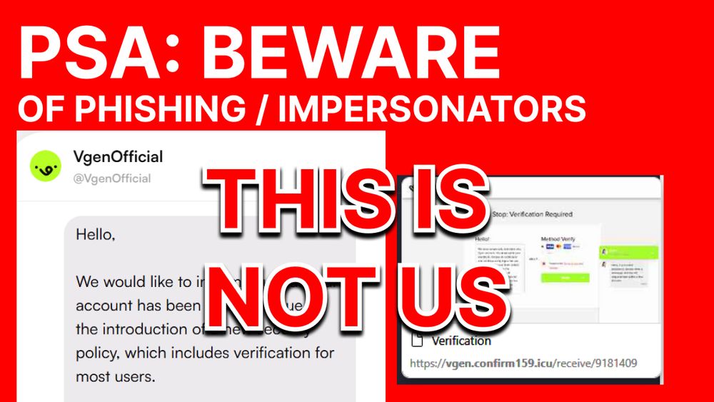
⚠️ PLEASE STAY SAFE ⚠️
We've been notified of accounts claiming to be VGen staff through DMs on-site. THEY ARE NOT US. Please report them if you encounter any of these.
02.07.2025 21:35 —
👍 2182
🔁 1674
💬 12
📌 33