Just heading back from a visit to City St George's, University of London where I gave a talk on embedded urban data vis, and had great chats with @gicentre.bsky.social researchers and the new Diverse CDT cohort. What a wonderful inspiring crowd! Thanks @narges-mahyar.bsky.social @jsndyks.bsky.social
06.02.2026 12:45 —
👍 0
🔁 0
💬 0
📌 0

Photo of students and staff from our first Diverse CDT cohort working through a group data visualization exercise together around a table in our dedicated visualization lab.

Photo of three students from our first cohort of Diverse-CDT PhD students reading and discussing visual thinking in our dedicated visualization workspace.

Sketch of a 'skills map' design co-created by Diverse-CDT PhD students during their first 'immersion week' at the start of their PhD journey. Sketch courtesy of Ana Marques, one of the students. It comprise a series of coloured dots, each representing a skill held by one or more of the students. Dots are clustered by skill type with some labelled for context. Dots are connected with lines in a tree-like structure with 'Diverse CDT' at the centre emphasising relationship between skills and skill types.

A photo of our first cohort of Diverse CDT PhD students who embarked on their PhD journey together in October 2025. Students are located in our dedicated Visualization learning space, posing for the camera with arms folded.
Interested in a fully-funded #datavis PhD with training?
Applications for our 2nd cohort of PhD students at Diverse-CDT open! We're keen to diversify the sector, encouraging anyone with enthusiasm for using 📊 to make change, even if you've not considered PhD study before:
diverse-cdt.ac.uk
18.12.2025 10:15 —
👍 13
🔁 12
💬 0
📌 0
Thank you for those kind words! Really excited to refine those ideas and extend the design space.
10.11.2025 11:28 —
👍 0
🔁 0
💬 0
📌 0

#IEEEVIS @tnagel.bsky.social WOW!
Thoughtful, creative (practical) design experiments with thoughtful creative (theoretical) explanation experiments that bounce off one another as ideas and experience progress.
Love this kind of paper. Inspiring.
06.11.2025 09:20 —
👍 5
🔁 3
💬 1
📌 0

Looking forward to a new edition of our #sfbtrr161 lecture series! Next Monday, @tnagel.bsky.social will kick off the series with a lecture on "Embedded #Visualization of Urban Data: Concepts, Contexts and Perspectives" at @unistuttgart.bsky.social. More info: www.sfbtrr161.de/events_sfbtrr161/
15.10.2025 09:31 —
👍 3
🔁 1
💬 0
📌 0

Book Review: Making with Data - Data Soapbox
If you’ve been around Ye Olde Blog for a while, you may have seen me geek out about data art. So, when I heard about Making with Data (MWD), I had to check it out.* MWD features more than 25 physical ...
What's a data object, and why are they innovative as hell?! Check out today's blog post! datasoapbox.com/book-review-... Edited by @cybunk.bsky.social @tnagel.bsky.social Lora Oehlberg & Wesley Willett, featuring projects by @dietoff.bsky.social @flowingdata.com @kimsauve.bsky.social & many others!
08.10.2025 14:46 —
👍 5
🔁 3
💬 2
📌 0
Thanks for the lovely review! You raise an important point at the end; one we have been reflecting on as well and are planning to discuss in a future paper.
08.10.2025 15:50 —
👍 2
🔁 0
💬 0
📌 0
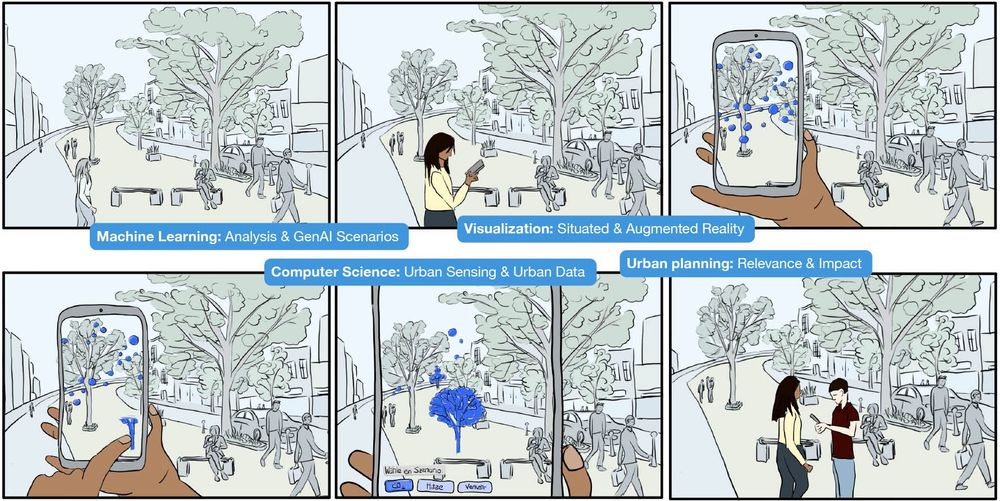
Storyboard of an example scenario in our research project: Sophie checks the air quality in front of her house in real-time using her smartphone. With a quick gesture, she suggests sustainable measures and discusses their potential impacts with her neighbor Ben.
New project: Crafting Futures aims to combine embedded visualizations and generative AI to make climate change impacts and other current and future urban phenomena visible. www.hdilab.org/projects/cra...
08.05.2025 16:17 —
👍 3
🔁 0
💬 0
📌 0
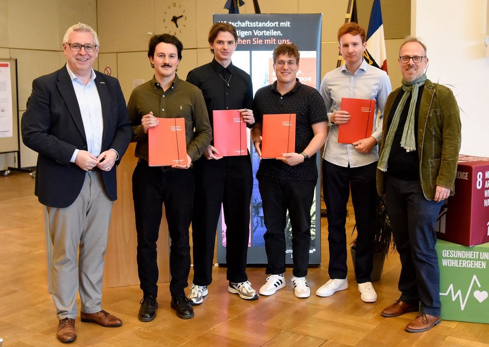
Students Romeo Türemis, Manuel Wirth, Fabian Hoppe, and Julian Wernz (from left to right; with team member Lisa Balsen not pictured) celebrate their Sustainability Prize at the award ceremony, joined by Economic Mayor Thorsten Rhiele, and Education Mayor Dirk Grunert. (Photo: Stadt Mannheim / Thomas Tröster).
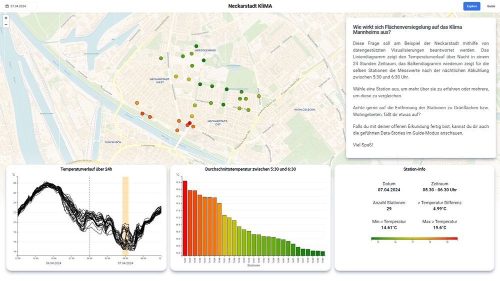
Screenshot of the visualization system showing a map with sensor locations color coded by temperature for the selected time, a line chart and a sorted bar chart. At the bottom, a component shows some KPIs for detailed information.
So cool! Student project wins sustainability prize of the City of Mannheim for their visualization of urban heat islands and cooling effects of urban greenery. www.hdilab.org/news/2025/05...
08.05.2025 16:08 —
👍 3
🔁 0
💬 0
📌 0
Lining up! Would go well with the letterpress version I got years ago from @johnresig.com
19.12.2024 17:18 —
👍 1
🔁 0
💬 1
📌 0
So cool! Having you two as instructors … dream class alert ☺️
12.12.2024 14:53 —
👍 1
🔁 0
💬 1
📌 0
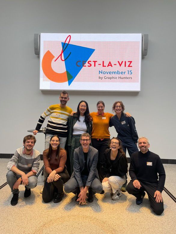
Photo of the Cest-la-Viz speakers and organizers. (By Chesca Kirkland)
Gave a talk at the incredible #cestlaviz conference in Utrecht last Friday! Shared our work on urban data visualizations. Huge thanks to @graphichunters.bsky.social for the organization! Was an honor to share the stage with so many talented and insightful speakers!
18.11.2024 21:22 —
👍 12
🔁 0
💬 2
📌 0
*were
Where can I edit posts?! 😅
17.11.2024 18:34 —
👍 0
🔁 0
💬 0
📌 0
Yes, they are. You can create them under your profile. Starter packs are what lists where on Twitter. Lists seem to be for moderation / blocking people.
17.11.2024 18:13 —
👍 1
🔁 0
💬 1
📌 0
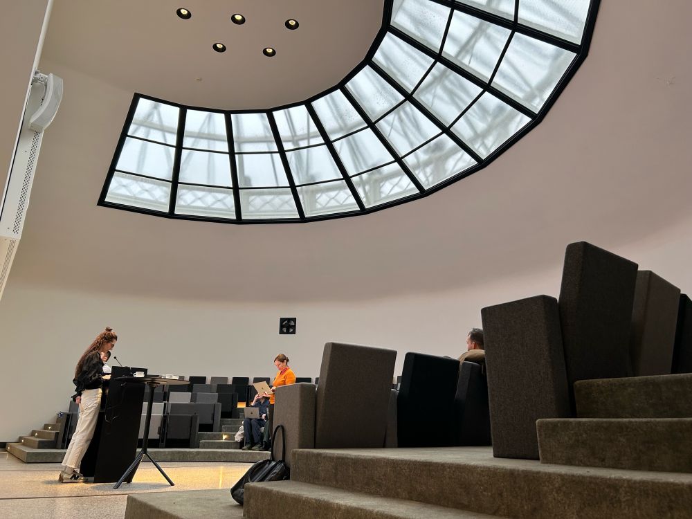
Photo of the former anatomical theatre with speakers testing their slides.
Photo of the former cutting room with tables prepared for an activity.
Setting up for the #cestlaviz conference in the amazing anatomical theatre in Utrecht.
15.11.2024 09:10 —
👍 9
🔁 0
💬 0
📌 0
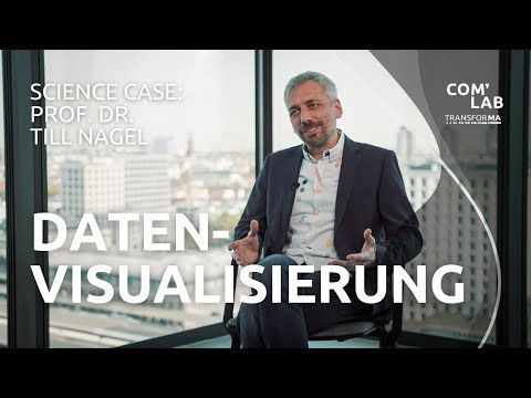
YouTube video by TRANSFORMA COM'LAB SciencePod
Science Case: Prof. Dr. Till Nagel - Über Datenvisualisierung
Über Datenvisualisierung: In diesem Interview gebe ich einen Einblick in unsere Arbeit am Human Data Interaction Lab und stelle kurz einige Projekte vor, in denen wir komplexe Daten verständlich machen und neue Perspektiven auf urbane Themen ermöglichen. youtu.be/3qt24EVc8dQ
12.11.2024 22:11 —
👍 5
🔁 1
💬 0
📌 0
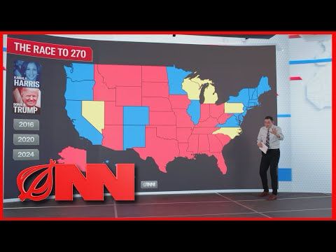
YouTube video by The Onion
Election Touchscreen Map Takes Deeper Look Inside Key Swing Voter | Onion News Network
Overview first, zoom and filter, then details-on-demand. youtu.be/9qI0LTmSr38
05.11.2024 18:12 —
👍 1
🔁 0
💬 1
📌 0
Reminder for the next dataviz conference in Europe. 📊
cest-la-viz.nl
November 15, 2024
Utrecht, Netherlands
€179
Three of the speakers are on Bluesky
@hellopeiying.bsky.social
@gotdairyya.bsky.social
@tnagel.bsky.social
29.10.2024 12:04 —
👍 14
🔁 3
💬 1
📌 0
Teaser (fast forward) video for EuroVis 2024 conference. See publication at https://diglib.eg.org/items/fc058e21-331d-45bf-b00b-35c58487e1af
Embedded temporal data visualizations in an urban environment for casual exploration
Excited to share our design concept for embedding temporal data visualizations into urban streets at EuroVis conference 2024. youtu.be/fDBIM9pJd7U
23.05.2024 08:07 —
👍 1
🔁 0
💬 0
📌 0
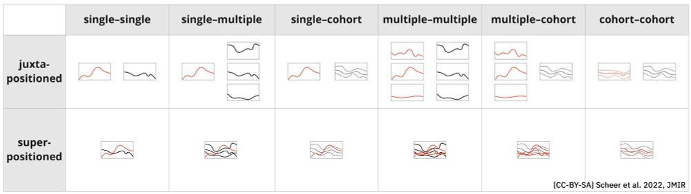
All possible combinations for comparing 1 measurement over time between different patient entities (single patient, multiple patients, and cohorts) in the case of line charts. For single and multiple patients, each line represents 1 measurement, whereas, for cohorts, the chart represents the mean and range. All combinations are shown in juxtapositioned and superpositioned layouts, with the colors supporting legibility in the latter.
Comparing temporal patient data with other patients and cohorts in the case of line charts. #fromthearchives
timevisforcomparingpatientsandcohorts.github.io
24.02.2024 12:57 —
👍 2
🔁 0
💬 0
📌 0
www.youtube.com/watch?v=ZblO...
21.02.2024 17:54 —
👍 1
🔁 0
💬 0
📌 0
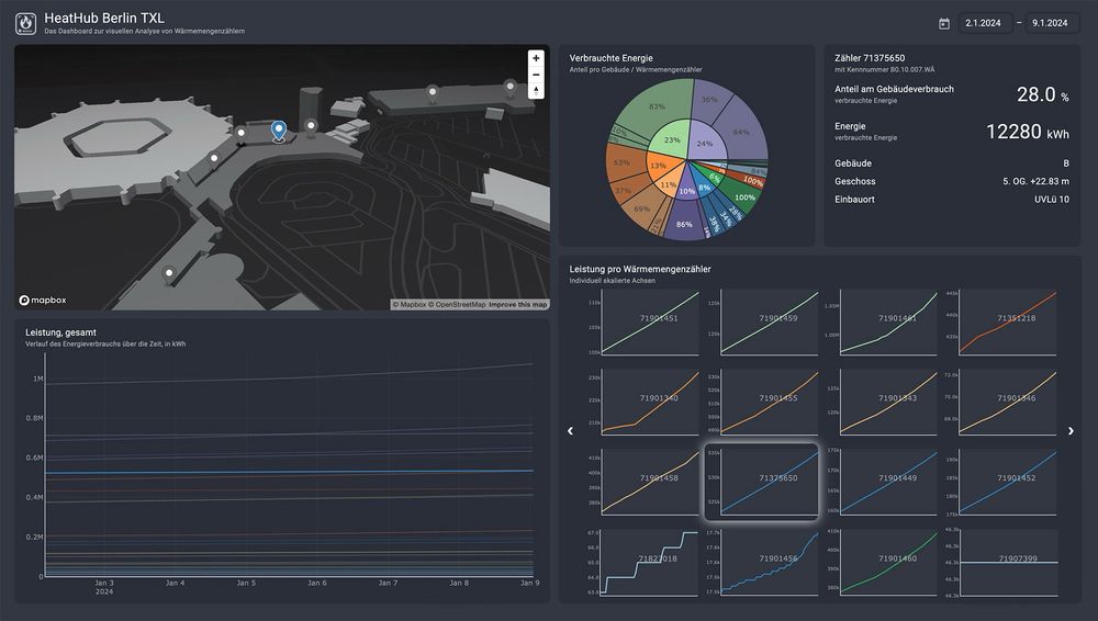
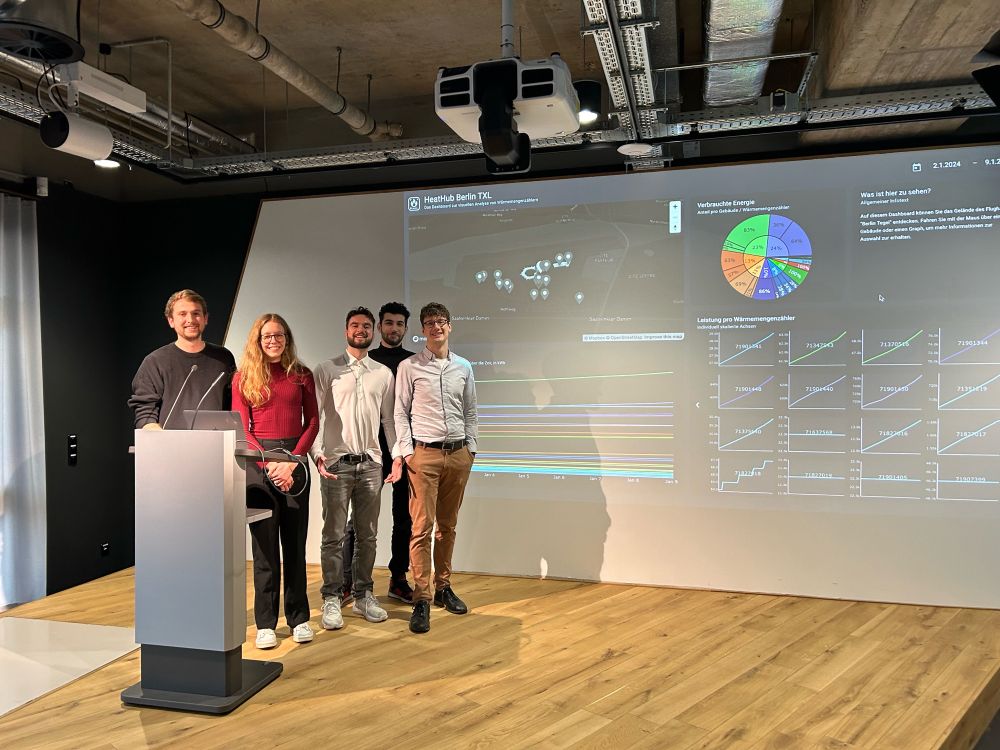
Dashboard with an interactive 3D map of buildings and heat meter locations, a sunburst chart showing proportional energy use, and small multiple line charts to show the energy consumption over time.
HeatHub is a visualization system to show spatial, hierarchical and temporal dimensions of heat meter data for the Berlin TXL. Developed by students of the Mannheim University of Applied Sciences in cooperation with the Urban Tech Republic, Berlin TXL. www.hdilab.org/projects/hea...
21.02.2024 17:53 —
👍 1
🔁 0
💬 1
📌 0
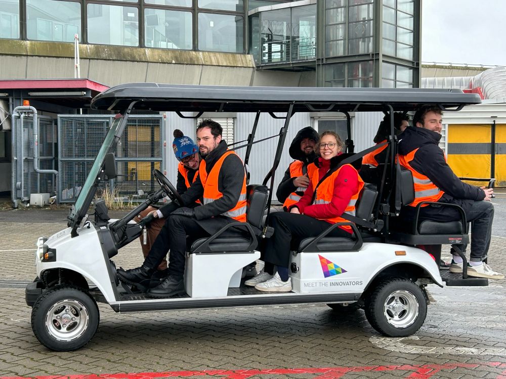
Students in high-visibility vests exploring the facilities on an airport cart.
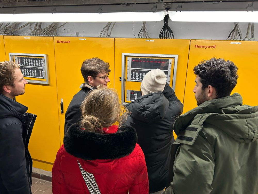
Students marveling at a heating system in the cellar of Berlin TXL.
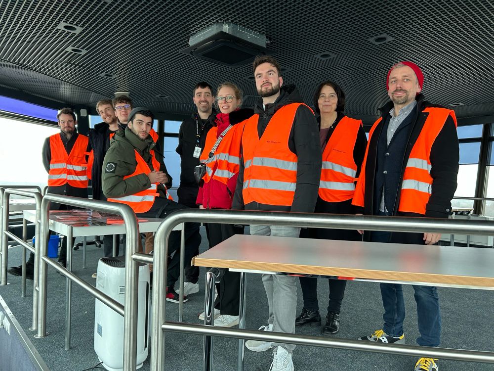
Students, partners and myself in high-visibility vests gathered inside the decommissioned control tower of Berlin TXL.
Not only did we have the pleasure to present and discuss the prototype but visit the former airport facilities. That was awesome!
08.02.2024 13:54 —
👍 1
🔁 0
💬 0
📌 0
Student team on stage at Urban Tech Republic's exhibition center with their visualization on screen behind them.
This week, students showcased their heat meter analysis dashboard at Urban Tech Republic, Berlin. After weeks of workshops and visualization design, the talented team impressed with their data-driven prototype. More info soon.
08.02.2024 13:51 —
👍 2
🔁 0
💬 1
📌 0
Hi there! 👋
22.12.2023 09:59 —
👍 6
🔁 0
💬 2
📌 0