Typography News No. 19
YouTube video by Jectives
Chapters have been added to yesterdays livestream 👀
Featured in this episode: Affinity, Universal Thirst, DualType, @frerejones.bsky.social, DJR, @dstype.bsky.social, Fontwerk, Fabio Haag, TypeMates, St Bride Library, and @remedy667isdead.bsky.social #typography #fontfeed
06.10.2025 15:31 —
👍 2
🔁 2
💬 0
📌 0


New Work: GRADINE, a typeface that combines serenity and foolishness. Because it's on the Next Fonts section, it can be yours for half the price of the future official release. www.dstype.com/next-fonts/g...
06.08.2025 19:50 —
👍 3
🔁 0
💬 0
📌 0
This is AI proofing that AI cannot redesign itself, they need a couple of human to do so. Maybe the worst mkt ever for AI.
08.02.2025 14:26 —
👍 1
🔁 0
💬 0
📌 0
I'm not sure if I disagree but I think that what stoped scripts (other than Latin), races, genders and everything you mentioned, wasn't the type industry, but the fact that people couldn't find in type a reliable source of income.
26.01.2025 17:17 —
👍 0
🔁 0
💬 0
📌 0
Honest question: What do you mean by inclusive?
26.01.2025 11:17 —
👍 1
🔁 0
💬 1
📌 0
Já faltou mais para o famoso "Sempre que ouço falar em cultura, pego no meu revólver"
11.12.2024 16:56 —
👍 1
🔁 0
💬 0
📌 0
Somente um pouco de ironia. Por oposição à CN a CS fica sempre nos antípodas aos olhos ocidentais, quando a verdade é bem mais complexa do que parece. Este acto é demonstrativo da facilidade que se caracterizam certos países.
03.12.2024 21:45 —
👍 1
🔁 0
💬 0
📌 0
Coreia do Norte, certo?
03.12.2024 20:54 —
👍 1
🔁 0
💬 1
📌 0
In the 90’s when I was a graphic designer one of my favorite pairings was FF Meta and Matrix Script.
28.11.2024 08:17 —
👍 4
🔁 0
💬 0
📌 0
Nice for a Brand named Kitten.
19.11.2024 18:07 —
👍 1
🔁 0
💬 0
📌 0
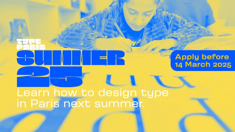
TypeParis Summer 25 is an intensive type design programme in English in Paris
Our summer programme is in English and covers typeface design and calligraphy techniques, type history, and software practices. Every kind of design professional can learn about type design in a relat...
typeparis.com/summer25
Core team: @jf.porchez.com, Mathieu Réguer, Marc Rouault, Rainer Erich Scheichelbauer, Georg Seifert, Gina Serret, Julie Soudanne, Malou Verlomme.
International type critics: @retypefoundry.bsky.social, Cecilia del Castillo, Diana Ovezea, Albert-Jan Pool.
#typeparis25
2-2
18.11.2024 16:39 —
👍 5
🔁 2
💬 0
📌 0
The point position, stroke width, x-height when the values are like 191, 483, or similar. If it doesn’t end with 5 or 0, it always look wrong.
18.11.2024 13:33 —
👍 0
🔁 0
💬 0
📌 0
Typefaces indeed smell different, yet those three smell exactly the same: Mold.
17.11.2024 21:31 —
👍 0
🔁 0
💬 1
📌 0
Definitely the version with vertical cut in the tail. It makes much more sense in Inter.
17.11.2024 21:28 —
👍 1
🔁 0
💬 0
📌 0

Commodore 64
17.11.2024 17:07 —
👍 0
🔁 0
💬 0
📌 0
@jf.porchez.com suggested me to register here early in the morning. I did and already find this place much more breathable than X.
17.11.2024 10:49 —
👍 2
🔁 0
💬 0
📌 0
Ladislas Mandel?
17.11.2024 09:19 —
👍 3
🔁 0
💬 0
📌 0