

I actually just published a blog post manifesto on this. Read it. Share it. And if you decide to start designing what's hard to do in Figma... holler 😎
www.learnui.design/blog/hard-i...
I actually just published a blog post manifesto on this. Read it. Share it. And if you decide to start designing what's hard to do in Figma... holler 😎
www.learnui.design/blog/hard-i...
Look, design trends are a sort of supply-and-demand thing.
What our tools make easy, you see a LOT of, and it gets boring 🥱
What our tools make hard, you see LESS of, and it can ✨ shine ✨
So, if you want your designs to stand out... DO WHAT'S HARD IN FIGMA.
Do what's hard to do in Figma.
"Like what?", you ask.
I don't care, ANYTHING that static vector editors suck at.
WebGL! custom photography! 3-D animations! isometric illustrations!
"How do I make this design look more interesting?"
"How do I make my portfolio stand out?"
"How should I use AI in my design workflow?"
I've got the same answer for each of these 😎
explainers.blog/posts/why-i...
09.02.2026 20:53 — 👍 0 🔁 0 💬 0 📌 0
I just launched a blog. (Those are still cool in 2026, right?)
It's currently on the front page of Hacker News (!)
First post, "Why is the sky blue?"
I wanted (a) an excuse to practice explaining complex things simply, and (b) to try out some new design techniques. Success!

🔥 Design tip: when trying out a new font, explore ALL the properties to try and find gold. There’s a lot more than normal and bold. Sometimes extrabold italic is 👌
Make sure to search:
🏋️ Very light or heavy weights
✨ Italics
🔠 Uppercase
⭐ Special characters -–—!?&*·←→«»


OK, it's crazy how 4 different AI site generators come up with such SIMILAR results.
Prompt includes NOTHING on specific copy, colors, images, or layouts.
What does this tell you?
So suppose I have ~70 hours of video lessons of me teaching design.
Where do I upload them so my students can chat with an LLM-powered version of my advice? Maybe even structure it to do design reviews?
Have you made a "meh" landing page with AI (Lovable, v0, etc) and want feedback?
Comment with the link or DM me. I'll shoot over some* feedback to everyone who responds 🤙
*Exact amount depends on response volume. Offer not valid in the state of Tennessee.

Looks like "Log in" has *positive* letter-spacing, which is probably a holdover from an older design where it was uppercase.
☝️ In general, don't add positive letter-spacing to sentence-case text.

Evernote is now using Figtree as a brand font, and they're doing a great job with it. Some typography tips:
✅ Negative letter-spacing in the header gives a crisper, tighter feel
✅ Use of non-standard weights to give a little extra emphasis (top nav uses medium weight text)
What else you got saved? 😎
13.01.2026 18:47 — 👍 1 🔁 0 💬 0 📌 0
unsplash.com/@britishlib...
unsplash.com/@birmingham...
unsplash.com/@libraryofc...
www.rawpixel.com/category/53...
images.nasa.gov/


Is AI "stealing with one step added"?
It doesn't seem like that to me 🤷♂️
But there's something undeniably nice about using human-produced assets for design work.
Here are some of my fav links for (free-to-use) paintings, illustrations, and renders...

I also wrote WAY too much about why mesh gradients are so broadly useful 😅 It's the hidden logic of design – enjoy.
www.learnui.design/blog/mesh-g...

I scratched my own itch and created a tool for making mesh gradients. May it inspire your own vibe-coded design tools 🫡
learnui.design/tools/mesh-...


Most underrated design trend of 2025… mesh gradients
(OK, technically this started earlier, but it felt like it really picked up last year)
You can adapt them for SO many brands and use-cases. It's shocking to me we don't see these lil' guys EVERYWHERE.


🏆 Most ridiculous design trend of 2025... 🥁
XL FOOTERS
It's true. We've gone all these years without any real love given to footers. But just including your logo at size one-billion? 🧐🧐🧐 There's no *there* there. My prediction is this will fade just as quickly as it rose.

What other visual styles are vibes-based, not requiring geometric exactitude, and therefore AI would punch above its weight? 🤔
07.01.2026 14:57 — 👍 0 🔁 0 💬 0 📌 0
My guess is Intercom didn't commission an oil painting. Instead, they used AI to replicate the style.
Why the trend now? B/c it's suddenly dirt cheap!
If we could've commissioned 10¢ oil paintings in 2015, we probably would've seen a whole lot more of them! 🤷♂️

My initial hunch is this trend is because of a specific medium, namely AI-generated images 🧐
AI is...
✅ GOOD at vibes-based visuals
❌ BAD at geometric exactitude
And painting – especially thickly laid-on, impressionist-style painting – is very "vibey". It's about the MOOD.


One of the most interesting design trends of 2025 (though ongoing) is OIL PAINTINGS AS A BACKGROUND.
I can't deny it. It looks 🔥🔥
But if we understand *why* it looks great, we can riff and figure out something more original.


Enrollment for my design courses closes at midnight tonight.
Lots of folks saying it's the best career investment they've ever made.
AMA 🫡
Props to James Cook for using common ingredients uncommonly well 🤩
hellojames.co.uk/writing/bet...
📏 XL SIZE: at size 84, this headline is massive. We see details in Georgia that aren't as familiar. It's a whole new font!
👌 NEGATIVE LETTER SPACING: fonts are designed for body text sizing. For headlines, subtract letter-spacing for a tighter, crisper feel.
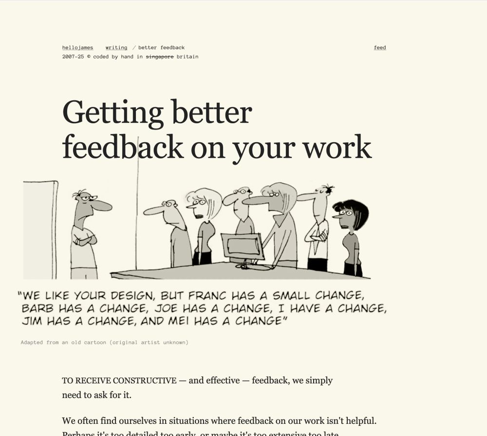
Georgia is a default web font, it's on a billion pages... but here it looks FRESH 🔥
Why? 2 reasons...
Showing a bunch of intermediate deliverables in your portfolio writeups?
Plz don't 🙈
Instead, focus on RESULTS.
If you can achieve the results, it's *understood* you know how to do the process. If you CAN'T achieve the results, it DOESN'T MATTER if you can do "the process".
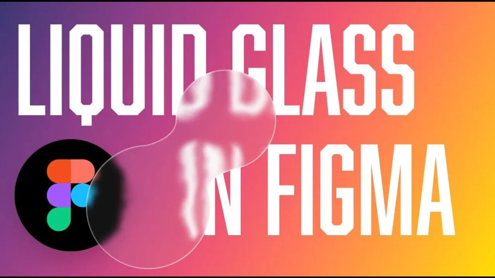
And here's the short video version where I break down Liquid Glass in Figma step-by-step 😎
youtu.be/uJthLkf8X1A
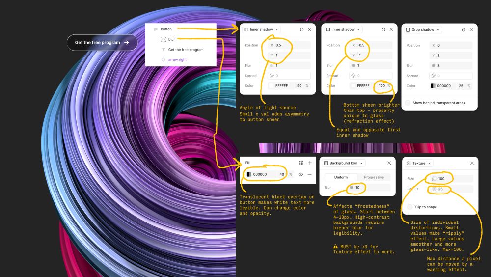
Here's a property-by-property visual breakdown of Liquid Glass in Figma, along with WHAT each property changes.
12.06.2025 20:23 — 👍 0 🔁 0 💬 1 📌 0