
Looks really slick! What plotting library are you using for the line-plots? I haven't seen any plots in R 'draw' the lines like that!
28.02.2026 03:03 — 👍 1 🔁 0 💬 1 📌 0Looks really slick! What plotting library are you using for the line-plots? I haven't seen any plots in R 'draw' the lines like that!
28.02.2026 03:03 — 👍 1 🔁 0 💬 1 📌 0
New feature in the Positron Notebook Editor: Inline data-explorer view. Whenever you print a pandas or polars dataframe you get an inline interactive view powered by Positron's data explorer. This allows you to view and sort massive dataframes.
25.02.2026 13:58 — 👍 27 🔁 6 💬 1 📌 1Thanks for sharing - I appreciate the benefits you write about (e.g. searching across multiple projects). It still feels weird that, as far as I know, I'd have to change the working directory at the outset of each new R session to whichever project I'm working on.
25.02.2026 03:39 — 👍 1 🔁 0 💬 1 📌 0
Positron users - do you set up multiple (all?) projects in a single workspace or open up each project into its own workspace. I'm thinking the latter is more common but I'm curious to know if others use the multiple-projects-in-one-workspace approach.
#positron #rstats
Working on Shiny apps for the passed few weeks, boy am I glad the browser() function exists. It makes it so much easier to walk through reactives as they're being evaluated. Check it out if you've ever felt stuck working on a massive Shiny app!
#rstats #rshiny
If you're deep-learning-curious, come read the free online book Deep Learning with Python with us at the @dslc.io
bsky.app/profile/josh...

I'm new to the world of neural networks and am 8 years late to this video, but this video really helped me build intuition for what happens under the hood. Thanks @3blue1brown.com!
youtu.be/aircAruvnKk
#rstats #pydata #machinelearning #deeplearning

dplyr 1.2.0 is out now and we are SO excited!
- `filter_out()` for dropping rows
- `recode_values()`, `replace_values()`, and `replace_when()` that join `case_when()` as a complete family of recoding/replacing tools
These are huge quality of life wins for #rstats!
tidyverse.org/blog/2026/02...

Come learn about deep learning with us! The Data Science Learning Community just started reading the free third edition of Deep Learning with Python. Meetings are Tuesday at 3 pm CST.
DSLC: dslc.io
Book: deeplearningwithpython.io
#rstats #pydata
Glad you think it's cool! I'm happy to share!
I referenced the sentiment analysis chapter of 'Text Mining with R' (www.tidytextmining.com/sentiment.ht...) while writing the analysis.
My (somewhat slapdash) code is available on GitHub:
github.com/joshpersi/ti...

For this week's #tidytuesday I looked at the sentiment of classic Christmas novels and found the most 'joyous' ones on the basis of a sentiment analysis. If you want extra joy next holiday season, Angel Unaware may be a good read!
#dataviz #rstats #ggplot2
Thanks for pointing that out! I'm still learning all the terms but I believe you're right. Whenever I wrote 'reference table' it would have been more correct to write 'dimension table'.
29.12.2025 16:48 — 👍 0 🔁 0 💬 0 📌 0
If you want to learn about DuckDB too, come join our 'DuckDB in Action' book club at the Data Science Learning Community (it's free and we're friendly!)
dslc.io
Hey folks! I built a Canadian trade database to practice what I'm learning about DuckDB. The database includes all Canadian imports and exports from 1988 to present as per Statistics Canada. Here's a blog post I wrote with more details:
joshpersi.github.io/blog/posts/0...
#rstats #duckdb

I'm taking my very first crack at OJS for this week's #tidytuesday! It's a super basic plot but getting going with OJS was a challenge, so I'm calling it a win!
#DataViz #RStats #ggplot2

A choropleth map of US states, coloured by the number of roundabouts per state. The state with the most roundabouts if Florida.
Who knew Florida had so many roundabouts? For this week's #tidytuesday I struggled to match each interval's colour intensity with the midpoint of the interval. I couldn't figure it out in code and ended up pulling from coolors.co/gradient-pal...
#DataViz #RStats #ggplot2 #tidytuesday
I took this week's #TidyTuesday as an opportunity to try and brush up on modelling and learn tidymodels.org. I have no great modelling insights to share, but in making this graph, I did learn you can set line-ends to be round in geom_line(). Who knew?!
#DataViz #RStats #ggplot2

testthat hex
testthat 3.3.0 is here! Major updates for #RStats testing include failure messages for easier debugging, 6 new specific expectations, and the SlowReporter to find your bottlenecks.
Heads Up: R 4.1+ is now required, and old mocking functions are removed.
Read the post: tidyverse.org/blog/2025/11...

The Data Science Learning Community is starting a new book club cohort for DuckDB in Action this Wednesday. Come read and learn with us! All are welcome!
DSLC: dslc.io
DuckDB in Action: motherduck.com/duckdb-book-...
#RStats #python #DataScience #OpenSource
Thank you!
23.11.2025 03:00 — 👍 1 🔁 0 💬 0 📌 0
A very long time in the making but I'm eager to share I've made a Quarto blog to talk about all the data science stuff I'm learning! First post is about adding data source and author attributions in ggplot2! Feel free to stop by!
joshpersi.github.io/blog
#RStats #Quarto #DataScience #OpenSource
Thanks Libby! You were actually one of the reasons I finally got the gumption to join in!
A few Data Science Hangouts back you said something along the lines of 'you don't need to wait to be an expert to start working in the open' and it really clicked with me!

A line-chart showing the number of deaths to tuberculosis on the y-axis and year, from 2000 to 2023, on the x-axis, with each line being a separate country. Most countries have had low tuberculosis mortality throughout this timespan, but two countries in particular, India and South Africa, have seen significant declines.
This is my first time joining in on the #TidyTuesday fun. Looking forward to seeing what everyone else is doing with this week's data!
#DataViz #RStats #ggplot2

A map of Canada showing rivers as lines
10 minutes is all we were allowed for day 13 of the #30DayMapChallenge. This took me about 15 minutes, so I'm a little over, but this was a fun way to work under a time constraint and avoid endless tweaking!
#DataViz #RStats #ggplot2
Thank you! I was able to find it and will keep it mind for the future!
Here's the link: www.metrolinx.com/en/about-us/...

Day 11 is all about minimalism so I made a map with four lines! Perhaps too minimal, but I also couldn't find geographic data on the stations themselves, so maybe it was meant to be 🤷
#30DayMapChallenge #DataViz #RStats #ggplot2
Happy to! My code is here:
github.com/joshpersi/30...
Data is pulled from the Climate Data Store: cds.climate.copernicus.eu/user-guide

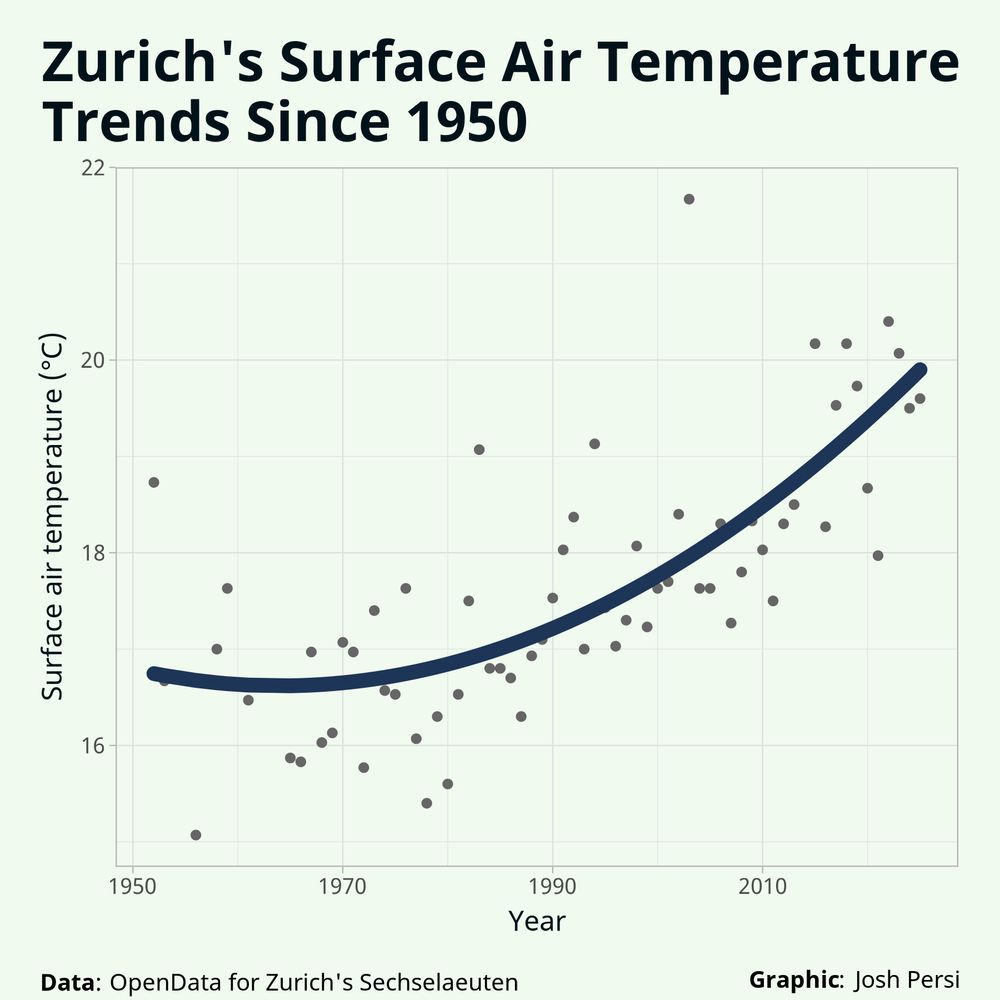
It's day 10 of the #30DayMapChallenge and the prompt is 'air', so I plotted global air temperature!
#DataViz #RStats #ggplot2

Day 8 of the #30DayMapChallenge and I'm plotting a road network of Montréal!
#DataViz #RStats #ggplot2
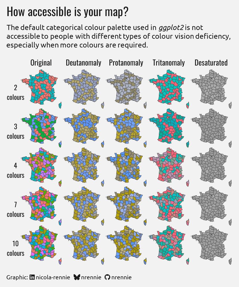
A 5x5 grid of maps of France. Each row contains areas shaded with a different number of colours, and each column shows how it looks with different types of colour vision deficiency. None are accessible, except when using only two colours.
For the "accessibility" prompt on day 7 of the #30DayMapChallenge, I decided to investigate how accessible the default #ggplot2 colours are to people with different types of colour vision deficiency (and for different numbers of colours used). 🎨
#RStats #DataViz