The image shows a control room with several monitors displaying weather data and various graphics. At the top, digital clocks indicate different time zones: 09:26 Eastern, 14:26 UTC, and 06:26 Pacific. Below the clocks are three large monitors. The left monitor presents a black and white weather map with swirling patterns. The middle monitor shows a time-series data graph with multicolored lines. The right monitor features a color-coded weather map with a focus on a coastal region. Below the large monitors, two smaller screens display more detailed geographical maps and text. The ambient lighting reveals horizontal blinds partially covering large windows, with a silhouette of a person working at a desk in the foreground.
Learn about the dedicated team at Public Environmental Data Partners who are preserving crucial data sets, like the EPA’s EJ Screen:
e360.yale.edu/featur...
2/2
15.04.2025 15:30 — 👍 2 🔁 1 💬 0 📌 0
The image shows a control room with several monitors displaying weather data and various graphics. At the top, digital clocks indicate different time zones: 09:26 Eastern, 14:26 UTC, and 06:26 Pacific. Below the clocks are three large monitors. The left monitor presents a black and white weather map with swirling patterns. The middle monitor shows a time-series data graph with multicolored lines. The right monitor features a color-coded weather map with a focus on a coastal region. Below the large monitors, two smaller screens display more detailed geographical maps and text. The ambient lighting reveals horizontal blinds partially covering large windows, with a silhouette of a person working at a desk in the foreground.
At #GreenlinkOrg, we have a strong passion for the power of #Data.
We see the importance of numbers and analysis for accurate, clean, and more efficient energy planning.
e360.yale.edu/featur...
1/2
15.04.2025 15:30 — 👍 4 🔁 1 💬 1 📌 0

The image features a dark teal background with three concentric circles in varying shades of orange and yellow, positioned on the top right and bottom left corners. In the top left, yellow text reads, "Over 24,000 Lives Impacted." Centered within the top right circles is a light blue icon of a hand above a family, symbolizing protection. On the middle right side, the text states "Through Data-Driven Policies" in yellow. In the bottom left corner, there is a logo for Greenlink Analytics, featuring a white icon and text.
Keep an eye on our pages!
We’ve got some exciting projects wrapping up that we can’t wait to share with you!
🌟 From cleaner routes along coastlines to our impactful work on #Health in #KansasCity, there's a lot to look forward to!
#StayTuned for updates and behind-the-scenes glimpses.
14.04.2025 15:00 — 👍 3 🔁 2 💬 0 📌 0

The image is divided into two main sections. On the left, there is a woman with dark hair staring intently at a retro television setup. The television is stacked on another device, and its screen displays the text "Change Channel." Behind her, a man is blurred in the background. On the right side, the image contains a dark teal background with white and orange lettering and graphics. It outlines achievements by Greenlink since 2016, highlighting "9 Billion Metric Tons of CO2" reduction, "$1 Trillion" in savings, and "Over 24K Lives Saved." Each accomplishment is accompanied by an icon: a cloud for CO2, a stack of money for savings, and figures under an umbrella for lives saved. The bottom left corner has Greenlink's logo, website, and social media handles.
The image is divided into two sections. The left part contains text on a solid teal background. It highlights three key achievements of Greenlink, with each statement in a bold and colorful font. "Enabled 200+" is in large yellow text, "Helped 1.7M" in coral orange, and "Donated $1M" in yellow, each accompanied by descriptive text. The right section shows a person standing in profile inside a dimly lit room with displays on the wall, suggesting a museum or exhibition setting. The person is wearing a light-colored shirt and has a backpack. At the bottom, Greenlink’s logo and contact information are displayed in white text.
Giving is receiving. Every dollar you #Donate helps create a safer, cleaner, and healthier world.
Please consider donating today:
www.greenlinkanalyti...
10.04.2025 15:00 — 👍 3 🔁 2 💬 0 📌 0

The image depicts a floating island with a cross-sectional view. The top half displays an industrial and ecological scene: three wind turbines and solar panels stand on a grassy area above a blue body of water, where a ship and an offshore oil rig are present. To the left, a red excavator emits white smoke, and to the right, two figures hold signs and a camera, possibly protesting or documenting. The lower half of the island reveals several layers of soil and rock containing colorful gemstones in yellow, blue, purple, and green. The entire island is shown against a black background with a few white, fluffy clouds.
Find out where they’re coming from.
Read more here:
grist.org/energy/cri...
@gristnews.bsky.social
2/2
09.04.2025 15:00 — 👍 2 🔁 2 💬 0 📌 0
The image depicts a floating island with a cross-sectional view. The top half displays an industrial and ecological scene: three wind turbines and solar panels stand on a grassy area above a blue body of water, where a ship and an offshore oil rig are present. To the left, a red excavator emits white smoke, and to the right, two figures hold signs and a camera, possibly protesting or documenting. The lower half of the island reveals several layers of soil and rock containing colorful gemstones in yellow, blue, purple, and green. The entire island is shown against a black background with a few white, fluffy clouds.
To combat #ClimateChange, we’ll need a lot of metal 🎸 🤘.
No, not the music kind, but the ones buried underground like #Lithium, #Cobalt, and #Nickel!
These metals create renewable energy components—from #EV #Batteries to #SolarPanels and #Turbine #Magnets.
@gristnews.bsky.social
1/2
09.04.2025 15:00 — 👍 2 🔁 2 💬 1 📌 0

The image features three computer monitors displaying maps and graphs, positioned side by side on a light blue background. Above each monitor is a speech bubble connected with curved lines. The left bubble, in dark teal, asks, “Where are asthma rates highest?” The center bubble, in olive green, inquires, “Who pays the most on electricity and gas bills?” The right bubble, in orange, queries, “Which are the warmest neighborhoods in the city?” In between the monitors, the text “gem has the answers” is placed. At the bottom right corner is a dark teal circle with "gem" inside it, accompanied by the text "greenlink equity map" and the website "www.equitymap.org" beneath it.
#Policy makers at the federal & state level have started incorporating #EnergyBurden into #Equity goals & program evaluations, aiming to get burdens below 6% for lower income households in the US.
Our #GEM maps show this data at the neighborhood level:
www.equitymap.org/
08.04.2025 15:00 — 👍 3 🔁 2 💬 0 📌 0

The image depicts a map of Georgia, showing energy burden percentages by county. Different shades of orange and brown represent varying levels of energy burden, as indicated by a legend on the right. Darker shades signify higher burdens. Atlanta and its surrounding area are highlighted in dark brown, indicating an energy burden of 10% or more. Other cities such as Augusta, Macon, Columbus, and Savannah are labeled but have lighter shading. To the right of the map, a section of South Carolina is visible. The map is titled 'Greenlink Equity Map', focusing on areas with significant energy demands relative to income.
🔍 Our #GEM #Maps aren’t just tools for steering fair #CleanEnergy #Policy—they’re also making an appearance in the news! 🌍
Check out this Columbus Ledger-Enquirer story on #Georgia's energy policy and the #GeorgiaPublicServiceCommission, the group that regulates it.
www.ledger-enquirer....
07.04.2025 15:00 — 👍 2 🔁 2 💬 0 📌 0

The image is a cover page of a report titled "2024 Annual Impact Report" by Greenlink Analytics, Inc. The background features two wind turbines standing against a vibrant orange sunset sky with scattered clouds, creating silhouettes on the horizon. Below the sky, a dark silhouette of hills and a field is visible. The design includes rounded geometric lines overlaid on the lower half of the image for a modern touch. The color gradient transitions from a bright orange near the horizon to a deeper blue at the top.
Our 2024 Annual Impact Report is now available!
Check out our achievements, insights, and impact we’ve made over the past year.
And yes, that cover is mighty pretty!
31.03.2025 17:00 — 👍 2 🔁 2 💬 0 📌 0
The image is a cover page of a report titled "2024 Annual Impact Report" by Greenlink Analytics, Inc. The background features two wind turbines standing against a vibrant orange sunset sky with scattered clouds, creating silhouettes on the horizon. Below the sky, a dark silhouette of hills and a field is visible. The design includes rounded geometric lines overlaid on the lower half of the image for a modern touch. The color gradient transitions from a bright orange near the horizon to a deeper blue at the top.
Check out the full report to explore our main achievements, financial performance, and gaze ahead at 2025:
www.greenlinkanalyti...
2/2
26.03.2025 17:00 — 👍 2 🔁 1 💬 0 📌 0
The image is a cover page of a report titled "2024 Annual Impact Report" by Greenlink Analytics, Inc. The background features two wind turbines standing against a vibrant orange sunset sky with scattered clouds, creating silhouettes on the horizon. Below the sky, a dark silhouette of hills and a field is visible. The design includes rounded geometric lines overlaid on the lower half of the image for a modern touch. The color gradient transitions from a bright orange near the horizon to a deeper blue at the top.
Exciting News! Our 2024 Annual Impact #Report is LIVE!
We’re thrilled to share some of the year’s milestones, including our energy repair job training program in Clarkston, #Georgia, and our support for 24 states as they work toward meeting their Paris Climate goals.
www.greenlinkanalyti...
1/2
26.03.2025 17:00 — 👍 3 🔁 1 💬 1 📌 0

A flyer announcing a survey for Atlanta renters in Castleberry Hill, West End, Mechanicsville, and Pittsburgh neighborhoods. The survey examines how electricity and gas bills impact renters' ability to pay rent. Contact information and a link to a qualification form are provided.
We're looking to hear from #Renters about their experiences with #Energy #Costs and how it impacts their housing situation.
Share your story with us and help us advocate for better solutions.
Click the link to participate!
cutt.ly/Greenlink-Re...
#RentersRights
#EnergyBills
#AtlantaRenters
2/2
21.03.2025 15:00 — 👍 1 🔁 0 💬 0 📌 0
A flyer announcing a survey for Atlanta renters in Castleberry Hill, West End, Mechanicsville, and Pittsburgh neighborhoods. The survey examines how electricity and gas bills impact renters' ability to pay rent. Contact information and a link to a qualification form are provided.
Attention #Atlanta renters in #Mechanicsville, #CastleberryHill, #WestEnd, and #Pittsburgh (#NPUs: M, T, & V)!
We know that high #EnergyBills can make it tough to stay in your homes.
cutt.ly/Greenlink-Re...
1/2
21.03.2025 15:00 — 👍 0 🔁 0 💬 1 📌 0

The image is a combination of a bar chart and a pie chart depicting the U.S. planned utility-scale electric-generating capacity additions for 2025 in gigawatts (GW). The bar chart on the left shows monthly capacity additions from January to December, with varying contributions from different energy sources. The bars are color-coded: solar (gold), battery storage (dark blue), wind (green), and natural gas (light blue). Solar energy dominantly contributes in several months, particularly noticeable in January and December.
The pie chart on the right represents the total planned additions for 2025. It shows solar leading with 52% (32.5 GW), followed by battery storage at 29% (18.2 GW), wind at 12% (7.7 GW), natural gas at 7% (4.4 GW), and a negligible "all other" category at 0% (0.2 GW). Each segment is distinctly colored, matching the bar chart scheme.
💡 Fun fact! This year, new large #Solar and #Battery plants will account for more than 81% of new #PowerGeneration added to the #ElectricGrid, according to a new EIA report.
💬 Share one of your favorite energy facts with us in the comments!
www.eia.gov/todayine...
20.03.2025 17:01 — 👍 1 🔁 0 💬 0 📌 0
The image depicts a picturesque landscape at sunset, dominated by an orange sky with scattered clouds and silhouettes of two large wind turbines positioned against the horizon. In the foreground, there is a field of lush green vegetation that stretches towards the base of dark, rolling hills in the background. The sky transitions from a dark blue at the top to a vibrant orange near the horizon, emphasizing the serene yet dynamic mood. Superimposed on the scene is white text that reads "greenlink 2024 Annual Impact Report," along with a subtle geometric design of transparent rounded rectangles framing the image.

The image is divided into two sections. On the left, a young woman stands with folded arms, gazing at a vintage television set. The setup includes two retro televisions stacked on top of each other, both displaying the words "Change Channel" on their screens. The background shows a man engaged in another activity. The right side of the image presents a teal-colored infographic from Greenlink, containing bold yellow and white text alongside icons. The infographic highlights three major achievements since 2016: "9 Billion Metric Tons of CO2" identified for reduction, "$1 Trillion" in potential savings from clean energy recommendations, and "Over 24K Lives Saved" due to reduced pollution. Decorative icons and concise phrases complement each statistic.

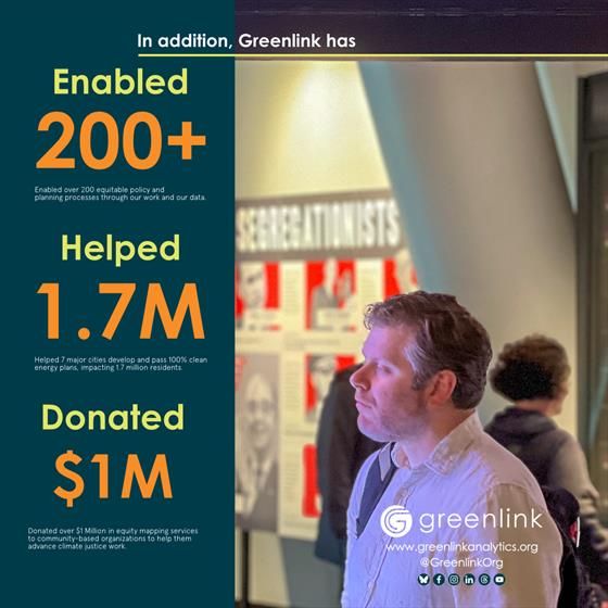
The image is divided into two sections. On the left, a dark teal background displays text in bold, bright colors. The top portion reads "In addition, Greenlink has," followed by three sections highlighting achievements. "Enabled 200+" is in large yellow text with a description below in smaller white text. "Helped 1.7M" is written in orange with another descriptive line underneath. "Donated $1M" appears in yellow, also accompanied by explanatory text. The right side of the image features a person in a white shirt with a backpack, looking at a display in a museum-like setting. The background is blurred but shows informational posters, with partially visible text including "SEGREGATIONISTS."
In this report, you'll find:
A thoughtful message from Greenlink's CEO ✅
Key measures of our impact ✅
An overview of projects and outcomes ✅
Fiscal review ✅
Explore the full report to learn more about our role in shaping a robust future:
www.greenlinkanalyti...
2/2
19.03.2025 17:01 — 👍 2 🔁 1 💬 0 📌 0
The image depicts a picturesque landscape at sunset, dominated by an orange sky with scattered clouds and silhouettes of two large wind turbines positioned against the horizon. In the foreground, there is a field of lush green vegetation that stretches towards the base of dark, rolling hills in the background. The sky transitions from a dark blue at the top to a vibrant orange near the horizon, emphasizing the serene yet dynamic mood. Superimposed on the scene is white text that reads "greenlink 2024 Annual Impact Report," along with a subtle geometric design of transparent rounded rectangles framing the image.
The image is divided into two sections. On the left, a young woman stands with folded arms, gazing at a vintage television set. The setup includes two retro televisions stacked on top of each other, both displaying the words "Change Channel" on their screens. The background shows a man engaged in another activity. The right side of the image presents a teal-colored infographic from Greenlink, containing bold yellow and white text alongside icons. The infographic highlights three major achievements since 2016: "9 Billion Metric Tons of CO2" identified for reduction, "$1 Trillion" in potential savings from clean energy recommendations, and "Over 24K Lives Saved" due to reduced pollution. Decorative icons and concise phrases complement each statistic.
The image is divided into two sections. On the left, a dark teal background displays text in bold, bright colors. The top portion reads "In addition, Greenlink has," followed by three sections highlighting achievements. "Enabled 200+" is in large yellow text with a description below in smaller white text. "Helped 1.7M" is written in orange with another descriptive line underneath. "Donated $1M" appears in yellow, also accompanied by explanatory text. The right side of the image features a person in a white shirt with a backpack, looking at a display in a museum-like setting. The background is blurred but shows informational posters, with partially visible text including "SEGREGATIONISTS."
We're excited to share #GreenlinkOrg's 2024 Annual Impact Report!
This past year, we made significant strides in supporting just, #CleanEnergy policies and plans through our #DataDriven #Insights and #Analytics.
www.greenlinkanalyti...
1/2
19.03.2025 17:00 — 👍 2 🔁 1 💬 1 📌 0
A flyer announcing a survey for Atlanta renters in Castleberry Hill, West End, Mechanicsville, and Pittsburgh neighborhoods. The survey examines how electricity and gas bills impact renters' ability to pay rent. Contact information is provided.
We're looking to hear from #Renters about their experiences with #Energy #Costs and how it impacts their housing situation.
Share your story with us and help us advocate for better solutions.
Click the link to participate!
cutt.ly/Greenlink-Re...
#RentersRights
#EnergyBills
#AtlantaRenters
2/2
19.03.2025 15:00 — 👍 2 🔁 1 💬 0 📌 0
A flyer announcing a survey for Atlanta renters in Castleberry Hill, West End, Mechanicsville, and Pittsburgh neighborhoods. The survey examines how electricity and gas bills impact renters' ability to pay rent. Contact information is provided.
Attention #Atlanta renters in #Mechanicsville, #CastleberryHill, #WestEnd, and #Pittsburgh (#NPUs: M, T, & V)!
We know that high #EnergyBills can make it tough to stay in your homes.
cutt.ly/Greenlink-Re...
1/2
19.03.2025 15:00 — 👍 1 🔁 1 💬 1 📌 0

The image is a color-coded map of the United States with each state shaded according to a grading system. The key is located in the bottom right corner and indicates five categories: A (90-100%), B (70-89%), C (50-69%), D (30-49%), and F (0-29%). Most states are shaded in darker hues representing lower scores, particularly in shades of red and dark orange, indicating grades D and F. One state, shaded in a pale green, represents the A category. A few states have lighter shades, like tans and beiges, which correspond to grades C and B.
Check out the 2025 Community Power Scorecard! Illinois is basically the A+ student, while the Southeast...well, let’s just say it has some catching up to do.
See how your state measures up in the full scorecard!
ilsr.org/articles/20...
18.03.2025 17:00 — 👍 1 🔁 1 💬 1 📌 0

The image features a dark blue background with light yellow curving lines resembling roads or pathways running vertically and horizontally. In the top right is an orange-colored map of the United States and parts of Canada with marked cities. The northeastern and northwestern states are shaded in gray, along with certain areas in Canada. Orange text at the top right states "Join over 100 cities across North America." Below on the left side, more orange text reads "Learn how Greenlink can drive your clean energy transition." In the bottom right corner, the "Greenlink" logo and website "www.greenlinkanalytics.org" are displayed in white.
We’re seeking partners to help ensure a sustainable and just future.
Reach out to our #Partnerships & #Development Executive, Jasmine Bridges:
cutt.ly/work-with-gr...
2/2
17.03.2025 16:00 — 👍 1 🔁 1 💬 0 📌 0
The image features a dark blue background with light yellow curving lines resembling roads or pathways running vertically and horizontally. In the top right is an orange-colored map of the United States and parts of Canada with marked cities. The northeastern and northwestern states are shaded in gray, along with certain areas in Canada. Orange text at the top right states "Join over 100 cities across North America." Below on the left side, more orange text reads "Learn how Greenlink can drive your clean energy transition." In the bottom right corner, the "Greenlink" logo and website "www.greenlinkanalytics.org" are displayed in white.
We’re Looking for More Partners 🌱
At Greenlink Analytics, we know that data-driven insights are essential for forecasting energy trends, costs, and impacts — enabling your organization to make informed decisions for cleaner, leaner energy use.
cutt.ly/work-with-gr...
1/2
17.03.2025 16:00 — 👍 2 🔁 1 💬 1 📌 0
A flyer announcing a survey for Atlanta renters in Castleberry Hill, West End, Mechanicsville, and Pittsburgh neighborhoods. The survey examines how electricity and gas bills impact renters' ability to pay rent. Contact information is provided.
We're looking to hear from #Renters about their experiences with #Energy #Costs and how it impacts their housing situation.
Share your story with us and help us advocate for better solutions.
Click the link to participate!
cutt.ly/Greenlink-Re...
#RentersRights
#EnergyBills
#AtlantaRenters
2/2
17.03.2025 15:01 — 👍 1 🔁 0 💬 0 📌 0
A flyer announcing a survey for Atlanta renters in Castleberry Hill, West End, Mechanicsville, and Pittsburgh neighborhoods. The survey examines how electricity and gas bills impact renters' ability to pay rent. Contact information is provided.
Attention #Atlanta renters in #Mechanicsville, #CastleberryHill, #WestEnd, and #Pittsburgh (#NPUs: M, T, & V)!
We know that high #EnergyBills can make it tough to stay in your homes.
cutt.ly/Greenlink-Re...
1/2
17.03.2025 15:01 — 👍 1 🔁 0 💬 1 📌 0

The image features a professional introduction for a team member named Jasmine Bridges. At the top, the background is dark green, gradually fading to light green towards the bottom. Centered is a circular portrait of Jasmine, framed with a green border. She is smiling and set against a blurred, green outdoor background. To the right of the portrait is text introducing her, with her name in stylish cursive overlaying bolder text listing her role and company. At the bottom, there's an outline of the Atlanta skyline. Also, two overlapping circular designs on the lower right contain images of renewable energy and city scenes, with a hexagonal pattern overlay.
Outside of work, she enjoys salsa dancing 💃, sight-seeing, and mentoring entrepreneurs and engineers to success! www.greenlinkanalyti...
2/2
14.03.2025 16:00 — 👍 1 🔁 1 💬 0 📌 0
The image features a professional introduction for a team member named Jasmine Bridges. At the top, the background is dark green, gradually fading to light green towards the bottom. Centered is a circular portrait of Jasmine, framed with a green border. She is smiling and set against a blurred, green outdoor background. To the right of the portrait is text introducing her, with her name in stylish cursive overlaying bolder text listing her role and company. At the bottom, there's an outline of the Atlanta skyline. Also, two overlapping circular designs on the lower right contain images of renewable energy and city scenes, with a hexagonal pattern overlay.
Employee spotlight: 🌟Today we’re spotlighting Jasmine Bridges, our Partnership & Development Executive! Jasmine connects with our incredible partners, ensuring they receive data-driven info to help them forecast energy trends, plan for the future, and achieve clean energy goals.
1/2
14.03.2025 16:00 — 👍 4 🔁 1 💬 1 📌 0
A flyer announcing a survey for Atlanta renters in Castleberry Hill, West End, Mechanicsville, and Pittsburgh neighborhoods. The survey examines how electricity and gas bills impact renters' ability to pay rent. Contact information is provided.
We're looking to hear from #Renters about their experiences with #Energy #Costs and how it impacts their housing situation.
Share your story with us and help us advocate for better solutions.
Click the link to participate!
cutt.ly/Greenlink-Re...
#RentersRights
#EnergyBills
#AtlantaRenters
2/2
14.03.2025 15:00 — 👍 1 🔁 0 💬 0 📌 0
A flyer announcing a survey for Atlanta renters in Castleberry Hill, West End, Mechanicsville, and Pittsburgh neighborhoods. The survey examines how electricity and gas bills impact renters' ability to pay rent. Contact information is provided.
Attention #Atlanta renters in #Mechanicsville, #CastleberryHill, #WestEnd, and #Pittsburgh (#NPUs: M, T, & V)!
We know that high #EnergyBills can make it tough to stay in your homes.
cutt.ly/Greenlink-Re...
1/2
14.03.2025 15:00 — 👍 1 🔁 0 💬 1 📌 0

The image shows a diverse group of fourteen people standing in front of a colorful mural. The mural features a large, stylized hand with fingers spread wide, emanating rays of vibrant patterns and text. The text includes phrases like "Justice" and "Stop Apartheid Now." The background displays bold colors such as pink, red, blue, and white, with graphic designs and illustrations. The individuals in the group are arranged in a single row, smiling or looking at the camera, dressed in casual attire. The setting appears to be indoors with a wooden floor.
"We stand together to foster diversity, equity, and inclusion, while driving clean energy initiatives for a healthier and cleaner future for EVERYone. We are here to do this important work—and we’re not going anywhere."
13.03.2025 16:00 — 👍 2 🔁 1 💬 0 📌 0

The image is a promotional graphic for a data analysis tool, featuring a central theme and a layout designed to highlight key functionalities. At the top, in large, dark blue text against a light blue background, is the phrase "Find Data That Work for You." Below this, there are four dark blue rounded rectangles with white text inside, each describing different features: "Indicators," "Layering," "Filtering," and "Exporting." These rectangles are strategically positioned around a central image that depicts a tablet displaying maps and data visualizations on its screen. The tablet screen shows a yellow map with a legend beside it, emphasizing the software's capability to manage geographical data. In the bottom left corner, there is a logo with the text "greenlink equity map" and the website "www.equitymap.org." The background consists of subtle, light tan lines creating a grid-like pattern.
Looking for equity data to support your clean energy and environmental justice work? GEM provides comprehensive data on race, income, health, housing, and more to move your projects forward.
We’ve got the insights you need.
www.equitymap.org/ab...
#EquityData #CleanEnergy #EnvironmentalJustice
12.03.2025 16:00 — 👍 3 🔁 2 💬 0 📌 0
A flyer announcing a survey for Atlanta renters in Castleberry Hill, West End, Mechanicsville, and Pittsburgh neighborhoods. The survey examines how electricity and gas bills impact renters' ability to pay rent. Contact information is provided.
We're looking to hear from #Renters about their experiences with #Energy #Costs and how it impacts their housing situation.
Share your story with us and help us advocate for better solutions.
Click the link to participate!
cutt.ly/Greenlink-Re...
#RentersRights
#EnergyBills
#AtlantaRenters
2/2
12.03.2025 15:00 — 👍 1 🔁 0 💬 0 📌 0