at times I wonder if I'm close to home
04.11.2025 12:02 — 👍 6 🔁 1 💬 2 📌 0
@pierinafosati.bsky.social
I mostly post things I find interesting from the first half of the 20th Century. Click on the image to display the meandering content I call alt text.
at times I wonder if I'm close to home
04.11.2025 12:02 — 👍 6 🔁 1 💬 2 📌 0Classical English literature is often dunking on older males, fathers and uncles, writing "useless memoirs" or pious boring tomes about all the things they believe should be right. But look, it's so much better than nothing! I wish my father had written a boring book before dying. I'd read it.
29.10.2025 08:41 — 👍 5 🔁 1 💬 1 📌 0I've been working on a huge research & editing project that is likely to take the better part of 2025 to finish. There's no time for posting pics these days. I'll be back when I'm on the other side of this commitment. Till then, stay fresh.
25.10.2024 21:21 — 👍 6 🔁 0 💬 0 📌 0
This is a black & white photograph of a teenage boy preparing to toss a horseshoe at a target stake during a contest. He stands in a 3 x 6 foot sandy area surrounding the stake known as the pit. His left foot is carefully positioned behind the foul line, making sure his toss will count. Generally played as a team sport, the rules for scoring are surprisingly nuanced. Reminds me of curling. “Champion Horseshoe Pitcher, Merritt Neese of Anderson, Indiana, displays his winning technique at the 1928 State Fair.” Image courtesy of the J.C. Allen and Son Collection, 1926-1952 at the Indiana Historical Society.
The Eden Corn Festival was held this past weekend. Besides food, it featured many rural entertainments, including corn husking, corn hole & horseshoe competitions. My grandpa had a horseshoe court on his lawn. I tried it once as a child. Throwing a horseshoe 40 feet accurately was pretty hard.
08.08.2024 16:54 — 👍 8 🔁 1 💬 0 📌 0
sigh, the image you posted was created as a spoof gif that has fooled thousands of people. Once you've seen the original (from 1904), it seems like a perfectly reasonable extrapolation.
07.08.2024 20:55 — 👍 3 🔁 1 💬 1 📌 0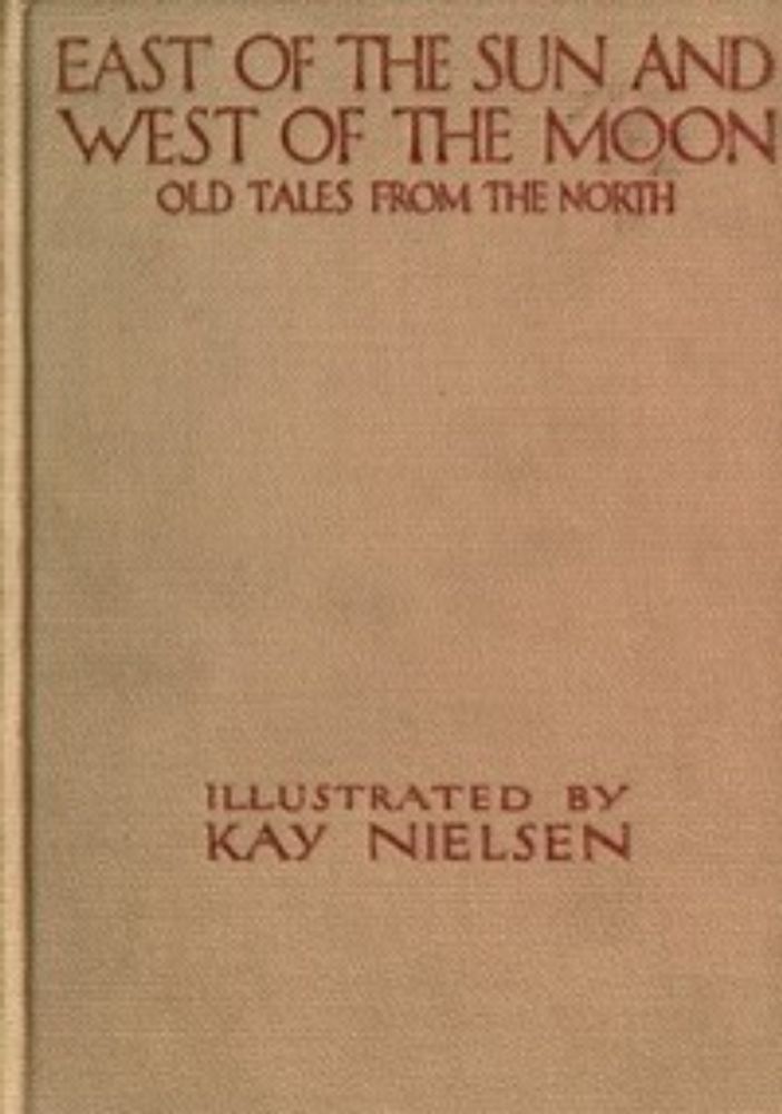
Gutenberg has it in their library. You can read a free copy of “East of the Sun” here: www.gutenberg.org/ebooks/30973
07.08.2024 14:52 — 👍 2 🔁 0 💬 0 📌 0
In this illustration a man and a woman ride a white steed. A small hill rises behind them. The woman is cradled in the man’s lap. Her long gown drags along the ground. The man’s visage is skull-like & he wears a long openwork crown. The steed’s mane & tail are elaborately braided & behind the saddle, he carries a decorative broadsword & elongated shield with a highly stylized face carved in it. “The Lassie and the King riding home,” illustration for the Norwegian fairy tale “The Lassie and her Godmother,” from “East of the Sun and West of the Moon: old tales from the North,” 1914 by Kay Nielsen (Danish, 1886–1957)
In researching Kay Nielsen, I re-discovered this image, which he also created for “East of the Sun.” Before I was married, I used it as a bookplate. You might find one pasted in the front of an ancient tome; my name written in sprawling child-like cursive across the bottom.
07.08.2024 14:51 — 👍 13 🔁 0 💬 0 📌 0
In this illustration, The North Wind (personified as a powerful man with long red hair) holds a power pose while flying over turbulent waves.
“The North Wind goes over the sea,” illustration for “East of the Sun and West of the Moon: old tales from the North,” 1914 by Kay Nielsen (Danish, 1886–1957)
I see so many precursors to contemporary anime in this striking illustration.

This is a black & white photograph. It features a railroad crossing sign that is situated to the left of a dirt road. The sign does not have the flashing red lights & crossing gates that, these days, usually block the roadway as a train approaches. Beyond the crossing is one of the four covered bridges that Northfield Falls, VT is known for. This one crosses the Dog River on the west side of the village. Source: Farm Security Administration - Office of War Information Photograph Collection at the Library of Congress
“Covered bridge. Northfield Falls, Vermont,” September 1937. Photo by Arthur Rothstein (American, 1915–1985.)
Railroad crossing
Look out for the cars
How do you spell it
Without any Rs?
They ARE pretty & stylish, winsome even.
As I've gained experience in the history of advertising, I've become more aware of how these manipulations continue to affect us today. Admittedly, the issue of hair dye triggers me, but I want folks to think about how the "pretty" influences them.
Been feeling spicy lately.
05.08.2024 13:44 — 👍 1 🔁 0 💬 0 📌 0
“Grey Hair Banished in 15 minutes,” 1924 advertisement for Inecto Rapid, Notox hair dye, illustrated by Homer B. Conant (American, 1887–1927) This is a color illustration for Inecto Rapid hair dye. It features a youthful woman dressed in a 1920s-era gown; a fantasy confection of expansive blue silk decorated with sprays of floral embroidery. A wide band across the bottom of the gown’s skirt is embellished with women’s heads that sport the various colors of hair dye available. This advertisement has several lines of text below the illustration. One of the paragraphs reads: “It is specifically guaranteed to impart to gray, streaked or faded hair all its former harmonious beauty of luster, of silken texture and shade. Its use cannot be detected. It is guaranteed permanent; its coloring will withstand any condition or treatment that Nature’s will – brushing, rubbing, shampooing, sunshine, salt water, perspiration, Turkish and Russian baths, permanent waving, marceling and curling.”

“Grey Hair Banished in fifteen minutes,” 1924 advertisement for Inecto Rapid, Notox hair dye, by an unknown illustrator. Continuing with its theme of equating youthful appearance with a plethora of flowers, this advertisement features a smiling woman who flirts with the viewer by playing peek-a-boo with a fluttering feather fan. She is dressed in an elaborate gown with a huge floral patterned skirt. Similar to the previous ad, the text below touts that Inecto Rapid Notox “has been created by science for coloring the sensitive organism of human hair.”
The discourse regarding whether hair dyes are carcinogenic or not, is akin to the path of ciggies & pesticides. Scientists have known about the elevated risks for decades (esp for Black women.) But for 100+ years it’s been 🎵 wash away the grey 🎵
Stop encouraging women to use this shit.
![This is a black & white photograph of a roadside establishment, which touts its “Honest Weights, Square Dealings.” An assortment of fruits, melons & plants are displayed in-and-around an open-air market. Signs posted on the building highlight the variety of fresh fish for sale. A large sign posted above the entrance advertises the services of “F.M. Pointer – The Old Reliable House Mover.”
“Roadside Stand Near Birmingham” 1936 by Walker Evans (American, 1903–1975)
“[Walker Evans’] photographs of roadside architecture, rural churches, small-town barbers, & cemeteries reveal a deep respect for the neglected traditions of the common man and secured his reputation as America’s preeminent documentarian. From their first appearance in magazines & books in the late 1930s, these direct, iconic images entered the public’s collective consciousness & are now deeply embedded in the nation’s shared visual history of the Depression.” – Dept of Photographs, The Metropolitan Museum of Art](https://cdn.bsky.app/img/feed_thumbnail/plain/did:plc:rgv5l75n73ojop5bsqohorrh/bafkreie72ejuhqadksosipbzoegkpopjgq7zn7zjjwxl4nmfq7ygrhhfzu@jpeg)
This is a black & white photograph of a roadside establishment, which touts its “Honest Weights, Square Dealings.” An assortment of fruits, melons & plants are displayed in-and-around an open-air market. Signs posted on the building highlight the variety of fresh fish for sale. A large sign posted above the entrance advertises the services of “F.M. Pointer – The Old Reliable House Mover.” “Roadside Stand Near Birmingham” 1936 by Walker Evans (American, 1903–1975) “[Walker Evans’] photographs of roadside architecture, rural churches, small-town barbers, & cemeteries reveal a deep respect for the neglected traditions of the common man and secured his reputation as America’s preeminent documentarian. From their first appearance in magazines & books in the late 1930s, these direct, iconic images entered the public’s collective consciousness & are now deeply embedded in the nation’s shared visual history of the Depression.” – Dept of Photographs, The Metropolitan Museum of Art
I had occasion to ride thru the Cattaraugus Indian Territory recently. Dear Reader, those small independent trading posts that were once scattered throughout the reservation have grown; now they rival Walmart plazas in size. Not surprising. Perhaps even fitting, I suppose.
04.08.2024 14:44 — 👍 6 🔁 1 💬 0 📌 0
This is a Gordon & Co’s "Gin Rickey" ad from 1917. In it the ingredients needed to make a Gin Rickey have been placed on a table. The recipe in the lower right corner reads: 1 piece of ice in glass Juice of half a lime Drop squeezed lime in glass Dunk Gordon Dry Gin Fill glass with fizz water.

In this Gordon’s Gin print advertisement from the September 6, 1937 issue of Life magazine, we see a Gordon’s Distilled London Dry Gin bottle sitting in the midst of a variety of cocktails, assumedly made using Gordon’s. The motto below the illustration reads: Drinks never taste thin with Gordon’s Gin. This message is supported by additional text to the right, which reads: “Gordon’s Gin has Liqueur Quality and high Proof, 94.4. That means richer flavor – velvety smoothness – drinks that never taste thin. Obey your sense of discrimination – always ask for Gordon’s – you’ll be amazed at the finer, richer, smoother taste of your gin drinks.”
Seeing these Gordon’s Gin ads reminded me of the refreshingly sour summer drink called a Gin Rickey. My first taste was virgin – made with fresh lime, ice & seltzer (no gin, bourbon or rye). I like to add a squirt of unsweetened raspberry syrup.
03.08.2024 14:03 — 👍 7 🔁 0 💬 0 📌 0
This black & white photograph features a young girl kissing a Weimaraner puppy. Photo courtesy of The LIFE Picture Collection/Shutterstock
"Puppy love is evident as Christina Goldsmith, 2½, kisses a young acquaintance. The Weimaraner makes a good household pet and an excellent watchdog." - LIFE magazine, June 12, 1950. Photo by Bernard Hoffman (American, 1913–1979)
02.08.2024 14:30 — 👍 7 🔁 2 💬 0 📌 0
This is an illustration of the head & neck of a beautiful female pilot seen in profile. In the background, two biplanes soar in an orange sky. Neysa McMein was known as much for her beauty, outrageous lifestyle & assorted love affairs as for her art. From 1923 through 1937, McMein created all of the covers for McCall's magazine, as well as countless covers for other national magazines and a multiplicity of product advertisements.
Cover illustration for The Saturday Evening Post, August 11, 1917 by Neysa McMein (American, 1888–1949)
01.08.2024 14:26 — 👍 4 🔁 0 💬 0 📌 0
In this color advertisement a woman has prepared an array of different foods for a picnic lunch. The items sit on the kitchen counter before her, ready to be loaded into a waiting picnic basket. The final step in the food prep is covering a bowl of potato salad with Saran Wrap. “that soft, velvety feel tells you it’s Saran Wrap,” 1953, color print advertisement for Saran Wrap, a product of the Dow Chemical Company. Image courtesy of the Science History Institute’s Dow Chemical Historical Collection.
With the advent of lifestyle branding after WW2, advertisers increasingly associated products with a particular way of life. A middle-class lifestyle of ease & convenience was accessible to all consumers — you just needed to buy the right stuff.
31.07.2024 13:43 — 👍 7 🔁 1 💬 0 📌 0
This is a black & white photograph from 1950 of a Fields department store taken in bright sunshine. The store was built on a corner lot and its minimalist architecture stands in stark contrast to the older buildings that surround it. People cluster in groups here and there along the sidewalk. Inside the store manikins stand on display, mirroring the people outside. "Fields department store, business at 37th Avenue and 82nd Street, Jackson Heights, Queens, New York. Exterior, by day." June 8, 1950. Image digitized from a 5x7 inch acetate negative by Gottscho-Schleisner. https://www.shorpy.com/node/22580

This is a black & white photograph of the same Fields department store we saw in the first picture. It was taken at night from the same spot. The interior of the store is brightly lit and the merchandise on the first floor can be seen scattered throughout the store’s open layout. "Fields department store, business at 37th Avenue and 82nd Street, Jackson Heights, Queens, New York. Exterior, by night." June 8, 1950. Image digitized from a 5x7 inch acetate negative by Gottscho-Schleisner. https://www.shorpy.com/node/22583
It’s like night and day.

This is a black & white photograph of a busy Parisian street taken at night. The viewer looks across a street filled with traffic to the buildings & people beyond. Most of the stores are closed for the night, but a large neon CINE sign fills the center of the image. In the foreground the letters CINE are reflected backwards in a puddle.
Untitled photograph from the series “Paris, 1956-1958” by Johan van der Keuken (Dutch, 1938–2001)
29.07.2024 14:42 — 👍 4 🔁 0 💬 0 📌 0So would I. Alas, all I could find were vague descriptions on the order of "ad for Soir de Paris." Not a whiff of an attribution to be found.
28.07.2024 15:52 — 👍 2 🔁 0 💬 1 📌 0


SIDEBAR:
While I’m not particularly interested in the fragrances they held, I am fascinated by the exquisite juxtaposition of curve vs cut & solidity vs fragility that glassmakers have explored in their designs for perfume bottles.

Soir de Paris is a nostalgic fragrance that is favored by older generations, who recognize its delicate composition of soft florals centered on violets. However, some find the powdery scent unpleasant & overwhelming. These charming advertisements are from the 1950s & 60s. No other information is available.

Soir de Paris (Evening in Paris) is the best-known fragrance manufactured by Bourjois. Created by Ernest Beaux in 1928, it was discontinued in 1969, then reconfigured & relaunched in 1992 by Francois Demachy & Jacques Polge.

Soir de Paris (Evening in Paris) by Bourjois was a popular, inexpensive perfume, sold in most department stores from the 1930s thru the late 1960s. Its charming advertisements were carefully crafted to embody the romanticism of mid-century Paris.
28.07.2024 14:59 — 👍 10 🔁 2 💬 1 📌 0
This is a black & white photograph of a man and woman kissing in the midst of a crowded Paris sidewalk. “Kiss by the Hotel de Ville, Paris” 1950 by Robert Doisneau (French, 1912–1994)
Though the photos in this series were staged, the couple & the emotion is genuine. Per Françoise Bornet, the woman pictured, "He told us we were charming & asked if we could kiss again for the camera. We didn't mind. We were used to kissing. We were doing it all the time then, it was delicious.”
28.07.2024 14:32 — 👍 4 🔁 1 💬 0 📌 0
This is a black & white photograph of a man and woman kissing on a Paris stairway. They are oblivious to the people in motion around them who appear as blurred specters. The photograph illustrates Doisneau’s modest, playful & ironic eye for amusing juxtapositions. “Opera Kiss, Paris” 1950 by Robert Doisneau (French, 1912–1994)
Fav Paris story:
Robert Doisneau revealed that he had seen these lovers kissing, but had not photographed them initially because of his natural reserve. "I would never have dared to photograph people like that. Lovers kissing in the street. Those couples are rarely legitimate."
![“A pioneering photojournalist, Robert Doisneau is known for documenting life in Paris with affection and humor. A series of books based on his images—The Suburbs of Paris, The Children of Paris, and The Magic of Paris, among others—appeared during the early postwar era. In the context of his lengthy project, Doisneau photographed the Eiffel Tower from a myriad of angles. … [H]e often framed the landmark within a humanistic context. Here, he employed an avant–garde perspective but recast the tower as kitsch, portraying an endless production line of trinkets for the Parisian tourist industry.” – Art Institute of Chicago](https://cdn.bsky.app/img/feed_thumbnail/plain/did:plc:rgv5l75n73ojop5bsqohorrh/bafkreigcuhraok5zfpsuvpsbechacsev2wuj4hcb5sl5t6new47hajb7oy@jpeg)
“A pioneering photojournalist, Robert Doisneau is known for documenting life in Paris with affection and humor. A series of books based on his images—The Suburbs of Paris, The Children of Paris, and The Magic of Paris, among others—appeared during the early postwar era. In the context of his lengthy project, Doisneau photographed the Eiffel Tower from a myriad of angles. … [H]e often framed the landmark within a humanistic context. Here, he employed an avant–garde perspective but recast the tower as kitsch, portraying an endless production line of trinkets for the Parisian tourist industry.” – Art Institute of Chicago
“Les Tour Eiffel dans les boules neigeuses” (Eiffel Towers in Snow Globes) 1949 by Robert Doisneau (French, 1912–1994)
27.07.2024 14:19 — 👍 4 🔁 1 💬 0 📌 0
Ilse Bing was fascinated by architectural structures & urban motifs, exploring the symmetry & rhythm inherent in everyday situations. “In her photograph of the Eiffel Tower, she found an ideal subject for more avant-garde expression, emphasizing abstract geometry in a vertiginous composition.” – Art Institute of Chicago “Eiffel Tower, Paris” 1931 by Ilse Bing (German, 1899–1998)

This oil painting depicts the Eiffel Tower and its surrounding gardens from a bird’s eye view. “La Tour Eiffel et Jardin du Champ de Mars,” (Eiffel Tower and Gardens, Champ de Mars) 1922 by Robert Delaunay (French, 1885–1941). Image courtesy of the Hirshhorn Museum and Sculpture Garden, Smithsonian Institution, Washington, DC, The Joseph H. Hirshhorn Bequest, 1981
In the 1920s & 30s, artists viewed the Eiffel Tower as a symbol of modernity. They created works that focused on the abstract forms afforded by its architectural design and novel perspectives related to its location.
27.07.2024 14:09 — 👍 4 🔁 2 💬 0 📌 0![“This poster was created in 1960 for Howard Hughes’ Trans World Airlines promoting their routes to [and from] Los Angeles, California. Illustrated by influential American artist David Klein, this design features a wonderful image of the Eiffel Tower at nighttime in front of a firework spectacular, with the TWA plane flying overhead.
Hughes and TWA collaborated with Klein on many posters during the height of the golden-era of aviation from the 50’s through to the 70’s. These posters have become synonymous with that golden, mid-Century era of design.” – 1stdibs.com](https://cdn.bsky.app/img/feed_thumbnail/plain/did:plc:rgv5l75n73ojop5bsqohorrh/bafkreiaz6z2zhiftkxwb6hkaq67qhhb5mtoltqzbchyaafqzdqzcdi2jum@jpeg)
“This poster was created in 1960 for Howard Hughes’ Trans World Airlines promoting their routes to [and from] Los Angeles, California. Illustrated by influential American artist David Klein, this design features a wonderful image of the Eiffel Tower at nighttime in front of a firework spectacular, with the TWA plane flying overhead. Hughes and TWA collaborated with Klein on many posters during the height of the golden-era of aviation from the 50’s through to the 70’s. These posters have become synonymous with that golden, mid-Century era of design.” – 1stdibs.com
“PARIS, Fly TWA Jets,” 1960 travel poster for Trans World Airlines promoting their flights to Paris by David Klein (American, 1918–2005)
27.07.2024 13:42 — 👍 2 🔁 1 💬 0 📌 0
This is a color photograph overlooking the Cliffside Beach Club on Nantucket Island, which is off the southern coast of Cape Cod in Massachusetts. In the foreground two women sit in low beach chairs sunbathing. Their legs shine in the sun and are probably coated with baby oil, which at the time was thought to assist in tanning. While the photog’s notes refers to them as ‘teenagers,’ to my eye, they seem much older. In the background, rows of colorful beach umbrellas have been lined up in rows for club member’s use. Image digitized from a 35mm Kodachrome negative. https://www.shorpy.com/node/27069
"Nantucket sunbathing. Also Fishing, Lounging, Teenagers." August 1957. Photograph by Toni Frissell (American, 1907–1988) for the “Sports Illustrated” assignment "Nantucket Essay."
26.07.2024 15:50 — 👍 5 🔁 1 💬 0 📌 0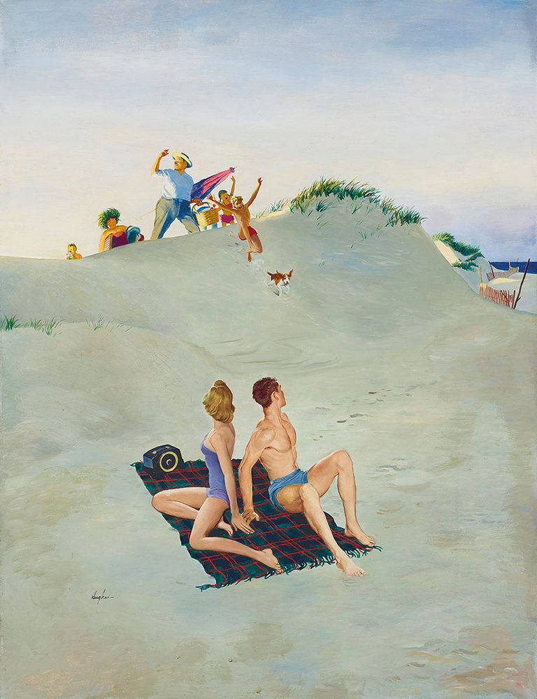
“Between 1948 until 1962, when the Post began to use more photographs on their covers, George Hughes painted 112 covers. Hughes’ work for the Saturday Evening Post became immediately recognizable and very popular due to his ability to capture typical America with humorous family situations in brilliant colors and accurate settings. A perfect example of that humor is this scene of young summer lover's quiet day on the beach being abruptly interrupted by the arrival of a raucous family coming over the dunes.” – AmericanIllustration.org
“First Day at the Beach,” cover for “The Saturday Evening Post,” August 11, 1956 by George Hughes (American, 1907–1990)
26.07.2024 15:07 — 👍 5 🔁 1 💬 0 📌 0
50 Years Ago
Released on this day in 1974, The Rolling Stones “It's Only Rock 'n Roll (But I Like It)"
If I could dig down deep in my heart
Feelings would flood on the page
Would it satisfy you? Would it slide on by you?
Would you think the boy's insane?