
Shoutout to Viktor Martvall from Chalmers University of Technology! This poster combines clear visuals with outstanding design; guaranteed to make people stop and read.
11.12.2025 09:05 — 👍 0 🔁 0 💬 0 📌 0
@vyscience.bsky.social
We improve visual communication for researchers worldwide! Online courses & workshops in science graphic design, presentations, and 3D animations for scientists. Visit us at: https://www.visualizeyourscience.com/
Shoutout to Viktor Martvall from Chalmers University of Technology! This poster combines clear visuals with outstanding design; guaranteed to make people stop and read.
11.12.2025 09:05 — 👍 0 🔁 0 💬 0 📌 0


The Animate Your Science Autumn 2025 course is complete! From Blender novices to stunning cover art creators. Cover mock-ups featured: Diego Moreno Morán, Johan Kolvik, Matias Bundgaard-Nielsen, and Tobias Hainer. Congrats to all graduates!
09.12.2025 14:36 — 👍 1 🔁 0 💬 0 📌 0
Myriam Barz has completed her internship with us! ✨
Throughout this autumn, she contributed to upcoming blog posts, joined teaching sessions, and brought great energy to team. Thank you, Myriam, for your hard work.
We wish you all the best in your future endeavours.

Welcome to our poster wall Robert Hansen Jagrelius from Technical University of Denmark! This poster demonstrates best practices in design: an inviting entry point, logical structure, and engaging visuals throughout. Well done, Robert!
04.12.2025 12:59 — 👍 1 🔁 0 💬 0 📌 0
Science is full of complex stories. Did you ever think of drawing them?
In our new blog post series of two, we're exploring sketchnoting as a fun and visual way to communicate science differently.
Read part 1 on our blog now!

We're thrilled to highlight the impressive poster by Diana Lorena Silva Garay from the Norwegian University of Science and Technology. The thoughtful use of colors and visuals demonstrates how design can both engage viewers and effectively communicate complex research.
27.11.2025 09:01 — 👍 2 🔁 0 💬 0 📌 0
We're proud to spotlight Isak Ingerholt from the Swedish University of Agricultural Sciences on our poster wall today! The design uses strong, dynamic shapes that guide the eye, an impressive example of visual storytelling.
Great work Isak!

We're pleased to feature Ida Cecilie Jensen from @au.dk on our poster wall today. This work showcases a compelling blend of photography and vector graphics, brought together with an earth-toned palette and subtle reds and blues. A standout design that leaves a lasting impression!
13.11.2025 14:15 — 👍 2 🔁 1 💬 0 📌 0
The Visualize your Science winter course starts today! That means it's time to choose your illustration software.
In our latest blog post, Liam dives into what... https://www.visualizeyourscience.com/blog/affinity-free?utm_campaign=coschedule&utm_source=bluesky&utm_medium=Visualize%20your%20Science

Infographics meet genetics: Elisenda Rius from Växa shares a stunning poster on predicting methane-linked markers in cows for low-emission breeding. Now featured on our Poster Wall!
30.10.2025 15:05 — 👍 2 🔁 0 💬 0 📌 0
Last chance to sign up for the free webinar on science posters!
You'll learn 10 poster design tips that go beyond the basics, insights you won't find in any textbook or online.
There are only a few seats left, sign up on our website!

Today's poster spotlight goes to Wouter van der Vegt from Vrije Universiteit Amsterdam. With a captivating beetle illustration and a design that commands attention, this poster is bound to inspire great conversations. Great work, Wouter!
23.10.2025 11:22 — 👍 2 🔁 0 💬 0 📌 0
We're excited to highlight the work of Alexander Wärnheim from KTH Royal Institute of Technology. This poster caught our eye with its clean design, vibrant palette, and intuitive visuals. A great addition to our poster wall and an inspiring example for others!
16.10.2025 13:10 — 👍 1 🔁 0 💬 0 📌 0
Want to make better research posters?
On October 30th, join us for a free lunch webinar with Andreas Dahlin, founder of Visualize your Science.
You'll learn 10 poster design tips that go beyond the basics, insights you won't find in any textbook or online.
Seats are limited, sign up on our website!

We're excited to have Viktor Gårdman from the Swedish University of Agricultural Sciences featured on our poster wall today. His work really stands out: a refined color palette, striking visuals, and data that's presented in such a clear, accessible way.
A fantastic poster, well done, Viktor!

Say hello to our newest team member, Liam Strand!
With a PhD in medical science and a passion for health economics and ethics, Liam brings a fresh perspective. His creative edge, shaped by years in the music and video production world, is a perfect fit for our mission.
Welcome, Liam!

Today, we welcome Trung Nguyen from @umeauniversitet.bsky.social to the Poster Wall! This poster has a strong entry point and a clear diagonal flow starting from the Illustration of Mars in the top left corner down to the conclusions in the bottom right.
Excellent work, Trung!


Less is more, especially on posters! When placing text on our posters, we often resort to text boxes. They are, however, very distracting and visually heavy design elements, so here are some tips on what to do with text boxes that clutter your poster.
30.09.2025 13:06 — 👍 1 🔁 1 💬 0 📌 0
Applause to Tiia Nurminen from the University of Jyväskylä for designing this outstanding poster. It's a great example of how to masterfully blend the depth of academic research with light-hearted, engaging illustrations, resulting in a truly remarkable piece.
Excellent work, Tiia!

Feedback Friday submissions are open! Take this opportunity to get FREE design feedback on your scientific posters!
Check out our website for instructions on how to submit your poster.

Today's featured poster is this stunning piece made by David Feldstein Bofill from the University of Copenhagen. The poster has both an eye-catching entry point and color palette and is a given showstopper at any conference. Excellent work, David!
18.09.2025 10:12 — 👍 1 🔁 0 💬 0 📌 0
Today, we feature this poster by Marion Lebrun from the Norwegian University of Science and Technology.
It demonstrates the impact of thoughtful design in research communication: a well-balanced layout, clear structure, and a harmonious use of color.

Feedback Friday is back! Submit your science poster by Sept 22 for free expert advice from our visual comms instructors. Feedback sent via email on May 26. Perfect for conference prep or a design glow-up!
Read more about the event on our website.

We're highlighting the work of Ann-Kathrin Rößling from @uni-freiburg.de on our poster wall today.
The poster's comic-style visuals bring energy and clarity to complex scientific concepts. From the illustrations to the adapted graphs, every element contributes to a cohesive and engaging design.

We're pleased to feature this poster by Aimer Gutierrez-Diaz from the Swedish University of Agricultural Sciences on our poster wall today. The use of the viral palette offers a clear and compelling visual explanation of the research. Well done on a thoughtful and effective poster!
28.08.2025 13:21 — 👍 1 🔁 0 💬 0 📌 0
That's a wrap on Color harmony of the week! Over the past weeks, we explored how different palettes, complementary, triadic, tetradic, and more, can shape scientific visuals and posters.
26.08.2025 10:04 — 👍 1 🔁 0 💬 0 📌 0
We're proud to showcase Elena Bergamasco from the University of Copenhagen on our poster wall today. The poster stands out for its clear visual storytelling, using the seed to guide the viewer through the research. The research group's logo, designed by Elena, adds a personal and creative touch.
21.08.2025 08:29 — 👍 1 🔁 0 💬 0 📌 0
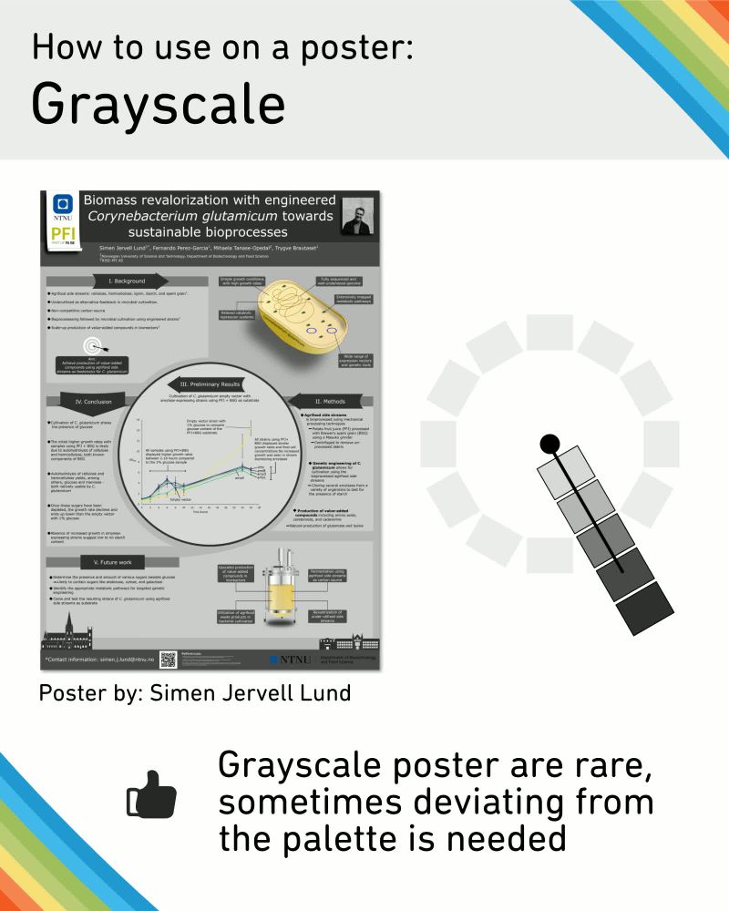
Grayscale = timeless and clean, but it can feel cold. Simen Jervell Lund adds just a touch of color for contrast; smart, subtle, and effective.
19.08.2025 08:19 — 👍 1 🔁 0 💬 0 📌 0
Welcome to the poster wall, Viktor Lidström from KTH Royal Institute of Technology! A great example of using background visuals to support the research theme and create a more engaging poster. Nicely done!
14.08.2025 13:02 — 👍 1 🔁 0 💬 0 📌 0

Monochromatic palettes are clean, but they can fall flat. Oda Braar Waege uses light and dark tones to create contrast and keep things interesting.
12.08.2025 11:10 — 👍 1 🔁 0 💬 0 📌 0