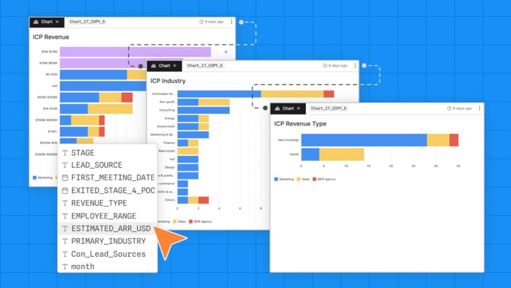
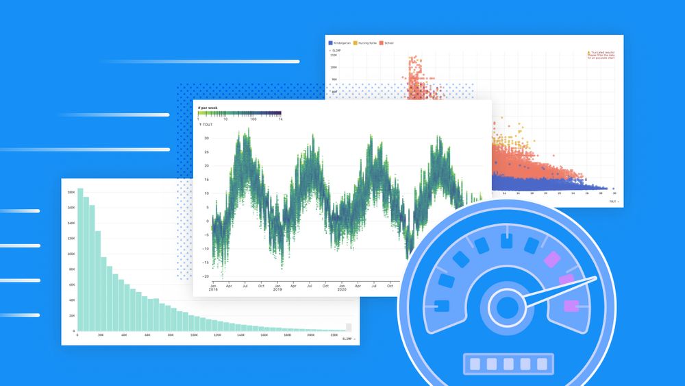
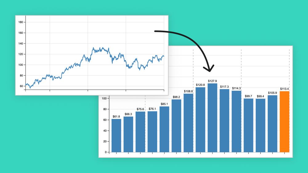
AI can speed up steps in throughout data analysis from initial data profiling to final chart development. For exploratory analysis, use AI to summarize database schemas and contents, automate tedious data wrangling tasks, and draft new charts. Learn more: buff.ly/5DzuzZ7
31.07.2025 20:30 — 👍 1 🔁 0 💬 0 📌 0
Great questions! We aren't ready to commit to public timelines for bringing the notebooks 2.0 capabilities to the web editor, but it's a top priority. We don't have immediate plans to support Linux — good suggestion for the notebook-kit repo. We will continue to support Observable Framework.
31.07.2025 15:02 — 👍 1 🔁 0 💬 1 📌 0
Thanks for the post! We look forward to seeing what else you build with Notebooks 2.0! 🙌
30.07.2025 13:06 — 👍 2 🔁 0 💬 1 📌 0
Observable Notebooks 2.0 Technology Preview | Observable
Notebooks 2.0 is here! 📓🔮 Previewing today:
Notebook Kit, an open file format for notebooks with open-source tooling for generating static sites; and
Observable Desktop, a macOS desktop application for editing notebooks as local files, with a radical new approach to AI. observablehq.com/notebooks/2/
29.07.2025 14:38 — 👍 58 🔁 25 💬 2 📌 4
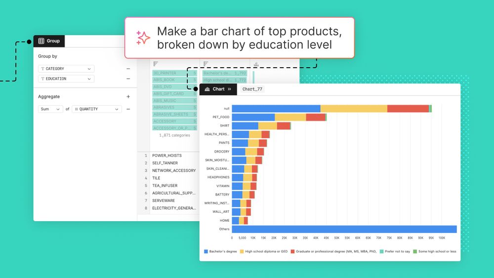
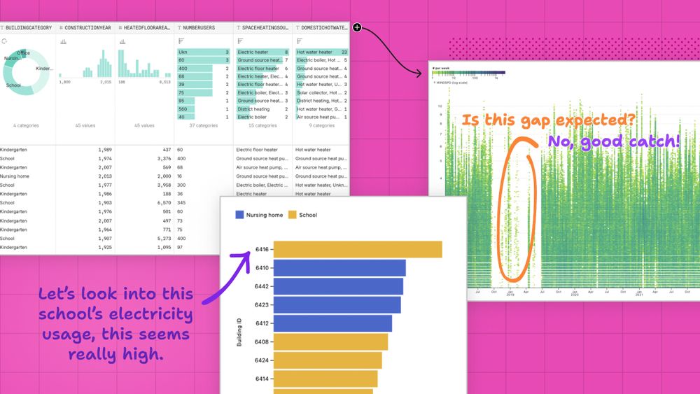
Three ways to use AI for exploratory data analysis
Data teams are rapidly adopting AI tools to boost analysis workflows, from exploration to dashboard development. Learn three ways that AI can improve exploratory data analysis.
In Observable Canvases, AI is transparent and verifiable, so you can confidently use it throughout your data analysis lifecycle. Discover how AI streamlines data exploration by accelerating data profiling, automating data wrangling, and drafting interactive charts:
24.07.2025 16:30 — 👍 1 🔁 0 💬 0 📌 0
AI can fast-track your data analysis, but only if you can trust its outputs. In Observable Canvases, you can see, verify, and interpret AI outputs every step of the way. Learn how our transparent AI gets you from messy tables to trusted insights, faster: buff.ly/B3H8cSG
17.07.2025 18:01 — 👍 0 🔁 0 💬 0 📌 0
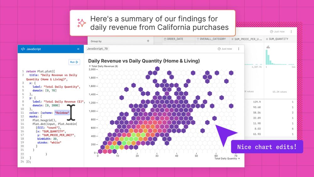
Playing safely with fire: Building interpretable AI
AI in Observable Canvases supercharges your data analysis, while keeping you in the driver’s seat. Learn more in this blog post from our founder and co-CEO Mike Bostock.
AI in Observable Canvases is transparent, so you can boost your data analysis while maintaining confidence in the results. We expose the logic and code at each step for AI outputs that you can immediately verify, and more easily interpret. Learn how we’re doing AI differently:
15.07.2025 17:01 — 👍 4 🔁 0 💬 0 📌 1
Big data, fast data visualizations
In Observable Canvases, charts representing millions of records are generated almost instantaneously. Learn how we keep data visualizations fast by limiting data returned by SQL queries and giving…
Big data usually means slow charts, but not in Observable Canvases. Our optimized queries power fast, interactive visualizations so you can explore more, and wait less, to find insights faster. Learn how we keep charts fast, even with big data: buff.ly/eOSF8Vt
02.07.2025 15:30 — 👍 4 🔁 0 💬 0 📌 0
The hardest part about reusing charts can be getting your data into the expected shape. Learn common data formats consumed by Plot & D3 — and how to transform your data to match — so you can quickly reuse thousands of stunning, interactive visualizations: buff.ly/rJaX6pT
26.06.2025 19:30 — 👍 11 🔁 3 💬 0 📌 1
Big data, fast data visualizations
In Observable Canvases, charts representing millions of records are generated almost instantaneously. Learn how we keep data visualizations fast by limiting data returned by SQL queries and giving…
When working with big data for BI, data visualizations can be painfully slow to load. That stifles exploration and iteration, which means you might be missing out on business insights. In our new post, learn how we keep charts fast in Observable Canvases:
11.06.2025 16:45 — 👍 3 🔁 1 💬 0 📌 0
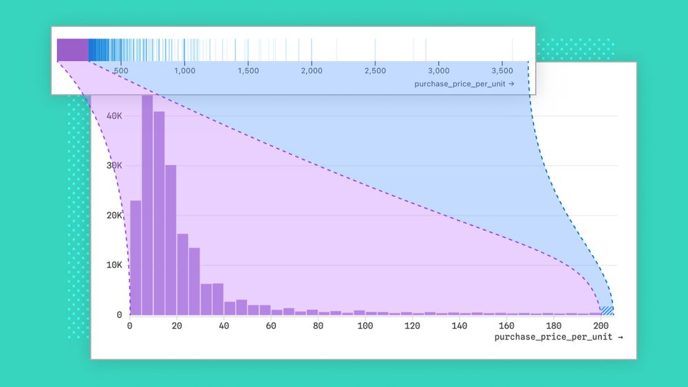
Designing better out-of-the-box histograms
Given how common histograms are in BI tools, you might think they’re easy to design. Think again. We share challenges we encountered, and how we handled them, while designing better out-of-the-box…
Histograms are incredibly useful, interpretable, and common in BI. But building histograms that work well out of the box — no matter the data — is trickier than it sounds. We share some of the challenges faced, and decisions made, when designing histograms for Observable Canvases:
05.06.2025 19:30 — 👍 27 🔁 8 💬 0 📌 1
Data analysts are knee-deep in company data on a day-to-day basis, so they are uniquely positioned to help teammates find, use, and trust analyses that can improve their work. Learn how analysts can contribute to a stronger data culture across their organization: buff.ly/JrTdLNH
27.05.2025 20:30 — 👍 3 🔁 0 💬 0 📌 0

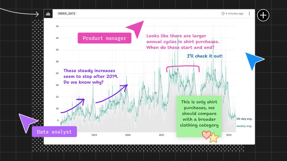
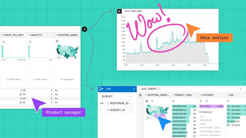
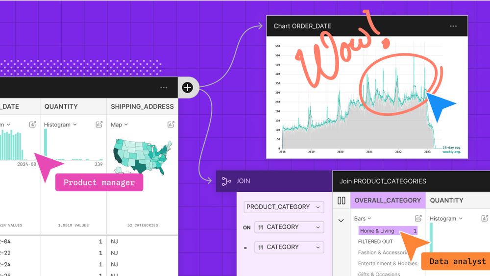
End-to-end visual data analysis improves discovery, accuracy, and collaboration
Visual data analysis helps data teams keep a close eye on their data throughout the entire analysis process. Learn how that expands opportunities for discovery, facilitates collaboration, and helps…
When data visualization is confined to initial exploration and final storytelling, you can miss out on insights, anomalies, and mistakes that get revealed in the messy middle. Learn how end-to-end visual data analysis helps you and your team uncover insights, and errors:
23.05.2025 19:35 — 👍 4 🔁 0 💬 0 📌 0
Designing better out-of-the-box histograms
Given how common histograms are in BI tools, you might think they’re easy to design. Think again. We share challenges we encountered, and how we handled them, while designing better out-of-the-box…
Most BI and data viz tools let you make histograms with a single click or command. So, you might think that designing good default histograms is simple. Turns out, it's harder than it sounds. Learn how we handle common challenges to make better out-of-the-box histograms in canvases:
22.05.2025 20:20 — 👍 8 🔁 2 💬 0 📌 1
Move faster, together, with collaborative analytics
When collaborators are only involved as an afterthought in the data lifecycle, analysts can find themselves mired in unexpected last-minute requests, or overhauling deliverables that didn’t match…
Including collaborators and stakeholders throughout analysis helps to avoid redundant work, crossed wires, and rehashing decisions at the project finish line. Learn how collaborative analytics gets you from raw data to trusted business decisions, faster:
14.05.2025 15:32 — 👍 2 🔁 0 💬 0 📌 0
With end-to-end visual data analysis, you can keep eyes on your data throughout the analysis process. Learn how that helps you discover unexpected value in your data, catch mistakes earlier, and improve cross-functional collaboration: buff.ly/Y4QGVZx
13.05.2025 15:35 — 👍 5 🔁 1 💬 0 📌 0
Collaborative analytics brings data teams and stakeholders into the analysis process from ideation to final product. Discover how that helps you all reach the finish line, faster: buff.ly/v65yvHD
08.05.2025 15:35 — 👍 4 🔁 0 💬 0 📌 0
Join us May 20 at 10 AM PT for a first look at Observable Canvases. Learn how canvases support fast, visual data exploration and analysis, with whiteboarding tools that let data teams and stakeholders all participate in the same place. Sign up today: buff.ly/TjsahdU
06.05.2025 20:30 — 👍 5 🔁 0 💬 0 📌 0
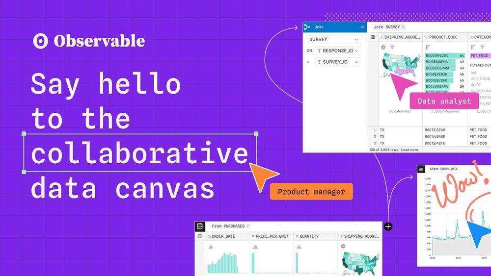
Introducing Observable Canvases
A new way to explore, visualize, and collaborate with data — all in one shared canvas.
In Observable Canvases, data teams can break free from linear workflows to explore data in branched, visual analyses across an infinite canvas. Work seamlessly between code and UI, and collaborate with stakeholders using whiteboarding tools:
01.05.2025 15:54 — 👍 3 🔁 1 💬 0 📌 0
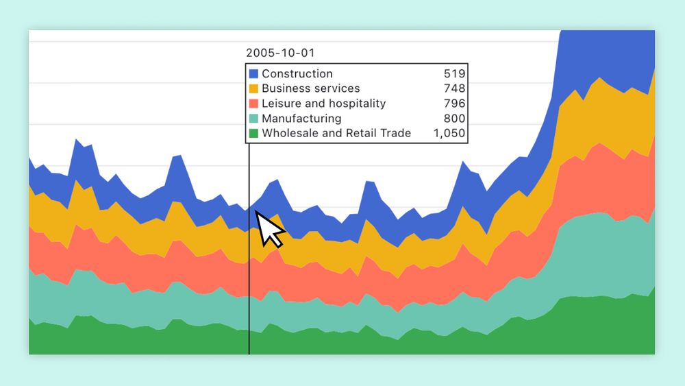
Five techniques to improve chart annotations in data visualizations
Enhance your data visualizations with five advanced chart annotation techniques, including pointer-driven marks, continuous crosshairs, and grouped tips, to boost user engagement and insight.
Ever built a chart only to have people misread it, or miss key insights? Annotations can make all the difference. Here are five ways you can uplevel your chart annotations for improved context, clarity, and interactivity (with reusable examples and code):
29.04.2025 19:39 — 👍 6 🔁 1 💬 0 📌 0
In Observable Canvases you can write queries in SQL, build custom charts in JavaScript, or wrangle and visualize data using UI options. Seamlessly mix methods across the infinite canvas, with the freedom to choose how you work with data at each step. Learn more: observablehq.com
22.04.2025 15:54 — 👍 6 🔁 0 💬 0 📌 0
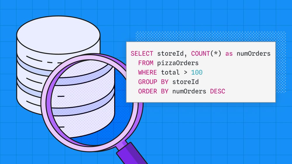
How to query databases for data analysis
A look at the basics of querying databases using SQL, to count values, add up numbers, and compute averages. We also cover filtering data to only consider specific values.
Learn how to answer questions about your data by querying your database in our newest blog post. We walk you through the kinds of queries you can ask of a single table and cover the basics of SQL.
21.04.2025 23:00 — 👍 4 🔁 0 💬 0 📌 0
Introducing Observable Canvases
Observable is the best place for data teams and stakeholders to explore data together, conduct analyses, and create stunning charts and dashboards. Learn how...
Observable Canvases get data teams and stakeholders all in one place, with the context and tools they need to fearlessly explore and analyze data together. Learn how canvases (now in early access) can help teams make faster, better, and more trusted business decisions: buff.ly/F1CCrQn
18.04.2025 15:30 — 👍 6 🔁 1 💬 0 📌 0
Introducing Observable Canvases
A new way to explore, visualize, and collaborate on data — all in one shared canvas.
Say hello to the collaborative data canvas. Observable Canvases give teams a faster, more flexible way to work with data — explore freely, think visually, and uncover better insights, together.
Now in early access:
15.04.2025 15:28 — 👍 29 🔁 4 💬 2 📌 4
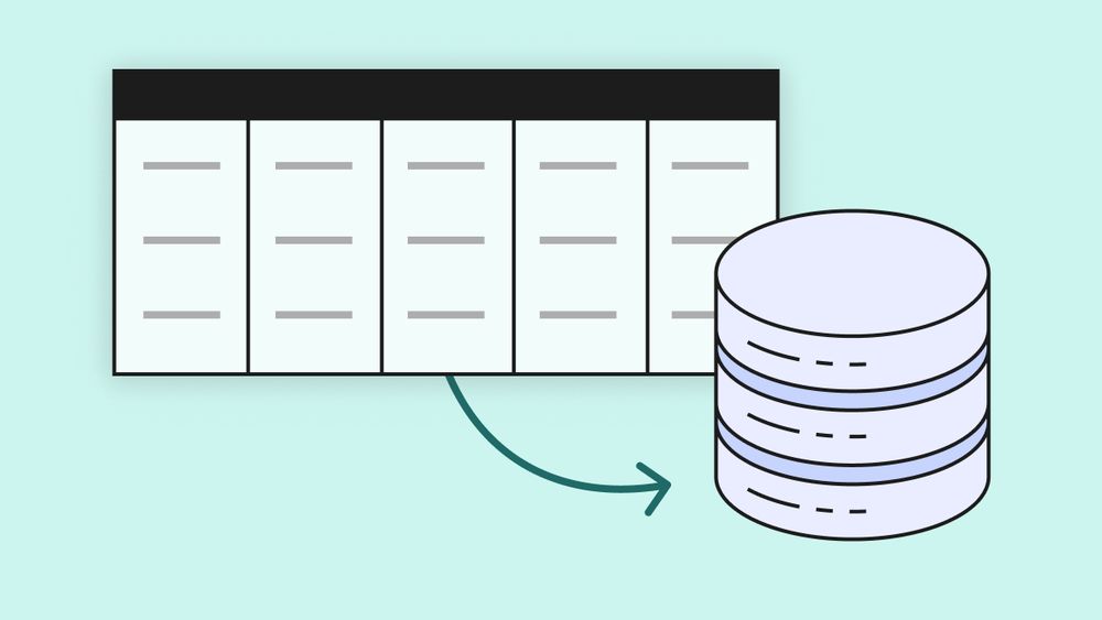
Databases 101 for data analysts
An introduction to database basics for analysts, covering the basics of how they work and why they are structured the way they are.
You know that databases are where most data lives, but do you understand how they work? In this series, we'll walk you through what tables and relations are, how data is organized, how you filter and aggregate, and how joins work. We’re starting with Databases 101:
10.04.2025 21:07 — 👍 8 🔁 1 💬 0 📌 0
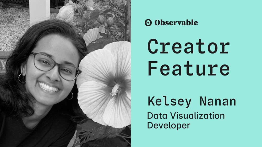
From Urban Science to data storytelling: Inside the work of Kelsey Nanan
Kelsey Nanan transforms complex data into impactful stories through creativity, collaboration, and data driven exploration.
Data visualizations should inspire curiosity, encourage exploration, and leave users excited for more. We spoke with data viz developer Kelsey Nanan to understand her process and guiding principals. Learn more:
09.04.2025 15:54 — 👍 3 🔁 1 💬 0 📌 0
How effective are AI tools for writing D3 code?
An exploration of using Claude to help write basic D3 code for time series data
Large language models (LLMs) and AI tools have proven to be very useful for programming, but how do they do when writing D3 code? In this blog post, we explore Claude's ability to create and modify some basic charts from time series data.
03.04.2025 23:00 — 👍 10 🔁 1 💬 0 📌 0