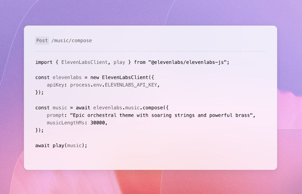
An example of how to use ElevenLabs API to generate music
ElevenLabs introduced AI generated music.
Any genres, styles, with or without vocals, in multiple languages.
Even with the API for that.

@vpon.me.bsky.social
I post about UI/UX, usability, design and development. UI/UX weekly tips 👉 https://l.vpon.me/newsletter-b
An example of how to use ElevenLabs API to generate music
ElevenLabs introduced AI generated music.
Any genres, styles, with or without vocals, in multiple languages.
Even with the API for that.
And then like a folder with pictures sent to the customer?
That's what I've been doing on X, but I feel the lack of "report" style. E.g. a table of issues, critical/moderate/nice-to-fix etc, which are connected to cleanshot or figma pictures.
Looks like a good way indeed.
The only thing is I'm trying to figure out how to categorize or systemize things like critical/nice-to-have, or, say, a11y, responsiveness, etc.
For now I simply put all my thoughts on frames, but there is not feel or complete "report"
I still don't get why SEO is a thing when:
- Many people use ChatGPT
- Others get AI-generated responses in SERP that take up the whole screen
In my opinion, having a personal blog is useful for brand awareness, viral articles, proof of knowledge but not for SEO.
And that's fine, since apps like Chrome, Word, and others has hundreds of options and gosh who needs an icon for each.
So indeed, it might be the fact that bookmark icon is more used but not because it has the same meaning as the floppy drive.
L - Logic :P
haha, yes.
By the way, I've quickly googled menus with the save icon and you know what - it looks like most heavy menus that were in 2000-2010 with al that icons, they simply removed them.
Do you have a set of tools you use for making UI/U Reviews?
1. Something where you put comments on screens (Figma shareable files?)
2. Some kind of a table or a list of issues (prioritized) that needs to be fixed
3. Video?
If anyone has any examples, would love to see them!
🔹And sound - do we mean volume here or what? Because the speaker icon has always been the default. That waveform? More like an audio track or signal indicator.
I get the attempt to modernize, but let’s not pretend these “old” icons are extinct.
They’re still alive and well in the wild.
🔹The save icon - yeah, the floppy is ancient, but it’s still what “save” means in most desktop tools. The other one is clearly bookmark, not save.
🔹The phone icon - is still the clearest symbol for calling or showing a phone number. The smartphone outline? Kinda vague.
🔹The send icon - was that envelope ever really the standard for sending? That’s usually used for messages or marking as read/unread.
🔹The hamburger icon? It’s the go-to for mobile navigation and shows up even on desktops. The three dot icon is more for overflow or dropdowns - not menus.
🔹The filter icon on the left is still very much in use. Sure, the slider version pops up in some contexts, but the funnel is far from outdated.
🔹The share icon on the left is just as common - if not more. The “new” one honestly looks more like an upload button than a share action.
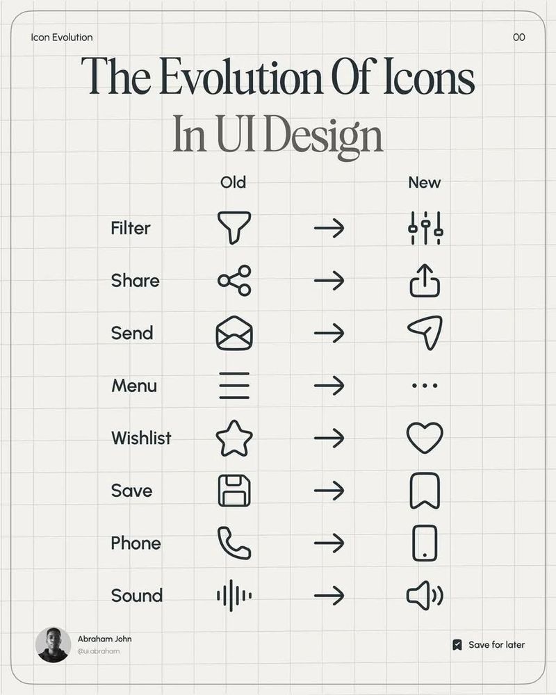
An example of evolution of icons in UI design
Seriously?
30.07.2025 09:27 — 👍 1 🔁 0 💬 3 📌 0Hey everyone,
It's been a long time.
How's BlueSky? How are you guys doing? 😊
Nope, well, just thinking about it.
It took me a year to migrate a project from VueJS 2 to 3, but it's of course a different case. Now I'm just scared of updating versions :D
But it looks like it's easy, right?
Do you like overall the v4?
I share UI/UX tips on my newsletter as well, 1-2 week, depending on... my mood 😅
Would be happy to see you here 👇
l.vpon.me/eXgXhh
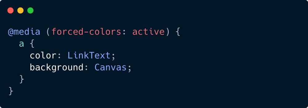
An example of using forced-colors query
5. forced-colors (92.86% global support)
Used to detect if the user agent has enabled a forced colors mode where it enforces a user-chosen limited color palette on the page.
An example of a forced colors mode is Windows High Contrast mode.
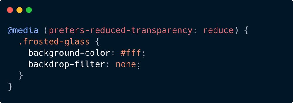
An example of using prefers-reduced-transparency
4. prefers-reduced-transparency (73.15% global support)
Tells us if the user prefers less transparency (e.g. no glassmorphism, hello new iOS design 👋)
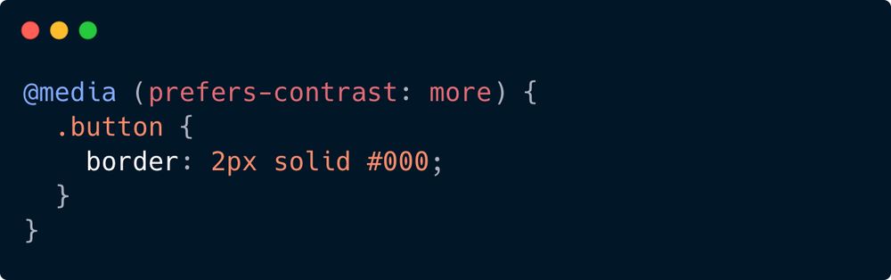
An example of prefers-contrast usage
3. prefers-contrast (92.68% global support)
Indicates the user prefers higher (or lower) contrast between elements.
Possible values are more/less/custom.
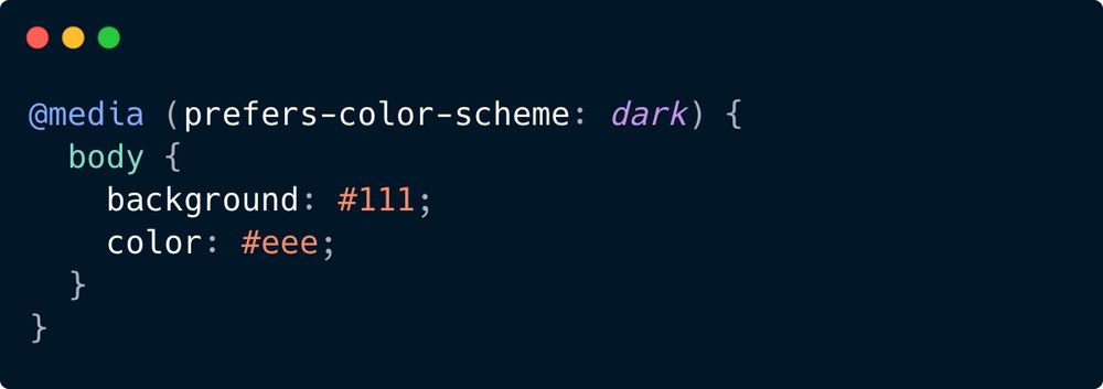
A code example of using prefers-color-scheme query
2. prefers-color-scheme (95.16% global support)
Detects whether the user prefers a light or dark color theme.
In this example we change the styling if the user prefers the dark theme.
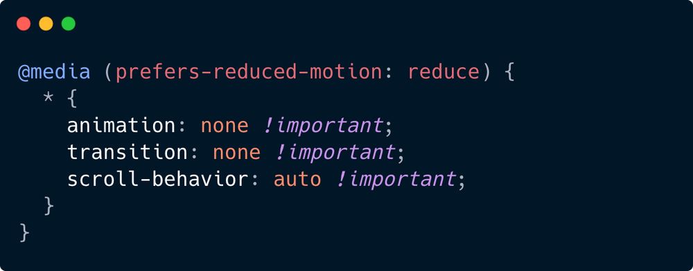
A sample code for disabling motion effects if the prefers-reduced-motion is set to reduce.
1. prefers-reduced-motion (95.57% global support)
Indicates whether the user prefers less motion to avoid VIMS -
Visually-Induced Motion Sickness.
Here we disable any animations or transitions, but we can be flexible here (e.g., REDUCE motion but do not disable it completely)
If you care about UI/UX and accessibility, you need to know about prefers-* media queries.
Here’s the full list - what they do and when to use them 👇
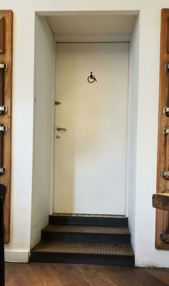
Accessibility in real life 🤦♂️
17.06.2025 14:42 — 👍 8 🔁 0 💬 1 📌 1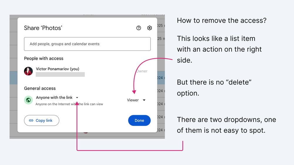
Google sharing modal
Bad UX example: Google Docs sharing modal.
To remove access, you instinctively look for a delete button somewhere.
Instead, you must find a second small dropdown next to "Anyone with the link".
Which is odd when no clear remove access button present and there are 2 dropdowns.
P.S. I might be wrong and I'm not a CSS pro, it just how it feels to me.
Otherwise instead of Bulba I would choose Vuetify/Quasar (for example) that already have styles + functional components for cards/buttons etc.
But I don't like their styles :)
So between applying .card class from Bootstrap or applying few utility classes, I would choose utility classes due to flexibility.
15.06.2025 11:46 — 👍 0 🔁 0 💬 1 📌 0So to me it seems like Boostrap = mix of utility classes + components
Tailwind = utility classes
But it's not hard to make a component out of utility classes, since anyway you'll have Card.vue or Button.vue (either from a library like Vuetify, or from scratch)
I'm pretty sure the frameworks like Bootstrap can do this but it's simply harder to customize everything, plus, they are limited to the components they have.
But also they have the same classes for margins, paddings, grids and so on.
E.g. if I need a card component, and I want it to look a certain way, I can instantly think of
"Okay, so, <div class="bg-white rounded p-4 shadow">"
now if I want to make it more rounded, I'll use rounded-xl.
Now, tailwind certainly gives full flexibility, while other frameworks give components that are customizeable. But the more customization you need to apply the harder it gets.
15.06.2025 11:46 — 👍 1 🔁 0 💬 1 📌 0I can
1. Take Vuetify and use their Button.
2. If I don't like how it looks I can customize it.
3. But if I don't like the whole Vuetify, and I prefer building components from scratch, then I need styles.