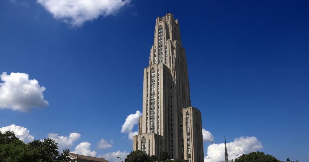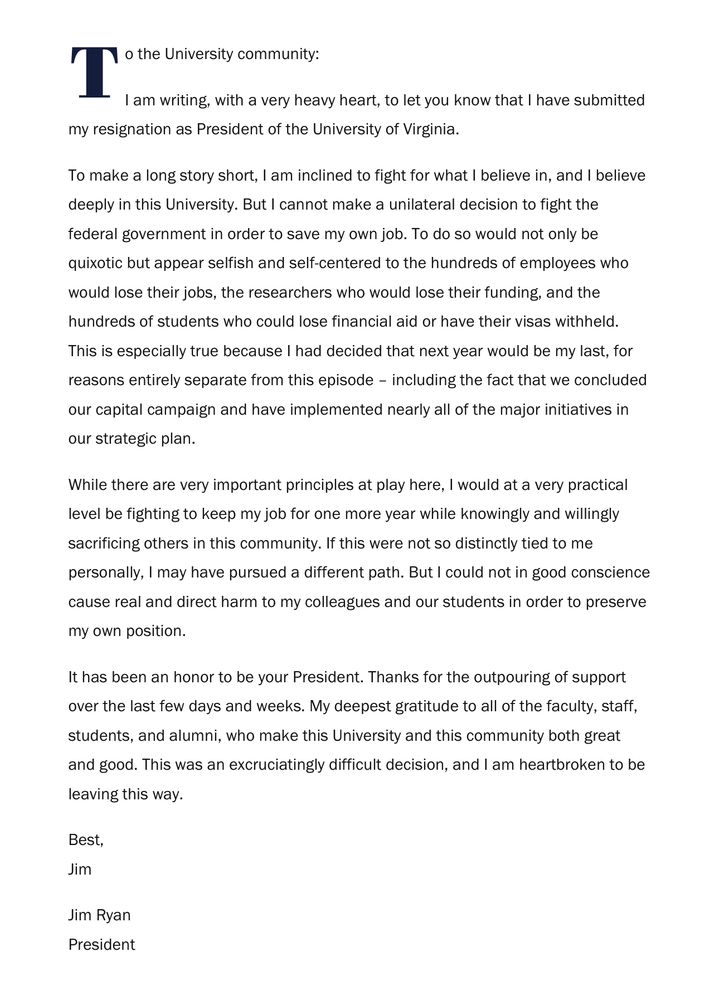
“I am inclined to fight for what I believe in, and I believe deeply in this University. But I cannot make a unilateral decision to fight the federal government in order to save my own job.”
A statement from University of Virginia President Jim Ryan, on his decision to resign:
27.06.2025 23:42 —
👍 95
🔁 39
💬 16
📌 0
@neorsd.org never ceases to be bright spot. Thank you from a sewer nerd.
08.05.2025 18:12 —
👍 2
🔁 0
💬 0
📌 0
Thanks for sharing these insights on good mentorship and leadership.
13.03.2025 12:42 —
👍 0
🔁 0
💬 0
📌 0
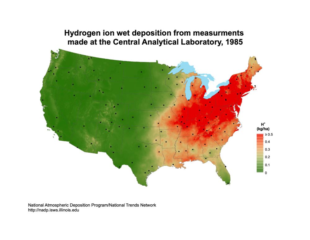
Map of the United States displaying hydrogen ion wet deposition levels from measurements taken in 1985 by the Central Analytical Laboratory. The map uses a color gradient from green (low deposition) to red (high deposition) to show varying levels of H+ deposition (kg/ha). The highest deposition levels are concentrated in the northeastern U.S., while the western U.S. has the lowest levels. Black dots indicate measurement locations. The map is sourced from the National Atmospheric Deposition Program/National Trends Network
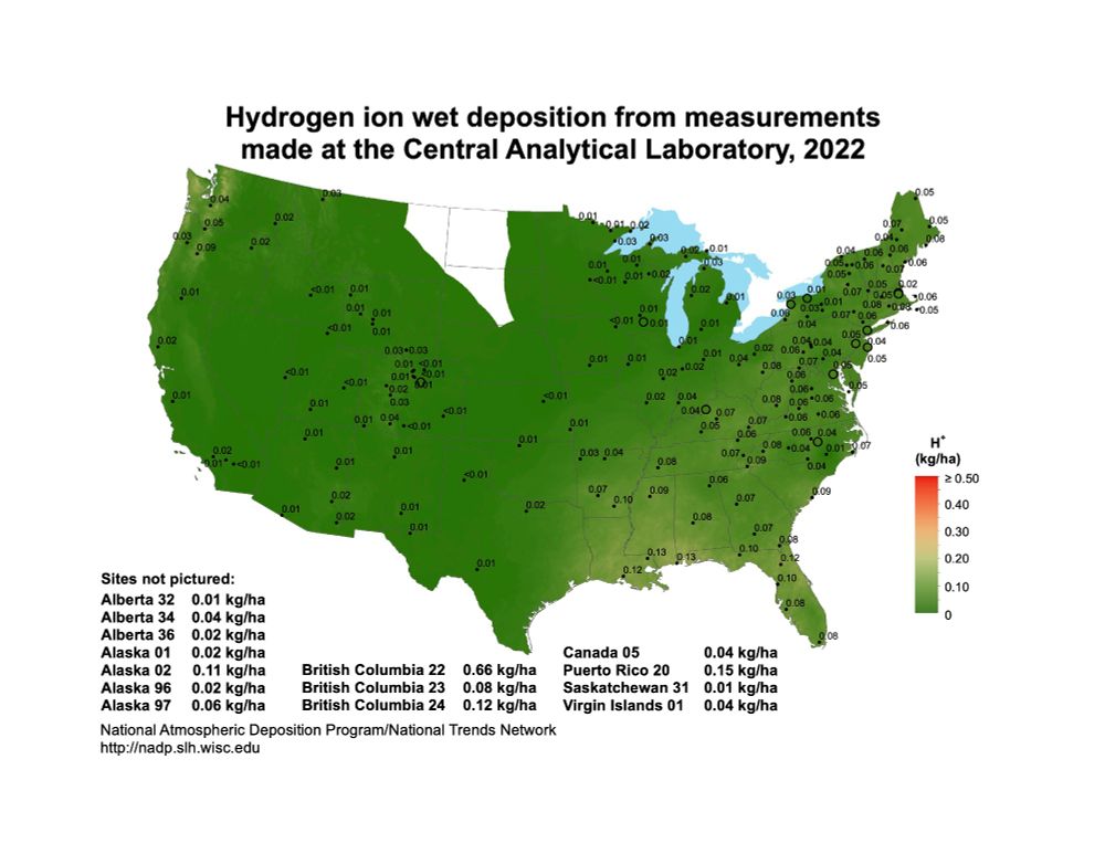
Map showing hydrogen ion wet deposition measurements across the United States and parts of Canada, indicating values in kg/ha for 2022. The color gradient represents different concentration levels, with a scale on the right. Sites not pictured are listed at the bottom. The map is mostly green, indicating that H+ deposition is no longer a environment issue that it once was.
Another dataset I like is from the National Atmospheric Deposition Program, which has maps of the US that show we fixed the acid rain problem by implementing stricter emission controls on power plants.
nadp.slh.wisc.edu/maps-data/nt...
22.02.2025 15:20 —
👍 3671
🔁 960
💬 93
📌 58