It’s happening again in November. 30 days and 30 themes for maps. Take part, learn something new and have fun. That’s what #30DayMapChallenge is about 🌎
01.10.2025 16:15 — 👍 44 🔁 23 💬 1 📌 8
@rajodm.bsky.social
#rstats | #dataviz
It’s happening again in November. 30 days and 30 themes for maps. Take part, learn something new and have fun. That’s what #30DayMapChallenge is about 🌎
01.10.2025 16:15 — 👍 44 🔁 23 💬 1 📌 8Thank you!
20.09.2025 03:36 — 👍 1 🔁 0 💬 0 📌 0
Alluvial plot showing monthly recipe publications on allrecipes.com by cuisine origin in 2024. The chart shows steady growth throughout the year, with a dramatic spike in November (313 recipes, 42% of yearly total). 'Other' cuisines dominate with 526 recipes, followed by French (40), Soul Food (31), Indian (31), German (31), Filipino (30), Jewish (29), and Cajun and Creole (29).
#TidyTuesday week 37
Data: allrecipes.com, {tastyR} package
Code: github.com/rajodm/TidyT...
#dataviz #rstats #ggplot2

A scatter plot showing passport strength by world region, with visa-free access count on the x-axis and seven regions (Africa, Americas, Asia, Caribbean, Europe, Middle East, Oceania) on the y-axis. Each country is represented by a circular flag icon. Vertical lines mark the median global mobility at 70 countries and the threshold for highest global mobility at 172 countries. European countries cluster toward the right with highest access, while African, Asian and Middle Eastern countries concentrate on the left with lower access. Caribbean and American countries show wide variation across the mobility spectrum.
#TidyTuesday week 36
Data: Henley Passport Index
Code: github.com/rajodm/TidyT...
#dataviz #rstats #ggplot2
Thank you!
10.09.2025 18:33 — 👍 1 🔁 0 💬 0 📌 0#TidyTuesday
05.09.2025 19:25 — 👍 1 🔁 0 💬 0 📌 0
Topographic map of Scotland showing the locations of its three highest peaks: Ben Nevis (1344.53m), Ben Macdui (1309m), and Braeriach (1296m), with elevation represented by color gradients from light blue to dark brown.
#TidyTuesday week 33
Data: Scottish Munros
Code: github.com/rajodm/TidyT...
#dataviz #rstats #ggplot2

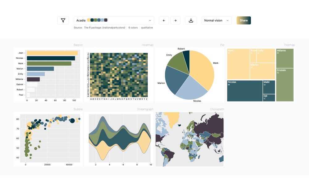
The Flexoki and Bit12 color scales from {hrbrthemes}
github.com/hrbrmstr/hrb...
Hello #dataBS (& especially #TidyTuesday) fam! I'm trying to organize a thing to help me keep TidyTuesday running smoothly, but first I need to get a bit of a runway. Every week I curate a TT dataset, and it's wearing me down. Please see github.com/rfordatascie... for some ways you can help! #RStats
15.08.2025 11:23 — 👍 49 🔁 37 💬 7 📌 4
Book cover of Spatial Linear Models for Enviornmental Data, dark blue background with white pattern with a picture of caribou and data plots
Happy Friday 🌍! We are giving away one copy of 'Spatial Linear Models for Environmental Data'. To enter, simply follow me and re-post this by the end of Sunday, August 17. #spatial #environment # #data #StatsSky routledge.com/9780367183349 not associated with bsky
15.08.2025 09:56 — 👍 7 🔁 7 💬 1 📌 1
A treemap chart titled 'Extreme Weather Attribution Studies' showing the breakdown of 620 studies by their conclusions about human climate influence. The chart is divided into two main sections: 'More severe or more likely N = 554' (left side, larger) and 'Less severe or less likely N = 66' (right side, smaller). In the larger left section, the biggest segments are Heat (196 studies, shown in orange), Rain & flooding (110 studies, in blue), Drought (74 studies, in yellow), Storm (46 studies, in gray), Compound events (32 studies, in light pink), Impact (30 studies, in coral), Wildfire (27 studies, in red), and Oceans (23 studies, in dark blue). In the smaller right section, the segments are Cold, snow & ice (37 studies, in light blue), Rain & flooding (20 studies, in blue), Storm (3 studies, in gray), Impact (2 studies, in coral), River flow (2 studies, in blue), and Drought (1 study, in yellow). The chart includes explanatory text stating that most extreme weather attribution studies conclude human influence has made extreme events more severe or likely, with Heat, Rain & flooding, and Drought being the most frequently reported. Data source is listed as Carbon Brief, dated TidyTuesday Week 32 2025
My #TidyTuesday Week 32: Extreme Weather Attribution studies. thanks for curating @rajodm.bsky.social !!
14.08.2025 23:05 — 👍 10 🔁 2 💬 0 📌 0
With {paletteer} you can filter palettes by exact length needed. It returns the original package name, palette name, and length for each option.
14.08.2025 19:28 — 👍 3 🔁 0 💬 0 📌 0
Sankey diagram showing the flow of extreme weather attribution studies from geographic regions through event types to climate change impact classifications. The largest flows show Europe and East & Southeast Asia predominantly studying heat events and rain/flooding. Most studies found that climate change made events more severe or more likely to occur. Smaller portions found no discernible human influence, insufficient data, or that events became less severe or likely (mainly for cold, snow, ice, rain and flooding).
#TidyTuesday week 32
🌪️Extreme weather events attribution studies
Code: github.com/rajodm/TidyT...
#dataviz #rstats #ggplot2
It is Tuesday already in New Zealand (yes I live in the future) so I am already sneeking a peek at the #TidyTuesday data. @rajodm.bsky.social has curated the dataset this week and it is about extreme weather attribution studies.
github.com/rfordatascie...
Thank you!
01.08.2025 03:08 — 👍 0 🔁 0 💬 0 📌 0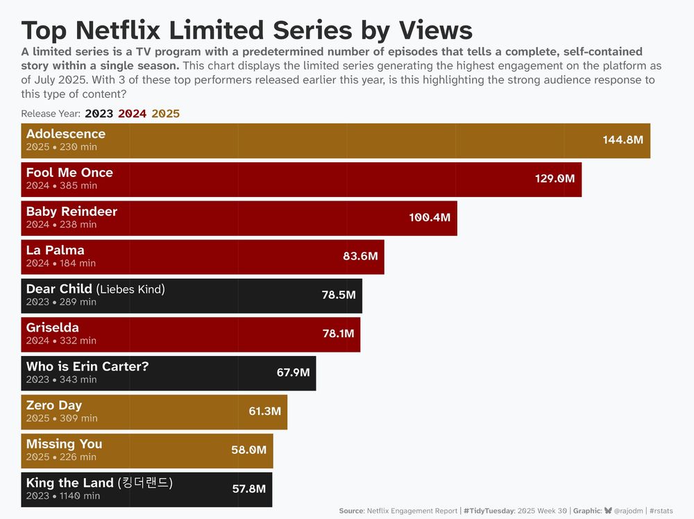
Horizontal bar chart showing top 10 Netflix limited series by views, with bars colored by release year. Adolescence released earlier this year leads with 144.8 million views. 4 contents were released in 2024, 3 in 2023, and 3 this year (2025).
#TidyTuesday week 30
#Netflix limited series audience engagement.
- Data: Netflix engagement report
- code: github.com/rajodm/TidyT...
#dataviz #rstats #ggplot2
Looking for feedback on my Quarto extensions listing! 📝
How's the navigation and browsing experience at m.canouil.dev/quarto-exten...?
Your feedbacks: github.com/mcanouil/qua... (or here)
I'd appreciate it if you could share/repost to help me reach more users!
#Quarto #QuartoExtension #QuartoPub
This one:
bsky.app/profile/did:...
Thank you!
16.07.2025 16:20 — 👍 2 🔁 0 💬 0 📌 0📢 Calling all #rstats #pydata #julialang #datascience folks!
This year, a Data Science Learning Community (DSLC.io) goal is to crowdsource the curation of #TidyTuesday datasets to allow the DLSC board members and project maintainer @jonthegeek.com, more time to better the community in other ways 1/
Thanks! It was a bit challenging at first since I'd never used {cowplot} before. Had to figure out that I need to re-draw the plot and use |> instead of + to combine them.
27.06.2025 17:25 — 👍 1 🔁 0 💬 0 📌 0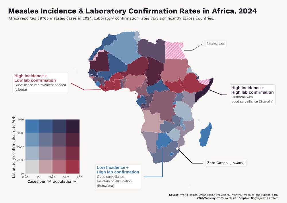
Bivariate choropleth map of Africa showing measles incidence rates and laboratory confirmation rates by country in 2024. Countries are colored using a blue-to-purple matrix where blue indicates low incidence with high lab confirmation (like Botswana), red indicates high incidence with low lab confirmation (like Liberia), and purple indicates high incidence with high lab confirmation (like Somalia). The map shows significant variation in both disease burden and diagnostic capacity across African countries, with 89,765 total measles cases reported.
#TidyTuesday week 25
📊 Exploring #measles incidence and laboratory confirmation rates in Africa (2024).
Code: github.com/rajodm/TidyT...
#dataviz #rstats #ggplot2
This tool from the r-graph-gallery is a really helpful one
r-graph-gallery.com/color-palett...
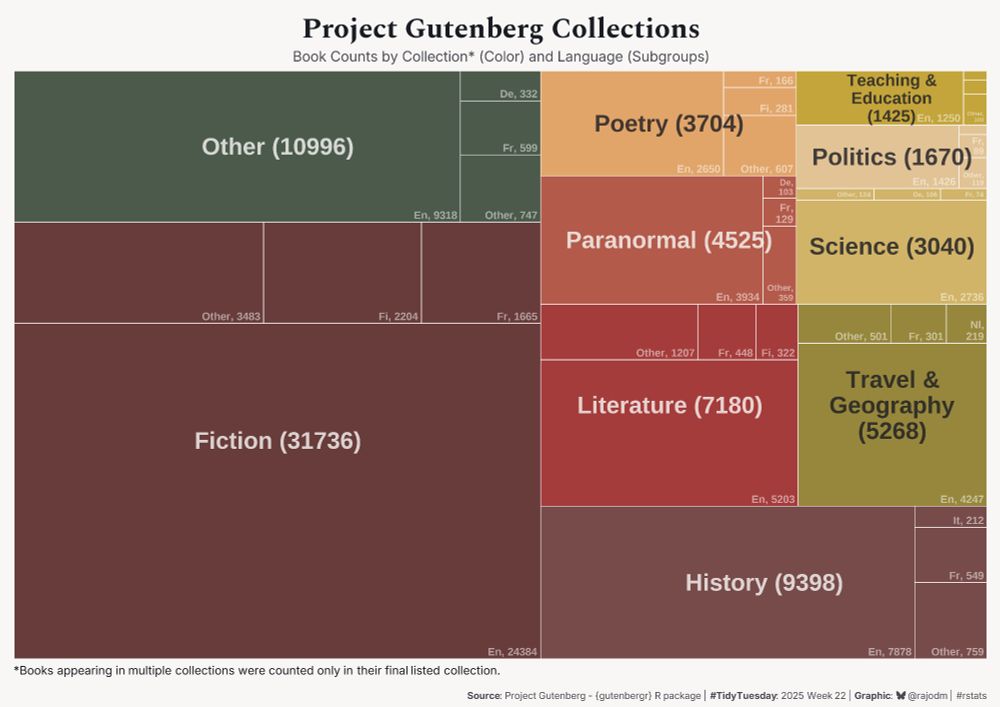
Treemap visualization of Project Gutenberg Collections showing book counts by collection and language. Fiction is the largest section with 31,736 books, followed by other (10,996 books), History (9,398 books), Literature (7,180), and smaller sections for travel & geography, paranormal, science, poetry, politics and Teaching & education. Each section shows language breakdowns with English dominating most categories.
#TidyTuesday week 22
Data: Project Gutenberg
Code: github.com/rajodm/TidyT...
#rstats #dataviz #ggplot2

I missed RStudio’s Tomorrow Night Bright 🌙 theme in Positron but not anymore! Thanks to Open VSX, it’s now an extension. Here’s how:
📚 Blog: ivelasq.rbind.io/blog/positro...
⚛️ Positron Extension: tinyurl.com/358pfa47
👩🏻💻 VS Code Extension: tinyurl.com/yundmctf
#RStats #Python #PositronIDE #VSCode
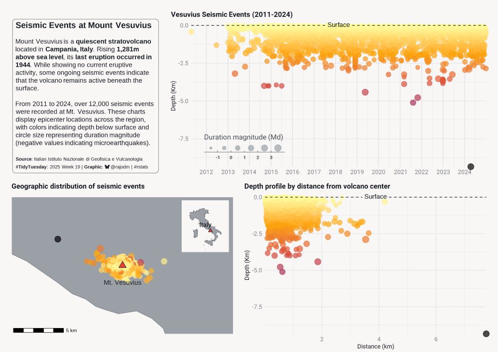
Visualisation of Mount Vesuvius seismic events from 2011 to 2024. The top chart displays the earthquake epicenter depths (0 to about 8 kilometers), the map at the bottom left shows geographic distribution around the volcano and the chart at the bottom right, a cross-section view from the center. Colors indicate the epicenter depth and circle sizes represent duration magnitude (a measure of the energy released).
#TidyTuesday week 19
📊🌋Data: Seismic events at Mount Vesuvius.
#dataviz #rstats #ggplot2
Glad you like it! Looking forward to seeing your chart!
06.05.2025 07:43 — 👍 0 🔁 0 💬 1 📌 0
A waffle chart showing 1,041 NSF research grants terminated since April 18, 2025, where each single square represents a project. STEM Education and Social Sciences were most affected, with colors indicating remaining time before projects' expected completion date. Many long term projects were terminated with more than 2 years before the (expected) completion date.
#TidyTuesday week 18.
Data: NSF Grant Terminations Under the Trump Administration.
Code: github.com/rajodm/TidyT...
#dataviz #rstats #ggplot2
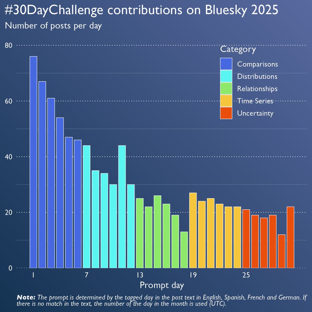
A column chart which shows the number of posts shared for each prompt of the 30DayChartChallenge. The columns are coloured by the category the prompt belongs to. The category with the most contributions is Comparisons (days 1 to 6) with day 1 (Fractions) having the most contributions with 76. The number of posts decreased for the following categories. Day 11 is a peak with the prompt “Birds” (40 posts). Note: The prompt is determined by the tagged day in the post text in English, Spanish, French and German. If there is no match in the text, the number of the day in the month is used (UTC).
We're happy to see so many charts shared on Bluesky. ♥️
So, we prepared a chart, too. It shows the number of contributions for each prompt on Bluesky this year.
#30DayChartChallenge