There’s still time to sign up for my online Python for Visual Designers workshop for Type@Cooper @coopertype, Thursdays 6.30–9.30pm US Eastern from 26 March–14 May (8 weeks).
coopertype.org/events/pytho...
@letterror.bsky.social
Typedesign, really nice fonts, typography and lettering. I run https://letterror.com More posting here: https://typo.social/deck/@letterror
There’s still time to sign up for my online Python for Visual Designers workshop for Type@Cooper @coopertype, Thursdays 6.30–9.30pm US Eastern from 26 March–14 May (8 weeks).
coopertype.org/events/pytho...
Every time Monotype acquires another foundry, the homogenization of type accelerates. The antidote isn't nostalgia—it's supporting indies who still treat type as craft, not content.
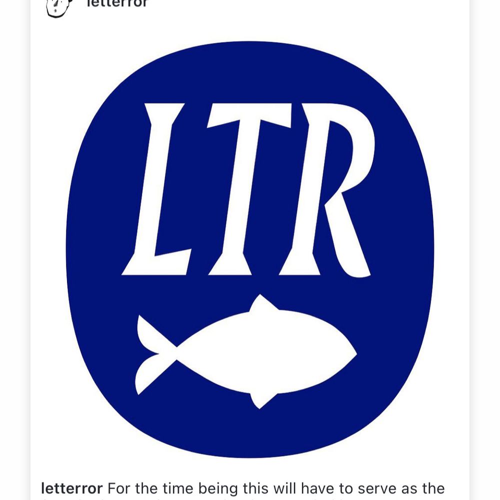
12.02.2026 00:30 — 👍 5 🔁 3 💬 0 📌 0LettError is a post-Monotype foundry.
11.02.2026 14:31 — 👍 2 🔁 0 💬 0 📌 0LTR Limited Grotesque®: Probably never at Monotype, but available at letterror.com/limited/ and FontStand. Variable weight humanist sans. More flavor, less baggage. #fonts #typography #lettering #sans
11.02.2026 07:39 — 👍 10 🔁 5 💬 1 📌 0
LTR Limited Grotesque from LettError Type.
NEW: LTR Limited Grotesque from LettError Type is a beautifully drawn, semi-informal, low-contrast, illustrative humanist sans serif family with steeply angled italics, in two variable styles, with unexpected extra tails, curves, and characteristic details to stand out.
fontstand.com/fonts/ltr-li...

"I understand that it’s not a great look to have exchanged tens of thousands of text messages with The Cannibal King over many years. Still, cut me some slack. We've all had a questionable acquaintance or two in our lives."
www.mcsweeneys.net/articles/jus...

"While it may have looked like a shooting, it was actually a 'rapid de-escalation outcome.' We recognize that phrases like that may sound invented, which is why we ask you to repeat them anyway."
28.01.2026 02:40 — 👍 86 🔁 12 💬 2 📌 1
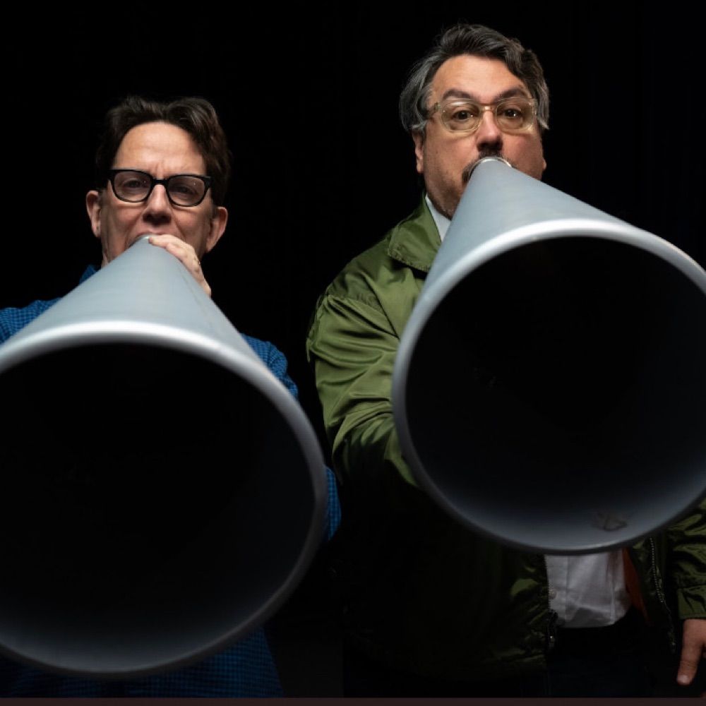
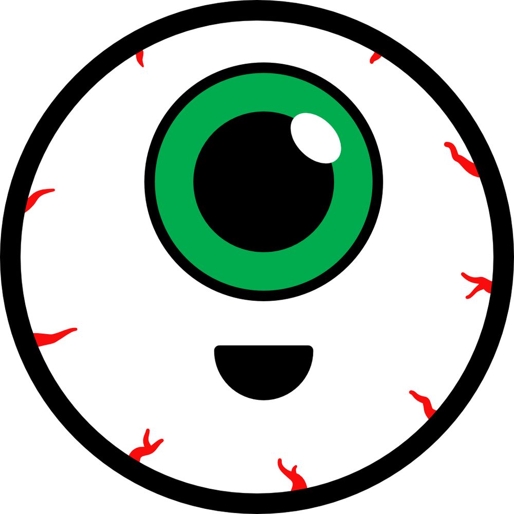
Our brand new Eyeball ep is here! Please share with everyone you know!
open.spotify.com/album/4lOS8c...

Two skulls, drawn in black shading, on a white background. The lines are rough. The left skull appears to look at the teeth of the right skull. It points with a bony finger and says “CAVITY”. Both skulls appear to be grinning. Which they always do, one supposes. The text balloon is lettered in a rough Fraktur as if the artist wants to make some sort of point. In the bottom right corner, a small ornamented box with “E+H”
E + H, the bony lads, practice some dentistry. #ensorHolbein The drawing will continue until morale improves. #dentistry #cartoon
16.01.2026 09:47 — 👍 4 🔁 0 💬 0 📌 0
Black and white drawing of a skull, in the middle of 10 fish. They all look at the skull. Fanciful shading. Are the fish nibbling on the skull? That would be gross. Still. A text label at the bottom reads “Ensor feeds the fish”.
In a moment of zen, Ensor has dinner with the fish. Where is his friend Holbein? Out dancing probably. It can be read as a gruesome scene, but then again it is rendered in such fetching shading! Artistique! The drawing will continue until morale improves. #ensorHolbein
15.01.2026 14:11 — 👍 5 🔁 0 💬 0 📌 0There's a Ted Lasso line..
12.01.2026 10:01 — 👍 1 🔁 0 💬 0 📌 0Obscure, but not necessarily expensive car. Creaky house. Remote locations, boots in the trunk, always up for a hike. Regularly sitting down and having a tea (with suspects, more cops). And a swearing vocabulary that is so much richer.
09.01.2026 14:20 — 👍 2 🔁 0 💬 2 📌 1
The cover of the Italian edition (2001) of some of James Mosley's essays: Radici della scrittura moderna.
Remembering James Mosley
hyphenpress.co.uk/2026/01/07/r...

A black and white drawing of two skeletons, with bits and rags still attached, doing a wild dance. Letter E and letter H float between the limbs. It could be a reference to James Ensor and Hans Holbein the younger, who, each in his own era, used skeletons to question authority and remind those in power that they are one step away from a neatly cut grave. Check the Holbein engravings.
Ensor and Holbein shake their bones. #ensorAndHolbein #dancingSkeletons #drawing #cartoon
04.01.2026 16:38 — 👍 2 🔁 0 💬 0 📌 0Love them!
25.12.2025 17:57 — 👍 1 🔁 0 💬 0 📌 0We’ve all been there.
25.12.2025 16:42 — 👍 1 🔁 1 💬 0 📌 0So how's the algorithm here? You're all angry already?
19.12.2025 17:52 — 👍 0 🔁 0 💬 1 📌 0📣THREAD: It’s surprising to me that so many people were surprised to learn that Signal runs partly on AWS (something we can do because we use encryption to make sure no one but you–not AWS, not Signal, not anyone–can access your comms).
It’s also concerning. 1/

Poster with an image of a frog and the words “Don’t Obey”
#NoKings Cincinnati
18.10.2025 19:39 — 👍 2960 🔁 550 💬 35 📌 22
People perceive thickness of letters very individually, and that’s why we are conducting Font Weight Survey to understand the regional preferences of font weight. Could we ask you for 10 min of your time? The findings will be published publicly once we have some results.
tptq.com/weight

Photo of the reflection of the lettering on the outside of the UvA library. You see the bookshelves on in the inside, and the reflection of the letters behind the camera. And a bit of blue sky.
LetterExchange, The Art Workers’ Guild in London, October 15 I will talk about the lettering for the Amsterdam University Library.
letterexchange.org/events
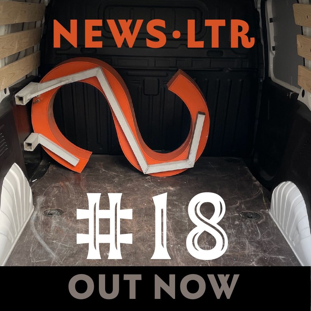
Red capital letter S in the back of a white van. Text reads "NEWSLTR #18 OUT NOW".
"…the main purpose of architecture is to provide surfaces for typography." Polemic! 🍿Fun and interesting things to read in the fresh NEWSLTR №18 Archives here → buttondown.com/letterror/ar...
✏️ Sign up for free! #lettering #fonts #type #architecture

A quick visit to the library, shining in the afternoon sun.
Amsterdam University Library letters catching the sun. Nieuwe Doelenstraat, across from De Jaren, if you want to have a beer while looking at Martinus Nijhoff. Read about the design: letterror.com/uva/index.html
21.07.2025 18:53 — 👍 11 🔁 2 💬 0 📌 0Worth a watch:
Head of Signal, Meredith Whittaker, on so-called "agentic AI" and the difference between how it's described in the marketing and what access and control it would actually require to work as advertised.
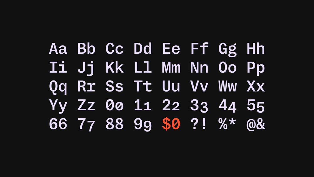
Alphabet and numbers in a monospaced typeface (MD System Mono, specifically), arranged in a grid. In the bottom row, ‘$0’ (zero dollars) is highlighted in bright red.
Maybe you’ve heard: every font is free! Since fonts aren’t subject to copyright, you can legally ‘pirate’ them if you use a specific loophole!
...except that’s not really true. I’ve seen this claim repeated quite a lot recently, and it’s missing some pretty important nuance.
🧵 A thread:
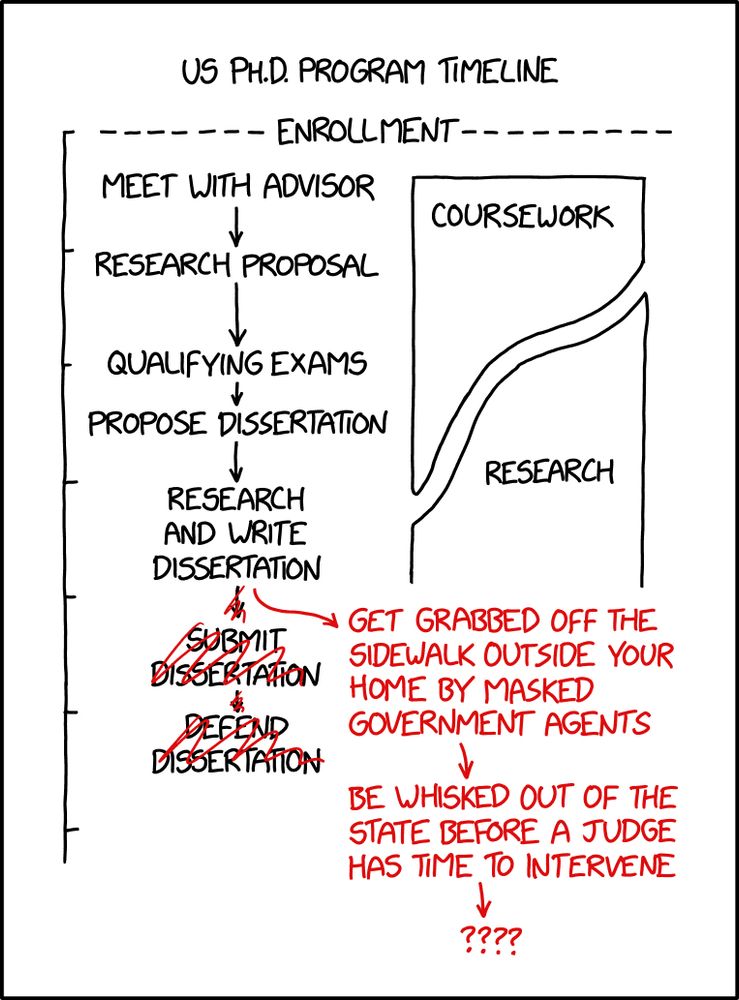
PhD Timeline xkcd.com/3081
25.04.2025 15:32 — 👍 60182 🔁 20602 💬 593 📌 831Since this seems to have found an audience: hello! Fonts are made by humans and (mostly) sold by small businesses — if you’re going to pirate something (like assets for an anti-piracy ad campaign, for example), there are probably other options to consider first <3
23.04.2025 22:18 — 👍 235 🔁 12 💬 0 📌 1The ‘Piracy. It’s a Crime’ campaign used pirated music, *and* as it turns out, also used pirated fonts. Incredible.
23.04.2025 20:20 — 👍 6826 🔁 3427 💬 58 📌 133