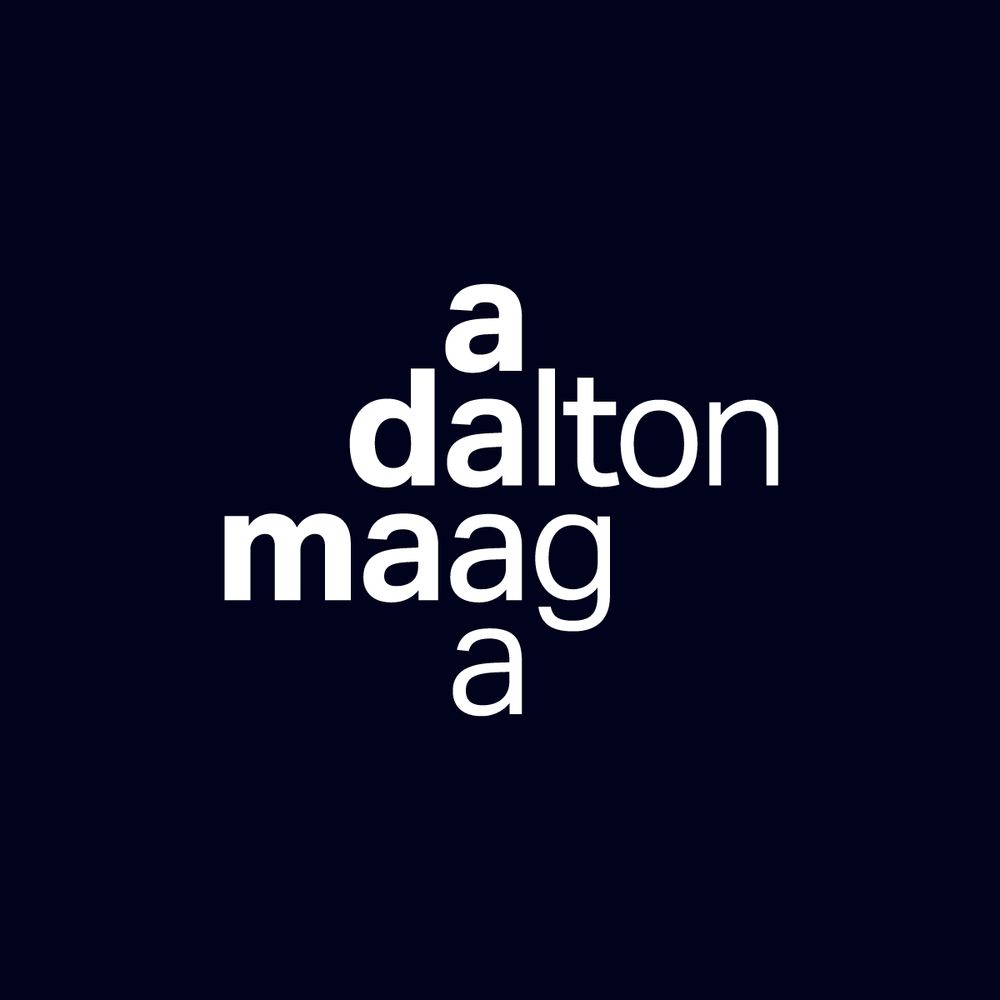
KAREL MARTENS — UNBOUND 💥
A powerful reminder of the beauty that comes from decades of making and remaking. Martens’ work flows across time, media, and intention—always with a sense of play and precision. It’s not about reaching a final form, but staying in motion.
Unmissable!
www.stedelijk.nl
06.08.2025 13:37 — 👍 30 🔁 6 💬 1 📌 1
Thank you for the insights, @lither.land, @patricking.com, @mass-driver.com, and @wes.wordsbywes.ink 🙏
05.08.2025 09:25 — 👍 2 🔁 0 💬 0 📌 0
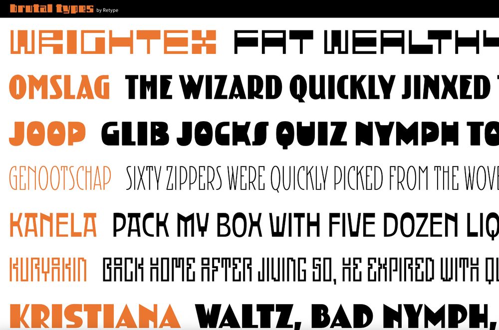
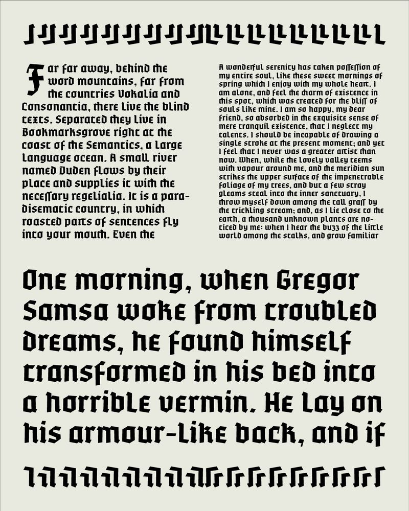
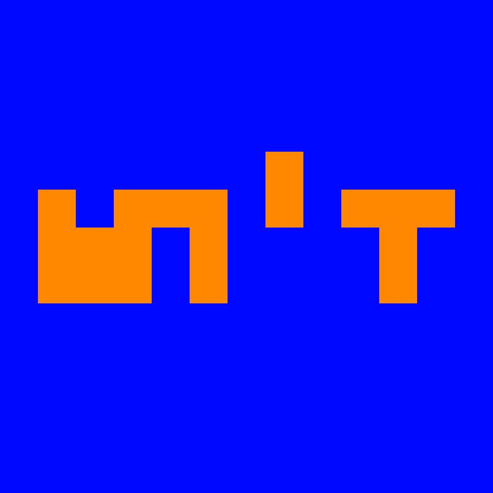
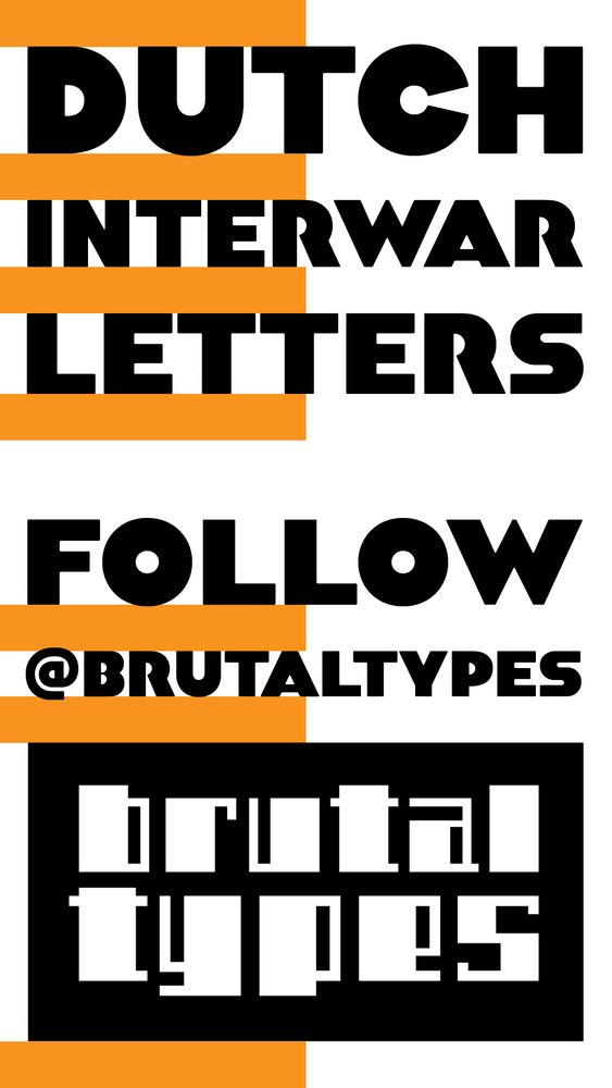
Brutaltypes.com is finally online! Enjoy the delightful quirkiness of early 20th-century avant-gardes. #typeface #typography #amsterdamseschool
05.08.2025 05:52 — 👍 7 🔁 2 💬 0 📌 1
English-native friends, which preposition, if any, do you prefer in constructs such as “Initially named X, later renamed […] Y”?
Is it “renamed Y”, “renamed to Y”, “renamed as Y”? I get the impression I picked up “renamed to Y” by way of software work. #language
04.08.2025 12:26 — 👍 1 🔁 0 💬 6 📌 0
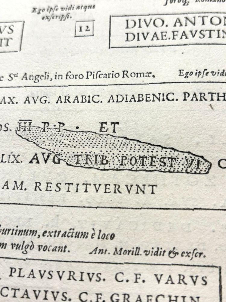
Detail of a woodcut integrated in a typeset text to display visual damage on a funeral stone.
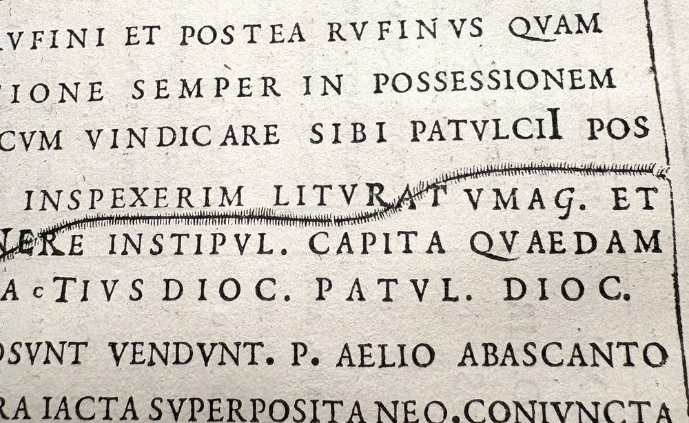
Detail of a woodcut integrated in a typeset text to display visual damage on a funeral stone.
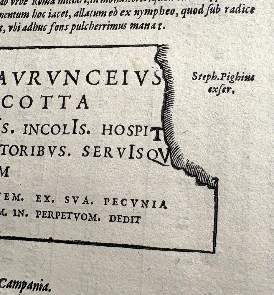
Detail of a woodcut integrated in a typeset text to display visual damage on a funeral stone.
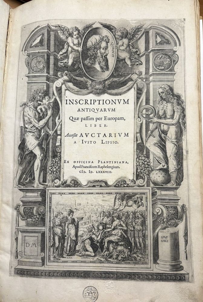
Engraved title page with typeset text in the middle. The engraving displays allegorical depictions and a historican scene at the bottom. The typeset text includes the title and the imprint.
Ingenious use of woodcuts that overlap typeset text in this 1588 edition, visually reproducing old inscriptions found on funerary stones, altars & Capitoline Tables, carefully rendering letters but also the erosion, fractures & surface damage of their material supports.
#rarebooks #bookhistory
31.07.2025 10:02 — 👍 96 🔁 30 💬 1 📌 3
I am excited to announce the all new Type Foundry Directory!
typefoundry.directory
29.07.2025 15:02 — 👍 26 🔁 11 💬 1 📌 2
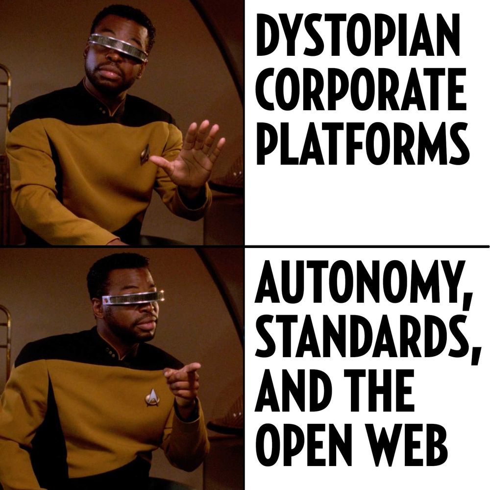
Geordi La Forge “No/Yes” meme.
No: Dystopian corporate platforms.
Yes: Autonomy, standards, and the Open Web.
Fonts In Use is not active on Instagram.
We’ve abandoned problematic platforms, embraced ethical alternatives, and survived to talk about it.
More here:
fontsinuse.com/uses/63903/f...
15.07.2025 17:50 — 👍 68 🔁 17 💬 3 📌 4
typo.social
Welcome to Typo.social! This is a Mastodon instance open to any typo and type enthusiastic. We are offering this service out of sheer courtesy without being held responsible for any disadvantages.
Bluesky is a good alternative to X for the general public and some specific topics, especially politics. But for many communities and fields, a critical mass remains exclusively on Mastodon. Type designers and fans, for instance, have their own server with 679 active users: typo.social/directory.
11.07.2025 18:24 — 👍 27 🔁 11 💬 1 📌 0
Christian Schwartz’s Amplitude comes home to his own foundry @commercialtype.bsky.social with Font Bureau’s closure. And finally updated with italics! vault.commercialtype.com/vault/amplit...
One of my favorite typefaces, often recommended to folks who want a versatile fam with deep ink traps.
07.07.2025 16:06 — 👍 6 🔁 2 💬 2 📌 0
Ooo, this is so nicely done!
03.07.2025 13:13 — 👍 1 🔁 0 💬 0 📌 0
New typeface: Phông by Khải Quang Nguyễn ⬛️🔲
Phông is a typeface inspired by the unique lettering found in Phong-Hóa, a Vietnamese satirical journal from the early 20th century.
www.poem-editions.com/products/phong
02.07.2025 16:18 — 👍 0 🔁 1 💬 0 📌 0
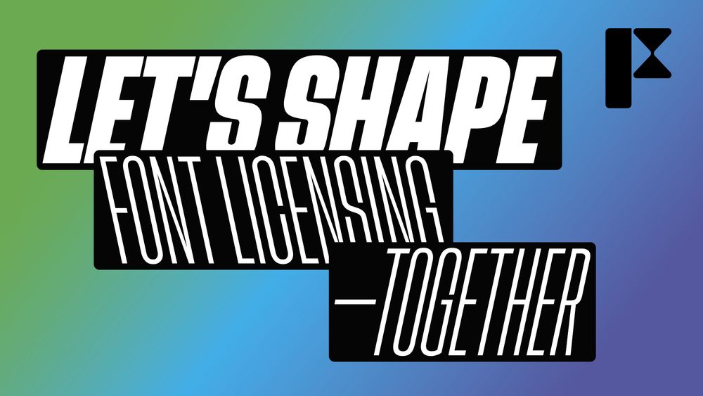
This is the final week of collecting responses regarding font users’ opinions on the current state of font licensing. The survey will close on Sunday 6 July at midnight CEST. Once the data has been analysed, we will share the findings publicly. Complete the survey today: fontstand.com/survey
30.06.2025 13:17 — 👍 6 🔁 8 💬 2 📌 0
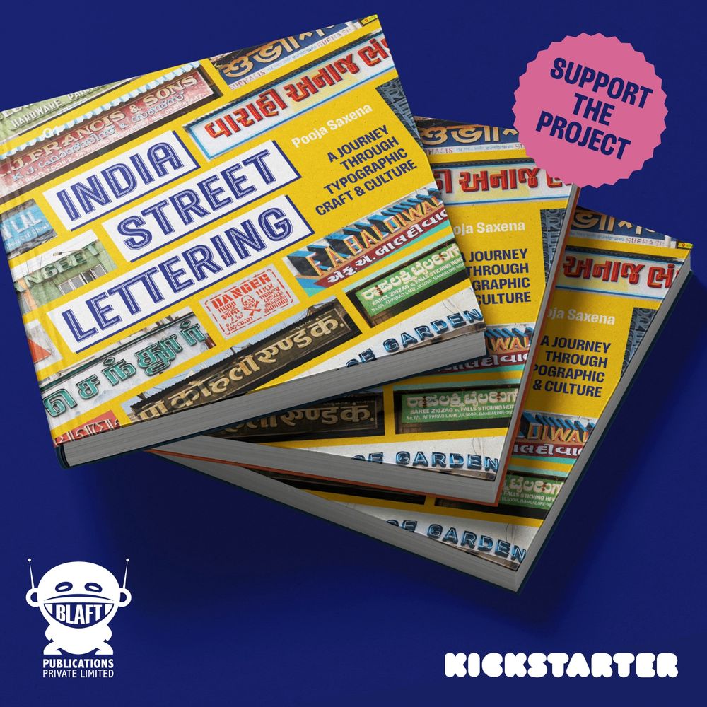
🥁 Welcome INDIA STREET LETTERING, the book! 🥁
I’m working with @blaft.bsky.social to bring together my documentation of letterforms from India’s cities into a 200-page hardcover full-colour book.
Support the project on Kickstarter ➡️ www.kickstarter.com/projects/bla... I promise it’ll be amazing!
26.06.2025 16:05 — 👍 45 🔁 21 💬 2 📌 5
David Pearson’s fantastic Book Cover Review finally has RSS! Subscribe with me: bookcoverreview.co.uk/feed
#BookCovers #BookDesign
23.06.2025 07:16 — 👍 2 🔁 3 💬 0 📌 0
Please take this survey and help the Fontstand Cooperative figure out how font licensing needs have evolved.
11.06.2025 16:01 — 👍 2 🔁 2 💬 0 📌 0
🚨 Lançamento: Uai 🚨
Primeiro, corre no minisite pra ver a fonte em ação nas interfaces que criamos, cheias de referências a Minas Gerais. Tem trial grátis e 50% de desconto com o código #fontesbrazucas 🎁🔥
👉 uai.naipefoundry.com
04.06.2025 13:34 — 👍 6 🔁 3 💬 1 📌 2

Grafica Română 1923-1932 | Arcanum Newspapers
Arcanum Newspapers has just added a near-complete set of issues of the seminal early 20th century Romanian type & design publication Grafica Română (1923-1932). Exciting!
adt.arcanum.com/en/collectio...
04.06.2025 06:33 — 👍 0 🔁 0 💬 0 📌 0
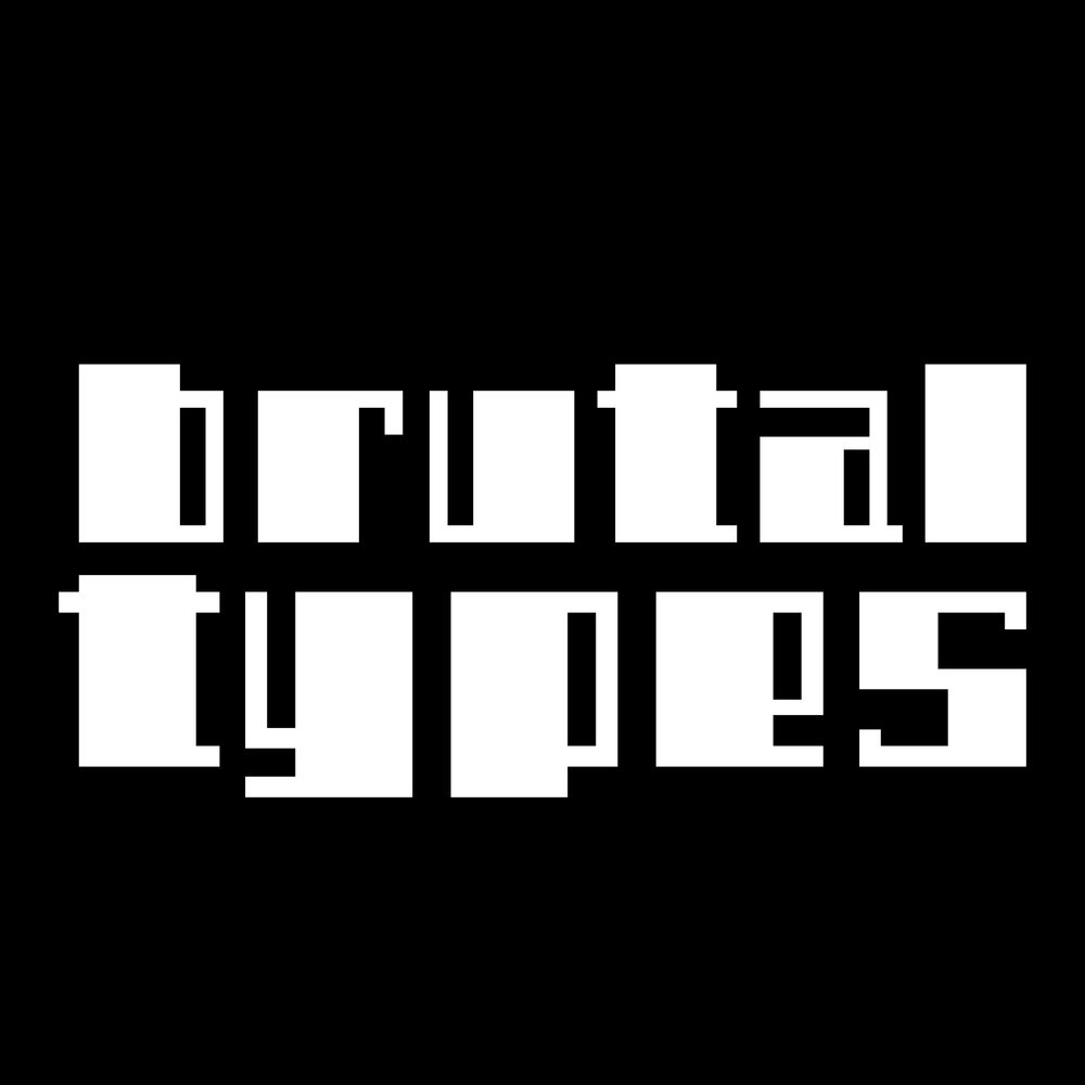
Something brutal is brewing ;)
02.06.2025 13:19 — 👍 8 🔁 4 💬 0 📌 0
I’ve learned that Robert Slimbach — one of our greatest living type designers — is being let go by Adobe. He’s near retirement, but I’m disappointed he’s being shown the door rather than leaving on his own terms. To me, it’s more evidence of Adobe’s waning interest in original type development.
31.05.2025 15:46 — 👍 22 🔁 6 💬 5 📌 2
The Knuth-Bigelow Type Design Incubator
We’re partnering with Stanford to keep languages alive through type design education.
We’re partnering with Stanford to keep languages alive through type design education. Learn more about the Knuth-Bigelow Type Design Incubator: letterformarchive.org/news/the-knu...
#TypeDesign #KBI #LetterformArchive #StanfordSILICON
31.05.2025 05:55 — 👍 34 🔁 8 💬 1 📌 0
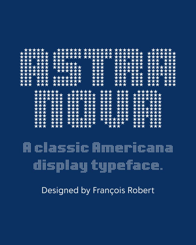
The title “ASTRA NOVA” typeset in all bold capital letters in the font Astra Nova, the design of which has each letter comprised of a grid-based matrix of white stars on a dark blue backgorund evoking a nostalgic, Americana aesthetic. The next line is the subtitle, also set in Astra Nova and in white but amaller and reads: “A classic Americana display typeface.” The last line is set in a sans serif typeface, in white and reads: “Designed by François Robert”
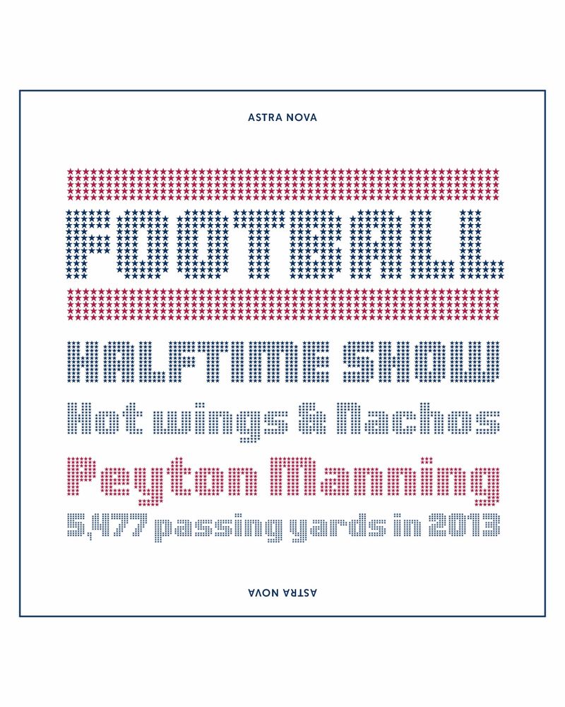
A 5-line type specimen on a white background with a thin, inset blue border and the type is set in various cap heights in the font Astra Nova. Line 1 reads: “FOOTBALL” in large blue capitals, sandwiched between horizontal rules of red stars. Line 2: “HALFTIME SHOW” also in blue. Line 3: “Hot wings & Nachos” in title-case, in blue. Line 4: The name “Peyton Manning” in red. Final line: “5,477 passing yards in 2013”, smaller and in blue.
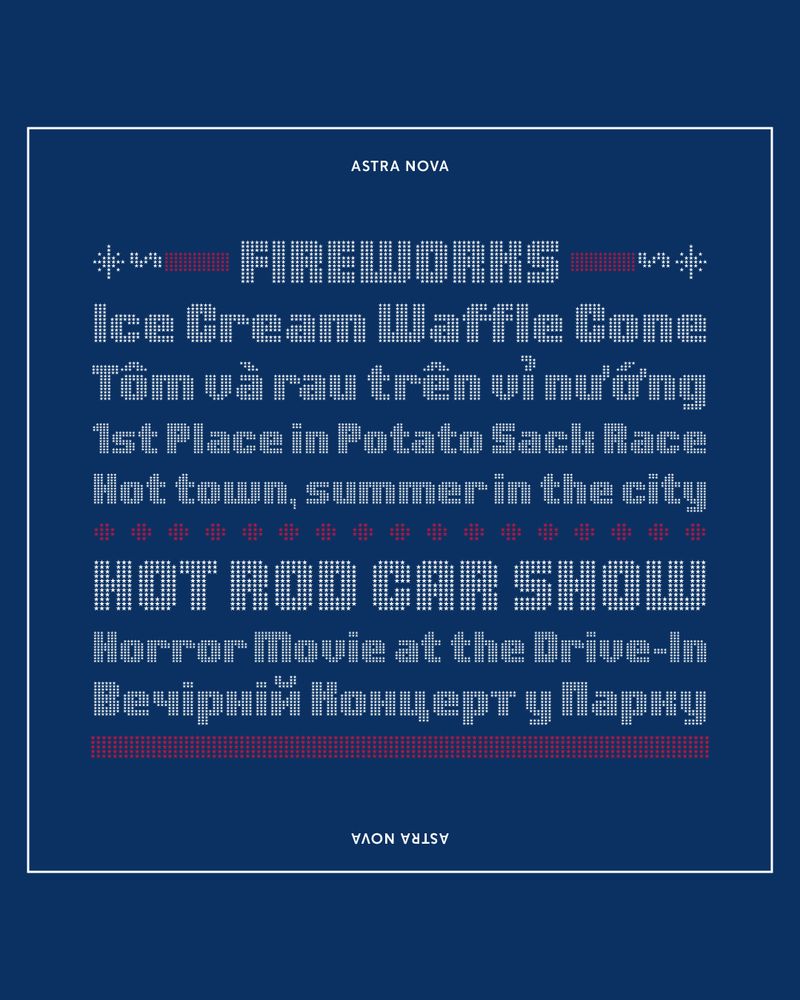
An 8-line type specimen on a dark blue background with a thin, inset white border set in various cap heights and all in the font Astra Nova. Line 1: “FIREWORKS” in white uppercase letters with flanking red and white typographic elements representing firecrackers with lit fuses. Line 2: “Ice Cream Waffle Cone” Line 3: (in Vietnamese) “Tôm và rau trên vỉ nướng”. Line 4: “1st Place in Potato Sack Race,” and Line 5: “Hot town, summer in the city.” A dotted red rule divides lines 5 and 6. Line 6: “HOT ROD CAR SHOW” in white. Line 7: “Horror Movie at the Drive-In” in white. Line 8: (in Ukrainian) “Вечірній концерт у парку” in white. Below that is a bold red rule.
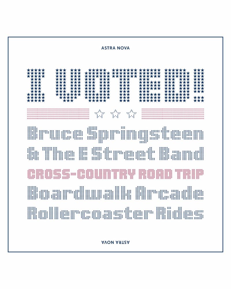
A 6-line type specimen on a white background with a thin, inset blue border set in various cap heights and all in the font Astra Nova.
Line 1: “I VOTED!!” in bold blue star-filled uppercase. Below it is a decorative rule of red stripes and outlined stars. Lines 2 & 3: “Bruce Springsteen & The E Street Band” set in blue. Line 4: “CROSS-COUNTRY ROAD TRIP” in all caps, in red. Lines 5 & 6: “Boardwalk Arcade”, and “Rollercoaster Rides” both blue and in title case.
🤩 NEW! Astra Nova by François Robert is a revitalized classic Americana display type he designed in 1969.
This new version precisely reproduces the overlap grid, while expanding the glyph set, and language support.
Add pizzazz to titles, posters, logos, etc.
Buy Astra Nova today 👉 DelveFonts.com
27.05.2025 19:28 — 👍 7 🔁 2 💬 1 📌 0
FWIW, as of late, uniform paragraph lengths have a bit of an LLM-slop feel to them
26.05.2025 17:00 — 👍 1 🔁 0 💬 1 📌 0
Dan does all the hard work to keep us updated on new typefaces, foundries, &c; and I can’t thank him enough! 🫶
(This time a special thanks for including @sportsfonts.com!)
#typefacts
26.05.2025 08:35 — 👍 8 🔁 3 💬 1 📌 0
Thank you, Christoph, I really appreciate it!
26.05.2025 08:39 — 👍 1 🔁 0 💬 1 📌 0
(* for the purposes of wrapping up this edition, I stopped adding stuff to it around May 14th)
24.05.2025 12:18 — 👍 3 🔁 0 💬 0 📌 0
Recent releases #34, catch-up edition · Atlas of Type
A directory of contemporary type design, with a focus on active, independent type designers and foundries who distribute their fonts through a dedicated web presence or though a small selection of rep...
For your w/e reading pleasure, a long-overdue edition of #AtlasOfType news feat. the typeface releases, updates and expansions of the past month*, as well as new foundry sites, cool projects to explore, publications to order, fundraisers to fund, deadlines to observe:
type-atlas.xyz/news/2025-05...
24.05.2025 12:17 — 👍 5 🔁 1 💬 1 📌 1
Editor, typographer. Wants UK constitutional remake. Supports underdogs.
‘Books that lie open’: https://robinkinross.substack.com/profile/posts
type designer, famously said to be illiterate
xotype.co 📍chicago
Academic, technical, and nonfiction editor, specializing in computer science, ML, AI, economics, finance, and related fields.
Member EFA, ACES
Home: www.wordsbywes.ink
Email: wes@wordsbywes.ink
Type designer looking to find communities about typefaces and type design.
🏠 tudorstype.com
Running Morning Type • Partner at Tipofili • Senior Design at High Tide • OAA (Official Aglet Ambassador) • He/Him/They/Them
Teaching designers & devs about the power of digital typography! 📼 #PimpMyType YouTube Channel 💌 Weekly #FontFriday NL 🤢 Stretched fonts 😍 #variablefonts
Poetic Program, Typographic System
https://www.rmfrt.com/
Publishing Manager, @themhra.bsky.social
Co-editor of the MHRA Style Guide
Posting about scholarly publishing • History and future of the book • Book design, typography, typesetting 📚
Also work on the history of witchcraft & magic 🌒
• Views here my own
Je suis ici aussi / moi-ypsilonediteur-section26 / et plein d’autres choses
Handcrafting pixel-perfect typefaces for game devs, designers & artists.
Browse Fonts 👉🏻 https://wqontype.com
Almost before we knew it, we had left the ground
www.kunisch.info
fonts.google.com
Too many side projects.
---
My ebook library
https://libra.re/ → https://libra.re/library/
Graphic designer and typographer. Working for both large and small organizations around the world.
One half of @retypefoundry.bsky.social
www.paulamastra.com
Home of the European interwar period fonts
https://www.brutaltypes.com/
An independent type foundry run by John Boran Jr.
An independent type foundry based in Berlin, Germany.
commatype.com
(Type-) Designer • Art Director • Devourer of pasta
Typeface design studio, founded 1991. We help clients and agencies worldwide hone their typographic expression, from logos and licensing to custom font suites.