...
05.02.2026 02:18 — 👍 1 🔁 0 💬 0 📌 0
@moaimx.bsky.social
Director de Datos Abiertos en @AgenciaGobMx. Construyo cosas con datos. Los datos no son recurso para generar valor, son herramienta para entender nuestro mundo
...
05.02.2026 02:18 — 👍 1 🔁 0 💬 0 📌 0
"This project takes DJ sets for a walk" with artistic data visualization in background.
Sharing a bit of work in progress:
This projects takes DJ sets for a walk 🚶➡️

I've been cooking. Bon appétit! www.chartography.net/p/the-stereo...
23.01.2026 18:25 — 👍 10 🔁 3 💬 0 📌 2
In many parts of the U.S., gun violence is down to pre-pandemic rates. In some places, shootings are at historic lows. In others, the drop is still out of reach. Use our Atlas of American Gun Violence — now updated with all 2025 data — to see how gun violence has marked your corner of the country.
08.01.2026 01:17 — 👍 14 🔁 11 💬 1 📌 0Archaeologist here. For 99.5% of human history (ca 300-400,000 years), we were peaceful (no war). There was conflict and smaller scale violence, but countless studies on the 119 known modern hunter gatherer groups show cooperation, negotiation, and peace instead of conflict. Please read books.
17.11.2025 22:46 — 👍 1658 🔁 422 💬 14 📌 5
1/
¿Olvidaste la contraseña de tu #LlaveMX🔑?
Te damos el paso a paso para recuperarla:
1️⃣ Entra a 👉 llave.gob.mx
2️⃣ Da clic en “Olvidé mi contraseña”
3️⃣ Ingresa tu correo y recibe el enlace para restablecerla
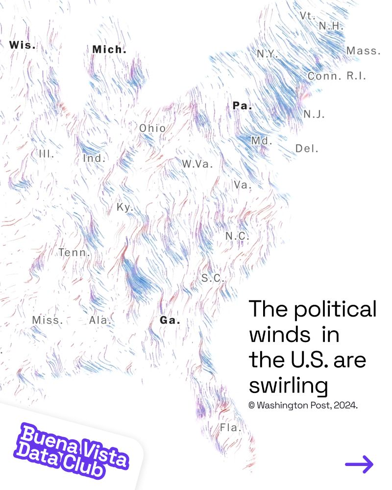
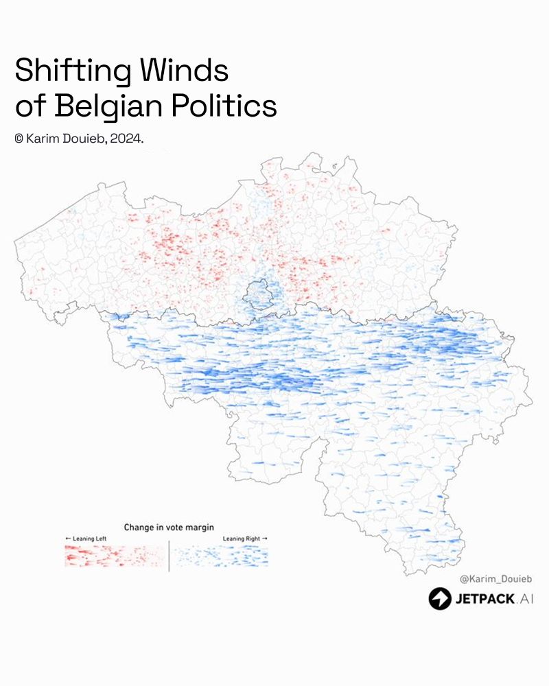
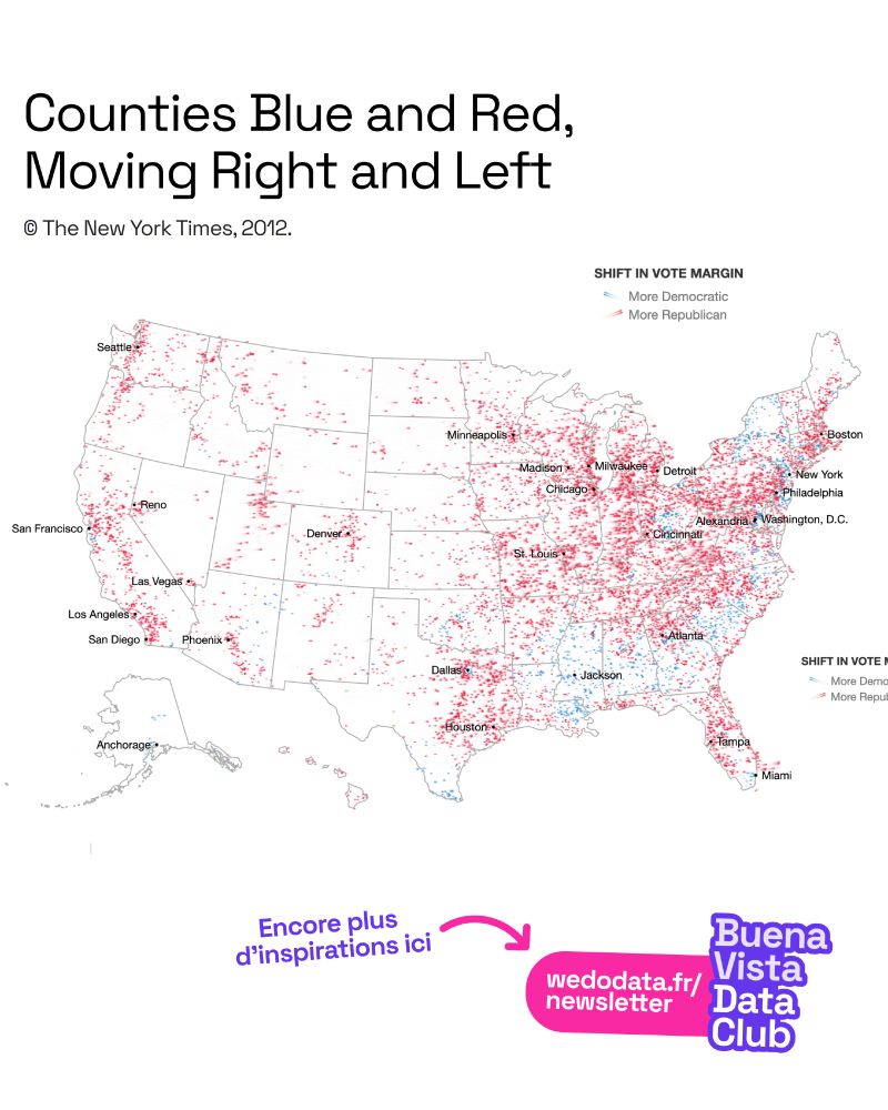
Des cartes inspirantes ! Voici des cartes qui utilisent la métaphore du vent pour illustrer la dynamique électorale entre deux dates. La direction et la couleur montrent le changement du vote sur une période donnée, la longueur du trait son intensité.
#dataviz #data #cartographie #map #carte
History requires deep, extensive research a lot of that research will end up not being directly relevant. You won't know that until you get in it. Research isn't just pulling a doc with all the answers, it's finding connections, it's understanding what's *not* being said, it's knowing context.
16.06.2025 14:27 — 👍 1110 🔁 178 💬 7 📌 29We do not invite the fae into the house and that now includes generative AI. We do not give them our full names and we do not, under any circumstances, make any sort of deal with them.
15.07.2025 01:44 — 👍 190 🔁 80 💬 4 📌 0
So much to love in the scrollytelling — the ternary plot, the depth of the data, the findings — but my favourite part is the explanation and the text in general. 📊
Remember, a chart doesn't have to be understood in 3 seconds. It should reward the effort you put into understanding it.

Valentina D'Efilippo www.poppyfield.org vibes too
26.04.2025 14:59 — 👍 2 🔁 1 💬 0 📌 0

Just realised what this Trump chart reminds me of
25.04.2025 20:07 — 👍 31 🔁 4 💬 4 📌 0
You can serve PMTiles directly from a cloud object storage but sometimes, you want to control who accesses data and how often—and you need a server for that. Craig Kochis wrote examples of how to serve PMTiles using a NodeJS server application.
ckochis.com/serve-protom...
Que maravilla...
15.04.2025 14:39 — 👍 1 🔁 0 💬 0 📌 0All projections are "good" and all projections are "bad". Just depends on your map's purpose and audience
14.04.2025 12:36 — 👍 11 🔁 2 💬 1 📌 0
NEW: We simulated a disease outbreak to show how vaccines can stop the spread of a contagious disease. With @fparis.bsky.social @upshot.nytimes.com (Paywall-free gift link) 🎁
13.04.2025 21:14 — 👍 193 🔁 78 💬 4 📌 7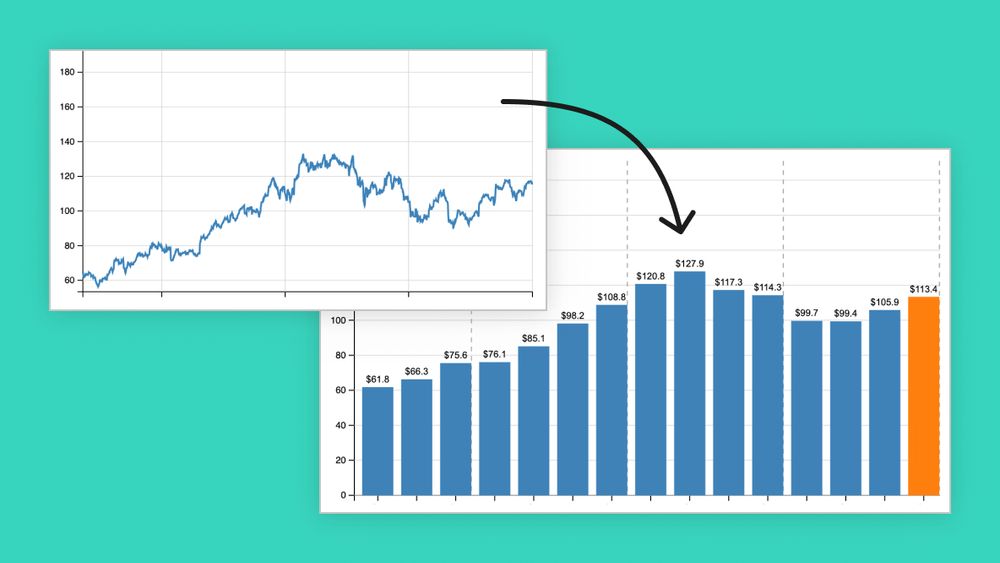
Large language models (LLMs) and AI tools have proven to be very useful for programming, but how do they do when writing D3 code? In this blog post, we explore Claude's ability to create and modify some basic charts from time series data.
03.04.2025 23:00 — 👍 10 🔁 1 💬 0 📌 0
🚨 JOURNALISM JOB ALERT 🚨
@propublica.org is hiring a Graphics Editor to help bring our investigations to life through charts, graphs and all manner of visuals.
Apply and get all the details, including salary range, here 👇👇

Sunshine Hours vs. Annual Rainfall Across The UK
Learn more: moverdb.com/sunshine-hours-...
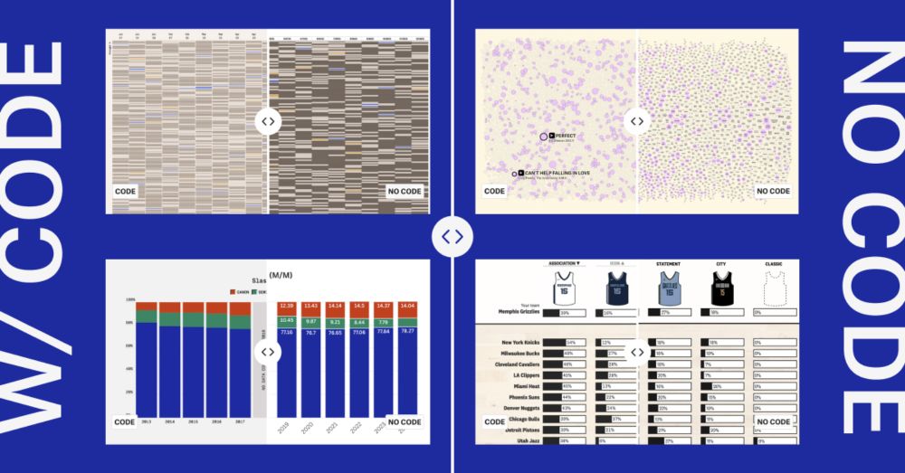
New video tutorials! You don't need to be a developer to make cool charts — here's how to recreate some of our latest graphics without using any code.
pudding.cool/process/no-c...

last spring, after a 2 year pause in client work, I noticed a significant uptick in clients asking for line+bar+pie charts 📈📊 even tho they come to me (I thought) for bespoke #dataviz. I wrote about it here: www.shirleywu.studio/notebook/202...
fellow #dataviz friends have you experienced the same?

IRE’s Phil Meyer Award recognizes the best use of social science research methods in journalism.
This year’s second-place prize went to @alexiafernandezcam.bsky.social, @pratheekrebala.bsky.social, April Simpson, @jlaf.bsky.social, Nadia Hamdan, Cynthia Rodriguez and Roy Hurst: 40acresandalie.com
Once again, the New York Times gives the dataviz community an opportunity to reflect on its purpose.
Can everything be quantified and turned into a chart?
Most important: what are the consequences of a chart?
If words matter, charts matter too.
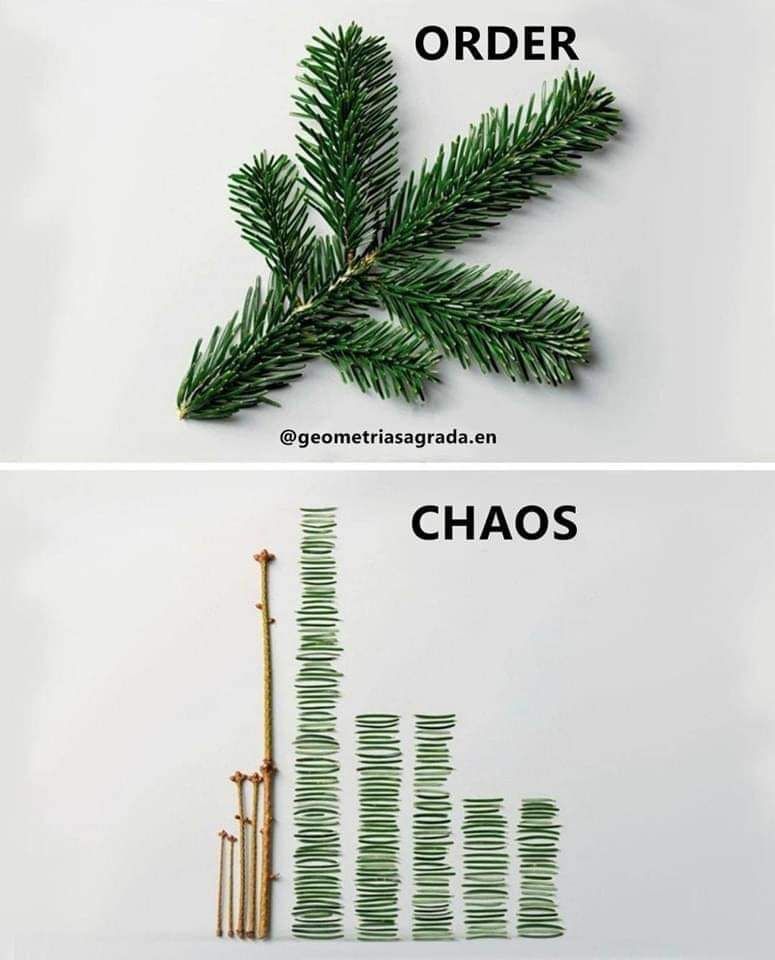
Top: the word order with a short fir tree branch on a white background. Bottom: the word chaos with a decomposition of the fir tree branch: three twigs and all needs organized like a bar chart.
When we visualize data, we reorganize the world, grouping and degrouping people and things across categories and time.
We remove a certain order as much as we create one. 📊
Closeread Prize winners are here! 🏆
Want to create engaging, scroll-based stories with your data? See stunning scrollytelling examples made with Quarto: posit.co/blog/closere...
Learn more about Closeread and its power to create dynamic narratives. Congrats winners! #Quarto #RStats #Python
Every industry AI sets its evil eye lasers on says the same thing: we don't lack ideas, thanks, we lack time and money.
It's almost like AI was cooked up by people with time and money, but lacking ideas.
On the communication side of dataviz — what would you say, were the "hits" in the last few years? Pieces that went viral, found wide adoption, opened new audiences, were shared a lot.
21.02.2025 09:54 — 👍 82 🔁 22 💬 30 📌 8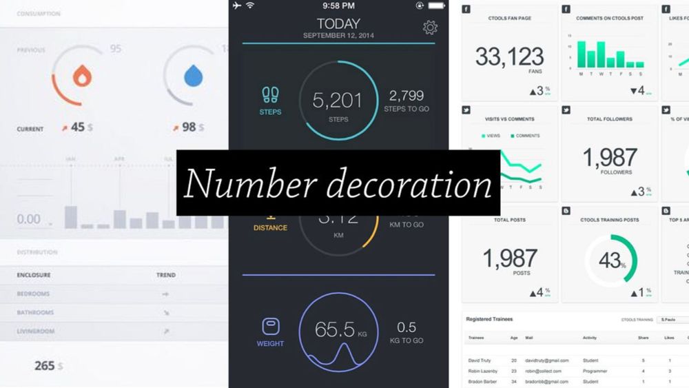
"…there’s one nut we have not been able to crack: anchoring bespoke data visualization as a full fledged profession in corporate settings."
Re-reading this article from 2017 (medium.com/visualizing-...), I wonder — where are we at 8 years on?
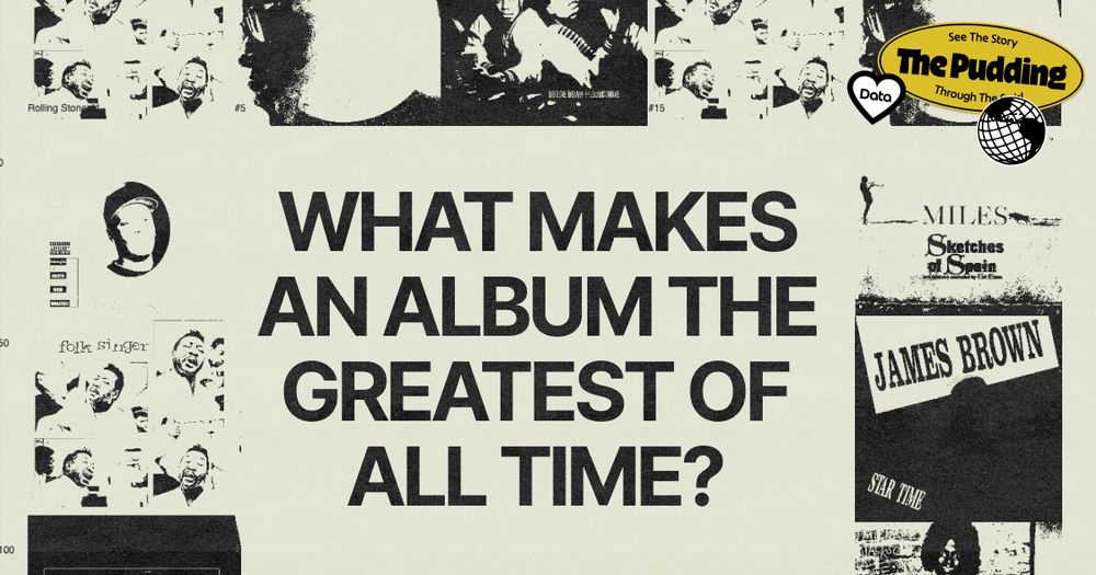
Rolling Stone just released their top albums of the 21st Century with Beyonce’s Lemonade at #1. Last year, we looked at what could influence these rankings: popularity, original release
medium, streaming availability, and the judge’s gender and age.
pudding.cool/2024/03/grea...