bro is that tom nook of finland
17.01.2026 09:44 — 👍 1 🔁 0 💬 0 📌 0

Wanjirou from Mahjong Soul in colorful robes
Happy belated birthday to the best character in Mahjong Soul, who is allowed to eat as many tiles as he wants
16.01.2026 04:17 — 👍 8 🔁 2 💬 1 📌 0

Three illustrated animals stacked on top of each other in a cute style. A blue bunny, yellow kitty, and pink dog. The bunny and kitty are facing the same direction yelling "keep" and "makin'" in word bubbles and the dog is facing the opposite direction with "art!" in a fart cloud from his butt.
My sincere wish for all of us in 2026 is we all keep makin' art! Good, bad, stinky – it doesn't matter! Let's keep making things. ✏️💨
31.12.2025 22:06 — 👍 2491 🔁 1002 💬 7 📌 5
ambient maria is live now to 9 pm pacific with a special holiday sunday sundowns! tune in twitch.tv/theambientma...
08.12.2025 02:08 — 👍 4 🔁 1 💬 0 📌 0
Pokemon is basically a thing Nintendo does where once every couple of years they release a new set of character designs and I get to enjoy cute fanart based on these character designs for the next two years. Allegedly, a video game is somehow involved somewhere
07.11.2025 00:15 — 👍 1246 🔁 121 💬 21 📌 6
well, they did tear down her office
06.11.2025 07:43 — 👍 1 🔁 1 💬 0 📌 0
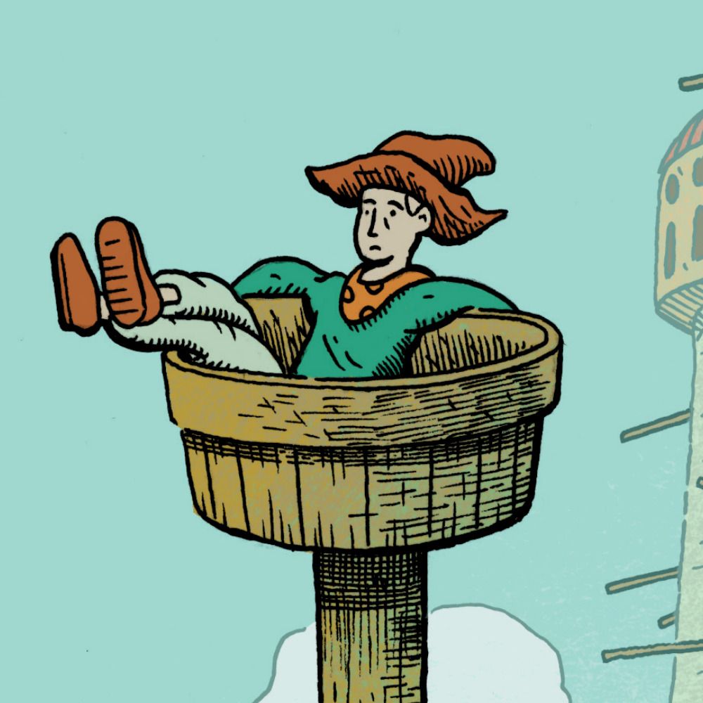
Legends 🌟
#nightinthewoods x #animalcrossing
16.01.2025 08:28 — 👍 1762 🔁 592 💬 8 📌 2
YouTube video by westernvinyl
Erik Hall - "Music for a Large Ensemble" (Steve Reich)
we're so back. youtu.be/aDl3cwrpz_U?...
04.11.2025 18:30 — 👍 1 🔁 1 💬 0 📌 0

all the A's i drew for #fontober 2025 (and an accurate representation of my mental state afterwards lol). which one was your favorite?
big thanks to everyone who followed along and provided feedback and encouragement ❤️ let's do it again next year!
02.11.2025 05:37 — 👍 2 🔁 0 💬 0 📌 0
that's it for fontober this year! thanks for your views and support, and stay tuned because i've got some more fun designs in the works ❤️
31.10.2025 20:21 — 👍 1 🔁 0 💬 0 📌 0


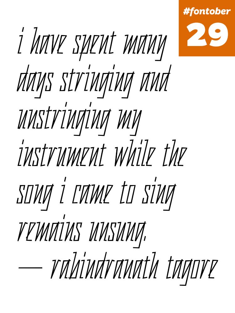
#fontober day 31 (LAST DAY 🎃): i had zero inspiration this morning so i just made a lowercase to complement the uppercase from yesterday. i like how i was able to reuse the weird serif from C in a/c/r/s. it feels like the headline from an old-timey railroad timetable or almanac
31.10.2025 20:21 — 👍 1 🔁 0 💬 1 📌 0
one of my favorite struggle meals is power oatmeal: two bags of instant oatmeal with a gob of peanut butter stirred in. raisins if i’m feeling fancy. equally good for camping and depression
31.10.2025 03:22 — 👍 0 🔁 0 💬 1 📌 0
pure fat is about as calorie-dense as you can get (about 100 calories per tablespoon). peanut butter and tahini both come very close to that. cheese is good too
31.10.2025 03:19 — 👍 0 🔁 0 💬 2 📌 0
i mean
CPUs are basically magic crystals
29.10.2025 19:13 — 👍 7 🔁 1 💬 0 📌 0

A Calvin and Hobbes strip where Calvin’s dad is going to read him a bedtime story.
First panel:
Calvin’s dad, scanning a bookshelf: “What story would you like tonight? We can read anything except—“
Calvin, from bed, excited: “The Voynich Manuscript!”
Second panel:
Calvin’s dad, deeply exasperated: “NO! No Voynich Manuscript tonight! We’ve tried to decipher that book a million times!”
Calvin, yelling: “I want the Voynich Manuscript!”
Third panel:
Calvin’s dad, trying to reason with him: “Look, you *know* how the story goes! You’ve memorized the whole thing! It’s completely unreadable!”
Calvin: “I want mysterious glyphs and sigils!”
Fourth panel:
Calvin, in bed and staring wide-eyed into the dark: “Wow, the story was different *that* time!”
Hobbes, also in bed and staring: (a long string of incomprehensible characters).
23.10.2025 21:07 — 👍 1086 🔁 279 💬 10 📌 16

shout-out to @dtemkin.bsky.social for getting me thinking about upside-down fonts with his Language 2, in which every other line goes backwards (5/5)
28.10.2025 20:27 — 👍 2 🔁 0 💬 0 📌 0

i took Times (a serif font most people are very familiar with), swapped the top and bottom serifs, flipped "symmetric" letters like s and x, and adjusted a/c/e/g to make them look better upside-down. the effect is striking IMO! (4/5)
28.10.2025 20:27 — 👍 0 🔁 0 💬 1 📌 0
i wanted to explore whether it works for text too, i.e. if i could make a font that looked OK upside-down but wrong when right side up. (3/5)
28.10.2025 20:27 — 👍 0 🔁 0 💬 1 📌 0

Thatcher effect - Wikipedia
the thatcher effect is a famous optical illusion where picture of a face (originally margaret thatcher's) looks fine when upside down but is revealed to have unsettling upside-down eyes and mouth when turned right-side up. (2/5) en.wikipedia.org/wiki/Thatche...
28.10.2025 20:27 — 👍 0 🔁 0 💬 1 📌 0


#fontober day 28: the font in the first image is plain old Times, just upside down, right? now look at the second image where i turn it right side up. wtf!! (1/5)
28.10.2025 20:27 — 👍 4 🔁 1 💬 1 📌 0
special thanks to @rebeccasolnit.bsky.social for the quote
24.10.2025 22:06 — 👍 1 🔁 0 💬 0 📌 0


#fontober day 22: @warriorchicken.me requested a font related to "brass music and trumpets" for her bday so i thought of the way the trumpet maker's name is engraved on the bell sometimes, all ornate and swooshy. might finish this one tomorrow. thanks to lttrink.com for the assist with the strokes!
22.10.2025 21:13 — 👍 2 🔁 0 💬 0 📌 0
just another illustrator
amandacotan@gmail.com
amandacotan.com
ケモノとか都市背景とか描きます
x.com/KatamichiRecord
Fighting every day to deliver a city that working New Yorkers can actually afford. Mayor of New York City.
Cartoonist. Picture books, GNs, Xavier Riddle & the Secret Museum, Ordinary People Change the World book series.
30 Frog, and Artist! 🐸
Hatched in Fresno
Authentic Gamer Girl 🙆🏻♀️
In baseball anime we don't say "I love you," we say "I want to see him stand on the mound at Kōshien" and I think that's beautiful
header by @pauljonmilne.bsky.social
makes keepingtimecomic.com
she/they, 26, trying to make a game
twistcmyk on twitter, tumblr, insta
my NSFW art is merged here & will be tagged, mind your content settings! 18+
contact@twist.dog
http://shop.twist.dog
https://ko-fi.com/twistcmyk
https://patreon.com/c/twistcmyk
shape engineer ✧ @desktopgeneration.com ✱ commission slots open, DM/Email for info! ✧ 📧→chocographix@gmail.com ✱ https://patreon.com/chocographix ✧ Portfolio → https://chocographix.net
Writer/Illustrator/noted Christmas enthusiast. Listen to "Deck the Halls (with Matrimony!)" on your favorite podcast app! Children's books: "Santa's Husband" +"Princess Dinosaur" available from your favorite book seller. Chinook now available on Wondery+!
Generative concrete poems by @rmfrt.com (work in progress)
Daily Jucika Strips, enable notification bell to see posts
she/her. musician, writer, podcaster, weird vidgame person http://www.patreon.com/ellaguro
the internet's uncle • waging a victorious 2-front war against cars and christmas • big fan of being a big fan of things • go read https://anildash.com
✨Comics & Figure Skating⛸️|🦌Blades of Furry Creator🦇 | 💍Wifey of Deya Muniz | Repped by Britt Siess | 🌈She/He/Any
Draws islands, writes comics, plays tabletop games
pcrf.net
sagehowardillustration.net
Poetic Program, Typographic System
https://www.rmfrt.com/
Artist, designer, cat dad, queer as folk.
🏳️🌈👬🏻
Artist + esolanger, he/him
New book: Forty-Four Esolangs—the first artist’s monograph of programming languages—out now: https://mitpress.mit.edu/9780262553087/forty-four-esolangs/