Although it’s probably great for gym bros for whom a Waterrower isn’t “manly” enough, I guess.
01.08.2025 14:40 — 👍 0 🔁 0 💬 0 📌 0
First time rowing on a Concept 2 rower. That thing is a dystopian steampunk machine straight out of a Mad Max movie.
01.08.2025 14:39 — 👍 0 🔁 0 💬 1 📌 0
“Color which, like music, is a matter of vibrations, achieves what is most general and therefore most indefinable in nature: one’s inner power.”
― Paul Gauguin
05.07.2025 15:51 — 👍 3 🔁 0 💬 0 📌 0
By the way, if you’re that person that posts AI-generated text, this advice isn’t for you. Keep doing what you’re doing. Keep stuffing AI slop in your social media cards so the rest of us get a chance to ignore your output.
(6/6)
05.07.2025 07:40 — 👍 0 🔁 0 💬 0 📌 0
So your article or post (which you probably put a fair amount of work in) will be ignored because of an image that flicks away in a social media feed for a split-second?
Don’t let this happen to you. Let people read your headline. Give them a chance to reflect on the quality of your writing.
(5/6)
05.07.2025 07:40 — 👍 0 🔁 0 💬 1 📌 0
Here’s the catch, though. How do people know you didn’t just have your text generated, as well?
They don’t.
So they’ll just assume you did.
Guess who wants to read a text from ChatGPT?
Right—nobody. (They can ask ChatGPT on their own, tailored to their own world view, you know.)
(4/6)
05.07.2025 07:40 — 👍 0 🔁 0 💬 1 📌 0
Why is that? People connect an AI-generated image to low effort and laziness.
Which, let’s be honest, is what it was for you. You couldn’t be bothered to create or license a picture. So you just had one generated on a whim.
(3/6)
05.07.2025 07:40 — 👍 0 🔁 0 💬 1 📌 0
Those people can spot AI slop from a mile by now. Especially AI “illustrations”. Guess what? They won’t even read your headline in that case. They’ll just keep scrolling.
For your article’s sake, don’t use an AI image. It’s a deterrent! Having no image gets you more readers than AI slop.
(2/6)
05.07.2025 07:40 — 👍 0 🔁 0 💬 1 📌 0
🧵Hey bloggers and Medium writers, I get it. You want a nice preview image for those fancy social media cards. That’ll surely make more people click your link, right?
Here’s a dirty little trade secret for you:
(1/6)
05.07.2025 07:40 — 👍 0 🔁 0 💬 1 📌 0
Today, we are just as far away from 2000 as we are from 2050 (8,949 days).
02.07.2025 18:22 — 👍 0 🔁 0 💬 0 📌 0
I think it was Matthew Carter who is said to have stated, “Type design is not taxidermy”, in regard to type revivals.
But I cannot seem to find a source.
Anyone have a link or literature source at hand?
02.07.2025 14:03 — 👍 1 🔁 0 💬 0 📌 0
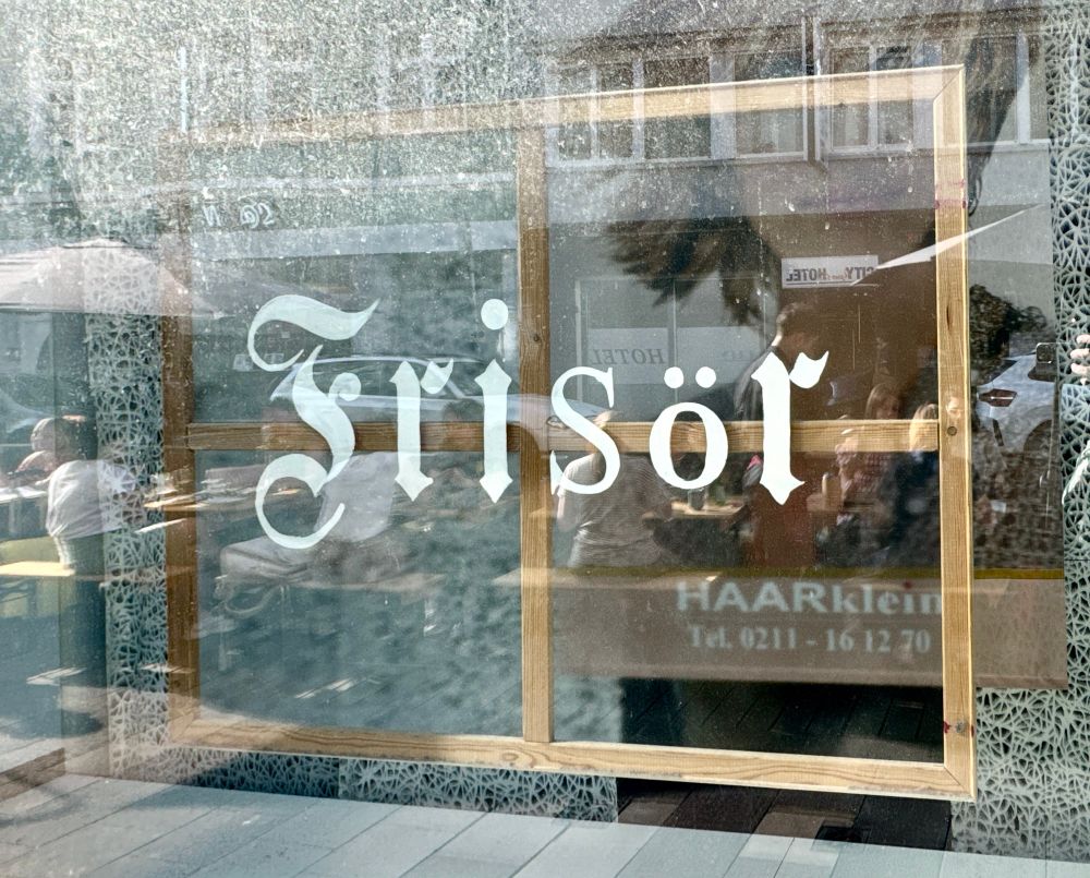
Schild „Frisör“ in eonem Schaufenster. Die Buchstaben F, R, I und R sind in der Titelschrift der FAZ gesetzt, S und Ö aus zwei anderen Serifenfonts.
Beim zweiten Besuch der Straße in Düsseldorf habe ich es kapiert: In „Frankfurter Allgemeine Zeitung“ fehlen die Buchstaben S und Ö.
20.06.2025 16:51 — 👍 77 🔁 3 💬 4 📌 0
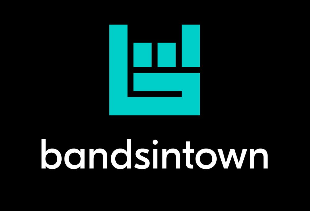
Bandsintown lockup. Icon: light cyan “Heavy Metal Horns” gesture that also doubles as a “b” with a stylized audio bar visualizer above it, composed entirely of rectangular shapes. Logotype below: “bandsintown”, typeset in a a generic geometric sans.
Never heard of Bandsintown before. Noticed them today because they’ve got the best logo I’ve seen in a while. www.company.bandsintown.com/brand-assets
21.06.2025 12:02 — 👍 0 🔁 0 💬 0 📌 0
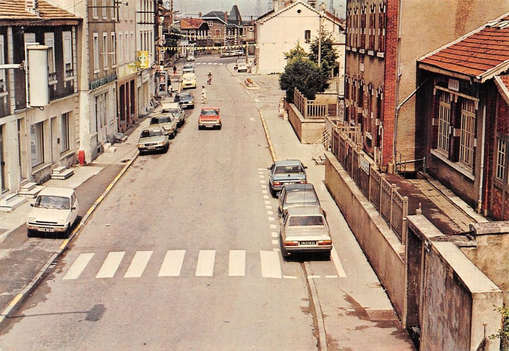
54 Herserange 1979
18.06.2025 17:26 — 👍 2 🔁 1 💬 0 📌 0
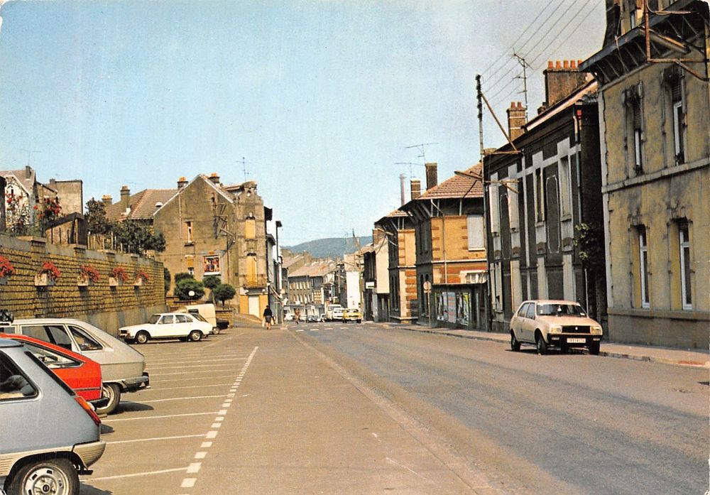
54 Piennes 1979
18.06.2025 17:27 — 👍 2 🔁 1 💬 0 📌 0
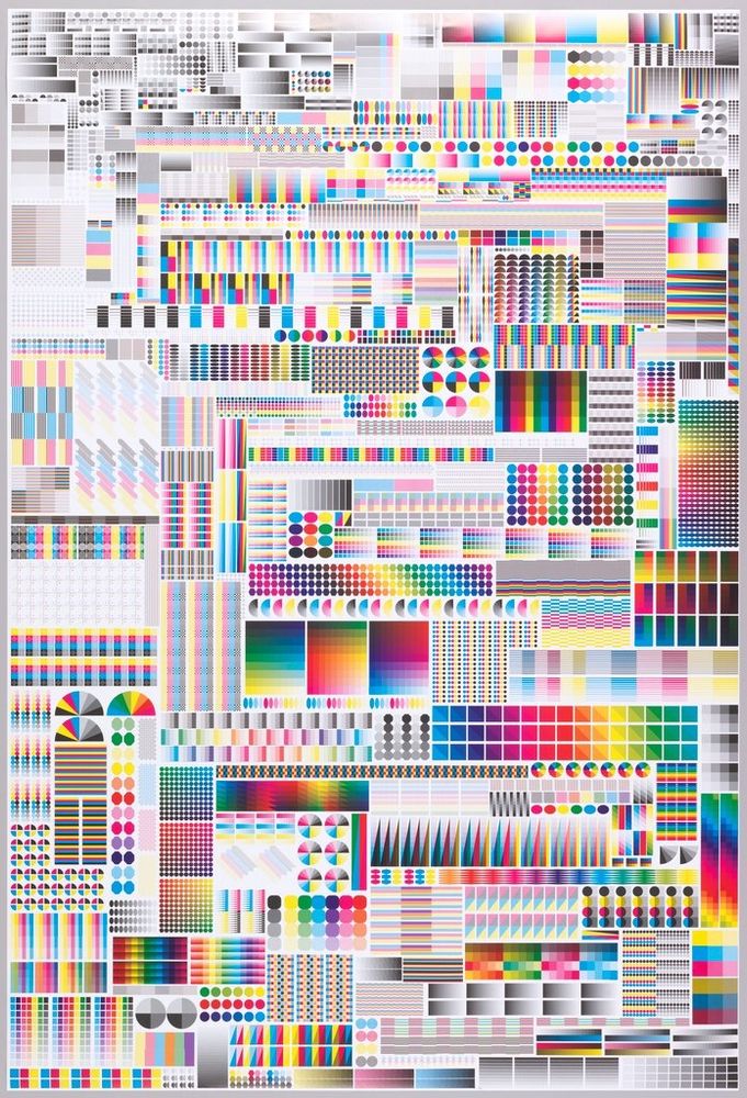
A dense poster of hundreds of printers marks/colour tests arranged vertically and horizontally to fill all space
A poster of printers marks. 2008. Fanette Mellier.
collection.cooperhewitt.org/objects/354608
18.06.2025 10:10 — 👍 261 🔁 53 💬 5 📌 6
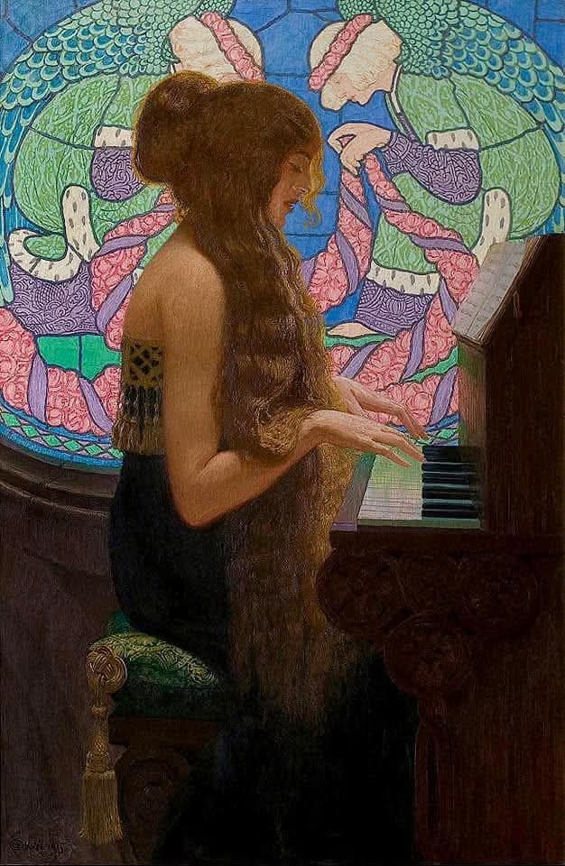
Sacred Music (1915)
by Edward Okuń
11.06.2025 09:38 — 👍 20 🔁 3 💬 0 📌 0
Solomon R. Guggenheim Foundation
Hannelore B. and Rudolph B. Schulhof Collection, bequest of Hannelore B. Schulhof, 2012
© 2016 Artists Rights Society (ARS), New York / SIAE, Rome
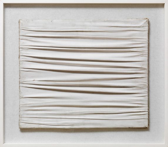
Achrome by Piero Manzoni, 1962 #artbots #guggenheim
https://botfrens.com/collections/212/contents/137430
10.06.2025 09:45 — 👍 23 🔁 1 💬 1 📌 0
Far far away
by Frances Featherstone
10.06.2025 11:01 — 👍 22 🔁 5 💬 0 📌 0
When life hands you lemons (2024)
by Frances Featherstone
10.06.2025 11:03 — 👍 14 🔁 4 💬 0 📌 0
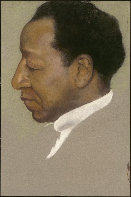
Painted image of artist Beauford Delaney, seen from the side, his eyes downturned, his white collar the only piece of his clothing visible
Georgia O'Keeffe's stunning portrait of fellow artist Beauford Delaney, from the collection of the National Portrait Gallery npg.si.edu/object/npg_N...
30.05.2025 21:41 — 👍 7346 🔁 737 💬 107 📌 38
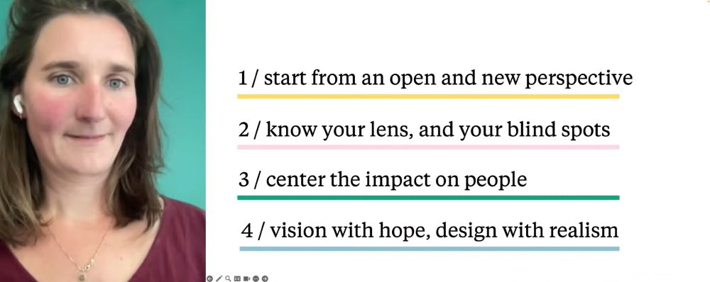
Lotte Jacobse's slide on what you can do as an individual designer (from her KRUPA design conference keynote):
1. Start from an open and new perspective
2. Know your lens, and your blind spots
3. Center the impact on people
4. Vision with hope, design with realism
If you're overwhelmed as a designer right now, let's break it down to: What can *you* do?
23.05.2025 14:46 — 👍 0 🔁 0 💬 0 📌 0
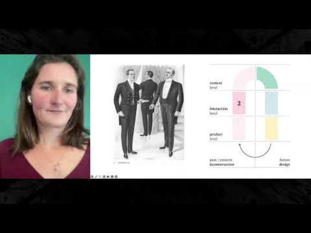
KRUPA
YouTube video by RecOnFace Studio
Lotte Jacobse presenting the Reframing design method at KRUPA design conference right now. Live stream: www.youtube.com/live/iwOnoc_...
23.05.2025 14:14 — 👍 0 🔁 0 💬 1 📌 0
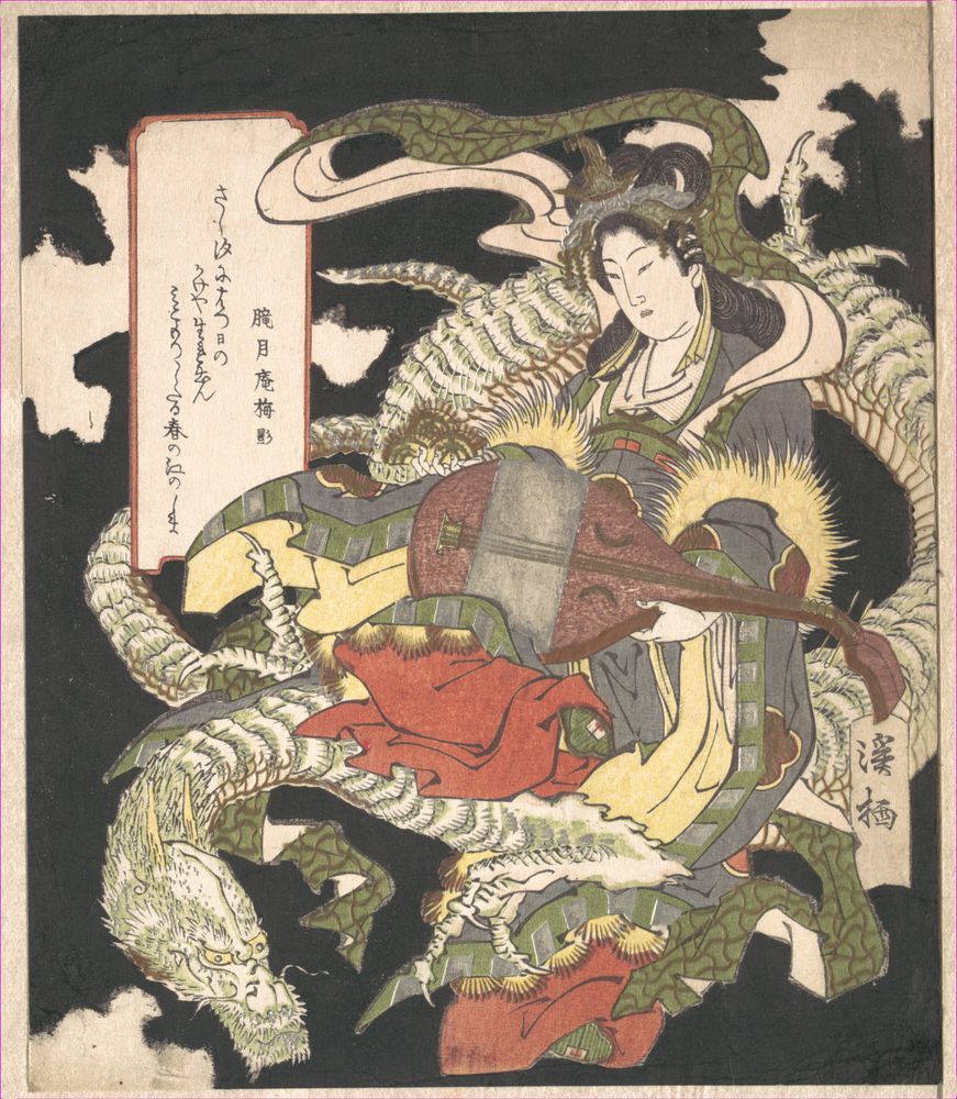
Traditional Japanese woodblock print depicting Benzaiten with a white dragon, symbolizing her connection to water deities and wisdom. (Aoigaoka Keisei, 1832)
Benzaiten, originally a Hindu river goddess adopted into Buddhism, is one of Japan's Seven Lucky Gods. Known for bestowing wisdom, music and eloquence, she's often depicted with a biwa (lute) and surrounded by water symbols, dragons, or serpents.
09.05.2025 08:30 — 👍 103 🔁 10 💬 3 📌 0
Keiji Shinohara(Japanese)
woodcut
09.05.2025 08:34 — 👍 62 🔁 10 💬 1 📌 1
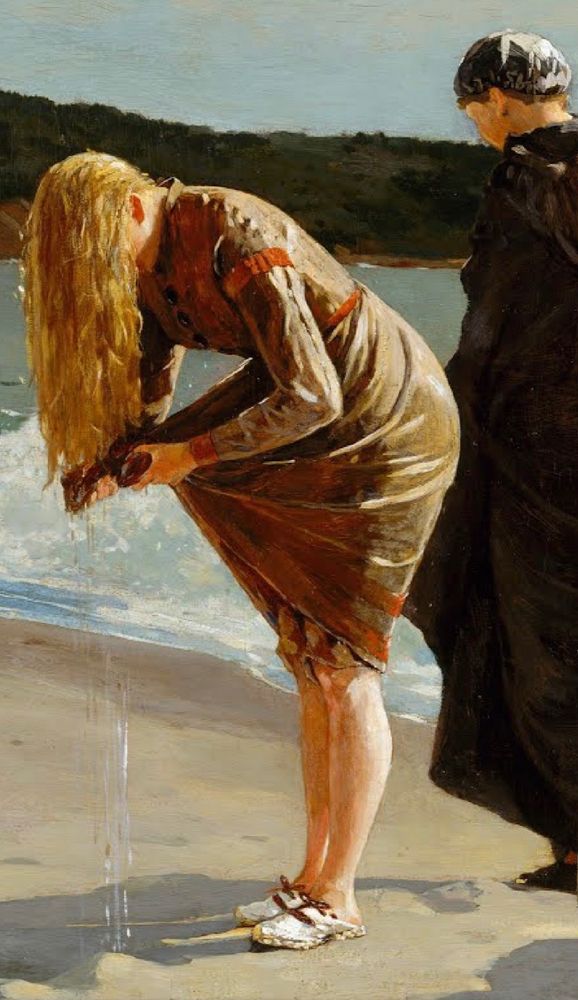
“Eagle Head, Manchester, Massachusetts (High Tide)” (detail), 1870, by Winslow Homer.
09.05.2025 08:41 — 👍 101 🔁 21 💬 2 📌 0
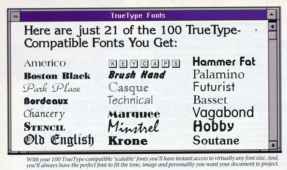
A 1993 screenshot of a font menu in three colums displaying 21 knockoff typefaces with hilarious names trying to stick close to the original trademark names, e. g., "Palamino" for "Palatino", or "Minstrel" for "Mistral".
Gosh, I’d certainly like to do some rad layout work with my 1993 selection of classic fonts like “Palamino”, “Minstrel”, “Hobby”, or—who doesn’t love it?—“Soutane”.
04.05.2025 14:02 — 👍 5 🔁 1 💬 3 📌 0
Tracking Germany's assistance for Ukraine | Plenty of writing | Proud to be mentioned on German television | info@deaidua.org | Threema: V95AP84E
https://deaidua.org/en/
https://deaidua.org/news/
https://ko-fi.com/deaidua
quality writing on : art : design : media
also The Signifier : six : shot : gallery
🌐 https://medium.com/signifier
Editor & Curator: @remydean.bsky.social
🏞️ I’m StuntmAEn Bob & I do pixel art
📩 bob.stuntmaen@gmail.com 💌
🛍️ https://www.inprnt.com/profile/stuntmaen_bob/
☕️ https://ko-fi.com/stuntmaenbob
🚫 no AI/ nf t
You can also find me on Insta, Mastodon, Tumblr & Cara!
#pixelart #pixelartist #pixel ✨
Signed comic prints: beetlemoses.bigcartel.com
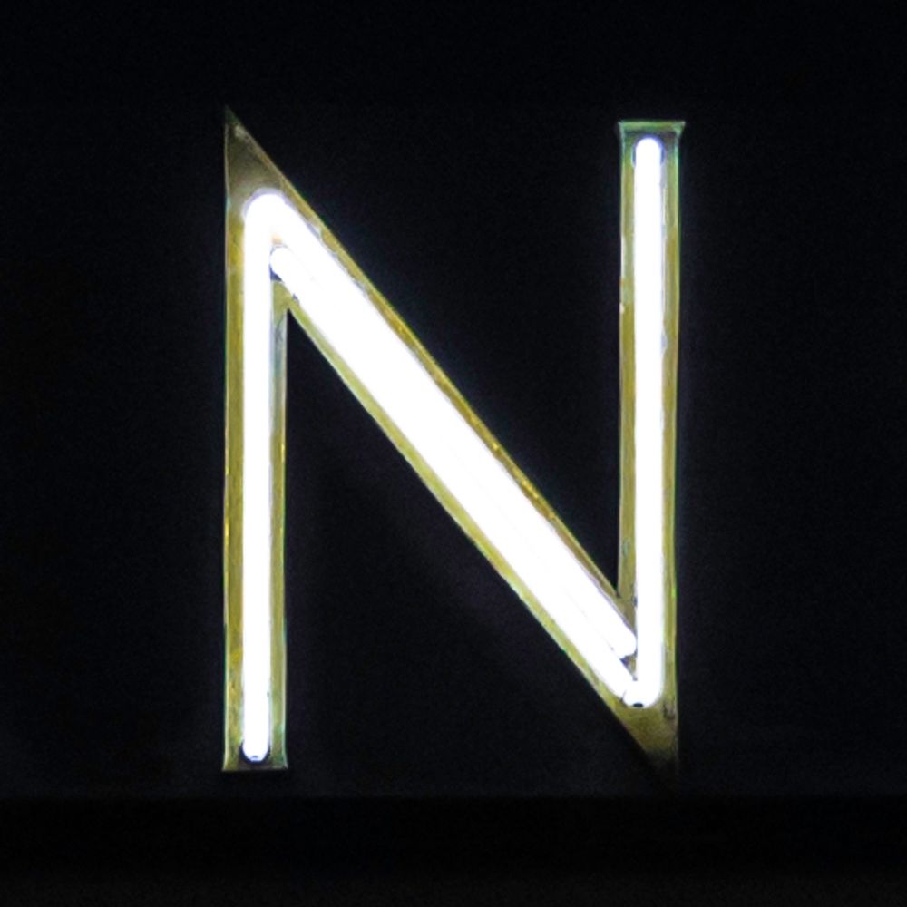
Germany’s finest neon.
A project of @berlintypography.bsky.social
Explore the best of Japan with us! Follow for event updates, travel guides, and insider tips. Hokkaido to Okinawa, we've got it all. https://hey-japan.com
News and information from the European Commission. Social media and data protection policy: http://europa.eu/!MnfFmT
President of the @ec.europa.eu
Mother of seven. Brussels-born. European by heart. 🇪🇺
Comics pulled kicking and screaming from a designer’s head.
https://designthinking.lol
One half of the award-winning german/spanish design studio RUSKA MARTÍN ASSOCIATES based in Berlin (HQ) and Valencia. Working for international and small brands. Interested in too many things. Views are my own.
https://ruskamartin.com
I paint because I can’t think of anything better to do.
graphic designer / visual artist
————————
UA / UK / NL / DE / FI
🇺🇦 / 🇬🇧 / 🇳🇱 / 🇩🇪 / 🇫🇮
Wir gehen für die Grundrechte vor Gericht.
Deine Unterstützung zählt! 👉 https://freiheitsrechte.org/mitmachen
Mastodon: freiheitsrechte@chaos.social
staff writer @theatlantic. author of GULAG, IRON CURTAIN, RED FAMINE, TWILIGHT OF DEMOCRACY and AUTOCRACY INC
https://linktr.ee/anneapplebaum
#ClimateEmergency
#ClimateAction
Institut für experimentelles Denken
Artlover/LoveArt
Hart to handle
Dyslexie mit Niveau
https://open.spotify.com/user/jn0rguv91q3br4256bsi16fbh?si=i
offshore – scientist by day, dancer by night 🇨🇭
The graphic joy of mid-century Eastern Bloc matchbox labels.
Prints are available to buy online http://matchbloc.com