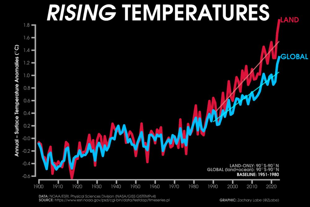
Line graph time series showing global land surface temperatures (90°S to 90°N) in a red line and global mean (land+ocean) surface temperatures (90°S to 90°N) in a blue line. Temperatures are averaged annually from 1900 through 2024. Linear least squares trends are also shown from 1990 to 2024. The land is warming faster than the global mean.
As a reminder, land areas (where we live) are warming around twice as fast as over the oceans. Subsequently, most of us are 'feeling' temperatures rising faster than the global mean record.
Graphic from zacklabe.com/climate-chan...
21.09.2025 00:57 — 👍 359 🔁 125 💬 4 📌 5

A line graph shows the time series of global mean surface temperature anomalies for each January-August from 1850 through 2025. There is a long-term increasing trend and large year-to-year variability. The mean surface temperature anomaly in January-August 2025 was 1.17°C globally. Anomalies are computed relative to a 1901-2000 climate baseline. All data is from NOAA/NESDIS/NCEI NOAAGlobalTemp v6.0.0 on this graphic.
Global temperatures so far this year are still the 2nd warmest on record when comparing with each prior January-August period. However, a ranking of #3 is most probable by the end of 2025.
Data provided by NOAAGlobalTemp v6.0.0 (www.ncei.noaa.gov/products/lan...).
22.09.2025 21:47 — 👍 71 🔁 15 💬 0 📌 1
I’m completely baffled by this reporting on getting weather and emergency alerts through only social media.
The majority of the public is not on Twitter/X, and the bizarre Facebook algorithm shows a mix of trashy AI videos and days-old news? I’m so confused.
06.07.2025 02:20 — 👍 191 🔁 27 💬 22 📌 1
"A nation which deliberately infects itself with poison will inevitably sicken and die."
Telford Taylor
23.06.2025 17:32 — 👍 37 🔁 6 💬 0 📌 0
User notice: Degraded SSMIS Data Delivery Affecting Data Products | National Snow and Ice Data Center
Recent delivery from the US Navy of the SSMIS passive microwave data that several sea ice and brightness temperature products use has become more sporadic.
More bad news for sea ice monitoring (key satellite observations for tracking for sea ice)
"The Defense Department has informed National Snow and Ice Data Center (NSIDC) that they will reduce the priority of processing the SSMIS data, resulting in likely daily data gaps"
nsidc.org/data/user-re...
06.06.2025 23:23 — 👍 137 🔁 40 💬 9 📌 4
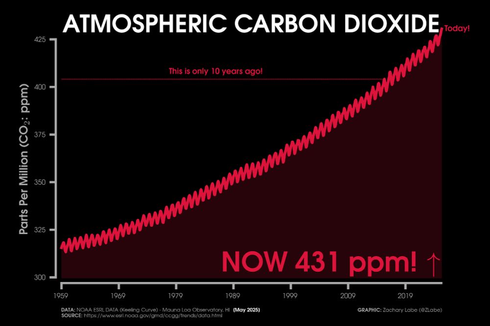
Red line graph time series of monthly carbon dioxide abundance from January 1959 through May 2025. There is a seasonal cycle and long-term increasing trend. Current levels of CO2 are at 431 ppm. This is the Keeling Curve graph. A line for CO2 10 years ago is also annotated.
🚨 Carbon dioxide (CO₂) levels set a new monthly *record high* in May 2025 - 430.51 ppm (seasonal maximum)
This is the second largest May-May increase in this dataset (3.6 ppm higher than 2024). This is not good... 🫣
Data from gml.noaa.gov/ccgg/trends/
07.06.2025 13:57 — 👍 227 🔁 120 💬 16 📌 14
Yikes. 😬
31.05.2025 16:01 — 👍 7 🔁 1 💬 0 📌 0
First three months of the year, Northern Hemisphere mid-latitude Sea Surface Temperatures for the past 170 years:
28.04.2025 22:02 — 👍 68 🔁 26 💬 2 📌 3

Your daily dose of #CO2 part 1
#CO2 explodes higher again
Hourly reading at 433 ...
24.04.2025 Unavailable
24.04.2024 428.42 🆙4,46 or +1.05 %
24.04.2023 423.96 🆙3.45 or 0.82 %
24.04.2022 420.51 🆙2.10 or 0.50 %
24.04.2021 418.41 🆙2.72 or 0.65 %
#ClimateCrisis
25.04.2025 14:19 — 👍 4 🔁 2 💬 1 📌 0

It's been over a month since I updated this graphic -- my analysis: still f&%ked.
The average global surface temperature anomaly so far this year, Jan. 1 - Apr. 23, 2025, is 1.62°C above the 1850-1900 IPCC pre-industrial baseline.
25.04.2025 15:22 — 👍 174 🔁 65 💬 10 📌 3
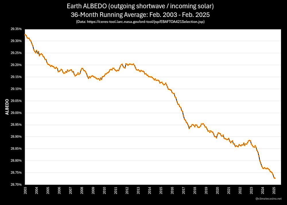
Breaking News!
Code Yikes!
The latest CERES data just dropped, and surprise, surprise, for the eighth month in a row the 36-month average for Earth's albedo hit yet another record low.
Gratitude to the folks at:
ceres-tool.larc.nasa.gov/ord-tool/srb...
25.04.2025 18:39 — 👍 154 🔁 51 💬 10 📌 1

And for those keeping track of the rate of planetary heating, as expressed in Hiroshima bombs per second (HpS), the current rate is 11.25 HpS, which comes out to about 970,000 Hiroshimas per day.
I guess if we're under 1 million per day, that's a good thing???
Lucky thing we have oceans, right?
25.04.2025 18:44 — 👍 193 🔁 56 💬 14 📌 11

Polar stereographic map showing 2-m air temperature trends over the Arctic for Aprils from 1979 to 2024. There is widespread warming over nearly all locations.
Trend in April temperatures across the #Arctic over the last 46 years...
The greatest warming is along the Siberian coast and in the Barents Sea, especially near Novaya Zemlya and Severnaya Zemlya.
Data from @copernicusecmwf.bsky.social ERA5. For more info: doi.org/10.1175/BAMS...
09.04.2025 23:50 — 👍 459 🔁 134 💬 16 📌 8

Line graph time series of 2025's daily Arctic sea ice extent compared to decadal averages from the 1980s to the 2010s. The decadal averages are shown with different colored lines with purple for the 1980s, blue for the 1990s, green for the 2000s, and white for the 2010s. Thin white lines are also shown for each year from 2000 to 2024. 2025 is shown with a thick gold line. There is a long-term decreasing trend in ice extent for every day of the year shown on this graph between February and May by looking at the decadal average line positions.
Friday ice update - #Arctic sea ice extent is currently the 5th lowest on record (JAXA data)
• about 310,000 km² below the 2010s mean
• about 660,000 km² below the 2000s mean
• about 1,130,000 km² below the 1990s mean
• about 1,640,000 km² below the 1980s mean
Plots: zacklabe.com/arctic-sea-i... 🧪
11.04.2025 20:02 — 👍 114 🔁 38 💬 2 📌 1

A line graph shows the time series of global mean surface temperature anomalies for each March from 1850 through 2025. There is a long-term increasing trend and large year-to-year variability. The mean surface temperature anomaly in March 2025 was 1.31°C globally. Anomalies are computed relative to a 1901-2000 climate baseline. A map of temperature anomalies in March 2025 is also shown. Red shading is for warmer than average temperatures, and blue shading is shown for colder than average temperatures. The climatological baseline on the map is relative to 1971 to 2000. All data is from NOAA/NESDIS/NCEI NOAAGlobalTemp v6.0.0 on this graphic.
In the NOAAGlobalTemp v6 dataset, last month was the 3rd warmest March on record. Small differences in rankings between datasets can occur. Particularly extensive warm anomalies were observed over Europe ⚒️🧪
+ For more info: www.ncei.noaa.gov/access/monit...
+ Data: www.ncei.noaa.gov/products/lan...
12.04.2025 14:21 — 👍 121 🔁 33 💬 6 📌 6

Your daily dose of #CO2
Over 430 again
12.04.2025 430.36 🆙5.56 or 1.31 %
12.04.2024 424.8. 🆙 1.57 or 0.37%
12.04.2023 423.23 🆙 4.24 or 1.01%
12.04.2022 418.99 ⬇️ 0.52 -0.12 %
12.04.2021 419.51 🆙3.82 or 0.92 %
03.04.2020 415.69 🆙 4.23 or 1.03%
#ClimateCrisis #ClimateChange
13.04.2025 13:53 — 👍 5 🔁 2 💬 3 📌 0

Line graph time series of daily mean Arctic sea ice thickness for each year from 1979 to 2025 using shades of red, white and blue. A seasonal cycle is shown with thicker ice in late winter and thinner ice in late summer. A long-term decreasing trend is also visible. Data is from PIOMAS v2.1.
Each line represents one year of #Arctic sea ice thickness from 1979 [dark blue] to 2024 [dark red]. This year is shown in yellow - now updated through March 2025 which is around the 2nd thinnest on record for the month.
+ More visuals of thickness and volume: zacklabe.com/arctic-sea-i...
13.04.2025 13:57 — 👍 116 🔁 38 💬 2 📌 4

Time series of globally averaged air temperature for March, with the LOESS curve clearly showing a concave up pattern

Time-varying global trends derived from LOESS fits to each month's time series. All have increasing trends over time with recent decade being around 0.3 to 0.4 deg C/decade.
Digging into the data on whether global warming is accelerating. It is.
Smoothing any month's global time series makes the concave up pattern clear. Taking the finite difference of the smoothed time series, the rate of change is increasing for all months and is now 0.3 to 0.4 °C/decade. #climate
25.03.2025 20:20 — 👍 96 🔁 38 💬 1 📌 2
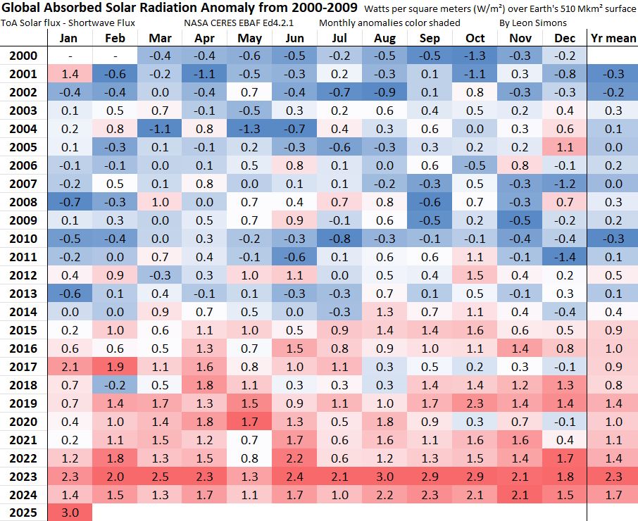
Monthly level of Absorbed Solar Radiation was record high:
26.03.2025 18:23 — 👍 35 🔁 6 💬 2 📌 0

January EEI update: it looks like the Earth Energy Imbalance has turned a corner since its recent drop -- full steam ahead everyone!
Will we see a new record high for the EEI in a few months? Stay tuned!
26.03.2025 03:27 — 👍 141 🔁 26 💬 10 📌 4

Breaking News!
Code Yikes!
Arctic sea-ice extent is once again back to lowest on record for the date, as of Mar. 25, 2025.
Hello, is anybody out there? Just nod if you can hear me. Is anybody home?
26.03.2025 03:37 — 👍 501 🔁 124 💬 45 📌 9
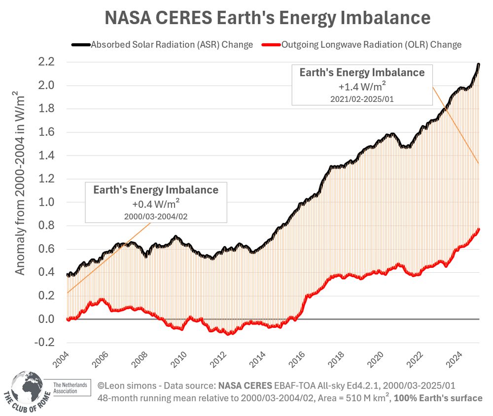
As Earth heats up, Outgoing Longwave Radiation increases.
But the increasing greenhouse gases keep much of the heat in.
And as sulphur emissions and cloud cover decrease, more and more sunlight is absorbed:
26.03.2025 18:16 — 👍 47 🔁 12 💬 4 📌 4
‘Shocking’ mass bleaching drains life from Australian reef - 10bmnews
SYDNEY: Alarming levels of coral bleaching have been recorded off Australia's western coast, scientists said Wednesday, turning huge chunks of a celebrated reef system a sickly dull white.A months-lon...
Ironically, this picture comes from Heron Is, on the southern Great Barrier Reef, in April 2024 - not from Western Australia.
It's almost like coral bleaching and mass mortality is increasingly global & more frequent,..... oh wait! See www.science.org/doi/10.1126/...
10bmnews.com/2025/03/shoc...
27.03.2025 01:08 — 👍 18 🔁 7 💬 2 📌 1
Surge!!!
26.03.2025 20:29 — 👍 1 🔁 0 💬 0 📌 0
BREAKING NASA 📈🔥
The most important graph in the world is going up again.
The four-year average Earth's Energy Imbalance is record high at +1.4 W/m².
Even with a record hot January 2025 of +1.75°C, the monthly (climatology corrected) Earth's Energy Imbalance was +2.5 W/m²!
26.03.2025 18:07 — 👍 189 🔁 97 💬 2 📌 7
Another warning about travelling to the US. Any criticism of Trump can now be qualified as terrorism when entering the US.
19.03.2025 21:57 — 👍 57 🔁 22 💬 1 📌 3

Line graph time series showing the latest mean sea level as of 27 January 2025 using data from 1993. There is a long-term increasing trend and a quadratic fit line is shown on the graph with an acceleration of 0.11 mm/yr^2. The current rate of increase is +4.1 mm/yr in the 2013-2024 period.
Another global sea level update with satellite altimetry data now processed by CNES/AVISO through late January 2025. It's accelerating. 🌊
+ Note that this graph was produced by www.aviso.altimetry.fr/en/data/prod...
20.03.2025 01:35 — 👍 250 🔁 97 💬 8 📌 8
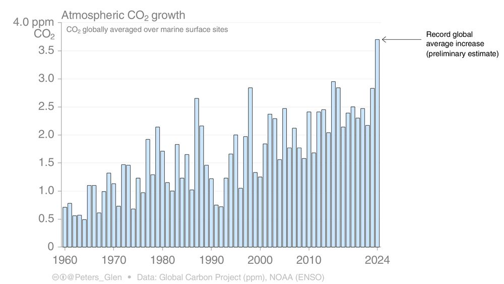
Preliminary data suggests that the global average increase in atmospheric CO2 concentration in 2024 will be a record.
Not just a little record, but 25% higher than the previous record.
(This is the global average, as opposed to Moana Loa)
gml.noaa.gov/ccgg/trends/...
1/
19.03.2025 08:33 — 👍 840 🔁 424 💬 26 📌 87
🔥 Blog by Dariusz Majgier. AI, fun facts, science & brilliant ideas:
👉 https://patreon.com/go4know
🔥 Get prompts, art styles & tutorials. Learn how to create Midjourney images/videos for FREE!
👉 Join me: https://patreon.com/ai_art_tutorials
Energy, emissions, & climate
CICERO Center for International Climate Research, Oslo, Norway
https://cicero.oslo.no/en/employees/glen-peters
Founder & reigning monarch at TPM. Lapsed historian. Hand tool woodworker. Jew.
"A tireless chronicler and commentator on all things climate" -NYTimes.
Climate research lead @stripe, writer @CarbonBrief, scientist @BerkeleyEarth, IPCC/NCA5 author.
Substack: https://theclimatebrink.substack.com/
Twitter: @hausfath
Climate scientist; ocean carbon cycle and climate solutions. Professor, University of Hawaiʻi at Mānoa; Visiting Faculty, Arizona State University. https://linktr.ee/david_ho
Urban Apache | Children’s Rights Advocate | A better world is possible | ✨ 777 ✨
Cat dad. Retired psychiatrist. Doomer/Realist. Born 318ppm CO2. Watching the Limits to Growth play out in real time.
“Humankind has not woven the web of life. We are but one thread within it. Whatever we do the web, we do to ourselves.”
― Chief Seattle, Squamish-Duamish
(1782 – June 7, 1866)
https://x.com/DavidUllrich202 🏳️🌈
Esensininiwag-Ikwe — Member of the #LittleShell Tribe of Montana 🦬🪶⚜️☘️
Anishinaabe, Nêhiyaw, Michif ♾️
i am antifa
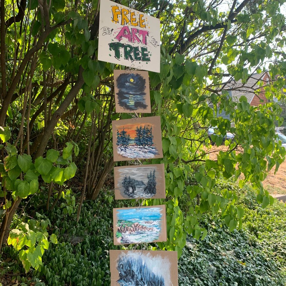
www.freearttree.com
The outcome of the climate crisis is now settled. The data is only for monitoring purposes.
But is 🌎 war on the way?
Geopolitics, climate.
“If you cannot find the truth right where you are, where else do you expect to find it?” -Dōgen Zenji
Scientist, mentor, posting on #ecology and #conservation, #environment, #climate change and #coral reefs. Australian-Irish. Fellow of the Australian Academy of Science.
https://scholar.google.com.au/citations?user=MhJ2LfsAAAAJ&hl=en
Retired professor of mathematics and computer science, casino consultant, author of 4 books: 3 on casino games & 1 poetry book. Now I volunteer, walk a lot & feed local critters.
Climate blog: climatecasino.net
Casino blog: advancedadvantageplay.com
Climate scientist working at NASA/JPL and lover of truth. Arrested for defending Earth. Opinions mine.
Award-winning journalism focused on #climatechange, science, energy and policy. Subscribe to our free newsletters: http://bit.ly/CBnewsletters or visit our website: https://www.carbonbrief.org/