Visualising Climate 2026 — Conference
The first global conference dedicated to how data visualisation can transform public understanding of climate change and support informed decision-making.
📢 Call for contributions
🟢 Opens: 28 Jan 2026
⏰ Deadline: 30 Apr 2026
✅ Decisions: 30 Jun 2026
🎟️ Registration & submissions:
visualisingclimate.com
#VisualisingClimate2026 #DataViz #DataViz4Climate #ClimateComm #ClimateVisuals #SeeingClimate
04.02.2026 14:12 — 👍 3 🔁 2 💬 0 📌 0
1) Visualising Climate 2026 is the first global conference dedicated to data visualisation and climate change. 📊🌍
#VisualisingClimate2026
📍 Bologna, Italy 🇮🇹
🗓️ 4–6 November 2026
What is this conference about? 👇
04.02.2026 14:12 — 👍 8 🔁 4 💬 1 📌 1
Join us in Bologna, Italy, 4–6 Nov 2026 for Visualising Climate — the first global conference fully dedicated to climate data visualization and its power to transform public understanding of a changing planet. Come see the data.
visualisingclimate.org
#VisualisingClimate2026 #DataVis #ClimateCrisis
28.01.2026 11:01 — 👍 272 🔁 116 💬 9 📌 17

30DayMapChallenge
Daily mapping challenge happening every November!
#30DayMapChallenge starts tomorrow: 30 days, 30 map ideas.
If you’re using R, Python, or Julia, consider sharing open-source examples or tutorials. 🧭
30daymapchallenge.com
#GeoData #DataViz #Maps #SpatialViz
31.10.2025 15:02 — 👍 19 🔁 11 💬 0 📌 0
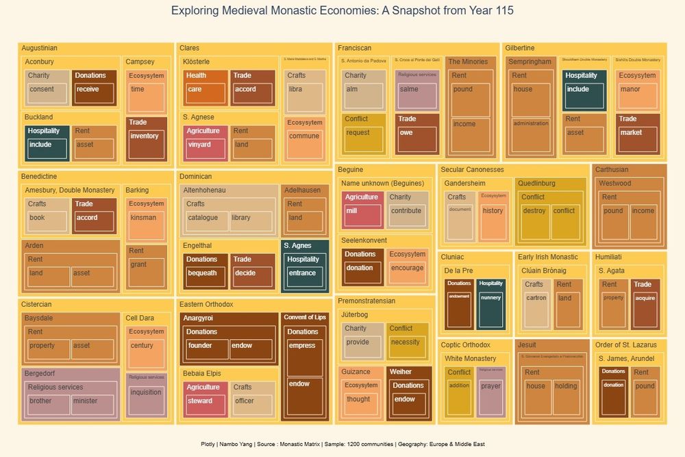
Different types of economic activities and resources in medieval Monasteries and Christian Communities
Tree Map with Plotly and wonderful Monastic Matrix resources
Relationships | Kinship #30DayChartChallenge2025 #conclave #WomeninChurch
06.05.2025 08:14 — 👍 1 🔁 1 💬 0 📌 0
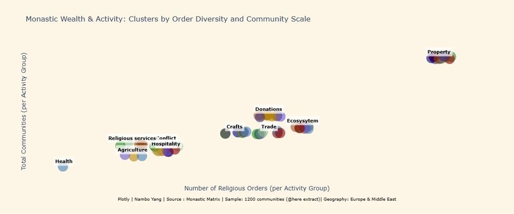
Think nuns were just about prayer? Think again!
This chart reveals the economic engines of the medieval monastic world, clustered by activity, source of wealth and colored by order. ✨💰
#30DayChartChallenge2025
Relationships | Clustera
06.05.2025 09:53 — 👍 1 🔁 1 💬 0 📌 0
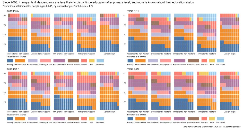
waffle chart of educational attainment in Denmark by national origin in 2005, 2011, 2017 and 2023
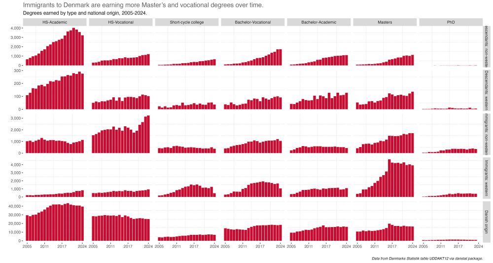
Faceted bar charts of waffle chart of degree types earned in Denmark by national origin from 2005 to 2024
A bit late for my last #30DayChartChallenge some #rstats #dataviz for day 28's prompt - inclusion. Looking at the immigrant experience in the 🇩🇰 education system
tl/dr is more attainment beyond primary level & immigrants rely on vocational degs for social mobility
www.gregdubrow.io/posts/30-day...
06.05.2025 11:22 — 👍 7 🔁 1 💬 1 📌 0

Relationships | Negative Correlation #30DayChartChallenge2025
Monastic Matrix, sample: 570 medieval christian communities
✝️ Community with the oldest founding date: S. Maria dei Colli (Founded 115)
✝️ Community with the maximum duration: S. Maria della Massima (Duration: 1410 yrs)
#curiousatheist
06.05.2025 18:58 — 👍 0 🔁 1 💬 0 📌 0
A colourful 6 by 5 grid of charts
The 30 day chart challenge is complete! You can now see all my recent charts and their stories in 1 place: didoesdigital.com/30-day-chart...
#30DayChartChallenge
07.05.2025 02:03 — 👍 19 🔁 1 💬 1 📌 0
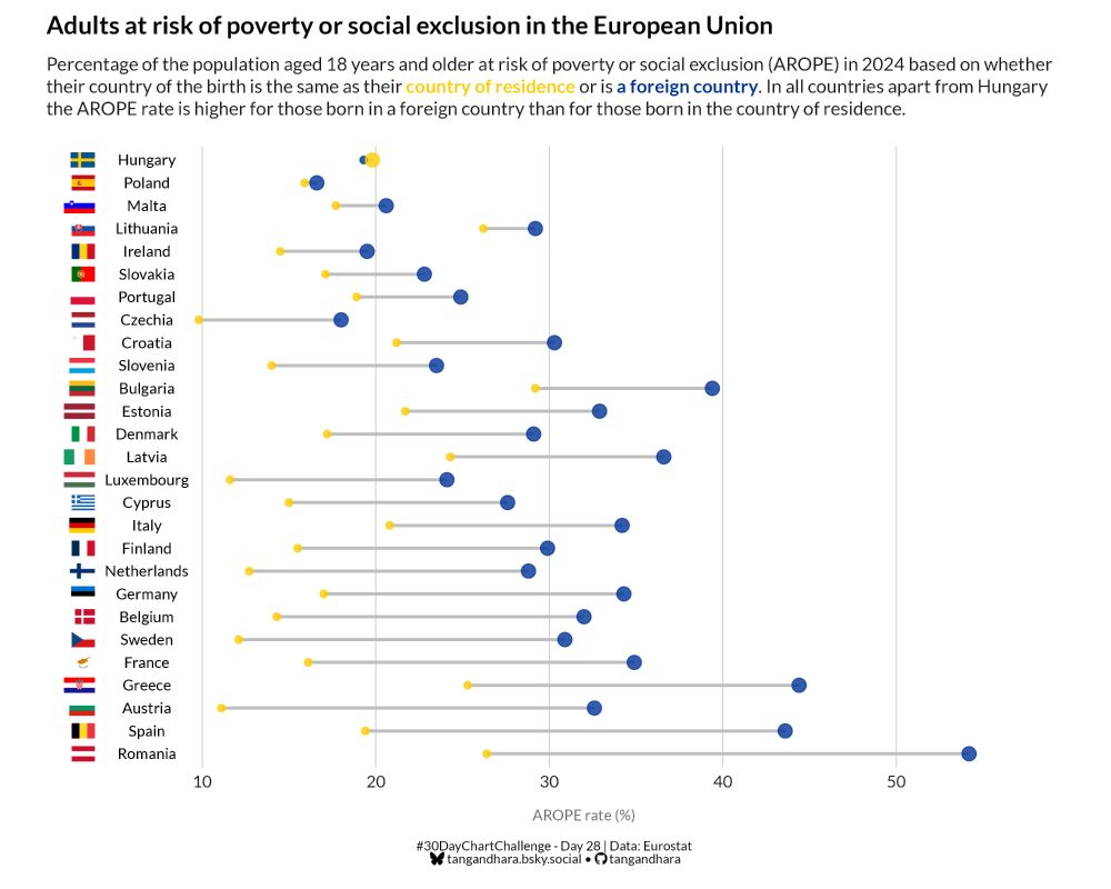
Adults at risk of poverty or social exclusion in the European Union
Percentage of the population aged 18 years and older at risk of poverty or social exclusion (AROPE) in 2024 based on whether their country of the birth is the same as their country of residence or is a foreign country. In all countries apart from Hungary the AROPE rate is higher for those born in a foreign country than for those born in the country of residence.
#30DayChartChallenge - Day 28: Inclusion
What's the opposite of inclusion? Exclusion and this chart compares the rate of adults at risk of poverty or social exclusion in the EU based on their country of birth.
#rstats #dataviz
04.05.2025 17:04 — 👍 16 🔁 2 💬 3 📌 0
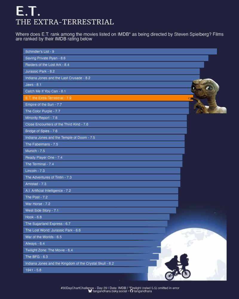
E.T.
THE EXTRA-TERRESTRIAL
Where does E.T. rank among the movies listed on IMDB* as being directed by Steven Spielberg? Films are ranked by their IMDB rating below
#30DayChartChallenge - Day 29: Extraterrestrial
I chuckled putting this one together for lots of reasons but especially because I loved E.T. as a kid.
All data was from IMDB and after failing at scraping it, the {datapasta} was a lifesaver!
#rstats #dataviz
04.05.2025 17:07 — 👍 6 🔁 1 💬 2 📌 0
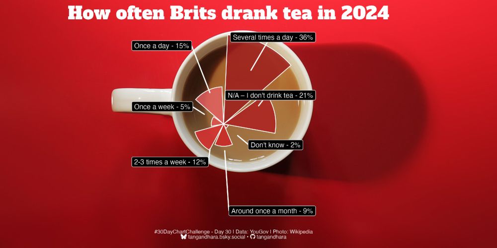
How often Brits drank tea in 2024
#30DayChartChallenge - Day 30: National Geographic theme
The final one! I had no idea what the style was so I Googled and found some interesting charts about tea from NatGeo which I used as inspiration. Not happy with the placement of the chart but I quite like the final result.
#rstats #dataviz
04.05.2025 17:10 — 👍 10 🔁 1 💬 1 📌 1
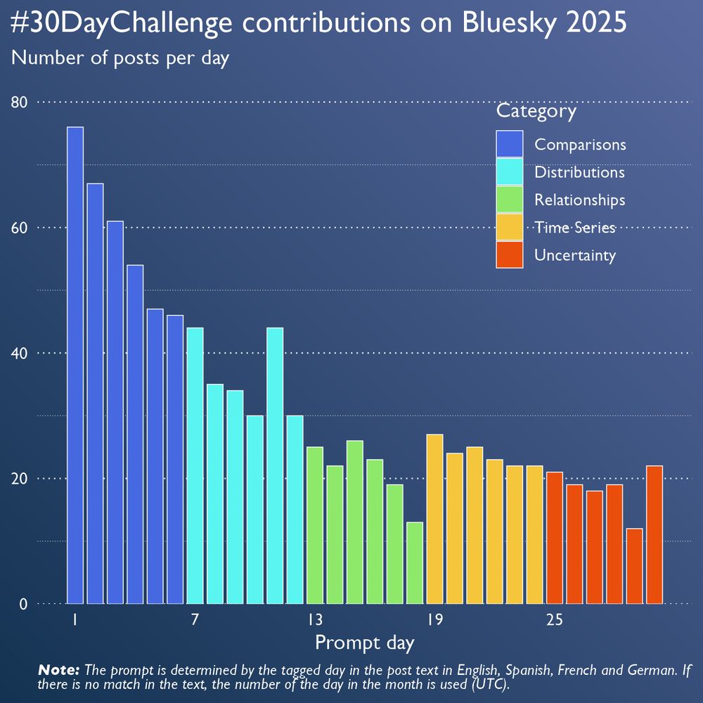
A column chart which shows the number of posts shared for each prompt of the 30DayChartChallenge. The columns are coloured by the category the prompt belongs to. The category with the most contributions is Comparisons (days 1 to 6) with day 1 (Fractions) having the most contributions with 76. The number of posts decreased for the following categories. Day 11 is a peak with the prompt “Birds” (40 posts).
Note: The prompt is determined by the tagged day in the post text in English, Spanish, French and German. If there is no match in the text, the number of the day in the month is used (UTC).
We're happy to see so many charts shared on Bluesky. ♥️
So, we prepared a chart, too. It shows the number of contributions for each prompt on Bluesky this year.
#30DayChartChallenge
01.05.2025 19:15 — 👍 43 🔁 10 💬 1 📌 0
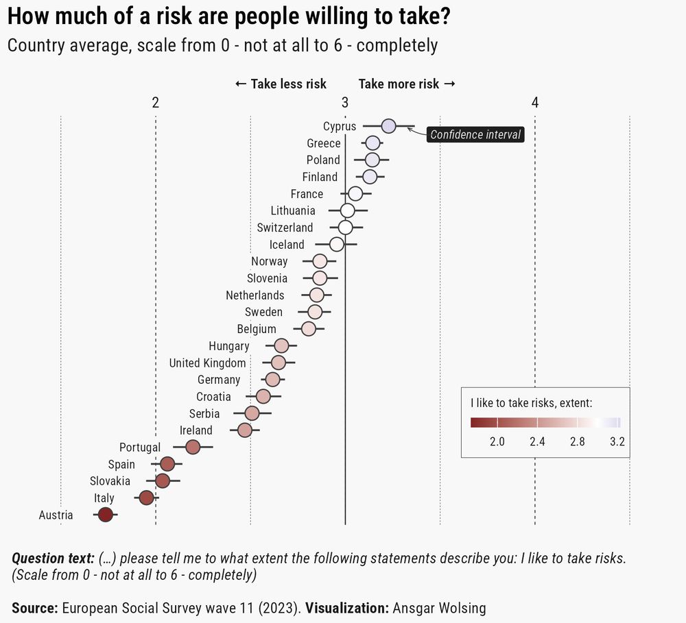
Dot plot showing average risk-taking willingness across European countries on a 0 to 6 scale. Cyprus ranks highest in risk willingness (3.2), while Austria ranks lowest (1.7). Most countries fall between 2.5 and 2.9. Error bars indicate the uncertainty of the mean values.
How much of a risk are you willing to take?
#30DayChartChallenge #Day25 Risk 📊 #rstats
03.05.2025 20:24 — 👍 21 🔁 2 💬 0 📌 1
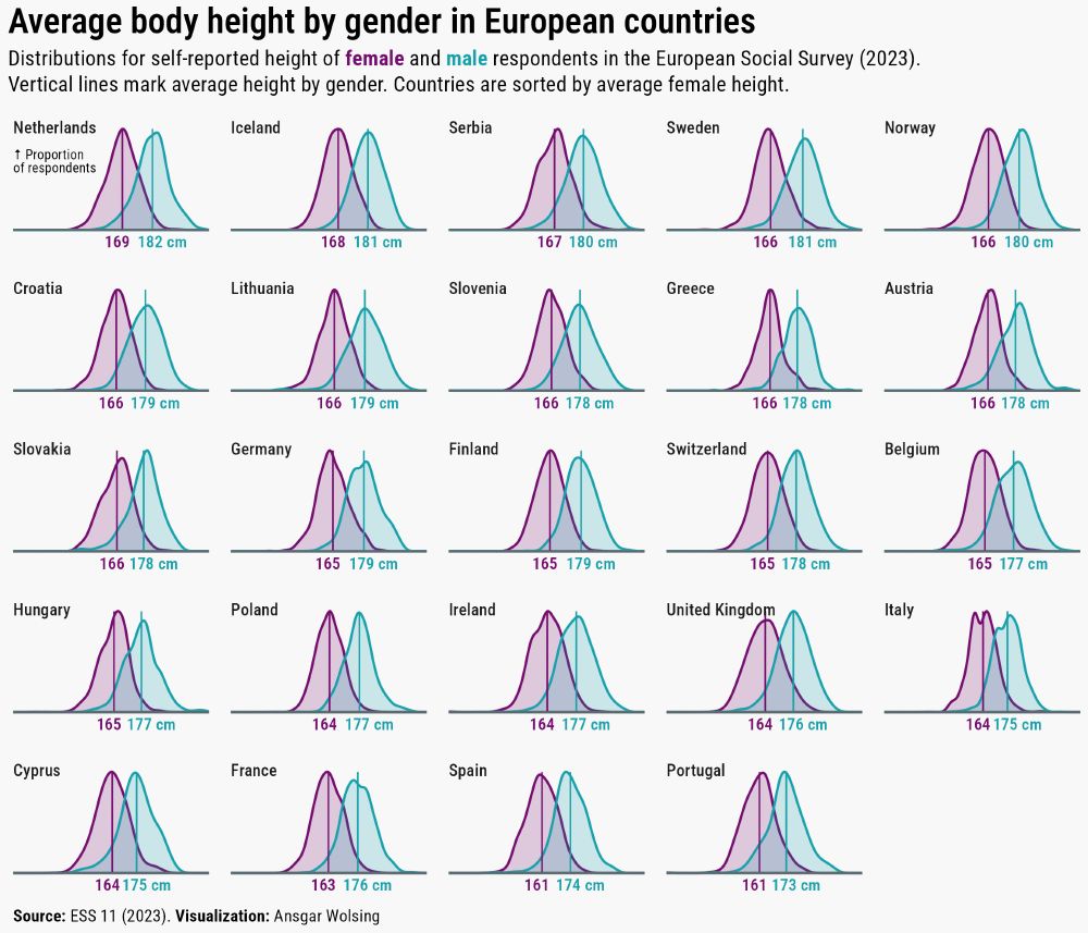
Chart showing the distribution of self-reported heights for men and women in 26 European countries (ESS 2023). Each mini-graph displays male (blue) and female (purple) height curves with vertical lines marking gender-specific averages. Countries are sorted by overall average height across genders. Top 3 by height: Netherlands (female: 169, male: 182 cm), Iceland (168, 181), Serbia (167, 180). Bottom 3 by height: Portugal (161, 173), Spain (161, 174), France (163, 176).
Average body by gender in European countries.
#30DayChartChallenge #Day10 Multimodal 📊 #rstats
03.05.2025 17:09 — 👍 14 🔁 1 💬 1 📌 0
Featured image title 30 Day Chart challenge against a backdrop of chart collage
📊 30 Day Chart Challenge Blog Post 📊
Featuring:
🧠 What I've learned
🤩 My favourite charts
🤞 Advice if you're thinking about participating!
Link: nrennie.rbind.io/blog/30-day-...
#DataViz #RStats #Python #D3 #30DayChartChallenge
02.05.2025 16:11 — 👍 17 🔁 2 💬 1 📌 0
Still slowly working away at #30DayChartChallenge in my own time. So here's day 15 - Complicated which involves one of the more complex GSAP plugins - morphSVG to manipulate SVG shapes.
Made with Svelte + GSAP. Still super janky but here's the code: github.com/schubert-da/...
02.05.2025 16:41 — 👍 8 🔁 1 💬 1 📌 0
Another late and last submission to #30DayChartChallenge
Thanl you for all who organized and contributed this challenge.
#Rstats #ggplot #DataViz
@30daychartchall.bsky.social
02.05.2025 21:07 — 👍 0 🔁 1 💬 0 📌 0
#30DayChartChallenge 2025... it's a wrap!
30 days... 30 visualizations... At some point, I hope to share some of my reflections... but for now, thank you for all your support! 🙏
Congrats to all of the participants! It was great seeing all of your work!
Link: public.tableau.com/app/profile/...
02.05.2025 22:53 — 👍 26 🔁 2 💬 1 📌 0
Thanks to everyone who contributed their #DataViz, celebrated others’ work, and shared encouragement —
thank you all simply for dedicating your time, in whatever context, to help make the 5th edition of the #30DayChartChallenge such a success 👑
02.05.2025 11:50 — 👍 25 🔁 4 💬 1 📌 0
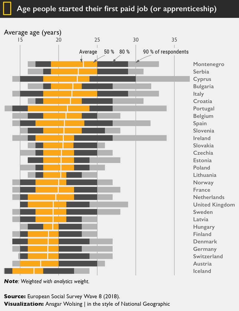
Interval plot showing the age at which people in various European countries started their first paid job or apprenticeship. It displays the average age (white line) and the ages by which 50%, 80% (orange), and 90% of respondents had started working (2 shades of gray). Countries like Iceland, Austria, and Switzerland show earlier average starting ages, while Montenegro and Serbia show later starts.
Age at which people in European countries start their first paid job. 🧑🎓🧑🏭👩⚖️
(I didn’t want to miss the last theme day of the challenge.)
#30DayChartChallenge #Day30 Theme Day: National Geographic 📊 #rstats
02.05.2025 12:02 — 👍 30 🔁 5 💬 2 📌 0
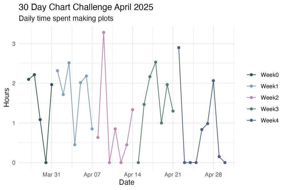
30 days, 30 prompts, obviously. 🤷♂️
30 days is tough already, but 30 charts in 0 days - impossible.
02.05.2025 11:52 — 👍 4 🔁 0 💬 0 📌 0

Noise Complaints in NYC
How did complaints to NYC311 - the city's non-emergency assistance service - about loud music & parties change between 2020 and 2024? There were over 293K complaints
#30DayChartChallenge - Day 26: Noise
Almost there! This one is all about people complaining about noise from loud music and parties in New York City in 2020 and 2024. The colour scheme is inspired by the yellow of the city's taxis.
#rstats #dataviz
01.05.2025 22:07 — 👍 19 🔁 4 💬 5 📌 0
And just like that, April is done.
The #30DayChartChallenge is over. 🙁
02.05.2025 05:05 — 👍 5 🔁 2 💬 1 📌 0
A column chart which shows the number of posts shared for each prompt of the 30DayChartChallenge. The columns are coloured by the category the prompt belongs to. The category with the most contributions is Comparisons (days 1 to 6) with day 1 (Fractions) having the most contributions with 76. The number of posts decreased for the following categories. Day 11 is a peak with the prompt “Birds” (40 posts).
Note: The prompt is determined by the tagged day in the post text in English, Spanish, French and German. If there is no match in the text, the number of the day in the month is used (UTC).
We're happy to see so many charts shared on Bluesky. ♥️
So, we prepared a chart, too. It shows the number of contributions for each prompt on Bluesky this year.
#30DayChartChallenge
01.05.2025 19:15 — 👍 43 🔁 10 💬 1 📌 0

A social media tile that reads:
30DayChartChallenge 2025
Thanks to all contributors and followers from the team!
See you next year!
0 days, 30 prompts - it's a wrap! 🎉
Huge thanks to everyone who joined the #30DayChartChallenge - daily, occasionally, or cheering from the sidelines.
We're amazed, inspired, and above all, grateful for all the creativity, learning, and sense of community! 💛
#dataviz #datavisualization
01.05.2025 19:15 — 👍 29 🔁 5 💬 1 📌 3
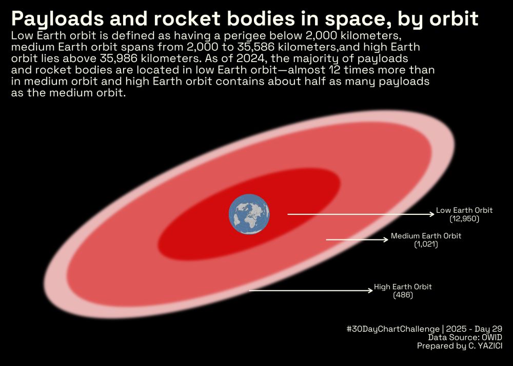
An experimental submission to #Day29 of #30DayChartChallenge
I studied the payloads and rocket bodies in space, by orbit.
#ggplot #Rstats #DataViz
@30daychartchall.bsky.social
30.04.2025 19:23 — 👍 1 🔁 1 💬 0 📌 0
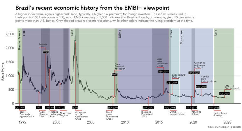
Still missing some plots, but wanted to share this one.
Day 25 #30DayChartChallenge | Uncertainties: Risk
The plot shows the "Brazil Risk" measured by the EMBI+ and highlights key economic/political events. This index broadly measures the risk that foreign investors face when investing in Brazil.
30.04.2025 20:15 — 👍 3 🔁 1 💬 0 📌 0
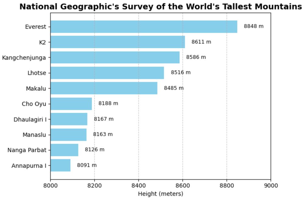
Day 30 of #30DayChartChallenge #datavis
The prompt today is National Geographic. Here are the tallest mountains according to Nat Geo. ( I made it 30 days straight 😎 !!)
30.04.2025 20:15 — 👍 6 🔁 1 💬 0 📌 0
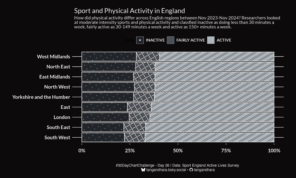
How did physical activity differ across English regions between Nov 2023-Nov 2024? Researchers looked at moderate intensity sports and physical activity and classfied inactive as doing less than 30 minutes a week, fairly active as 30-149 minutes a week and active as 150+ minutes a week.
#30DayChartChallenge - Day 26: Monochrome
Here's how physical activity differed across England in 2023-24.
#rstats #dataviz
30.04.2025 21:59 — 👍 15 🔁 1 💬 1 📌 0