Thefts in England and Wales are much less common than they were in the 1990s
Four small line charts showing estimated annual incidents from 1981 to 2025 from the Crime in England and Wales Survey (which interviews adults about their experiences of selected crimes in the 12 months before). Cover vehicle-related theft, domestic burglary, other household theft, and pickpocketing. Data source: Office for National Statistics (2025). Note: This data captures many incidents that were not reported to the police. The chart is licensed CC BY to Our World in Data.
People living in England and Wales are much less likely to be victims of theft than in the 1990s—
Several data sources show that theft in England and Wales has declined in recent decades.
One of those is police records — but they only capture reported crimes, and many people don’t report thefts.
29.01.2026 15:52 — 👍 47 🔁 22 💬 1 📌 2

✍️ New article: "How have crime rates in the United States changed over the last 50 years?"
Crime is clearly a concern for many people. Nearly 60% of Americans, for example, say that reducing crime should be a top priority for the US president and Congress.
19.01.2026 15:36 — 👍 69 🔁 22 💬 3 📌 6

screenshot of my post
Big new blogpost!
My guide to data visualization, which includes a very long table of contents, tons of charts, and more.
--> Why data visualization matters and how to make charts more effective, clear, transparent, and sometimes, beautiful.
www.scientificdiscovery.dev/p/salonis-gu...
09.12.2025 20:28 — 👍 799 🔁 317 💬 22 📌 50

A line chart showing annual CO2 emissions from fossil fuels and industry (not land use) for several countries from 1750 to 2024. Data from the Global Carbon Budget (2025)
We just published our “Top of the Charts”, a look at our most popular charts, articles, data insights & more in 2025! (link in 🧵)
Here are our top 5 most-viewed charts.
Each Friday over the next few weeks, we’ll share the top 5 for other categories (articles, etc.). Stay tuned!
1. CO2 emissions
05.12.2025 10:19 — 👍 74 🔁 29 💬 4 📌 4

The visual representation illustrates the global biomass of various animal groups, emphasizing the dominance of humans and livestock. Humans constitute 36% of total biomass, depicted by a grouping of figures representing people. Livestock and pets collectively make up 59% of biomass, represented below humans.
Within the livestock category, cattle are noted as the largest contributors at 38%, followed by sheep at 4%, buffalo at 6%, and goats and pigs, both at 3%. Horses, asses, and dogs each account for 3% and 2% respectively.
Wild mammals, positioned at the bottom, represent only 5% of total biomass, illustrated by animal figures.
The footer includes data sourced from Lior Greenspoon et al. in 2023, regarding the global biomass of wild mammals as published in the Proceedings of the National Academy of Sciences. The organization, Our World in Data, is credited for its role in providing research and data pertaining to global issues.
A diverse range of mammals once roamed the planet. This changed dramatically with the arrival of humans, who have become the dominant species through our own population, as well as the animals we breed and raise for food.
What is the distribution of the global mammal kingdom today?
01.12.2025 10:12 — 👍 80 🔁 30 💬 2 📌 5

A world map shows the distribution of reported cases of guinea worm disease in 2024. Two countries are highlighted in darker shades: Chad, which has nine reported cases, and South Sudan, which has six reported cases. The rest of the map, particularly surrounding regions, is light-colored and marked as having no reported cases. The caption notes that there were only 15 reported cases globally and mentions that guinea worm disease is still endemic in three other countries. The data is sourced from the World Health Organization, with a note explaining that the disease is caused by a parasitic worm spread through contaminated water.
Only two countries recorded human cases of guinea worm disease in 2024
17.10.2025 13:26 — 👍 35 🔁 8 💬 1 📌 1

What Americans die from and the causes of death the US media reports on.
4 stacked bar charts. showing in short that while heart diseases and cancer constitutes 55% of the causes of death, they receive about 7% of the media coverages. Homicide is under 1% but receives between 42% and 52%. Terrorisme barely registers in the causes of death, but gets between 11% and 18%.
The first stacked bar is causes of death in the US in 2023
Heart diseases 29%
Cancer 26%
Accidents 9.5%
Stroke 6.9%
Lower respiratory diseases (6.2%)
Alzheimer's disease (4.8%)
Diabetes (4.0%)
Kidney failure (2.4%)
Liver disease (2.2%)
Suicide (2.1%)
COVID-19 (2.1%)
Influenza/Pneumonia (1.9%)
Drug overdose (1.8%)
Homicide (<1%)
Terrorism (<0.001%)
Media coverage of these causes of death in 2023 in...
New York Times
Heart disease (2.8%)
Cancer (4.1%)
Accidents (9.7%)
Suicide (3.8%)
COVID-19 (5.3%)
Drug overdose (7.5%)
Homicide (42%)
Terrorism (18%)
Washington Post
Heart disease (2.9%)
Cancer (4.7%)
Accidents (5.9%)
Suicide (3.3%)
COVID-19 (7.9%)
Drug overdose (9.5%)
Homicide (46%)
Terrorism (12%)
Fox News
Heart disease (2.3%)
Cancer (3.8%)
Accidents (6.1%)
Suicide (4.1%)
COVID-19 (6.0%)
Drug overdose (9.8%)
Homicide (52%)
Terrorism (11%)
Note: Based on the share of causes of death in the US and the share of mentions for each of the causes in the New York Times, the Washington Post and Fox News. All values are normalized to 100%, so the shares are relative to all deaths caused by the 12 most common causes + drug overdoses, homicides and terrorism. These causes account for more than 75% of deaths in the US.
A "media mention" is a published article in one of the outlets which mentions the cause (e.g. "influenza) or related keywords (e.g. "flu") least twice.
Data sources: Media mentions from Media Cloud (2025); deaths data from the US CDC (2025) and Global Terrorism Index.
Fox News
This is really one of the best charts by @ourworldindata.org 📊
Amazing how much research and work goes into creating a chart like this. And it's such a good insight into society.
08.10.2025 16:17 — 👍 46 🔁 16 💬 1 📌 3

A bar chart showing that of all vertebrate groups (animals with a backbone and skull), amphibians face the highest risk of extinction. The data source is the IUCN Red List. The chart is licensed under CC BY to Our World in Data.
The threat of extinction is not spread evenly across the tree of life. To protect animals, it’s important to know which ones are most threatened and why.
Of all vertebrates (animals with a backbone and skull), amphibians are most threatened with extinction.
02.10.2025 12:07 — 👍 78 🔁 31 💬 1 📌 1

Chartle - A daily chart game
Guess the country in red by analysing today's chart
Launch day 🚀
We’ve just released @chartlecc.bsky.social - a daily chart game!
Your job is to guess which country is represented by the red line in today's chart. You get 5 tries, no other clues!
Play today, come back tomorrow for a different chart with new data and share with your chart friends 📈
12.09.2025 13:41 — 👍 124 🔁 53 💬 12 📌 27

The image presents a line graph depicting global maternal mortality rates from 1985 to 2023. The y-axis represents the number of maternal deaths per 100,000 live births, ranging from 0 to 500, while the x-axis spans the years from 1985 to 2023.
The graph shows a downward trend in maternal mortality rates, starting at approximately 460 in 1985 and declining steadily over the years. A notable increase is observed during the first year of the COVID-19 pandemic, but by 2023, the rate has decreased to about 197. This marks a 57% reduction compared to the rates in 1985.
Annotations highlight key points, such as the spike during the pandemic and the significant decrease achieved by 2023.
The data sources for this graph include the WHO, UNICEF, UNFPA, World Bank, and UN DESA (2025). There is a note stating that the estimates aim to adjust for underreporting and misclassification. The image is credited with a Creative Commons attribution.
Global maternal mortality rates have fallen by almost 60% since 1985
10.09.2025 10:21 — 👍 94 🔁 24 💬 1 📌 4

A line chart showing that large fires in August mean 2025 has been a record year for wildfires in Spain. The data is measured as cumulative area burnt by wildfires in hectares, and the chart has a line for each year from 2012 to 2025. Annotations explain that by August 5th, Spain's wildfires this year were below average. Just two weeks later, 2025 had overtaken all previous years with consistent records. The data source is the Global Wildfire Information System (2025). The chart is licensed CC BY to Our World in Data.
Spain is having its largest wildfire year in well over a decade
03.09.2025 16:36 — 👍 56 🔁 20 💬 1 📌 2
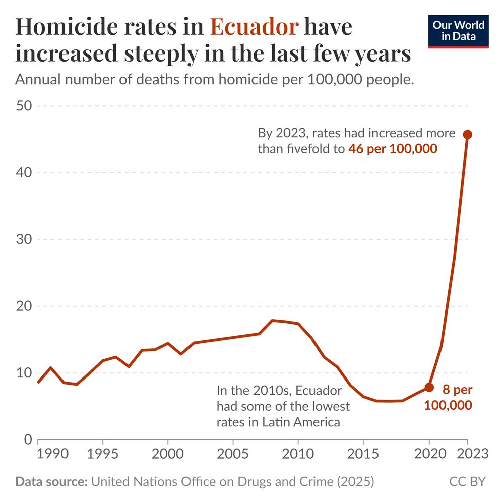
This image is a line graph depicting homicide rates in Ecuador from 1990 to 2023, measured as annual deaths from homicide per 100,000 people.
Initially, the graph shows low homicide rates, peaking near 20 per 100,000 around 2010, a time when Ecuador had some of the lowest rates in Latin America. However, there is a noticeable upward trend beginning around 2020, with rates increasing sharply. By 2023, the rate has surged dramatically to 46 per 100,000, indicating a more than fivefold increase from previous levels.
The data source listed at the bottom is the United Nations Office on Drugs and Crime, dated 2025. The chart is licensed under CC BY for Our World in Data.
Homicide rates in Ecuador have increased steeply in the last few years
27.08.2025 16:15 — 👍 32 🔁 4 💬 3 📌 4
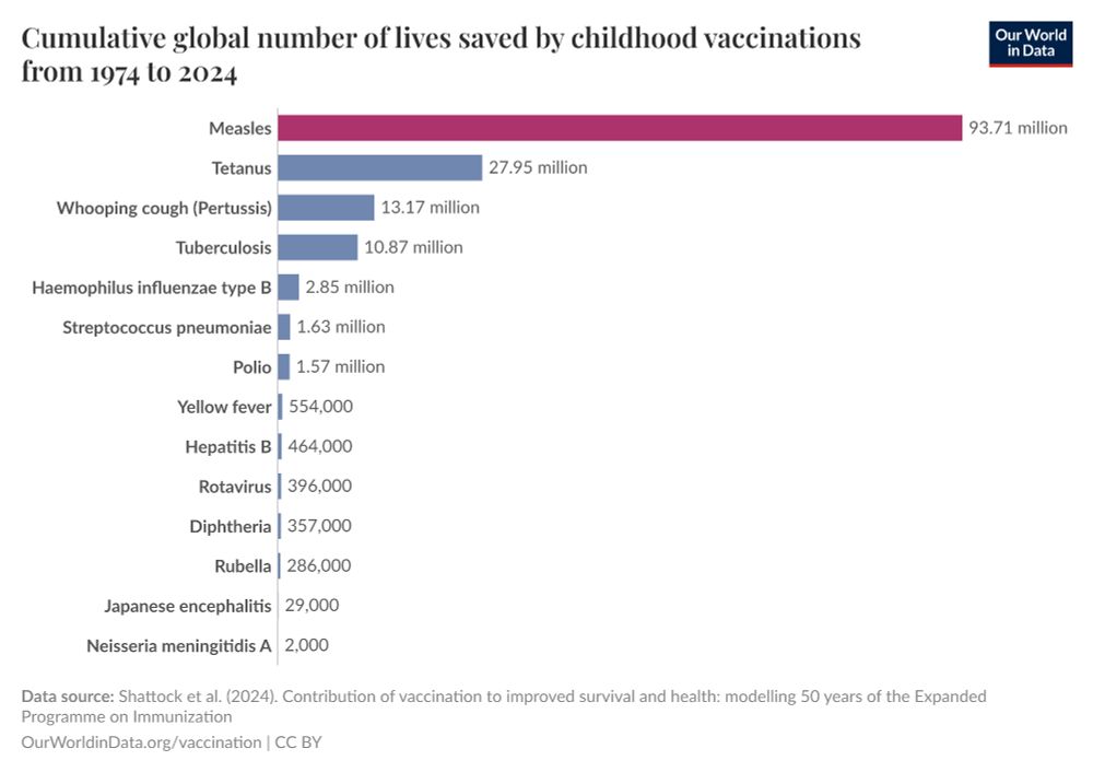
Vaccines are one of the most powerful tools in public health. They have saved hundreds of millions of lives by preventing deadly diseases like measles, polio, and smallpox. Before vaccines, these infections were common; surviving them often meant facing severe complications or lifelong disability.
18.08.2025 10:57 — 👍 157 🔁 71 💬 2 📌 4

A screenshot of the page that appears when 'Learn more about this data' is clicked on any of Our World in Data's interactive chart.
The page shows detailed information about the source that the chart is based on, in this case, the WHO Mortality Database.
It states that:
The WHO mortality database is a collection death registration data including cause-of-death information from member states.
Where they are collected, death registration data are the best source of information on key health indicators, such as life expectancy, and death registration data with cause-of-death information are the best source of information on mortality by cause, such as maternal mortality and suicide mortality.
WHO requests from all countries annual data by age, sex, and complete ICD code (e.g., 4-digit code if the 10th revision of ICD was used). Countries have reported deaths by cause of death, year, sex, and age for inclusion in the WHO Mortality Database since 1950.
The WHO only includes data, which are properly coded according to the International Classification of Diseases (ICD). Today the database is maintained by the WHO Division of Data, Analytics and Delivery for Impact (DDI) and contains data from over 120 countries and areas. Data reported by member states and selected areas are displayed in this portal’s interactive visualizations if the data are reported to the WHO mortality database in the requested format and at least 65% of deaths were recorded in each country and year.
Additional information includes the date the data was retrieved on, the url the data was retrieved from and a suggested citation for the data source.
We do our very best to attribute the data to our sources and to make information on our sources available to our users.
If you click 'Learn more about this data' on any of our interactive charts, a new window will open with more information about the indicator and data source used.
15.08.2025 08:54 — 👍 1 🔁 0 💬 0 📌 0

Bar chart showing the death rate from tuberculosis in 2021 for a selection of countries. Someone in Lesotho, the Central African Republic, or Gabon is at least 3,000 times more likely to die from TB than someone in the United States or Denmark. Data source: WHO (2024). Chart CC BY Our World in Data.
✍️ New article: "The world left its fight against tuberculosis unfinished — how can we complete the job?"
28.07.2025 16:28 — 👍 58 🔁 17 💬 1 📌 0
💡New feature rolling out: switch between different indicators on our data pages!
For example, on our page showing childhood vaccination coverage, you can easily switch between the share and number of children vaccinated (and unvaccinated), and compare across vaccines or focus on a particular one.
21.07.2025 16:59 — 👍 65 🔁 13 💬 1 📌 1

A line chart showing tuberculosis cases in the United States from 1975 to 2023. In the second half of the 1980s there was a rise in the number of cases before falling again. Data source: US CDC (2024). CCBY Our World in Data
✍️ New article: The end of tuberculosis that wasn’t
30.06.2025 17:59 — 👍 64 🔁 14 💬 2 📌 0
💡 Very excited to announce new features: better interactive maps! 🗺️
– Enhanced country/region selection with several sorting options and a bar chart preview
– Selecting a country highlights it and shows its value on the map
– Zooming to your selection brings up a 3D globe view 🌍
05.06.2025 16:25 — 👍 158 🔁 36 💬 5 📌 8
Progress can sometimes be slow, but with persistence it is possible. Take the case of leaded gasoline.
04.06.2025 11:20 — 👍 83 🔁 16 💬 2 📌 0

📊 Data update: We've just updated the data in our charts on homicides.
The data comes from the UN Office on Drugs and Crime 2025 release.
This update was led on our team by @spoonerf.bsky.social.
03.06.2025 17:13 — 👍 25 🔁 7 💬 4 📌 2
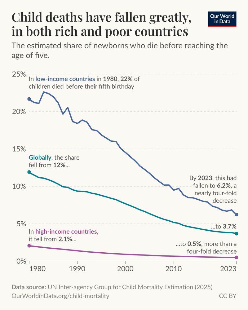
Few things are more heartbreaking than the death of a young child.
For most of humanity’s past, these tragedies occurred all too frequently — half of all children died. This was true no matter where in the world a child was born, even in the richest countries.
22.05.2025 13:49 — 👍 69 🔁 15 💬 2 📌 5
Thanks for the kind words Francis! You are right this is our attempt at updating the classic WSJ chart.
19.05.2025 20:31 — 👍 6 🔁 0 💬 1 📌 0

Measles vaccines save millions of lives each year
Measles once killed millions every year. Vaccines changed this, preventing disease, long-term immune damage, and deadly outbreaks.
In just the last 50 years, it’s estimated that measles vaccinations have prevented over 90 million deaths worldwide.
In a new article, @spoonerf.bsky.social and I describe how they were developed and scaled up worldwide, and the impact they've had:
19.05.2025 18:48 — 👍 147 🔁 51 💬 1 📌 1
An important reminder that measles vaccines save millions of lives every year across the world.
The measles vaccine is arguably the most life-saving vaccine in use.
Our latest article from @scientificdiscovery.dev and @spoonerf.bsky.social: ourworldindata.org/measles-vacc...
19.05.2025 10:33 — 👍 2128 🔁 601 💬 17 📌 17

A scatter plot showing the peak blossom date of cherry blossom in Kyoto, Japan from 812 to 2025. The trend oscillates around mid-April until the mid 19th century where it moves consistently earlier in the year, in 2025 it happened on 4th April.
In 2025, the peak cherry blossom of happened on April 4th.
This long-run data is a proxy for how the climate has changed.
Since the early 20th century, the combined effects of urbanization and higher temperatures due to climate change have gradually moved the peak blossom earlier in the year.
10.04.2025 18:18 — 👍 11 🔁 6 💬 0 📌 1
Aw thanks Bertha! ❤️
10.04.2025 16:10 — 👍 2 🔁 0 💬 0 📌 0
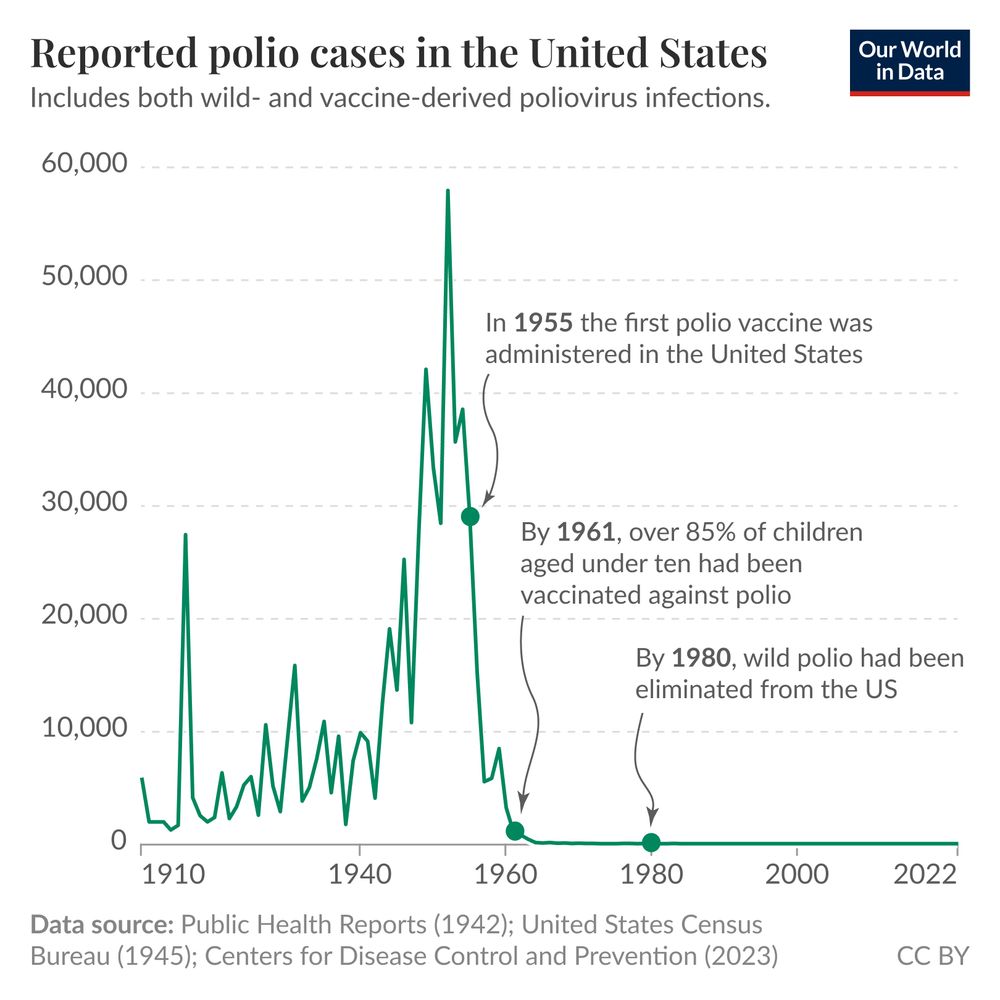
A line graph titled "Reported polio cases in the United States" displays the number of reported polio cases from 1910 to 2022. The vertical axis represents the number of cases, ranging from 0 to 60,000, while the horizontal axis indicates the years. The graph shows a dramatic peak in polio cases around 1952, with over 58,000 cases reported. Following this peak, there is a noticeable decline in cases, reaching nearly zero by the early 1960s, reflecting the impact of vaccination efforts. The graph includes a note stating it accounts for both wild and vaccine-derived poliovirus infections, whether indigenous or imported.
In the footer are the data sources: Public Health Reports (1942), United States Census Bureau (1945), and Centers for Disease Control and Prevention (2023). The graph is attributed to "Our World in Data" and is licensed under CC BY.
Vaccination eliminated polio from the United States 🧵
07.04.2025 12:22 — 👍 177 🔁 40 💬 5 📌 1
Papa to 9 microbes, mackerel snapper, shepherd, master of sucking. I want to help you learn the skills you'll need to succeed in science.
Director of CPS, editor-in-chief of CapX, columnist for The Sunday Times, author of The Great Acceleration. Politics, policy and parenting.
Working on Science and Policy 🌎🚄🧪
Geographer 🗺️; PHD in public hea (focus environmental health and environmental epidemiology)
Board member Volt 🇪🇺
Data, charts, analysis and games from The New York Times: nytimes.com/upshot
Working in data viz and generative design. Data Visualisation & Information Design Lead, City Intelligence Unit, London City Hall. Also @mikebrondbjerg@vis.social
Journalist, author, musician, sonifier. I make things with data. Half of Loud Numbers.
Assoc. Prof. in Conservation Science @biology.ox.ac.uk
Advocate for Equity, Diversity & Inclusion.
2020 National Geographic Explorer.
🦇🏝️🦎🐈⬛ // @iccs.bsky.social
https://iccs.org.uk/author/ricardo-rocha/
Professor of Invasion Biology at UCL. Amateur father, birder, moth-er. Mainly post wildlife photos, occasionally science and politics. Author of The Jewel Box, winner of the ZSL Clarivate Award for Communicating Zoology.
🌍☮️🌎
California Climate Policy Director,
Climate Law Institute, Center for Biological Diversity. @cbd-climate-energy.bsky.social
@biologicaldiversity.org @cbdactionfund.bsky.social
Views my own (sometimes my dog has opinions)
A daily chart game 📈
Can you guess the country in red in 5 tries or less?
New chart, new topic, every day!
https://chartle.cc/
Lapis is a no-code data storytelling tool that facilitates real-time collaboration and long-term community building. Made by @kontinentalist.bsky.social
https://masalmon.eu/
🧰 #Rstats / research software engineer.
🗒️ Blogger.
📦 Software review editor for @ropensci.
💜 #RLadies.
📈 PhD in statistics.
🍋 Nancy, France (let's say this emoji is a bergamot orange).
ASA Fellow; #rstats developer of graphical methods for categorical and multivariate data; #datavis history of data visualization; #historicaldatavis; Milestones project
Web: www.datavis.ca
GitHub: github.com/friendly
😀 Take a break from doomscrolling!
We share tech, science, health, environment, and social progress
What Could Go Right? newsletter and podcast 👇
linktr.ee/progressntwrk
Marine ecologist working in marine science - blue carbon / coral reef biodiversity / MPAs / kelp / conservation technology. Ocean optimist. Views my own
A curious generalist who loves making things.
👋 https://www.davidbauer.ch
📨 https://www.weeklyfilet.com
🧯 https://www.republik.ch/challenge-accepted
🕹️ https://www.youdontknowafrica.com
🤔 https://www.dataguessr.com
📚 https://www.davidbauer.ch/bookshelf
Data visualisation designer at BBC News focusing on satellite data, climate change and cartography | previously at @esa.int | Co-founder of @chartle.cc - A daily chart game
Demography nerd at Pew Research Center
Global religious change, sociology
Cartography and graphics @postgraphics.bsky.social | Big ol' fan of @wfmu.bsky.social
https://moriartymaps.com/
Advancing transformative climate solutions. Analysis, insights, and research from the Climate, Economics, Finance and Equity team at the World Resources Institute.