Arendsdorp – 17-05-24
Website link: corneakkers.com/arendsdorp-1...
Print: corneakkers.com/print-arends...
Drawing on paper(10.5 x 14.8 cm)
Artist: Corné Akkers
#artcurator #artcollector #artinvestment #pencildrawing #impressionism #printableart
19.11.2025 22:03 — 👍 0 🔁 0 💬 0 📌 0
The Infinite Waves of Eternity – 06-02-24
Website link: corneakkers.com/the-infinite...
Print: corneakkers.com/print-the-in...
Printable: corneakkers.com/product/prin...
Oil on linen (60 x 80 cm)
Artist: Corné Akkers
#artinvestment #cubism #artdeco #artcollector #artcurator #oilpainting
16.11.2025 13:46 — 👍 2 🔁 0 💬 0 📌 0
Nieuwe Veenmolen – 18-11-17
Website link: corneakkers.com/nieuwe-veenm...
Print: corneakkers.com/print-nieuwe...
Printable: corneakkers.com/2019/07/07/n...
Pastel on Canson Mi-Teintes board (47 x 67 x 0.2 cm)
Artist: Corné Akkers
#artcurator #artinvestment #artcollector #cubism #pastel #drawing
14.11.2025 22:56 — 👍 2 🔁 0 💬 0 📌 0

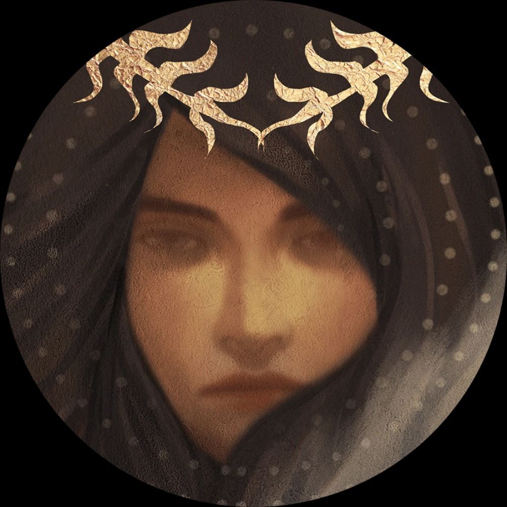
Louise Brooks Revisited
This colored pencil drawing ‘Louise Brooks – 04-11-25’ pays homage to a cinematic icon whose beauty and presence transcend time. Her features keep on enchanting me. They almost look like chiseled, the likes of which you long to see in a styled art deco statue. Perhaps she represents what I’m striving for: to create timeless art. Basically, I considered myself not to be fashionable at all. Never was, never will be. Always headstrong and I always knew what I wanted to pursue with my own art. Hence my reluctance to have social criticism appear in my artworks because it is so time-bound. Well, once in a while but then subtlely processed and not to the detriment of a sound composition. Therefor I hope in the long run my art will not be considered old fashioned just as LB won’t.
Color versus Tonality
Louise and I go back a long time together. The first time I drew her was back in 2014. Already in my hatched strokes style. The one before my last one was executed in color. Since my last colored pencil drawing was ‘De Smorenhoek – 15-12-24’ I thought I’d do another one. At least to keep my pencil techniques in color in good shapes. Many see color as mere pigments. Yet something stirs in the shadows: something literal, something alive. That is the realm of tonality. Even people like Johannes Itten reitterates the phrase ‘color tones’ and all that jazz. Colours are nice but always will be an extra on top of tonal values. For years now I teach my students to distinguish color from tones. Well, you don’t have to believe me. The tones speak for themselves. At least I hope did a good job. Your’s to decide.
Louise Brooks – 04-11-25
Print: corneakkers.com/product/prin...
Available as original (if not sold), prints & printable
Colored pencil drawing on paper (21 x 29.7 cm)
Artist: Corné Akkers
#artcollector #artcurator #artinvestment #louisebrooks #coloredpencil #pencildrawing #realism #impressionism
06.11.2025 22:10 — 👍 2 🔁 0 💬 0 📌 0
Marlot – 24-09-20
Website link: corneakkers.com/marlot-24-09...
Available as original (if not sold), prints & printable
Colored pencil drawing on paper (21 x 29.7 cm)
Artist: Corné Akkers
#artinvestment #ArtCollector #artcurator #cubism #cow #coloredpencil
04.11.2025 18:58 — 👍 1 🔁 0 💬 0 📌 0
Berg en Dal – 30-12-23
Website link: corneakkers.com/berg-en-dal-...
Printable: corneakkers.com/product/prin...
Pastel drawing on Clairfontaine Pastelmat paper (69.4 x 49.8 x 0.1 cm)
Artist: Corné Akkers
#artinvestment #artcollector #artcurator #cubism #Pastel #drawing
31.10.2025 21:10 — 👍 1 🔁 1 💬 0 📌 0
Neo Deco - 10-03-25
Website link: corneakkers.com/neo-deco-10-...
Print: corneakkers.com/print-neo-de...
Graphite pencil drawing Talens Bristol paper (21 x 29.7 cm)
Artist: Corné Akkers
#artinvestment #artcollector #cubism #artcurator #pencildrawing #artdeco
30.10.2025 09:38 — 👍 1 🔁 0 💬 0 📌 0
Psyche & Amor – 23-05-23
Website link: corneakkers.com/psyche-amor-...
Print: corneakkers.com/print-psyche...
Available as originals, print & printable
Oil on linen (100 x 150 x 2 cm)
Artist: Corné Akkers
#artinvestment #artcollector #realism #surrealism #oil #oilpainting
28.10.2025 20:45 — 👍 1 🔁 0 💬 0 📌 0

Henriëtte Sibie’s Portrait
This pastel drawing ‘Model Session – 18-10-25 – 2’ shows Henriëtte Sibie’s portrait. A bit of cubism but realist as well. My first session’s pastel showed a reclined position but we like the variety of it all. Therefor we already decided in advance to have her pose in two different poses. The second one she stood right up and we had her lean on an easel comfortably. After all, she had to take this pose for one hour at one stretch. Well, leave that to Henriëtte. She’s a great professional model and she can stand perfectly still. Ideal to draw her portrait. Which was my very aim to be honest.
Measuring out Proportions
Not the first time I did a portrait of her beautiful features though. In fact, quite some time ago, in 2013 I painted one. After that I hired her as model a couple of times but mostly as model for students to pose. However, this time I felt this was my chance to do another portrait. My view on her from the room and the very lighting were perfect. First, measuring out proportions wich was a bit of a drag. The reason is she has a great yet lush hairdo with lots of individual hairs and locks sticking out. Consequently, one cannot compare height and width to establish a clear ratio for defining spatial boundaries on paper. Luckily I could get hold of the length from chin to the scalp just below the hairline. From there to the end of the hairdo way up was equal in length.
Cubist Planes
The initial goal was to keep it cubist looking and I think I did a good job. Especially some cubist planes in her chest do their abstract magic. These areas can be bothersome to depict. Her clavicles weren’t showing to much because of the overexposure. Nevertheless, by styling some light planes into more abstract ones I got a beautiful contrast with her head. The play of light and dark on her face are cubist too yet more refined. A lovely live session and I got her likeness within that hour.
Model Session – 18-10-25 – 2
Website link: corneakkers.com/model-sessio...
Pastel on paper (48 x 62,5 cm)
Artist: Corné Akkers
#printableart #printables #art #cubism #henriettesibie #femaleform #pastel #pastels #realism #impressionism #artcollector #collectingart #drawingsession #clairobscur
26.10.2025 18:43 — 👍 4 🔁 0 💬 0 📌 0
Anaglyphical Roundism – 27-07-22
Website link: corneakkers.com/anaglyphical...
Print: corneakkers.com/print-anagly...
Oil on linen (70 x 100 cm)
Artist: Corné Akkers
#artcollector #artprint #Art #artcollection #artcurator #cubism #oilpainting #oil
25.10.2025 20:30 — 👍 1 🔁 0 💬 0 📌 0

Henriëtte Sibie
This pastel drawing ‘Model Session – 18-10-25 – 1’ is a continuation of my cubist endeavours during live model drawing sessions. Henriëtte Sibie was our model this time. She came to visit us again in community center ‘De Blauwe Tram’. However, not the first time. Last time was about a year ago and in the past I worked with her at Brugman Art in Voorburg. Those who consider themselves live model draftsmen and painters matter once they had the pleasure to meet her. Surely, there are a lot of models around. They flock academies throughout the Netherlands and groups like ours but Henriëtte is knows by all. Also yours truely and my painting of her portrait I made back in 2013 got even sold. Time to extend my series of artworks with her beautiful features and personality as theme.
A Reclining Posee
A reclining pose was the first one whe had her struck this afternoon. Luckily I had a good view on her front with a slightly slanted mattress she reclined on. Regularly it strikes me people during a live drawing session often tend to begin right away. Not me though because I take my time to thoroughly think through a fine composition. Rule number one I learnt in the past: when someone is lieing flat in a full frontal vision, be alarmed! Trying to capture a model from head to toe is useless. It’ll only deliver you a slender sausage on a paper with more than 75% negative space. That was the reason to skip the lower leg of Jelco in my last pastel drawing by the way.
Impressionist Cubism
In order to avoid such mishaps I decided not to include her lower legs. From elbow to the upper side of the head formed about 2/3rd of the total height of the paper. The mattress forms were also fun and a good excuse to fill up the negative space. Not to much though, merely a supportive detail to support the body structures. Personally, I like these angular types of impressionist cubism. They serve me well in my search for capturing the model’s forms quickly.
Model Session – 18-10-25 – 1
Website link: corneakkers.com/model-sessio...
Pastel on paper (48 x 62,5 x 0.1 cm)
Artist: Corné Akkers
#art #cubism #henriettesibie #femaleform #pastel #pastels #realism #artcollector #collectingart #drawingsession #clairobscur #print #poster #chiaroscur
23.10.2025 19:31 — 👍 3 🔁 0 💬 0 📌 0
Nude - 28-08-15
Website link: corneakkers.com/nude-28-08-15/
Print: corneakkers.com/print-nude-2...
drawing on paper (21 x 29.7 cm)
Artist: Corné Akkers
Available as original (if not sold) prints & printable
#artinvestment #artdeco #cubism #pencildrawing #artcollection #artcollector #femaleform
21.10.2025 20:31 — 👍 2 🔁 0 💬 0 📌 0
Neo Deco – 15-01-24
Website link: corneakkers.com/neo-deco-15-...
Print: corneakkers.com/print-neo-de...
Available as original, print & printable
Oil on linen (60 x 80 x 2 cm)
Artist: Corné Akkers
#artinvestment #artcollection #artdeco #artcollector #cubism #oil #oilpainting
20.10.2025 20:16 — 👍 2 🔁 0 💬 0 📌 0
Homage to Eugène Durieu’s Seated Nude – 02-08-22
Website link: corneakkers.com/homage-to-eu....
Print: corneakkers.com/print-homage...
Available as print and printable
Oil on linen (70 x 100 cm)
Artist: Corné Akkers
#artinvestment #oil #oilpainting #artcollection #artcollector #cubism #artdeco
19.10.2025 14:21 — 👍 1 🔁 0 💬 0 📌 0
Portrait of Princess Wilhelmina (Tribute to Thérèse Schwartze) - 23-08-24
Website link: corneakkers.com/portrait-of-....
Pastel on paper (47 x 62 cm)
Artist: Corné Akkers
#artinvestment #artcollector #impressionism #realism #interiordecoration #artcurator #posterdesign #artcollection #pastel
14.10.2025 22:13 — 👍 1 🔁 0 💬 0 📌 0
The Ooij Polder (2013)
Website link: corneakkers.com/the-ooij-pol...
Oil paint on wood panel (54.5 x 67 cm)
Artist: Corné Akkers
#artinvestment #artcollector #impressionism #realism #interiordecoration #artcurator #posterdesign #artcollection #artprint #pointillism #oil #oilpainting #ooijpolder
14.10.2025 10:20 — 👍 2 🔁 0 💬 0 📌 0
The Court Pond (De Hofvijver) - 07-04-17
Website link: corneakkers.com/the-courts-p...
Print: corneakkers.com/print-the-co...
Drawing on paper (21 x 29.7 cm)
Artist: Corné Akkers
#artinvestment #pencildrawing #artprint #artcollector #artcollection #thehague #denhaag #cubism #interiordesign
08.10.2025 15:34 — 👍 1 🔁 0 💬 0 📌 0
Roundism 04-07-17
Website link: corneakkers.com/roundism-04-...
Drawing (Pentel 0.5 mm, 3B) on Strathmore Bristol paper (21 x 29.7 cm)
Artist: Corné Akkers
#artcuration #artinvestment #artcollector #artadvisory #artprint #roundism #cubism #femaleform #graphitedrawing #art
03.10.2025 08:07 — 👍 3 🔁 0 💬 0 📌 0
Berg en Dal 01 (2014) (Sold)
Website link: corneakkers.com/2019/07/15/b...
Pastel on paper (50 x 65 x 0.1 cm)
Artist: Corné Akkers
#bergendal #gelderland #expressionism #impressionism #treescape #Pastel #interiordesign #artcollector #artinvestment #artcuration #artadvisory #LuxuryInteriors
01.10.2025 09:07 — 👍 1 🔁 0 💬 0 📌 0
Paris 24 – 04-07-24
Website link: corneakkers.com/paris-24-04-...
Print: corneakkers.com/print-paris-...
Pastel drawing on Canson Mi-Teintes (50 x 65 x 0.1 cm)
Artist: Corné Akkers
#paris #ArtDeco #artdecointerior #artdecostyle #pastel #pastelart #femaleform #artprint #art #Kunst
28.09.2025 10:52 — 👍 2 🔁 0 💬 0 📌 0

Impressionism Meets Surrealism
This graphite pencil drawing ‘Elysian Fields – 15-09-25’ combines impressionism with a bit of surrealism. Two elephants in the back and why not? Perhaps the scenery needed some excitement. Foremost, this place holds special significance for me. Back in 2008 I made an oil painting under the same name. It must have been ages ago since I visit the place for the first time. That was back in the 70s together with my parents. The name ‘ Elysian Fields’ does justice to the place: meadows of pure tranquility amidst forests against hill slopes. If you ever visit Nijmegen, promise me you will visit this place as well.
Repoussoirs and Contrast
Some weeks ago I went for a walk up there. Farther to the right in the back you can follow a path to the Natte Beek. There I drew some cows with view on Persingen’s little church. Obviously, at least to me, that was the first drawing I would like to make. Second was this view on these fields, coming from the Ravenberg. These kinds of views with some tree branches serving as repoussoirs are the best. Actually, when you’re standing over there it’s quite boring from an artistic point of view. Indeed, you can look around and see beauty in each and every direction. However, it’s a lot of grass indeed. Therefor, contrast is what I’m looking for. Basically one thing supplements another: darkness and light, thin lines against massive structures, etc. Now you know what drives me the most.
Dutch Elephants
The elephants have become something special to me. First appearing in my drawing ‘The Last of the Dutch Elephants – 12-05-16’ occasionally they return. Not very often though because they are shy. They are also rare. In fact, there aren’t many Dutch elephants around anymore. Certainly not extinct but they more or less carefully choose the moment to show themselves. Who knows, when you quiet down in these surroundings you might be able to see them yourself eventually.
Elysian Fields – 15-09-25
Website link: corneakkers.com/elysian-fiel...
Drawing on Talens Bristol paper (21 x 29.7 cm - A4 format)
Artist: Corné Akkers
#ubbergen #beek #gelderland #impressionism #landscapeart #cubism #elephants #graphitedrawing #graphite #pencildrawing #wallart #posterdesign
25.09.2025 19:48 — 👍 1 🔁 0 💬 0 📌 0
Strelitzia (2007)
Website link: corneakkers.com/strelitzia-2...
Printable: corneakkers.com/product/prin...
Oil paining on wood panel (54 x 69.5 x 0.1 cm)
Artist: Corné Akkers
#strelitzia #stilllife #oilpainting #oil #blue #orange #artdeco #ArtdecoInterior #wallart #surrealism
12.09.2025 19:27 — 👍 3 🔁 0 💬 0 📌 0

Cows
This graphite pencil drawing ‘Beek – 08-09-25’ combines cubism with atmospheric depth. Cows, trees and a lovely view over the Ooijpolder. In the back on the right is the church of Persingen. On my last trip to Beek-Ubbergen I went to the so-called ‘Natte Beek’. It’s a small area glued to the hillside of Berg en Dal. The farm with the same name appeared as a drawing shortly hereafter. Somehow I was intrigued by the place. Not least because of cows grazing the grass in a meadow on the left as you walk up the road. Then I remembered how fun it was to draw them. Why not look them up and see what I could do? Upon my word, there they were again. Typical Limousiin cows and they contrasted the darker trees in the background perfectly! Possibly the best series of pictures I took last Saturday.
Power Lines
You see, I took extra care of capturing them into a perfect frame in which they would align with eachother. This way I had a great styled set-up already. Persingen is in the back. There were also three treescape structures in the foreground. A pine on the left, in the middle some kind of willow and brambleberry bushes on the right. Basically, I had to layer the whole scenery. The trees served as repoussoirs against the Ooijpolder whereas the cows contrasts those trees behind them. Foremost, I wanted to draw the cows with sturdy lines. In fact, I like this thing that I found: harsh power lines revealing the overall structure. They guide the viewer through the drawing. Especially in this drawing I think they serve their purpose also to create aforementioned atmospheric depth. A great experiment I loved to do.
Pitt Graphite Matt pencil (Faber-Castell, 14B) drawing on Canson Bristol paper (21 x 29,7 x 0.1 cm)
Artist: Corné Akkers
Beek - 08-09-25
Website link: corneakkers.com/beek-08-09-25/
Graphite pencil drawing on Talens Bristol paper (21 x 29.7 cm - A4 format)
Artist: Corné Akkers
#ubbergen #beek #gelderland #impressionism #landscapeart #cubism #cows #graphitedrawing #graphite #pencildrawing #wallart #posterdesign
09.09.2025 20:24 — 👍 3 🔁 0 💬 0 📌 0
Thanks :-)
09.09.2025 20:22 — 👍 1 🔁 0 💬 0 📌 0

A Culmination
This oil painting ‘Neo Deco – 27-08-25’ is the result of 13 previous graphite pencil drawings of Assia Granatouroff. Finally colour has touched her sweet features. With this painting I want to offer the viewer a 5-course meal experience from the perspective of color. Just like in the last painting I forged the color scheme with uttter care and precision. Surely, I didn’t want colors flying out of control. Apparently, they often do and no exception this time.
Overcoming Troubles with Colors
Last Sunday I was attending to an exhibition of artwork by Floris Verster in the Lakenhal, Leiden. There I read he was praised by art critics because of his innovative flower still lifes. On the other hand he was constantly suffering a lot during the process of creating them. That’s exactly how I felt at this very moment. Unfortunately, that is what we artists have to cope with each time. However, I have gone through this before and I know I have to keep my head cool and study what went wrong. The problem lies in either the quantity of base colors or their respective quality. Johannes Itten often speaks of qualitative / quantitative contrasts.
Wu Wei
After careful reconsiderations I decided many colors were too strong (saturation). Next to this, I found yellow to become too dominant in the highlights. So I almost cancelled all the yellow and took care of tuning down many saturated colors. The fun part is that, as in the case in last painting, forms already were perfect. The only care was to match a suiting color scheme. When that’s accomplished all things fell into place. That was today and even to my surprize. It was only last Monday I said to one of my students I had to work on the painting for a long time. This is how it goes: Wu Wei and before you know it …
Oil on portrait linen (60 x 80 x 2 cm)
Artist: Corné Akkers
Neo Deco – 27-08-25
Website link: corneakkers.com/neo-deco-27-...
Oil on portrait linen (60 x 80 x 2 cm)
Artist: Corné Akkers
#printableart #printables #art #neodeco #cubism #cubisme
#oil #painting #neodeco #artdeco #chiaroscuro #clairobscur #print #poster #chiaroscuro #paintings #deco
04.09.2025 07:10 — 👍 9 🔁 0 💬 2 📌 0

A Mixture of Styles
This graphite pencil drawing ‘Louise Brooks – 02-09-25’ is a mixture of surrealism, cubist styling and
art deco. Louise, two cats and an elephant combined. And why not? Even though I don’t think of her
daily once in a while she re-enters my mind. The first time I drew her was back in 2014. The next to
last was almost a year ago. Now I have put one Assia drawing into oil I feel I have to move on and do
new projects. What else could be conducive to walking to new artistic horizons than being led by Ms.
Brooks, wouldn’t you think?
Some Mysterious Wanting
Lately I feel my cubist style is turning into a new direction. A bit more realistic and I have written
about this already some time ago. Somehow I see my eyes are drawn to combining power lines with
smooth tonal gradients. Aforementioned oil and my last drawing ‘Neo Deco – 19-08-25’ are proof of
that, I’d say. To where this all will lead I surely don’t know. Maybe there will be some major mishaps
coming my way but we cross that bridge when we come to it. Anway, some mysterious wanting has
taken hold of me. One that pushes me to investigate a certain kind of contrast. That’s between
powerful linear structures and weaker but quantitatively bigger and softer planes.
Two Cats and an Elephant
As to this drawing, I found some great and charming contour delineations, especially in and around
her arms. I decided to enforce them and have them stand on their own from a tonal point of view.
Next to this, I threw in two cats and an elephant. No idea if she liked cats and I don’t mind. They are
as egnimatic as Louise herself.
Louise Brooks – 02-09-25
Website link: corneakkers.com/louise-brook...
Drawing on Talens Bristol paper (21 x 29.7 x 0.1 cm - A4 format)
Artist: Corné Akkers
#louisebrooks #moviestar #flapper #surrealism #actress #cubism #portrait #graphitedrawing #graphite #pencildrawing #wallart #posterdesign
03.09.2025 17:04 — 👍 7 🔁 1 💬 0 📌 0

A Mixture of Styles
This graphite pencil drawing ‘Sans Titre – 16-08-25’ depicts french actress Marion Cotillard. Captured in a mixture of cubism, impressionism and art deco. Strange how something turns out to become. Initially I had it in me to apply some more cubist styling such as in my Veronica Lake sketch. However, I simply loved the play of chiaroscuro light and dark too much. There was this beautiful photo of MS Cotillard I was inspired by. Unfortunately the picture didn’t state the photographer. The position I thought I could improve a bit though. You see, I wanted to have her lean over more towards the right. AI is getting smarter day by day and I thought I’d run the photo through it. Not the first time since I did that a couple of times before. Last time was a new Geesje Kwak back in May of this year.
Clean Lines and Soft Gradients
The flowery dress wasn’t my first choice as well. Patterns like that are a bit too restless for my taste and I very much wanted to abstract a lot. Therefor I decided to depict her in an opaque looking dress. AI even got most of the shadows right this time, even though changing the position of body. The fun part was to both cubist style her as well asto create a rather realist / impressionist look. All in all, I must say I’m quite surprized by the result. The power lines I drew support parts containing much softer tonal gradients such as facial features. The Fabriano Ingres paper proved itself perfect for the job. It’s grainy but rather sturdy. Unlike the fluffy Hahnemühle variety it allows drawing straight and harsh lines into the paper without damaging it.
Neo Deco - 10-08-25
Website link: corneakkers.com/neo-deco-10-...
Print: corneakkers.com/print-neo-de...
Printable: corneakkers.com/product/prin...
Graphite pencil (Faber Castell, Pitt Graphite Matt, 14B) drawing on Fabriano Ingres paper (21 x 28.2 x
0.1 cm)
Artist: Corné Akkers
29.08.2025 06:28 — 👍 2 🔁 0 💬 0 📌 0

Something Special
This graphite pencil drawing ‘Neo Deco – 19-08-25’ is something special. A cubist yet impressionist appearance that begun as an experiment indeed. My last drawing of Assia was inspired by a photo from the 1930s. However, this time I thought I’d run Assia through AI. Simply have her move near a wall casting shadows on it. The result was astonishing really! AI wasn’t that great a couple of years back, mistreating fingers and feet horribly. It gets better and better though. Lately I put it to work on my mockups of my artworks who on themselves are AI generated as well. The outcome is viewers and possible art collectors being able to interpret my works in a virtual room. Actual yet animated people present my drawings and paintings to the world in those short movies.
AI as a Worktool
Somehow I can’t help thinking of my former esteemed colleague Humphrey Brugman. He always told not to resist new developments. They come into our lifes, whether we like it or not. There was been a lot of discussion on AI lately. As always, also with the introduction of the internet or the mobile phone, people are sceptic and even scared by this new thing. Already two and a half years back I wrote in an art statement AI is a sort of Heineken Beer. Not a real great specific taste but an average tasting beer. In fact, it averages out basically everything that’s out there. As such, it is becoming just a daily tool like it is was intented to be in the first place. Something similar to the internet and soon to be followed up by quantum computing, I guess.
Neo Deco - 19-08-25
Website link: corneakkers.com/neo-deco-19-...
Drawing on Fabriano Ingres paper (21 x 28.2 x 0.1 cm)
Artist: Corné Akkers
#cubism #graphitepencil #art #monochrome #vintage #artcollector #artcollection #interiordesign #artprint #graphite #pencil #nude #drawing #femaleform
29.08.2025 06:12 — 👍 6 🔁 0 💬 0 📌 0

Sans Titre – 16-08-25
Drawing on Fabriano Ingres paper (21 x 28.2 x
0.1 cm)
Artist: Corné Akkers
Website link: corneakkers.com/sans-titre-1...
#graphitedrawing #pencildrawing #cubism #neodeco #artdeco #femaleform #artprint #homedecor #marioncotillard
17.08.2025 18:19 — 👍 2 🔁 0 💬 0 📌 0
Neo Deco - 10-08-25
Graphite pencil (Faber Castell, Pitt Graphite Matt, 14B) drawing on Fabriano Ingres paper (21 x 28.2 x
0.1 cm)
Artist: Corné Akkers
Website link: corneakkers.com/neo-deco-10-...
#graphitedrawing #pencildrawing #cubism #neodeco #artdeco #femaleform #artprint #homedecor
17.08.2025 18:18 — 👍 2 🔁 0 💬 0 📌 0
Illustrator ✨ she/her ✨
Portfolio: https://marissasketch.carrd.co
Prints: https://inprnt.com/gallery/marissasketch
Ko-fi: https://ko-fi.com/marissasketch
Illustrator, character designer
Netflix: Blue Eye Samurai | WB, Disney Books, WotC, Penguin, Macmillan, Hachette
Rep: Alison Mann
Torino 🇮🇹
PRINTS: gallerynucleus.com/artists/abigail_larson?category=prints
🕸️ abigaillarson.com
patreon.com/abigaillarson
イラストレーターのしぐれういです!※本物
pixiv: https://www.pixiv.net/users/431873
Youtube: https://www.youtube.com/channel/UCt30jJgChL8qeT9VPadidSw
Australian cartoonist and illustrator, concept artist, storyboards, trading card artist, other stuff. Anti-AI.
For work enquires email: timecowboyillustrations@gmail.com
🔗 https://linktr.ee/timecowboy
Comics? On the INTERNET?? On WWW DOT BSKY DOT APP??
A dog whose best friend is a frog named forg
extremely alive cartoonist. I won an award once • http://amultiverse.com • http://goats.com • http://patreon.com/jonrosenberg • http://linktr.ee/mrjonrosenberg • he/him
Author of Bea Wolf, A City on Mars, and the comic SMBC
Website: www.smbc-comics.com
Patreon: https://www.patreon.com/ZachWeinersmith?ty=h
New book: http://www.acityonmars.com/
Onemorething on ABCtales, Bath Poet. First collection Crown of Eggshell pub. 2020. @BookWormSat w/ Signe Maene. Literature, art, myth, folklore, the gothic. Left wing. 🇪🇺 She/her 🌈🏳️⚧️ Ally https://linktr.ee/rachel_deering
https://ko-fi.com/kofisupporter68929
Pés na terra e asas na mão | Freelance Illustrator from Portugal 🇵🇹 | she/her | https://linktr.ee/eleonorpiteira | FaB & MtG art | Clients: Digital Extremes, Del Rey, Tor, Orbit
✨ https://eleonorpiteira.squarespace.com/
No NF/Ts, No A/I 'art'
Cartoonist and Illustrator. My book of science cartoons, PHYSICS FOR CATS, is available now! www.tomgauld.com
Artist 🐟
you can support me on
🐙 http://patreon.com/pikaole
🦑 Store : http://pikaole.redbubble.com
🔎 'pikaole' on GIF/LINE/Galaxy/App store
Kidlit author & illustrator. 🇨🇦📚👍🏽. Illus in books by Judy Blume, Michael Ian Black, others.
Newest:
📚 I WANT TO READ *ALL* THE BOOKS
📚 I'M BUSY (w/ Michael Ian Black, 2026/02/24)
Debbieohi.link/BlueSkyGuide
DebbieOhi.com @work.debbieohi.com
flat fantasy and rpg illustration by some queer in the hills of western NC
commissions open - shaferbrownillus@gmail.com
portfolio: shaferbrown.com
tipjar: patreon.com/shaferbrown
Rhymes with "rock." Call your reps (reps.fyi), help your neighbor. #DidThisToday Comics writer, filmmaker, photojournalist. SILVER SURFER, SUPERNATURAL, PLANET HULK. He/him. gregpak.fyi
(this account is me in sweatpants. @gregpak.com is me in chinos lol)
librarian and illustrator.
will post later, too sleepy
My shop: https://www.willquinnart.com/shop/prints