Graúna In Use
15.02.2026 01:04 — 👍 1 🔁 0 💬 0 📌 0
regimes fascistas são regimes de publicidade e propaganda
02.02.2026 15:25 — 👍 111 🔁 24 💬 3 📌 3
O Brasil já teve política de adoção de software livre, criada em 2003: não era perfeita, tinha várias exceções, mas a diretriz era do software livre ser a primeira opção.
Mas aí veio o golpe de 2016 o Temer acabou com isso.
30.01.2026 09:21 — 👍 558 🔁 204 💬 7 📌 8
How is Melania the only person with a bespoke font in the Epstein Files?
30.01.2026 21:23 — 👍 5167 🔁 646 💬 133 📌 26
 20.01.2026 20:05 — 👍 5480 🔁 1364 💬 24 📌 54
━━━━━━┃┃┃┃┃┃┃┃┃┃┃┃┃┃┃┃┃┃┃━━━━━━┃┃┃┃┃┃┃┃┃┃┃┃┃┃┃┃┃┃┃━━━━━━┃┃┃┃┃┃┃┃┃┃┃┃┃┃┃┃┃┃┃━━━━━━┃┃┃┃┃┃┃┃┃┃┃┃┃┃┃┃┃┃┃━━━━━━┃┃┃┃┃┃┃┃┃┃┃┃┃┃┃┃┃┃┃━━━━━━┃┃┃┃┃┃┃┃┃┃┃┃┃┃┃┃┃┃┃━━━━━━┃┃┃┃┃┃┃┃┃┃┃┃┃┃┃┃┃┃┃━━━━━━┃┃┃┃┃┃┃┃┃┃┃┃┃┃┃┃┃┃┃━━━━━━┃┃┃┃┃┃┃┃┃┃┃┃┃┃┃┃┃┃┃━━━━━━┃┃┃┃┃┃┃┃┃┃┃┃┃┃┃┃┃┃┃━━━━━━┃┃┃┃┃┃┃┃┃┃┃┃┃┃┃┃┃┃┃━━━━━━┃┃┃┃┃┃┃┃┃┃┃┃┃┃┃┃┃┃┃
19.01.2026 08:00 — 👍 8 🔁 2 💬 0 📌 0
Everybody thinks 'https://' stands for 'hypertext transfer protocol secure' but it actually stands for 'head to this place, sucka' followed by a colon and two laser sounds
13.01.2026 20:17 — 👍 9021 🔁 3418 💬 64 📌 59
Caralho, é real mesmo. Não é possível huauhauhauha.
09.01.2026 16:06 — 👍 160 🔁 70 💬 4 📌 0

Adobe plans and pricing for creative professionals
Want to use the Adobe Fonts service but don’t want to pay $70/month for Creative Cloud? You can subscribe to InCopy for $5/month (which includes Adobe Fonts): www.adobe.com/plans/creati...
Just learned this from Tom Phinney: typedrawers.com/discussion/c...
15.12.2025 07:34 — 👍 26 🔁 7 💬 1 📌 0

Quatro caracteres de escritas antigas distintas - Aleph Egípcio-semítico 1900 BC, Aleph proto-sinaitico 1750 B.C. -- esses dois últimos claramente lembrando um boi -- o fenício de 1100 BC e o grego de 720 B.C., esses dois últimos lembrando bem mais nosso A
VOCÊS SABIAM?
O chifre molda nosso pensamento desde os tempos mais primórdios, sendo a origem da nossa querida letra A
13.12.2025 20:34 — 👍 240 🔁 75 💬 1 📌 12

On the top is the photo of Luc(as) de Groot, typedesigner, and Calibri creator. The text follows: I designed Calibri to make reading on computer screens easier. In 2006 Microsoft chose it to replace Times New Roman as the default font in the Office suite, for good reasons: Times creates visual noise on typical office screens, which can be problematic for people with impaired vision, such as many older users. Calibri, on the other hand, performs exceptionally well at small sizes and across a wide range of resolutions.
The LucasFonts logo is at the bottom.

A screenshot of the comparison of the Calibri and Times New Roman at 11 points on the typical office displays. The text follows: On a typical office screen, the serifs of Times New Roman introduce visual disturbance and make the text difficult to read.
The LucasFonts logo is at the bottom.


Ditching Calibri as a “wasteful diversity” font is both hilarious and sad.
Here's a quick reminder of what Calibri actually is and why it matters. (1/2)
11.12.2025 17:22 — 👍 31 🔁 13 💬 2 📌 2

A New York Times headline that reads: "Calibri’s Run-In With Rubio Wasn’t Its First Controversy."
Can't say I ever expected to see a "That Font was No Angel" headline. But here we are.
11.12.2025 11:56 — 👍 8041 🔁 1586 💬 165 📌 148
you can just claim any font is better for dyslexia. no one checks. I think we should all agree the best one is Zapfino and be done with it
10.12.2025 09:59 — 👍 11 🔁 3 💬 0 📌 0
Monotype once again giving our whole industry a bad name
01.12.2025 21:08 — 👍 11 🔁 3 💬 0 📌 0

this is also another great onion newspaper ad
29.11.2025 01:26 — 👍 1625 🔁 164 💬 7 📌 4

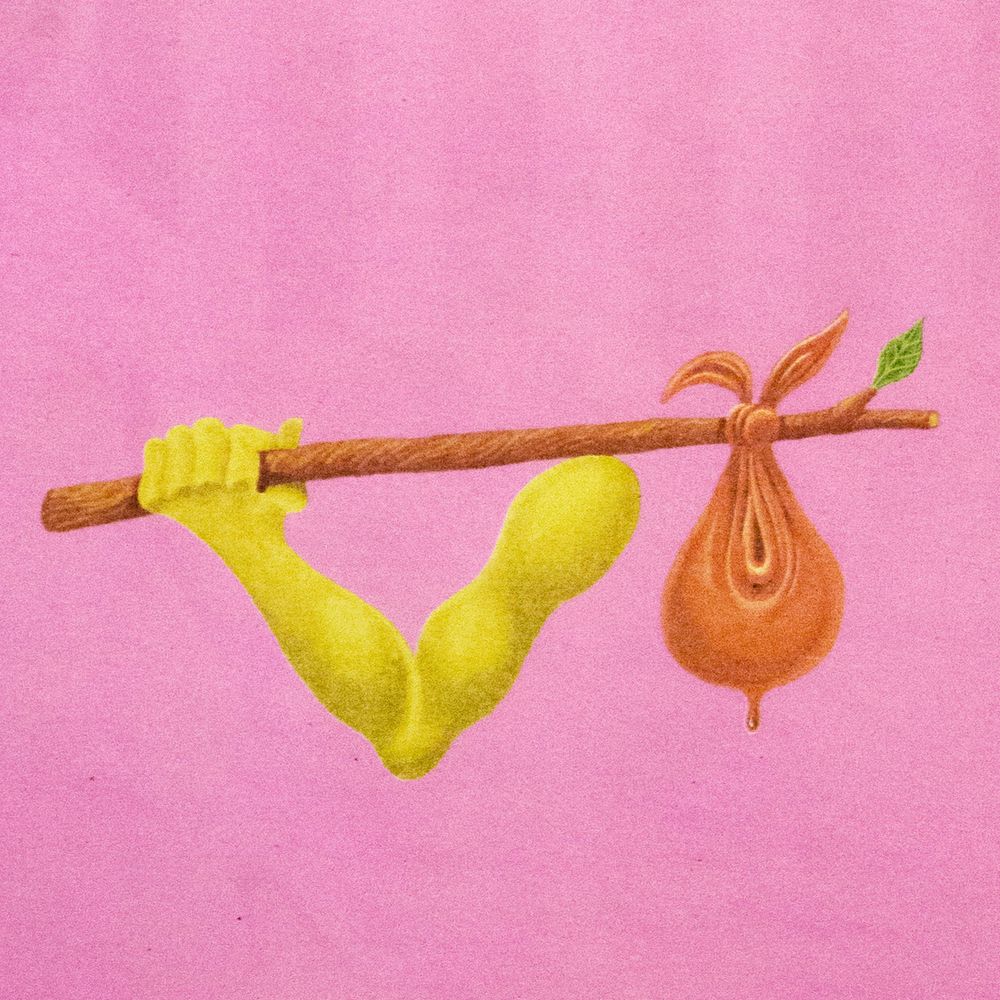
fachada de uma clínica de podóloga com uma mascote que é um pé toda feminina com um jaleco
you better not be cunty doutora pé when i get home
27.11.2025 18:55 — 👍 271 🔁 76 💬 6 📌 4
26.11.2025 21:22 — 👍 9305 🔁 3117 💬 26 📌 32

Letterer Todd Klein - B&W portrait

Spider-Man and Batman logos

Thirteen DC and Marvel logos

Eleven DC and Marvel logos
Todd Klein, ladies and gentlemen.
24.11.2025 22:20 — 👍 436 🔁 120 💬 9 📌 11

A digital drawing of one of those drawing tutorials that says 'don't do this, do this.'
The drawing is of an almost naked middle-aged man doing a flying kick. The 'Don't do this' one has a bunch of areas circled and a cross under it. The 'Do this' one is exactly the same but without the circles and a tick instead of a cross.
The text reads 'Needlessly adding red circles will ruin your art' and a smaller bit of text at the bottom reads 'Bonus tip! Add a tick under all your art so people think you did it right.'
#3157 A helpful tutorial
17.11.2025 23:39 — 👍 38412 🔁 8564 💬 162 📌 95

The 9000-page 52-pound book, entitled LIAR, LIAR, on display today at the University of Maryland.

Sample interior page.

Front of a postcard describing the project.

Photo of postcard describing project: “9,296
pages document 3o,573 false or misleading claims by Donald Trump from his
first day in office, 2017, to his final day on January 20, 2020, when Joe Biden was sworn in as the country's next president. All that verbiage is s3" thick, weighs 52 pounds, and it started like this.
The disolution of the Delaware College of Art & Design, to whom Lead Graffti had donated 1oos of design books over the past decade, brought an invitation to redaim them. We found a few, which brought us another interesting find — a blank Coppic-stitched book with a spine about 36 inches wide bound by Ema Ishii Holdredge for her BEA show at the Corcoran School of Art in
2008. That book haunted us for several weeks, and we decided it was too audacious not to give ita Lead Graffiti shot. For a while, we pondered how to fill a several thousand-page book with
content that made a serious point.
The notion of the presidential untruths came to mind, so maybe there was some documentation we could "borrow?" Sure enough, in a few Safari minutes, we found a downloadable PDE from
The Washington Post that we could massage into a typographic form we could use. We were off. Ray undertook the ink-jet printing of the pages, folding and inserting the red cover-weight sheets for structural support, and gathering and
punching the folds for sewing. Jill did 99.8% of the sewing.
At a 3o2 United gathering, we encouraged attendees to give the book a stroke.
Shown at right is the head of the Delaware ACLU, who has excellent technique.
LEAD GRAFFITI | NEWARK, DELAWARE| LEADGRAFFITI.COM|RAY@LEADGRAIETTI.COM”
This is a 52-pound 9000+ page accordion-bound artist’s book of Donald Trump’s lies, conceived, printed, and bound by Jill and Ray Nichols of @leadgraffiti.bsky.social in Delaware. Each of the 9000 pages has the text (per the Washington Post) of one or more of Trump’s lies; none are repeated.
15.11.2025 19:09 — 👍 317 🔁 141 💬 8 📌 20
Also, you get a comma. And a capital S which is usually a more useful test than T.
Shorter phrases for font testing: library.typographica.org/short-phrase...
15.11.2025 21:14 — 👍 21 🔁 4 💬 0 📌 1

Letraset inspired blanket. www.thedesignersfoundry.com/goods/goodma...
Very good.
Via @its-nice-that.bsky.social
14.11.2025 21:29 — 👍 120 🔁 22 💬 3 📌 4
Importante lembrar que a Lei Rouanet não usa UM ÚNICO CENTAVO DE DINHEIRO PÚBLICO, é um sistema de arrecadação de dinheiro PRIVADO que vira desconto e isenção de imposto pra empresa que subsidia o artista.
07.11.2025 15:56 — 👍 128 🔁 43 💬 1 📌 0
A queda do império em imagens
07.11.2025 21:36 — 👍 64 🔁 8 💬 3 📌 0
fun fact (fatos engraçados) sobre designers
na novela Meu Bem, Meu Mal o Claúdio (dono de um estúdio de design) tem um derrame vendo um prisma do hans donner na tela de um computador.
(hans donner eu te amo)
05.11.2025 17:39 — 👍 545 🔁 146 💬 36 📌 76
dawg not the steakhouse wedding font
05.11.2025 15:33 — 👍 15906 🔁 2519 💬 830 📌 189

Grandpa Simpson yelling at a cloud
Back in my day, AI used to stand for Adobe Illustrator! And we hated that, too!
29.10.2025 18:52 — 👍 18142 🔁 5282 💬 73 📌 68
Kopenhaggen
23.10.2025 14:55 — 👍 72 🔁 7 💬 3 📌 0
https://type-atlas.xyz, a directory of contemporary type design, collected since 2024 by https://typo.social/@db. Weekly* #AtlasOfType news on the website and wherever you read your RSS. Avatar: Crayonette DJR (2017) [*slowly catching up]
https://slammermemes.wordpress.com/
Lexington, KY based artist and musician
www.robertbeattyart.com
illustrator, birdwatcher, mustelid enjoyer 🌲🏳️🌈🏳️⚧️⭐️ Portland, ME @campmustelid.bsky.social
links: https://www.bird-illustration.com/links
Bird art and @pigeonpost.shop 🔡🐦
https://links.alex.gd
Pigeon Post is your go-to online purveyor of birdy delight! Illustration and design by @alextomlinson.com
📚📍 Visit our Art & Bookstore in Scranton, Penna! Open Fri-Sun 10-3pm.
pigeonpost.shop
QUADRINISTA | CARTOONIST
e-mail: afratura@gmail.com
-
publico gibis semanalmente em: http://afratura.substack.com
Darren Cullen
""Artist"" - Daily Mail
"Britain-hating anarchist who knows the value of nothing" - Johnny Mercer MP.
Hell Bus / Co-curator Museum of Neoliberalism
www.spellingmistakescostlives.com
www.linktr.ee/spellingmistakescostlives
Cartazista, designer pro cinema e pra vida real • nipo-brasileiro • ele/dele • aqui eu escrevo sobre design, cinema, direção de arte e distribuição.
portfolio: guskondo.com
ig: instagram.com/guskondo
a meditation on videogame (w/ occasional technology and web) history. donate to my ko-fi: https://ko-fi.com/moshboy/ also find me on mastodon: https://mastodon.social/@moshboy nfaq: https://pastebin.com/vUmrYKx6
Web Design Museum exhibits thousands of screenshots and videos of websites, apps, software, and Flash games from the 1990s to the late 2000s.
(pt-br/eng) luana góes, mixed media artist 🇧🇷 artista do norte que gosta de fazer mil coisas no analógico e digital! 👩💻
📩 luanagoesmontes@gmail.com
🖍 Idealizadora da Biblioteca de Zines https://www.biblioteca-de-zines.com.br/
Links: bento.me/luanagm
The world's #1 used book store. Come visit us at the edge of eternity.
store:
https://paperbackparadise.bigcartel.com/
isso não é um perfil profissional mas eu crio coisas!
🇵🇸 🏳️🌈 | www.joannamaciel.com | https://suaveporranenhuma.blog/
💌 maciel.joanna@gmail.com
👕 umapenca.com/joannamaciel
Long running, award winning narrative podcast about all the thought that goes into things most people don’t think about.
www.99pi.org
siriusxm.com/podcasts-plus-subscription