Someone send me one of these once and it was surreal. They clearly trained it on NPR pods so it’s two This American Life esque hosts going back and forth like “WOW that’s so interesting about the phase 2 schedule, now tell me more about the target customer analysis…”
26.02.2025 20:07 — 👍 1 🔁 0 💬 1 📌 0
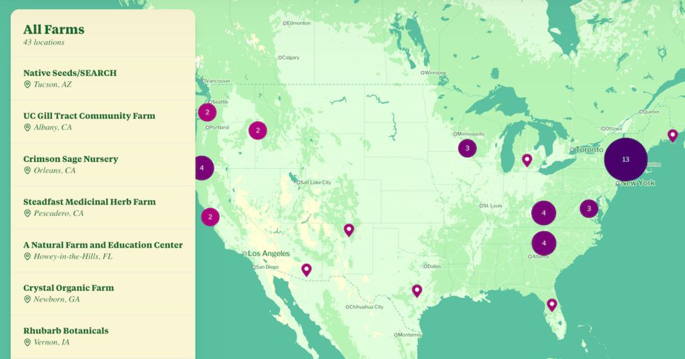
Herb Atlas
Herb Atlas is an interactive map that highlights small, human-scale farms growing medicinal herbs with a commitment to sustainable farming practices.
I've often wanted to be able to easily reference what farms are growing medicinal herbs with a focus on sustainable + regenerative practices. As a designer, I also thought it'd be fun to present that info in a searchable, interactive map.
So as a side project, I created herbatlas.fyi
#dataviz
16.01.2025 17:21 — 👍 23 🔁 6 💬 8 📌 1
Thanks Maggie 😊😊
11.01.2025 17:58 — 👍 0 🔁 0 💬 0 📌 0

How a gang's takedown revealed their playbook behind ransomware attacks
One of the most devastating cyberattacks plaguing companies today has been around for a decade — and its perpetrators have hardly had to innovate to stay profitable.
First post! My latest from @visuals.axios.com: How a ransomware attack works
This was a fun project to build. Probably the most CSS animations I've forced into a single page ✨
Words by @samsabin.bsky.social, illustration by Aïda Amer, dev by me.
www.axios.com/visuals/comp...
10.01.2025 19:41 — 👍 15 🔁 9 💬 1 📌 3
![Diagram with three sets of color ramps comparing real life paint mixing with digital color models. The first two compare magenta to white and blue to white, the third blue to yellow.
Caption 1: Real paints gain saturation and shift in hue when mixed with white, as exhibited by Quinacridone Magenta (left) and Phthalo Blue (right). These effects are reproduced faithfully by the K–M model, unlike RGB, where colors tend to lose saturation when mixed with white.
Caption 2: Mixing Cobalt Blue and Hansa Yellow in real life vs. in RGB, RYB [Gos- sett and Chen 2004], Subtractive, Subtractive-Additive [Simonot and Hébert 2014] and K–M model. The ad-hoc approaches are unable to match the K–M’s ability to predict the outcome of two pigments mixing together.](https://cdn.bsky.app/img/feed_thumbnail/plain/did:plc:c6b4jhahjjn75k4k2rvhsvyh/bafkreifkpg4gc7uf7eovyqsw6ygrtrdi7na64gdguc5ddjesltaeryxbfi@jpeg)
Diagram with three sets of color ramps comparing real life paint mixing with digital color models. The first two compare magenta to white and blue to white, the third blue to yellow.
Caption 1: Real paints gain saturation and shift in hue when mixed with white, as exhibited by Quinacridone Magenta (left) and Phthalo Blue (right). These effects are reproduced faithfully by the K–M model, unlike RGB, where colors tend to lose saturation when mixed with white.
Caption 2: Mixing Cobalt Blue and Hansa Yellow in real life vs. in RGB, RYB [Gos- sett and Chen 2004], Subtractive, Subtractive-Additive [Simonot and Hébert 2014] and K–M model. The ad-hoc approaches are unable to match the K–M’s ability to predict the outcome of two pigments mixing together.

Sample of simulated color mixing with different types of paint using the Kubelka–Munk model.
Caption: This digital painting was done using our pigment-based color mixing approach. It was painted on an 8-bit RGB canvas with colors picked from a regular HSV wheel. Thanks to our mixing method, all simulated media such as oil paints, watercolor, or pastels look realistic and natural. The paints blend intuitively and produce vibrant secondary colors: orange, violet, and most critically, green.
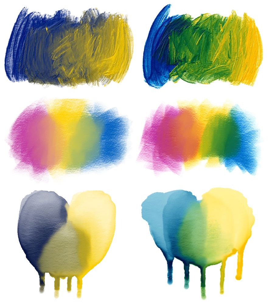
Diagram comparing RGB color mixing on the left compared to the Kubelka–Munk model on the right. Each column has three examples.
Caption: The effect pigment-based color mixing has on traditional media simulation. When mixed in RGB, paints blend into grayish, dull colors, while our method yields intuitive, natural shades and brings the simulation of oil paints, pastels, watercolor, and other media to the next level.
Cool color-mixing paper using the Kubelka–Munk model (which incorporates light absorption & scattering) to simulate real life paint behavior in software: scrtwpns.com/mixbox.pdf
It would be interesting to play with to generate #dataviz palettes.
via @jscarto.bsky.social & Jack Morris
📊🎨
06.01.2025 19:18 — 👍 72 🔁 13 💬 3 📌 1
They do help, I got more for Christmas.
07.01.2025 02:39 — 👍 1 🔁 0 💬 0 📌 0
🌟 Professional news 🌟
Today I joined @observablehq.com as a UX Designer to help build the next generation of awesome data + viz products! I've been a fan and user of Observable since the beginning, so I'm very excited to be a part of the journey and join such an inspiring team 🤗
07.01.2025 01:23 — 👍 109 🔁 3 💬 13 📌 0
I'm cold, and I will remain cold until May 15th. It's kinda the deal you make in exchange for having Tim Walz and affordable housing
07.01.2025 01:09 — 👍 0 🔁 0 💬 1 📌 0

Animated illustration of an iced coffee and a hot coffee, both with arms and legs, arguing about which one is better than the other.
Have you seen the best of Axios Visuals 2024 yet? Come for the bitcoin ETF saga timeline, stay for an investigation into how many cupholders different countries put on their boats, an analysis of cicada brood sizes, and dancing Nerds.
graphics.axios.com/2024-visuals...
03.01.2025 23:52 — 👍 3 🔁 3 💬 2 📌 0
project 1: Map Designer, a #dataviz tool and @figma.com plug in that simplifies the process creating and customizing maps in Figma! Had a lot of fun learning how to translate d3-geo's svg paths into Figma's vector networks.
try it out and let me know what you think! www.figma.com/community/pl...
02.01.2025 00:57 — 👍 40 🔁 7 💬 3 📌 1

CEO Unveils Bold New Plan To Undo Damage From Last Year’s Bold New Plan
CEO Unveils Bold New Plan To Undo Damage From Last Year’s Bold New Plan
theonion.com/ceo-unveils-...
31.12.2024 20:21 — 👍 6036 🔁 728 💬 60 📌 67
Undershirt coordinated with the orange, belt cinching the jumpsuit to build a snatched silhouette. Someone’s been going to the Anna Delvey school of prison styling
20.12.2024 03:11 — 👍 11 🔁 0 💬 0 📌 0
We have the Juicy Lucy, a cheeseburger with cheese on the inside of the patty. Why? So you can get squirted in the face with boiling hot cheese on your first bite, and said cheese can then drool out onto your plate leaving you with a dry cheeseless burger!
19.12.2024 05:06 — 👍 5 🔁 0 💬 1 📌 0
Omg it’s all about the alpaca! That’s what we’re getting everyone
18.12.2024 15:48 — 👍 0 🔁 0 💬 0 📌 0
The most egregious part of this is the bullet point alignment
18.12.2024 15:02 — 👍 3 🔁 0 💬 1 📌 0
Minnesota has taught us a thing or two about socks so we are using our knowledge and getting everyone socks. It’s a perfect stocking stuffer
18.12.2024 15:00 — 👍 0 🔁 0 💬 1 📌 0
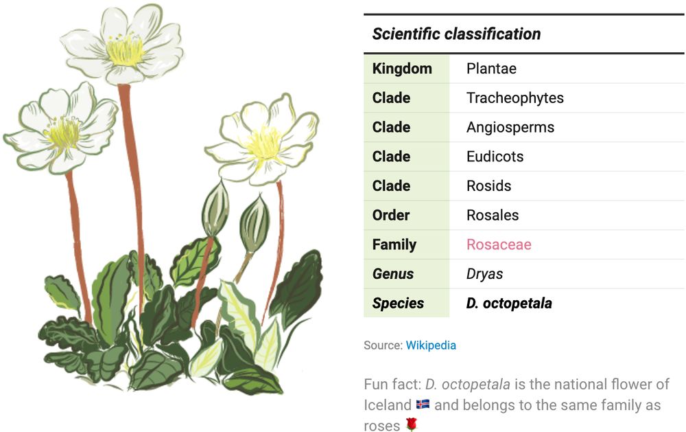
Table of the scientific classification of the flower Dryas octopetala annotated with a handmade illustration. Created by Eleni from the Datawrapper team.
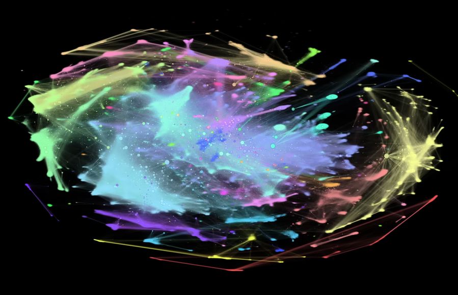
Screenshot of I “Made a Graph of Wikipedia... This Is What I Found”. Shown is a network graph of all Wikipedia articles and the links between them, resulting in a colourful representation of the world's collective knowledge. Among the most interesting findings are so-called communities, groups of articles that are more closely linked to each other than the rest of the site, represented by the individual colours. Published on YouTube by adumb.
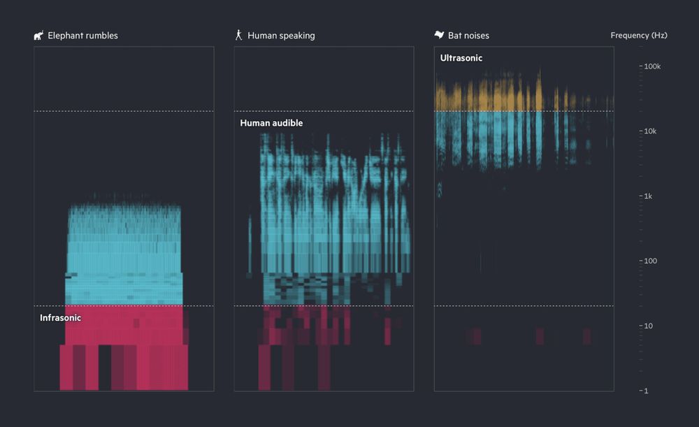
This image shows a spectrogram of three sound types: elephant rumbles (mostly infrasonic, red), human speaking (audible range, blue), and bat noises (ultrasonic, yellow and blue), with frequency increasing from bottom to top on a logarithmic scale. Published by Financial Times.
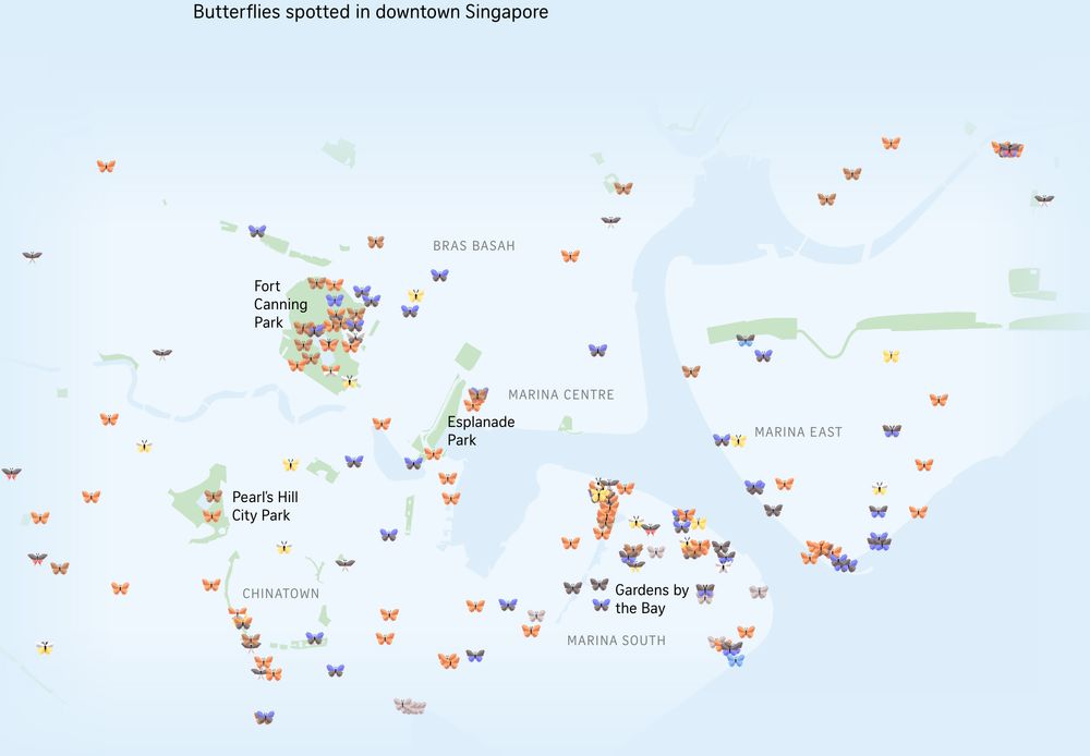
Map of downtown Singapore with little 3D butterflies added where butterflies have been spotted in the area. Different colored butterflies represent different species. Published in The Straits Times.
End of the year! ✨🎄🎇 So here we've got a special Data Vis Dispatch for you: it comes from the whole Datawrapper team. We're sharing our favorite visualizations of 2024. Take a look here 🎁 https://blog.datawrapper.de/data-vis-dispatch-december-17-2024/ and tell us: what were your favorites?
17.12.2024 16:33 — 👍 71 🔁 26 💬 2 📌 6
Me and my bestie in 30 years talking about waluigi
09.12.2024 23:22 — 👍 2 🔁 0 💬 0 📌 0
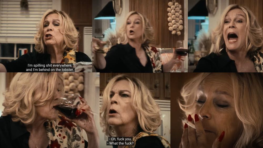
A collage of Jamie Lee Curtis in the Seven Fishes episode of The Bear
Me hosting Thanksgiving
27.11.2024 19:18 — 👍 5 🔁 0 💬 0 📌 0
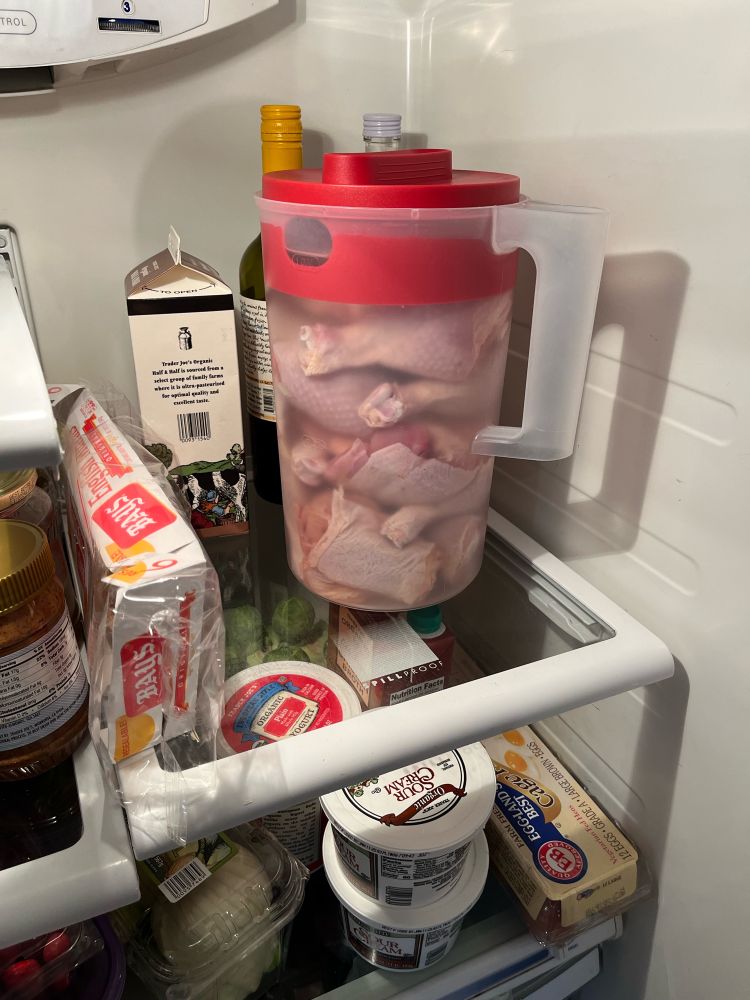
Chicken brining in a plastic pitcher
Brining chicken in a pitcher because Thanksgiving
27.11.2024 17:40 — 👍 6 🔁 0 💬 0 📌 0

Chart by The Economist showing tweets by Elon Musk from 2014 to 2024, by time of day. There is a considerable increase in volume after he bought Twitter at the end of 2022, and fallow periods throughout the day seem to dwindle
He forgot the first rule: don't get high on your own supply
www.economist.com/briefing/202...
21.11.2024 12:42 — 👍 622 🔁 159 💬 19 📌 33
Independent Map Sellers
congrats to @pinakographos.bsky.social & @awoodruff.bsky.social for launching mapartists.org
"A shopping guide offered by the Independent Map Artists"
19.11.2024 18:32 — 👍 14 🔁 6 💬 0 📌 0
Ok, I'm doing this Friday at 11am Pacific on the @rfortherestofus.com YouTube channel. youtube.com/live/mHyjToT...
19.11.2024 15:23 — 👍 19 🔁 5 💬 2 📌 2
Same 💜
19.11.2024 02:42 — 👍 0 🔁 0 💬 0 📌 0
Sounds cool, would love to see it!
19.11.2024 01:33 — 👍 1 🔁 0 💬 0 📌 0
Thank you! More to come
19.11.2024 01:09 — 👍 1 🔁 0 💬 0 📌 0
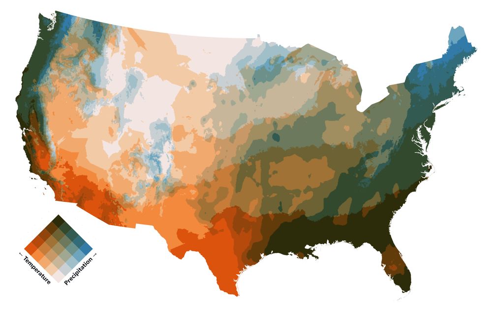
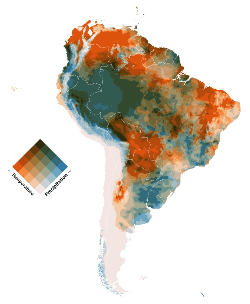
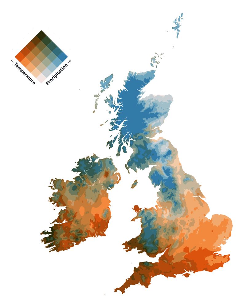
The map was composed in QGIS, using lots and lots of landcover layers, masks, and blending modes to achieve the right look. The smoke data was also styled in QGIS and exported as transparent PNGs. The whole thing is then composed like a flipbook with the smoke PNGs swapping as you scroll
19.11.2024 00:42 — 👍 11 🔁 0 💬 2 📌 0
Current: Principal Data Scientist (retail). Former: Data Science & AI Manager, Responsible AI Architect, ML Engineer, Data Scientist, Professor.
Research, design, art
Connecting people with nature.
Newsletter: marisamorby.kit.com/posts
Ceramics shop: mm.gifts
👨💼 Founding Engineer @ Zipline AI
🛠️ Creator of LayerChart and Svelte UX
👨💻 Fullstack dev w/ Frontend & DataViz specialties
💾 Network/Systems engineer in a prior life
Designer working with data visualization and machine learning.
Engineer at Posit (fka RStudio), technical lead at quarto.org
Learning Brazilian Choro, the 7-string guitar, and to deal with the Minneapolis winter after 10 years in Tucson
GIS and Cartography at Eurostat.
Exploring new ways of making maps.
observablehq.com/@joewdavies
DIGITAL ART since 1995: http://liaworks.com + NFTs: http://liaworks.com/nfts + foodblog: http://vegetaria.at | all social: @liasomething
"the woman, the myth, the legend, OG"
visual journalist, CNN data & graphics
🇨🇦 she/her
amyokruk.github.io
Designing apps & building websites ◦ Learning front-end ◦ Runner 👟 ◦ Madrid 🇪🇸🏠 ◦ Bournemouth 🇬🇧 ◦ United fan 🇾🇪
https://www.joe-watson.com/
Designer, developer, data viz enthusiast. Building 25 projects this year. Currently at Recurse Center.
priyamisner.com
News Apps at ProPublica, based in D.C.
Remote sensing, FOIA, other nonsense. Hit me with your climate/ag/H2O/H5N1-related thoughts & tips.
Chief product and brand officer @ProPublica.org; previously @nytimes.com
online: journalism & product management @ProPublica.org + a lotta #booksky
offline: en la discoteca, @ the swimming hole, & hosting @bookpeople.com's Happy Hour Book Club 🌈🤠🪩📚
📍#ATX, she/they
Visuals Editor @ProPublica.org working mostly on our collaborations with local newsrooms across the country.
Cofounder of The Everyday Projects.
@jskstanford.bsky.social alum.
Journalism, photography, metal, comic books, etc.
MSP based.
Investigative journalist. News Apps Developer at @ProPublica.org. Occasional AI/ML researcher. Using data+code to hold power to account.
Web: https://bxroberts.org
Signal: brandonrobertz.01
visuals editor at ProPublica 🦂
probably headbanging
www.cengizyar.com
I design applications that make data accessible for nonprofits, governments, and newsrooms. Product Designer at @propublica.org.
Data + news apps @propublica.org • Nonprofit Explorer • runner, squeaky fiddler, probably thinking about food • Green Mountain Transit 🚍 board member • 🧶🧵 • 📍Vermont
signal: asuozzo.05
Graphics, maps, etc. at ProPublica
design director at propublica