The piece reminded me of the activist work I do with OCIO and Inside Airbnb on housing accessibility, STR and corporate landlords, as we often have used similar phrases like "5% of host manage 30% of Airbnb listings and 34% of the revenue", to accompany network vizs which indeed look like octopi.
19.05.2025 18:38 — 👍 1 🔁 0 💬 0 📌 0

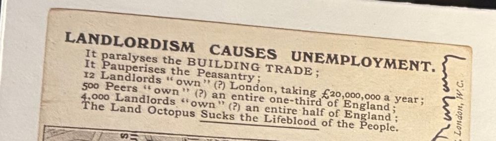
In another room, distant yet conceptually connected by this reflection on power, sat my favorite piece: a card with an etched octopus whose tentacles enclose London, framed by the text "12 Landlords 'own'(?) London, taking £20,000,000 a year[...]The Land Octopus Sucks the Lifeblood of the People."
19.05.2025 18:38 — 👍 1 🔁 0 💬 1 📌 0

There was a neat, minimalist drawing that immediately caught my attention. Upon closer scrutiny, I was shocked as the diagram was captioned "Bombing plan for the dropping of the atomic bomb on Hiroshima (August 6, 1945) by Robert A. Lewis", the co-pilot of the Enola Gay who dropped the Bomb
19.05.2025 18:38 — 👍 0 🔁 0 💬 1 📌 0
I walked through the historical data visualizations as if through an implicit essay on how (visual forms of) data are inevitably tied to dynamics of power: the practice is not neutral, but each piece is deeply embedded with the context, motivations for coming into existence & politics of its author
19.05.2025 18:38 — 👍 0 🔁 0 💬 1 📌 0

Diagrams
The strength of the diagram is in its apparent neutrality. Often stripped of ornament, scale, and context, diagrams imply knowledge without the burden of explanation. Their authority comes from arrang...
Last weekend, I visited "Diagrams" in Venice, curated by OMA. What I appreciated most was its open-endedness, which allowed my mind to create connections and aha-moments beyond those more linearly suggested by the organization of the space or the brief captions.
www.oma.com/projects/dia...
19.05.2025 18:38 — 👍 0 🔁 0 💬 1 📌 0

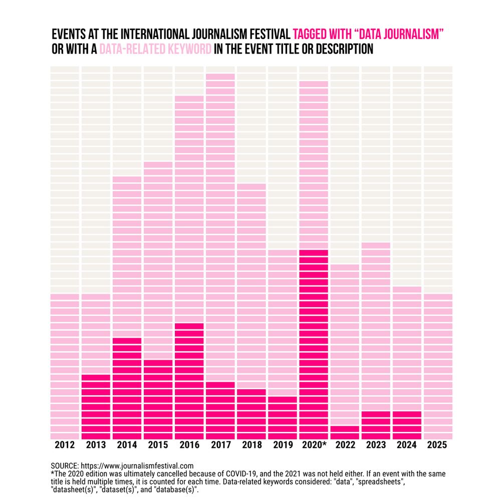
#ijf data output
For anyone wanting to do something else with the data, you can find the spreadsheet with the processed data here: docs.google.com/spreadsheets...
#ijf2025
11.04.2025 07:06 — 👍 0 🔁 0 💬 0 📌 0
PS. all charts made thanks to the amazing @datawrapper.de 😍
28.02.2025 16:12 — 👍 1 🔁 0 💬 0 📌 0

[1/4] I have just finished teaching a lesson in my course centered around one of the most common, yet misframed, questions I get from my students: "What is the best chart for my data"? #dataliteracy #criticaldata #dataviz #datajournalism
28.02.2025 16:05 — 👍 1 🔁 1 💬 1 📌 0
Former Washington Post columnist
Writing: pbump.net
Book: "The Aftermath"
Newsletter: https://howtoreadthisch.art
Email: philip@pbump.com
Signal: pbump.11
Data Analyst, AI enthusiasts and also #SocialPolicy researcher
#R #rstats #CSS #Sociology #DataJournalism
Professor of Political Science, University of Copenhagen. Research interests: European and Nordic Politics, Political Economy. Collector of modern ceramics, Faroese paintings and Christine Swane paintings. Lifelong fan of Bob Dylan and modernist poetry.
Political ecologist/radical geographer
MSCA EUTOPIA SIF postdoc @ CY Paris PLACES lab/ CASES group UPF Barcelona. Views are mine. spiritual landscapes network @eco_spiritual_practices
linktr.ee/AlesManzini
FILWD on Substack: https://filwd.substack.com/. Weekly post on data visualization and beyond (quite some AI lately).
Data visualizer (teaching, researching, divulging, etc.) Faculty at Northeastern University. Italian. Father of 3.
Freelancer (bylines in Rolling Stone, Wired, Jacobin, Left, Africa Express, Elle Decor and other media in Italy) + cultural operator based in Milan.
It’s not my disability, it’s your ableism.
[contact: chiara.zanini@outlook.com]
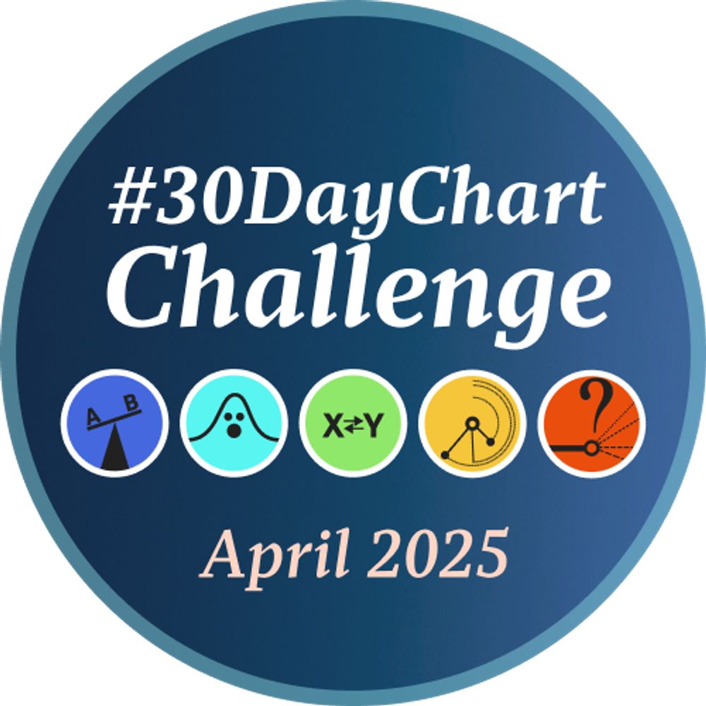
A #DataViz challenge 📊 by @cedricscherer.com and @drxeo.eu
Supported by @wendyshijia.bsky.social and @ansgarw.bsky.social
More info on Github: https://github.com/30DayChartChallenge/Edition2024
The UK’s largest not-for-profit newsroom. Exposing injustice and sparking change 💪
Investigative reporting on corruption, climate, rainforests and rights.
https://thegeckoproject.org/
Healthcare data analyst.
Aspiring Munroist.
Enrich your stories with charts, maps, and tables – interactive, responsive, and on brand. Questions? Write us: datawrapper.de/contact-us
data journalist & mentor
homolova.sk/newsletter
www.amphora.media
The non-profit investigative journalism platform of The Daphne Caruana Galizia Foundation. @daphne-foundation.bsky.social www.daphne.foundation
GQ trans woman • AP at UBC geography • center for applied trans studies • Carolina girl in PNW • settler on xʷməθkʷəy̓əm land • writing a book on trans data • teaching GIS with Justice lens • all things applied, intersectional, & spatial
👊🏾💥 critical technologist // design researcher // 📨 writes First & Fifteenth // 🦆 birdwatcher // 🍽️ collects menus (no, really) // 🔗 https://linktr.ee/uxmichaelco // 🌐 uxmichael.co
Ερευνητική δημοσιογραφία για το δημόσιο συμφέρον | Investigative journalism in the public interest. Newsletter: http://bit.ly/solomon-sign-up
Critical community archives, feminism & technology, queer archives, digital preservation. Doggie Mam, Vegan for the animals 🌱
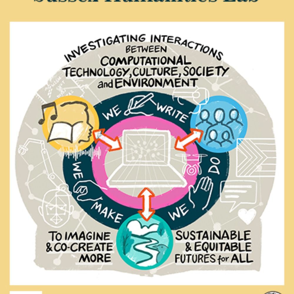
The Sussex Digital Humanities Lab investigates the interactions between technology, culture, society and environment toward sustainable & just futures for all.
@shl@h-net.social
@SussexHumsLab