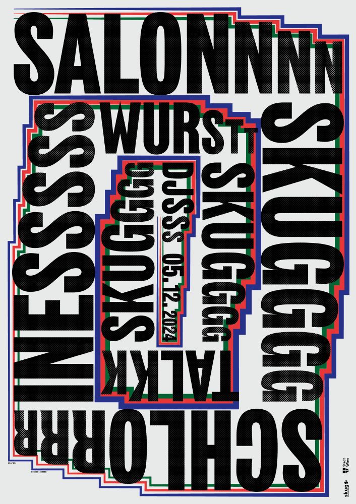
Poster for the live event “Salon skug” in December 2024, organised by the Austrian subculture magazine skug
27.01.2025 15:16 — 👍 3 🔁 0 💬 0 📌 0
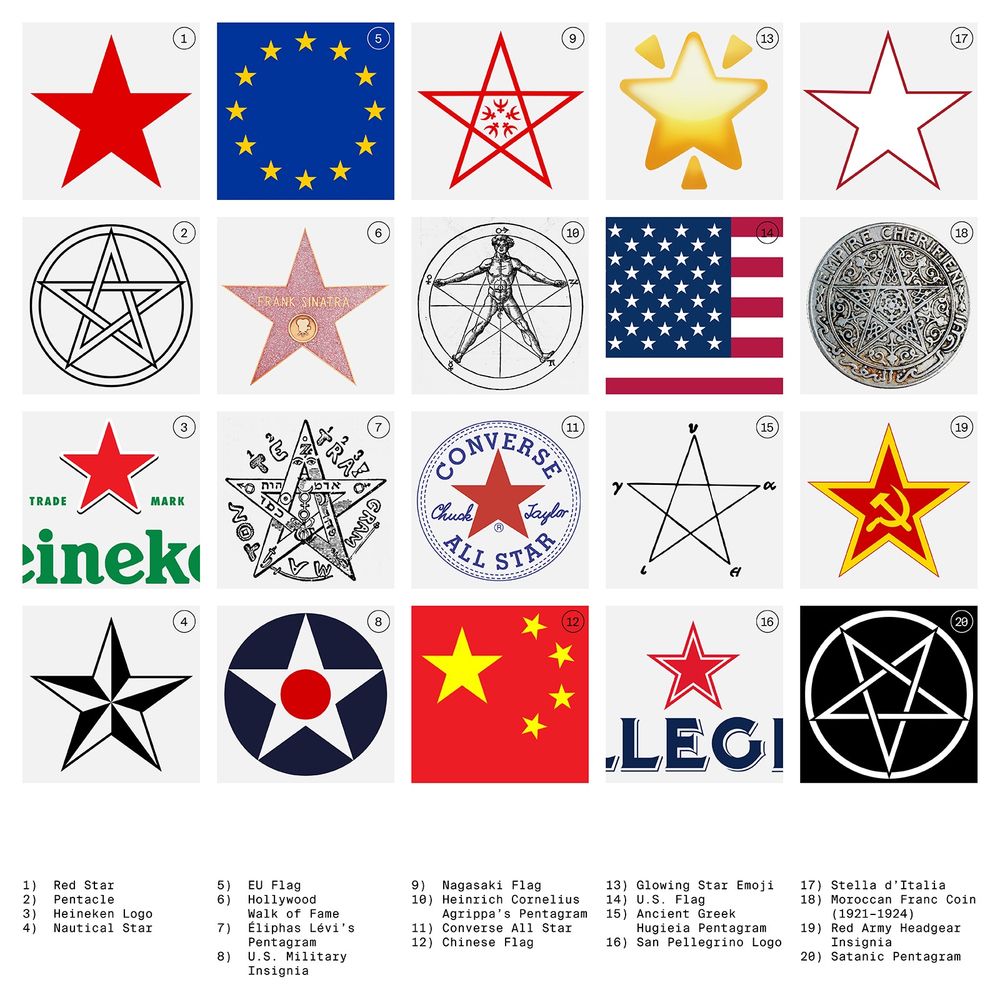
What is the meaning of the five-pointed star? ⭐️
Read about it in our new essay “Content and Form”: nguyengobber.com/insights/content-and-form
22.01.2025 11:21 — 👍 0 🔁 0 💬 0 📌 0
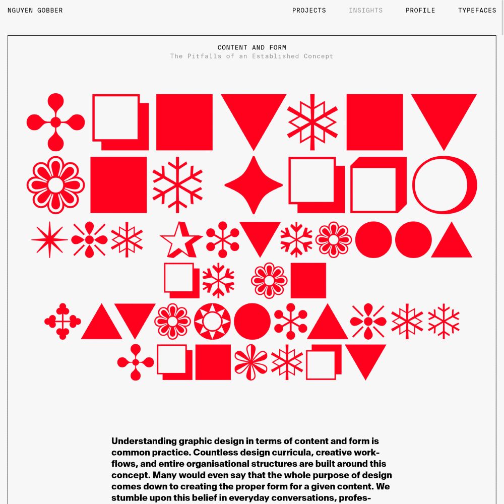
Does graphic design really come down to creating the “right” form for a given content?
In our essay we challenge this established view and explore how meaning is shaped through references, connections, and context—and what this entails for design.
Read: nguyengobber.com/insights/content-and-form
21.01.2025 15:15 — 👍 0 🔁 0 💬 0 📌 0
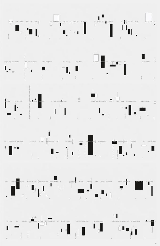
Graphic score designed for the artwork “Safe Harbor” by Russell Perkins.
Read more at nguyengobber.com/projects/safe-harbor
20.01.2025 20:37 — 👍 0 🔁 0 💬 0 📌 0
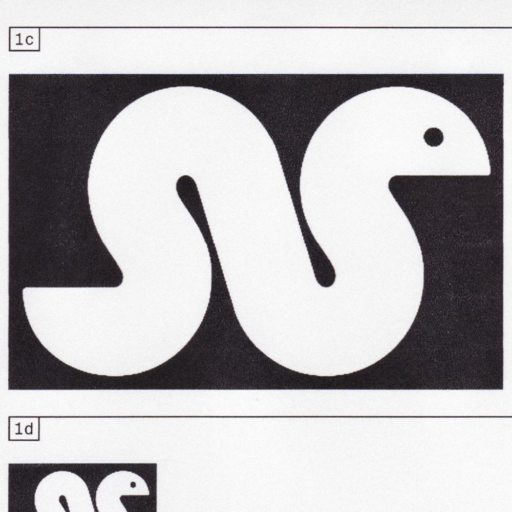
A charming snake signet designed for the visual identity of fashion designer Ali Zedtwitz.
16.01.2025 18:07 — 👍 1 🔁 0 💬 0 📌 0
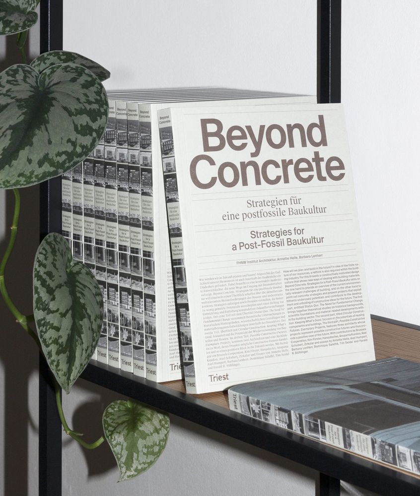
The publication “Beyond Concrete. Strategies for a Post-Fossil Baukultur” deals with how we will plan and build in the future. As resources are finite, the building industry must adapt and aim for more sustainable solutions beyond the professional comfort zones.
More at nguyengobber.com
15.01.2025 17:05 — 👍 1 🔁 0 💬 0 📌 0
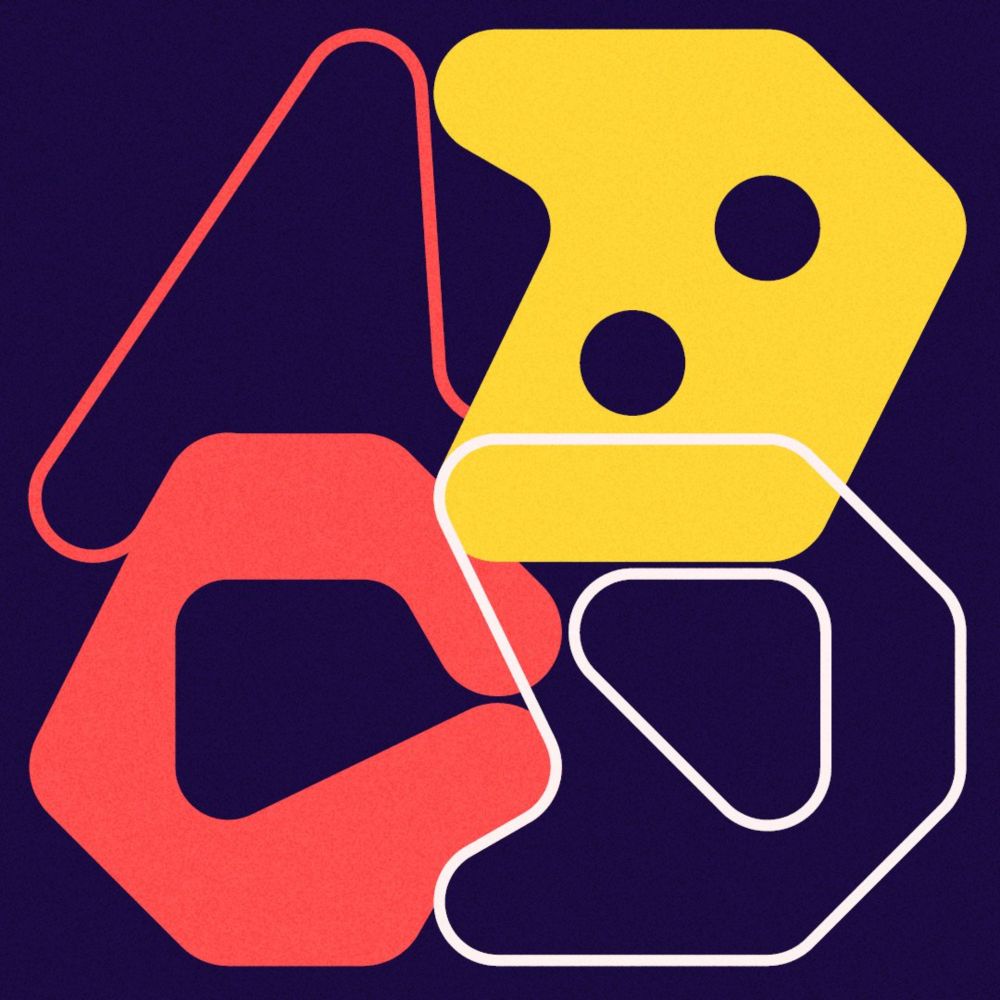
Nguyen Gobber has taken a 1960s design challenge and turned it into a typeface
Inspired by an exercise in Armin Hofmann’s Graphic Design Manual, the Hofmann typeface is built around a four-by-four dot grid.
Well, that’s kind of a very shallow comment, wouldn’t you agree? All comments based on frustration are going to look awkward. We kind of like that you’re trying to contribute something, but in the end: this is sad.
Anyway, the design explores a grid system by Armin Hofmann (1960s). More here:
15.01.2025 09:19 — 👍 0 🔁 0 💬 1 📌 0
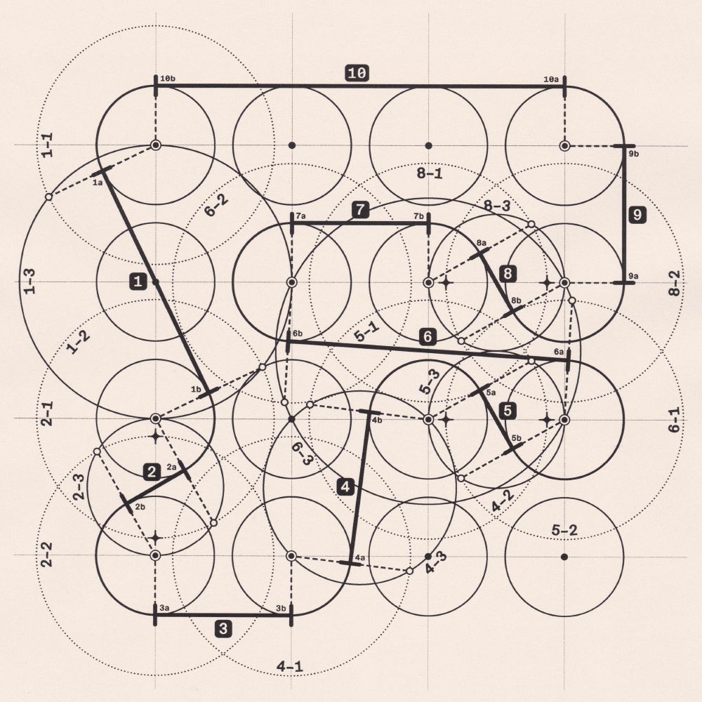
Construction details of the letter F from our typeface Hofmann
14.01.2025 18:10 — 👍 3 🔁 0 💬 1 📌 0
What if Josef Müller-Brockmann had used a different grid—or no grid at all—on page 98 of “Grid Systems in Graphic Design”?
(Layouts created during an investigation into grids in 2019)
13.01.2025 16:31 — 👍 1 🔁 0 💬 0 📌 0
Kind words about our Hofmann typeface on It’s Nice That:
“[…] there’s also something to be said for how successfully the duo has taken something rooted in mid-20th century Swiss design, and developed it into something contemporary […]”
www.itsnicethat.com/articles/ngu...
01.12.2024 12:16 — 👍 4 🔁 0 💬 0 📌 0
I'll write about design. Its practice, theory, history, and occasional existential crises. Expect praise for Mediterranean food and Latin-American culture 🥙 💃🏽
Artistic research at the Royal Academy of Fine Arts Antwerp
@royalacademyantwrp.bsky.social
Journal of Design Research. Published by Inderscience. Emphasising human aspects of design through integrative studies of social sciences and design disciplines.
Skeets by @reneewever.bsky.social (editor)
Incl journal updates & vacancies in design academia
The independent critical voice in contemporary art since 1949.
Sign up to our newsletter: https://artreview.com/newsletters/
Shop: https://shop.artreview.com
Parametric Type in Progress ⛳️
https://demo.burrowlab.com/demo
https://linktr.ee/burrowlab
A nonprofit center for inspiration, education, publishing, and community in lettering, typography, and graphic design. We post items from our collection of over 100,000 objects. Visit, take a class, buy a book: https://letterformarchive.org
🔵 Director at Knoth & Renner Berlin
🔴 Professor at University of the Arts Hamburg
We’re a bookstore in Amsterdam. Weekly events! Open Thu, Fri, Sat 1-7 + Sun 1-5! & www.san-serriffe.com
Committed to the daily re-imagining of what a university press can be since 1962.
Website: https://mitpress.mit.edu // The Reader (our home for excerpts, essays, & interviews): https://thereader.mitpress.mit.edu
London Centre for Book Arts is an artist-run, open-access studio for all things books. A community of artists sharing resources, skills, and ideas.
Britannia Works, Dace Road, London E3 2NQ
www.londonbookarts.org
Looking Makes Making Better
http://www.draw-down.com
We love books, type specimens, and printed matter. Turning pages since 2012. Bookshop and publishing house.
festival for art & digital culture berlin
transmediale.de/
Magazin für Kunst und Leben
Monatlich am Kiosk, täglich im Netz, Berlin
Impressum: https://www.monopol-magazin.de/impressum
Independent digital type foundry
Toulouse, France
Our last release: Round Condensed
https://bureaubrut.com/en/product/round-condensed
About typography. With a multilingual encyclopedia, events, and a community.
👉 https://wiki.wordsoftype.com
Events: https://wordsoftype.com
Designer, researcher, and occasional editor, publisher, based in Geneva, Switzerland.
🔗 romankarrer.ch
TF, two letters that stand for Type Foundry and Typographie Française (French Typography).
https://www.205.tf/
Working to expand Culture with Tech. Developing projects in Creation, Knowledge and Innovation. Steering Culttech.at