So remember this one and make your presentations and reports much better:
(𝗮𝗹𝗺𝗼𝘀𝘁 𝗮𝗹𝘄𝗮𝘆𝘀) 𝘂𝘀𝗲 𝗟𝗶𝗻𝗲 𝗰𝗵𝗮𝗿𝘁𝘀 𝘁𝗼 𝘀𝗵𝗼𝘄 𝘁𝗿𝗲𝗻𝗱𝘀 𝗼𝘃𝗲𝗿 𝗧𝗶𝗺𝗲 ⏳📈
14.02.2025 16:50 — 👍 0 🔁 0 💬 0 📌 0
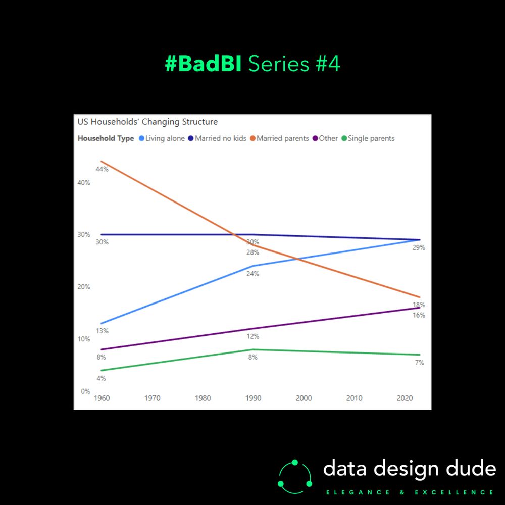
These flaws aren’t exclusive to this particular chart; all stacked area charts have them.
Now look at the second chart I made (with data points for just three years) and see how each of the problems above go away.
14.02.2025 16:49 — 👍 0 🔁 0 💬 1 📌 0
- We can’t see at what point a certain category overtook another.
- We can’t accurately compare the rate of change for a category in a certain period, against another category in the same period, or against itself/another in a different period.
I could go on.
14.02.2025 16:48 — 👍 0 🔁 0 💬 1 📌 0
- We can’t discern the value for any category at any point in time except the range’s start and end.
- We can’t tell the ranking of categories at any point in time except the first and last years… and even then, it’s not instantaneous for the first year.
14.02.2025 16:47 — 👍 0 🔁 0 💬 1 📌 0
The more I look at this chart, the more I see it sucks 🍑…
I’ll explain quickly why:
14.02.2025 16:47 — 👍 1 🔁 0 💬 1 📌 0
P.S. I dubbed the gesture an “𝘢𝘶𝘵𝘪𝘴𝘵𝘪𝘤 𝘴𝘩𝘶𝘳𝘪𝘬𝘦𝘯 𝘵𝘰𝘴𝘴” 🐱👤 [𝘵𝘳𝘢𝘥𝘦𝘮𝘢𝘳𝘬 𝘱𝘦𝘯𝘥𝘪𝘯𝘨 𝘭𝘰𝘭]
Regardless of if you thought the move was a NoT-C sAlo0t or not, I can guarantee you the world’s most minted doesn’t give 2 💩s… So let's not forget that bad press is good press! 💡
#BusinessIntelligence #Data #Analytics
28.01.2025 23:03 — 👍 1 🔁 0 💬 0 📌 0
I also reduced the 𝘀𝗮𝘁𝘂𝗿𝗮𝘁𝗶𝗼𝗻 of the red colour, so that it doesn’t take too much attention away from the overall visual.
Lastly, while the “part-to-whole” meaning is somewhat reduced by not using stacked bars, user's eyes no longer flit between the legend and chart to figure out the category. 👀
28.01.2025 23:02 — 👍 0 🔁 0 💬 1 📌 0
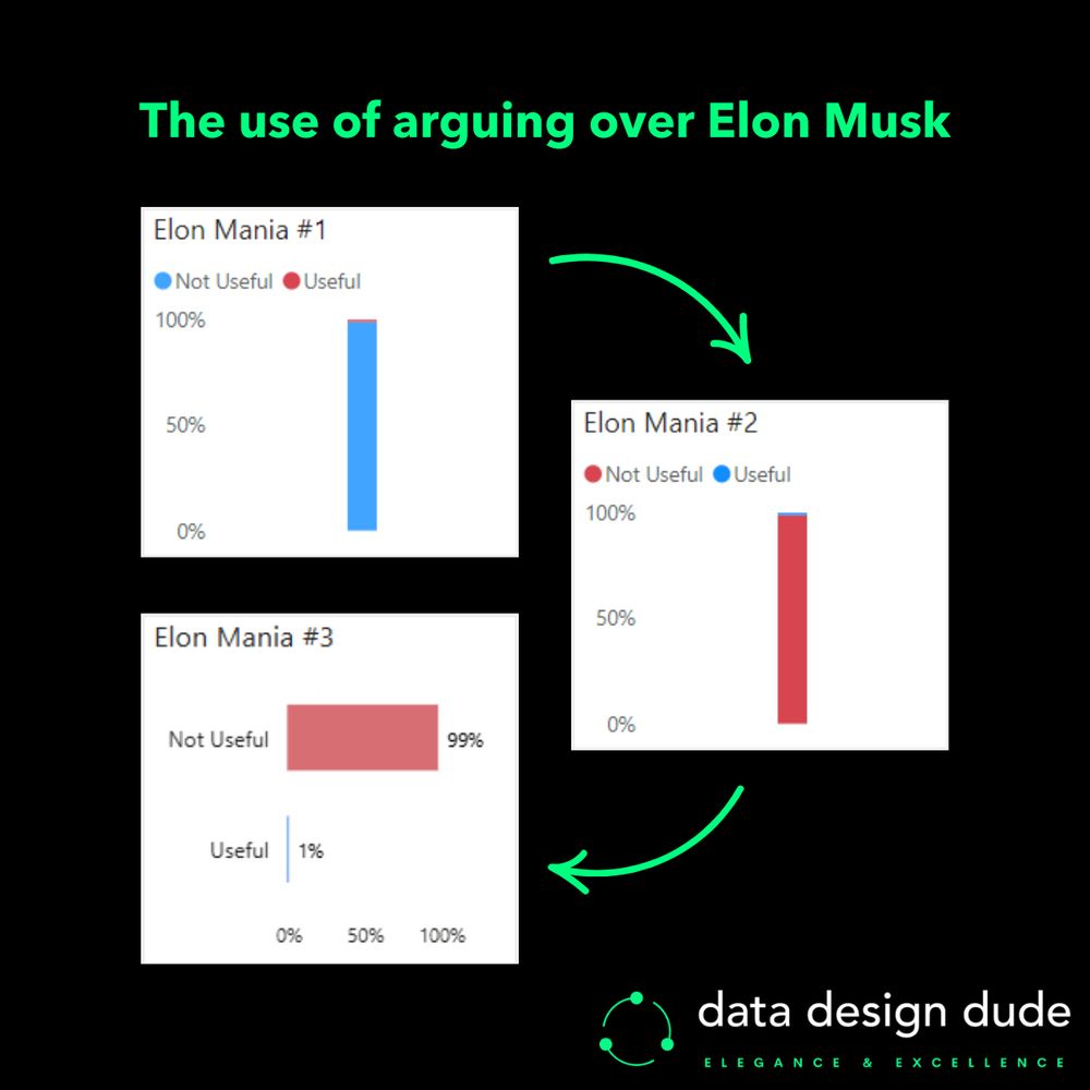
𝗣𝗿𝗼𝗯𝗹𝗲𝗺: The subconscious messaging of the colours is now correct, but it’s still quite hard to make out the blue ‘useful’ category when the difference is so much.
▶ 𝗩𝗲𝗿𝘀𝗶𝗼𝗻 𝟯
A simple horizontal Bar chart.
Now with the 𝘄𝗶𝗱𝗲𝗻𝗲𝗱 bars, even the very thin 1% one is more visible.
28.01.2025 23:01 — 👍 0 🔁 0 💬 1 📌 0
𝗣𝗿𝗼𝗯𝗹𝗲𝗺: Blue and red respectively convey ‘good’ and ‘bad’ sentiment to us, but ‘not useful’ isn’t good and ‘useful’ isn’t bad.
▶ 𝗩𝗲𝗿𝘀𝗶𝗼𝗻 𝟮
The same 100% Stacked column chart, now with the colours reversed.
28.01.2025 23:01 — 👍 0 🔁 0 💬 1 📌 0
▶ 𝗩𝗲𝗿𝘀𝗶𝗼𝗻 𝟭
I used a simple 100% Stacked column chart to show the disparity between ‘useful’ and ‘not useful’ conversations regarding Elon…
(𝘐 𝘱𝘪𝘤𝘬𝘦𝘥 1% 𝘧𝘰𝘳 𝘵𝘩𝘦 ‘𝘶𝘴𝘦𝘧𝘶𝘭’ 𝘤𝘢𝘵𝘦𝘨𝘰𝘳𝘺 𝘵𝘰 𝘣𝘦 𝘢𝘣𝘭𝘦 𝘵𝘰 𝘴𝘩𝘰𝘸 𝘴𝘰𝘮𝘦𝘵𝘩𝘪𝘯𝘨, 𝘣𝘶𝘵 𝘐 𝘵𝘩𝘪𝘯𝘬 𝘪𝘵’𝘴 𝘳𝘦𝘢𝘭𝘭𝘺 0% 😂)
28.01.2025 23:00 — 👍 0 🔁 0 💬 1 📌 0
I’ve found the discussions surrounding the recent controversy to be utterly 𝙪𝙨𝙚𝙡𝙚𝙨𝙨 time sinks, so I thought to make something 𝙪𝙨𝙚𝙛𝙪𝙡 out of them…
So I thought up a random hashtag#DataVisualization exercise to visualise it:
28.01.2025 23:00 — 👍 0 🔁 0 💬 1 📌 0
Elon Musk Mania
You sick of seeing #ElonMusk everywhere too?.. 😑
I definitely am. And even more than that, I’m sick of the “I know we should keep politics of LinkedIn buuut…” posts whose writers somehow all think they’re the very 1st person to think of a certain take.
🧵⤵
28.01.2025 22:59 — 👍 1 🔁 0 💬 1 📌 0
I have that too... I go out way less and sometimes when I'm out, I feel I should be hustling.
I call it "reverse fomo"... a friend/mentor yesterday told me it's just "ambition" :)
19.12.2024 20:38 — 👍 2 🔁 0 💬 0 📌 0
😂😂
19.12.2024 19:24 — 👍 1 🔁 0 💬 0 📌 0
no, bcuz their love is (almost) unconditional
18.12.2024 23:34 — 👍 1 🔁 0 💬 1 📌 0
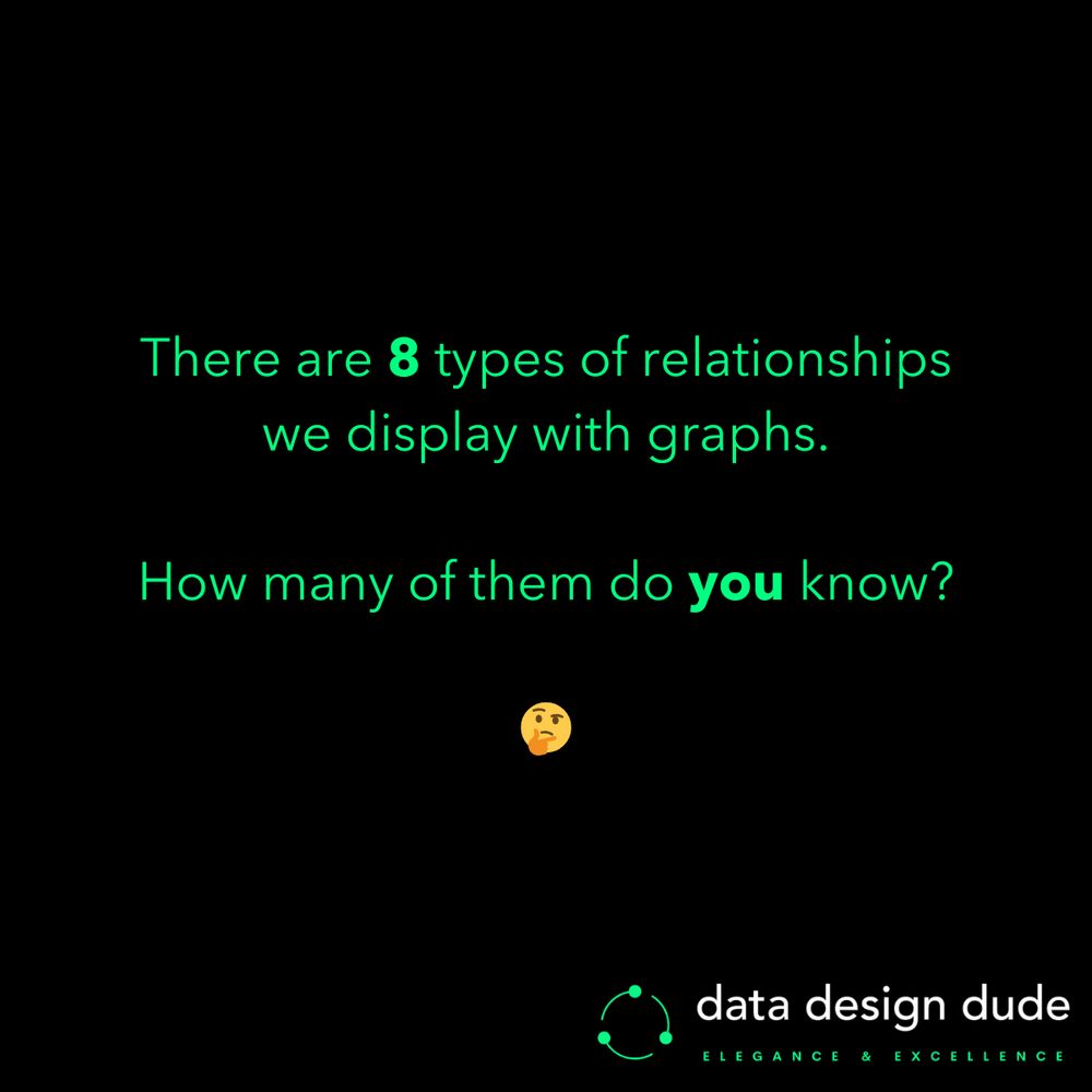
There are 8 types of relationships we display with graphs.
How many of these do you know? ⤵
- Times series
- Ranking
- Part-to-whole
- Deviation
- Distribution
- Correlation
- Geospatial
- Nominal comparison
#BusinessIntelligence #Data #Analytics #DataVisualization
17.12.2024 22:55 — 👍 2 🔁 0 💬 0 📌 0
'YYYY-MM-DD' ? 😅
10.12.2024 23:04 — 👍 0 🔁 0 💬 0 📌 0
preceding 𝘢𝘯𝘥 (lowercase) team, sorry ;)
10.12.2024 01:27 — 👍 1 🔁 0 💬 1 📌 0
loooool. it was just the latest one)
just experimenting here with the least amount of effort possible)
10.12.2024 01:25 — 👍 0 🔁 0 💬 0 📌 0
So remember this principle and make your presentations and reports much more accurate instantaneously:
>> 𝗔𝗹𝘄𝗮𝘆𝘀 𝘀𝘁𝗮𝗿𝘁 𝘆𝗼𝘂𝗿 𝗮𝘅𝗶𝘀 𝘃𝗮𝗹𝘂𝗲𝘀 𝗳𝗿𝗼𝗺 𝟬 <<
09.12.2024 23:37 — 👍 0 🔁 0 💬 1 📌 0
This is one of the most fundamental principles when designing any graph with a quantitative value axis, and as we can see here, forgetting it leads to communicating a very incorrect message to your reader.
09.12.2024 23:37 — 👍 0 🔁 0 💬 1 📌 0
In fact, by counting the grid squares you can see that this chart is telling our brains that March’s inflation was 𝟭𝟮𝘅 September’s inflation!! 😱
The reason for this is very simple… the Y-axis doesn’t start from zero.
09.12.2024 23:36 — 👍 0 🔁 0 💬 1 📌 0
But actually, when you take a few moments to think about it, you realise that September’s value looks awfully close to 0, even though it’s not.
And while March’s value isn’t even double that of September’s (it’s 46% higher) it looks to be many times higher. 👀
09.12.2024 23:36 — 👍 0 🔁 0 💬 1 📌 0
The chart shows US inflation % from Oct '23 to Oct '24.
The Y-axis shows the inflation rate in intervals of 0.2%.
All looks good right? It’s simple and easy to read, and we can easily tell in a glance that March had the highest inflation (3.5%) and September had the lowest (2.4%).
09.12.2024 23:35 — 👍 0 🔁 0 💬 1 📌 0
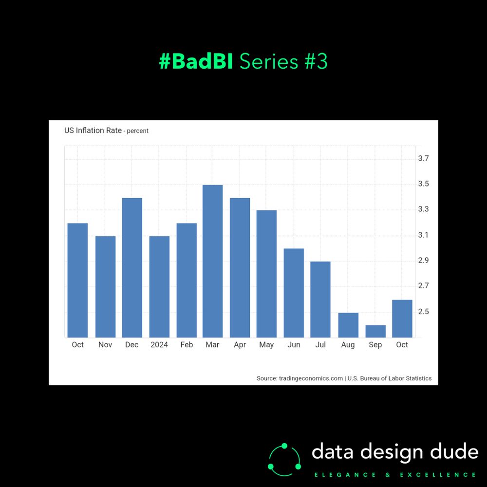
A column chart showing US inflation % from October of last year to October this year. The Y-axis doesn’t start from zero, resulting in incorrect comparisons.
You might think this chart looks pretty nice and clear, but it’s actually distorting the message completely. 😩
It misses a simple but very important #dataviz principle.
By learning it you can EASILY become a much better #data storyteller...
09.12.2024 23:34 — 👍 2 🔁 0 💬 1 📌 0
Mr. Blue Sky
Electric Light Orchestra · Out of the Blue · Song · 1977
The literal/perfect song for this platform:
open.spotify.com/track/2RlgNH...
#MrBlueSky #ELO #ElectricLightOrchestra ⚡💧
(𝘯𝘰𝘵𝘩𝘪𝘯𝘨 𝘵𝘰 𝘥𝘰 𝘸𝘪𝘵𝘩 #𝘥𝘢𝘵𝘢 𝘰𝘳 #𝘥𝘢𝘵𝘢𝘷𝘪𝘻 𝘭𝘰𝘭)
02.12.2024 20:11 — 👍 3 🔁 0 💬 0 📌 0
One of my top 3 series of all time... and how can one ever forget this scene when election season comes around and people go on about "surveys"... :)
26.11.2024 22:43 — 👍 0 🔁 0 💬 0 📌 0
Well, technically, they would've all "felt the same" 😜
26.11.2024 00:44 — 👍 0 🔁 0 💬 0 📌 0
So, learning data visualisation, whether for your next report or powerpoint presentation is crucial if you’re to make up the mind of stakeholders, like you’ve made up your own. 😉
📲 Follow along to become a confident data storyteller and learn how to persuade your stakeholders.
26.11.2024 00:42 — 👍 1 🔁 0 💬 0 📌 0
And if you use incorrect methods to present that data when the time comes for your stakeholders to listen to you, then unfortunately all of your analysis and hard work will have been for nothing… 😓
26.11.2024 00:41 — 👍 0 🔁 0 💬 1 📌 0
High-quality datasets designed to spark ideas, solve problems, and drive innovation. Fresh data added all the time for your AI projects, research, or curiosity. Let’s turn raw numbers into real impact 🚀
👩🎨 Artist📍Based in Florida 🐊
Freehand dip pen сontemporary ink on paper 🖋️
Mostly drawings ✍️
Vegan 🌱🫶
nenazhivina.com/hi
No DMs. Any enquirers: olga@nenazhivina.com
Power BI wizard from the frosty north, turning data into stories and visuals into insights. Founder of Viz.fo, always ready to dive into discussions about visuals, learn something new, and push the boundaries. Life’s too short to fail and stay static—keep
rotatingsandwiches.com / batting around podcast
Sports Betting News & Content | bettingnews.com
Streams EVERY DAY http://twitch.tv/bettingnews
ITS NOT GAMBLING IF YOU KNOW YOU’RE GONNA WIN
FREE GAMBLING PICKS AND ADVICE
& some Puns
…Clones Are People Two
I bet on football and golf while yapping about fake football, betting and playing golf
USA 🌎 ; Co-Founder of Lost Kids Esports🎮 ; Official Wyatt Lock’s Affiliate ⚾️🏈🏀; Check Linktree For Links 🔗
https://linktr.ee/mrfawkes
Living for and living off of college football. IG/Threads:
@tom_fornelli. Twitter/TikTok: @TomFornelli
Managing editor for the NBA/WNBA, combat sports and sports betting @YahooSports • The sunshine bores the daylights out of me.
ESPN Fantasy and Sports Betting editor. As seen in Errol Morris' film
BEING MR. MET. Author, YES IT'S HOT IN HERE. "It can only good happen."
Programmatically generated NFL data sheets for upcoming games, utilizing go-sports (https://github.com/cputans/go-sports)
Inspired by Cody Brown Bets - https://x.com/CodyBrownBets
Not affiliated with the NFL in any way.
TV writing, MMA, betting and Aston Villa.
https://www.theguardian.com/profile/jamesdonaghy
http://aerialtelly.co.uk/
https://plantbasedsavage.com/
The ultimate sports research companion designed by bettors, for bettors. jaXon gives you insights to bet smarter. 📈 Access jaXon and our Discord ➡️ https://beacons.ai/pinesports
Founder G3 Projections | Sports Bettor | Freelance Writer
Subscribe ---> garyg3garrison.substack.com/subscribe
https://linktr.ee/TripsG11
TIPS APPRECIATED: Cashapp $TrackInvesting - Stock/Betting Investments. Consultant/Not financial advisor- all trades/bets are my own ideas
Host - Dirt and Sprague 6-9am on 1080 The FAN | Host - Back to the Futures on BetQL | Dad to Jayda and Nori
Senior EP, Audacy Sports, BetQL Network, You Better You Bet. Deputy Editor, Windy City Gridiron. Host, Bears Banter Podcast.
born TX, raised PGH, Steelers/Pens/Bucs/PSU, one gorgeous wife, two kids, three jobs: Y108, BetMGM Network, Kaboly + Mack