New working paper up on SocArxiv! osf.io/preprints/so.... I use the 1940 Census and linked mortality records in combination with an IV-design to study the causal effects of racial segregation on longevity. I show that segregation reduces both Black and White longevity.
13.11.2025 14:52 — 👍 12 🔁 7 💬 1 📌 0
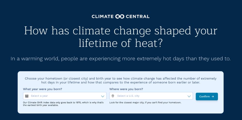
Screenshot for the interactive tool to enter year you were born and where for how has climate change shaped your lifetime of heat? In a warming world, people are experiencing more extremely hot days than they used to.
How has climate change shaped your lifetime of heat?
Younger people today are experiencing more extremely hot days during their childhood compared to previous generations.
Check out the new interactive tool by @climatecentral.org: climatecentral.observablehq.cloud/generational...
03.09.2025 19:59 — 👍 134 🔁 45 💬 7 📌 2

🌡️ New global study: hot nights increase mortality risk — independently of daytime heat. 178 cities, 44 countries, 14M+ deaths analyzed.
Our new study published in Environment Int and led by Carmen Iñiguez and myself from the MCC Research Network.
#HotNights #ClimateHealth #climatechange
02.09.2025 10:04 — 👍 35 🔁 23 💬 2 📌 0
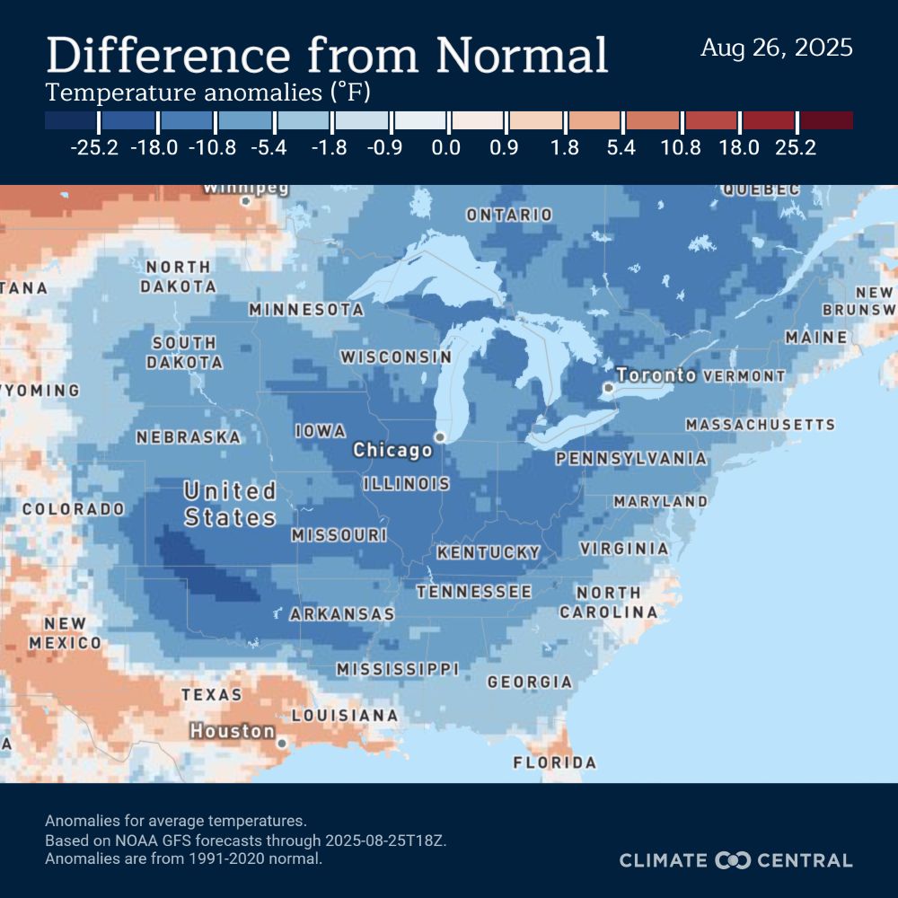
Map of the U.S. showing average temperature anomalies on August 26, 2025. Much of the Central and Eastern U.S. is shaded blue, indicating temperatures 5–15°F cooler than normal. Stronger cool anomalies appear in the Midwest and Mid-South. Warmer-than-normal areas in red and orange are seen along the West Coast, southern Texas, and parts of the Southwest
🍂 Aug-tober?
From the Upper Midwest to the Southeast, many are stepping into refreshingly cool late-summer air this week.
🔵 Temps 10–20°F below average—a rare late-August treat
The catch? A refreshing summer cool down like this is becoming less common for future summer fun 🔽
26.08.2025 16:05 — 👍 5 🔁 3 💬 1 📌 0
Enfatizo esto cada vez que hablo sobre calor y salud con otras personas. Si no estás acostumbradx, 30 grados pueden ser una pesadilla.
I emphasize this every time I talk about the impacts of heat on health with other people. If you're not used to it, 30C 86F can be a nightmare.
05.07.2025 16:39 — 👍 2 🔁 0 💬 1 📌 0
Esto estaba pensando ahora... si hace un calor para cocerse ya, lo de aguantar "5 días" va a ser tremendo.
26.06.2025 13:33 — 👍 1 🔁 0 💬 0 📌 0

A graphic showing that the average temperature in Raleigh/Durham since 1970 has risen by 4.5 degrees Fahrenheit
It felt like a cool May, but only because we're frogs in a pot of water that is gradually boiling.
@climatecentral.org
03.06.2025 18:18 — 👍 683 🔁 133 💬 11 📌 3
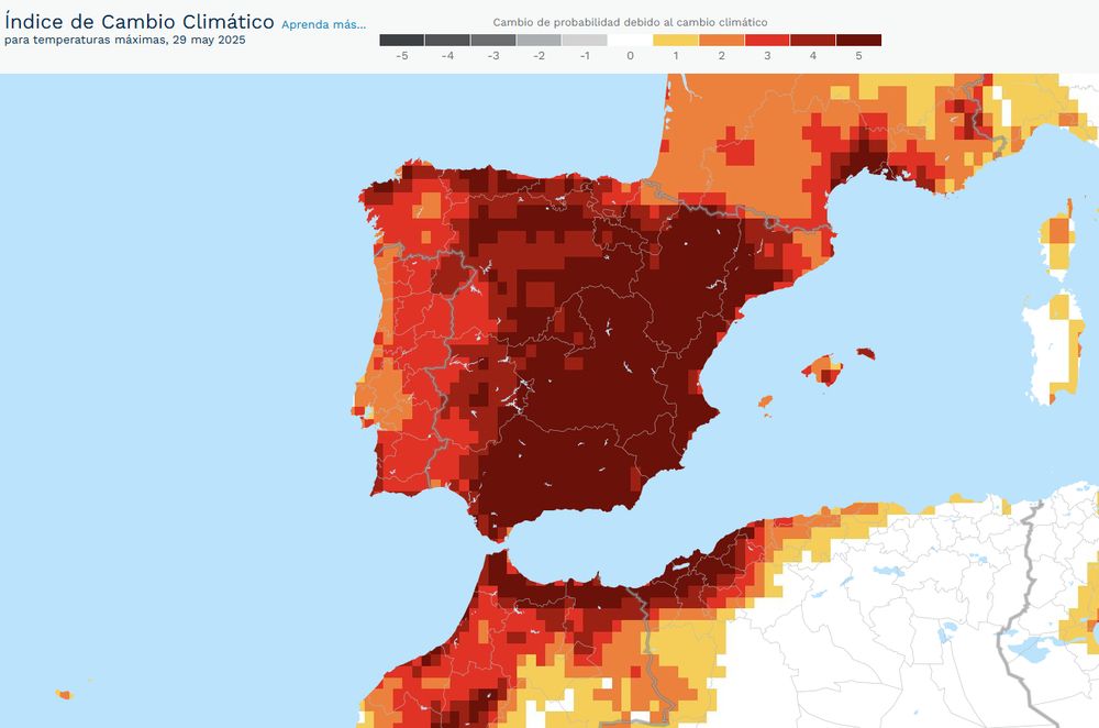
⚠️El calor de hoy no ha sido lo normal 🔥
Y este evento extremo es 5 veces más probable en un mundo con cambio climático que sin él 📈🌡️🌍
29.05.2025 20:31 — 👍 94 🔁 54 💬 1 📌 4
![What can be learned when multiple analysts arrive at different estimates
Kowall et al. (2025) have brought the multi-analyst approach to epidemiology, with instructive results. With this approach, multiple researchers analyze the same data set to answer the same research question. Or, at least, what appears to be the same research question. In fact, the very first paper that popularized this approach [1] has been criticized for using a vague research question (“Are soccer referees more likely to give red cards to players with dark skin tone than light skin tone?”), which apparently led the analysts to try to answer quite different questions—from a simple question about a bivariate statistical association to much more complex causal questions about racial bias [2].
In contrast, the research question passed on to analysts in Kowall et al. (2025) seems less ambiguous: Does marital status influence the incidence of cardiovascular disease? But less ambiguous does not equal unambiguous. Considerable...](https://cdn.bsky.app/img/feed_thumbnail/plain/did:plc:gz53felr7btxgmbxae5aooxi/bafkreidvs4c7wvoh63tr2ptmvnnl5hya246ofttwyzlvotkmqhnpwgbf4a@jpeg)
What can be learned when multiple analysts arrive at different estimates
Kowall et al. (2025) have brought the multi-analyst approach to epidemiology, with instructive results. With this approach, multiple researchers analyze the same data set to answer the same research question. Or, at least, what appears to be the same research question. In fact, the very first paper that popularized this approach [1] has been criticized for using a vague research question (“Are soccer referees more likely to give red cards to players with dark skin tone than light skin tone?”), which apparently led the analysts to try to answer quite different questions—from a simple question about a bivariate statistical association to much more complex causal questions about racial bias [2].
In contrast, the research question passed on to analysts in Kowall et al. (2025) seems less ambiguous: Does marital status influence the incidence of cardiovascular disease? But less ambiguous does not equal unambiguous. Considerable...
Kowall et al. published a multi-analyst epi study on the effect of marital status on cardiovascular disease (link.springer.com/article/10.1...). What can be learned from this effort? Check out our new commentary! link.springer.com/article/10.1...
with @mendelrandom.bsky.social & Marcus Munafò
30.05.2025 05:56 — 👍 101 🔁 31 💬 5 📌 9

España es de los países con la tasa más baja, pero Singapur, Hong Kong y Corea del Sur están por debajo del bebé por mujer.
ourworldindata.org/grapher/chil...
16.05.2025 07:52 — 👍 2 🔁 0 💬 1 📌 0
good_description/good_description_ddk_agb.pdf at main · ddekadt/good_description
Homepage of "Good Description" by Daniel de Kadt & Anna Grzymala-Busse - ddekadt/good_description
🚨 “Good Description” with @annagbusse.bsky.social 🚨
What sets 'good' description apart from 'mere' description?
We develop a framework for evaluating descriptive research, whether we are doing it as scholars or assessing it as readers.
Two main contributions...
🔗📄 tinyurl.com/gooddesc
14.05.2025 21:52 — 👍 234 🔁 77 💬 11 📌 11
“I’ll just run this last robustness check and then the paper will be finished...”
08.05.2025 19:47 — 👍 64 🔁 5 💬 2 📌 2

[🆕RESEARCH] Increasing vegetation cover by 10%, 20%, and 30% could lower the global population-weighted mean temperature during the #warm season. These reductions could prevent approximately 0.86, 1.02, and 1.16 million deaths—corresponding to 27.16%, 32.22%, and 36.66% of all heat-related deaths.
05.05.2025 08:47 — 👍 31 🔁 18 💬 1 📌 0
🔔 Call for Interest 🔔 – UPF DemoSoc is looking for senior researchers to join through Spain’s ATRAE 2025 programme. PhD before 01/01/2018 required. 3–4 year contract + long-term stabilization. If you are interested, send an email to: jorge.rodriguez@upf.edu. Deadline to express interest: May 9.
30.04.2025 11:21 — 👍 5 🔁 5 💬 0 📌 0

Book jacket for Multiverse Analysis: Computational Methods for Robust Results by Cristobal Young and Erin Cumberworth.
My colleague Cristobal Young and co-author Erin Cumberworth just released their book on multiverse analysis, a set of tools that help resolve the "garden of forking paths" and "file-drawer" problems and, in the process, improve quantitative social & behavioral science.
Highly recommend.
19.04.2025 21:52 — 👍 76 🔁 26 💬 2 📌 3
If you presented work related to climate or the environment at @popassocamerica.bsky.social , self-promote and join the list!
16.04.2025 21:32 — 👍 0 🔁 0 💬 0 📌 0
Putting together a list of demographers working on questions related to climate change and the environment.
Reply or like this post to be added.
Reposts appreciated so we can reach as many people as possible.
go.bsky.app/MwYXxeN
16.04.2025 14:22 — 👍 10 🔁 6 💬 2 📌 0
Added. Thanks Clark! I'm relatively new to the field so I appreciate any suggestions.
16.04.2025 14:42 — 👍 1 🔁 0 💬 0 📌 0
Putting together a list of demographers working on questions related to climate change and the environment.
Reply or like this post to be added.
Reposts appreciated so we can reach as many people as possible.
go.bsky.app/MwYXxeN
16.04.2025 14:22 — 👍 10 🔁 6 💬 2 📌 0
I was thinking about this, especially after meeting so many cool people doing amazing env demography work at PAA. I'll give it a try!
16.04.2025 13:52 — 👍 2 🔁 0 💬 0 📌 0
Hi. Could I added to the list? Thanks :)!
16.04.2025 13:19 — 👍 0 🔁 0 💬 2 📌 0

Dags Yda Like Dags Mickey Oniel GIF
ALT: Dags Yda Like Dags Mickey Oniel GIF
New paper in @bmj.com. Ever been told ‘what does your DAG say?” or “show me your DAG”, or “ok draw a DAG” and not sure what that means or how to get started? Well buckle up, because Fernando Hartwig, @neilmdavies.bsky.social and I wrote an RMR on just this topic. www.bmj.com/content/388/...
26.03.2025 15:47 — 👍 56 🔁 26 💬 6 📌 0
I really liked this idea of using a histogram as a legend in a choropleth map (since land isn't unemployed; people are), so I made a little guide to doing it with #rstats, {ggplot2}, and {patchwork}
www.andrewheiss.com/blog/2025/02...
19.02.2025 17:58 — 👍 868 🔁 192 💬 27 📌 23

Our Super Bowl plan is watching American Psycho and eating eggplant parmigiana.
10.02.2025 00:50 — 👍 0 🔁 0 💬 0 📌 0
policy, $, political economy of race // 70-80s soul, 90s hip hop // #DubNation // proud product of miscegenation // Berkeley prof (formerly: Princeton CSDP, UW)
Associate Professor GW.
Labor unions and international trade.
blogs.gwu.edu/adamdean/
Demographer and economist.
population dynamics | mortality | population ageing | fertility | public policy
https://sites.google.com/view/tothgcs
Columbia Econ PhD candidate. Labor, health, and public economics.
‣PhD Candidate in Economics and Public Policy @ University of Michigan
‣Public/Environmental Applied Microeconomist
www.maryquiroga.com
Sociologist at Rutgers. Studies far-right politics, populism, and hate speech. Computational social science.
https://www.thomasrdavidson.com/
Sociology PhD student. I study segregation, climate events, and schools.
https://tylermcdaniel.github.io/
Sociology PhD candidate at Cornell, studying wealth inequality and elites.
www.wesleystubenbord.com
Associate Professor @YaleSoc @ysphbiostat @JacksonYale | Advocate for evidence-based family and health policies | Data science enthusiast
Sociology Ph.D. student @Yale @YaleSoc studying social demography, aging and life course, health, and environmental inequality. 🎧🌆☕️
🔗 https://jasonwongyh.weebly.com/
Sociologist at UNED (Madrid) working on educational inequalities, social mobility and social demography, EiC of ESR.
https://www.fabriziobernardi.net
Econ @CUNEF Universidad.
Machine Learning | Public Econ | Inequality | Housing | Wagner | Mahler
https://www.pedrosalasrojo.com/
Yale SOM professor & Bulls fan. I study consumer finance, and econometrics is a big part of my research identity. He/him/his
Assistant Professor at @McCourtSchool @Georgetown Working on computational social science, social media, and politics. De Belém 🇧🇷
A new media company focused on the biggest story of our time: climate change. Subscribe to our newsletter at https://heatmap.news.
Alternately Defiant, Dispirited, and Despondent. Without illusions but not disillusioned. Focus on Climate, Inequality and Development.
I co-edit the Polycrisis project and newsletter https://www.phenomenalworld.org/series/the-polycrisis/
We are the European Environmental Bureau (EEB), Europe's largest network of environmental NGOs. We work for a better future where people and nature thrive together.
https://linktr.ee/eeb_europe
Social statistician/demographer
@IIASA
@Wittgenstein Centre
An international scientific institute that conducts research into critical issues of global environmental, economic, technological, and social change. https://iiasa.ac.at