New data suggests that when looking at public colleges in California, it’s increasingly prudent to attend a school in the Bay Area when it comes to the ROI.
20.09.2025 12:40 — 👍 6 🔁 1 💬 0 📌 2
@hannazakharenko.bsky.social
data utility developer @sfchronicle.com
New data suggests that when looking at public colleges in California, it’s increasingly prudent to attend a school in the Bay Area when it comes to the ROI.
20.09.2025 12:40 — 👍 6 🔁 1 💬 0 📌 2
Almost 20 California state employees made over $1 million last year. For the majority of them, the biggest chunk in their compensation came from "other pay" a category that encompasses bonus payments and incentive pay. Learn more (🎁🔗): www.sfchronicle.com/projects/202...
03.09.2025 21:12 — 👍 1 🔁 0 💬 0 📌 0
How much do you need to earn to be rich? That depends on where you live. Learn more (🎁🔗): www.sfchronicle.com/projects/202...
20.08.2025 16:59 — 👍 0 🔁 0 💬 0 📌 0welcome!! a mission burrito awaits. let me know if you want a tour of the chron!
07.08.2025 01:54 — 👍 1 🔁 0 💬 0 📌 0
Love this quirky piece of urban S.F. data journalism from @danielleechev.bsky.social and @hannazakharenko.bsky.social — with a cameo from @woodylabounty.bsky.social
🌁 💯
www.sfchronicle.com/sf/article/s...

4. And lastly, I get to work with newsrooms across the U.S.
Stories with personalized text to their area were also published in the San Antonio Express-News:
www.expressnews.com/projects/202...
And in the Albany Times Union: www.timesunion.com/projects/202...
with more in the works!

3. I get to make charts that are infinitely fun to play with.
Curious on how the popularity of your name has changed over time? I was too. So I made a chart for it!
Explore yours here (🎁🔗): www.ctinsider.com/projects/202...

2. I get to have fun with design.
Insert fun scribble breaks to add some personality to the story.

1. I get to try new things.
I wanted to make a story that could be replicable across our papers.
For this story on baby names, a web scraper grabs the newest data and updates the charts on the page when the annual data is released. Every chart is personalized (e.g., a dropdown for state here)
Sometimes, I scribble on the job.
But this is the first time those scribbles have been published.
A little 🧵 about what makes my role so unique, and why being a fellow is pretty awesome.

Line chart showing the net number of people who moved between San Francisco and New York City for jobs between 2001 and 2023.
San Francisco used to lure workers from New York. But in recent years, more San Franciscans have been moving to the New York metro area, reversing the pre-2020 trend. Find out more about SF’s shifting job migration patterns here (🎁🔗): www.sfchronicle.com/projects/202...
28.04.2025 18:13 — 👍 4 🔁 1 💬 0 📌 0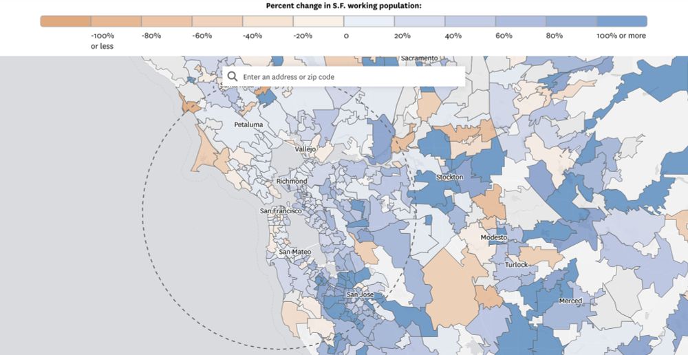
San Francisco saw the nation’s biggest jump in the percentage of the workers living 50 or more miles from their jobs from 2012 to 2022, compared with the top 25 cities with the largest workforces in the U.S.
Experts said this was fueled by remote work and high housing costs.

Aerial and satellite imagery companies released visuals on Thursday that begin to show the devastating extent of damage caused by the wildfires that have scorched thousands of acres in the Los Angeles area.
10.01.2025 00:57 — 👍 29 🔁 9 💬 1 📌 1
Aerial imagery from Nearmap shows a Pacific Palisades neighborhood before the fire, on Jan. 1 and during the fire on Jan. 7.
Aerial imagery shows how truly devastating the L.A. fires are. Take a look at some side-by-side photos before and during the fires, provided by Nearmap here (🎁🔗): www.sfchronicle.com/projects/202...
10.01.2025 01:06 — 👍 5 🔁 1 💬 0 📌 0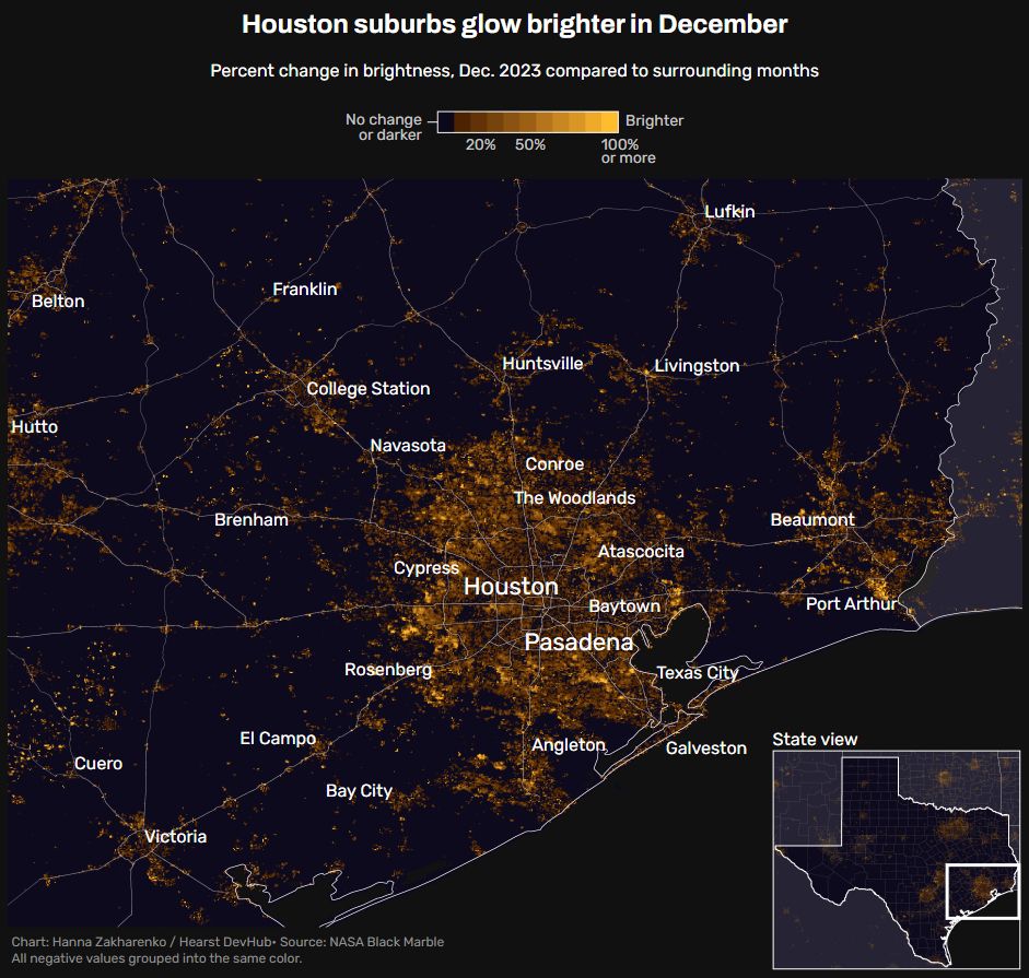
Really cool mapping by @hannazakharenko.bsky.social, visualizing increased brightness from holiday lights in the month of December 💡
www.houstonchronicle.com/projects/202...

How much brighter the San Antonio metro area is in December compared to surrounding months.
Did you know that scientists can see your Christmas lights from space?
Nighttime satellite imagery from NASA Black Marble shows many suburban areas get 30 to 50 percent brighter in December compared to surrounding months. Learn more (🎁 link!):
www.expressnews.com/projects/202...

Screenshot of Spotify Wrapped city project with a photo of Taylor Swift and a list of top artists and tracks.

Graphic showing San Antonio's most-listened-to artists and those across the U.S.
Here's a fun project from the Hearst DevHub and our data teams: Spotify Wrapped for Your City. 🎶🎶
Leila Darwiche and @hannazakharenko.bsky.social used Spotify data and included an AI-powered playlist for each city.
Check out the @expressnews.com version (🎁🔗): www.expressnews.com/projects/202...

A fun evening/weekend read: Spotify Wrapped is out 🎧 How did listeners in San Francisco compare to the U.S.? Find out here:
www.sfchronicle.com/projects/202...
I’ve had such a blast in this role so far! If you’re thinking about applying and have questions, feel free to reach out.
21.11.2024 20:52 — 👍 4 🔁 2 💬 0 📌 0
Love the Starter Pack idea to kickstart a social network. Check out this pack by @ryanserpi.co with a bunch of awesome Hearst Newspapers journos / devs (also me) go.bsky.app/14eYWzK
18.11.2024 17:56 — 👍 4 🔁 3 💬 0 📌 0