The Downballot's special elections Big Board for the 2025-26 cycle
4 elections on the Big Board tonight, 3 in NY.
We have 27 NY specials logged since '17. In only 12 of 27 was there a dem overperformance compared the last pres elex.
In 10 of 27 the pres margin was > D+60. In *just 1* of those did we see a dem overperformance.
04.02.2026 02:16 — 👍 15 🔁 7 💬 1 📌 1
Glad you asked!
01.02.2026 21:08 — 👍 3 🔁 1 💬 1 📌 0
No matter the obstacle, whether it's winter storms or stormtroopers, Democratic voters are showing up. So far this cycle, 26 R to D flips, 0 D to R flips.
01.02.2026 15:50 — 👍 41 🔁 15 💬 1 📌 0
Also trying to parse all the emails that read like they were written by a concussed golden retriever I think I finally get why these guys are so enthusiastic about getting chatbots to write for them
31.01.2026 17:48 — 👍 2886 🔁 559 💬 40 📌 23
This is a survey of ICE and CBP employees. They are miserable. Compare the 2024 and 2025 columns.
Even ICE wants to abolish ICE.
30.01.2026 00:06 — 👍 10 🔁 2 💬 0 📌 0
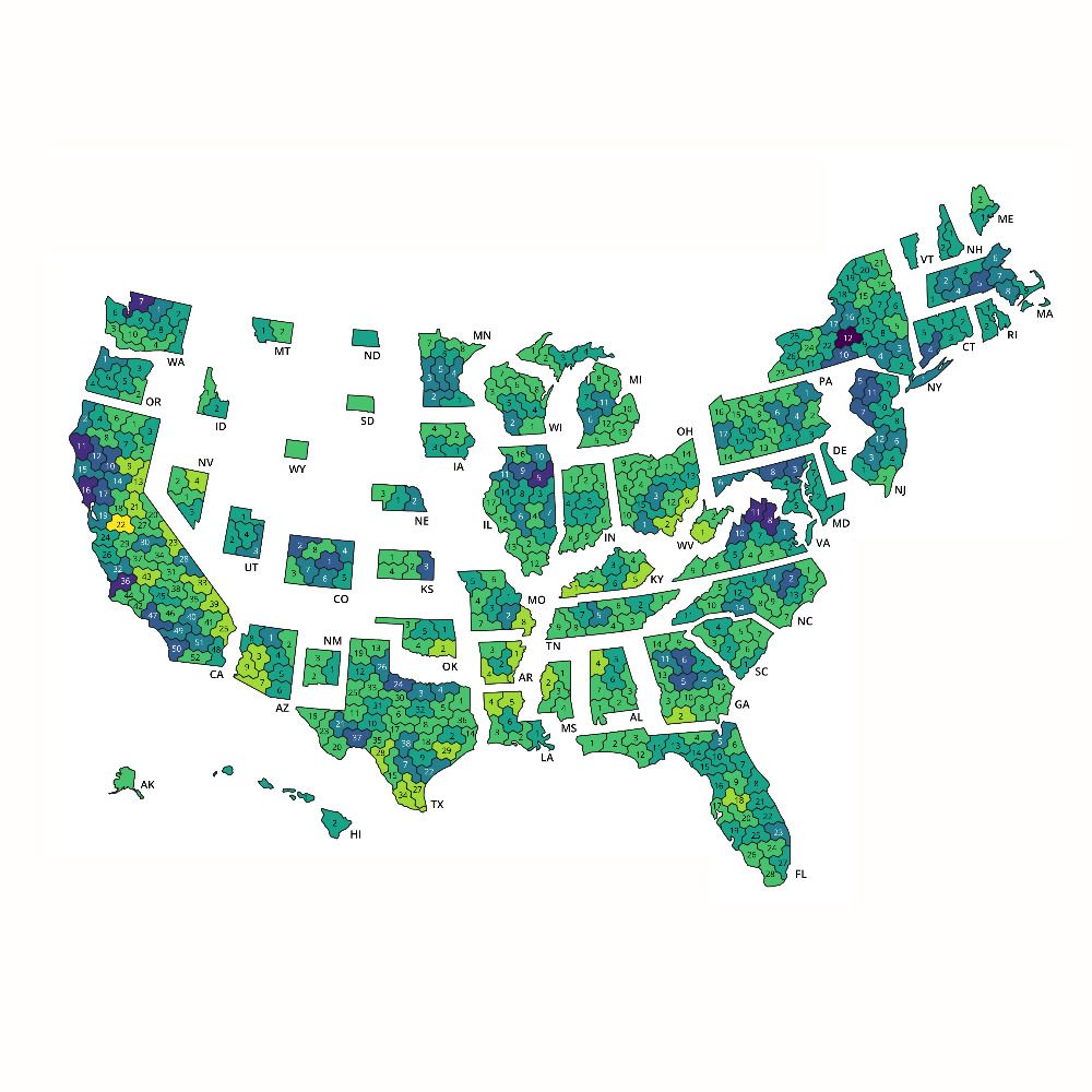
That's MN SD-60 from Jan 2025
28.01.2026 17:46 — 👍 5 🔁 1 💬 1 📌 0

Democrats are outperforming in special elections for the 2026 cycle. Last night's Minnesota special election is highlighted in the upper right quadrant, with a margin of D+91 in a seat Harris won by 71 points.
Here, the axes are extended to see MN HD-64A results. 3/3
28.01.2026 16:43 — 👍 43 🔁 13 💬 1 📌 1

A graph showing that this cycle's special election results consistently favor Democrats, on average.
Last night's special election performance was literally off the charts. As in, normally the axes for this chart only go up to a margin of 80 points. 2/3
28.01.2026 16:40 — 👍 43 🔁 10 💬 1 📌 0
In this Minnesota special election last night, the Republican's vote share (4%) was just 33% of Trump's 2024 vote share (13%). That's the lowest ratio for R/(last Pres R) we have on record going back to 2017! 1/3
28.01.2026 16:38 — 👍 175 🔁 49 💬 2 📌 2

Pie chart titled “Breaking Down 49 Trump Tariff Threats Since November 2024.” The chart shows six categories: 26.5% “Not yet imposed” (largest slice), 22.4% “Investigation,” 20.4% “Imposed in full,” 16.3% “Withdrawn,” 8.2% “Imposed in part,” and 6.1% “Imposed in full then withdrawn.” Source: Bloomberg Economics.
As we await a Supreme Court ruling on tariff authority, a new @bloomberg.com analysis finds this admin followed through on just 27% of its tariff threats.
Tariffs can be a serious policy tool—when used strategically.
This approach has been anything but.
www.bloomberg.com/news/newslet...
28.01.2026 16:19 — 👍 15 🔁 6 💬 1 📌 1
Holy moly this chart: Cumulative US measles cases
28.01.2026 12:54 — 👍 4680 🔁 2252 💬 204 📌 644
Nope. Son of Holocaust survivor. My father was 11 when the Nazis invaded his hometown in eastern Poland. He survived only by fleeing to a different city with a false baptismal certificate. The comparison is apt. Carry on.
28.01.2026 03:23 — 👍 3132 🔁 667 💬 40 📌 11

India's electrification shortcut! ⚡️🇮🇳
Solar, wind, batteries, electric vehicles...India's economy has different tools available than the US and China did at the same stage in their economic development.
The result? An early turn away from fossil molecules towards electrons.
23.01.2026 12:38 — 👍 118 🔁 25 💬 5 📌 8

As interest in the Arctic grows and questions of sovereignty intensify, the RCGS will be sharing articles and research to help our readers deepen their understanding— starting with this map by our cartographer, Chris Brackley.
22.01.2026 19:21 — 👍 7 🔁 3 💬 0 📌 0
This is such a cool illustration of how the Mercator map distorts the size of Greenland, which looks as big as the whole continent of Africa on that map but is actually the size of Mexico.
18.01.2026 19:43 — 👍 4603 🔁 1759 💬 59 📌 182

This chart shows which of Congress’s oldest 24 members are running for re-election (13 members), which aren’t (six members), and which are uncertain (four members). Each politician’s current age is shown, and for those running, the age they would be at the end of the term they could be re-elected for is shown. The party of each member is also shown. All of these politicians are at least 80 years old, most are younger than 84, and one is in his 90s. The uncertain politicians are, on average, the oldest, though there are three politicians at or near 88 who are running for re-election.
Pitched and landed this story for @NBCNews.com: 24 members of Congress are 80 or older. More than half are running for re-election. #dataViz www.nbcnews.com/politics/con...
15.01.2026 12:12 — 👍 72 🔁 34 💬 8 📌 15

Globally, no single day in 2025 was cooler than its 1991-2020 average.
climate.copernicus.eu/global-clima...
14.01.2026 12:44 — 👍 1013 🔁 682 💬 19 📌 74

While a substantial number of members of the House of Representatives are retiring, don’t expect these retirements to produce many flipped seats or shifts in the ideological makeup of either party.
open.substack.com/pub/charlesa...
14.01.2026 03:39 — 👍 10 🔁 3 💬 1 📌 1
DHS invading Minnesota in winter
11.01.2026 23:20 — 👍 930 🔁 152 💬 32 📌 13
11.01.2026 02:29 — 👍 419 🔁 121 💬 41 📌 11

A website displaying a map of London with red markers plotting key locations for "The Red-Headed League." Sidebars feature the story text and methodology notes.

A detailed close-up of the London map focusing on the green expanse of Hyde Park, featuring a red location marker and clearly labeled carriage drives and pathways.

A snippet of the 1893 Ordnance Survey map with an orange path tracing a specific character's route, connecting Farringdon Station, Charterhouse Square, and Poppins Court with directional arrows.
After weeks of staring at 1890s Survey maps and Victorian railway timetables, I think I've finally mapped how each set of characters moves in the Sherlock Holmes adventure 'The Red-Headed League'. 📊 #maps #booksky
Fancy new blogpost: aman.bh/blog/2026/ma...
Just the map: aman.bh/projects/red...
09.01.2026 19:26 — 👍 19 🔁 6 💬 2 📌 1

Chart showing increase use and brandishing of weapons by ICE over time
I don’t know if this acceleration is the result of larger deployments or a more violent strategy, but either way it’s harrowing
09.01.2026 15:14 — 👍 28 🔁 13 💬 0 📌 1

a graph of US blue collar job growth
The US is losing blue-collar jobs for the first time since the early pandemic—year-on-year job losses have hit 145k as manufacturing, transportation, & mining industries lose jobs at a rapid pace while growth in construction has nearly zeroed out
09.01.2026 13:58 — 👍 346 🔁 128 💬 8 📌 21

2025 is now, officially, the worst year for job creation outside of recession since 2003.
@byheatherlong.bsky.social
09.01.2026 13:43 — 👍 5254 🔁 2297 💬 247 📌 232

Map showing the U.S. 2025 Billion-Dollar Weather & Climate Disasters and highlights wildfires and severe weather through December 2025. Graphic is produced by Climate Central.
Just in - "According to @climatecentral.org, 2025 ranks as the third-highest year (after 2023 and 2024) for billion-dollar weather and climate disasters..."
+ Interactive graphics/data: www.climatecentral.org/climate-serv...
+ Climate Matters article: www.climatecentral.org/climate-matt...
08.01.2026 13:59 — 👍 119 🔁 60 💬 8 📌 14
Deploying emergency kitten videos
Sound on
07.01.2026 19:05 — 👍 519 🔁 157 💬 19 📌 8
New Year, New Colour Tool
for you data visualizers and maybe the odd designer
obumbratta.com/colour
07.01.2026 16:20 — 👍 256 🔁 62 💬 6 📌 12
My primary problems lately have been trying to find information that isn't contaminated by AI slop or consumer goods that aren't bloated with AI hardware/software...
07.01.2026 14:47 — 👍 3 🔁 1 💬 0 📌 0
Professor of Political Science & Director of the Saltzman Institute of War & Peace Studies, Columbia. New Book: The Insiders' Game: How Elites Make War and Peace https://press.princeton.edu/books/paperback/9780691215808/the-insiders-game
Health Data Science | 📊 DataViz | 📖✨️ | 🐾
LinkedIn: linkedin.com/in/darakhshannehal
GitHub: github.com/darakhshannehal
Data & Graphics @ CNN. 📈👸
Priors: WSJ, ONS. Clearly a fan of acronyms. "Aggressive Door Opener".
Likes: Cats, maps, stats 🐱🗺️📊
Fair Warning newsletter: https://fairwarning.substack.com
https://www.not-ship.com/
Explaining the world through data and design • Newsletter: Not-Ship • Formerly Washington Post, Quartz, the Guardian 🇨🇦 🏴
Senior Editor at Book Riot. Editor/Author of BODY TALK, HERE WE ARE, + (DON'T) CALL ME CRAZY. Former librarian. Anti-censorship advocate. Yoga teacher. Your favorite infernal witch. She/her. Library Journal Mover & Shaker in 2024.
data & politics @washingtonpost.com
texan in dc 🕯️
Geospatial Data Analyst 🌍| Remote Sensing (EO)🛰️ | GIScience |🇰🇪🇺🇳| GIS | Maps 🗺️ | Research | Innovation | Geoinformation Technology |
Data, Graphics & Art ✨ freelance creative, black cat lover, DnD nerd 🖤 amandaweisbrod.com
Assistant professor, Department of Political Science, Duke University
jgreen4919.github.io
Climate Scientist at @climatecentral.org | PhD | Passionate about improving science communication through data-driven stories | Harrisburg, PA | https://zacklabe.com/
Views, thoughts, and opinions expressed here are only my own.
📈 Anàlisi, comunicació, visualització i gestió de/amb dades. Director de Polis (@polis-dades.bsky.social).
Independent data visualisation designer and scientific illustrator, LinkedIn instructor. Portfolio: ritagiordano.co.uk
Executive Editor @sherwood.news, book whatyou.watch, writer numlock.com. Previously FiveThirtyEight and Business Insider. Pulitzer Prize winner.
Executive Director, States Win (formerly Sister District) 👉 we build progressive power in state legislatures.
Single mom by choice. Lifelong Michigander. Prev: EMILYs List VP of State and Local, Michigan Senate Caucus Director.
founding member of election bluesky
also election + data at The Washington Post
https://sara-suzuki.com
Senior Researcher @ CIRCLE, Tufts University
Building a more just democracy through co-creating knowledge and power with young people
{ civic engagement, critical consciousness, youth vote, QuantCrit, movement building }
Vibrant community of human & physical geographers + environmental scientists (GEES) at the University of Northern British Columbia. Posts by GEES Professor Catherine Nolin
https://www.unbc.ca/department-geography-earth-and-environmental-sciences
Politics. College Football. Oregon Wine.
I ❤️ Portland. YIMBY.