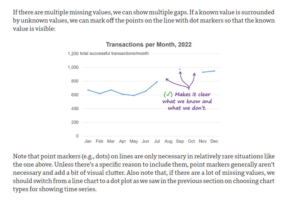
Someone else proposed this use case but, to my eye anyway, bars would be considerably quicker and easier to read:
28.08.2025 22:09 — 👍 1 🔁 0 💬 1 📌 0
Really excellent. Nice work, @shrikhalpada.dev .
11.07.2025 15:05 — 👍 1 🔁 0 💬 0 📌 0
For a while now, I've been trying to think of ways to visually and viscerally communicate just how ludicrous the wealth that the top 1% has accumulated is. This one (not mine) is pretty good...
11.07.2025 15:03 — 👍 7 🔁 1 💬 1 📌 0
Just heard Musk say that xAI's latest benchmark testing proves that "...Grok 4 is better than PhD-level at everything...".
I guess PhDs don't know that showing bars on truncated scales is a bad idea.
11.07.2025 11:53 — 👍 3 🔁 0 💬 0 📌 0

Why it wouldn’t make sense to adapt Practical Charts to Power BI’s limited visuals
My Practical Charts course is tool agnostic, that is, it doesn’t assume that any particular dataviz software product (Excel, Tableau, Google Sheets, etc.) is being used.
While I (thank god) haven't had to do a lot of hands-on work w Power BI, I've seen enough to know that it would be soul-destroying for anyone who cares about making effective charts.
I'm sometimes asked to adapt my courses to Power BI's limitations; my answer: www.linkedin.com/pulse/why-wo...
08.07.2025 16:25 — 👍 2 🔁 0 💬 2 📌 0
So, all dashboards should be ignored?
08.07.2025 16:09 — 👍 0 🔁 0 💬 1 📌 0
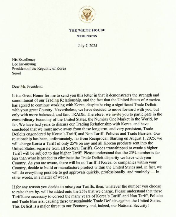
Imagine receiving a letter that threatens your country's entire economy, and that also contains so many grammatical errors and poorly constructed sentences that it would get an F if it were submitted in a high school English writing class. Just... surreal.
08.07.2025 04:35 — 👍 3 🔁 0 💬 1 📌 0
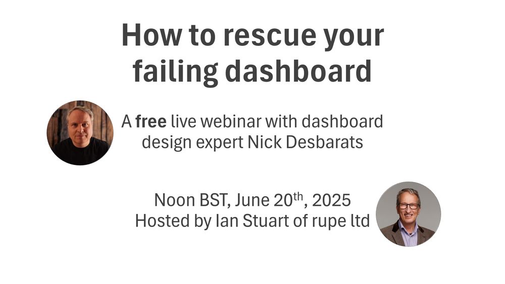
YouTube video by Practical Reporting Inc.
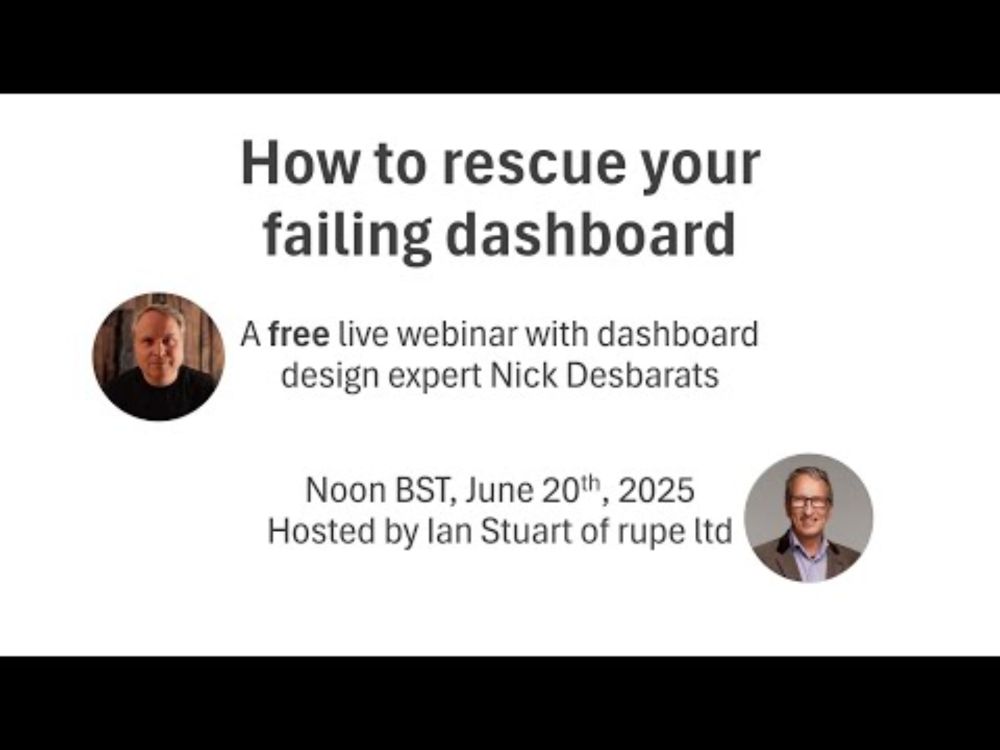
How to Rescue Your Failing Dashboard - Nick Desbarats interview with Rupe
"How to rescue your failing dashboard" webinar recording now available! My 47-minute interview with Ian Stuart of Rupe Ltd covers the top reasons why dashboards die, and what you can do about them.
youtu.be/xL7qHCy-CEE
02.07.2025 13:52 — 👍 3 🔁 0 💬 1 📌 0
𝗛𝗼𝘄 𝘁𝗼 𝗿𝗲𝘀𝗰𝘂𝗲 𝘆𝗼𝘂𝗿 𝗳𝗮𝗶𝗹𝗶𝗻𝗴 𝗱𝗮𝘀𝗵𝗯𝗼𝗮𝗿𝗱 😬
Unfortunately, many dashboards end up under-used or (worse) abandoned entirely. Why? I'll be covering the top reasons in a FREE webinar at noon BST Jun20. Hope to see you there!
Pre-register for the webinar here: events.teams.microsoft.com/event/4908a1...
10.06.2025 20:39 — 👍 1 🔁 0 💬 0 📌 0
Nice. I have yet to find a good use case for radar graphs, apart from some highly specialized applications in which the audience thinks of the data as "circular," e.g., wind roses.
26.05.2025 19:11 — 👍 1 🔁 0 💬 1 📌 0
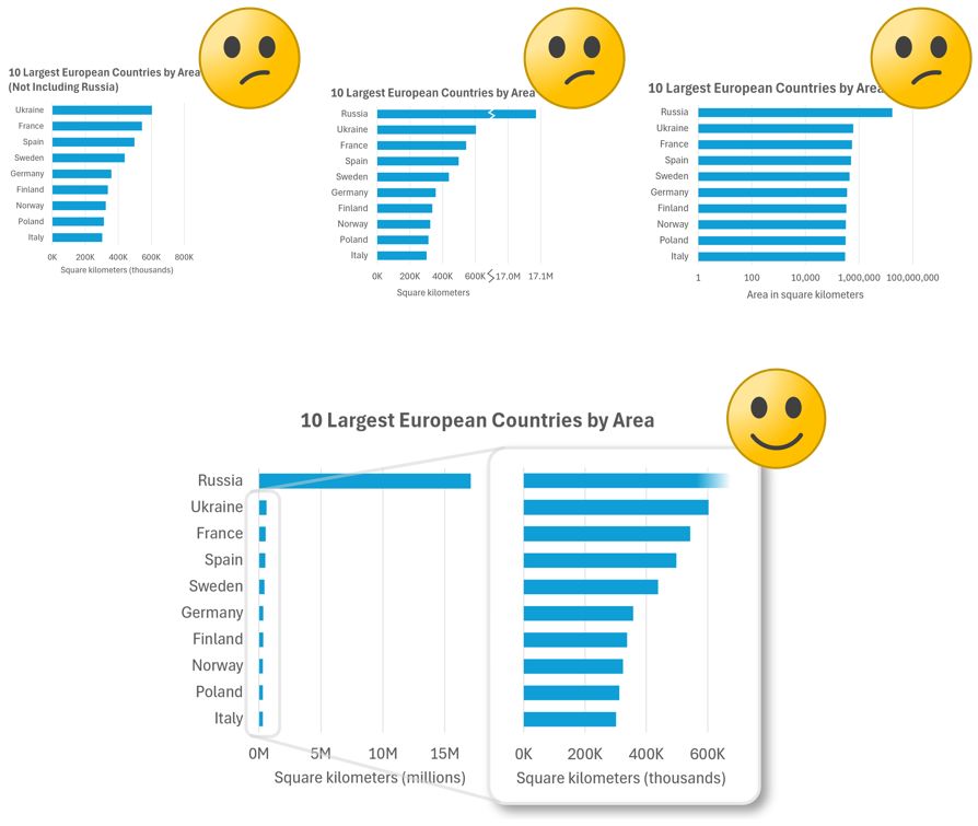
𝗛𝗼𝘄 𝘀𝗵𝗼𝘂𝗹𝗱 𝘆𝗼𝘂 𝘀𝗵𝗼𝘄 𝗢𝗨𝗧𝗟𝗜𝗘𝗥𝗦 𝗶𝗻 𝗰𝗵𝗮𝗿𝘁𝘀?
Check out three common-but-not-ideal methods and one good one (IMHO, anyway) in my latest post: www.linkedin.com/feed/update/...
26.05.2025 19:08 — 👍 4 🔁 0 💬 0 📌 0
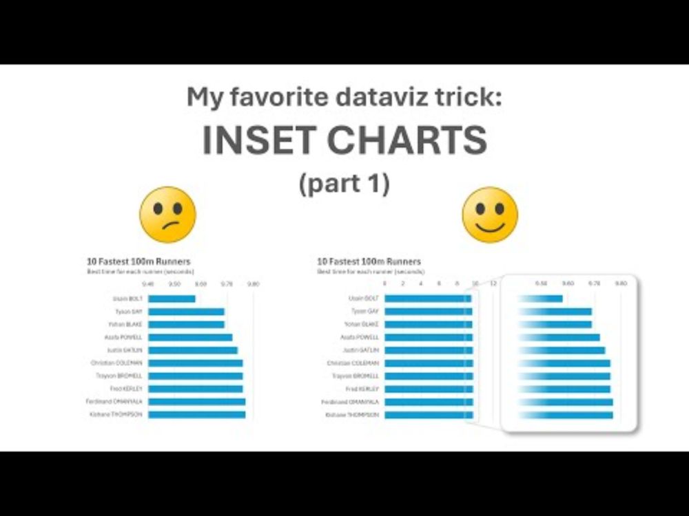
YouTube video by Practical Reporting Inc.
My favorite dataviz trick: inset charts 🔥
Inset charts are my favorite #dataviz trick🔥 Many chart creators aren't aware of them but I use them all the time. What are they? Find out in my latest video (5 mins): youtu.be/n1RCV-NMct0
BTW, registration is now open for my Jun2 live online workshop! www.practicalreporting.com/june-2025-on...
22.05.2025 14:08 — 👍 3 🔁 1 💬 0 📌 0
Agreed. I cover this situation in my "Practical Charts" course and book:
17.05.2025 04:12 — 👍 0 🔁 0 💬 0 📌 0
The dumbbell version would address the "steep slopes" perception issue, but it adds visual busy-ness and I'm not sure it makes the deviations between both series any more salient. The line chart also communicates that one series was always lower than the other at a glance...
13.05.2025 16:34 — 👍 0 🔁 0 💬 0 📌 0
The discussion and engagement was so good on this over the last few weeks that I went ahead and added 2 whole new sections to this blog post (worth checking out if you already read this!):
I reflect on the discussions and fun that we had as well as provide more resources and a call to action.
13.05.2025 13:50 — 👍 14 🔁 6 💬 2 📌 1
Love this.
(...though the minimalism-fascism connection feels like a bit of stretch, IMHO.)
13.05.2025 14:32 — 👍 1 🔁 0 💬 1 📌 0
@duvekot.bsky.social I see your point but, again, pros and cons. If you only show deviation vals, the scale of the "lag" is lost. In a chart like that, it could be that, e.g., in the grand scheme of things, Boeing is only lagging Airbus by a tiny amount relative to total sales, or it could be huge.
12.05.2025 11:24 — 👍 0 🔁 0 💬 1 📌 0
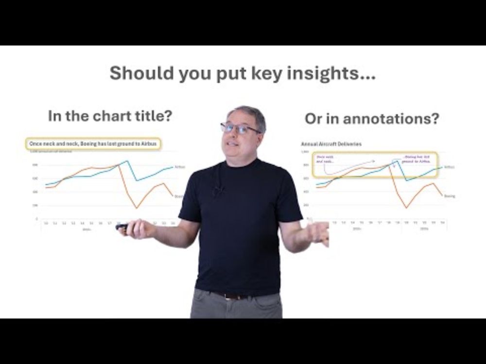
YouTube video by Practical Reporting Inc.
Should you put key insights in chart titles or annotations?
▶️ New video (4 mins) ▶️ Should you put key insights in chart titles, on in annotations directly in the chart?
I've recently been leaning toward the latter, but would love to know your opinion in the comments.
www.youtube.com/watch?v=OU3s...
06.05.2025 13:00 — 👍 3 🔁 0 💬 1 📌 0
@duvekot.bsky.social Also a viable option, yes. No color associations needed, but the trade-off is that the chart is visually busier with each category name listed four times (and yet busier with all 20 quantitative values labeled instead of a quant scale with 4 or 5 value labels). Pros and cons...
01.05.2025 20:18 — 👍 1 🔁 0 💬 0 📌 0
YouTube video by Practical Reporting Inc.
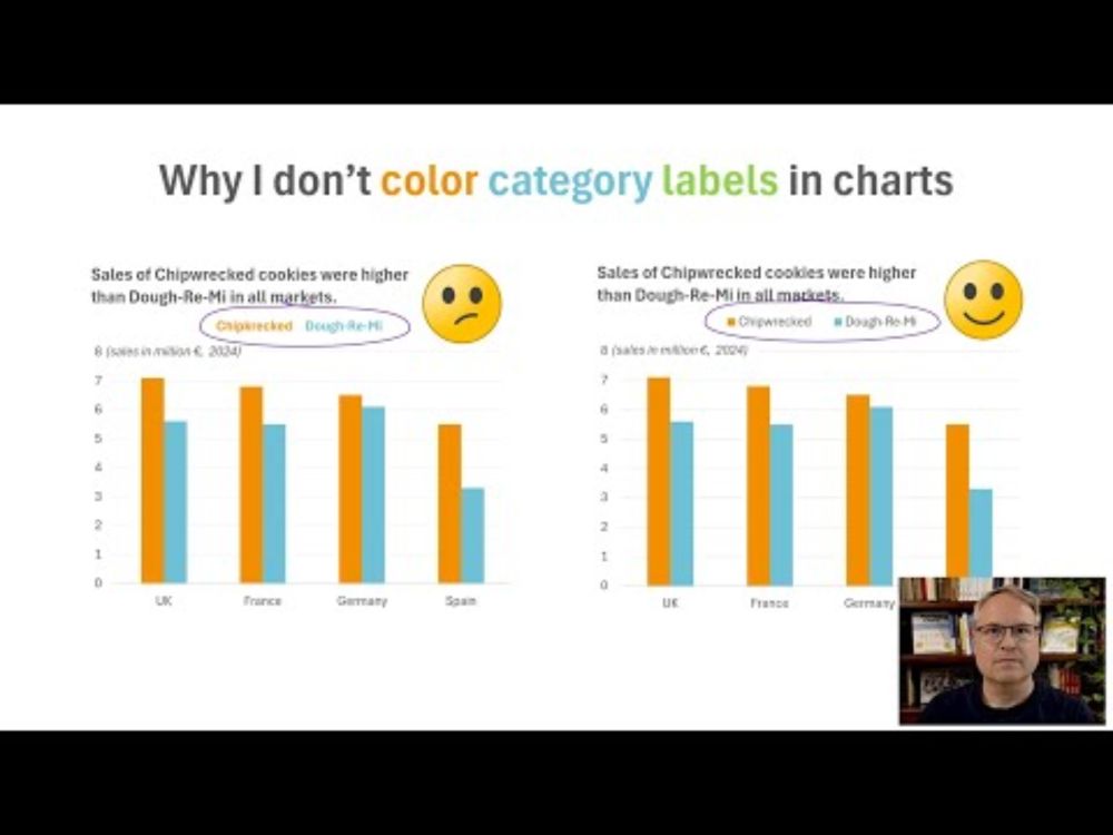
Why I don't color category labels in charts
▶️New video!▶️Why I don't use colored category labels in my charts (4 mins)
You've probably seen charts where the colors in the chart are identified by coloring category name labels instead of using "traditional" color swatches. I don't use this technique in my charts, though. youtu.be/RLdsgluOqnM
01.05.2025 11:46 — 👍 4 🔁 0 💬 1 📌 0
@mjskay.com @frank.computer
🤣 Here's my version:
24.04.2025 14:40 — 👍 2 🔁 0 💬 1 📌 0
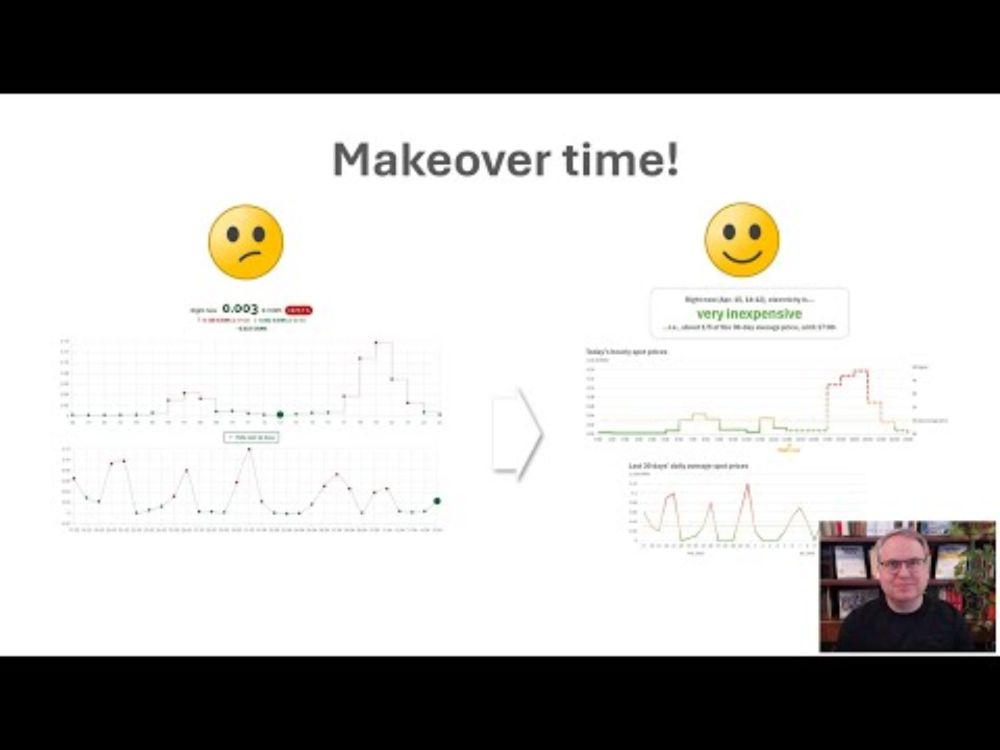
YouTube video by Practical Reporting Inc.
Chart redesign! Watch me make this chart better at "doing its job"!
⏯️New video!⏯️ Watch me redesign a chart so that it "does its job" (10 mins) youtu.be/QnqpuGeKIxw
BTW, live online workshop kicks off on June 2 with early-bird prices ending May 9! Info/registration: www.practicalreporting.com/june-2025-on...
16.04.2025 15:52 — 👍 2 🔁 0 💬 0 📌 1
So, basically, screw small businesses.
12.04.2025 15:23 — 👍 17 🔁 2 💬 0 📌 0
Congrats!
02.04.2025 03:35 — 👍 2 🔁 0 💬 0 📌 0
Tired of shouting into Amazon’s void? SelfPubShelf.com is the indie author’s rebellion against invisibility.
selfpubshelf.com
We Do What Amazon Won’t:
Get found by readers Googling your genre.
Drive traffic that makes Amazon’s system beg to recommend you.
Designer fazedora de muitas coisas. JF
@vagadesign.bsky.social
https://zaap.bio/pedestre
Smashing Conferences, friendly, practical events for web designers and developers.
🌟 In 2026, join us in-person or online in Amsterdam 🇳🇱, Freiburg 🇩🇪, and more!
🌟 Or learn from the comfort of your home with our Online Workshops! We can't wait!
Writing project. Thinking about how data makes people feel, and how the way people feel shapes data.
creative coder, basketball data nerd, preferrer of democracy
also into coffee shops, sad folk music, basketball, and playing chess poorly
data viz: http://perthirtysix.com
creative coding: http://shrikhalpada.dev/projects
I like maps, GIS, data visualization, graphic design, hiking, writing, and hanging out in nature. I wrote a book, GIS for Dummies (2nd Edition).
(He/Him) Folk Technologist • anthony.moser@gmail.com • N4EJ • http://www.BetterDataPortal.com • baker in The FOIA Bakery • http://publicdatatools.com • http://deseguys.com • #1 on hackernews when you search for "hater" • anthonymoser.github.io/writing/
The official "Resistance" team of U.S. National Park Service. Our website: www.ourparks.org
Social psychologist at NYU-Stern, working to roll back the phone-based childhood. Please visit anxiousgeneration.com & afterbabel.com
Bronx boy. Cubs fan. Dad, husband, writer, podcaster and cable news host.
The Sirens’ Call: How Attention Became the World’s Most Endangered Resource out now.
https://sirenscallbook.com/
Reformed palaeobiologist 🪱🦴 | Data analyst (Python, PowerBi, Excel) 📈📊 | Film lover 📽🎬
PhD in Cambrian conodonts (tiny old fossils)
Any views I may possess are my own.
https://willsfilms.github.io/
Letterboxd: https://boxd.it/2fofD
Data, #analytics, #statistics, #dataviz—all more fun w/ #JMP. Enjoy family time, organic gardening, dog walking, cooking, reading... Opinions my own.
Entrepreneur
Costplusdrugs.com
Behavioral Neuroscientist, dog and music lover, and a fan of positive vibes.
Data Visualization. Ex-Planet & NASA Earth Observatory. Blue Marble, Earth at Night, color, cartography, occasionally skewed views of Earth. Looking for a job.