great job. chart looks pretty
31.01.2026 19:30 — 👍 3 🔁 0 💬 1 📌 0
wow, this was interesting to read
31.01.2026 19:30 — 👍 1 🔁 0 💬 0 📌 0
wow, congratulations Alberto! The site looks great, and I can't wait to dig into these videos
31.01.2026 19:28 — 👍 1 🔁 0 💬 1 📌 0
looks cool!
31.01.2026 19:26 — 👍 1 🔁 0 💬 0 📌 0
love it. quick, simple, informative
31.01.2026 19:25 — 👍 2 🔁 0 💬 1 📌 0
wow, those look amazing
31.01.2026 19:24 — 👍 1 🔁 0 💬 0 📌 0
wow, this is so interesting. love your account!
31.01.2026 19:24 — 👍 2 🔁 0 💬 1 📌 0
That's awesome! Your work is so important
31.01.2026 19:21 — 👍 1 🔁 0 💬 0 📌 0

Let's Use Data to Compare Milks
A data-driven comparison of whole milk and its plant milk counterparts
I rarely share my work these days anymore, but figured I'd share out my latest data post because I think it's particularly fun
gourmetdata.substack.com/p/lets-use-d...
28.01.2026 14:30 — 👍 2 🔁 0 💬 0 📌 0
A subtle data problem I keep running into isn’t bad data; it’s categories.
Categories feel authoritative because they come from somewhere upstream, but it's important to remember that data is always recorded from somewhere, and human context matters
13.01.2026 14:50 — 👍 1 🔁 0 💬 0 📌 0

Which nutrients do you get from a regular cucumber?
When you break down cucumber into its nutrients, you get this chart as a result. It shows how much of our daily recommended value is met for each vitamin everytime we eat a cucumber.
You can see vitamin K's presence pretty easily
07.01.2026 14:50 — 👍 1 🔁 0 💬 0 📌 0
congratulations! Like someone else said, this framing helped me look more positively on my own work. To 2026!
07.01.2026 12:01 — 👍 0 🔁 0 💬 0 📌 0
the more heartbreaking thing to me is the absence of a good text-based social media, outside of…linkedin i guess
07.01.2026 12:00 — 👍 0 🔁 0 💬 0 📌 0

FlowingData
An exploration of how we use analysis and visualization to understand data and ourselves.
a bit out of the box, but flowingdata.com has a lot of data-first front-end experiments that are fun
07.01.2026 11:57 — 👍 0 🔁 0 💬 0 📌 0
at this point, I should check to see if I didn’t work on the paper myself lol
07.01.2026 11:53 — 👍 1 🔁 0 💬 0 📌 0
Gentle reminder that pivoting is part of the job of a data analyst.
A common mistake I make is assuming the data will just… cooperate.
Sometimes it does. But sometimes the data is just not good for answering your question. Whether that means I find a new dataset or asking a new question, I pivot
06.01.2026 16:08 — 👍 1 🔁 0 💬 0 📌 0
alarming trend aside, this is such an effective way to convey this information.
not only engaging, but does a decent job of compressing a huge amount of information (daily temps) to a single object (the curves)
05.01.2026 17:48 — 👍 3 🔁 1 💬 0 📌 0

I‘m American so I mostly agree with you, but we unfortunately need to consider this chart
05.01.2026 17:45 — 👍 0 🔁 0 💬 0 📌 0
it’s especially tricky with the different videos coming from venezuela
mixed reactions + internet echo chambers = crazy stuff getting normalized
05.01.2026 17:41 — 👍 1 🔁 0 💬 0 📌 0
like most things, a balance of everything is probably the solution
05.01.2026 17:39 — 👍 1 🔁 0 💬 0 📌 0

According to other USDA FoodData database, cucumbers are 95% water.
I represented it as a sankey because...well, because sankeys are cool
05.01.2026 14:01 — 👍 1 🔁 1 💬 0 📌 0
Thanks for sharing, Søren!
02.01.2026 16:56 — 👍 1 🔁 0 💬 0 📌 0
We at the JA team wish you all a very happy new year. We are excited to continue our work doing what we do best: building a more data-forward society.
We have big things coming up!
01.01.2026 17:02 — 👍 1 🔁 0 💬 0 📌 0

Look at how wicked this pictorial map is! Zoom in
I personally am mixed on illustration in maps; it helps make finding important info easier (eg Statue of Liberty for NY) but I can't help but get distracted when I'm looking at them.
Either way, this beast is called 'The Geologic Time Spiral'
01.11.2025 13:34 — 👍 2 🔁 2 💬 0 📌 0

When you do pretty much anything on the internet, you send a request through the internet to a remote data center. Roughly 80–90% of global internet traffic passes through data centers at some stage.
Still, imagining that 10% of power demand being for data centers is bonkers
31.10.2025 13:23 — 👍 1 🔁 0 💬 0 📌 1

What determines the cost of your internet?
Terrain: harsher environments means its harder/costlier to build
Density: the more dense, the more users can share the bill
Tech Infrastructure: fewer cables/towers mean longer, pricier data routes
Competition: more options usually means cheaper costs
30.10.2025 13:09 — 👍 3 🔁 1 💬 0 📌 0
Ugh, I thought I had it but its somewhere buried in my bookmarks. I'll try to dig it up
29.10.2025 15:03 — 👍 1 🔁 0 💬 0 📌 0

A look at all the months the US has had a recession. Purple are recessions, blue are growth.
What I like most about this graph is the clear change in trends. whether it was because the us's economy got stronger, or if the measurement got more gray...
29.10.2025 13:50 — 👍 3 🔁 0 💬 0 📌 0
cool animation! what software did you use?
19.10.2025 13:50 — 👍 1 🔁 0 💬 1 📌 0

Horizontal bar chart on a black background showing the number of appearances of common ingredients. Butter, egg, onion, flour, and garlic appear most often (40k–60k range), followed by baking powder, milk, vanilla, and cinnamon. Less frequent ingredients include cayenne pepper, nutmeg, bacon, chili powder, and cornstarch, each below 10k appearances.
https://www.reddit.com/r/dataisbeautiful/comments/idgdio/oc_top_30_most_common_ingredients_based_on_the/
This chart looks at ingredients from over 100k recipes, and lists them out in order of popularity. Oils, salt, and pepper were taken out.
Not surprised to see onions/garlic in the top 5, but I think butter's/egg's popularities are cuz this probably lists out baking recipes too
18.10.2025 13:03 — 👍 2 🔁 2 💬 1 📌 0
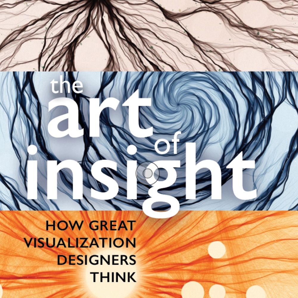
Designer, journalist, and professor.
Author of 'The Art of Insight' (2023) 'How Charts Lie' (2019), 'The Truthful Art' (2016), and 'The Functional Art' (2012). NEW PROJECT: https://openvisualizationacademy.org/
#Rstats, sports, data viz, carolina, and other shenanigans.
📊 blessyourchart.substack.com (free to read)
🏀 wabwatch.com
🏈 cfbtxt.com
#DigitalArtist #Photography #Flipboard #Surf. #Marketer by day and #Artist #Blogger by night. #FlipboardUserGroup founder. #Traveler, #FoodHistory lover.
independent writer of citationneeded.news and @web3isgoinggreat.com • tech researcher and cryptocurrency industry critic • software engineer • wikipedian
support my work: citationneeded.news/signup
links: mollywhite.net/linktree
💗💜💙
Presently PhD candidate studying tool-making for vis 📊 @hcii.cmu.edu. Prev: Adobe, Highsoft, Apple, Visa.
Softer-ware (malleability), accessibility, data interaction, node-edge navigation
Disabled & making a ttrpg.
www.frank.computer
Consultant CTO, runner, former musician, Norwegian / New Zealander / Brit floating between the U.K. and Scandinavia. Interested in all things finance, healthcare, ethics, economics and engineering leadership.
"A tireless chronicler and commentator on all things climate" -NYTimes.
Climate research lead @stripe, writer @CarbonBrief, scientist @BerkeleyEarth, IPCC AR7 lead author / NCA5 author.
Substack: https://theclimatebrink.substack.com/
Twitter: @hausfath
Climate Scientist at @climatecentral.org | PhD | Passionate about improving science communication through data-driven stories | Harrisburg, PA | https://zacklabe.com/
Views, thoughts, and opinions expressed here are only my own.
Data all-rounder. Recovering economist.
Senior Data Journalist. Adjunct Faculty @ NYU. Co-founder of Trash Club. Priors: POLITICO, The Guardian & Obama White House.
https://www.are.na/rashida-kamal/ | https://rashidakamal.com/portfolio/
High-quality datasets designed to spark ideas, solve problems, and drive innovation. Fresh data added all the time for your AI projects, research, or curiosity. Let’s turn raw numbers into real impact 🚀
Underviser i historie og samfundsfag.
Forperson for Historielærerforeningen for stx & hf -> @historielaerer.dk
Likes and reposts doesn't equal agreement.
#skolechat #dkhist #dkøko #dkpol #uddpol #histmed #30DayChartChallenge
🇩🇰🇫🇴
visual journalist, CNN data & graphics
🇨🇦 she/her
amyokruk.github.io
People, data science, and design. Critical friend of technology. Chicagoan.
Currently: dad, fractional leader, nerd
Previously: IDEO partner, Datascope cofounder, physicist, nerd
Graphics, maps, etc. at ProPublica
Baiana, power nap champion, ARMY // Visual & Data journalist @ BBC News. All views my own. Talk to me: camilla.costa@bbc.co.uk
Computational artist | Experience Designer | Interface Developer | 🐝
Mastodon: https://m.xuv.be/@julien
(he/him)
Human/AI interaction. ML interpretability. Visualization as design, science, art. Professor at Harvard, and part-time at Google DeepMind.
That guy who makes visual essays about software at https://samwho.dev.
Developer Educator @ ngrok.com. Want to pair on something ngrok related? Let's do it! https://cal.com/samwho/workhours
He/him.