Movies are more problematic, several bars are 30%+ longer than they should be. Shows bars are generally more accurate but still misleading
Code: github.com/gkaramanis/t...
Nicola's post:
bsky.app/profile/nren...
03.08.2025 13:26 — 👍 5 🔁 1 💬 0 📌 0
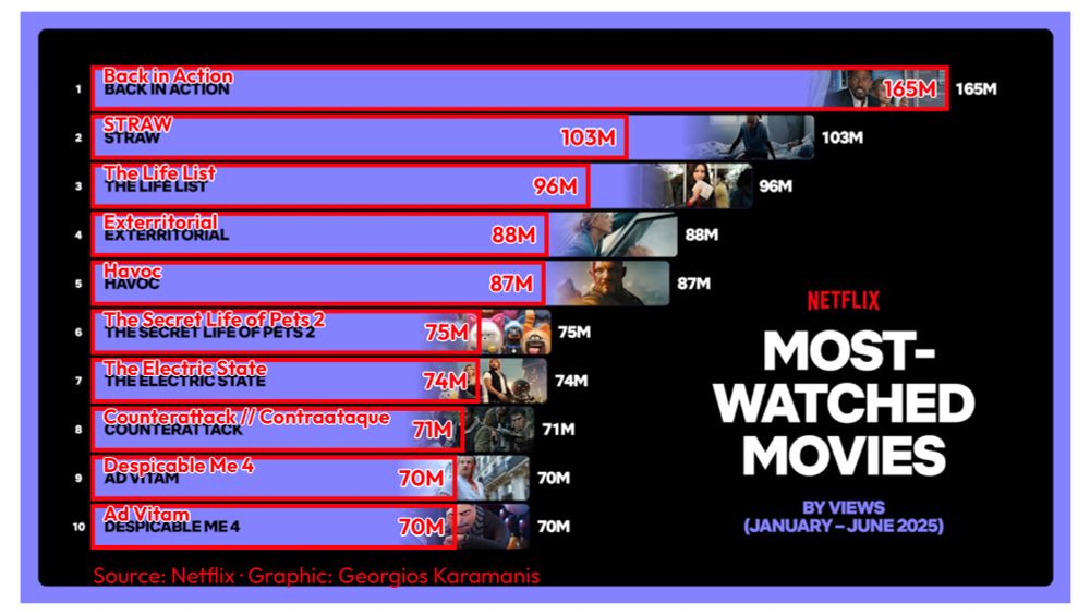
A horizontal bar chart recreating Netflix's top 10 movies from H1 2025, overlaid on the original report image to reveal visual discrepancies. Red outlined bars show the proportionally correct lengths based on actual view counts, with "Back in Action" leading at 165M views. The overlay demonstrates how Netflix's original bars don't accurately represent the data proportions, with several movies appearing visually larger than their view counts warrant.
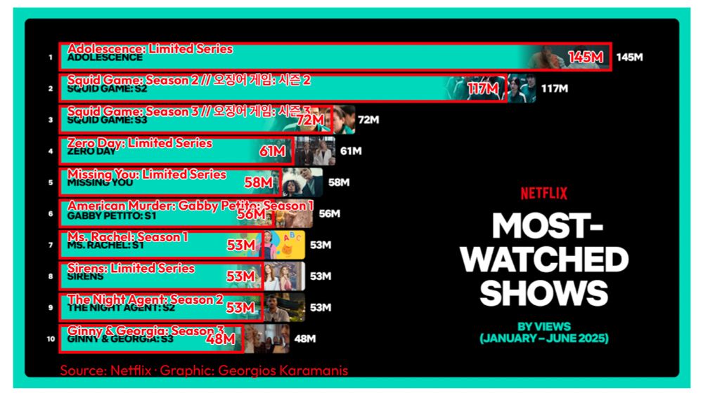
A horizontal bar chart recreating Netflix's top 10 shows from H1 2025, overlaid on the original report image to expose proportional inaccuracies. Red outlined bars display the correct visual proportions based on actual view counts, with "Adolescence: Limited Series" leading at 145M views. The comparison reveals how Netflix's original visualization misleads viewers about the relative performance differences between shows.
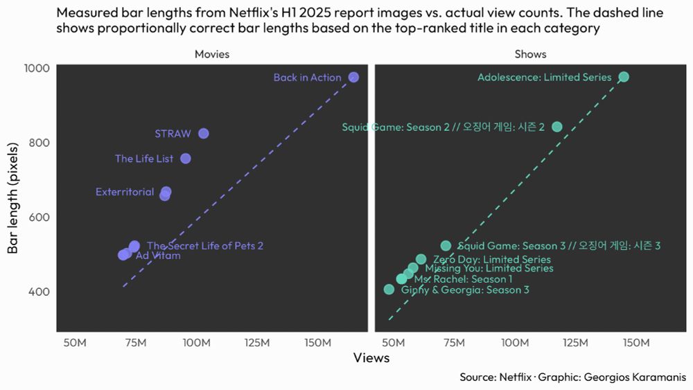
A dual-panel scatter plot analyzing Netflix's bar chart accuracy. The left panel shows Movies and right panel shows Shows, both plotting actual measured bar lengths (y-axis, in pixels) against view counts (x-axis). Purple points represent Movies, teal points represent Shows. Dashed lines show proportionally correct bar lengths. Movies show larger deviations from the expected line, with several points well above it, while Shows generally follow the expected line more closely. Point labels identify specific titles.
Something different for this week's #TidyTuesday, looking at Netflix's creative charting, as spotted by @nrennie.bsky.social
I measured the actual bar lengths from Netflix's H1 2025 engagement report and compared them to what they should be based on view counts.
#RStats #dataviz
03.08.2025 13:26 — 👍 19 🔁 2 💬 2 📌 0
Wow, really well done! 🤩
28.07.2025 17:25 — 👍 2 🔁 0 💬 1 📌 0
Thanks!
28.07.2025 17:22 — 👍 1 🔁 0 💬 0 📌 0
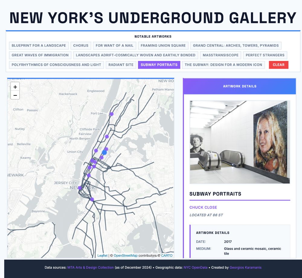
Screenshot of 'New York's Underground Gallery' interactive web application showing MTA subway art locations. The interface features a large title at the top, followed by a control panel with small clickable buttons for notable artworks including 'Wall-Slide', 'Subway Portraits', 'Blueprint for a Landscape', and others, with a red 'CLEAR' button. The main content area displays a map of New York City subway lines on the left side with purple circular markers indicating artwork locations, and a detailed artwork viewer panel on the right side titled 'ARTWORK DETAILS' with a purple gradient header. The right panel shows information for a selected artwork including an image placeholder, artwork title, artist name, station location, metadata such as date and medium, and a description. The interface uses a modern design with Space Grotesk and Inter fonts, purple and blue accent colors, and a clean white background. A dark footer at the bottom credits data sources including MTA Arts & Design Collection and NYC OpenData, and lists the creator as Georgios Karamanis.
A Shiny app for last week's #TidyTuesday. Explore and learn about selected NYC subway artworks
App: karamanis.shinyapps.io/New_Yorks_Un...
Code: github.com/gkaramanis/t...
#RStats #dataviz
28.07.2025 11:44 — 👍 23 🔁 4 💬 1 📌 0
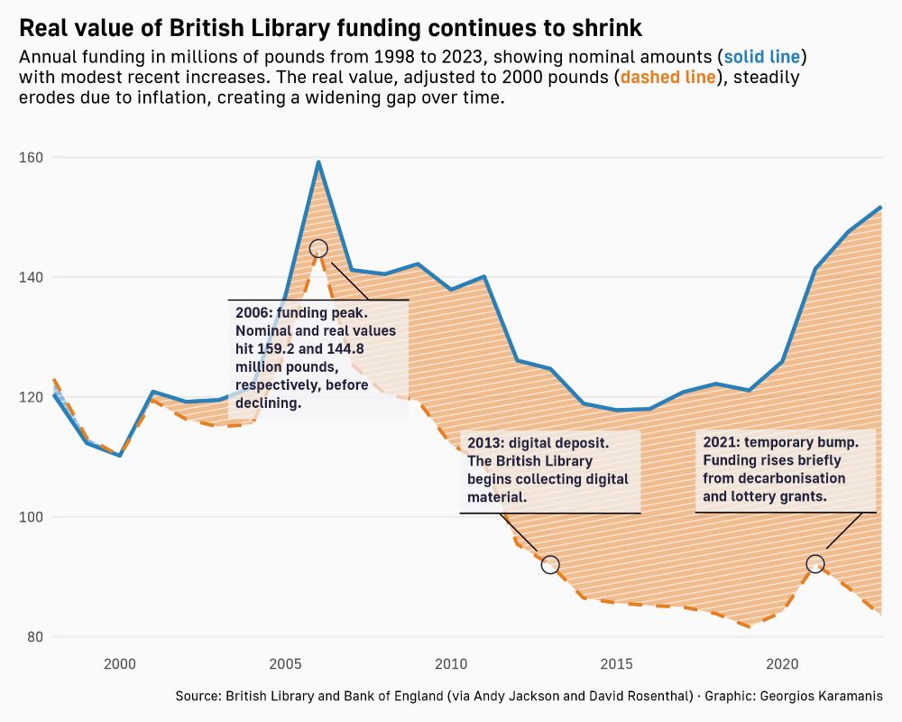
Line chart showing British Library annual funding from 1998 to 2023. A solid blue line represents nominal funding in millions of pounds, which rises modestly in recent years. The dashed orange line shows real funding adjusted to 2000 pounds, which steadily declines due to inflation. Key years are highlighted: a funding peak in 2006, the start of digital deposit in 2013, and a temporary funding bump in 2021. The gap between the two lines widens over time.
British Library
@britishlibrary.bsky.social funding for this week's #TidyTuesday
Code: github.com/gkaramanis/t...
#RStats #dataviz
18.07.2025 14:03 — 👍 15 🔁 3 💬 0 📌 0
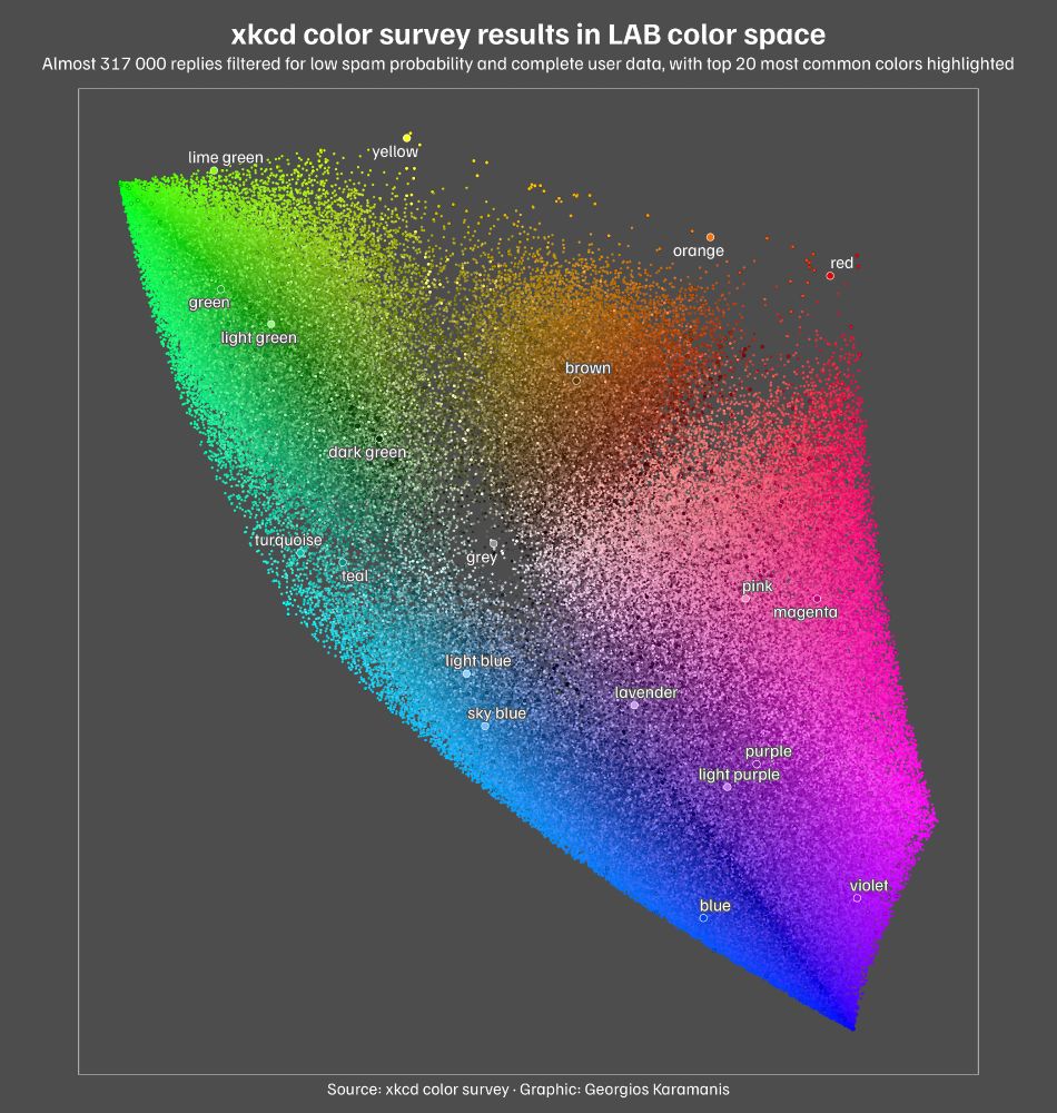
A scatter plot showing xkcd color survey results plotted in LAB color space. The plot displays almost 317 000 individual color responses as tiny colored dots scattered across the coordinate system, with the a-axis (green-red) running horizontally and b-axis (blue-yellow) running vertically. Overlaid on this cloud are larger black-outlined circles representing the 949 most common colors, with the top 20 most common colors highlighted as white-outlined circles and labeled with their names. The plot has a dark gray background with white text.
xkcd color survey results for this week's #TidyTuesday
Code: github.com/gkaramanis/t...
#RStats #dataviz
09.07.2025 14:17 — 👍 35 🔁 2 💬 1 📌 1
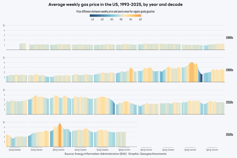
A grid of bar charts showing the average weekly price of regular grade gasoline in the United States from 1993 to 2025, grouped by decade and year. Each bar represents a week, colored by the difference from the yearly mean price. The color scale ranges from deep blue for below-average weeks to orange for above-average weeks.
Gas prices in the US for this week's #TidyTuesday
Code: github.com/gkaramanis/t...
#RStats #dataviz
06.07.2025 08:08 — 👍 13 🔁 2 💬 1 📌 0
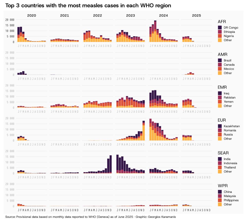
A stacked column chart showing monthly measles cases from 2020 onwards across six WHO regions. Each region displays the top 3 countries with the most cases plus an "Other" category: AFR (DR Congo, Ethiopia, Nigeria), AMR (Brazil, Canada, Mexico), EMR (Iraq, Pakistan, Yemen), EUR (Kazakhstan, Romania, Russia), SEAR (India, Indonesia, Thailand), and WPR (China, Malaysia, Philippines). AFR and EUR regions had surges in late 2023 through early 2024, while SEAR surged about one year earlier. Recent years show a reappearance of cases even in regions that previously had few cases, continuing into 2025.
Measles cases by WHO region for this week's #TidyTuesday
Code: github.com/gkaramanis/t...
#RStats #dataviz
25.06.2025 08:54 — 👍 37 🔁 7 💬 3 📌 1
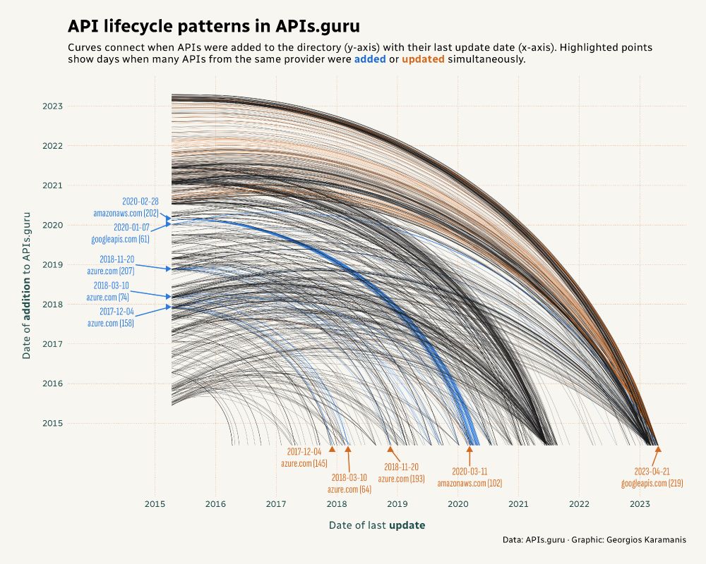
A plot with curved lines showing API lifecycle patterns from APIs.guru directory spanning 2015 to 2023. Each curved line connects an API's addition date (y-axis) to its last update date (x-axis), creating flowing arcs across the plot area. Most curves are gray, but blue and orange curves highlight APIs from providers that had bulk additions or updates on the same day. Blue upward-pointing triangular markers along the bottom edge indicate days when multiple APIs from the same provider were updated simultaneously, including googleapis.com updating 219 APIs on 21 April 2023 and azure.com updating 193 APIs on 20 November 2018. Blue right-pointing triangular markers along the left edge mark days when multiple APIs from the same provider were added together, such as azure.com adding 207 APIs on 20 November 2018 and amazonaws.com adding 202 APIs on 28 February 2020.
For this week's #TidyTuesday I explored when APIs are added and updated in the APIs.guru directory
Code: github.com/gkaramanis/t...
#RStats #dataviz
22.06.2025 13:47 — 👍 10 🔁 1 💬 0 📌 0
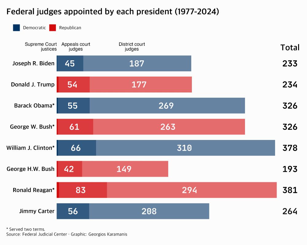
Horizontal stacked bar chart showing federal judges appointed by each president from 1977-2024. Each bar is divided into three segments: district court judges (largest, lightest), appeals court judges (medium), and Supreme Court justices (smallest, darkest). Bars are colored by party - blue for Democratic presidents, red for Republican presidents. Reagan leads with 381 total appointments, followed by Clinton (378), Obama (326), George W. Bush (326), Carter (264), Trump (234), Biden (233), and George H.W. Bush (193). District court judges make up the majority of appointments for all presidents. An asterisk indicates presidents who served two terms.
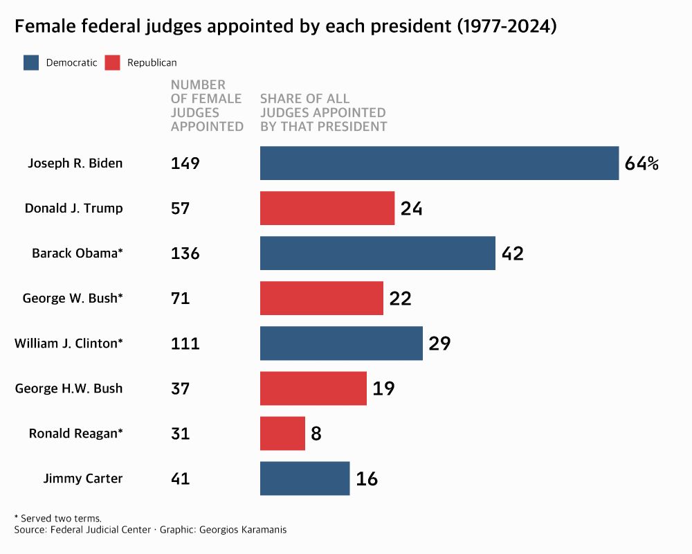
Horizontal bar chart showing the percentage and number of female federal judges appointed by each president from 1977-2024. Biden has the highest percentage at 64% (149 female judges), followed by Obama at 42% (136), Clinton at 29% (111), Trump at 24% (57), George W. Bush at 22% (71), George H.W. Bush at 19% (37), Carter at 16% (41), and Reagan at 8% (31). Bars are colored by party affiliation - blue for Democratic presidents, red for Republican presidents. The chart shows an increase in female representation over time, with Democratic presidents generally appointing higher percentages of women.
For this week’s #TidyTuesday I recreated two of the charts made by @pewresearch.org: www.pewresearch.org/short-reads/...
Code: github.com/gkaramanis/t...
#RStats #dataviz
15.06.2025 13:40 — 👍 17 🔁 1 💬 1 📌 0
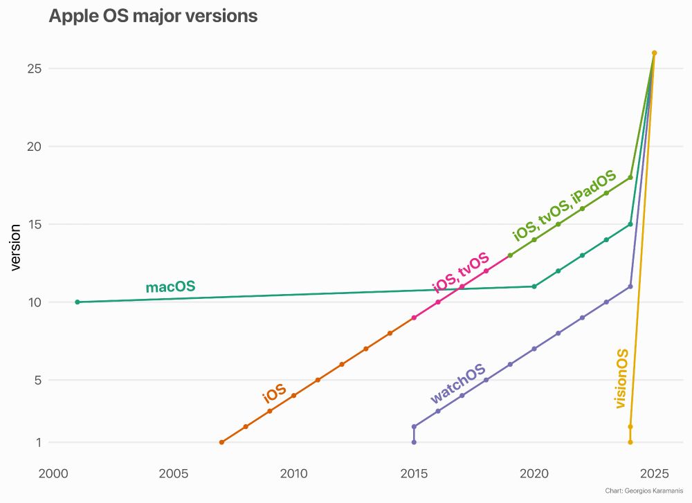
Line chart showing the major version numbers of Apple operating systems from 2001 to 2025. Each OS is represented by a coloured line, with macOS, iOS, watchOS, tvOS, iPadOS, and visionOS included. The chart highlights the rumored convergence of all platforms to version 26 in 2025.
Apple's OS major versions in a chart. The Great Merging is coming
#Apple #Dataviz #RStats
08.06.2025 08:57 — 👍 6 🔁 1 💬 0 📌 0
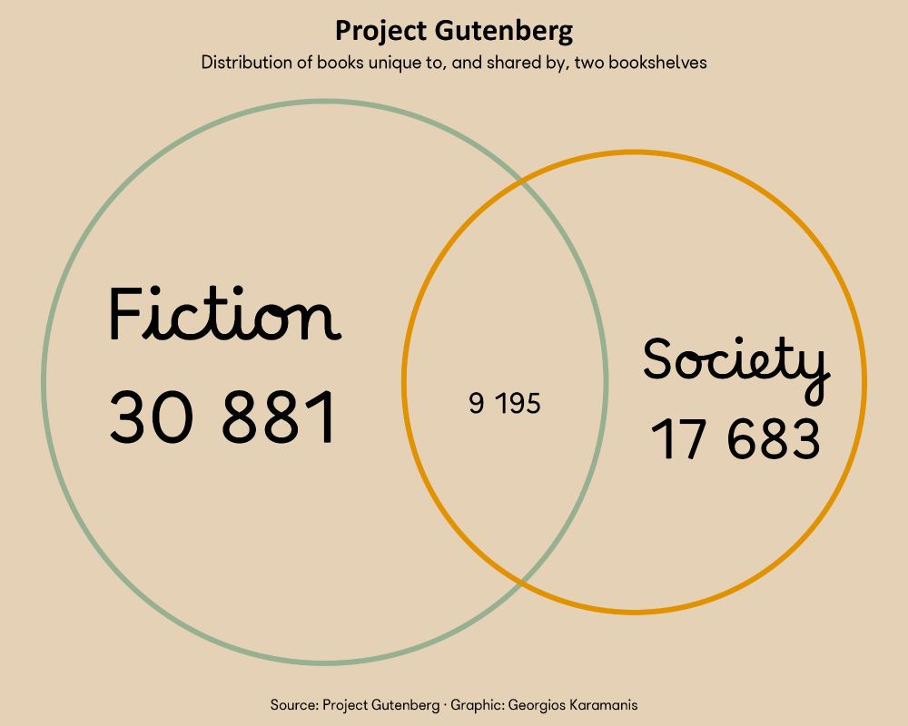
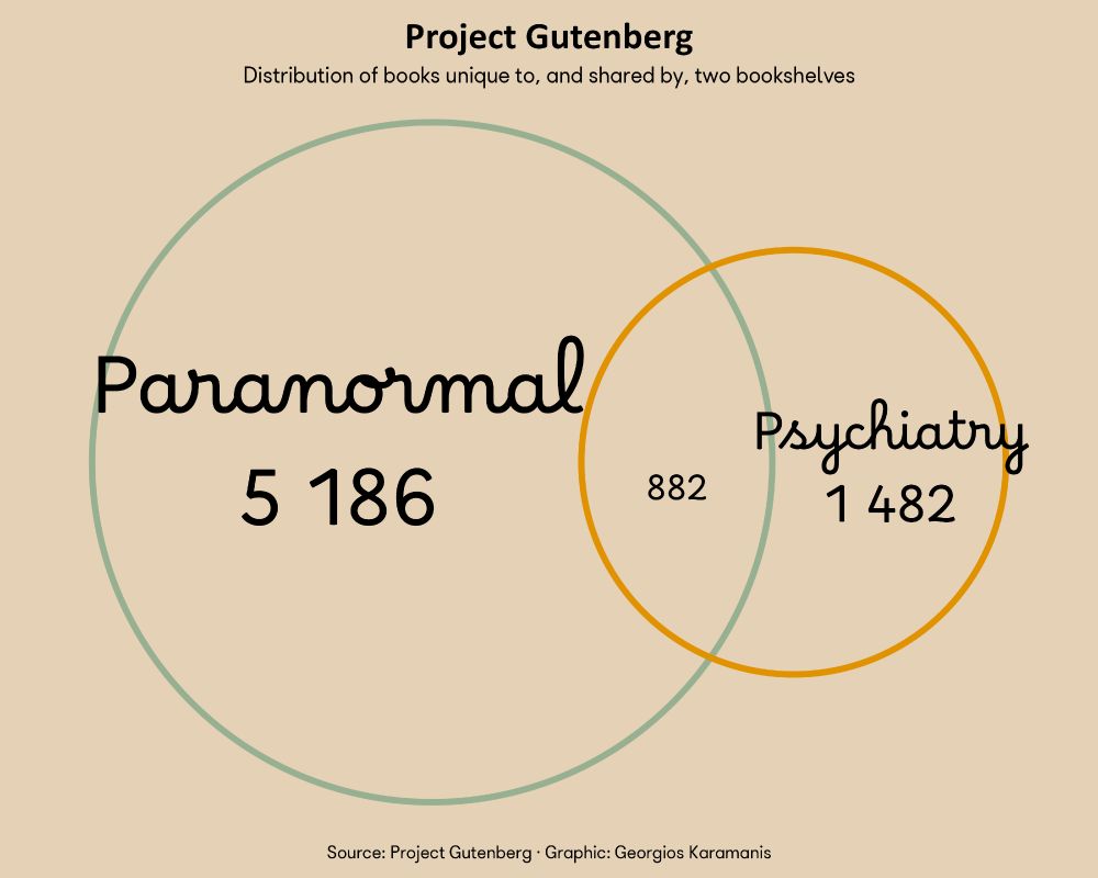
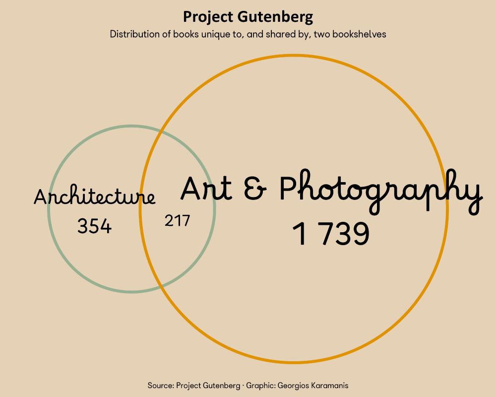
Visualization from Project Gutenberg data showing two bookshelf categories as overlapping circles. The intersection quantifies books present in both bookshelves, while the separate areas indicate books unique to each category.
Visualization from Project Gutenberg data showing two bookshelf categories as overlapping circles. The intersection quantifies books present in both bookshelves, while the separate areas indicate books unique to each category.
Visualization from Project Gutenberg data showing two bookshelf categories as overlapping circles. The intersection quantifies books present in both bookshelves, while the separate areas indicate books unique to each category.
Project Gutenberg bookshelf overlap for this week’s #TidyTuesday
Code: github.com/gkaramanis/t...
#RStats #dataviz
07.06.2025 14:48 — 👍 17 🔁 0 💬 0 📌 0
Idea for the radar chart from @nrennie.bsky.social's plot: bsky.app/profile/nren...
01.06.2025 14:56 — 👍 4 🔁 1 💬 0 📌 0
Dungeons & Dragons monsters for this week's #TidyTuesday
A Shiny app for exploring monster stats with interactive radar chart
App: karamanis.shinyapps.io/shiny-monste...
Code: github.com/gkaramanis/t...
#RStats #dataviz #Shiny
01.06.2025 14:56 — 👍 51 🔁 3 💬 2 📌 0
Should be working now
25.05.2025 06:19 — 👍 0 🔁 0 💬 1 📌 0
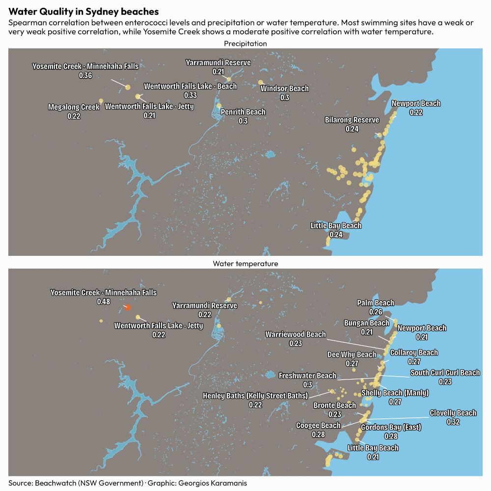
A map visualization showing water quality correlations at Sydney beaches, displayed in two panels. The top panel shows the correlation between precipitation and enterococci levels, while the bottom panel shows the correlation between water temperature and enterococci levels. The map covers the Sydney coastal area with land shown in light brown and water bodies in light blue. Swimming sites are represented as circles of varying sizes, with yellow circles indicating weak correlations (below 0.4) and orange circles indicating moderate correlations (0.4 and above). Several sites with correlations of 0.2 or higher are labeled with their names and correlation values. Yosemite Creek stands out with a moderate positive correlation of approximately 0.48 with water temperature. Most other sites show weak or very weak positive correlations between enterococci bacteria levels and both weather variables.
Water Quality in Sydney beaches for this week's #TidyTuesday
Code: github.com/gkaramanis/t...
#RStats #dataviz
25.05.2025 06:01 — 👍 13 🔁 0 💬 1 📌 0
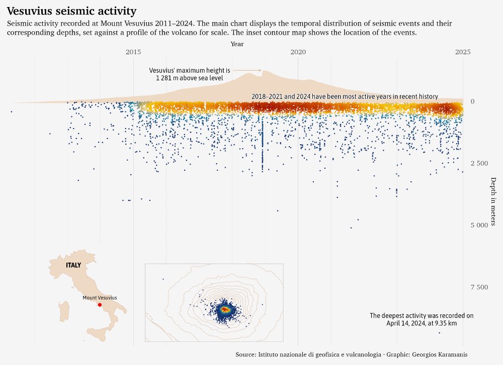
A chart displaying Vesuvius seismic activity from 2011 to 2024. The main panel shows seismic events plotted by year and depth, with a brown silhouette of Vesuvius in the background for scale. Points indicate individual seismic events, colored by density. Annotations highlight that 2018–2021 and 2024 were the most active recent years, the deepest event was recorded at 9.35 km on 14 April 2024, and Vesuvius' maximum height is 1 281 m. Two insets are present: a map of Italy pinpointing Vesuvius, and a contour map showing the geographic spread of the seismic events around the volcano.
Vesuvius seismic activity for this week's #TidyTuesday
Code: github.com/gkaramanis/t...
#RStats #dataviz
18.05.2025 09:50 — 👍 38 🔁 10 💬 2 📌 0
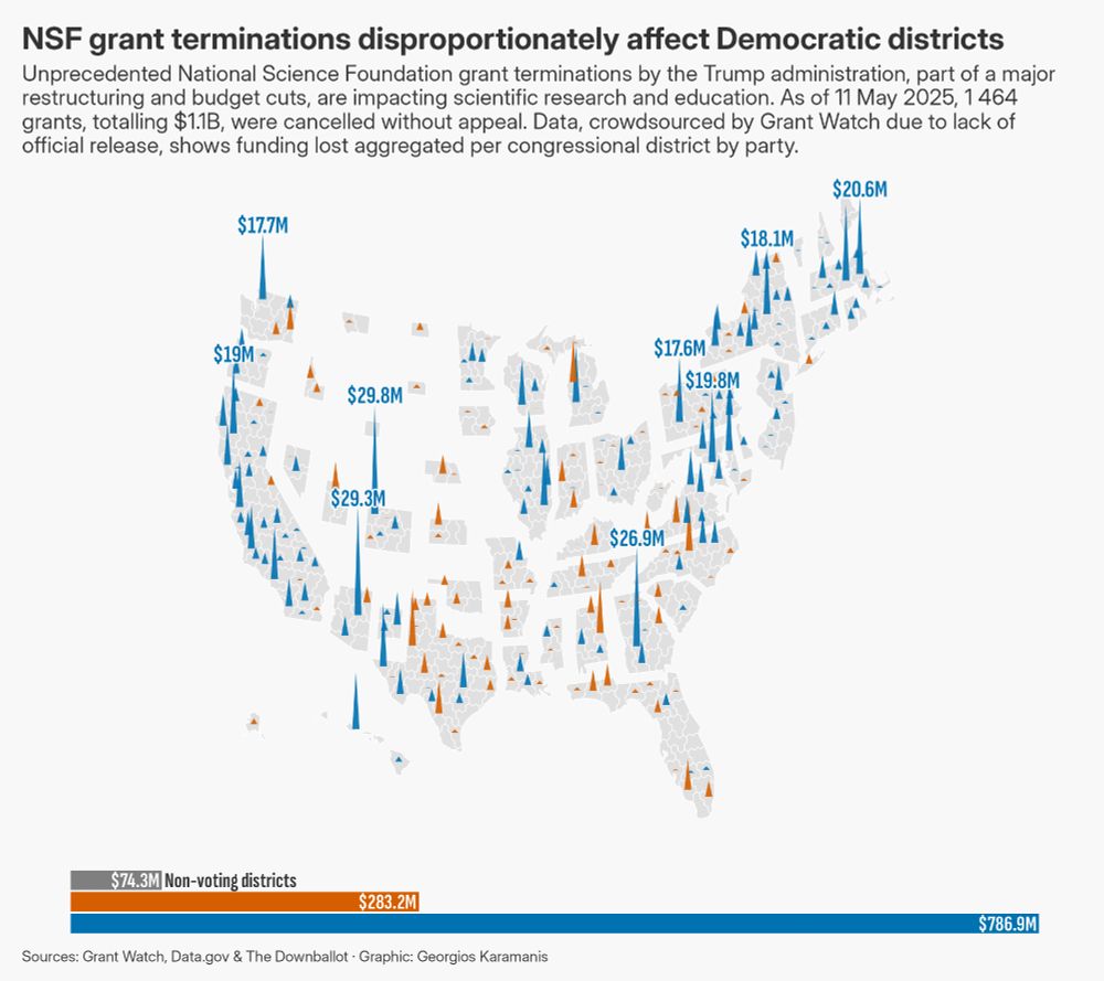
A visualization consisting of two parts. The upper, larger part is a hex map of the United States, where each hexagon represents a congressional district. From the centre of many hexagons, a vertical spike extends upwards; the height of this spike is proportional to the amount of National Science Foundation (NSF) funding terminated in that district. Hexagons are colored blue for Democratic districts and red for Republican districts. For the ten districts with the highest amounts of terminated funding, a text label near the tip of the spike indicates the amount in millions of US dollars.
The lower, smaller part of the visualization is a horizontal bar chart. It shows three bars: one for Democratic districts (blue), one for Republican districts (red), and one for non-voting districts (light grey). The length of each bar represents the total sum of NSF funding terminated for districts of that party affiliation. Text labels on or near the bars indicate these total amounts in millions of US dollars.
The overall title of the visualization is "NSF grant terminations disproportionately affect Democratic districts". A subtitle provides further context, stating that as of the current date, a specific number of grants, totalling a specific amount in billions of US dollars, were cancelled, and that the data shows funding lost aggregated per congressional district by party.
NSF grant cuts for this week's #TidyTuesday
Code: github.com/gkaramanis/t...
Map by @donnermaps.bsky.social of @the-downballot.com at the-db.co/maps
#RStats #dataviz
11.05.2025 08:05 — 👍 92 🔁 39 💬 1 📌 4
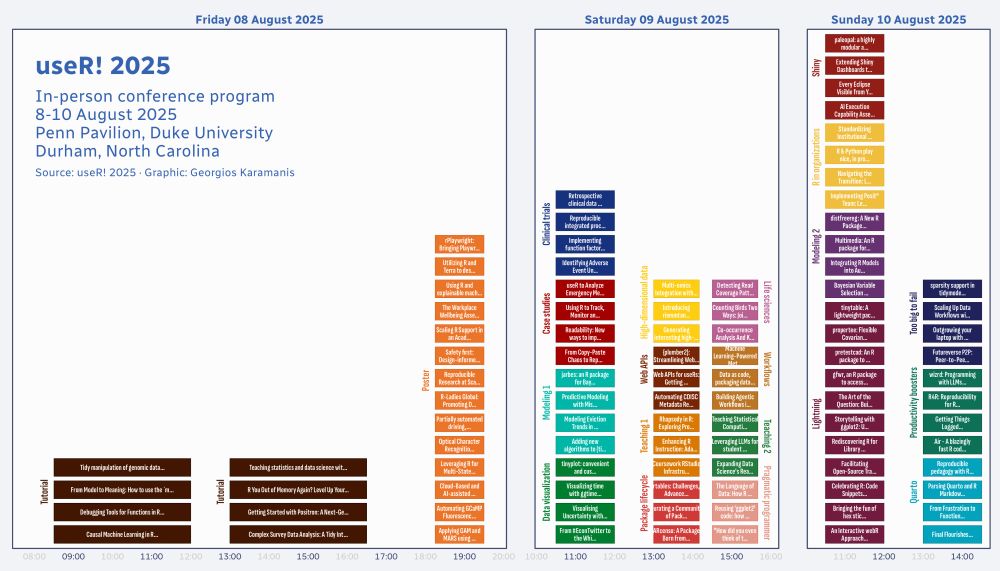
A conference schedule for useR! 2025, displayed as a timeline chart faceted by day (Friday 08 August, Saturday 09 August, Sunday 10 August 2025). The x-axis shows time. Colored rectangles represent sessions, positioned according to their start and end times. The height of the rectangles indicates parallel tracks or slots. Session titles are displayed within the rectangles. Session types are indicated by color and also labelled vertically beside the time slots. The top-left corner includes the title 'useR! 2025', event details, and source information.
#useR2025 in-person program for this week's #TidyTuesday
Code: github.com/gkaramanis/t...
#RStats #dataviz
04.05.2025 06:40 — 👍 9 🔁 2 💬 0 📌 0
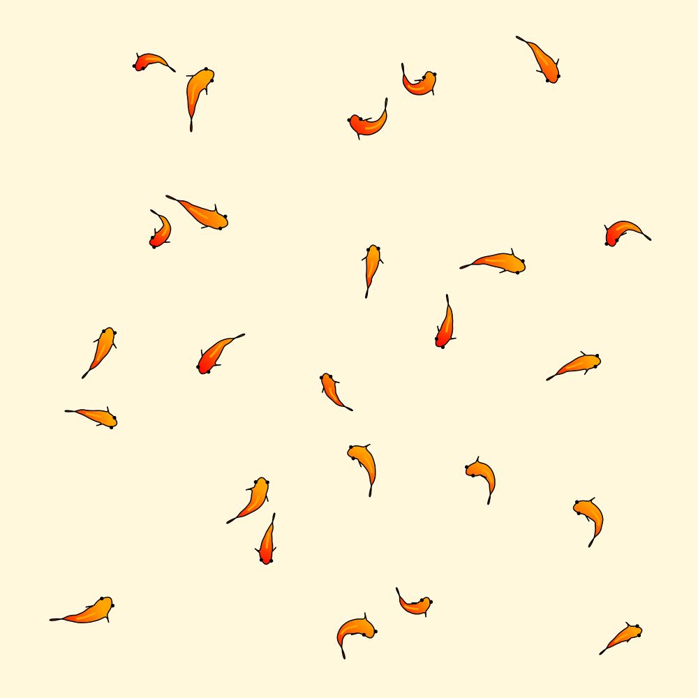
Generative art displaying a 5x5 grid of 25 stylised fish against a pale yellow background. While arranged in a grid, each fish exhibits randomness in its size, body curvature, orientation, and position within its grid cell. The fish have curved bodies filled with a red-to-orange gradient, black outlines, small black dot eyes, and a faint orange line along their back.
Drawing fish with #ggplot2, inspired by this awesome video: www.youtube.com/watch?v=qlfh...
#Rstats #creativecoding
02.05.2025 15:33 — 👍 45 🔁 4 💬 0 📌 0
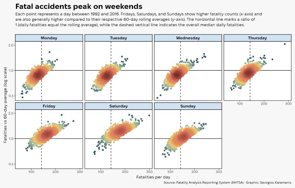
A grid of seven scatter plots, one for each day of the week from Monday to Sunday. Each plot displays US daily road fatalities between 1992 and 2016. The horizontal axis represents the number of fatalities per day, while the vertical axis shows the ratio of that day's fatalities compared to the 60-day rolling average, presented on a logarithmic scale. Points are coloured based on density, highlighting clusters. The plots for Friday, Saturday, and Sunday visibly contain more points concentrated towards higher fatality counts and higher ratios relative to the rolling average, compared to the plots for Monday through Thursday. A solid horizontal line marks a ratio of 1, and a dashed vertical line indicates the median number of daily fatalities across the entire period.
Daily road accidents for this week's #TidyTuesday
Code: github.com/gkaramanis/t...
#RStats #dataviz
27.04.2025 15:40 — 👍 12 🔁 0 💬 0 📌 0
I didn’t, interesting idea!
26.04.2025 17:40 — 👍 0 🔁 0 💬 0 📌 0
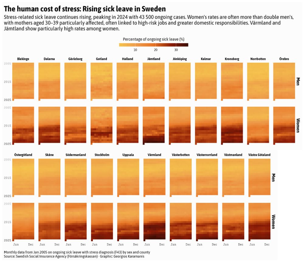
A grid of heatmaps showing the percentage of ongoing stress-related sick leave in Sweden from January 2005 to January 2025, faceted by sex (Women and Men) and county. Each heatmap displays months horizontally and years vertically. Darker shades represent higher percentages of sick leave. The visualisations indicate a general increase in stress-related sick leave over the period, particularly after 2015. Rates for women are consistently much higher than for men across almost all counties, with Värmland and Jämtland showing particularly high percentages for women in recent years. Data is sourced from the Swedish Social Insurance Agency.
Day 26 of #30DayChartChallenge, Monochrome
Sick leave due to stress is rising in Sweden, especially among women
Read more (Swedish): www.forsakringskassan.se/nyhetsarkiv/...
Code: github.com/gkaramanis/3...
#RStats #dataviz
26.04.2025 15:14 — 👍 19 🔁 3 💬 1 📌 0
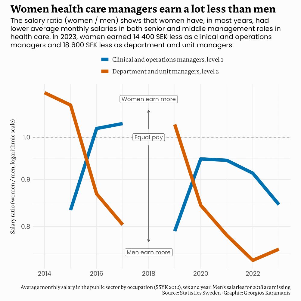
The chart displays the salary ratio (women / men) for senior and middle management roles in health care, using a logarithmic scale. In most years, women earned less than men in both roles. In 2023, women earned 14 400 SEK less as clinical and operations managers and 18 600 SEK less as department and unit managers. Men's salaries for 2018 are missing. Data source: Statistics Sweden.
Day 23 of #30DayChartChallenge, Log scale
Women health care managers in Sweden earn a lot less than men
Code: github.com/gkaramanis/3...
#RStats #dataviz
23.04.2025 17:02 — 👍 6 🔁 2 💬 0 📌 0
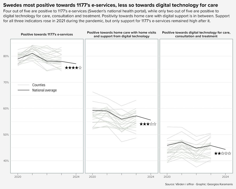
The chart shows trends in positive attitudes among Swedes towards three types of digital health services from 2020 to 2024. Each thin line represents a county, while the bold line shows the national average. The three facets display: positivity towards digital technology for care, positivity towards home care with digital support, and positivity towards 1177's e-services (Sweden's national health portal). Support for all three indicators increased in 2021 during the pandemic. Only support for 1177's e-services remained high after 2021, while the other two indicators fell below pre-pandemic levels. Star symbols next to the latest data summarise the level of positivity.
Day 22 of #30DayChartChallenge, Stars
How positive are Swedes towards digital health?
Code: github.com/gkaramanis/3...
#RStats #dataviz
22.04.2025 15:50 — 👍 16 🔁 2 💬 0 📌 0
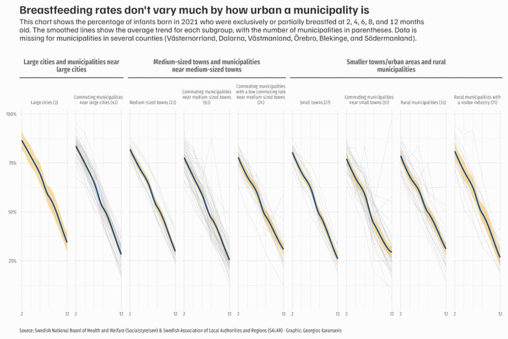
A multi-panel line chart titled "Breastfeeding rates don't vary much by how urban a municipality is". The chart displays the percentage of exclusively or partially breastfed infants born in Sweden in 2021, measured at 2, 4, 6, 8, and 12 months of age (x-axis). The y-axis shows the percentage from 0% to 100%. The chart is divided into multiple panels (facets) based on the Swedish Association of Local Authorities and Regions (SALAR) municipality classification. These classifications are nested under three main headings: "Large cities and municipalities near large cities", "Medium-sized towns and municipalities near medium-sized towns", and "Smaller towns/urban areas and rural municipalities". Within each panel, faint grey lines represent individual municipalities, while a prominent smoothed blue line with an orange confidence interval shows the average trend for that specific municipality subgroup. All panels show a general downward trend in breastfeeding rates as infants get older, starting at around 80% at 2 months and decreasing to around 30% by 12 months.
Day 20 of #30DayChartChallenge, Urbanization
Breastfeeding during the first year in Swedish municipalities by degree of urbanization
Code: github.com/gkaramanis/3...
#RStats #dataviz
20.04.2025 08:53 — 👍 11 🔁 1 💬 0 📌 0
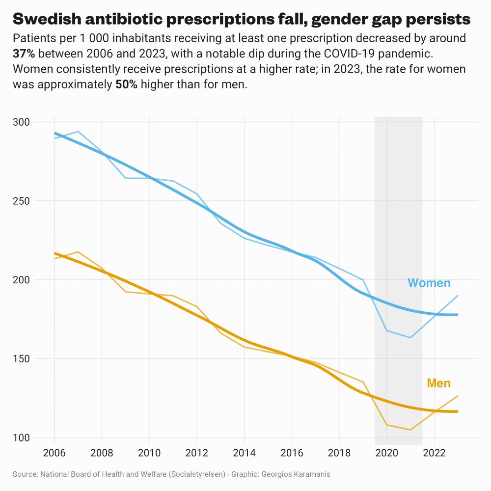
A line chart titled "Swedish antibiotic prescriptions fall, gender gap persists" displays the rate of patients per 1 000 inhabitants receiving at least one antibiotic prescription in Sweden from 2006 to 2023. Two lines are shown: one blue for women and one orange for men, with smoothed trend lines overlaid. Both lines show a clear downward trend over the 17-year period. The line for women is consistently higher than the line for men. A light grey shaded rectangle highlights a dip in prescriptions for both sexes during the 2020-2021 COVID-19 pandemic years. The subtitle notes an overall decrease of around 37% between 2006 and 2023, and that the rate for women in 2023 was approximately 50% higher than for men.
Day 19 of #30DayChartChallenge, Smooth
Antibiotics in Sweden are declining
Code: github.com/gkaramanis/3...
#RStats #dataviz
19.04.2025 13:22 — 👍 15 🔁 3 💬 0 📌 0
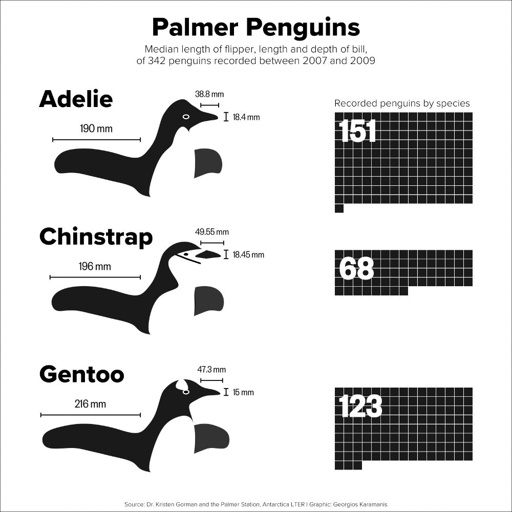
The original penguins plot, in black and white
Original plot
19.04.2025 12:23 — 👍 3 🔁 0 💬 0 📌 0
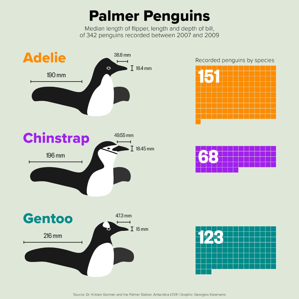
A plot titled "Palmer Penguins" displaying stylized illustrations of three penguin species: Adelie (orange), Chinstrap (purple), and Gentoo (cyan), arranged vertically. Each illustration shows median measurements for bill length, bill depth, and flipper length using labelled lines directly on the penguin drawing. To the right of each penguin, a grid of small coloured squares represents the number of recorded individuals for that species, with the total count displayed numerically. The subtitle indicates the data represents median measurements from 342 penguins recorded between 2007 and 2009. The background is a pale green-grey.
Palmer penguins for this week's #TidyTuesday. A remake of the original plot, now with color
Code: github.com/gkaramanis/t...
#RStats #dataviz
19.04.2025 12:23 — 👍 50 🔁 2 💬 1 📌 0