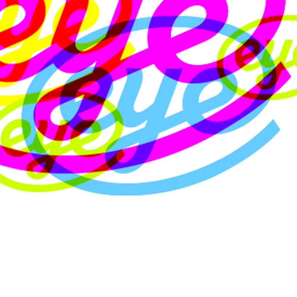
Immigration is good, actually.
25.01.2026 20:07 — 👍 18 🔁 3 💬 0 📌 0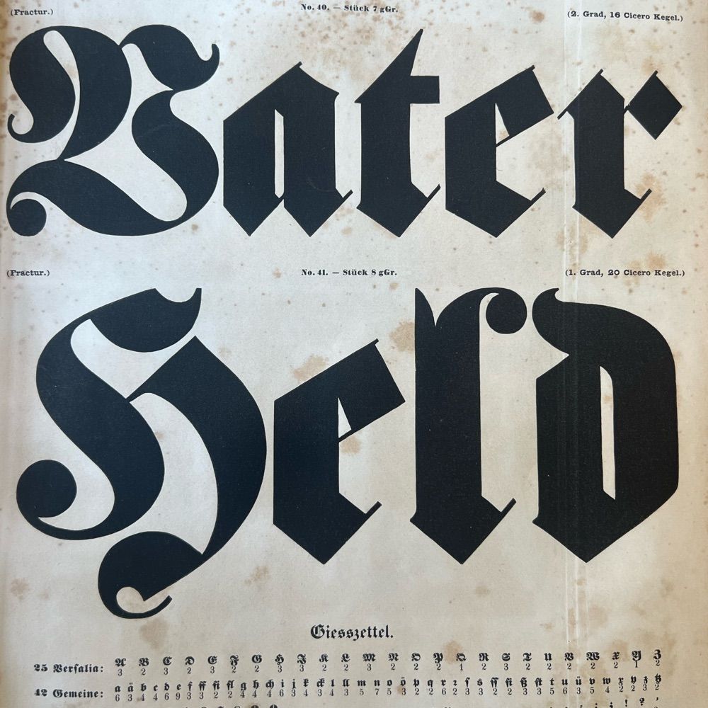
@typeoff.bsky.social
Type historian and copywriter. Sometimes a designer, too. I live in Wuppertal and work in the book studies program down in Mainz. www.typeoff.de
Immigration is good, actually.
25.01.2026 20:07 — 👍 18 🔁 3 💬 0 📌 0I don't need a rationale / to sing the internationale youtu.be/vvCGZEqk8Ak?...
05.11.2025 03:04 — 👍 54 🔁 9 💬 1 📌 0
James Mosley at St Bride in 1983 examining a print of five ornamented letters from the Pouchée foundry. Photo: Ian Mortimer.

James Mosley at the tomb of William Caslon, c. 2005. Photo: Alastair Johnson.

A view of the storage stacks inside the St Bride Library. Had it not been for James Mosley‘s tenure, many of the invaluable typographic materials now within the library’s collection would never have been preserved. Photo: Bob Richardson.

James Mosley and Gillian Riley at the tomb of T. B. Reed, c. 2005. Photo: Alastair Johnson.
Riccardo Olocco from CAST has written a heartfelt obituary about James Mosley. It touches a note that will hopefully resound with readers, whether they had the chance to be Mosley’s students or not. fontstand.com/news/essays/...
04.11.2025 15:59 — 👍 5 🔁 2 💬 0 📌 0
Either at www.gutenberg-shop.de/Type.-Buchdr... or any German bookstore could order it and then ship it. It should be on all German bookstore-chain websites now.
21.10.2025 20:43 — 👍 1 🔁 0 💬 0 📌 0


This book is out now! Over 196-pages, it dives into the technological differences between the systems of movable type pioneered in East Asia and Western Europe. It is probably the most challenging thing I have designed so far but if it sells well, I might get to do it all over again in English 😉
17.10.2025 14:47 — 👍 11 🔁 3 💬 1 📌 0I think this is a drawing for Stempel’s phototypesetting version of the font, not one for the original Deberny & Peignot letterpress fonts.
17.09.2025 06:11 — 👍 1 🔁 0 💬 1 📌 0Death Comes to Time is the best 21st-century Doctor Who story!
12.08.2025 11:26 — 👍 0 🔁 0 💬 0 📌 0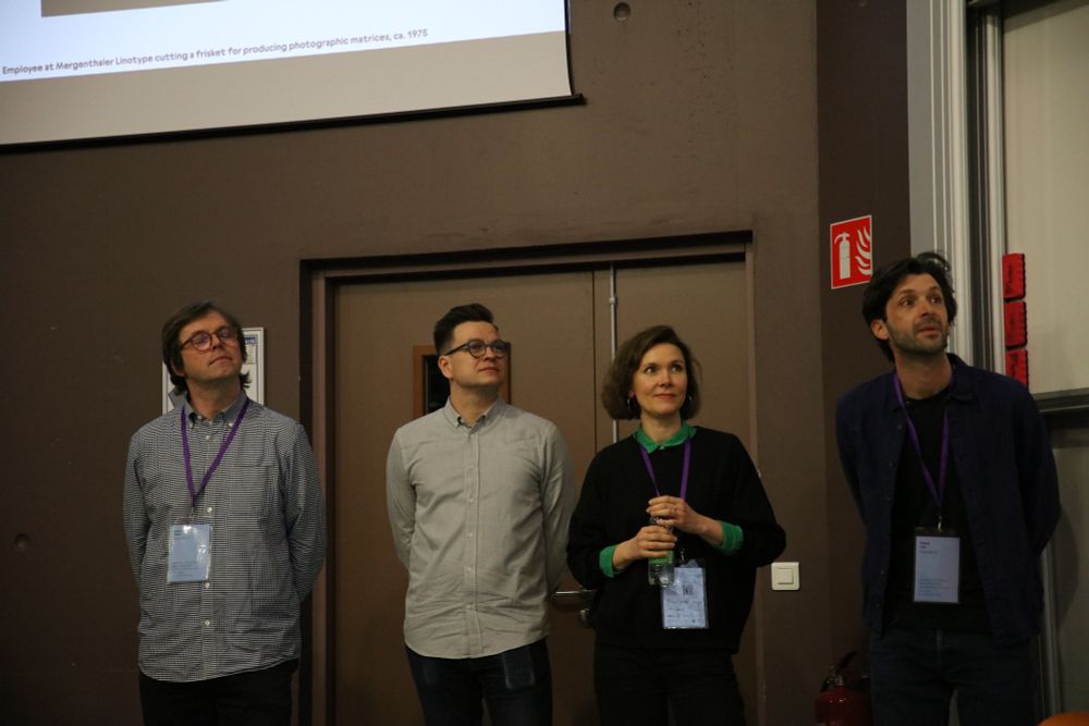
From left to right: Radim Peško, Kai Bernau, Alice Savoie, and Roland Früh standing in the back of a room with part of a conference presentation shown on a screen above their heads.
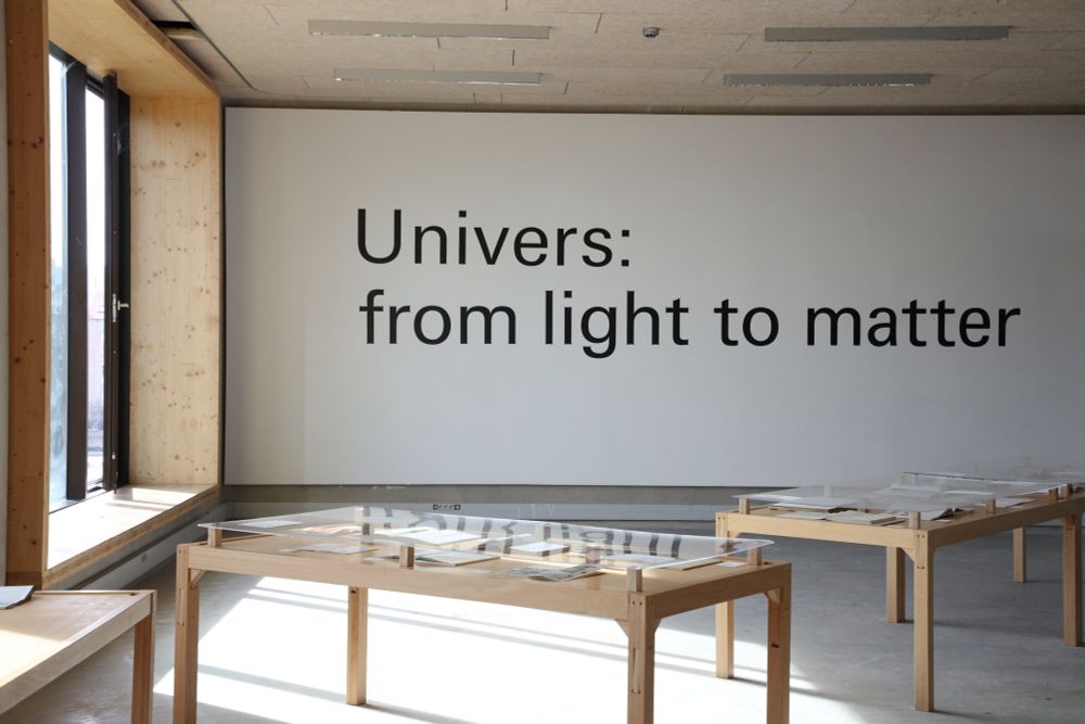
Overview of the exhibition “Univers: from light to matter,” curated by Tânia Raposo and Varya Goncharova.
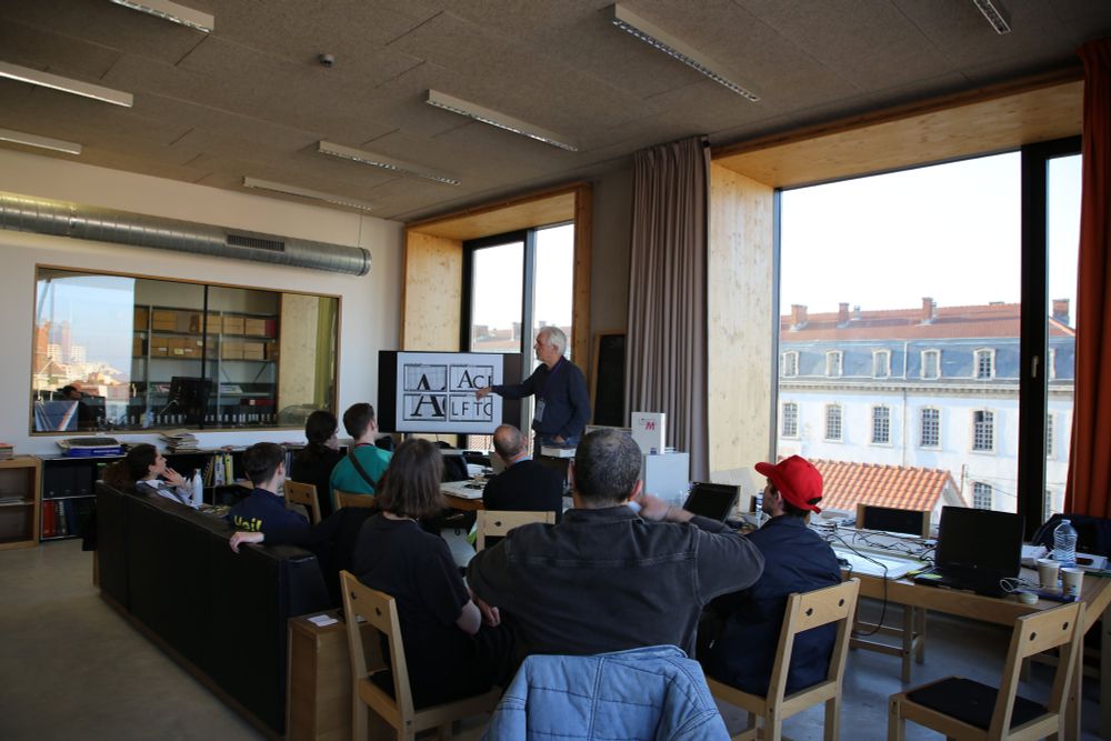
Photo showing participants at one of the conference’s workshops.
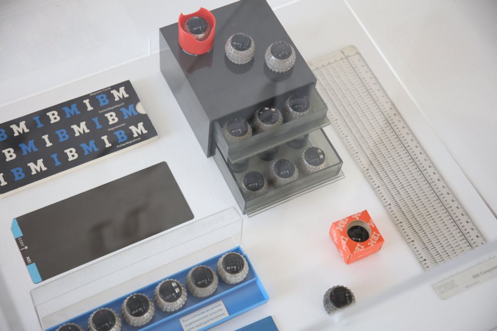
IBM typewriter “golfballs,” from the “Univers: from light to matter” exhibition.
Do you remember when ANRT held its third Automatic Type Design conference? Silvia Sfligiotti was there, and now she’s written all about it for Fontstand News!
fontstand.com/news/design-...
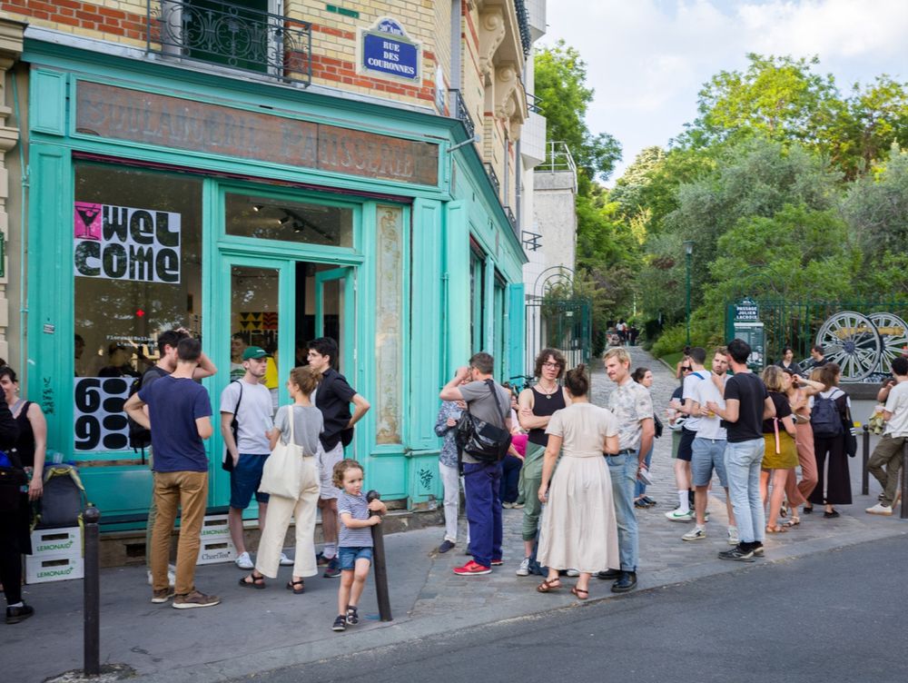
A festive launch event was organized in a local art center. Photo © Baldinger-Vu-Huu, 2024.
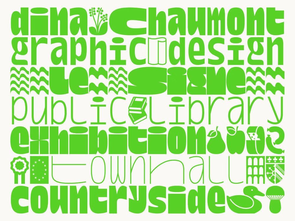
Dina Chaumont Display and its pictograms are designed in both landscape and portrait versions.
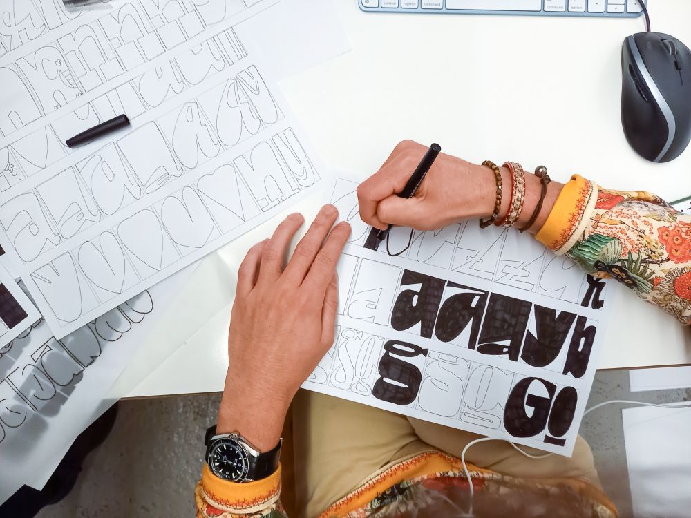
Toan sketching letters. Photo © Baldinger•Vu-Huu.
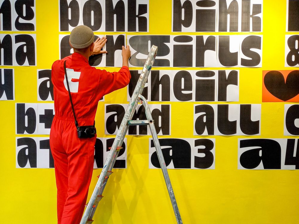
Assembly image from Dina Chaumont’s launch showing lettering being mounted onto a wall behind a ladder.
What would it feel like to be asked to create an all-new typeface for the City of Graphic Design? On Fontstand News, you can find out in Matthijs Sluiter’s new interview with André Baldinger and Toan Vu-Huu of BVH Type. fontstand.com/news/essays/...
10.03.2025 16:07 — 👍 7 🔁 1 💬 0 📌 0„Migration“ als politische wie mediale Fixierung ist spätmoderner Aberglaube, die Angst vor dem bösen Blick der anderen. Als könne das Land ein paar Nadeln in die Schwächsten stecken und dadurch allen realen Flüchen entkommen. Zwanghaft gewordenes magisches Denken,
so regressiv wie rassistisch.
Ohno Softie from OH no Type Co.
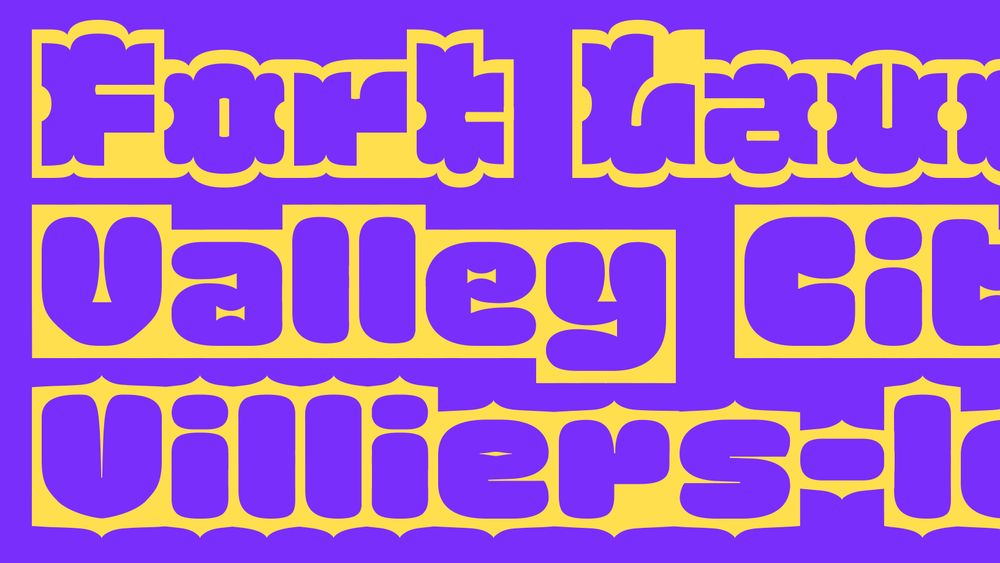
Honk from Ek Type.
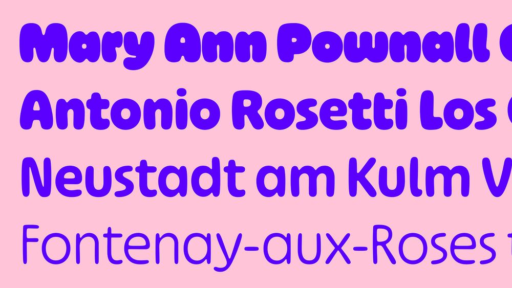
LiebeHeide from LiebeFonts.
Megascope from DJR.
On Fontstand News, Indra Kupferschmid looks back on the previous year and selects some of her favorite typefaces released back then on Fontstand, month by month. Which typeface from last year was your favorite?
fontstand.com/news/essays/...
They also document the names of the employees who made the additions. With time, this will help round out our understanding of how many people worked in type-making at the company, and who they were.
12.12.2024 15:00 — 👍 1 🔁 0 💬 0 📌 0Nevertheless, those are helpful from a historical perspective, too. They tell us when certain alternates were made, or when certain characters were swapped out for new forms entirely.
12.12.2024 15:00 — 👍 1 🔁 0 💬 1 📌 0A good chunk of type-makers’ work at Berthold wasn’t necessarily glamorous; anyone making fonts today can probably understand! Most records in these files are orders for additional matrices to be made, as orders for new coverage came in. Sometimes, that might have only been one new character, too.
12.12.2024 15:00 — 👍 0 🔁 0 💬 1 📌 0The website’s information, and the file names, are all in German. But at least most of the typeface names should be familiar!
12.12.2024 14:59 — 👍 0 🔁 0 💬 1 📌 0These offer our only glimpse into day-to-day type-making practices at one of the world’s then-largest foundry-type manufacturers.
You can browse all 75 files online now. Each image is published with a CC0 license, so you can use it however you like, without restrictions.
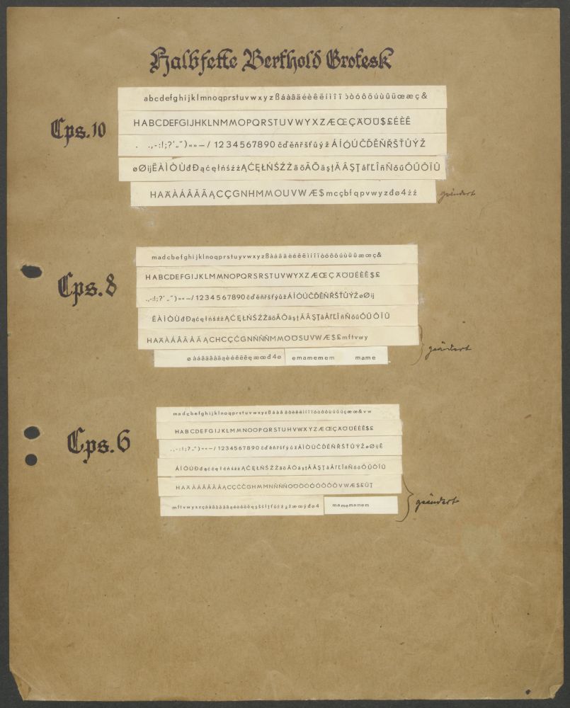
A few years ago, the Deutsches Technikmuseum uncovered surviving records from H. Berthold AG’s type-cutting department. Thanks to funding from digiS, files 70 years old or more were digitized.
berlin.museum-digital.de/collection/1...
Exhibition view. Photo by Martin Šimral, courtesy of the Museum Kampa.
Exhibition view. Photo by Martin Šimral, courtesy of the Museum Kampa.
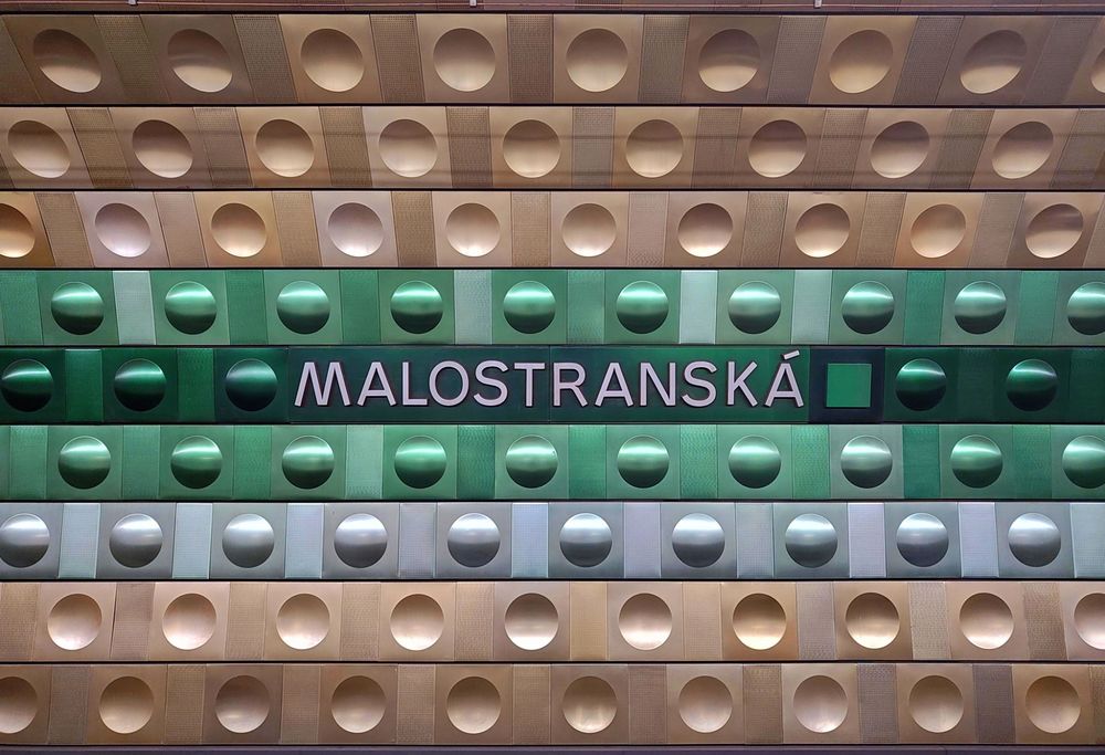
Metal letters designed by Jiří Rathouský, Malostranská station, Prague.
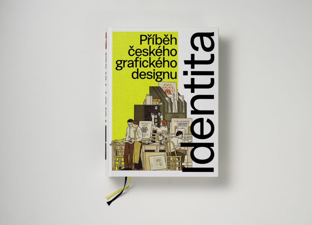
Cover of the Czech edition of the Identitabook, 2024. Concept and editor: Linda Kudrnovská. Design: Filip Blažek and Adéla Svobodová. Photo: Tomáš Rasl.
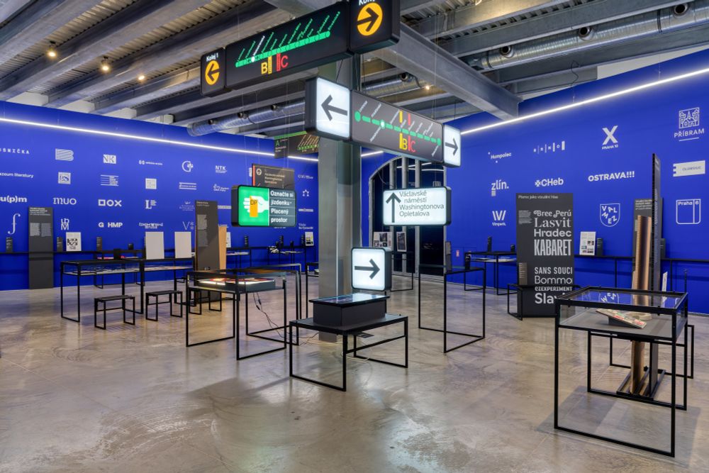
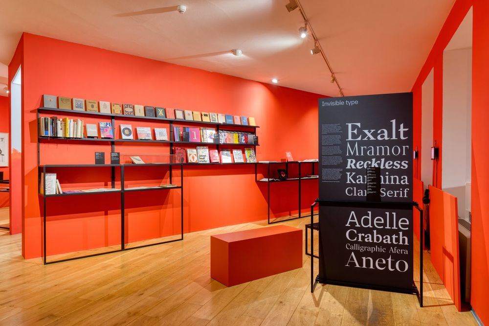
On Fontstand News, Silvia Sfligiotti presents a review of Identita, a lovely exhibition showing 100 years of Czech graphic design. If you have the chance to visit in person, it is on display at the Museum Kampa in Prague until February 2nd.
fontstand.com/news/essays/...
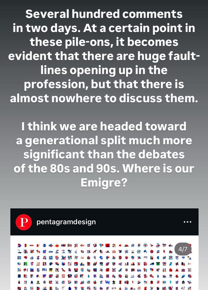
“Where is our Emigre?”
Yet again, J Dakota Brown said better then me what is desperately missing in our field: we have no place to discuss our profession, collectively.
(Screenshot of his IG story)