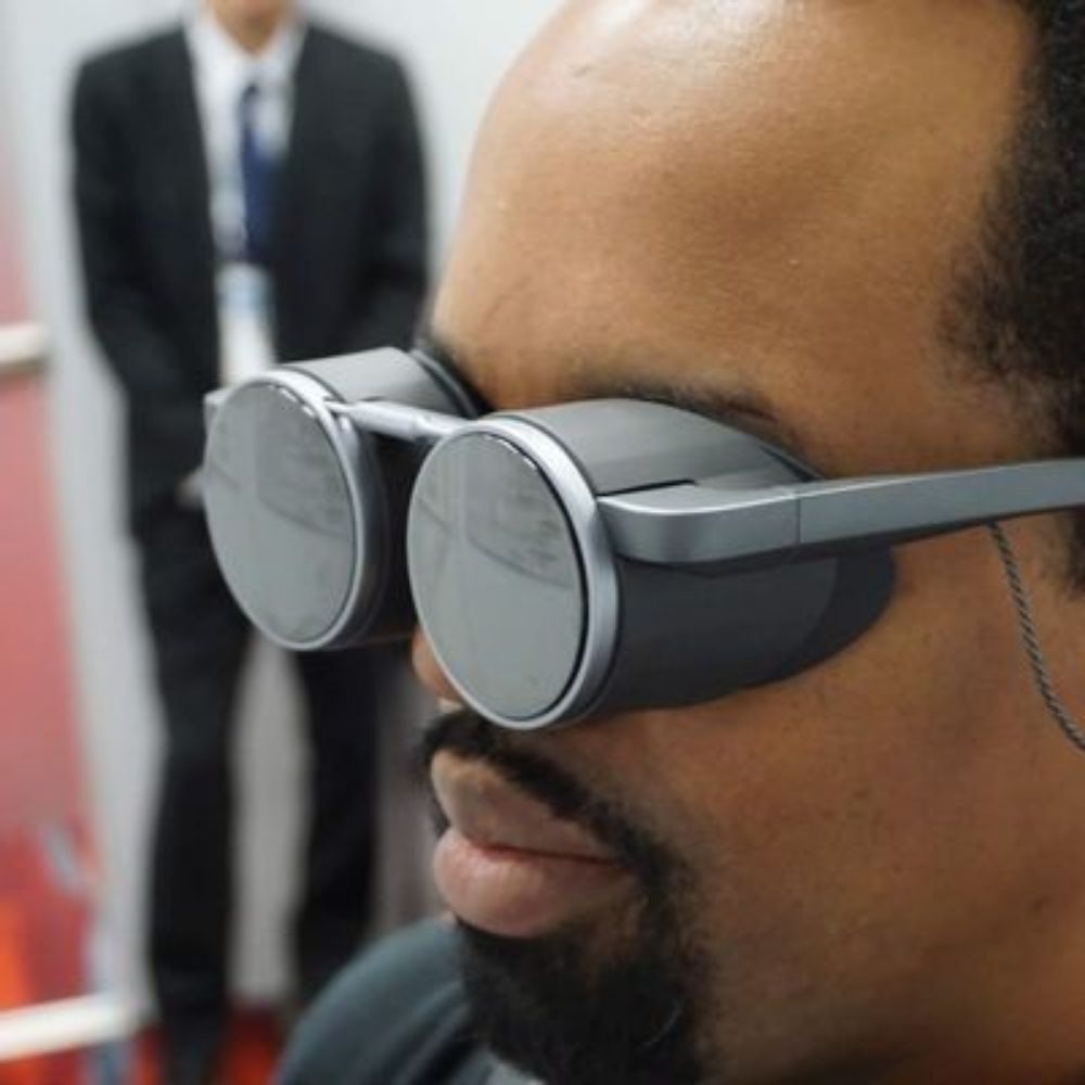
It was an amazing 2025 The Power of Storytelling conference in Bucharest this weekend! And what an ending #story25
23.03.2025 20:59 — 👍 3 🔁 0 💬 0 📌 0
Yeah, people try to make this look too much like hard science when in fact is a lot looser. On the flip side, how would you be a credible/employable professional if you don’t state that you have a “proven methodology”
18.11.2024 22:38 — 👍 0 🔁 0 💬 0 📌 0
Saved for later when I am looking for cool #gamification examples in #dataviz
17.11.2024 09:33 — 👍 2 🔁 0 💬 0 📌 0
Data viz is still a skill that you primarily develop after finishing your studies and I don’t regret the path that led me but I wished there was such a program 10 years ago!
20.02.2024 21:15 — 👍 1 🔁 0 💬 0 📌 0
Next I will look into the intricacies of data analysis and how I decided on the overarching theme for my contribution. 🌍✨
19.02.2024 08:59 — 👍 0 🔁 0 💬 0 📌 0

ACLED Dashboard - ACLED
Use our interactive dashboard to explore ACLED data by region, country, event type, and actor, from the start of our coverage to the present date.
5/4: The Armed Conflict Location & Event Data Project (ACLED) 🗺️ ACLED focuses on collecting real-time, georeferenced information on political violence and armed conflict worldwide. Dive into their dataset for granular insights: acleddata.com/dashboard/#/...
19.02.2024 08:58 — 👍 0 🔁 0 💬 0 📌 0
3/4: Resource 1: GDELT Project 🌍 This initiative analyzes global news media to track and document conflict narratives over time, offering insights into evolving media landscapes. Check out their comprehensive dataset here: www.gdeltproject.org
19.02.2024 08:56 — 👍 0 🔁 0 💬 0 📌 0
2/4: Challenge 1: Finding the Right Data 🌐 Navigating the vast expanse of conflict data online was daunting. After extensive research, I've identified three invaluable resources. Let's dive in!
19.02.2024 08:55 — 👍 0 🔁 0 💬 0 📌 0

Delayed Gratification
The Slow Journalism Magazine | Last to breaking news
I have been following The Baffler magazine ( thebaffler.com/latest/every...) for a while now. They write opinion pieces on different themes but they also follow the daily news. Also, Delayed Gratification is a very good infographic rich slow journalism outlet: www.slow-journalism.com
18.02.2024 21:23 — 👍 2 🔁 0 💬 1 📌 0
Doing some charting on a thermal printer is on my bucket list for a while. This post is super useful to know where to start in terms of constraints. There are a few I haven’t thought about at all. Thanks @amycesal.bsky.social for sharing!
17.02.2024 14:14 — 👍 1 🔁 0 💬 0 📌 0
The first post is always tricky.
17.02.2024 14:01 — 👍 4 🔁 0 💬 0 📌 0
dataviz and information graphics at ELTE MMI
portfolio: https://attilabatorfy.com/
head of visual journalism project: https://atlo.team/
book order: https://eltebook.hu/batorfy-attila-adatvizualizacio
blog: https://attilabatorfy.substack.com/
Writer: Short Fiction on 💔 ⛧ 💀/ Journalist: Investigations on 🐻🤖💰 michaelbirdjournalist.com / Read 'Modern Gothic' out now https://shorturl.at/33aUY / Watch www.animalhustlers.com
Bellingcat is an independent investigative collective of researchers, investigators and citizen journalists brought together by a passion for open source research.
Want to support our charity? bellingcat.com/donate
Entusiastic Design Studio for Visual Science Communication in Kiel, Germany. Established since 2015. http://www.scicom-lab.com
Health policy wonk, workers' rights advocate & employability mentor. Data cruncher, purveyor of pretty graphs. Relentlessly hopeful. Kitchen gadgets addict, poster of cat pics, wearer of too many florals. Mum. She/her. Views my own. #QISky
Political scientist at the University of Oxford working on legislative studies and party politics in Central and Eastern Europe and the European Parliament.
Covering life in the future
https://www.theverge.com/subscribe
Editor-in-chief of The Verge, host of Decoder, cohost of The Vergecast. I am in love with spectacle.
reporter at @theverge.com, and things of that nature. i cover social media/tech companies and life online. contact me securely on signal: @miasato.11.
Senior Editor @theverge.com ║ Sign up to Notepad, my weekly newsletter on Microsoft's big bets at http://theverge.com/notepad ║ Tips? msg me on Signal: tomwarren.01
i write at @theverge.com. Portland, OR.
News @TheVerge.com etc.
This is the part where I tell you not to follow me and also that this is a Sandra Oh stan account.
News Writer at The Verge. Distressingly English. Fueled by Vyvanse, instant ramen, and spite.
Professional orange whip drinker. Freelance tech journalist, often at Gizmodo and IGN. Previously The Verge. Also pubbed at Tom’s Hardware/Guide, PCWorld, TechHive, CNN Underscored. He/him/they
Smart Home reviewer at The Verge. www.theverge.com/authors/jennifer-tuohy
Senior Reporter at @theverge.com. Email tips to jay.peters@theverge.com.
Personal website is https://jaypeters.net.
writing sources.news, co-hosting the Access podcast
internet typist at the verge, known cat lady, zevon stan. she/hers/hesher
tip me: liz@theverge.com
senior social media manager at @theverge.com, also @canyoupetthedog.com guy