dplyr 1.2.0
dplyr 1.2.0 fills in some important gaps in dplyr's API: we've added a new complement to `filter()` focused on dropping rows, and we've expanded the `case_when()` family with three new recoding and re...
dplyr 1.2.0 is out now and we are SO excited!
- `filter_out()` for dropping rows
- `recode_values()`, `replace_values()`, and `replace_when()` that join `case_when()` as a complete family of recoding/replacing tools
These are huge quality of life wins for #rstats!
tidyverse.org/blog/2026/02...
04.02.2026 11:39 — 👍 462 🔁 135 💬 12 📌 14

1995-2025 : les médias contre les mouvements sociaux (vidéo)
Acrimed sur Blast.
Nouvel épisode de « 4e pouvoir », l’émission vidéo d’Acrimed chez @blast-info.fr 👇
28.12.2025 17:16 — 👍 138 🔁 86 💬 3 📌 2
[tw divers] Pour Noël j'ai eu un livre sur la prison ("Perpétuité" de G. Poix), un livre sur les violences sexuelles ("Le viol, notre culture" de B. Hamidi) et un avec des nazis ("Une ascension" de S. Hertmans)
Ça me va très bien, mais je crois que VA avait raison, je casse l'ambiance en soirée.
28.12.2025 17:21 — 👍 70 🔁 3 💬 1 📌 0
J'ai ma réponse : le 19 novembre 2025...
21.11.2025 19:39 — 👍 78 🔁 31 💬 7 📌 4
Congratulations to my student, Maggie Ma, for publishing her first #rstats package {ggincerta} on CRAN 🥳
Spatial uncertainty visualisation (bivariate, pixel, exceedance, glyph), like {Vizumap}, but fully integrated with ggplot2 -- a much simpler API with all the advantages of the ggplot2 system.
16.11.2025 04:50 — 👍 73 🔁 12 💬 1 📌 0
I used it because there was a bug with using patchwork so I added it as a layout element.
This said, do feel free to open issues on the Github repo. Very preliminary for now anyway :)
13.11.2025 08:12 — 👍 1 🔁 0 💬 1 📌 0

Days 08 and 11 of #30DayMapChallenge bridged into one: I minimally represented urbanism via the non-urban fabric of the Geneva area. Decided it was minimal although not that much.
Code: guillaume-noblet.com/30DayMapChal...
#ggplot2 #dataviz #maps #rstats
12.11.2025 07:54 — 👍 10 🔁 2 💬 1 📌 0
This is quite at a slow biking speed it seems.
11.11.2025 10:44 — 👍 0 🔁 0 💬 0 📌 0

#Day07 of #30DayMapChallenge on Accessibility
This map shows the time needed to cycle from Bains des Paquis (a popular fondue and sauna place in Geneva)
🆕 1st time use of the `osmr` package to define #isochrones.
Gallery: guillaume-noblet.com/30DayMapChal...
#dataviz #rstats #ggplot2 #gis #map
11.11.2025 10:40 — 👍 15 🔁 3 💬 2 📌 0

For Day 06 of the #30DayMapChallenge, I used:
📖 Wikipedia retrieving tallest building list with `rvest`
🏔️ `tidyterra` to retrieve elevation shades
🔮 Refined top buildings's labels and lines with `ggrepel`
Code: guillaume-noblet.com/30DayMapChal...
#rstats #gis #dataviz #ggplot2 #terra
08.11.2025 15:52 — 👍 12 🔁 2 💬 0 📌 0
Day 05 of #30DayMapChallenge on Earth (Classical Elements 1/4)
I've discovered and used the new `tmap.mapgl` to show Swizerland's elevation. It's mindblowing how easy it is.
guillaume-noblet.com/30DayMapChal...
#dataviz #rstats #tmap #gis #mapgl cc @mtennekes and thanks!
07.11.2025 12:30 — 👍 17 🔁 5 💬 0 📌 0
Interesting & nice chart!. Similar idea to what I use in #rstats
vcd::fourfold()
- but uses quarter circles, with CI rings for the odds ratio.
- signif OR !=1 \equiv quarter circles DON'T OVERLAP
06.11.2025 03:39 — 👍 21 🔁 4 💬 2 📌 0

I did publish Day 04 of #30DayMapChallenge on a Microsoft owned platform too! With a bit of tweaking the theme.
Code: guillaume-noblet.com/30DayMapChal...
#rstats #dataviz #map #ggplot2 #gis #fedora
06.11.2025 10:21 — 👍 2 🔁 0 💬 0 📌 0

Here it is :) guillaume-noblet.com/30DayMapChal...
05.11.2025 15:17 — 👍 1 🔁 1 💬 1 📌 0
Oh, and btw here is a live gallery for the challenge with scripts: guillaume-noblet.com/30DayMapChal...
05.11.2025 15:14 — 👍 2 🔁 0 💬 0 📌 0

Day 03 of #30DayMapChallenge with a density choropleth and quantiles!
👏 Thanks to @Benjamin Novak's tutorial in @yan-holtz.bsky.social gallery r-graph-gallery.com/web-map-chor...
🌚 Used data from the Observatoire Statistique Tranfrontalier
#rstats #dataviz #map #ggplot2 #gis
05.11.2025 15:14 — 👍 16 🔁 4 💬 1 📌 0

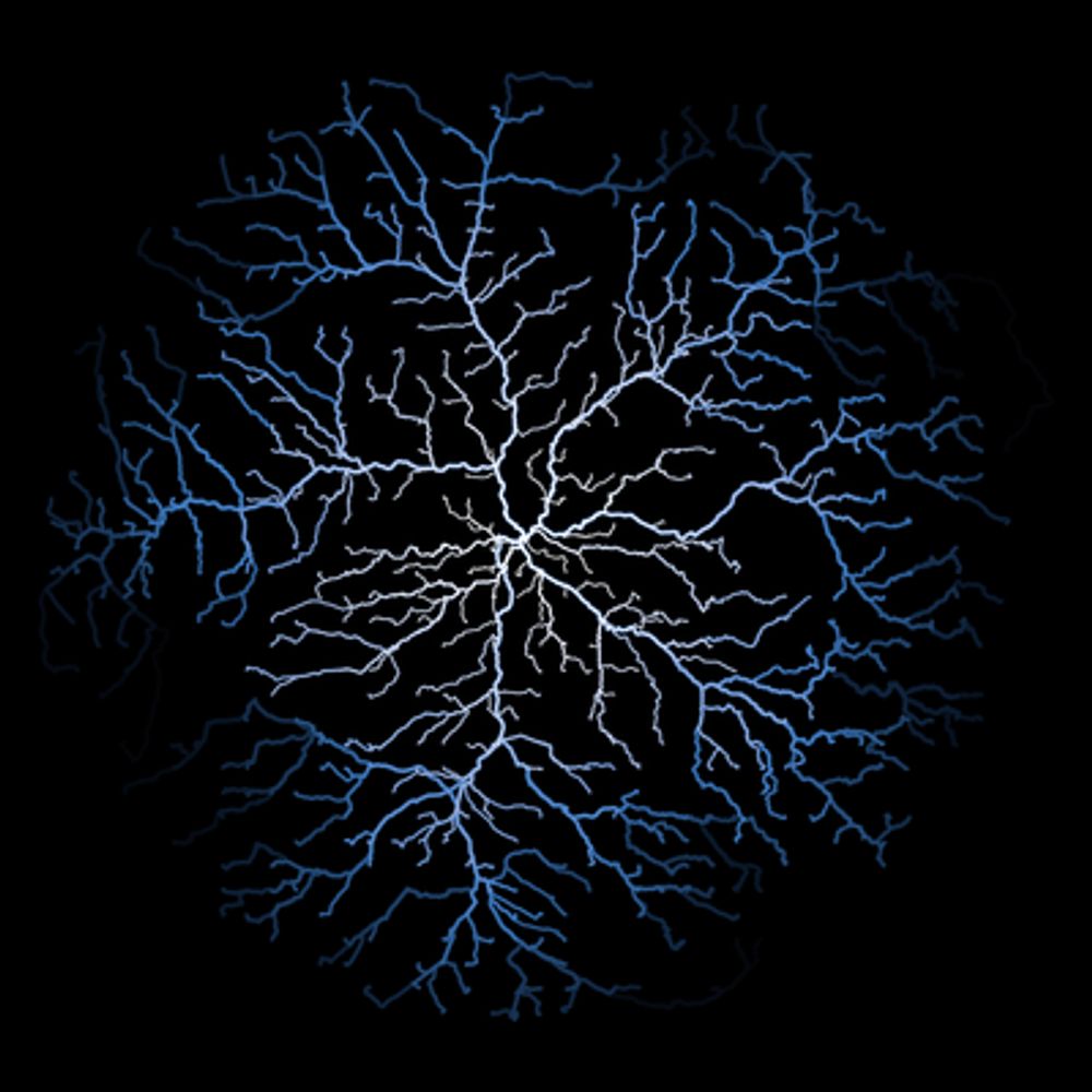
a map of Swiss rivers and basins
Day 02 of #30DayMapChallenge with a few Swiss river lines
🙏 Followed @milos-makes-maps.bsky.social's tutorial
🆕 Added a halo layer under the lines layer
✨ 1st time I plotted a river system
#ggplot2 #rstats #dataviz #maps
04.11.2025 08:52 — 👍 24 🔁 2 💬 1 📌 1

#30DayMapChallenge Day 2 - Lines
#popelevation #joyplot of the UK
02.11.2025 12:38 — 👍 50 🔁 11 💬 3 📌 0

#30DayMapChallenge Here is day 01, showing road accidents in Geneva, Switzerland.
#DataViz #RStats #ggplot2
03.11.2025 12:55 — 👍 19 🔁 1 💬 0 📌 0
The reproduced chart can be found here: github.com/davidsjoberg...
15.10.2025 14:42 — 👍 2 🔁 1 💬 0 📌 0
On Gaza in the last IPC report: "As this Famine is entirely man-made, it can be halted and reversed. The time for debate and hesitation has passed, starvation is present and is rapidly spreading. [...] Any further delay will result in a totally unacceptable escalation of Famine-related mortality."
15.10.2025 14:42 — 👍 3 🔁 1 💬 1 📌 0

The 15 Countries with the Largest Number of People Experiencing Severe Food Insecurity
#TidyTuesday this week is about the #FAO data for the #WorldFoodDay
📊 Combining `ggbump` and a map to display a ranking, I chose to use IPC data instead and reproduce a chart by David Sjoberg.
#rstats #ipcinfo #ipc #fsl #dataviz #map #ggplot2
Code: guillaume-noblet.com/TidyTuesday/
15.10.2025 14:42 — 👍 21 🔁 5 💬 2 📌 0
The reproduced chart can be found here: github.com/davidsjoberg...
15.10.2025 14:39 — 👍 0 🔁 0 💬 0 📌 0
On Gaza in the last IPC report: "As this Famine is entirely man-made, it can be halted and reversed. The time for debate and hesitation has passed, starvation is present and is rapidly spreading. [...] Any further delay will result in a totally unacceptable escalation of Famine-related mortality."
15.10.2025 14:39 — 👍 0 🔁 0 💬 1 📌 0

#TidyTuesday a week late on Crane Observations at Lake Hornborgasjön, Sweden (1994–2024).
🗓️ Used a heatmap to look at the repeated yearly spring observations
🎷 `ggbranding` to add personal branding github.com/gnoblet/ggbr...
👽 Code: gnoblet.github.io/TidyTuesday/
#rstats #ggplot2 #heatmap #dataviz
06.10.2025 09:29 — 👍 29 🔁 6 💬 0 📌 0
Ça fonctionne bien pour une tendance, oui ! Pour avoir une série précise dans le temps, le graphique devient très vite trop dense et illisble. D'où, l'usage de moyenne décennale ici.
10.10.2025 15:40 — 👍 1 🔁 0 💬 0 📌 0

One of my graph has just entered the "best" section of the r-graph-gallery.com with a tutorial.
Featuring a waffle chart for time series, where the subtitle serves as a colorful legend.
Thanks a lot to @yan-holtz.bsky.social and @soeundataviz.bsky.social for adding it! #rstats #dataviz #ggplot2
10.10.2025 06:24 — 👍 53 🔁 12 💬 3 📌 0

#TidyTuesday Week 40 – I mostly just wanted to plot a map!
👉 Code: guillaume-noblet.com/TidyTuesday/
#DataScience #RStats #Geospatial #dataviz
07.10.2025 14:58 — 👍 15 🔁 2 💬 0 📌 0
JJR est une organisation révolutionnaire juive en France. Depuis 2015 en lutte contre l'antisémitisme d'où qu'il vienne et contre le racisme, le capitalisme, le colonialisme, le sexisme.
Notre site internet : juivesetjuifsrevolutionnaires.fr
📺 Rédactrice en chef sur ARTE Le Dessous des Cartes
📖 Auteure Le Monde mis à nu 2021 + Le retour de la guerre 2022 + La puissance et la guerre 2023
Blog qui met la lumière sur les structures horizontales d'auto-organisation dans une perspective émancipatrice.
I work at CNRS. I post about reproducible research and all things spatial.
Author of {mapsf}, {osrm} and other :rstats: spatial packages. Co-author of the thematic […]
🌉 bridged from ⁂ https://fosstodon.org/@rcarto, follow @ap.brid.gy to interact
Demographics | Geospatial | Data Science | Open Source
Data viz enthusiast. Bookworm.
Github: https://github.com/DevJupyHUB/
Journaliste. Actus, enquête et décryptage sur les services et produits de consommation. Droits des consommateurs.
Urbanist, Map nerd, Hongkonger, GIS, #RStats
🔗 mappyurbanist.com
Journaliste raisonnablement indépendant. Marottes: défense, sécurité, renseignement, droits humains et environnement. Membre @collectifyoupress.bsky.social et @ajdpresse.bsky.social. Crie aussi dans des micros.
Journalist at @disclose.ngo, in Marseille back from Egypt
🖊️Member AJD @ajdpresse.bsky.social
✊ @prenonslaune.bsky.social & @ofalp.org
👵🏻 Andrée Viollis fan club
data viz beginner!
south korea | still taking grasp of everything about data viz, would love to be part of the community
Musique et grève générale
Petit agité (salut Christophe)
Campagne sur l'eau et hors de l'eau pour mettre fin au blocus israélien illégal de Gaza et pour la liberté de circulation du peuple palestinien.
https://linktr.ee/flottillelibertegaza.france
DeGoogled & pro-privacy smartphones and online workspace: mobile ecosystem for ethical tech seekers.
https://murena.com
Support: https://murena.com/contact-us/
DataVis journalist @ The National (Abu Dhabi, UAE)
I dedicate —some of— my working hours to painting charts and maps.
I created this account because the datavis community moved here, and I miss them.
https://www.behance.net/isaacarroyov
Head of Data Visualisation @TheNationalNews.com in #AbuDhabi. Recent UK expat. Syrian/Iraqi
#Journalist #Technologist #data, #AI, #OSINT & information integrity. A journalism polymath of sorts (if such a thing exists)
(Ex-Twitter Head of Curation MENA)
Economics and data science | Former academic now working in the tech sector | Views my own | 🇿🇦 in 🇺🇸 | https://grantmcdermott.com/
#rstats #ggblanket
https://github.com/davidhodge931/ggblanket