Logo for the #TidyTuesday Project. The words TidyTuesday, A weekly data project from the Data Science Learning Community (dslc.io) overlaying a black paint splash.
TidyTuesday is a weekly social data project. All are welcome to participate! Please remember to share the code used to generate your results!
TidyTuesday is organized by the Data Science Learning Community. Join our Slack for free online help with R and other data-related topics, or to participate in a data-related book club!
How to Participate
Data is posted to social media every Monday morning. Follow the instructions in the new post for how to download the data.
Explore the data, watching out for interesting relationships. We would like to emphasize that you should not draw conclusions about causation in the data.
Create a visualization, a model, a shiny app, or some other piece of data-science-related output, using R or another programming language.
Share your output and the code used to generate it on social media with the #TidyTuesday hashtag.
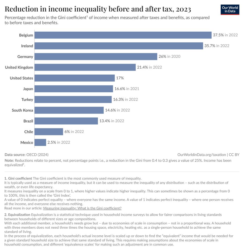
Bar chart titled 'Reduction in income inequality before and after tax, 2023,' showing the percentage reduction in the Gini coefficient of income due to taxes and benefits. The chart ranks 11 countries by their reduction percentage. Belgium leads with a 37.5% reduction, followed by Ireland at 35.7%, and Germany at 26%. Mexico shows the smallest reduction at 2.5%. Other countries in descending order include the UK (21.4%), US (17%), Japan (16.6%), Turkey (16.3%), South Korea (14.6%), Brazil (13.4%), and Chile (6%). The chart includes footnotes explaining the Gini coefficient and income equalization. Source: "OECD (2024), via Our World in Data, https://ourworldindata.org/income-inequality-before-and-after-taxes."
@dslc.io welcomes you to week 31 of #TidyTuesday! We're exploring Income Inequality Before and After Taxes!
📂 https://tidytues.day/2025/2025-08-05
📰 https://ourworldindata.org/income-inequality-before-and-after-taxes
#RStats #PyData #JuliaLang #DataViz #tidyverse #r4ds
04.08.2025 13:53 — 👍 9 🔁 2 💬 0 📌 1
Thread version: bsky.app/profile/jont...
30.07.2025 14:37 — 👍 1 🔁 0 💬 0 📌 0
Time commitment: 1 hr/wk, 1 chapter/wk, you should lead the discussion (with our existing slide deck) ~5 times (depending on # of participants) & optionally improve the slides. Times are chosen by all participants picking days+times in a shiny app and then I'll choose from the most popular times.
30.07.2025 14:36 — 👍 1 🔁 0 💬 0 📌 1
I'll add this to the thread! 1 hr (& chapter)/week, ideally you should read the chapter, and occasionally lead the discussion. We have well established shared slides for Advanced R, so you don't really need to prepare anything when you present (but you're encouraged to improve the slides)!
30.07.2025 14:32 — 👍 2 🔁 0 💬 1 📌 0
Join the DSLC.io Slack, then navigate to the #bookclub-advr channel (or directly to dslcio.slack.com/archives/C01... once you're logged into Slack)!
BTW, I plan to cover {{ and #S7 in the club, even though they didn't make it into the book!
#RStats #dataBS
30.07.2025 12:10 — 👍 9 🔁 0 💬 1 📌 0
Hello #dataBS! I'm facilitating a new free @dslc.io Advanced #RStats adv-r.hadley.nz cohort soon! It's been 5+ years since I read this excellent book by @hadley.nz, so I'm giving it a re-read. Let's learn to embrace {{ tidy evaluation }}, purrr::reduce() repetition, and count S/R #OOP systems!
30.07.2025 12:10 — 👍 30 🔁 9 💬 2 📌 1
Logo for the #TidyTuesday Project. The words TidyTuesday, A weekly data project from the Data Science Learning Community (dslc.io) overlaying a black paint splash.
TidyTuesday is a weekly social data project. All are welcome to participate! Please remember to share the code used to generate your results!
TidyTuesday is organized by the Data Science Learning Community. Join our Slack for free online help with R and other data-related topics, or to participate in a data-related book club!
How to Participate
Data is posted to social media every Monday morning. Follow the instructions in the new post for how to download the data.
Explore the data, watching out for interesting relationships. We would like to emphasize that you should not draw conclusions about causation in the data.
Create a visualization, a model, a shiny app, or some other piece of data-science-related output, using R or another programming language.
Share your output and the code used to generate it on social media with the #TidyTuesday hashtag.
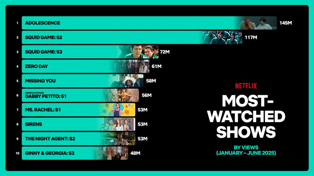
A stacked bar chart illustrating the number of times the Top10 shows on Nexflix were viewed between January-June2025. The bars are filled green with images from each show embedded on the right side of each bar. The show Adolescence tops the charts with 145M views followed by Season 2 and 3 of the Squid Games, with 117M and 72M views respectively.
@dslc.io welcomes you to week 30 of #TidyTuesday! We're exploring What have we been watching on Netflix?!
📂 https://tidytues.day/2025/2025-07-29
🗞️ https://about.netflix.com/en/news/what-we-watched-the-first-half-of-2025
#RStats #PyData #JuliaLang #DataViz #tidyverse #r4ds
28.07.2025 14:21 — 👍 13 🔁 3 💬 0 📌 1
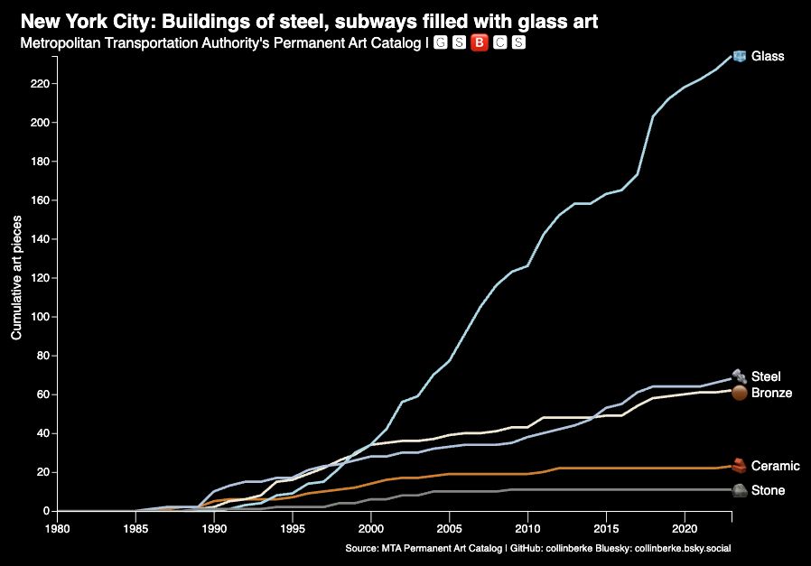
Here's my contribution to this week's #TidyTuesday data: MTA Permanent Art Catalog.
New York City: Buildings of steel, subways filled with glass art
⚙️Data transformation using {tidyverse}
📈Plot using D3.js
🔗Code and data links 👇
#RStats #DataViz #tidyverse #r4ds
28.07.2025 04:29 — 👍 7 🔁 3 💬 1 📌 0
Logo for the #TidyTuesday Project. The words TidyTuesday, A weekly data project from the Data Science Learning Community (dslc.io) overlaying a black paint splash.
TidyTuesday is a weekly social data project. All are welcome to participate! Please remember to share the code used to generate your results!
TidyTuesday is organized by the Data Science Learning Community. Join our Slack for free online help with R and other data-related topics, or to participate in a data-related book club!
How to Participate
Data is posted to social media every Monday morning. Follow the instructions in the new post for how to download the data.
Explore the data, watching out for interesting relationships. We would like to emphasize that you should not draw conclusions about causation in the data.
Create a visualization, a model, a shiny app, or some other piece of data-science-related output, using R or another programming language.
Share your output and the code used to generate it on social media with the #TidyTuesday hashtag.
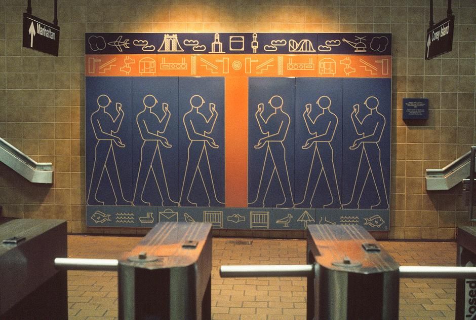
Photograph of the artwork 'Kings Highway Hieroglyphs' (1987) by Rhoda Yohai Andors at the Kings Hwy subway station. The mural features six outlined human figures standing in profile, each with one arm raised. The figures are each set on their own vertical panel with a blue background, and the three on the left face the three on the right, separated by an orange stripe. Above and below the figures are rows of stylized pictograms of things like clouds, an airplane, a bridge, a roller coaster, a helicopter, fish, and birds, modern visual symbols echoing ancient hieroglyphs. A plaque with more information about the artwork is visible but illegible. Subway turnstiles are visible in the foreground, with directional signs for 'Manhattan' and 'Coney Island' hanging above. Photo by Rhoda Yohai Andors via MTA Arts & Design at https://www.mta.info/agency/arts-design/collection/Kings-Highway-Hieroglyphs.
Curator: @jonthegeek.com
@dslc.io welcomes you to week 29 of #TidyTuesday! We're exploring MTA Permanent Art Catalog!
📁 https://tidytues.day/2025/2025-07-22
🗞️ https://www.mta.info/agency/arts-design/permanent-art
#RStats #PyData #JuliaLang #DataViz #tidyverse #r4ds
21.07.2025 13:50 — 👍 10 🔁 3 💬 0 📌 1
I'm about 6 minutes into the latest #TheAdventureZone *audio podcast* and if this "Whisper" character survives one episode of this thing I attempt to *listen to with my ears* I think I'll have to be done. What were you thinking @griffinmcelroy.bsky.social??
17.07.2025 21:14 — 👍 2 🔁 1 💬 0 📌 0
Logo for the #TidyTuesday Project. The words TidyTuesday, A weekly data project from the Data Science Learning Community (dslc.io) overlaying a black paint splash.
TidyTuesday is a weekly social data project. All are welcome to participate! Please remember to share the code used to generate your results!
TidyTuesday is organized by the Data Science Learning Community. Join our Slack for free online help with R and other data-related topics, or to participate in a data-related book club!
How to Participate
Data is posted to social media every Monday morning. Follow the instructions in the new post for how to download the data.
Explore the data, watching out for interesting relationships. We would like to emphasize that you should not draw conclusions about causation in the data.
Create a visualization, a model, a shiny app, or some other piece of data-science-related output, using R or another programming language.
Share your output and the code used to generate it on social media with the #TidyTuesday hashtag.
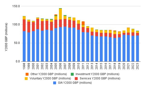
Stacked bar chart showing the British Library’s funding sources from 1998 to 2023, adjusted to Year 2000 GBP (millions). The chart breaks funding into five categories per year: "GIA (blue, dominant throughout), Services (red)," Voluntary (yellow), Investment (green), and Other (orange). Funding peaked in 2006 and declined gradually thereafter, stabilizing at a lower level from 2014 onward. GIA remains the largest component, with smaller and more variable contributions from other categories. The y-axis ranges from 0 to 150 million, and the x-axis lists years from 1998 to 2023. Original plot by Andy Jackson.
@dslc.io welcomes you to week 28 of #TidyTuesday! We're exploring British Library Funding!
📁 https://tidytues.day/2025/2025-07-15
📰 https://anjackson.net/2024/11/29/british-library-funding-breakdown-trends/#income-streams
#RStats #PyData #JuliaLang #DataViz #tidyverse #r4ds
14.07.2025 13:48 — 👍 12 🔁 3 💬 0 📌 1
@nrennie.bsky.social any thoughts on this? I'm on the road and don't have the ability to dig in right now.
08.07.2025 18:06 — 👍 0 🔁 0 💬 1 📌 0
This was a super fun dataset to curate and I learnt a lot of things in the process!
💻 Processing .txt file dumps of SQLite databases in #RStats
💽 Finding "nice" subsets of big datasets
📊 Plotting jittered polygons
I'd highly recommend curating a #TidyTuesday dataset if you haven't already!
07.07.2025 13:54 — 👍 22 🔁 7 💬 0 📌 0
Logo for the #TidyTuesday Project. The words TidyTuesday, A weekly data project from the Data Science Learning Community (dslc.io) overlaying a black paint splash.
TidyTuesday is a weekly social data project. All are welcome to participate! Please remember to share the code used to generate your results!
TidyTuesday is organized by the Data Science Learning Community. Join our Slack for free online help with R and other data-related topics, or to participate in a data-related book club!
How to Participate
Data is posted to social media every Monday morning. Follow the instructions in the new post for how to download the data.
Explore the data, watching out for interesting relationships. We would like to emphasize that you should not draw conclusions about causation in the data.
Create a visualization, a model, a shiny app, or some other piece of data-science-related output, using R or another programming language.
Share your output and the code used to generate it on social media with the #TidyTuesday hashtag.
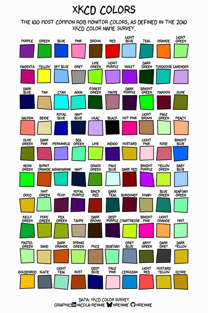
A 10x10 grid of roughly drawn squares each including a color from the top 100 most common rgb monitor colors from the xkcd color survey. Purple is the most used, and ochre is the 100th. There are lots of green squares. Color names are printed under each square.
Curator: @nrennie.bsky.social
@dslc.io welcomes you to week 27 of #TidyTuesday! We're exploring The xkcd Color Survey Results!
📁 https://tidytues.day/2025/2025-07-08
📰 https://blog.xkcd.com/2010/05/03/color-survey-results/
#RStats #PyData #JuliaLang #DataViz #tidyverse #r4ds
07.07.2025 13:45 — 👍 17 🔁 4 💬 1 📌 2
Logo for the #TidyTuesday Project. The words TidyTuesday, A weekly data project from the Data Science Learning Community (dslc.io) overlaying a black paint splash.
TidyTuesday is a weekly social data project. All are welcome to participate! Please remember to share the code used to generate your results!
TidyTuesday is organized by the Data Science Learning Community. Join our Slack for free online help with R and other data-related topics, or to participate in a data-related book club!
How to Participate
Data is posted to social media every Monday morning. Follow the instructions in the new post for how to download the data.
Explore the data, watching out for interesting relationships. We would like to emphasize that you should not draw conclusions about causation in the data.
Create a visualization, a model, a shiny app, or some other piece of data-science-related output, using R or another programming language.
Share your output and the code used to generate it on social media with the #TidyTuesday hashtag.
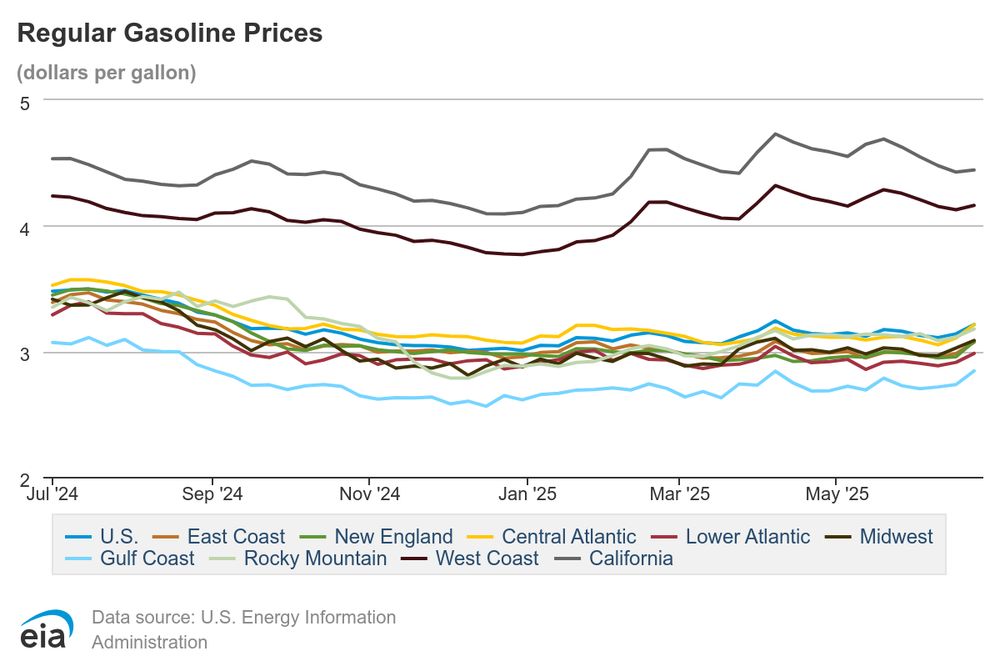
A line chart titled 'Regular Gasoline Prices' showing weekly average gasoline prices by U.S. region from July 2024 to May 2025 in dollars per gallon. California and West Coast lines are highest, ranging from just below $4 to almost $5. Gulf Coast is lowest, starting just above $3 but remaining below $3 since September 2024. Most regions cluster near $3 per gallon.
Curator: @jonthegeek.com
@dslc.io welcomes you to week 26 of #TidyTuesday! We're exploring Weekly US Gas Prices!
📁 https://tidytues.day/2025/2025-07-01
📰 https://www.eia.gov/petroleum/gasdiesel/
#RStats #PyData #JuliaLang #DataViz #tidyverse #r4ds
30.06.2025 13:44 — 👍 12 🔁 3 💬 0 📌 2
dslc.io
📢 Calling all #rstats #pydata #julialang #datascience folks!
This year, a Data Science Learning Community (DSLC.io) goal is to crowdsource the curation of #TidyTuesday datasets to allow the DLSC board members and project maintainer @jonthegeek.com, more time to better the community in other ways 1/
30.06.2025 00:09 — 👍 15 🔁 5 💬 1 📌 1
It is worth reminding every American today that the people who hid Anne Frank were outlaws. The people who sent her to die in the Bergen-Belsen concentration camp were law-abiding citizens.
23.06.2025 21:24 — 👍 1204 🔁 423 💬 12 📌 7
Logo for the #TidyTuesday Project. The words TidyTuesday, A weekly data project from the Data Science Learning Community (dslc.io) overlaying a black paint splash.
TidyTuesday is a weekly social data project. All are welcome to participate! Please remember to share the code used to generate your results!
TidyTuesday is organized by the Data Science Learning Community. Join our Slack for free online help with R and other data-related topics, or to participate in a data-related book club!
How to Participate
Data is posted to social media every Monday morning. Follow the instructions in the new post for how to download the data.
Explore the data, watching out for interesting relationships. We would like to emphasize that you should not draw conclusions about causation in the data.
Create a visualization, a model, a shiny app, or some other piece of data-science-related output, using R or another programming language.
Share your output and the code used to generate it on social media with the #TidyTuesday hashtag.
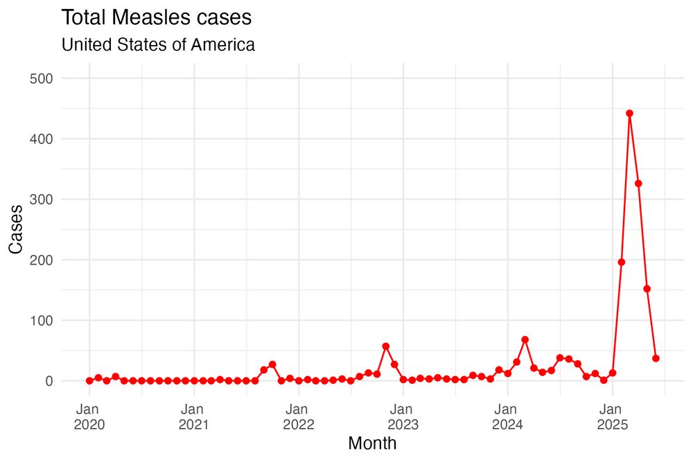
The plot displays the number of monthly measles cases in the US from 2020 to 2025 using red points and lines. The pattern shows very low measles cases each month, until 2025, when there is a spike of cases, rising to more than 400 in March 2025
Curator: @jenrichmondphd.bsky.social
@dslc.io welcomes you to week 25 of #TidyTuesday! We're exploring Measles cases across the world!
📂 https://tidytues.day/2025/2025-06-24
#RStats #PyData #JuliaLang #DataViz #tidyverse #r4ds
23.06.2025 14:02 — 👍 18 🔁 4 💬 0 📌 1

Just some creepy armed Mad Max guys trying to gain entry to Dodgers Stadium.
ICE says it wasn’t them. DHS says they were Border Patrol. But honestly who the hell knows? They’ve given permission for any psycho to put on a ski mask, point a gun, grab people & throw them into an unmarked vehicle.
19.06.2025 21:52 — 👍 38745 🔁 12811 💬 3166 📌 1552
Web APIs with R Book Club – Introduction
These slides from my in-progress book "Web APIs with R" might help (I hope)! dslc-io.github.io/club-wapir/s...
19.06.2025 19:06 — 👍 4 🔁 1 💬 1 📌 0
...he says to Signal's president
17.06.2025 15:15 — 👍 3493 🔁 218 💬 94 📌 105
This is beyond cruel, especially for young folks who are going through it. Cutting off LGBTQ+ youth from specialized suicide prevention help is a death sentence disguised as bureaucracy.
Shame on every official who signed off on this. You’re not protecting children, you’re abandoning them.
18.06.2025 17:48 — 👍 8841 🔁 3062 💬 396 📌 222
Browse APIs
Our goal is to create a machine-readable Wikipedia for WEB APIs. If you have an API definition in any format (OpenAPI, Postman, RAML, WADL, API Blueprint etc) for any public API, please, feel free to ...
GitHub actually has a duplicate in the apis.guru database, but in a way that made it not worth cleaning out (it amounts to the same thing but not obviously so until you know to look for it, I can't remember details past that). I *think* that's the only one, but Azure/Google MIGHT have some!
18.06.2025 18:01 — 👍 0 🔁 0 💬 1 📌 0
#RStats maintainers: last week I used #TidyTuesday to promote the fact that @ropensci.org has been looking for a {historydata} maintainer for a year. This week it has a new volunteer maintainer. Need help with your data? Submit a dataset with {tidytuesdayR}! dslc-io.github.io/tidytuesdayR... #dataBS
17.06.2025 02:21 — 👍 23 🔁 9 💬 1 📌 0
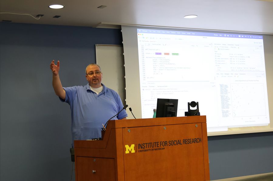
Professor lecturing at podium.
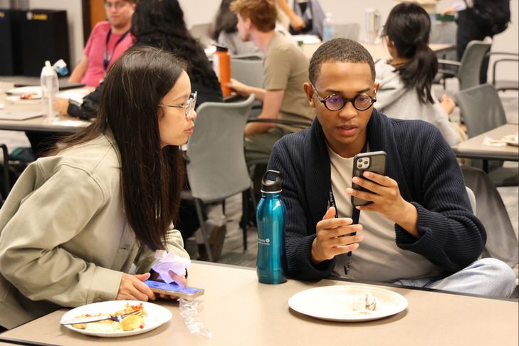
Participant showing phone to another.
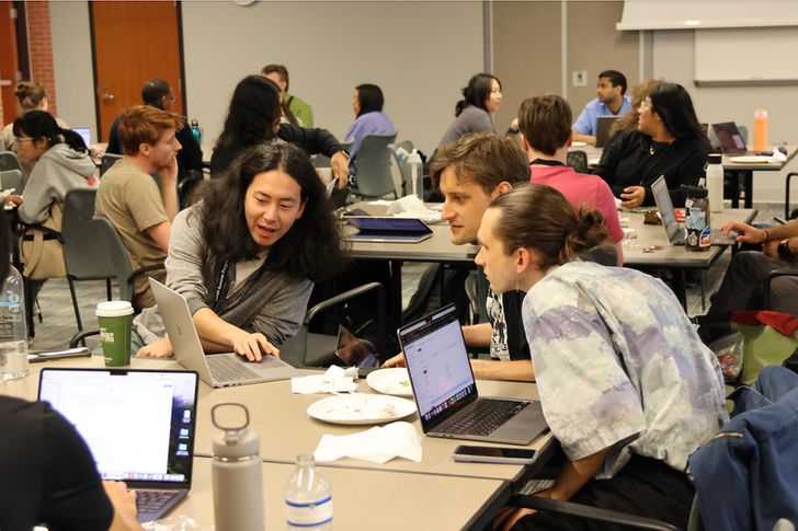
Participants looking at a computer screen.
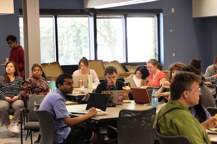
Participants sitting at tables.
Great turnout for our first TidyTuesday of the ICPSR Summer Program! Show up at ISR each Tuesday for a new TidyTuesday dataset, and there is always food!
#SumProg25 #ICPSR #TidyTuesday #DataScience
10.06.2025 21:00 — 👍 7 🔁 2 💬 2 📌 0
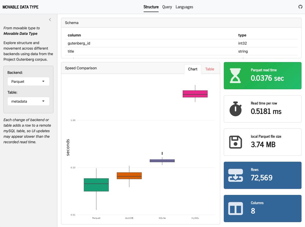
Screenshot of Shiny app comparing structure and performance of one data set using Parquet files, duckDB, SQLite, and MySQL. The “Structure” page is selected, and additional pages labeled “Query” and “Languages” are also listed
From shower idea to #Shiny app in 2 days. 😅 Little late for last week’s #TidyTuesday but I couldn’t stop adjusting! Movable Data Type explores Gutenberg data across backends, comparing structure, running queries, and visualizing distributions. #RStats #SQL jmclawson.shinyapps.io/movable-data...
11.06.2025 16:50 — 👍 20 🔁 4 💬 1 📌 0
Logo for the #TidyTuesday Project. The words TidyTuesday, A weekly data project from the Data Science Learning Community (dslc.io) overlaying a black paint splash.
TidyTuesday is a weekly social data project. All are welcome to participate! Please remember to share the code used to generate your results!
TidyTuesday is organized by the Data Science Learning Community. Join our Slack for free online help with R and other data-related topics, or to participate in a data-related book club!
How to Participate
Data is posted to social media every Monday morning. Follow the instructions in the new post for how to download the data.
Explore the data, watching out for interesting relationships. We would like to emphasize that you should not draw conclusions about causation in the data.
Create a visualization, a model, a shiny app, or some other piece of data-science-related output, using R or another programming language.
Share your output and the code used to generate it on social media with the #TidyTuesday hashtag.

The logo of apis.guru, consisting of a stylized bee face, with a hexagonal head and hexagonal glasses.
Curator: @jonthegeek.com
@dslc.io welcomes you to week 24 of #TidyTuesday! We're exploring API Specs!
📁 https://tidytues.day/2025/2025-06-17
📰 https://dslc-io.github.io/club-wapir/slides/intro.html
#RStats #PyData #JuliaLang #DataViz #tidyverse #r4ds
16.06.2025 13:46 — 👍 11 🔁 2 💬 0 📌 1
Health wearable are what plants crave.
14.06.2025 05:40 — 👍 0 🔁 0 💬 0 📌 0
I'm finally watching the Handmaid's Tale. It's fitting that this show premiered shortly after Trump's first inauguration and ended shortly after the final inauguration of an American President.
14.06.2025 05:08 — 👍 2 🔁 0 💬 0 📌 0
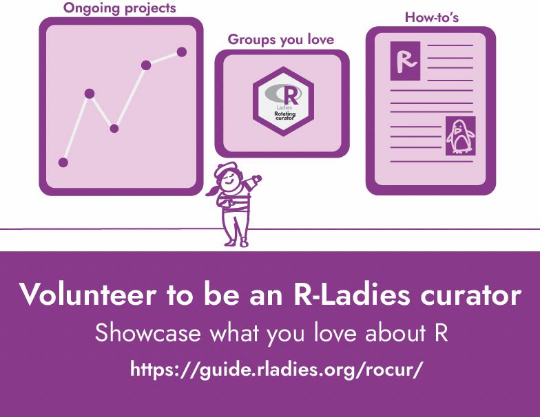
A chic lady (in a French outfit) shows off her gallery: a plot, a hex sticker of a group she loves, and a how to guide with an homage to the penguin dataset. It says "Volunteer to be an R-Ladies curator" with the subtitle "Showcase what you love about R" as well as the link to it! All in dashing purple.
We're looking for more curators for the second half of 2025! Want to share your voice or know someone who should?
📝 Sign up to curate: airtable.com/appjkZZgtF0i...
📖 Learn what curating involves: guide.rladies.org/rocur/guide/
💌 Nominate someone you admire: airtable.com/appFIBzsk2Ax...
12.06.2025 11:59 — 👍 19 🔁 20 💬 1 📌 3