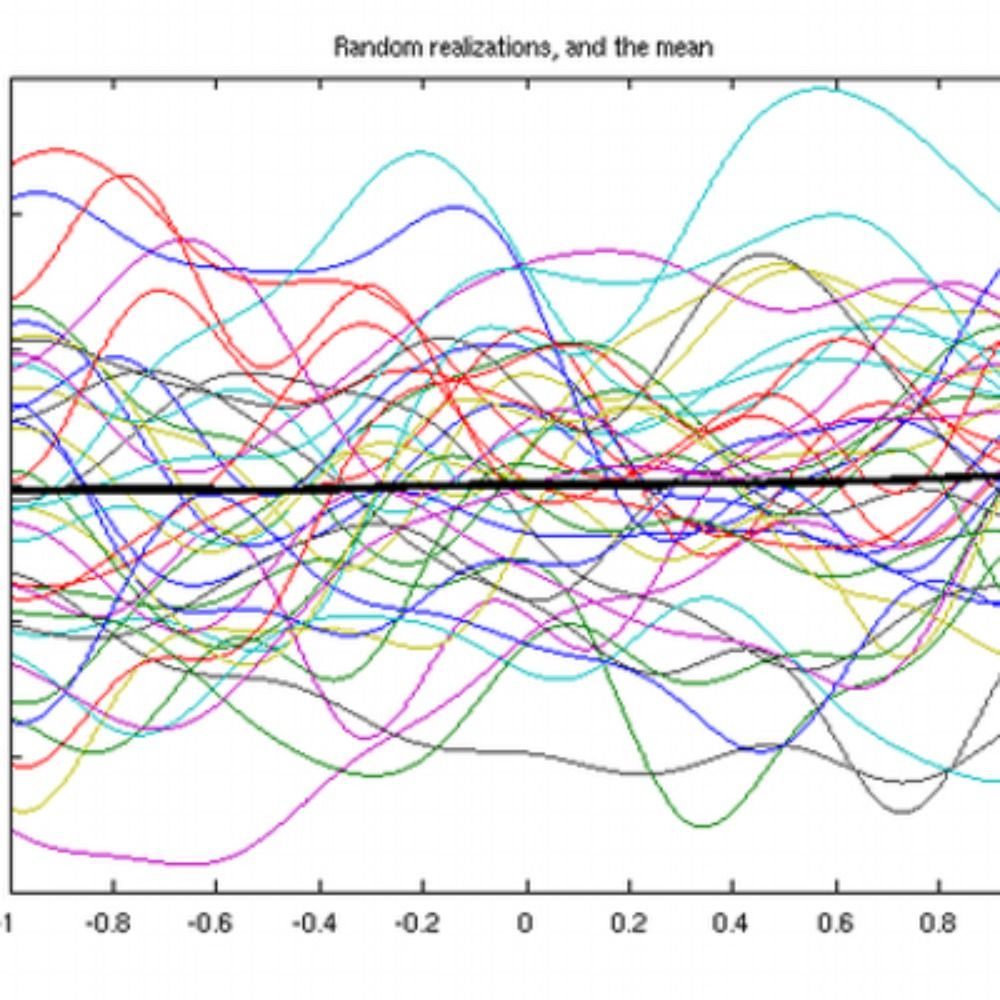
here's a preprint of the unhinged paper i wrote with @lane
we stop just short of saying that the unthinking use of frequentist statistics puts your very soul at hazard
https://arxiv.org/pdf/2509.08213
11.09.2025 13:33 — 👍 6 🔁 2 💬 0 📌 2

📢The open access version of our book is available now via OUP's site: global.oup.com/academic/pro...
20.08.2025 04:57 — 👍 27 🔁 9 💬 0 📌 0
Furthermore, we unpack broader implications of reframing visualization as a mechanism for data disclosure such as in authoring tools where designers like Fred are recommended possible visualization designs based on their disclosure goals. 8/n
13.08.2025 14:02 — 👍 0 🔁 0 💬 1 📌 0
From this analysis, we present a taxonomy of 13 data operations, what we dub disclosure tactics. These tactics give us a shared vocabulary to think about design tradeoffs in terms of disclosure, whether it is to protect privacy, persuade viewers, or simplify complex patterns. 7/n
13.08.2025 14:02 — 👍 0 🔁 1 💬 1 📌 0
We analyzed 425 examples of visualization techniques to study how designers made choices about information disclosure - about what information is hidden and what information is revealed in a chart. 6/n
13.08.2025 14:02 — 👍 0 🔁 0 💬 1 📌 0
In our new paper, we ask: Can these decisions be made more deliberate? Can we name and describe the operations that shape what a visualization reveals, distorts, or hides? 5/n
13.08.2025 14:02 — 👍 0 🔁 0 💬 1 📌 0
Without clear guidance from existing tools, he’s left to experiment until something “looks right,” hoping it meets both goals. 4/n
13.08.2025 14:02 — 👍 0 🔁 0 💬 1 📌 0

The image is a four-panel comic illustrating a privacy dilemma in data visualization. In the first panel, a scatterplot shows individual data points, and Fred wants to hide these while still showing clusters. The second panel shows aggregation into a heatmap, which distorts clusters and can still reveal individuals. The third panel depicts adding noise, which hides clusters but requires fine tuning and introduces spurious signals. The fourth panel shows smoothed contour shapes that reveal only the clusters, which Fred finds effective and easy to produce.
For example, imagine a bio-statistician Fred who works at a university medical center. He’s tasked with revealing clusters in patient data to an industry partner, while protecting patient privacy. 3/n
13.08.2025 14:02 — 👍 1 🔁 1 💬 1 📌 0
Visualizing real-world data means making tradeoffs: Datasets can be messy, high-dimensional, or contain sensitive information. Designers are constantly making judgment calls about what to show and what to leave out. 2/n
13.08.2025 14:02 — 👍 0 🔁 0 💬 1 📌 0
I am excited to share a new paper titled “Designing for Disclosure in Data Visualizations” set to appear at IEEE VIS 2025 (link below). 1/n
13.08.2025 14:02 — 👍 3 🔁 1 💬 1 📌 1
@tengshanyuan.info is an incredible researcher and collaborator. He’s hiring students for his new lab at NTU! Don’t miss this opportunity!
30.07.2025 00:46 — 👍 3 🔁 1 💬 0 📌 0
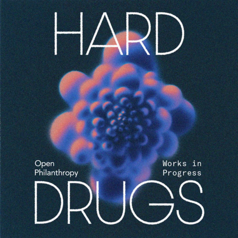
Lenacapavir: The miracle drug that could end AIDS
Hard Drugs · Episode
LAUNCH DAY 🚀
Today I’m launching a new podcast, Hard Drugs, with Jacob Trefethen (@jacobtref.bsky.social)
Our first episode is about lenacapavir — a new HIV drug that blocks infections with an efficacy rate of nearly 100%, and which could completely change the fight against HIV worldwide.
11.06.2025 14:16 — 👍 239 🔁 72 💬 14 📌 21

Annotation Interview Study
We are researchers at University of Utah, Harvard Medical School, and University of Oklahoma, seeking visualization professionals/practitioners to share insights on their annotation practices. The goa...
Do you use data visualizations 📊 or add annotations to them? My collaborators and I are doing a study on how people use visualizations in their work — we'd love to interview you!
Survey: docs.google.com/forms/d/e/1F...
Book a time: calendar.google.com/calendar/u/0...
27.05.2025 21:43 — 👍 4 🔁 7 💬 0 📌 1
Thanks to everybody who chimed in!
I arrived at the conclusion that (1) there's a lot of interesting stuff about interactions and (2) the figure I was looking for does not exist.
So, I made it myself! Here's a simple illustration of how to control for confounding in interactions:>
11.05.2025 05:34 — 👍 1135 🔁 275 💬 69 📌 18
My student @abhsarma.bsky.social is presenting his work on visualizing forecasts under uncertainty induced by the presence of multiple forecasters at #chi2025 tomorrow! #vis #stats #hci
BTW he's great and he's looking for jobs!!
29.04.2025 07:49 — 👍 16 🔁 4 💬 0 📌 0
behold the CONNECTED SPLATTERPIE
kneel before my works, ye mighty, and despair
30.03.2025 21:00 — 👍 400 🔁 70 💬 36 📌 23
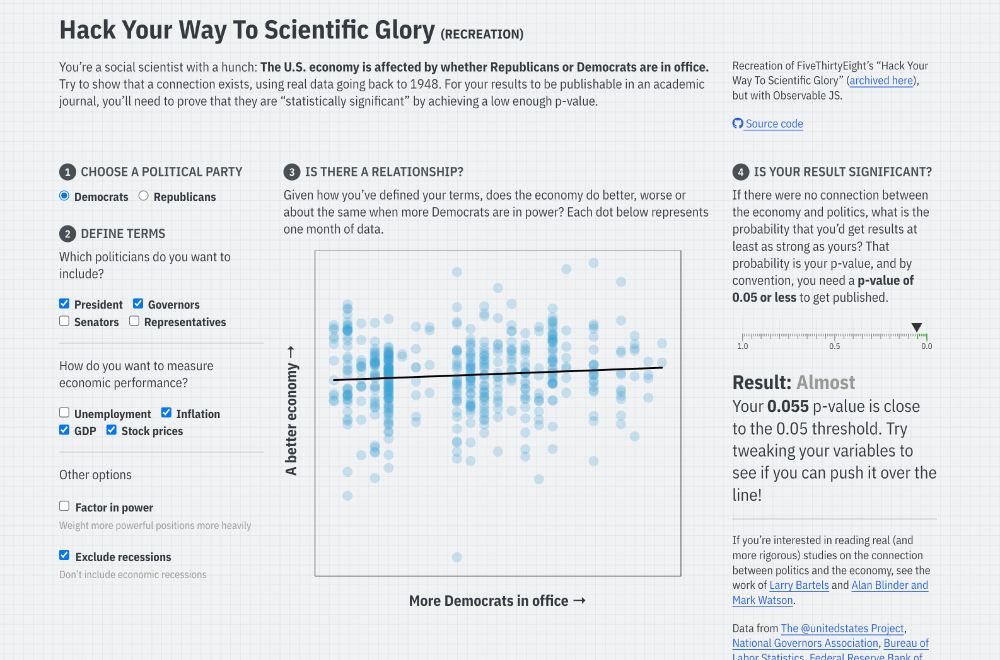
Screenshot of the linked Quarto website, with input checkboxes to change different conditions for a regression model that predicts economic performance based on US political party, with a reported p-value
I’ve long used FiveThirtyEight’s interactive “Hack Your Way To Scientific Glory” to illustrate the idea of p-hacking when I teach statistics. But ABC/Disney killed the site earlier this month :(
So I made my own with #rstats and Observable and #QuartoPub ! stats.andrewheiss.com/hack-your-way/
20.03.2025 18:30 — 👍 1468 🔁 439 💬 58 📌 30
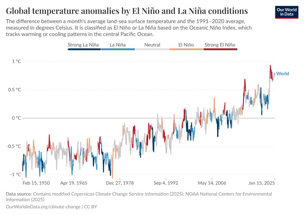
🌡 New on @ourworldindata.org:
We added global temperature anomaly charts *coloured by El Nino / La Nina periods*.
Today's "cool" years are warmer than "warm" years of the past.
[New article and charts by my colleague Veronika Samborska and I: ourworldindata.org/global-tempe... ]
03.03.2025 15:20 — 👍 424 🔁 176 💬 9 📌 9
I really liked this idea of using a histogram as a legend in a choropleth map (since land isn't unemployed; people are), so I made a little guide to doing it with #rstats, {ggplot2}, and {patchwork}
www.andrewheiss.com/blog/2025/02...
19.02.2025 17:58 — 👍 865 🔁 191 💬 27 📌 23
We ( @joshnicholas.com and I ) have just finished a big re-design of our poll tracking page. The redesign had two goals 1) improve the clarity of the summary charts and 2) de-emphasise the mean, and add emphasis on the credibility range/uncertainty of the modelling...
10.02.2025 03:50 — 👍 26 🔁 6 💬 2 📌 0
YouTube video by UChicago Data Science Institute
Can thinking with data benefit society? @UChicago #datascience #ai #airesearch
How can helping people think with data benefit society?
Explore the research of Alex Kale (@kalealex.bsky.social), Assistant Professor of Computer Science and Data Science at the University of Chicago!
www.youtube.com/shorts/8SkXI...
06.02.2025 22:44 — 👍 2 🔁 2 💬 0 📌 1

Information+ Conference 2025
#info+ 2025 conference announced!! informationplusconference.com/2025/
29.01.2025 18:21 — 👍 20 🔁 12 💬 0 📌 2

Tues 2/11! Join us for a FREE online lecture, Design Pioneers: African American Graphic Designers You Should Know with Glenford Laughton, founder of Laughton Creatves.
Free to attend: letterformarchive.org/shop/design-...
29.01.2025 02:57 — 👍 41 🔁 9 💬 0 📌 3
I found going into Account -> Account Settings -> Integrations -> Disable AI features turns it off for all the projects.
29.01.2025 02:32 — 👍 2 🔁 0 💬 0 📌 0
Humans. Data. Puns. AI/ML. WIDS_Sweden. MSc Epidemiology program at LSHTM. King (ABK/MS). Ex-Google. Ex-Northvolt. ☕☕☕. A mostly American living in Sweden. Formerly @galinash on the semi-dead app.
I research and create educational videos about misinformation, propaganda, fascism, and sometimes (unfortunately) AI
Assistant prof @ UofT, associated scientist @ Helmholtz Institute for RNA-based Infection Research. Pathogen systems biology / informatics / functional genomics. Coastal New Hampshirite. Drink Moxie.
📈 Anàlisi, comunicació, visualització i gestió de/amb dades. Director de Polis (@polis-dades.bsky.social).
MPhil in HKUST(GZ), Data Visualization, Human Computer Interaction. Looking for PhD position in 2025 Fall! My homepage: https://manlingyang.org/
https://olivia.science
assistant professor of computational cognitive science · she/they · cypriot/kıbrıslı/κυπραία · σὺν Ἀθηνᾷ καὶ χεῖρα κίνει
(He/Him)
I am a GIS Specialist, working from Happy Valley-Goose Bay. I love maps, cartography and cool data visualisations.
Currently finishing a PhD with MUNL on the historic landscape of the Exploits River Valley.
Cranky lioness. You know me from Twitter. Cats, game design, Judaism, and very long threads. (She/her)
Computational biologist, data scientist, digital artist | he, him | http://clauswilke.com/ | Opinions are my own and do not represent UT Austin.
Researcher @Microsoft; PhD @Harvard; Incoming Assistant Professor @MIT (Fall 2026); Human-AI Interaction, Worker-Centric AI
zbucinca.github.io
Econometrics, Statistics, Computational Economics, etc
University of Zurich
http://donskerclass.github.io
🇺🇲 in 🇨🇭. 🏳️⚧️
Associate Professor @ UW
Computational Social Science
Searching for the numinous
Australian Canadian, currently living in the US
https://michaelnotebook.com
Stanford economist. I have a market design blog: https://marketdesigner.blogspot.com/ Lately I’m interested in #controversial markets
economist. Posts Reflect Me Only! collects/analyzes: poll, market, social media/online data, to study: news, public opinion, ads, market design
Testing the waters, floating the trial balloons. Professing and researching. Author / editor of a few books, but claims to have no time to write book called "Its About Time"
Researcher @DIPF
Editor @LIBREAS.Library ideas
Enthusiastic about:
Charles Sanders Peirce, Visualization, Imagery, Semiotics, Digital Humanities, Information Theory, Knowledge Organization, Open Access and Schalke04 💙🤍
Professor of Computer Science, Stanford - HCI & Design, Co-Founder & Co-Director Stanford HAI @stanfordhai.bsky.social
Assistant Professor at the Department of Computer Science, University of Liverpool.
https://lutzoe.github.io/